border
- Definition: An element's outer margin and inner margin are the elements'borders. The border of an element is one or more lines around the content and inner margin of the element. Therefore, the background of the element stops at the outer margin, because the background does not extend within the outer margin, while the border is inside the outer margin.
The borders in each direction have three directions:
- Width or thickness
- Style or appearance
- colour
Border width:
Generally, the default value of the border width is medium, about 2 pixels. The keywords thin, medium and thick do not necessarily correspond to a specific width. They are only relative definitions. According to the specifications, thick is always the pen medium width, while media is always wider than thin. Nevertheless, the width is not necessarily visible, because the default style of the border is none (the border will not appear when the style is hidden), and if a border has no style, it will not exist.
If a water cup is empty, you can't describe it as a cup with nothing in it. The height of the quilt content can only be discussed when there is something in the cup. Similarly, the width of the border can only be discussed when it exists.
Keeping this in mind prevents the appearance of a style at first glance, but forgets that the default style of the border is none, which eventually leads to confusion when the border cannot appear. So, if you want the border to appear, you must declare a border style.
Let's focus on the border width in various situations.
The following css code:
.tri {
    width: 78px;
    height: 16px;
    border: 0;
    background-color: red;
    display: inline-block;
}
.tri-test {
    border-top: 50px solid lightsalmon;
    border-right: 50px solid lightseagreen;
    border-left: 50px solid lightskyblue;
    border-bottom: 50px solid lightslategray;
}
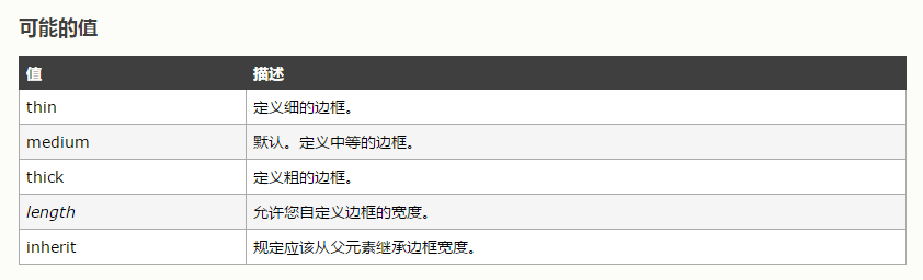
The effect is as follows:
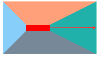
There is no deviation between the effect and what we think. Then we change the width and height of the content to zero. 
Does the width of the border feel changed? Or is it not clear what the width of the border is?
Their borders are all 50px wide. Look at the red arrow in the picture below. 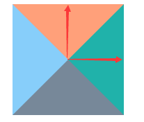
The true width of the border can be understood as the path marked with red arrows in the figure above.
At this point, it can be preliminarily concluded that it represents the distance from the content area boundary to the specified direction (top, left, right or bottom).
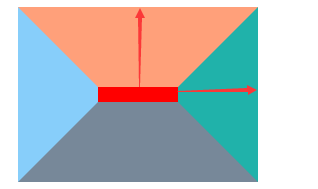
When we change the width of the right border to 160px 
From the graph, it can be seen that the defined border width does not change with the change of the content area size, so the definition of the border width is determined.
So what is the practical use of such discoveries?
-
Drawing triangles of various styles with css
After we have defined the width of the border, changing the color of the border and changing the number of border can achieve the following results:
.tri-test {
    border-top: 80px solid lightsalmon;
    border-right: 80px solid transparent;
}

.tri-test {
    border-top: 80px solid lightsalmon;
    border-right: 80px solid transparent;
    border-left: 80px solid transparent;
}
.tri-test {
    border-right: 43px solid transparent;
    border-left: 151px solid transparent;
    border-bottom: 135px solid lightslategray;
}
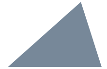
The principle of making triangles is very simple. We use a basic figure to make triangles.
Let's say you want to make a triangle like this: 
Step 1: Let's put the bottom of the triangle horizontally or vertically. 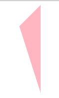
perhaps 
Step 2: Move the height to the two corners and connect the head together. 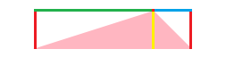
Step 3: This step can be very clear. Comparing with the previous basic graph, we find that the parameters that determine the triangle are the width of the lower border, the width of the left border and the width of the right border. On the corresponding graph, the yellow, green and blue lines correspond to the width of the right border. The color of the left border and the right border can be changed to transparent, and then rotated properly. My parameters are as follows:
.tri-test {
    border-right: 50px solid transparent;
    border-left: 150px solid transparent;
    border-bottom: 50px solid lightpink;
    transform:rotate(310deg);
}
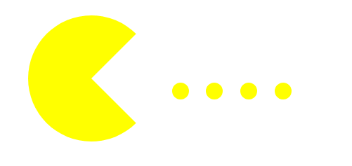
It's also possible to combine triangles with border-radius attributes, for example:
.tri-test {
    border-top: 90px solid transparent;
    border-right: 90px solid #ffff00;
    border-left: 90px solid #ffff00;
    border-bottom: 90px solid #ffff00;
    border-radius: 90px;
    transform:rotate(90deg);
}
.tri-test {
    border-top: 225px solid transparent;
    border-right: 225px solid transparent;
    border-left: 65px solid lightpink;
    border-bottom: 65px solid lightcoral;
    border-radius: 20px;
    transform:rotate(225deg);
}