There is such a syntax in the CSS3 version:
@media mediatype and|not|only (media
feature) {
CSS-Code;
}
Recent beginners of css require various page-adaptive scenarios on both the device and the computer side.Naturally, this attribute comes to mind:
@media, it took about an hour today to make an adaptive little demo, which is recorded as follows:
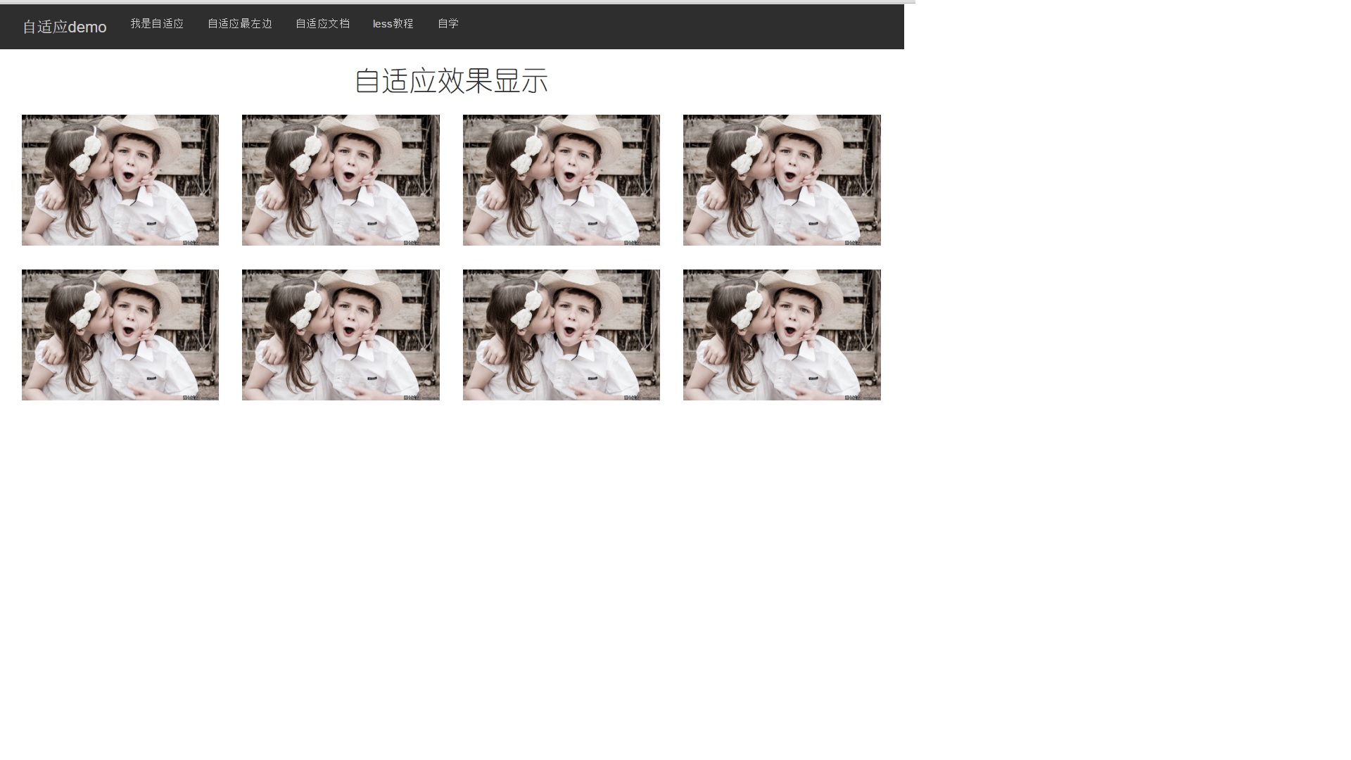
Computer side display:
Mobile display:
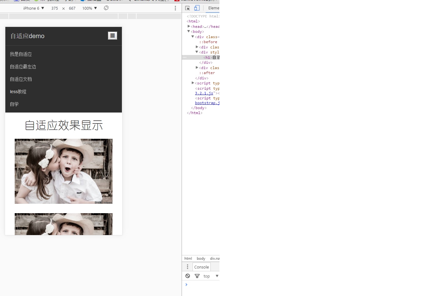
The template for the bootstrap main page is applied, and only the @media syntax is used (with the media attribute to configure, but I don't use it), probably the bootstrap raster system and @media.
The code block is shown below and can be run by copying and pasting directly.
<!DOCTYPE html>
<html>
<meta charset="utf-8">
<meta name="viewport" content="width=device-width, initial-scale=1"/>
<link rel="stylesheet" href="https://cdn.bootcss.com/bootstrap/3.3.7/css/bootstrap.min.css">
<head>
	<title>self-adaption</title>
</head>
<body>
<div class="navbar">
	<div class="container">
		<div class="navbar-header"><a href="#">Adaptive demo</a>
		<button class="change" onclick="change(this)"><span class="glyphicon glyphicon-align-justify"></span></button>
		</div>
		<div id="n1" class="navbar-collapse collapse">
			<ul class="nav navbar-nav">
				<li class="hidden-sm hidden-md"><a href="http://V2.bootcss.com/">Bootstrap2 Chinese Document</a></li>
				<li><a href="#">Adaptive Leftmost</a></li>
				<li><a href="">Adaptive Document</a></li>
				<li><a href="">less Course</a></li>
				<li><a href="">Self-taught</a></li>
			</ul>

		</div>
	</div>
	<div style="text-align: center;font-family:'Juvenile Round'">
		<h1>Adaptive effect display</h1>
	</div>
	<div class="container container-body">
		<div class="div_info col-sm-6 col-md-4 col-lg-3"><img width="100%" height="100%" src="http://www.th7.cn/d/file/p/2014/09/28/8543a9ac6d0ade866f7a2fa8f7b5f8b0.jpg"></div>
		<div class="div_info col-sm-6 col-md-4 col-lg-3"><img width="100%" height="100%" src="http://www.th7.cn/d/file/p/2014/09/28/8543a9ac6d0ade866f7a2fa8f7b5f8b0.jpg"></div>
		<div class="div_info col-sm-6 col-md-4 col-lg-3"><img width="100%" height="100%" src="http://www.th7.cn/d/file/p/2014/09/28/8543a9ac6d0ade866f7a2fa8f7b5f8b0.jpg"></div>
		<div class="div_info col-sm-6 col-md-4 col-lg-3"><img width="100%" height="100%" src="http://www.th7.cn/d/file/p/2014/09/28/8543a9ac6d0ade866f7a2fa8f7b5f8b0.jpg"></div>
		<div class="div_info col-sm-6 col-md-4 col-lg-3"><img width="100%" height="100%" src="http://www.th7.cn/d/file/p/2014/09/28/8543a9ac6d0ade866f7a2fa8f7b5f8b0.jpg"></div>
		<div class="div_info col-sm-6 col-md-4 col-lg-3"><img width="100%" height="100%" src="http://www.th7.cn/d/file/p/2014/09/28/8543a9ac6d0ade866f7a2fa8f7b5f8b0.jpg"></div>
		<div class="div_info col-sm-6 col-md-4 col-lg-3"><img width="100%" height="100%" src="http://www.th7.cn/d/file/p/2014/09/28/8543a9ac6d0ade866f7a2fa8f7b5f8b0.jpg"></div>
		<div class="div_info col-sm-6 col-md-4 col-lg-3"><img width="100%" height="100%" src="http://www.th7.cn/d/file/p/2014/09/28/8543a9ac6d0ade866f7a2fa8f7b5f8b0.jpg"></div>
	</div>
</div>
</body>
</html>
<script type="text/javascript">
	function change(obj){
		if($("#n1").hasClass("collapse in")){
			$("#n1").removeClass("collapse in");
			$("#n1").addClass("collapse");
		}else{
			$("#n1").removeClass("collapse");
			$("#n1").addClass("collapse in");
		}
	}
</script>
<script src="https://cdn.bootcss.com/jquery/2.1.1/jquery.min.js"></script>
<script src="https://cdn.bootcss.com/bootstrap/3.3.7/js/bootstrap.min.js"></script>
<style type="text/css">
@media (max-width: 768px){
.change{
height: 100%;
float: right;
margin: 15px;
}
}
@media (min-width: 768px){
.change{
display: none;
}
}
</style>
<style type="text/css">
.container{
background-color: #2e2e2e;
}
.container-body{
background-color: white;
}
.navbar-header > a{
margin: 15px;
font-size: 20px;
text-align: center;
}
a{
color: #ccc;
}
.nav>li>a:hover{
background-color: #2e2e2e;
color: white;
}
.navbar-collapse > ul >li{
}
.navbar-header > a{
float:left;
}
.navbar-header > a:hover{
text-decoration:none;
background-color: #2e2e2e;
}
.div_info{
height: auto;
padding: 15px;
}
.btn-type{
font-size: 24px;
}
</style>This demo is simple, just take a note of your first adaptive demo
The main grammar to note is: