Preface
Button is a very common function for developers. The front-end usually adds some operation interaction styles to the buttons to increase some user experience.
For example: hover style, click style, loading style, etc. Let's learn about the css 3 animation and css pseudo class through a simple example.
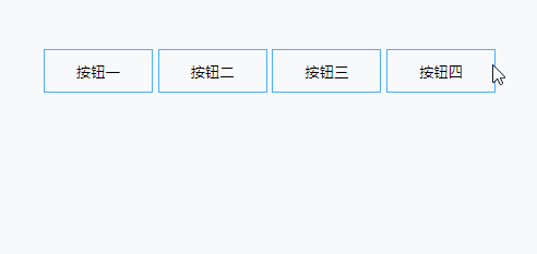
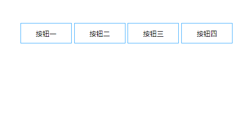
Example 1
<button class="btn-1">Button 1</button>

<style>
button{
  position: relative;
  width: 100px;
  height: 40px;
  border: 1px solid #46b0ff;
  background: none;
  cursor: pointer;
}
button:after{
  position: absolute;
  content: '';
  width: 100%;
  height: 100%;
  top: 0;
  left: 0;
}
.btn-1:after{
  opacity: 0;
  background: #46b0ff;
  transition: all .3s;
  z-index: -1;
}
.btn-1:hover:after{
  opacity: 1;
}
</style>

Analysis:
1. Using pseudo class as mouse: after hover event, the button background, here used relative and absolute positioning Remember: when using absolute positioning elements, the parent element must use relative positioning. Otherwise, the element will always look up to the root node.
2. Here we use transition to describe the: hover event animation, 0.3s to complete the animation, and change the transparency of: after. All is all behavior.
Of course, we have a simpler way to implement it here. It's ok to change the background directly without type. See the code:
<button class="btn-1">Button 1</button>

<style>
button{
  position: relative;
  width: 100px;
  height: 40px;
  border: 1px solid #46b0ff;
  background: none;
  cursor: pointer;
  background: rgba(70, 176, 255, 0);
  transition: all 1s;
}
.btn-1:hover{
  background: rgba(70, 176, 255, 1);
}
</style>
ok, on the basis of example 1, let's go a step further. See example 2
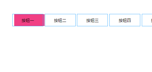
Example two
<button class="btn-2">Button two</button>

<style>
...
/* The public style above is omitted here */
.btn-2:after{
  width: 0;
  background: #f13f84;
  transition: all .3s;
  z-index: -1;
}
.btn-2:hover:after{
  width: 100%;
}
</style>
Analysis: 1. This is similar to example 1, but it changes the width of the pseudo class.
2. By analogy, we can change the height of the pseudo class and see the animation extending down.
<button class="btn-3">Button three</button>

<style>
...
/* The public style above is omitted here */
.btn-2:after{
  width: 0;
  background: #f13f84;
  transition: all .3s;
  z-index: -1;
}
.btn-2:hover:after{
  width: 100%;
}
</style>
So there is a question, how to make pseudo classes from right to left, or from bottom to top?
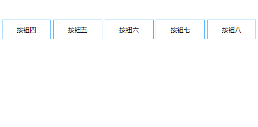
<button class="btn-4">Button four</button>
<button class="btn-5">Button five</button>

<style>
...
/* The public style above is omitted here */

button:after{
  position: absolute;
  content: '';
  width: 100%;
  height: 100%;
  top: 0;
  left: 0;
}

.btn-4:after{
  height: 0;
  background: #00b7a3;
  transition: all .3s;
  z-index: -1;
  bottom: 0;
  top: initial
}
.btn-4:hover:after{
  height: 100%;
}

.btn-5:after{
  width: 0;
  background: #00b7a3;
  transition: all .3s;
  z-index: -1;
  right: 0;
  left: initial
}
.btn-5:hover:after{
  width: 100%;
}
</style>
In fact, it is also very simple. If we change the initial position of the pseudo class, for example, from the bottom to the top, we will let the element start at the bottom: 0, and then change the height, we can see that the effect is delayed from the bottom to the top, the same is true from the right to the left.
Did you learn from it?
In fact, there are other ways to achieve this. For example, from left to right, we can make the pseudo class 100% wide at the beginning, but left is just the opposite direction of the button, and then the animation makes left:0
See code:
<button class="btn-2">Button two</button>

<style>
...
/* The public style above is omitted here */
.btn-2:after{
  left: -100px;
  background: #f13f84;
  transition: all .3s;
  z-index: -1;

}
.btn-2:hover:after{
  left: 0;
}
This kind of effect is certainly unsatisfactory. When the mouse is not pointing up, you can see the pseudo class on the left. In fact, you can add the hidden beyond the button
button{
  ...
  overflow: hidden;
}
Let's expand it to show a higher-level example
Example three
<button class="btn-6">Button six</button>
<button class="btn-7">Button seven</button>

<style>
...
/* The public style above is omitted here */
.btn-6:after{
  width: 0;
  background: #ff9900;
  transition: all .3s;
  z-index: -1;
  left: 50%;
  transform: translateX(-50%);
}
.btn-6:hover:after{
  width: 100%;
}

.btn-7:after{
  height: 0;
  background: #00b7a3;
  transition: all .3s;
  z-index: -1;
  top: 50%;
  transform: translateY(-50%);
}
.btn-7:hover:after{
  height: 100%;
}
Analysis:
1. Let's first let the pseudo class: after, center horizontally or center vertically
/* horizontally */
left: 50%;
transform: translateX(-50%);

/* Vertical centering */
top: 50%;
transform: translateY(-50%);
2. When you change the width or height through: hover, you can form the animation effect of the above figure
Through the above effect, we can go further, please see the following code
Example four
<button class="btn-8">Button eight</button>

<style>
...
/* The public style above is omitted here */
.btn-8:after{
  height: 0;
  width: 0;
  background: #f13f84;
  transition: all .3s;
  z-index: -1;
  top: 50%;
  left: 50%;
  border-radius: 100%;
  transform: translate(-50%, -50%);
  overflow: hidden;
  opacity: .3;
}
.btn-8:hover:after{
  height: 300px;
  width: 300px;
  opacity: 1;
}
Analysis:
1. Pseudo class element: after horizontal vertical center
top: 50%;
left: 50%;
transform: translate(-50%, -50%);
2. Animation changes the width and height (unlike the previous example, the width and height must be greater than the width of the button and be circular) 3. Hide beyond button
summary
This section is over. Do you think it's very simple? Is it possible to find out that there is still room for expansion? For example: up and down around the same time delay effect, you can add tilt, the effect is not the same.
What did you learn through this section?
1. Flexible use of pseudo elements
2. The role of transition
3. : hover mouse in animation
4. How to center elements horizontally and vertically
Guys, if you have any questions, please leave a message in the comment area. Welcome to comment.
Original address: http://www.javanx.cn/20191224/buttonhover/