preface
before you start, let's explain: This article only involves basic CSS knowledge. If there are students who do front-end development, you can skip it. This article is aimed at students who just get started and turn to front-end development from other directions. As we all know, CSS is not a programming language. Its learning in the early stage mainly comes from the accumulation of attributes and the combination of various attributes. Therefore, there is no rapid progress in learning CSS after learning a programming language
this paper summarizes what the author thinks is necessary for the introduction of css. Others can be gradually mastered through Baidu practice in development. The following is the content involved in this paper.
- css basic usage and common selectors
- css layering and weight
- css common properties
- css box model
- float
- position positioning
- flex elastic box
css is so difficult that few people dare to say they are the God of css, but the introduction is very simple. Next, let's start the learning process of css.
Note: This article assumes that the reader has some html knowledge and does not explain the html part.
css basic usage and common selectors
before starting learning, choose a favorite development environment. Because it's just for learning, two lightweight editors are recommended here. Hubuilderx and VsCode.VsCode are easy to use, but you need to install your own plug-ins. If you are lazy, use hubuilderx. However, hubuilderx is made in China and has some problems in experience. (personal experience, not looking down on domestic products).
HBuilderX - effective geek skills (dcloud.io)
Download Visual Studio Code - Mac, Linux, Windows
now let's start learning, create a new file in the editor and edit the basic html code.
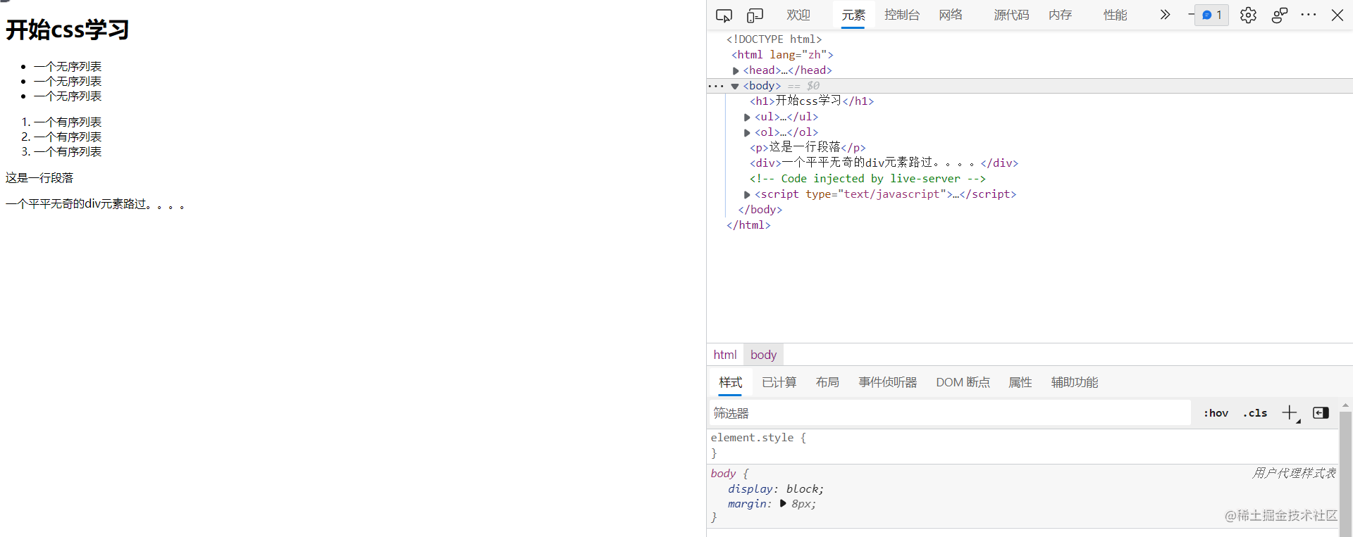
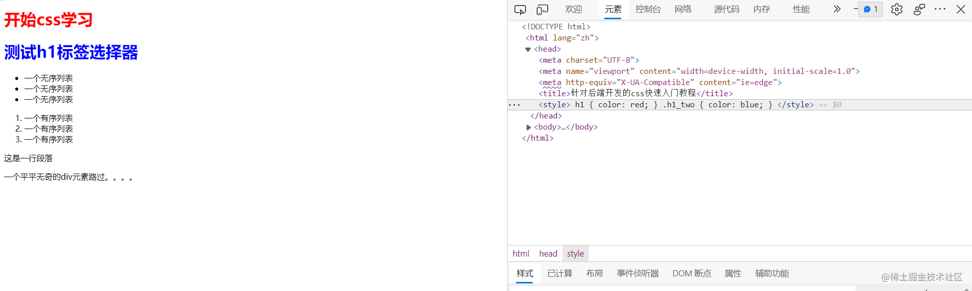
<!DOCTYPE html>
<html lang="zh">

<head>
	<meta charset="UTF-8">
	<meta name="viewport" content="width=device-width, initial-scale=1.0">
	<meta http-equiv="X-UA-Compatible" content="ie=edge">
	<title>For backend development css Quick start tutorial</title>
</head>

<body>
	<h1>start css study</h1>
	<ul>
		<li>An unordered list</li>
		<li>An unordered list</li>
		<li>An unordered list</li>
	</ul>
	<ol>
		<li>A sequence table</li>
		<li>A sequence table</li>
		<li>A sequence table</li>
	</ol>
	<p>This is a one line paragraph</p>
	<div>An ordinary div Elements passing by....</div>
</body>

</html>
press the computer F12 or right-click the browser to select the inspection element to open the console. This is where the browser debugs the code. You can see that our current page has appeared, but only html is bare.
Basic usage of css
there are three ways to introduce css: inner chain, outer chain, and inline. In fact, css is written in three different places. You can go to Baidu by yourself. It's very simple. We've brought it here. We directly use the external chain to write the style on our h1 label. Add a style tag in the body to indicate that we write css style here.
<head>
	<meta charset="UTF-8">
	<meta name="viewport" content="width=device-width, initial-scale=1.0">
	<meta http-equiv="X-UA-Compatible" content="ie=edge">
	<title>For backend development css Quick start tutorial</title>
	<style>
		h1 {
			color: red;
		}
	</style>
</head>
you can see that the h1 label already has a style.
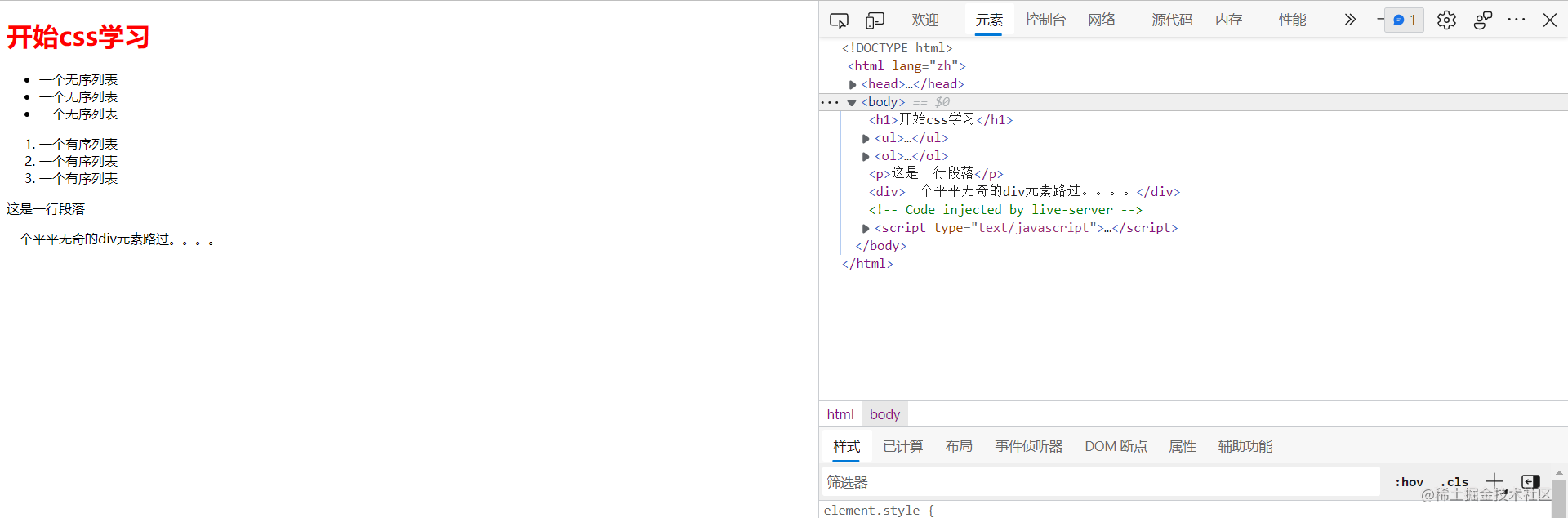
from here, we can find the working mode of css. Select the attribute we want to assign the style to through the selector, and add the style to the selected element through the attribute set in braces. h1 here is the selector, corresponding to h1 element, color is the attribute, which means to change the font color, and red is the attribute value, which means that the color changes to red. Color attributes can use corresponding words in css, rgb and hexadecimal. Here to share a practical gadget. When the computer QQ is turned on, you can press and hold the computer Ctrl+Alt+a to call up the QQ screenshot tool. Slide the mouse over the screen color you want to absorb, and press Ctrl+C to copy the hexadecimal number of the color, which can be pasted directly into our css.
next, let's introduce the four most commonly used css selectors, label selectors, class selectors, id selectors and descendant selectors, which are enough to complete the basic selection needs. We rely more on Baidu to learn. Here is only an introductory study.
tag chooser
as the name suggests, the tag selector is a selector that takes the tag name as the selector name and selects all the tags with that name. For example, the above example is a tag selector that selects the h1 tag. This is very simple. The selector name is equal to the html tag. For example, if we write two h1 labels here, we can find that both h1 characters turn red and are selected.
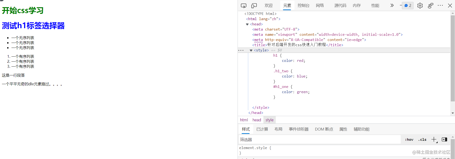
class selector
when using the tag selector, there will be a problem, that is, there are only a few html tags. What should we do if we want to give different styles to the same tag? Here comes the most commonly used class selector. The usage of the class selector is to write the class name on the required element, and then use the method of. + name to select the element, Please note: the class here has nothing to do with the object-oriented class, which can be understood as the marking method. Names can be named casually. Generally, English words that can show functions are semantically used. The code is as follows:
<style>
h1 {
color: red;
}
.h1_two {
color: blue;
}
</style>
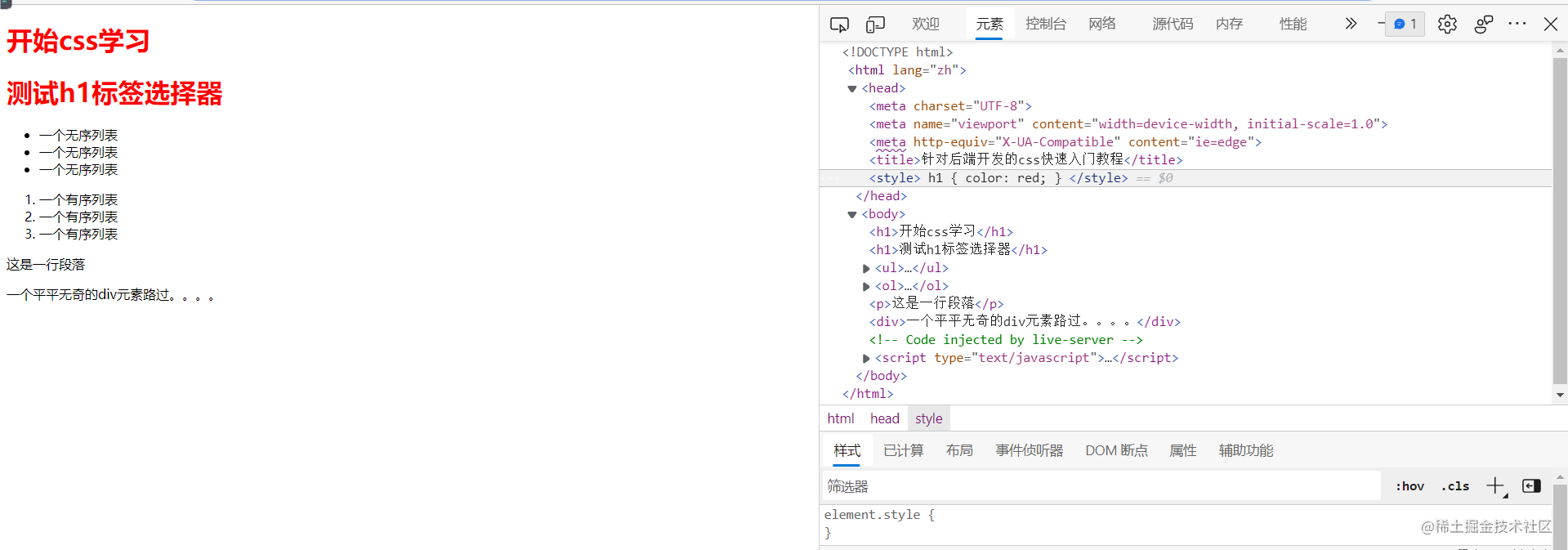
<h1>start css study</h1>
<h1 class="h1_two">test h1 tag chooser </h1>
We write class on the second h1 tag, and then write the style by the name of. + class. The effects are as follows:
It can be found that the class has been selected successfully. It is worth mentioning that the class can be reused. Like the label selector, the class with the same name will be selected together. You can try it yourself.
id selector
like class, write the id attribute on the element, and choose the name at will, making it semantic as much as possible. The use method is # + id name. Please note that the id selector is unique. Please do not use it more than once.
	<style>
		h1 {
			color: red;
		}
		.h1_two {
			color: blue;
		}
		#h1_one {
			color: green;
		}
	</style>
<h1 id="h1_one">start css study</h1>
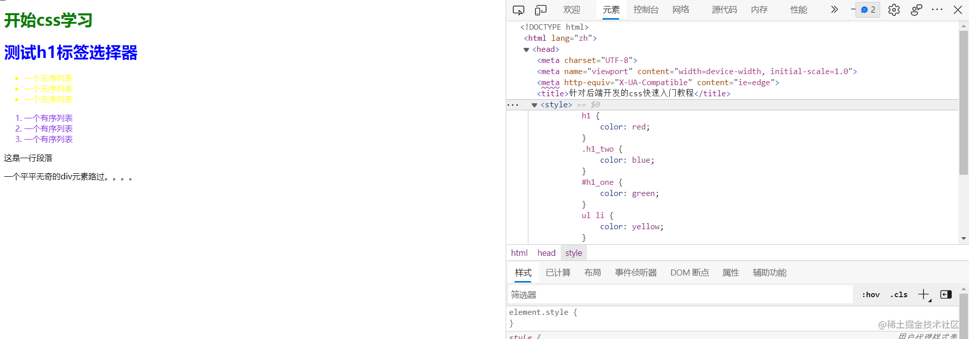
Descendant Selectors
when multiple similar elements need to be selected, we can use the descendant selector, which can be superimposed. The use method is selector + space + selector. For example, there are sequence tables and unordered lists. Their child elements are li tags. We want to give different effects to different li tags. What should we do. The answer is to use a descendant selector
	<style>
		h1 {
			color: red;
		}
		.h1_two {
			color: blue;
		}
		#h1_one {
			color: green;
		}
		ul li {
			color: yellow;
		}
		ol li {
			color: blueviolet;
		}
	</style>
        <ul>
		<li>An unordered list</li>
		<li>An unordered list</li>
		<li>An unordered list</li>
	</ul>
	<ol>
		<li>A sequence table</li>
		<li>A sequence table</li>
		<li>A sequence table</li>
	</ol>
As you can see, we set different font colors for the li tags under ul and ol respectively. Here is the descendant selection of tag selector. clas and id can also be combined or mixed with each other. You can study it yourself.
css layering and weight
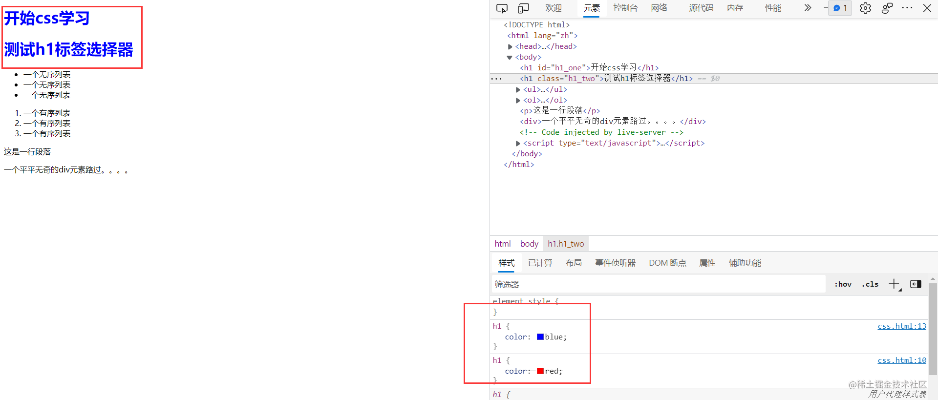
I believe more careful students have found that when we use the class selector, the original two h1 tags are red, but after adding the blue attribute to the second tag, the original red is overwritten. Select this element and check it on the console. It is found that the red font set by the original label selector is marked with a delete line.
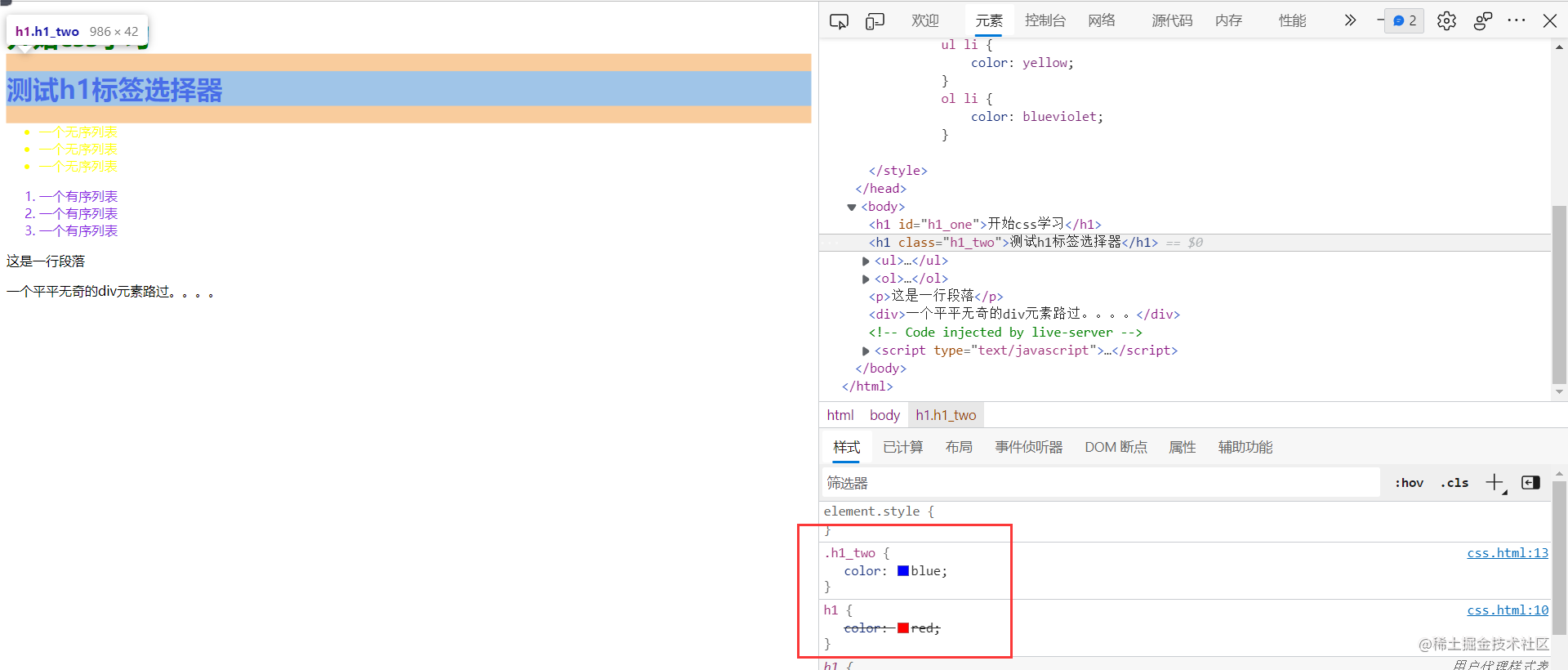
Here we introduce two important features of css, cascading attribute and weight value.
Cascade attribute
this is easy to understand. Multiple selectors act on the same tag, and the same attributes will overwrite each other. The rule is that the attributes written later overwrite the attributes written earlier. Here are two examples of h1 tags.
<!DOCTYPE html>
<html lang="zh">

<head>
	<meta charset="UTF-8">
	<meta name="viewport" content="width=device-width, initial-scale=1.0">
	<meta http-equiv="X-UA-Compatible" content="ie=edge">
	<title>For backend development css Quick start tutorial</title>
	<style>
		h1 {
			color: red;
		}
		h1 {
			color: blue;
		}
	</style>
</head>

<body>
	<h1 id="h1_one">start css study</h1>
	<h1 class="h1_two">test h1 tag chooser </h1>
	<ul>
		<li>An unordered list</li>
		<li>An unordered list</li>
		<li>An unordered list</li>
	</ul>
	<ol>
		<li>A sequence table</li>
		<li>A sequence table</li>
		<li>A sequence table</li>
	</ol>
	<p>This is a one line paragraph</p>
	<div>An ordinary div Elements passing by....</div>
</body>

</html>
The effect is that the back selector overwrites the front effect, and the h1 label font is blue.
Weight value
what would be the effect.
	<style>
		.h1_two {
			color: blue;
		}
		h1 {
			color: red;
		}
	</style>
        <h1 id="h1_one">start css study</h1>
	<h1 class="h1_two">test h1 tag chooser </h1>
as we explained earlier, the class selector selects the second h1 tag, but it sets the tag selector later to turn all h1 tags into red, so both h1 tags should be red, right, but it is not the case.
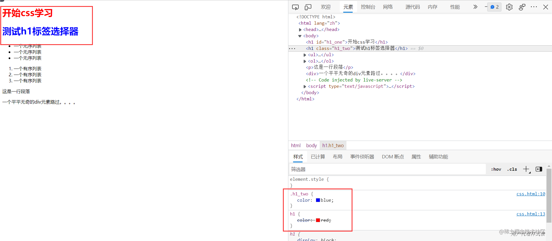
the actual effect is that the effect of the class selector covers the label selector, and the second is blue, * the reason here is that there are weight values between different selectors. We judge the coverage effect of the selection by looking at the weight first. If the weight is high, the coverage with low weight will be written first. If the weight is the same, the coverage written later will be written first* The weights between the different selectors are:
- < H1 style = "color: Aqua;" > start css learning < / H1 > the maximum in-line style is 1000
- id selector: 100
- class selector: 10
- Label selector: 1
If there is a superposition of multiple selectors such as descendant selectors, add and compare the values here. You can try it yourself. Finally, there is a little trick to manually increase the weight. You only need to add it under the written attribute! Important, such as color: red! important; Then the weight of this attribute will be infinite and cover everything, but it is not recommended to use more.
Inheritance
some css attributes have inheritance on some tags. For example, the font style written on ul will be inherited by li tag, but the inherited attribute weight is very low, which can be understood as weight 0.1. There are a lot. I won't expand here. Just know it.
css common properties
you don't have to take the initiative to remember css attributes, let alone recite English words. The style of web pages mainly comes from css, and the style is easier to express in language, which is very convenient for Baidu search. For example, how to add borders to elements, how to set backgrounds for elements, and change fonts and glyphs. As long as you can see the effect on the web page, basically css can be realized, but the degree of difficulty is different. Here is a css article. You can have a look at it when you are free. CSS tutorial (w3school.com.cn)
But I suggest that after reading this article, you should have a general understanding of the basic use of css. You can directly find some simple practice pages and directly copy them. If you encounter properties you haven't seen and don't understand, you can learn from Baidu, so that you can master css soon.
css box model
box model is an important thing for everyone to learn css. I won't elaborate here. Just know two important points.
Block elements and inline elements
<!DOCTYPE html>
<html lang="zh">

<head>
	<meta charset="UTF-8">
	<meta name="viewport" content="width=device-width, initial-scale=1.0">
	<meta http-equiv="X-UA-Compatible" content="ie=edge">
	<title>For backend development css Quick start tutorial</title>
	<style>
		div {
			height: 300px;
		}
		.one {
			background-color: red;
		}
		.two {
			background-color: blue;
		}
	</style>
</head>

<body>
	<div class="one"></div>
	<div class="two"></div>
</body>

</html>
as you can see here, we set the height and different background for the two divs. The effect is that it doesn't set the width, but it fills the whole browser, and the two divs won't be on the same line again, even if we reduce its width.
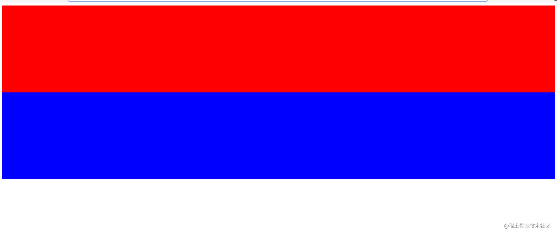
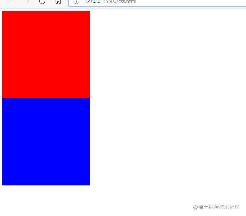
such elements are called block level elements, which are characterized in that the width automatically fills the parent element and cannot be on the same line. The attribute controlling the element type is display, in which the attribute value of the block element is block. The default elements of the block element are, div,p,h series, etc.
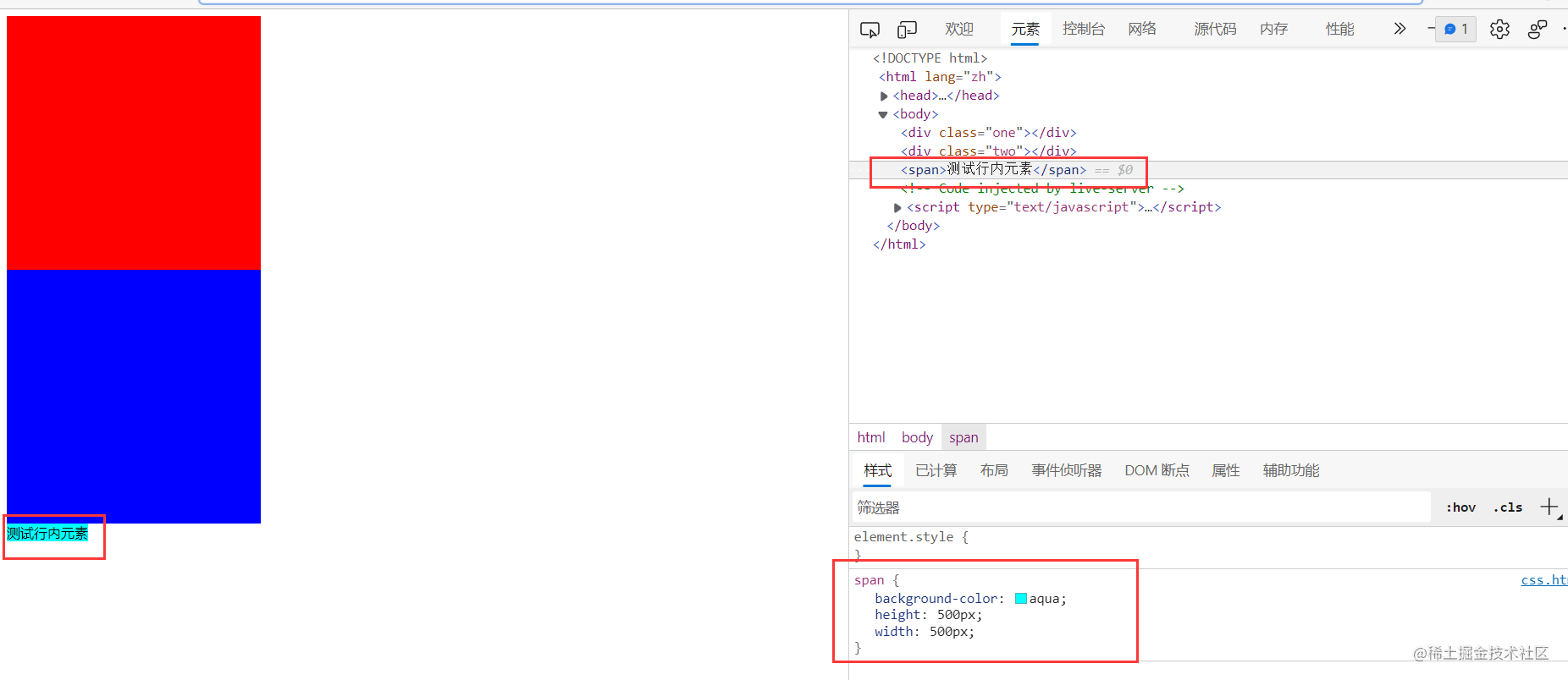
the other is inline elements, which can be arranged in parallel. The content is supported by sub elements, and the width and height cannot be set for itself.
For example, I set the width and height of this span element to 500px, but it has no change in width and height, and it is still only the text size. Its attribute value is display: inline
there is another type called inline block. As the name suggests, it has two characteristics: block elements and inline elements. It can be arranged in parallel or set width and height. img tag is an inline block element. Its attribute value is display: inline block. Here is a general understanding. For more information, please refer to CSS properties (7): Display properties - Nuggets (juejin.cn)
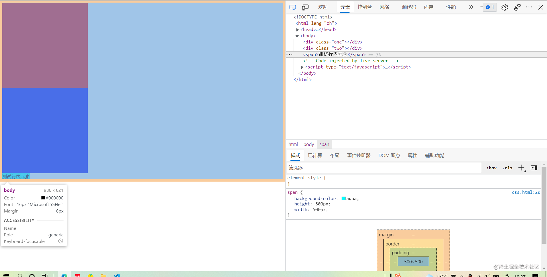
Inner and outer margin of box model
as the name suggests, the box model means that all elements on the web page can be regarded as a box. For example, when we check the elements and slide the mouse over the corresponding elements, the selected box is not a rectangular box.
We set the internal margin, external margin and border for div in turn,
	div {
		height: 300px;
		width: 300px;
		margin: 0;
		padding: 20px;
		margin: 20px;
		border: 30px solid blueviolet;
	}
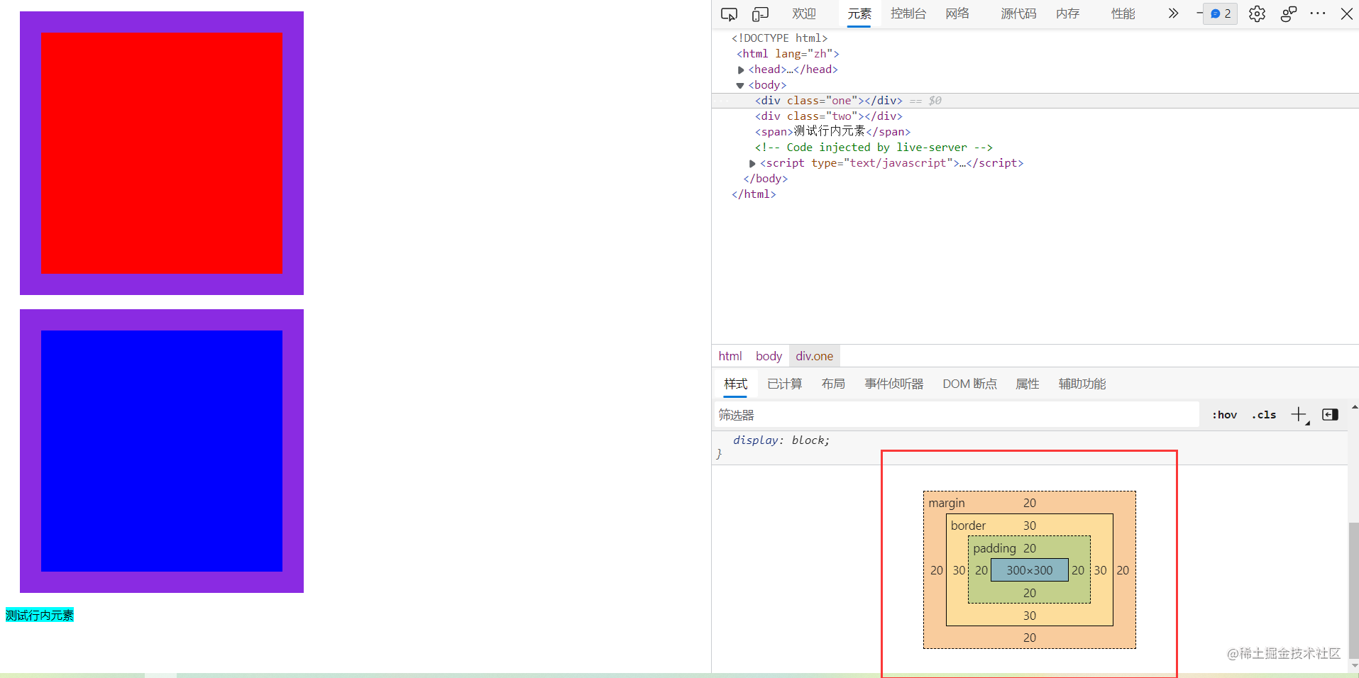
You can imagine a courier box. In order to prevent the box collision, the outer part of the box is wrapped up with a layer of inflatable air bags, which separates the box from other boxes. This is the outer distance, the thickness of the box, that is the border, and the foam inside the box is the inner margin to avoid the wobble. There are two ways to calculate the contents of a box. Some people regard bubbles and articles as box contents. Some people only regard items as box contents. This method of calculation can be changed. By box-sizing, the box and the bubble are computed together by default. The box-sizing: border-box can be set up. Change to another one, which involves the specification dispute between IE and W3C. Usage is not detailed, you can view the article. About CSS3's box sizing attribute - Nuggets (juejin.cn)
float
floating is an old layout scheme. Originally, it was not designed to be used for layout, but only to realize the style of text surrounding pictures similar to newspapers. Later, we found that its layout is very convenient, so we all use it. Its layout will have some defects. Now I have rarely used it, unless we can understand it in order to be compatible with IE. Now mainly use positioning and elastic box flex layout.
Floating layout
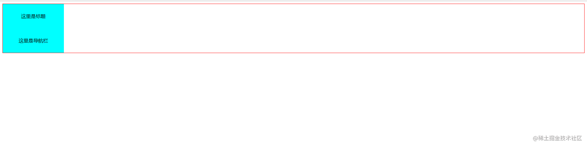
as we mentioned above, a feature of block level elements is that they cannot be arranged in the same line, but parallel arrangement will certainly be used in actual page development. How to solve this problem, floating can be used. Here we write a header with a title and a navigation bar
<!DOCTYPE html>
<html lang="zh">

<head>
	<meta charset="UTF-8">
	<meta name="viewport" content="width=device-width, initial-scale=1.0">
	<meta http-equiv="X-UA-Compatible" content="ie=edge">
	<title>For backend development css Quick start tutorial</title>
	<style>
		.header {
			border: 1px solid red;
		}
		.title,.nav {
			height: 80px;
			width: 200px;
			text-align: center;
			line-height: 80px;
			background-color: aqua;
		}
	</style>
</head>

<body>
	<div class="header">
		<div class="title">Here is the title</div>
		<div class="nav">This is the navigation bar</div>
	</div>
</body>

</html>
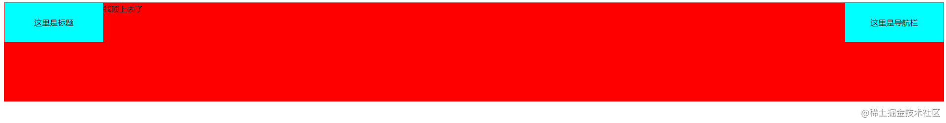
The effect is not ideal. Two block level elements cannot be side by side
Using floating, the title bar floats left and the navigation bar floats right. Set float property
		.title {
			float: left;
		}
		.nav {
			float: right;
		}

The two block level elements are successfully placed side by side, floating left and right. However, a problem arises here, that is, their parent element, header, has lost its height. You can see that the original red border has collapsed into a line. Why?
this is also the defect of floating mentioned above: floating will make the document separate from the document flow. In a more appropriate way, they float up. Originally, they are in the same plane, and the height of the child element stretches the parent element, but after floating, the floating element floats up and regards the web page as a three-dimensional, Floating elements are equivalent to floating perpendicular to the computer screen. In this way, the parent element has nothing to open. Naturally, it collapses and the height disappears.
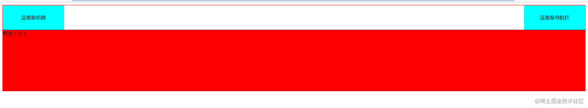
we add a div at the same level of the header.
<style>
	.test {
		height: 200px;
		background-color: red;
	}
</style>
<body>
	<div class="header">
		<div class="title">Here is the title</div>
		<div class="nav">This is the navigation bar</div>
	</div>
	<div class="test">I'm on top</div>
</body>
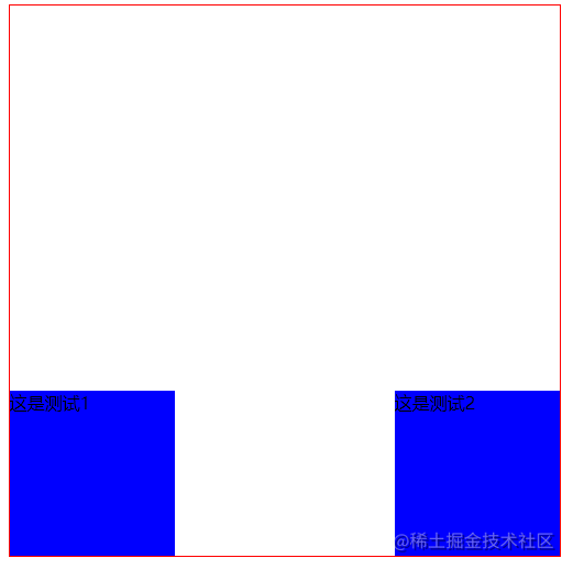
As you can see, test div is on top, and two floating elements float on test. To solve this defect, we need to clear the float
Clear float
there are two common methods to clear floating: one is to set the overflow attribute on the parent element, and the other is to add a child element and set clear: both. Let's try the first.
.header {
	border: 1px solid rgb(250, 0, 0);
	overflow: auto;
}
It can be seen that the height collapse of the parent element is close. In fact, it is OK to set overflow to auto and hidden. You can try it yourself. clear is troublesome. I usually use overflow, which is not shown here. Interested can see the article. Four ways to clear floating and their principle understanding - Nuggets (juejin.cn)
position positioning
this positioning is easy to understand. Generally, the child element is equivalent to the positioning of the parent element. There are four types of commonly used values.
- position: static static. This is the default positioning method of elements when nothing is done. It's useless.
- position: relative positioning, which is equivalent to moving when its own positioning is in the current position
- position: absolute absolute positioning, relative to the position of the previous parent element whose position value is not static
- position: fixed fixed positioning. Relative to the screen positioning, it is fixed no matter how the page scrolls.
- position: sticky ceiling. I haven't used this much. I can baidu myself
A simple example is as follows:
<!DOCTYPE html>
<html lang="zh">
<head>
<meta charset="UTF-8">
<meta name="viewport" content="width=device-width, initial-scale=1.0">
<meta http-equiv="X-UA-Compatible" content="ie=edge">
<title>For backend development css Quick start tutorial</title>
<style>
.position {
position: relative;
width: 500px;
height: 500px;
border: 1px solid red;
}
.position div {
height: 150px;
width: 150px;
background-color: blue;
}
.test1 {
position: absolute;
left: 10px;
bottom: 0;
}
</style>
</head>
<body>
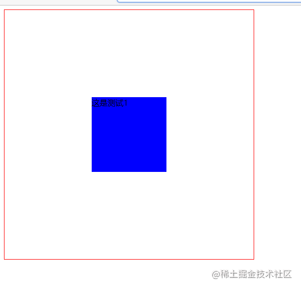
<div class="position">
<div class="test1">This is test 1</div>
</div>
</body>
</html>
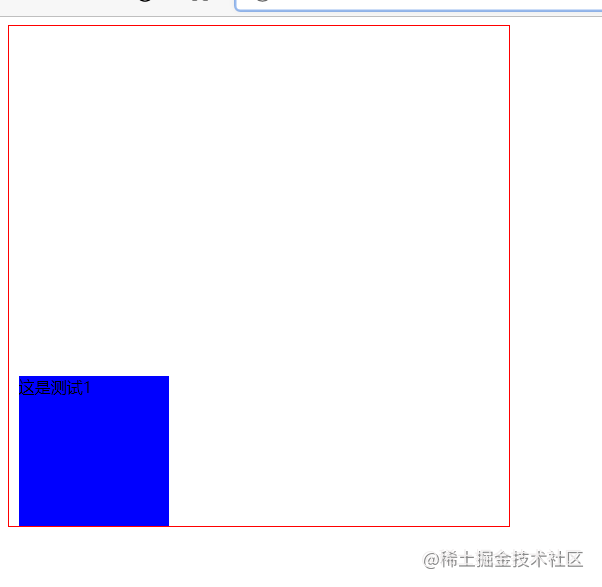
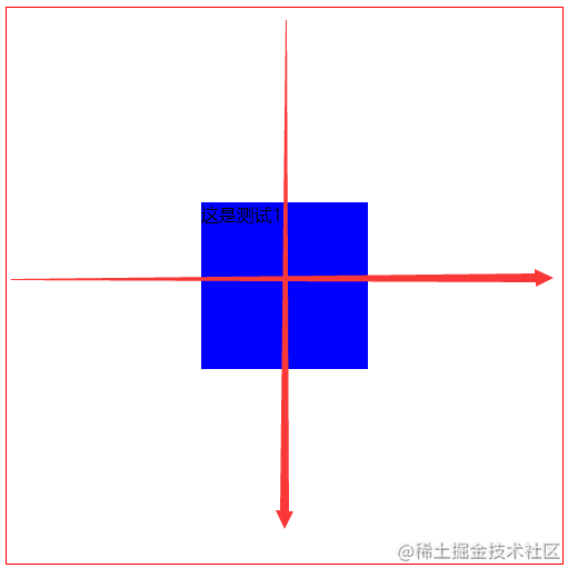
It can be seen that after the relative positioning is set for the parent element of position, the absolute positioning is set for the child element, so that the positioning of the child element is relative to the parent element. After the positioning is set, the direction positioning can be used. There are four values, left, right, top and bottom, respectively corresponding to the distance from the left, right, top and bottom. Generally, the positioning can be completed by setting two, Similar to xy in the coordinate system. For example, 10px from the left and 0 from the bottom are set above, so it is positioned to the bottom.
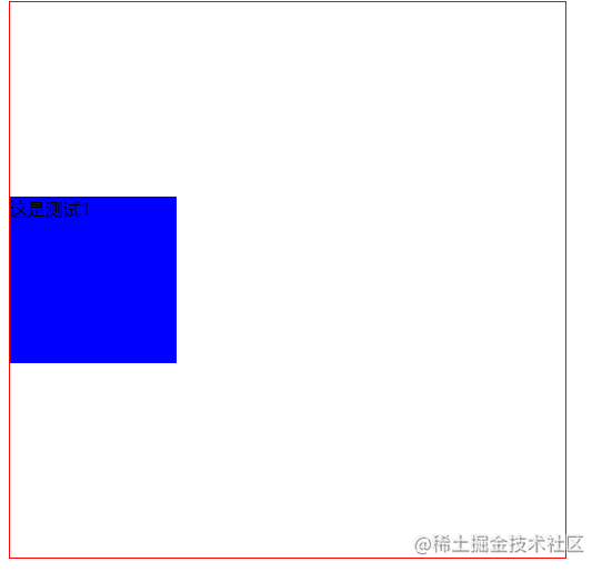
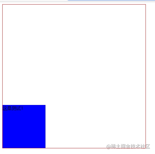
if we delete the parent element, relative positioning.
		.position {
			/* position: relative; */
			width: 500px;
			height: 500px;
			border: 1px solid red;
		}
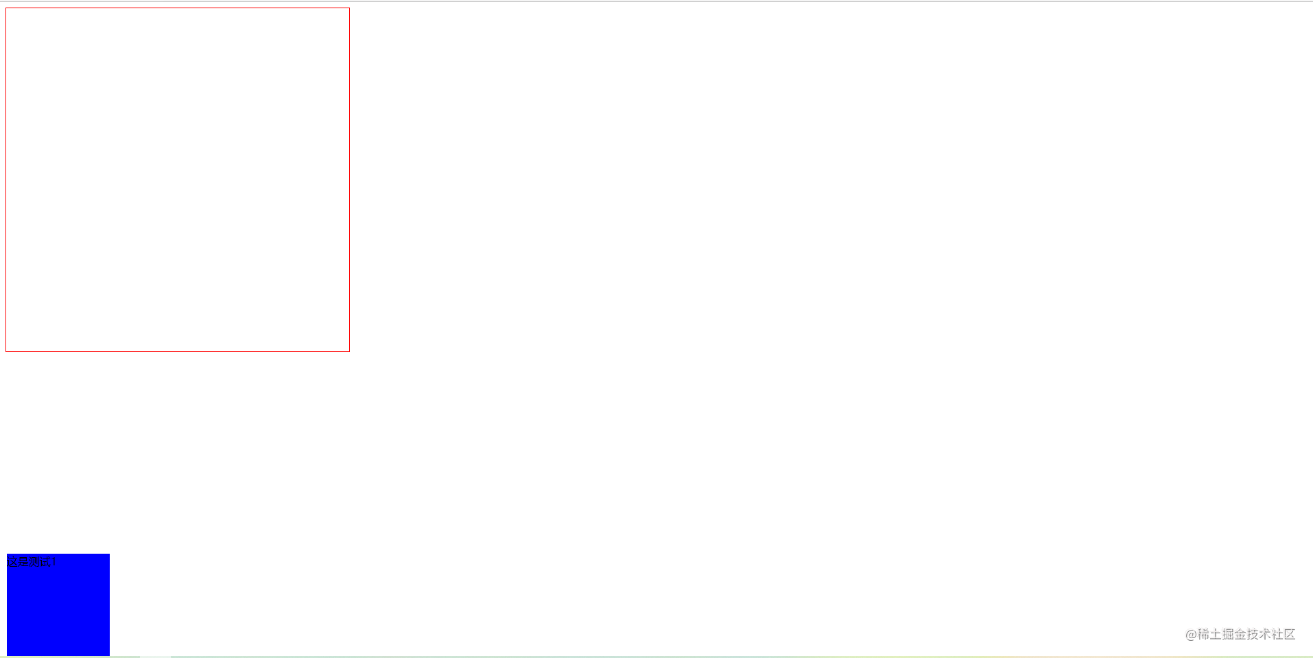
It can be seen that the child element is no longer positioned relative to the parent element, because the attribute value of the parent element's position becomes the default static, while absolute cannot be positioned relative to static. Finally, the body element is found and positioned relative to the whole page, which becomes the current effect and runs to the bottom of the page. Remember a basic positioning formula, child absolute parent phase, which means that child elements use absolute absolute positioning and parent elements use relative positioning. For more post operations, please see the article. CSS position ing - Nuggets (juejin.cn)
Elastic box flex
the use method of elastic box is very simple, and it is also a common layout method, but the support of IE is not very good. Don't care about these details. We don't tidy up those gorgeous and flowery ones. We can learn by ourselves and go directly to the code.
<!DOCTYPE html>
<html lang="zh">

<head>
	<meta charset="UTF-8">
	<meta name="viewport" content="width=device-width, initial-scale=1.0">
	<meta http-equiv="X-UA-Compatible" content="ie=edge">
	<title>For backend development css Quick start tutorial</title>
	<style>
		.flex {
			width: 500px;
			height: 500px;
			border: 1px solid red;
			display: flex;
			justify-content: center;
			align-items: center;
		}
		.flex div {
			height: 150px;
			width: 150px;
			background-color: blue;
		}

	</style>
</head>

<body>
	<div class="flex">
		<div class="test1">This is test 1</div>
	</div>
</body>

</html>
this completes the centering effect. In essence, first use the display: flex declaration. This is a container of an elastic box. The display attribute is familiar to everyone. The essence of the elastic box is that the container has two directions, one horizontal and one vertical. Select the layout above these two directions, such as justify content: Center; It is centered on the horizontal axis, align items: Center; The vertical axis is centered.
The horizontal axis is from left to right, and the vertical axis is from top to bottom. They each have three attributes, starting point, middle point and ending point,
justify-content: flex-start;
If the horizontal axis is set as the starting point
align-items: flex-end;
Set the vertical axis as the end point
There is also a common attribute, space between. Add a div and set the horizontal axis to space between
justify-content: space-between;
Two div s are distributed on both sides of the horizontal axis of the parent element. This attribute allows child elements to be spread out. Try it yourself. You can also multiple elements. Automatically distribute evenly.
Note: the flex layout basically operates on the parent element. The parent element is called a container, which acts on the direct child element, and the child element is called an item. If there is nesting in the child element, you need to set display:flex again as the parent element of the child element
the above are common flex layout operations. If you master this layout, basically all static page styles can be developed. I haven't finished here. There are still many knowledge about flex layout. You can refer to: Flex layout tutorial: Grammar - Ruan Yifeng's Weblog (ruanyifeng.com).
follow-up
here is the end of the quick start. css has many attributes. There are many operations for the direct combination of different attributes, which need to be accumulated in the actual combat. Here are some advanced basic knowledge of css (not sick sentences).
- Front end Basics: CSS world - Nuggets (juejin.cn)
- 15 thousand words CSS basic collection (core knowledge, common requirements) - Nuggets (juejin.cn)
- Unknown CSS skills - Nuggets (juejin.cn)
- Summary of CSS secret revealing practical skills - Nuggets (juejin.cn)
- 50 CSS basic interview questions (with answers) - SegmentFault no