Responsive Web design allows your Web pages to display well on all devices.
Responsive Web design uses only HTML and CSS.
Responsive Web design is not a program or Javascript script.
Learn the following from Rookie tutorial
Viewport
A viewport is a visual area of a user's web page.
The mobile browser places the page in a virtual "window". Usually, the virtual "window" is wider than the screen, so that each web page does not have to be squeezed into a very small window (which will destroy the layout of the web page not optimized for the mobile browser). Users can see different parts of the web page by panning and zooming.
Set Viewport
<meta name="viewport" content="width=device-width, initial-scale=1.0">
- Width: controls the size of the viewport. You can specify a value, such as 600, or a special value, such as device width is the width of the device (the unit is the pixel of CSS when it is scaled to 100%).
- Height: corresponding to width, specify the height.
- Initial scale: initial scale, that is, the scale when the page is load ed for the first time.
- Maximum scale: the maximum scale to which the user is allowed to zoom.
- Minimum scale: the minimum scale to which the user is allowed to zoom.
- User scalable: whether the user can scale manually.
Grid view
Using grid view helps us design web pages. This makes it easier to add elements to a web page.
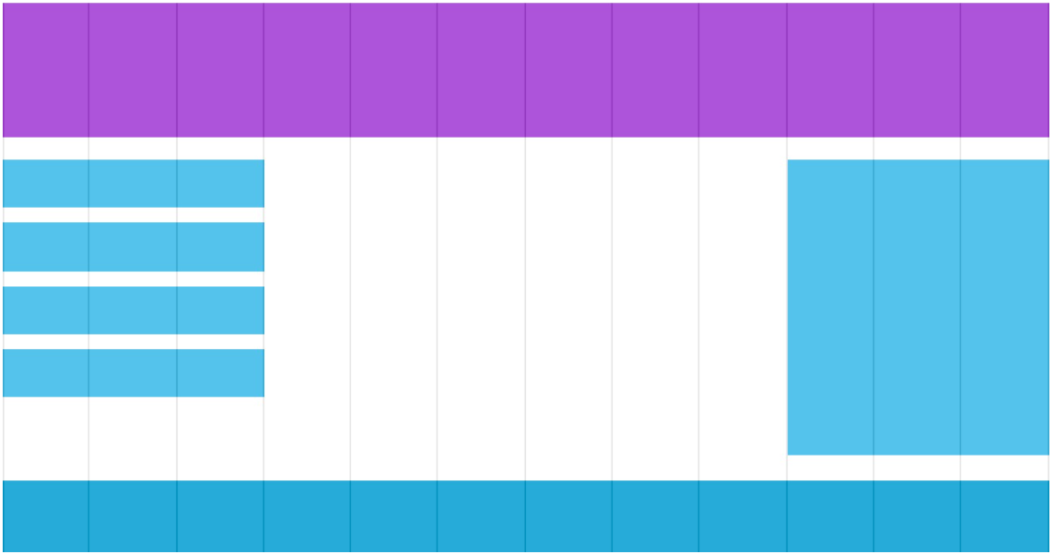
The responsive grid view is usually 12 columns, 100% wide, and automatically scales when the browser window is resized.
Create a responsive grid view
We can use rows and columns to make web pages
/*12 Column grid system can better control responsive web pages. First, we can calculate the percentage of each column: 100% / 12 columns = 8.33%.*/
.col-1 {width: 8.33%;}
.col-2 {width: 16.66%;}
.col-3 {width: 25%;}
.col-4 {width: 33.33%;}
.col-5 {width: 41.66%;}
.col-6 {width: 50%;}
.col-7 {width: 58.33%;}
.col-8 {width: 66.66%;}
.col-9 {width: 75%;}
.col-10 {width: 83.33%;}
.col-11 {width: 91.66%;}
.col-12 {width: 100%;}

/*
Set a menu div with 3 columns:
<div class="col-3 menu"></div>
*/
It's responsive, but it's not friendly on a small screen.
Media inquiry can help us solve this problem. We can add breakpoints in the middle of the design draft. Different breakpoints have different effects.
<!DOCTYPE html>
<html>
<head>
	<meta name="viewport" content="width=device-width, initial-scale=1.0">
	<meta charset="utf-8">
	<title>Rookie tutorial(runoob.com)</title>
	<style>
		* {
    		box-sizing: border-box;  /*Make sure that margins and borders are contained between the width and height of the element*/
		}
		.row:after { /*Clear float*/
    		content: "";
    		clear: both;
    		display: block;
		}
		[class*="col-"] { /*All columns float to the left with a spacing of 15px*/
    		float: left;
    		padding: 15px;
		}
		html {
    		font-family: "Lucida Sans", sans-serif;
		}
		.header {
    		background-color: #9933cc;
    		color: #ffffff;
    		padding: 15px;
		}
		.menu ul {
    		list-style-type: none;
    		margin: 0;
    		padding: 0;
		}
		.menu li {
    		padding: 8px;
    		margin-bottom: 7px;
    		background-color :#33b5e5;
    		color: #ffffff;
    		box-shadow: 0 1px 3px rgba(0,0,0,0.12), 0 1px 2px rgba(0,0,0,0.24);
		}
		.menu li:hover {
    		background-color: #0099cc;
		}
		.aside {
    		background-color: #33b5e5;
    		padding: 15px;
    		color: #ffffff;
    		text-align: center;
    		font-size: 14px;
    		box-shadow: 0 1px 3px rgba(0,0,0,0.12), 0 1px 2px rgba(0,0,0,0.24);
		}
		.footer {
    		background-color: #0099cc;
    		color: #ffffff;
    		text-align: center;
    		font-size: 12px;
    		padding: 15px;
		}
		/* For mobile phones: */
		[class*="col-"] {
    		width: 100%;
		}
		@media only screen and (min-width: 600px) {
    		/* For tablets: */
    		.col-m-1 {width: 8.33%;}
            .col-m-2 {width: 16.66%;}
            .col-m-3 {width: 25%;}
            .col-m-4 {width: 33.33%;}
            .col-m-5 {width: 41.66%;}
            .col-m-6 {width: 50%;}
            .col-m-7 {width: 58.33%;}
            .col-m-8 {width: 66.66%;}
            .col-m-9 {width: 75%;}
            .col-m-10 {width: 83.33%;}
            .col-m-11 {width: 91.66%;}
            .col-m-12 {width: 100%;}
		}
        @media only screen and (min-width: 768px) {
            /* For desktop: */
            .col-1 {width: 8.33%;}
            .col-2 {width: 16.66%;}
            .col-3 {width: 25%;}
            .col-4 {width: 33.33%;}
            .col-5 {width: 41.66%;}
            .col-6 {width: 50%;}
            .col-7 {width: 58.33%;}
            .col-8 {width: 66.66%;}
            .col-9 {width: 75%;}
            .col-10 {width: 83.33%;}
            .col-11 {width: 91.66%;}
            .col-12 {width: 100%;}
        }
	</style>
</head>
<body>

	<div class="header">
		<h1>Chania</h1>
	</div>

    <!--Use for each line <div> Package. All columns should add up to 12-->
	<div class="row">
		<div class="col-3 col-m-3 menu">
			<ul>
				<li>The Flight</li>
				<li>The City</li>
				<li>The Island</li>
				<li>The Food</li>
			</ul>
		</div>

		<div class="col-6 col-m-9">
			<h1>The City</h1>
			<p>Chania is the capital of the Chania region on the island of Crete. The city can be 					divided in two parts, the old town and the modern city.</p>
		</div>

		<div class="col-3 col-m-12">
			<div class="aside">
				<h2>What?</h2>
				<p>Chania is a city on the island of Crete.</p>
				<h2>Where?</h2>
				<p>Crete is a Greek island in the Mediterranean Sea.</p>
				<h2>How?</h2>
				<p>You can reach Chania airport from all over Europe.</p>
			</div>
		</div>

	</div>

	<div class="footer">
		<p>Resize the browser window to see how the content respond to the resizing.</p>
	</div>

</body>
</html>
picture
width & max-width
If the width attribute is set to 100%, the picture will realize the responsive function according to the upper and lower range:
img {
    width: 100%;
    height: auto;
}
In the above example, the image will be larger than its original image. We can use the max width attribute to solve this problem.
If the max width attribute is set to 100%, the picture will never be larger than its original size:
img {
    max-width: 100%;
    height: auto;
}
Background picture
The background picture can be resized or scaled in response.
- If the background size property is set to "contain", the background picture will adapt to the content area proportionally. The picture keeps its scale unchanged
- When the background size property is set to "100%", the background image will extend and cover the whole area
- If the background size property is set to "cover", the background image will be expanded to be large enough so that the background image completely covers the background area. Note that this attribute maintains the scale of the picture, so some parts of the background image cannot be displayed in the background positioning area
Different devices display different pictures
Large size pictures can be displayed on the large screen, but they can't be displayed well on the small screen. We don't need to load large pictures on the small screen, which will affect the loading speed. So we can use media query to display different pictures according to different devices.
/* For width smaller than 400px: */
body {
    background-image: url('img_smallflower.jpg');
}

/* For width 400px and larger: */
@media only screen and (min-width: 400px) {
    body {
        background-image: url('img_flowers.jpg');
    }
}
You can replace the Min width attribute with the Min device width of the media query, which will detect the device width rather than the browser width. When the browser size is reset, the picture size will not change.
frame
Responsive Web design framework Bootstrap
Bootstrap, from Twitter, is currently the most popular front-end framework. Bootstrap is based on HTML, CSS and JAVASCRIPT. It is simple and flexible, making Web development faster.
For details, you can go to the rookie tutorial Bootstrap tutorial.