catalog:
1,Expand clickable area
2,Custom check box
3,Through shadows/Blur to weaken the background
4,Scroll prompt
1. Expand clickable area
The clickable area of some buttons is very small. For user interaction, CSS needs to be used to exaggerate their clickable area.
For the simple button shown below, we want to expand the clickable area by 10px in four directions on the basis of its clickable area;
The easiest way to expand the hot area is to set a transparent border around the button, because the interaction of the mouse with the element border will also trigger mouse events, which is better than tracing and projection.
.btn {
      cursor: pointer;
      border: 10px solid transparent;
}
The click area is indeed expanded, but the button body is also expanded. At this time, the background clip: padding box needs to be used to cut the background area;
background-clip: padding-box;
If we use this method to expand, we can't use border to set the border effect. We can only use box shadow instead to achieve the border effect, but the effect is poor;
Because border will affect the layout, we choose to replace it with pseudo elements to achieve the effect of expanding the click area;
.btn::before {
      content: '';
      position: absolute;
      color: black;
      top: -10px;
      right: -10px;
      bottom: -10px;
      left: -10px;
}
2. Custom check box
Some scenes need to change the default style of the check box to show different visual effects, so you need to customize the check box.
Only one custom implementation method is shown here:
<input type="checkbox" id="awesome" />
<label for="awesome">Awesome!</label>
input[type="checkbox"] + label::before {
    content: '\a0'; /* Non-breaking space  */
    display: inline-block;
    vertical-align: .2em;
    width: .8em;
    height: .8em;
    margin-right: .2em;
    border-radius: .2em;
    background: silver;
    text-indent: .15em;
    line-height: .65;
}
input[type="checkbox"]:checked+label::before {
    content: '\2713';
    background: yellowgreen;
}
The above code is to bind a custom label label to the back of a checkbox, then customize the effect, and finally hide the front checkbox in a certain way without destroying the elements, as shown in the following code:
input[type="checkbox"] {
 position: absolute;
 clip: rect(0,0,0,0);
}
Finally, a custom checkbox is implemented: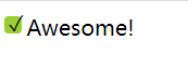
3. Weaken the background by shading / blurring
(1) Shadow
Many times, we need a translucent mask layer to adjust everything in the back as a whole
Dark to highlight a specific UI element and guide users' attention. For example, pop-up layer.
Using pseudo elements to achieve shadow occlusion effect is a reliable scheme, which avoids adding new elements as occlusion layer.
body.dimmed::before {
  position: fixed;
  top: 0;
  right: 0;
  bottom: 0;
  left: 0;
  z-index: 1;
  background: rgba(0,0,0,.8);
}
The disadvantage is that you also need to perform JS operations to display pseudo class elements.
(2) Obscure
The so-called fuzzy weakening background is to blur everything except the key elements to match (or replace) the shadow effect, which can highlight the content you want to highlight more than the above shadow weakening background.
This effect requires adding a main element to wrap everything, and then using a blur filter
<main>Bacon Ipsum dolor sit amet...</main>
  <dialog>
    O HAI, I'm a dialog. Click on me to dismiss.
  </dialog>
main {
transition: .6s filter;
}
main:onfocus {
filter: blur(5px);
}Because this blurring effect is very abrupt, it is too much to add animation effect to it.
4. Scroll prompt
Scroll bar is a common interface control used to prompt that an element contains more content than can be seen. However, it is often too cumbersome and visually dominant, because when the user does not interact with scrollable elements, the scroll bar will be completely hidden. However, it is impossible to see whether the element can scroll.
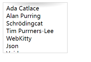
We refer to an RSS reader to make the scrollable area show a shadow effect up and down to inform users that this is a scrollable area.
<ul>
    <li>Ada Catlace</li>
    <li>Alan Purring</li>
    <li>Schrödingcat</li>
    <li>Tim Purrners-Lee</li>
    <li>WebKitty</li>
    <li>Json</li>
    <li>Void</li>
    <li>Neko</li>
    <li>NaN</li>
    <li>Cat5</li>
    <li>Vector</li>
</ul>
ul {
overflow: auto;
width: 10em;
height: 8em;
padding: .3em .5em;
border: 1px solid silver;
background: radial-gradient(at top, rgba(0, 0, 0, .2),
transparent 70%) no-repeat;
background-size: 100% 15px;
}In this way, the user can be prompted to scroll the area while keeping the scroll bar hidden.