Location
1 Why do I need to locate?
1. What if I want an element to move freely on the page or in a box and press down on another box?
2. What if we want a box to stay fixed while we scroll the page? (Side navigation bar)
The above effect, standard stream or floating can not be achieved quickly, so positioning is needed to achieve it.
So:
- Floating allows multiple block-level boxes to appear in seamless rows, often used to arrange boxes horizontally.
- Positioning allows the box to move freely within a box or to fix a position on the screen, and to hold down other boxes.
2. Composition of positioning
Positioning: Position the box in a certain position, so positioning is also placing the box, moving the box in a positioned way.
Location = Location mode + Edge offset.
Location mode is used to specify how an element is positioned in a document. The edge offset determines the final position of the element.
There are four positioning modes that can be set by positioning in CSS:
Static: static positioning
Relative: relative positioning
Absolute: absolute positioning
Fixed: fixed position
Edge offset is when the positioned box moves to the final position. There are top, bottom, left, and right attributes
3. Static positioning
Static positioning is the default positioning method of an element and has no meaning of positioning.
Grammar:
selector {
	position: static;
}
Static positioning is positioned according to standard stream characteristics, it has no edge offset
Static positioning is rarely used in layout
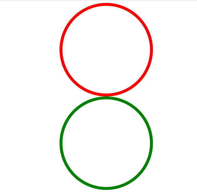
4. Relative positioning relative
Relative positioning is when an element moves, relative to its original position
Grammar:
selector {
	position: relative;
}
- It moves relative to its original position (the reference point is its original position when moving the position).
- The original position of the standard stream continues to be occupied, while the box behind it still treats it as the standard stream.
Therefore, relative positioning is not out of label. Its most typical application is to give absolute positioning to a dad.
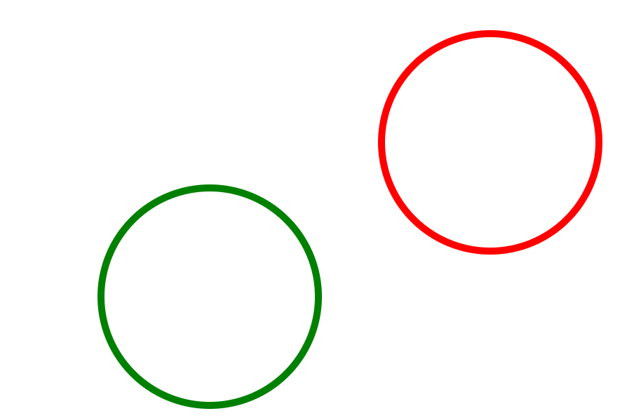
For example:
Effect:
The code is as follows:
<!DOCTYPE html>
<html lang="en">
<head>
    <meta charset="UTF-8">
    <title>CSS Relative positioning of positioning</title>
    <style>
        /*Relative positioning relative*/
        .div1 {
            width: 300px;
            height: 300px;
            border-radius: 50%;
            border: 10px solid red;
            position: relative;
            top: 100px;
            left: 400px;
        }
        .div2 {
            width: 300px;
            height: 300px;
            border-radius: 50%;
            border: 10px solid green;
        }
        .box {
            margin: auto;
            width: 1000px;
            height: 1000px;
        }
    </style>
</head>
<body>
<div class="box">
    <div class="div1"></div>
    <div class="div2"></div>
</div>
</body>
</html>
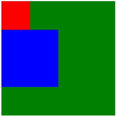
5. Absolute positioning
Absolute positioning is when an element moves, relative to its ancestor element
Grammar:
selector {
	position: absolute;
}
The characteristics of absolute positioning: (be sure to remember)
- If there are no ancestor elements or the ancestor elements are not located, browser-oriented location (Document document) is used.
- If the ancestor elements are positioned (relative, absolute, fixed), move the position with the nearest positioned ancestor element as the reference point.
- Absolute positioning no longer takes its place. (Unscaled) So absolute positioning is out of standard flow.
- Tip: Supreme father
For example:
Effect:
Before adding absolute positioning to the red box
After adding absolute positioning to the red box
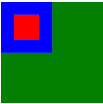
Absolute positioning no longer takes its place. (Unscaled) So absolute positioning is out of standard flow
Code:
<!DOCTYPE html>
<html lang="en">
<head>
    <meta charset="UTF-8">
    <title>CSS Location is the key to positioning</title>
    <style>
        /*Absolute positioning absolute*/
        .box {
            position: relative;
            /*top: 200px;*/
            /*left: 200px;*/
            width: 400px;
            height: 400px;
            background-color: green;
            margin: 100px auto;
        }
        .box1 {
            width: 100px;
            height: 100px;
            position: absolute;
            top: 50px;
            left: 50px;
            background-color: red;
        }
        .box2 {
            width: 200px;
            height: 200px;
            background-color: blue;
        }
    </style>
</head>
<body>
<div class="box">
    <div class="box1"></div>
    <div class="box2"></div>
</div>
</body>
</html>
6. Use the above lessons to complete the following small cases
Effect:
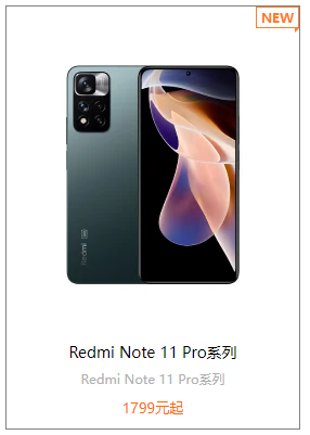
The code is as follows:
<!DOCTYPE html>
<html lang="en">
<head>
    <meta charset="UTF-8">
    <title>A Small Case of Fatherhood</title>
    <style>
        .box{
            width: 250px;
            margin: 100px auto;
            padding: 10px;
            text-align: center;
            border: 1px solid gray;
            position: relative;
        }
        .box>em {
            position: absolute;
            top: 0;
            right: 0;
        }
        .box>img {
            margin: 20px auto;
        }
        .box h3 {
            margin: 5px auto;
            width: 214px;
            height: 21px;
            font-weight: 400;
            font-size: 14px;
        }
        .box p {
            margin: 5px auto;
            width: 214px;
            height: 18px;
            font-size: 12px;
            color: #b0b0b0;
        }
        .box span {
            margin: 5px auto;
            width: 214px;
            height: 21px;
            color: #ff6700;
            font-size: 13px;
        }
    </style>
</head>
<body>
<div class="box">
    <em>
        <img src="../img/new.png" alt="">
    </em>
    <img src="../img/no5_box_3__2_1.jpg">
    <h3>Redmi Note 11 Pro series</h3>
    <p>Redmi Note 11 Pro series</p>
    <span>1799 Yuan Qi</span>
</div>
</body>
</html>
7. Fixed positioning fixed
Fixed positioning is the position where the element is fixed in the viewport of the browser. Use scenarios primarily: elements can be positioned unchanged as the browser page scrolls.
Grammar:
selector {
	position: fixed;
}
Features of fixed positioning: (Always remember)
- Move elements using the browser's visual window as a reference point.
Has nothing to do with the parent element
Do not scroll with the scrollbar. - Fixed positioning does not occupy the original position.
Fixed positioning is also out of label, in fact, fixed positioning can also be regarded as a special absolute positioning.
For example:
Effect:
Code:
<!DOCTYPE html>
<html lang="en">
<head>
    <meta charset="UTF-8">
    <title>CSS Fixed Position of Position</title>
    <style>
        body {
            height: 6000px;
        }
        .dj {
            position: fixed;
            top: 100px;
            right: 40px;
        }
    </style>
</head>
<body>
<div class="dj">
    <img src="../img/pvp.png" alt="">
</div>
</body>
</html>
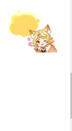
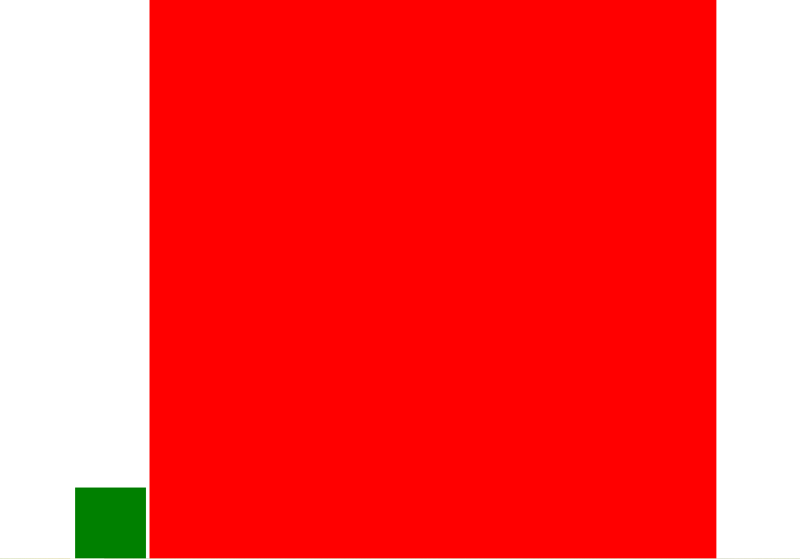
8.Fixed positioning tips: Fixed to the right side of the version center.
Small algorithm:
- Let the positioned box left: 50%. Go to half of your browser's viewing area (which can also be considered the edition center).
- Make the positioned box margin-left: half the width of the version center. Half width of multi-walkthrough Center
You can align the positioned boxes to the right of the layout center.
For example:
Effect:
Code:
<!DOCTYPE html>
<html lang="en">
<head>
    <meta charset="UTF-8">
    <title>Fixed to right side of version Center</title>
    <style>
        * {
            margin: 0;
            padding: 0;
        }
        .div1 {
            width: 100px;
            height: 100px;
            background-color: green;
            position: fixed;
            bottom: 0;
            left: 50%;
            margin-left: -505px;
            /* This section is on the right*/
            /*position: fixed;*/
            /*right: 250px;*/
            /*left: 50%;*/
            /*bottom: 0px;*/
        }
        .div2 {
            width: 800px;
            height: 8000px;
            margin: 0 auto;
            background-color: red;
        }
    </style>
</head>
<body>
<div class="div1"></div>
<div class="div2"></div>
</body>
</html>
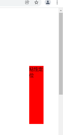
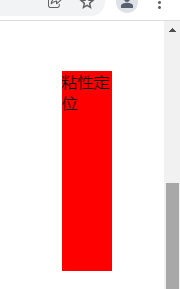
9. Viscous positioning
Viscous positioning can be thought of as a mix of relative positioning and fixed positioning. Sticky
Grammar:
selector {
	position: sticky; top: 10px;
 }
The characteristics of sticky positioning:
- Move elements using the browser's visual window as a reference point (fixed positioning features)
- Sticky positioning takes up the original position (relative positioning feature)
- One of top, left, right, bottom must be added to be valid
For example:
When the page scrolls somewhere, it stays fixed
Effect:
Code:
<!DOCTYPE html>
<html lang="en">
<head>
    <meta charset="UTF-8">
    <title>Viscous positioning</title>
    <style>
        body {
            height: 3000px;
        }
        .box {
            width: 50px;
            height: 200px;
            background-color: red;
            margin-left: 95%;
            margin-top: 200px;
            position: sticky;
            top: 50px;
        }
    </style>
</head>
<body>
<div class="box">Viscous positioning</div>
</body>
</html>
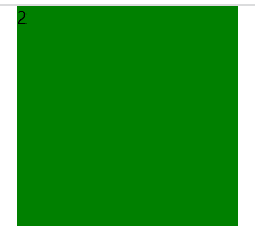
10 Position overlay order z-index
When using positioning layouts, there may be overlapping boxes. In this case, you can use z-index to control the order of boxes (z-axis)
Grammar:
selector {
	 z-index: 1;
 }
The value can be a positive integer, a negative integer, or 0. The default is auto. The larger the number, the closer the box is
If the attribute values are the same, they are written in the order followed by the top
Numbers cannot be followed by units
Only positioned boxes have a z-index attribute
For example:
Three boxes stacked together using positioning to show the second box
Effect:
Code:
<!DOCTYPE html>
<html lang="en">
<head>
    <meta charset="UTF-8">
    <title>Stacking order of positioning</title>
    <style>
        .box {
            width: 200px;
            height: 200px;
            position: absolute;
            top: 0;
            left: 100px;
        }
        .div1 {
            z-index: 1;
            background-color: red;
        }
        .div2 {
            z-index: 2;
            background-color: green;
        }
        .div3 {
            background-color: blue;
        }
    </style>
</head>
<body>
<div class="div1 box">1</div>
<div class="div2 box">2</div>
<div class="div3 box">3</div>
</body>
</html>
11 Absolutely positioned box centered
Boxes with absolute positioning cannot be centered horizontally by margin:0 auto, but can be centered horizontally and vertically by the following calculation methods.
1) left: 50%; Move the left side of the box to the horizontal center of the parent element.
(2) margin-left: -100px;: Let the box move half its width to the left.
The code is as follows:
<!DOCTYPE html>
<html lang="en">
<head>
    <meta charset="UTF-8">
    <title>Absolute positioning Horizontal vertical centering</title>
    <style>
        * {
            margin: 0;
            padding: 0;
        }
        .box {
            width: 200px;
            height: 200px;
            background-color: red;
            position: absolute;
            margin:0 auto;
            left: 50%;
            top: 50%;
            margin-left: -100px;
            margin-top: -100px;
        }
    </style>
</head>
<body>
<div class="box"></div>
</body>
</html>
12 Positioning special features
Absolute and fixed positioning are similar to floating.
- By adding absolute or fixed positioning to an inline element, you can set the height and width directly.
- Block-level elements add absolute or fixed positioning, and if width or height is not given, the default size is the size of the content.
13 Unmarked boxes do not trigger collapsing of outer margins
Floating elements and absolutely positioned (fixed) elements will not trigger the merging of outer margins.
14 Absolute positioning (fixed positioning) will completely press the box
Floating elements differ in that they only press the box of standard stream underneath them, but not the text (pictures) inside the box of standard stream underneath them.
However, absolute positioning (fixed positioning) can suppress all of the following standard streams.
Floating does not hold down text because it was originally created to create text wrapping effects. Text surrounds floating elements
15 Locate Cases
Effect:

Analysis:
Layout analysis: First there is a large box with a picture inside, then left and right arrows, and finally an ul unordered list
Style: First the big box adds relative positioning, then the small box with the left and right arrows adds absolute positioning. With the small algorithm of vertical centering, positioning in the middle is sufficient. Other style modifications are not discussed here.
Code:
<!DOCTYPE html>
<html lang="en">
<head>
    <meta charset="UTF-8">
    <title>Taobao Round-robin Map Structure</title>
    <style>
        * {
            margin: 0;
            padding: 0;
        }
        .tb-promo {
            position: relative;
            width: 520px;
            height: 280px;
            margin: 100px auto;
        }
        .prev {
            width: 20px;
            height: 30px;
            position: absolute;
            top: 50%;
            margin-top: -15px;
            left: 0;
            background-color: rgba(0,0,0,.4);
            color: white;
            text-align: center;
            line-height: 30px;
            border-top-right-radius: 50%;
            border-bottom-right-radius: 50%;
        }
        .next {
            position: absolute;
            top: 50%;
            margin-top: -15px;
            right: 0;
            width: 20px;
            height: 30px;
            background-color: rgba(0,0,0,.4);
            color: white;
            text-align: center;
            line-height: 30px;
            border-top-left-radius: 50%;
            border-bottom-left-radius: 50%;
        }
        .promo-nav {
            position: absolute;
            bottom: 15px;
            left: 50%;
            margin-left: -35px;
            width: 70px;
            height: 13px;
            border-radius: 7px;
            background-color: rgba(255,255,255,.3);
        }
        .promo-nav li {
            width: 8px;
            height: 8px;
            list-style: none;
            background-color: white;
            border-radius: 50%;
            float: left;
            margin: 3px;
        }
        .promo-nav li:hover {
            background-color: #ff5000;
        }
    </style>
</head>
<body>
<div class="tb-promo">
    <img src="../img/tb.jpg" alt="">
    <div class="prev"><</div>
    <div class="next">></div>
    <ul class="promo-nav">
        <li></li>
        <li></li>
        <li></li>
        <li></li>
        <li></li>
    </ul>
</div>
</body>
</html>
Display and Hide of 16 Elements
- Displaying show hiding
- visibility Show Hide
- overflow Overflow Show Hide
16.1 display attribute
The displayproperty sets how an element should be displayed.
display: none; hidden object
Display:block; In addition to converting to block-level elements, there is also the meaning of the display element
After display ing a hidden element, it no longer takes its place.
16.2 visibility Visibility
The visibility property specifies whether an element should be visible or hidden.
visibility:visible; Element visibility
visibility:hidden; Element Hide
After the visibility hides the element, it continues to take its place.
If the hidden element wants its original location, use visibility:hidden
Use display:none if hidden elements don't want the original location
16.3 overflow overflow
The overflow property specifies what happens if the content overflows the box of an element beyond its specified height and width.
Attribute value:
visible: do not cut or add scrollbars
hidden: do not show content beyond the size of the object, hide the excess
scroll: always show scrollbars whether they exceed content or not
auto: beyond automatic scrollbar display, not beyond no scrollbar display
16.4 Summary
- Displaying shows hidden elements but does not preserve position
- visibility shows hidden elements but keeps the original position
- Overflow overflow shows hidden but only partially handles overflow
17 Show Hidden Cases
Effect:
Mouse does not pass through:
Mouse Passes

Code:
<html lang="en">
<head>
    <meta charset="UTF-8">
    <title>Potato case</title>
    <style>
        .box {
            position: relative;
            width: 448px;
            height: 252px;
            margin: 100px auto;
        }
        .div1 {
            width: 448px;
            height: 252px;
            background-color: rgba(0,0,0,.4);
            position: absolute;
            left: 0;
            top: 0;
            display: none;
        }
        .div1 img {
            position: relative;
            left: 50%;
            top: 50%;
            margin-left: -17px;
            margin-top: -17px;
        }
        .box:hover  .div1{
            display: block;
        }
    </style>
</head>
<body>
<div class="box">
    <img src="../img/tudou.jpg" alt="">
    <div class="div1">
        <img src="../img/arr.png" alt="">
    </div>
</div>
</body>
</html>