1. In development, sometimes some small triangles are used to emphasize or mark elements, so as to distinguish different items, and then draw the triangles into a more obvious color to achieve the effect. How can we draw triangles? I didn't know before. Recently, I saw some web pages being used and marked, They all use background pictures for marking, which makes it feel a little stiff when the web page is displayed. After all, the loading of pictures is not as smooth as that of css
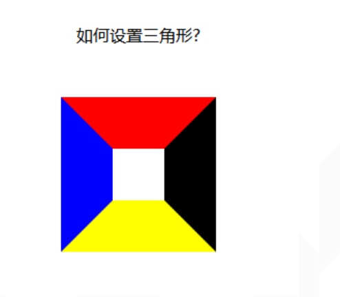
Let's look at a piece of code: here, a span element is set as a block level element, and the four sides of the border are set to different colors:
<!DOCTYPE html>
<html lang="en">
<head>
<meta charset="UTF-8">
<meta name="viewport" content="width=device-width, initial-scale=1.0">
<meta http-equiv="X-UA-Compatible" content="ie=edge">
<title>Document</title>
<style>
div {
width: 100%;
margin: 50px 0;
text-align: center;
}
span {
position: relative;
margin: 0 auto;
display: block;
width: 50px;
height: 50px;
border-style: solid;
border-width: 50px;
border-top-color: red;
border-left-color: blue;
border-bottom-color: yellow;
border-right-color: black;
}
</style>
</head>
<body>
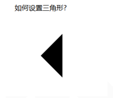
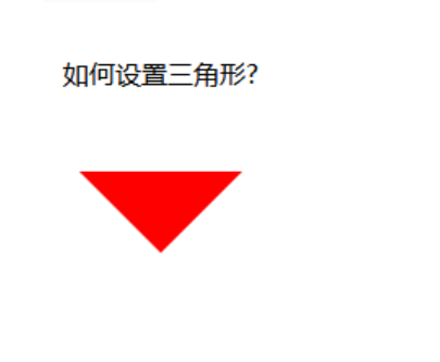
<div class="as">How to set triangles?</div>
<div class="jindaobox">
<span class="sanjiao">
</span>
</div>
</body>
</html>
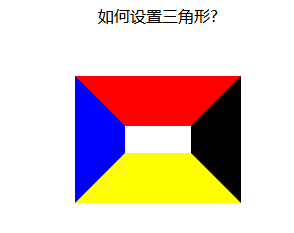
Running results: it is found that the four sides of the frame are actually this trapezoidal structure. If the top and bottom of the trapezoid are changed to 0, it is not the triangle we want. Moreover, this can not be done by using html and css. There is no problem of using static pages, and there is no problem of discontinuous display of pictures;
The next step is to change the top and bottom of the trapezoid to 0
It's easy to change the bottom to 0. Just set the height and width of the element to 0
Width: ------ > 0 get up and down arrows
Height: -------- > 0 get left and right arrows
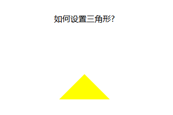
1. When we want the up arrow, remove the left and right borders and the bottom borders of the element
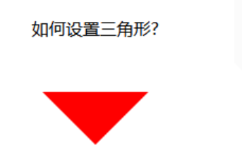
2. When we want the down arrow, remove the left and right borders and upper borders of the element
3. When we want the left arrow, remove the upper and lower border and the right border
4. When we want the right arrow, remove the upper and lower border and the left border
The idea is very good, but it doesn't work. Let's change the method: since setting the width doesn't work, let's set the color. Just set the color of the upper, left and right borders to transparent. Isn't it OK? There's just a value in css that sets the color to transparent
span {
            position: relative;
            margin: 0 auto;
            display: block;
            width: 0px;
            height: 0px;
            border-style: solid;
            border-width: 50px

            border-top-color: transparent;
            border-left-color: transparent;
            border-right-color: transparent
            border-bottom-color: yellow;

        }
Set down arrow:
span {
            position: relative;
            margin: 0 auto;
            display: block;
            width: 0px;
            height: 0px;
            border-style: solid;
            border-width: 50px;

            border-bottom-color: transparent;
            border-left-color: transparent;
            border-right-color: transparent
            border-top-color: red
        }
Set left arrow:
span {
            position: relative;
            margin: 0 auto;
            display: block;
            width: 0px;
            height: 0px;
            border-style: solid;
            border-width: 50px;

            border-top-color: transparent;
            border-bottom-color: transparent
            border-right-color: transparent;
            border-left-color: blue;

        }

Set right arrow:
span {
            position: relative;
            margin: 0 auto;
            display: block;
            width: 0px;
            height: 0px;
            border-style: solid;
            border-width: 50px;

            border-top-color: transparent;
            border-bottom-color: transparent;
            border-left-color: transparent;
            border-right-color: black;
        }
Of course, css can also be written together, which looks simpler:
span {
            position: relative;
            margin: 0 auto;
            display: block;
            width: 0px;
            height: 0px;
            /* The border color attributes of top, right, bottom and left are the same. Which arrow is needed, and then set the color attribute of which direction. In this way, the last set attribute overrides the previous attribute and becomes an arrow */
            border: 50px solid transparent;
            border-top-color: red;
        }
The above is an arrow set using html and css. Can you make it simpler?
Next, I use the class attribute to set the arrow. When the arrow is needed, I can directly add this class attribute. When the arrow is not wanted, I can just remove this class
Here is an example:
<!DOCTYPE html>
<html lang="en">

<head>
    <meta charset="UTF-8">
    <meta name="viewport" content="width=device-width, initial-scale=1.0">
    <meta http-equiv="X-UA-Compatible" content="ie=edge">
    <title>Document</title>
    <style>
        div {
            width: 100%;
            margin: 50px 0;
            text-align: center;
        }

        .jindaobox {
            position: relative;
            width: 980px;
            margin: 20px auto;

        }

        li {
            list-style: none;
            float: left;
            position: relative;
            border: 1px solid #eee;
            margin-right: 30px;
            padding: 10px 20px;
            border-radius: 5px;
            -webkit-border-radius: 5px;
            -moz-border-radius: 5px;
            -ms-border-radius: 5px;
            -o-border-radius: 5px;
        }

        .active {
            border: 1px solid red !important;

        }

        .active::after {
            position: absolute;
            content: "";
            height: 0;
            width: 0;

            border: 8px solid transparent;
            border-top-color: red;

            top: 0;
            left: 0;
            right: 0;
            margin: auto;
        }
    </style>
</head>

<body>
    <div class="as">Please choose your favorite movie</div>
    <ul class="jindaobox">
        <li class="lis">dragon flight</li>
        <li class="lis  active">Zichuan</li>
        <li class="lis">The Canonization of the Gods</li>
        <li class="lis  active">Fengyun first knife</li>
        <li class="lis">Flying fairy outside the sky</li>
    </ul>

</body>

</html>

In this way, you can use the class attribute to control the arrow. When you need to select, you can add an active class attribute to the li element. When you don't need it, you can remove the active class attribute
Article source http://www.cnblogs.com/huanying2015