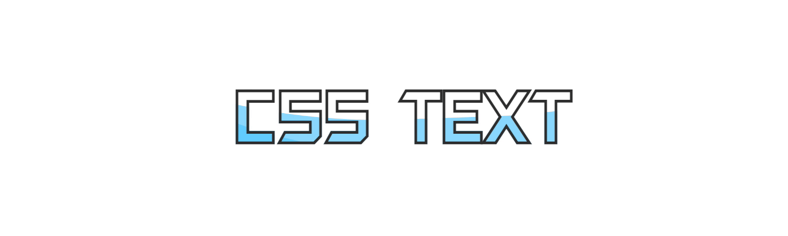
I read an article before: CSS tricks | clever use of mixed mode to achieve text hollowed out wave effect , it is very ingenious to integrate CSS animation into the text, mainly using the mixed mode. The effect is like this

Why use mixed mode? Because this is text and it is impossible to put HTML nodes inside the text, another method will be introduced below. When html is completely limited, this effect can be easily realized with the help of SVG foreignObject, and it will have better results. Let's have a look
1, What is SVG foreignObject
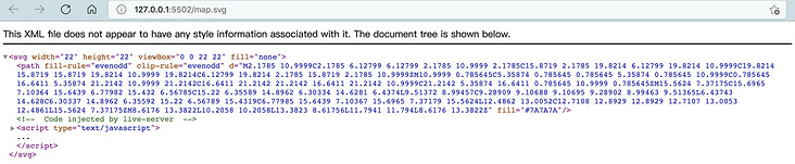
first, foreignObject Is an element in SVG that allows elements from different XML namespaces to be included. In the context of the browser, it is generally XHTML / HTML. What do you mean? For example, the SVG we usually export in various design software may be like this
<svg width="22" height="22" viewBox="0 0 22 22" fill="none" xmlns="http://www.w3.org/2000/svg">
<path fill-rule="evenodd" clip-rule="evenodd" d="M2.1785 10.9999C2.1785 6.12799..." fill="#7A7A7A"/>
</svg>
If you save directly as map SVG, and then put it in the browser

Notice that SVG has an attribute xmlns, which is the namespace. It specifies how this content is rendered in the browser. Here's how http://www.w3.org/2000/svg Is the namespace of SVG. Without this attribute, the browser will directly render ordinary xml documents, as follows
However, there is one case where you don't need to specify this namespace: if our SVG file is directly inline in the XHTML page or directly in html, as a suffix, can not specify a namespace, and the browser will recognize it automatically.

So, back here, what can foreignObject do? I believe you have guessed that you can render HTML tags inside SVG! The specific method is to add an xml namespace to the foreignObject, for example
<svg xmlns="http://www.w3.org/2000/svg">
<foreignObject width="100%" height="100%">
<body xmlns="http://www.w3.org/1999/xhtml">
<style>
p{
color: red
}
</style>
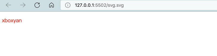
<p>xboxyan</p>
</body>
</foreignObject>
</svg>Notice that the body tag has an attribute xmlns=“ http://www.w3.org/1999/xhtml ", this is the namespace of html, and the rendering result is as follows
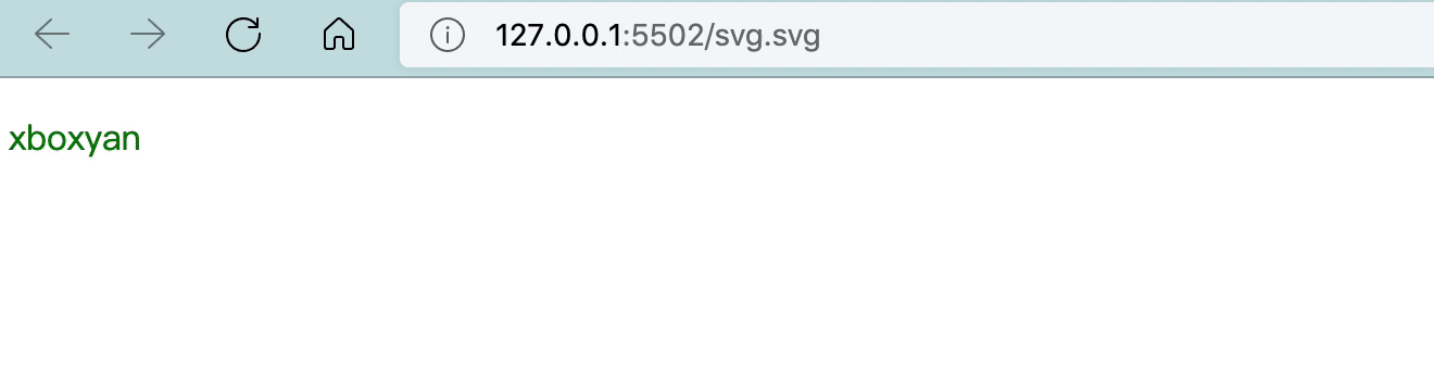
It's almost the same as ordinary HTML. Here's the key point. You can also add some CSS animation
<svg xmlns="http://www.w3.org/2000/svg">
  <foreignObject width="100%" height="100%">
      <body xmlns="http://www.w3.org/1999/xhtml">
        <style>
          p{
            color: red;
            animation: hue 5s infinite
          }
          @keyframes hue{
              to {
                  filter: hue-rotate(1turn)
              }
          }
        </style>
        <p>xboxyan</p>
      </body>
    </foreignObject>
</svg>
In this way, we get an animated SVG
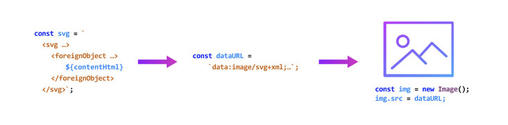
In general, we can take SVG as an image, which can be easily used in various places in the web page, such as the src attribute of img, or directly as a CSS background image. In short, with the help of foreignObject, you can easily convert a piece of HTML into pictures, including CSS animation.
This is interesting. Many scenes limited by HTML structure can be solved in this way, such as the text hollowed out wave animation mentioned at the beginning of the article
2, Text background picture
Embedding the background image in the text has a fixed routine. With the help of WebKit background clip cutting and transparent text, you can easily put any background into the text, such as
<p>CSS TEXT</p>
p{
    -webkit-background-clip: text;
    color: transparent;
      background: linear-gradient( #f44336, #ffc107);
}
The effect is as follows

Just think, if the above wave animation is made into a picture, can it be directly used here?
p{
    -webkit-background-clip: text;
    color: transparent;
      background: url(wave.svg);
}
3, CSS animation to SVG image
Assuming that we have implemented such a wave animation (the focus of this paper is not here), the detailed principle can be referred to coco Articles Pure CSS to achieve wave effect , slightly modified here
body::before, body::after {
  content: "";
  position: absolute;
  bottom: 50%;
  left: 50%;
  width: 400vw;
  height: 400vw;
  border-radius: 45% 48% 43% 47%;
  transform: translate(-50%, 0);
  box-shadow: 0 0 0 50vw #54caff9e;
  animation: rotate 10s infinite linear;
}
body::after {
  border-radius: 43% 47% 44% 48%;
  animation: rotate 10s infinite -1s linear;
}

@keyframes rotate {
  0% {
    transform: translate(-50%, 0) rotate(0);
  }
  100% {
    transform: translate(-50%, 0) rotate(360deg);
  }
}
This effect can be obtained

Then put this into an SVG foreignObject, and it becomes like this
<svg xmlns="http://www.w3.org/2000/svg" width="100%" height="100%">
  <foreignObject width="100%" height="100%">
    <style>
      html,body{
          width: 100%;
          height: 100%
      }
        body{
            margin: 0;
            background:transparent;
            transition: .3s;
        }
        body::before, body::after {
        content: '';
        position: absolute;
        bottom: 50%;
        left: 50%;
        width: 400vw;
        height: 400vw;
        border-radius: 45% 48% 43% 47%;
        transform: translate(-50%, 0);
        box-shadow: 0 0 0 50vw #54caff9e;
                animation: rotate 10s infinite linear;
      }
      body::after {
        border-radius: 43% 47% 44% 48%;
        animation: rotate 10s infinite -1s linear;
      }
      @keyframes rotate {
        0% {
          transform: translate(-50%, 0) rotate(0);
        }
        100% {
          transform: translate(-50%, 0) rotate(360deg);
        }
      }
    </style>
      <body xmlns="http://www.w3.org/1999/xhtml">
      </body>
    </foreignObject>
</svg>
Save this SVG as wave SVG, you can directly open the preview in the browser!
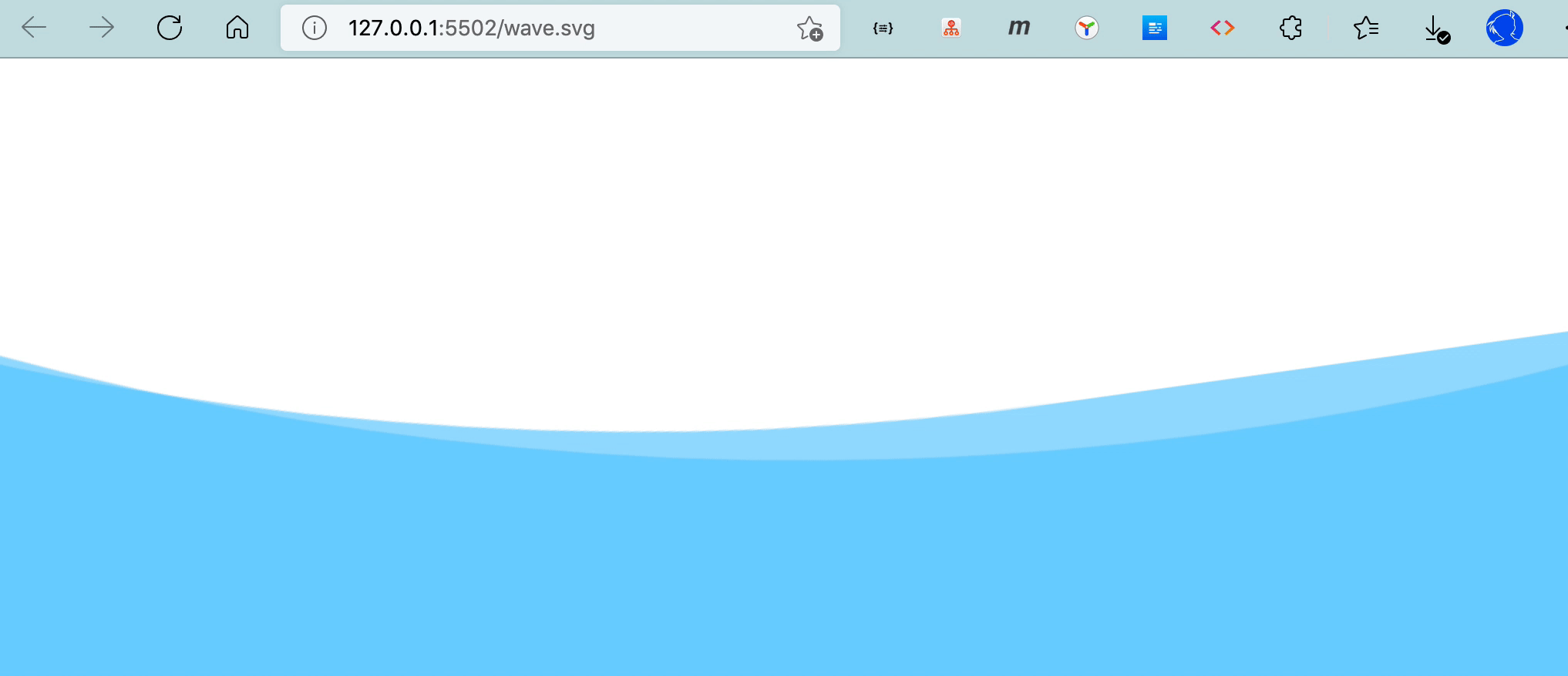
So you get a "moving picture"
4, Use of SVG pictures
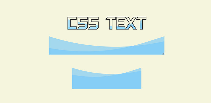
Back to the previous text, just change the gradient to this picture
p{
      -webkit-text-stroke: 1px #333;
    -webkit-background-clip: text;
    color: transparent;
      background: url(wave.svg);
}
The effect is as follows
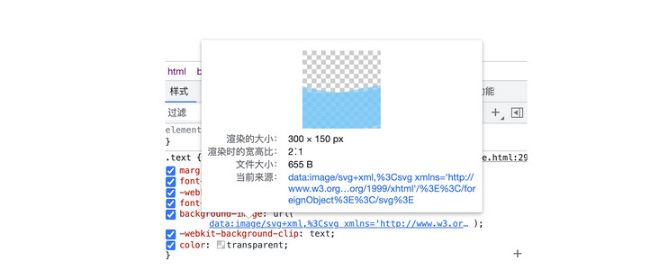
Of course, you can also directly convert this SVG into base 64 format (it is recommended that you use Mr. Zhang Xinxu's) SVG conversion tool , great)

This is the case after the conversion. There is no dependence at all (you can see it vaguely)
p{
      -webkit-text-stroke: 1px #333;
    -webkit-background-clip: text;
    color: transparent;
      background: url("data:image/svg+xml,%3Csvg xmlns='http://www.w3.org/2000/svg'%3E%3CforeignObject width='100%25' height='100%25'%3E%3Cstyle%3E@keyframes rotate%7B0%25%7Btransform:translate(-50%25,0) rotate(0)%7Dto%7Btransform:translate(-50%25,0) rotate(360deg)%7D%7Dbody%7Bwidth:100%25;height:100%25;margin:0;background:0 0;transition:.3s%7Dbody::after,body::before%7Bcontent:'';position:absolute;bottom:50%25;left:50%25;width:400vw;height:400vw;border-radius:45%25 48%25 43%25 47%25;transform:translate(-50%25,0);box-shadow:0 0 0 50vw %2354caff9e;animation:rotate 10s infinite linear;z-index:1%7Dbody::after%7Bborder-radius:43%25 47%25 44%25 48%25;animation:rotate 10s infinite -1s linear%7D%3C/style%3E%3Cbody xmlns='http://www.w3.org/1999/xhtml'/%3E%3C/foreignObject%3E%3C/svg%3E");
}
This is also completely OK (if the preview is wrong, it may be the problem of single and double quotation marks in CSS, such as content: '')
The complete code is accessible CSS wave text (codepen.io)
5, Advantages and limitations
In fact, the advantage is very obvious. Because it is a picture and belongs to the real text hollowing effect, it will not be easily affected by the background layer like the mixed mode (the original implementation can only be a white background). For example, change a color here
The limitation is that when it becomes a picture, some attribute styles are fixed and cannot be dynamically modified. The interaction related to hover also fails, and the speed of animation cannot be controlled, etc. (it is possible to use SVG directly in the page)
6, Other applications
Many HTML can be implemented in this way under strict restrictions. For example, sometimes what to do if there are not enough pseudo elements? It can be generated by SVG, so you have countless pseudo elements available.
In addition, there is a very important application scenario, the pure front-end screenshot function and the famous front-end screenshot library rasterizeHTML That's the principle
7, Summary and description
The above is the whole content of this article. A fairly practical trick, with the help of a little bit of SVG features, is mainly to solve the problem of HTML structure constraints. The rest is related to traditional CSS. Here's a summary
- SVG foreignObject can embed HTML tags
- Pay attention to the namespace of SVG and HTML, which will be automatically recognized in HTML
- The text background picture is realized by WebKit background clip combined with transparent text
- SVG is essentially a picture
- SVG can be escaped to inline base 64 without affecting the original animation
- SVG does not support dynamic style modification when used as a picture
- SVG foreignObject can realize the screenshot function
Many times, you can think in the direction of SVG if you have image related needs. After all, SVG is an image language. There are many useful features of SVG, which will be introduced later. Finally, if you think it's good and helpful to you, you're welcome to like, collect and forward ❤❤❤