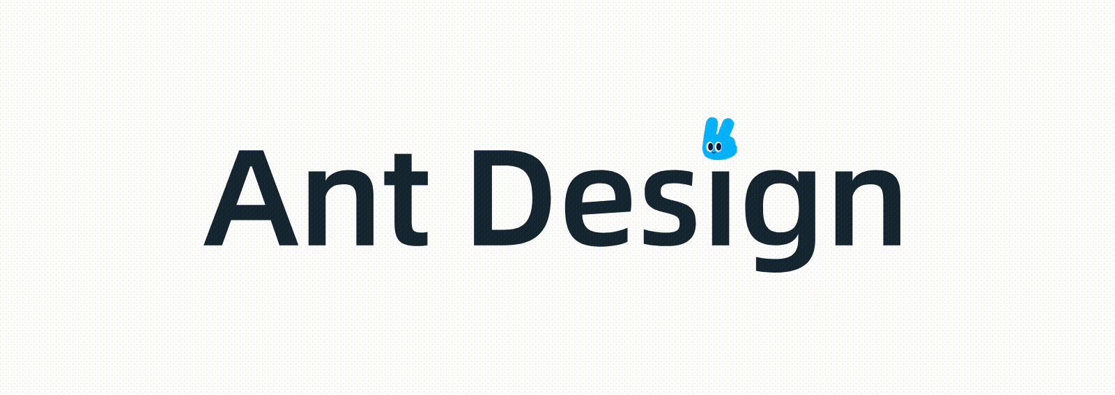
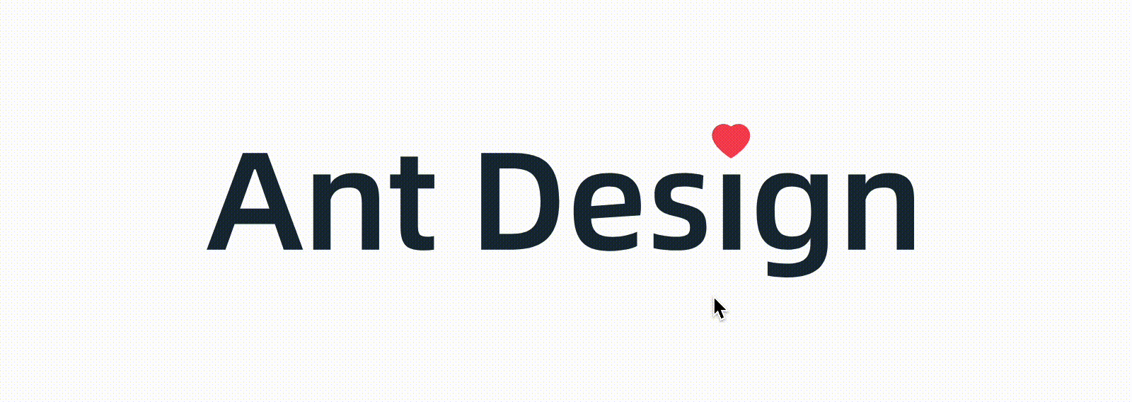
In recent projects Ant Design There are a lot of connections, which is very good. i don't know if you have found such an effect. On the official website, if you put the mouse on the Logo, the icon on the letter i will change constantly. After leaving, it will stop and change again. It can be regarded as a small colored egg (maybe i didn't find it before) 🤣), The demonstration is as follows:
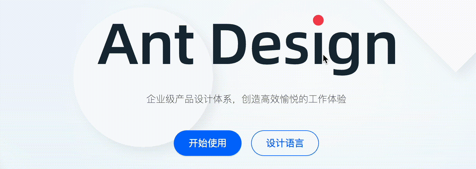
However, it's not surprising that you didn't find it, because this effect is implemented by js, and it can only take effect after the loading is completed. Sometimes, the official website is particularly slow. For example, when it's still loading, the probability will not have the above hover effect
Well, after thinking about it, this effect can be completed with pure CSS. The implementation cost is low and can effectively avoid the above loading problems. Let's have a look
1, CSS implementation principle
The whole implementation principle is roughly as follows
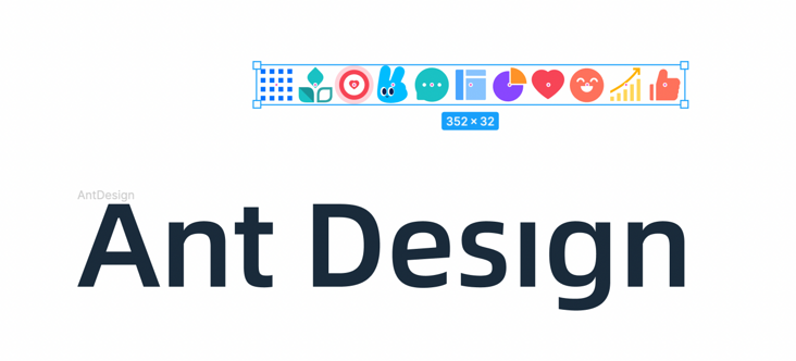
- Prepare a material containing all the small icons
- Create a CSS frame by frame animation that changes the position of the background
- Use the mouse hover to control the animation
2, Material preparation
In order to avoid repeated requests and facilitate the creation of animation, all small icon materials are combined together (saved from the official website), just like the previous "Sprite map", as follows
Suppose the HTML structure is like this
<h1 class="logo">Ant Design</h1>
For better semantics, it is suggested to keep the text here, and then hide the text in other ways (such as transparency). The logo can be used as the background picture, and then the changeable small icons can be generated with pseudo elements (decorative elements can be generated with pseudo elements to ensure the cleanliness of HTML). The CSS is as follows
.logo{
  width: 500px;
  height: 100px;
  position: relative;
  color: transparent;
  background: url('https://imgservices-1252317822.image.myqcloud.com/image/012420220165011/c0e82c29.svg') center/contain no-repeat;
  cursor: pointer;
}
.logo::after{
  content: '';
  position: absolute;
  width: 32px;
  height: 32px;
  background: url('https://imgservices-1252317822.image.myqcloud.com/image/012420220165415/b0005044.svg') 0 / cover no-repeat;
  right: 113px;
  top: -18px;
}
The static layout is calculated
2, CSS frame by frame animation
Then there is animation, which only needs to use the animation function in CSS steps() Function symbol, you can realize frame by frame animation
First, define a key frame and change the position of the background
@keyframes random {
  to {
    background-position: 100%;
  }
}
There are a total of 11 small icons here, and the change between them is 10 steps, so the animation is set as follows
.logo::after{
    /*Other styles*/
  animation: random 1s steps(10) infinite;
}
This results in an infinite loop of frame by frame animation
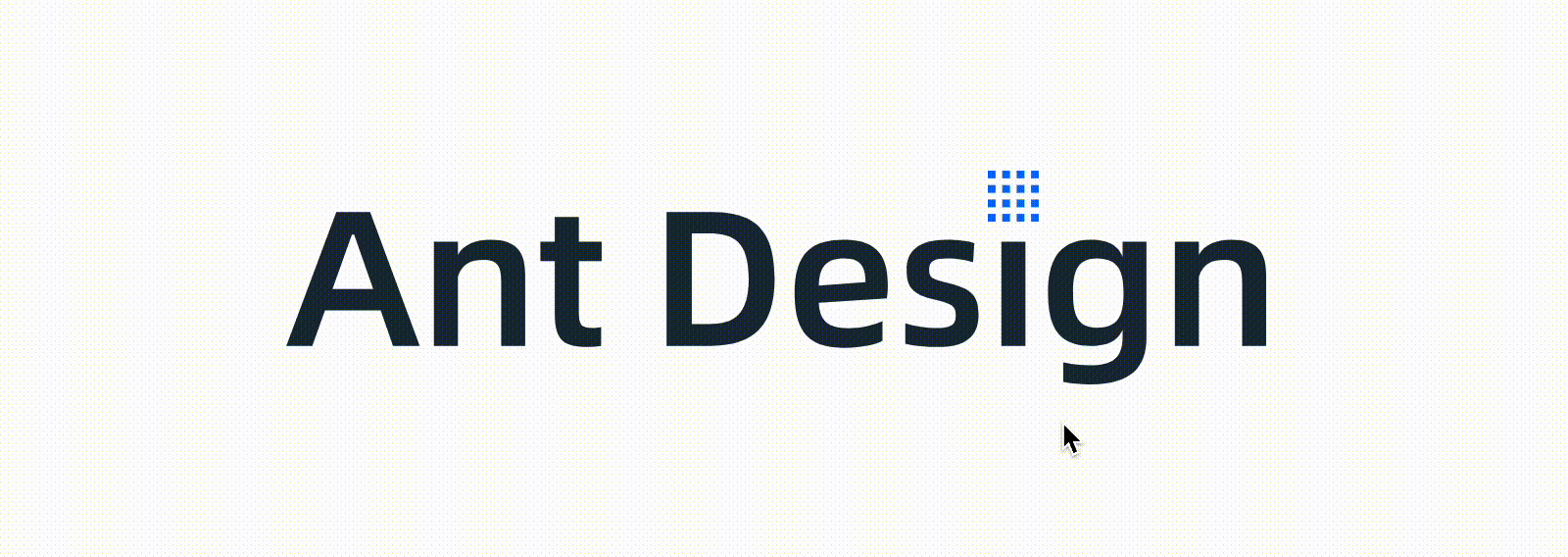
3, Pause and run of CSS animation
By default, CSS animation runs by default, but the current requirement is that it will only move when the mouse hover s.
Some students may do this. By default, there is no animation. Create animation when hover, as shown below
.logo::after{
    /*Default no animation*/
}
.logo:hover::after{
  animation: random 1s steps(10) infinite;
}
But there are two problems with doing so:
- Each time you create an animation in real time, there will be more performance consumption
- Every time the mouse leaves, the position returns to its original state
Therefore, this approach is not desirable
In addition to the above methods, you can also actively set the pause through animation play state, as shown below
.logo::after{
    /*Other styles*/
  animation: random 1s steps(10) infinite;
  animation-play-state: paused; /*Animation pause*/
}
In this way, it will not move by default, and then "run" when hover
.logo:hover::after{
  animation-play-state: running; /*Animation run*/
}
The effect is as follows
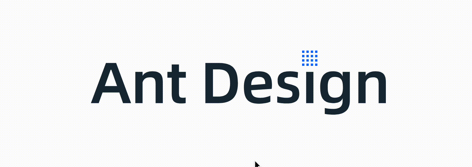
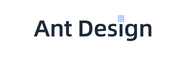
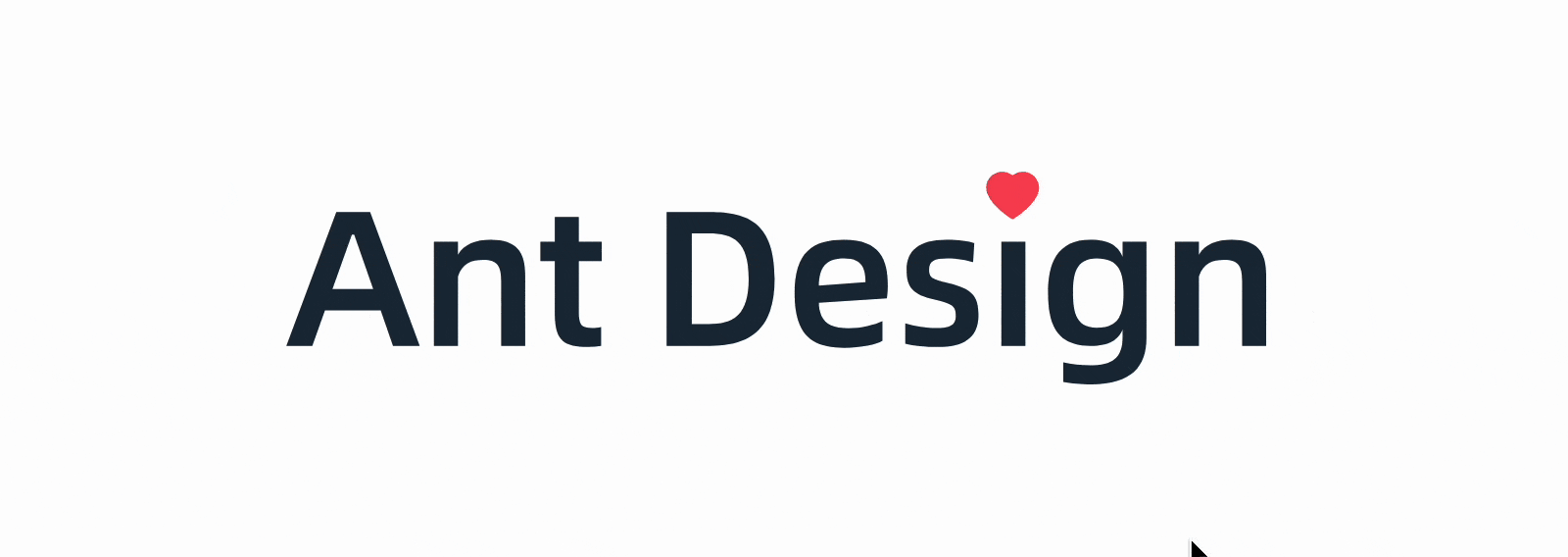
4, Specify initial location
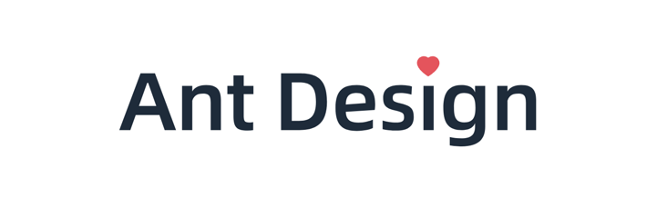
Now the default is that the small icon is the first one. If you want to specify another one, such as ❤
How to deal with this situation
First of all, we thought that we could change the background position manually, ❤ In the eighth, so
.logo::after{
  /*Other styles*/
  background-position: -224px; /* 32 * 7 */
}
The effect is as follows
In this way, there are more problems. Due to the change of the starting position of the animation, the animation moves from the 8th place to the far right, and the left does not pass through, and the step also needs to be readjusted.
In addition to this method, it can also be realized through the "negative delay" of the animation. After adding a negative delay to the animation, the animation will move to the future position in advance.
For example, if you want to specify the position of the seventh frame in the future, you can delay 7 / 10 of the negative total motion duration, as follows
.logo::after{
  /*Other styles*/
  animation-delay: -.7s; /* 7 / 10 * 1s*/
}
This will not affect the original animation, perfect realization
The complete code can be accessed: Ant Design Logo (codepen.io)
Attach the complete code (codepen seems unstable recently)
.logo{
  width: 500px;
  height: 100px;
  position: relative;
  color: transparent;
  background: url('https://imgservices-1252317822.image.myqcloud.com/image/012420220165011/c0e82c29.svg') center/contain no-repeat;
  cursor: pointer;
}
.logo::after{
  content: '';
  position: absolute;
  width: 32px;
  height: 32px;
  background: url('https://imgservices-1252317822.image.myqcloud.com/image/012420220165415/b0005044.svg') 0 / cover no-repeat;
  right: 113px;
  top: -18px;
  animation: random 1s -.7s steps(10) infinite;
  animation-play-state: paused;
}
.logo:hover::after{
  animation-play-state: running;
}
@keyframes random {
  to {
    background-position: 100%;
  }
}
5, Summary and description
The above is the CSS implementation for the Logo effect of Ant Design official website. The amount of code is very small, and the problem of js not loading is avoided. The experience is better. Here is a brief summary
- CSS rendering is timely. As long as the page is visible, it will not affect CSS interaction
- Frame by frame animation can be realized through the step() function in CSS animation
- CSS animation can run automatically or pause manually
- By setting a negative delay, CSS animation can run in advance
Of course, the advantages of CSS are more than these. Opening the Ant Design console makes me a little crash. It is actually implemented by constantly changing svg links. If it is always placed on the Logo, there will be a steady stream of requests for pictures, and small icons will "flicker"
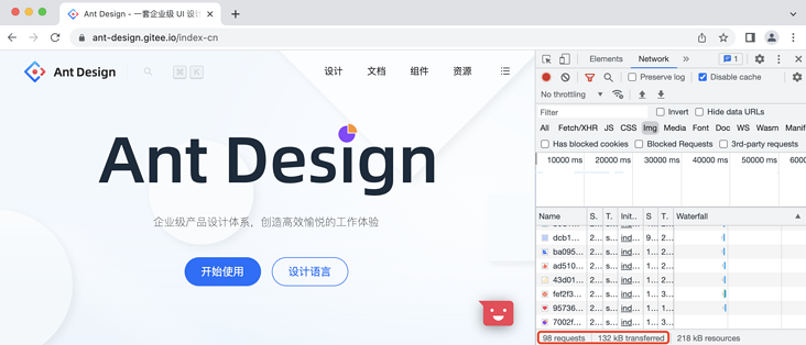
The number of requests is a little amazing. If a small partner in charge of Ant Design official website sees it here, can it be optimized?
Finally, if you think it's good and helpful to you, you're welcome to like, collect and forward ❤❤❤