preface
First, let's imagine our typing scene. The letters will come out one by one. Our goal today is to achieve this effect
be careful
The core code in the project is animation, which is not supported in Internet Explorer 9 and earlier versions.
The easy version only uses CSS
Let's start
Our file directory is
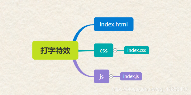
start-up
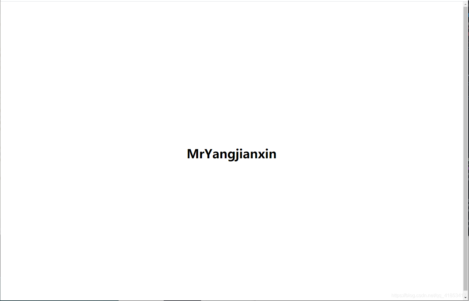
First, we create a new file, give it an h1 label, and use the flex layout to center it
<!-- index.html -->
<!DOCTYPE html>
<html lang="en">
<head>
  <meta charset="UTF-8">
  <meta http-equiv="X-UA-Compatible" content="IE=edge">
  <meta name="viewport" content="width=device-width, initial-scale=1.0">
  <link rel="stylesheet" type="text/css" href="css/index.css">
  <title>Typing effects</title>
</head>
<body>
  <h1>MrYangjianxin</h1>
</body>
</html>
Root: This CSS pseudo class matches the root element of the document tree. For HTML,: root represents the < HTML > element, which is the same as the HTML selector except for higher priority.
/* index.css */
:root{
  font-size: 20px;
}

body{
  display: flex;
  justify-content: center;
  align-items: center;
  min-height: 100vh;
}
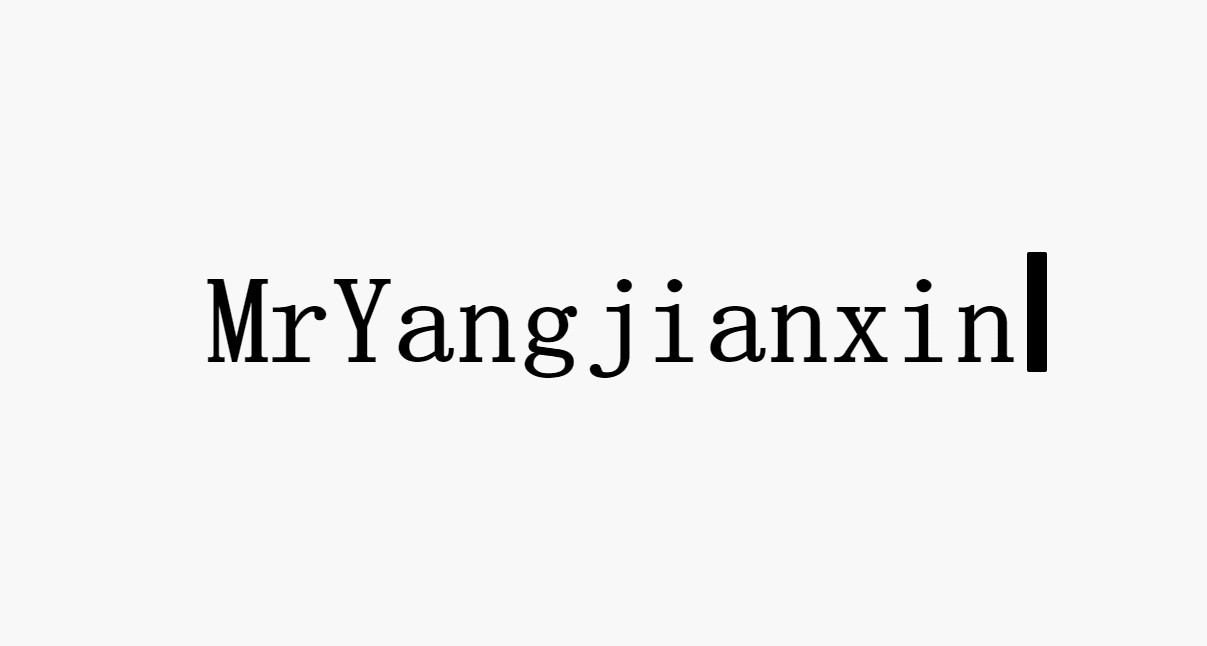
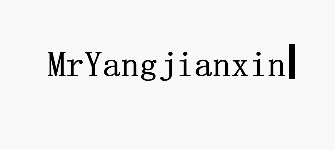
The effect is as follows
Uniform standard
extend
In order to unify different editors, we use monospace font consistently
Next, we introduce a unit ch, which is a size relative to the number 0. 1ch is the width of the number 0.
Then use the animation attribute to call the @ keyframes rule to create animation effects. In @ keyframes, we can specify the animation in two ways: specify the time of change in percentage, or use the keywords "from" and "to", which are equivalent to 0% and 100%.
0% is the start time of the animation and 100% is the end time of the animation.
New CSS code
/* index.css */
h1{
  font-size: 6rem;
  margin: 0;
  padding: 0;
  font-family: monospace;
  width: 2ch;
  overflow: hidden;
  animation: 2s typing steps(13,jump-none) forwards;
  -webkit-animation:mymove 5s infinite; /*Safari and Chrome*/
}

@keyframes typing{
  from{
    width: 1ch;
  }
  to{
    width: 13ch;
  }
}
@-webkit-keyframes mymove /*Safari and Chrome*/
{
from {left:0px;}
to {left:200px;}
}
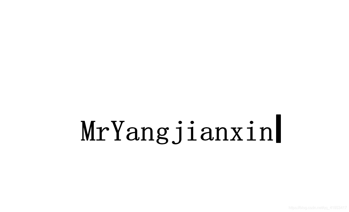
The effect of the simple version has been completed
Advanced version production is more smooth and new effect
First, let's go back to the preparation stage and center the content
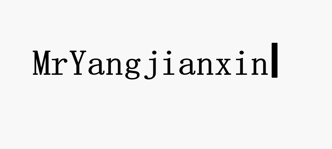
Effect expectation
First of all, the font will gradually appear like the simple version. We make it more optimized. In addition, when we reach the capital letters, it will make a pause effect, which makes us closer to the feeling of hand typing. Add the cursor, do not flicker when typing, and the font starts to flicker after displaying.
First design the cursor
Here we use the after pseudo class to add a cursor effect at the end of the font
/* index.css */
h1 {
  position: relative;
}
h1::after {
  content: '';
  display: inline-block;
  position: absolute;
  width: 20px;
  height: 6rem;
  background-color: #000;
  border-radius: 2px;
  right: -30px;
}
Next, let's make the cursor flash
/* index.css */
h1{
  animation: 1.1s cursor steps(2, jump-none) infinite;
}
@keyframes cursor {
  from {
    opacity: 0;
  }
  to {
    opacity: 1;
  }
}
Typing effect
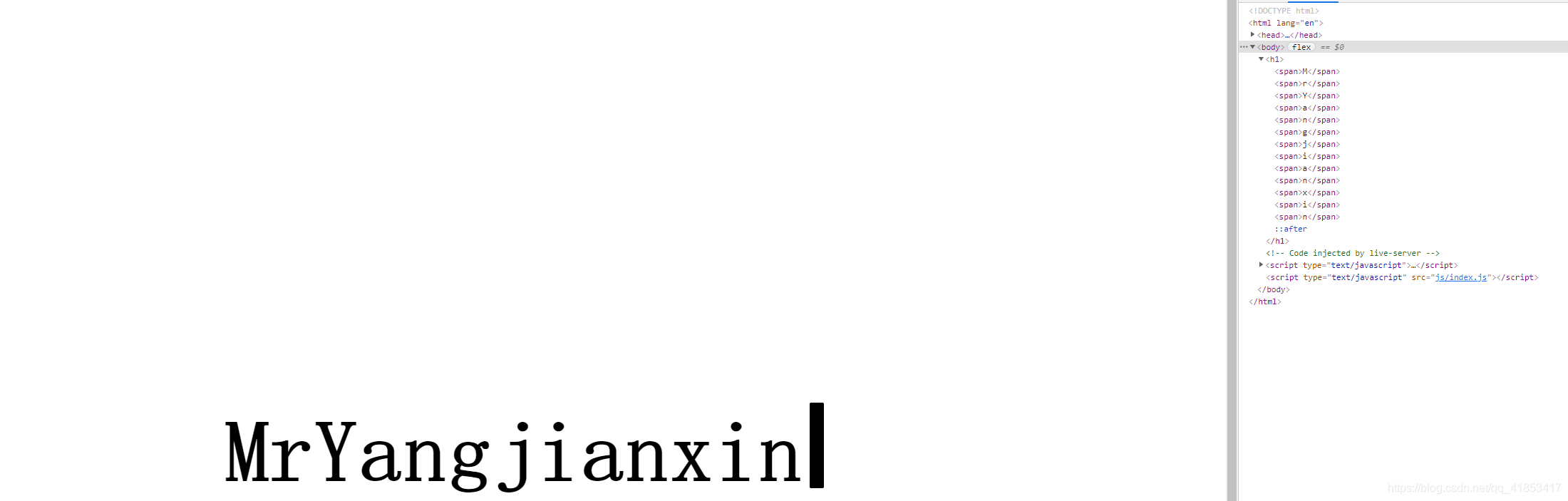
We want to achieve the sliding effect of every word. At this time, we need to add a span label to each letter
<!-- index.html -->
<!-- idnex.html introduce js file-->
<!-- Note that if referenced locally js File. For simple reference, we should put the imported file at the end. If asynchronous reference is used, it will have no impact-->
<script type="text/javascript" src="js/index.js"></script>
//index.js
const h1 = document.querySelector('h1')
h1.innerHTML = h1.textContent.replace(/\S/g, "<span>$&</span>")
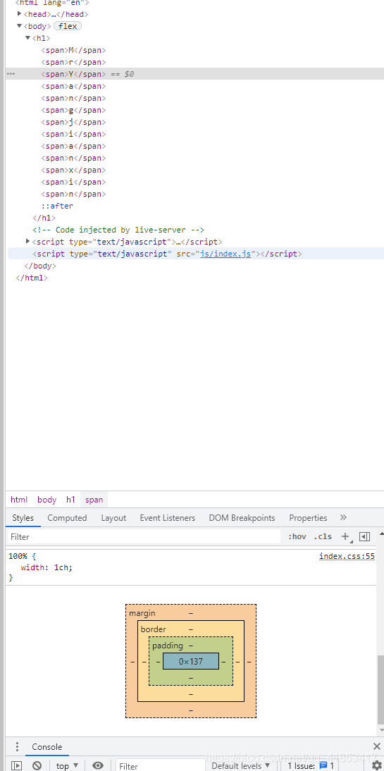
Text width by width assignment
Next, we deal with the text effect so that the span label of the text is 0
/* index.css */
h1 span {
  display: inline-block;
  overflow: hidden;
  width: 0ch;
}
display text
Next, we use the previously cited knowledge to slowly display the span label of the text, so that all the text will slide in in one second
/* index.css */
h1 span {`Insert the code slice here`
  animation: 1s text-in ease-in-out forwards;
}
@keyframes text-in {
  from {
    width: 0ch;
  }
  to {
    width: 1ch
  }
}
Text by text delay
Because each text will be displayed at the same time, we add a delay to each text
/* index.css */
h1 span {
  animation-delay: var(--delay);
}
//index.js
let delay = 0
document.querySelectorAll('span').forEach((span, index) => {
  delay += 1
  span.style.setProperty('--delay', `${delay}s`)
})

Modify typing speed and Pause effect
Modify the animation time to one millisecond
/* index.css */
h1 span {
  animation: 0.1s text-in ease-in-out forwards;
}
We're doing a little modification
//index.js
let delay = 0
document.querySelectorAll('span').forEach((span, index) => {
  delay += 0.1
  if(index === 2)delay+=0.3
  span.style.setProperty('--delay', `${delay}s`)
})
optimization
The cursor doesn't blink when we type, so we use js to monitor whether our text has been executed to the last step
/* index.css */
h1 span {
  --delay: 10s;
}
h1::after {
/*animation: 1.1s cursor steps(2, jump-none) infinite; */
}
h1.ended::after {
  animation: 1.1s cursor steps(2, jump-none) infinite;
}
h1.addEventListener('animationend', (e) => {
  if (e.target === document.querySelector('h1 span:last-child')) {
    h1.classList.add('ended')
  }
})

The final effect is completed
Code location
codepen: https://codepen.io/2416390659/pen/YzVdEPe
Code location
gitee: https://gitee.com/mryangjianxin/typing-effect.git
Reference video source
Station B: https://www.bilibili.com/video/BV1NV411v7Xp