CSS3 transition and 2D conversion
1.3 transition
Using transitions allows you to change the style of an element from one state to another
Syntax:
transition: The attributes to transition take time. When does the motion curve begin;
If there are many attributes that you want to transition, you can use all
Motion curve:
linear: uniform speed
ease: slow down gradually
Ease in: acceleration
Ease out: slow down
Ease in out: accelerate first and then decelerate
For example:
When the mouse passes, the width and height of the box change
code:
<!DOCTYPE html>
<html lang="en">
<head>
    <meta charset="UTF-8">
    <title>CSS3 Transition effect</title>
    <style>
        /*Who makes the transition? Who adds transition*/
        .box {
            width: 200px;
            height: 200px;
            background-color: red;
            margin: 100px auto;
            /*Use transition effects*/
            /*transition: The attribute to transition takes time, and when the motion curve starts;*/
            transition: width .5s linear ,background-color .5s ease ,height .5s ease-in-out ;
            /*If you want to change multiple styles at the same time, don't write multiple transition s. Just use commas for segmentation, or use the following methods*/
            /*transition: all .5s ease 1s;*/
        }
        /*Previous practice*/
        .box:hover {
            width: 400px;
            height: 400px;
            background-color: red;
        }

    </style>
</head>
<body>
<div class="box"></div>
</body>
</html>
Transition case: progress bar
effect:

After the mouse passes:
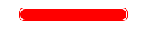
Idea: when the mouse passes the parent box, increase the width of the child box
code:
<!DOCTYPE html>
<html lang="en">
<head>
    <meta charset="UTF-8">
    <title>progress bar</title>
    <style>
        .father {
            width: 150px;
            height: 15px;
            border: 1px solid red;
            border-radius: 7px;
            padding: 1px;
            margin: 100px auto;
        }
        .son {
            width: 50%;
            height: 100%;
            border-radius: 7px;
            background-color: red;
            transition: all .5s linear;
        }
        .father:hover .son{
            width: 100%;
        }
    </style>
</head>
<body>
<div class="father">
    <div class="son"></div>
</div>
</body>
</html>
2 2D conversion
Transformation is one of the subversive features in CSS3. It can realize the effects of element displacement, rotation and scaling. Transformation can be simply understood as deformation
2.1 two dimensional coordinate system
2D conversion is a technology to change the position and shape of labels on a two-dimensional plane. First, learn the two-dimensional coordinate system

Here, the upper left of the browser is taken as the coordinate origin, the right and down are positive values of X and Y, and vice versa
2.2 move translate
- grammar
transform: translate(x,y); Or write it separately
transform: translateX(n);
transform: translateY(n);
Note:
Defines the movement in 2D conversion, moving elements along the X and Y axes
The biggest advantage of translate: it will not affect the position of other elements
The percentage unit in translate is the translate relative to its own element: (50%, 50%);
No effect on inline labels
We can use this attribute to move elements or do some small animation effects, such as:
effect:
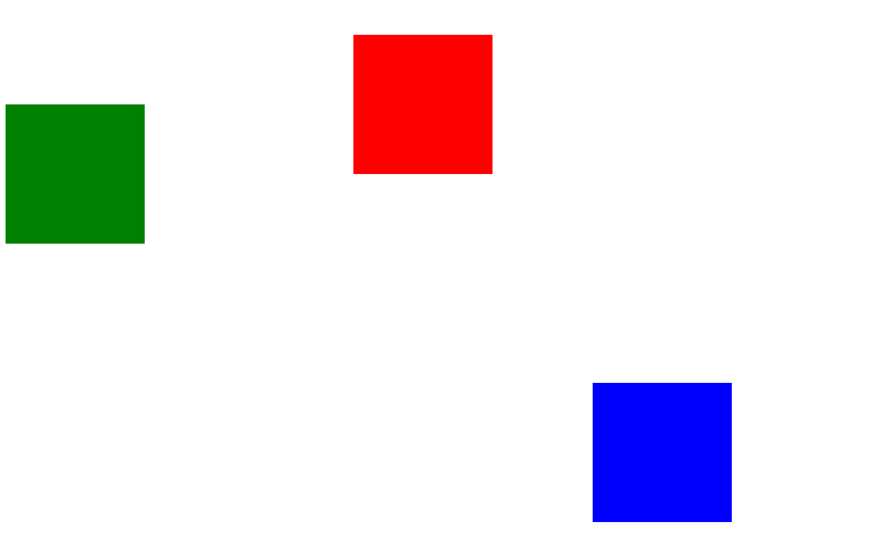
translate is added to the red box to move relative to the green box. A mouse passing event is added to the blue box. The effect is as follows:

code:
<!DOCTYPE html>
<html lang="en">
<head>
    <meta charset="UTF-8">
    <title>Title</title>
    <style>
        .box {
            width: 200px;
            height: 200px;
            background-color: red;
            transform: translate(500px,100px);
            /*transform: translateX(100px);*/
            /*transform: translateY(100px);*/
        }
        .box_1 {
            width: 200px;
            height: 200px;
            background-color: green;
        }
        .anli {
            width: 200px;
            height: 200px;
            background-color: blue;
            margin: 200px auto;
            transition: all .5s;
        }
        .anli:hover {
            transform: translate(0px,-10px);
            box-shadow: 10px 10px 10px 10px rgba(0,0,0,.6);
        }
    </style>
</head>
<body>
<div class="box"></div>
<div class="box_1"></div>
<div class="anli"></div>
</body>
</html>
2.3 rotate
2D rotation refers to rotating an element clockwise or counterclockwise in a 2-dimensional plane.
Syntax:
transform:rotate(degrees)
Note:
Rotate is followed by degrees. The unit is deg, such as rotate(45deg)
When the angle is positive, it is clockwise, and when it is negative, it is counterclockwise
The default center point of rotation is the center point of the element
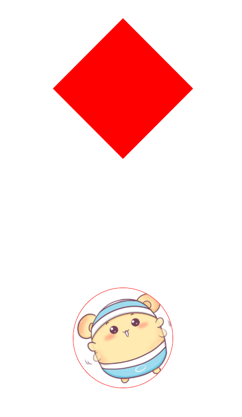
For example:
Turn a box into a diamond and make a simple animation with the transition. After the mouse rotates, the effect is as follows:
code:
<!DOCTYPE html>
<html lang="en">
<head>
    <meta charset="UTF-8">
    <title>Title</title>
    <style>
        div {
            width: 200px;
            height: 200px;
            background-color: red;
            margin: 100px auto;
            transform: rotate(45deg);
        }
        img {
            display: block;
            width: 200px;
            height: 200px;
            margin: 300px auto;
            transition: all 2s;
            border-radius: 50%;
            border: 1px solid red;
        }
        img:hover {
            transform: rotate(360deg);
        }
    </style>
</head>
<body>
<div></div>
<img src="img/pic.jpg" alt="">
</body>
</html>
2.4 transform origin
We can set the center point of element transformation
Syntax:
transform-origin: x y;
X and y can be pixels, percentages, or azimuth nouns
Different effects can be achieved by setting different conversion center points. For example, when the mouse passes by, let a child box rotate counterclockwise from the lower left of the parent box.
effect:


code:
<!DOCTYPE html>
<html lang="en">
<head>
    <meta charset="UTF-8">
    <title>Title</title>
    <style>
        .far {
            width: 200px;
            height: 200px;
            background-color: blue;
            margin: 100px auto;
            overflow: hidden;
        }
        .son {
            width: 200px;
            height: 200px;
            background-color: #00FFFF;
            text-align: center;
            line-height: 200px;
            font-size: 50px;
            color: #fff;
            transform-origin: 0 100%;
            transform: rotate(90deg);
            transition: all 1s;
        }
        .far:hover .son{
            transform: rotate(0deg);
        }
    </style>
</head>
<body>
<div class="far">
    <div class="son">media</div>
</div>
</body>
</html>
2.5 scale
Adding a zoom attribute to an element can implement the method of the element or zoom out
Syntax:
transform:scale(x,y);
Notice that x and y are separated by commas
transform:scale(1,1): double the width and height, compared with no magnification
transform:scale(2,2): both width and height are magnified twice
transform:scale(2): write only one parameter. The second parameter is the same as the first parameter, which is equivalent to scale(2,2)
transform:scale(0.5,0.5): zoom out
The biggest advantage of sacle scaling: you can set the conversion center point scaling, which is scaled by the center point by default, and does not affect other boxes
For example, you can use zoom to make a paging button where the mouse passes through the element and becomes larger
effect:
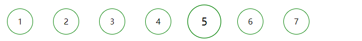
The implementation method is to add a zoom attribute to the element when the mouse passes by
<!DOCTYPE html>
<html lang="en">
<head>
    <meta charset="UTF-8">
    <title>Title</title>
    <style>
        div {
            width: 50px;
            height: 50px;
            border-radius: 50%;
            border: 1px solid green;
            text-align: center;
            line-height: 50px;
            transition: all 1s;
            float: left;
            margin: 20px;
            cursor: pointer;
        }
        div:hover {
            transform: scale(1.3);
        }
    </style>
</head>
<body>
<div>1</div>
<div>2</div>
<div>3</div>
<div>4</div>
<div>5</div>
<div>6</div>
<div>7</div>
</body>
</html>