Pixel size
px
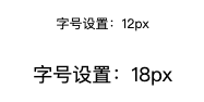
px is a fixed pixel unit. If your web page needs to be used at multiple ends, use it as little as possible. It does not have responsive characteristics.
As follows:
<!DOCTYPE html>
<html lang="en">

<head>
    <meta charset="UTF-8">
    <meta http-equiv="X-UA-Compatible" content="IE=edge">
    <meta name="viewport" content="width=device-width, initial-scale=1.0">
    <title>Document</title>
    <link rel="stylesheet" href="./css_reset.css">
    <style>
        div:first-of-type{
            font-size: 12px;
        }
        div:last-of-type{
            font-size: 18px;
        }
    </style>
</head>

<body>
    <div>Font size setting: 12 px</div>
    <div>Font size setting: 18 px</div>
</body>

</html>
Render results:
%
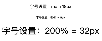
Percentage is the size of the child element relative to the parent element. For example, if the size of the parent element is 18px, then setting the child element to 50% is 9px, as shown below:
<!DOCTYPE html>
<html lang="en">

<head>
    <meta charset="UTF-8">
    <meta http-equiv="X-UA-Compatible" content="IE=edge">
    <meta name="viewport" content="width=device-width, initial-scale=1.0">
    <title>Document</title>
    <link rel="stylesheet" href="./css_reset.css">
    <style>
        main{
            font-size: 18px;
        }
        div:first-of-type{
            font-size: 50%;
        }
        div:last-of-type{
            font-size: 200%;
        }
    </style>
</head>

<body>
    <main>
        <p>Font size setting: main 18px</p>
        <div>Font size setting: 50% = 9px</div>
        <div>Font size setting: 200% = 32px</div>
    </main>
</body>

</html>
Render results:
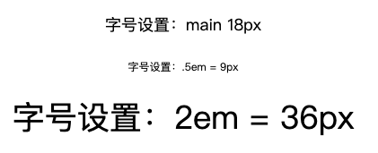
em
EM is similar to the percent sign. It also sets the size of the child element compared with the parent element. 1em is equivalent to 100% and 0.5rem is equivalent to 50%.
Note that if it is 0 The beginning of X can be directly abbreviated as x. As follows:
<!DOCTYPE html>
<html lang="en">

<head>
    <meta charset="UTF-8">
    <meta http-equiv="X-UA-Compatible" content="IE=edge">
    <meta name="viewport" content="width=device-width, initial-scale=1.0">
    <title>Document</title>
    <link rel="stylesheet" href="./css_reset.css">
    <style>
        main{
            font-size: 18px;
        }
        div:first-of-type{
            font-size: .5em;
        }
        div:last-of-type{
            font-size: 2em;
        }
    </style>
</head>

<body>
    <main>
        <p>Font size setting: main 18px</p>
        <div>Font size setting:.5em = 9px</div>
        <div>Font size setting: 2 em = 36px</div>
    </main>
</body>

</html>
Render results:
rem
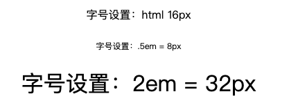
rem is an upgraded version of em and is recommended. All size settings will not change according to the value of the parent element, but are uniformly referenced by the value of the html document.
The default font size of html document in Chorme browser is 16px. If an element is set to. 5rem, it is 8px.
As follows:
<!DOCTYPE html>
<html lang="en">

<head>
    <meta charset="UTF-8">
    <meta http-equiv="X-UA-Compatible" content="IE=edge">
    <meta name="viewport" content="width=device-width, initial-scale=1.0">
    <title>Document</title>
    <link rel="stylesheet" href="./css_reset.css">
    <style>
        :root{
            font-size: 16px;
        }
        div:first-of-type{
            font-size: .5rem;
        }
        div:last-of-type{
            font-size: 2rem;
        }
    </style>
</head>

<body>
    <p>Font size setting: html 16px</p>
    <div>Font size setting:.5em = 8px</div>
    <div>Font size setting: 2 em = 32px</div>
</body>

</html>
Render results:
Color format
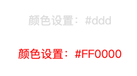
#xxxxxx
#When all x in xxxxxx (x is a hexadecimal number) are the same, it can be abbreviated as #xxx.
As follows:
<!DOCTYPE html>
<html lang="en">

<head>
    <meta charset="UTF-8">
    <meta http-equiv="X-UA-Compatible" content="IE=edge">
    <meta name="viewport" content="width=device-width, initial-scale=1.0">
    <title>Document</title>
    <link rel="stylesheet" href="./css_reset.css">
    <style>
        div:first-of-type{
            color: #ddd;
        }
        div:last-of-type{
            color: #ff0000;
        }
    </style>
</head>

<body>
    <div>Color settings:#ddd</div>
    <div>Color settings:#FF0000</div>
</body>

</html>
Render results:
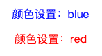
word
You can directly use words to set colors, such as color:red; Or color:blue; Wait.
As follows:
<!DOCTYPE html>
<html lang="en">

<head>
    <meta charset="UTF-8">
    <meta http-equiv="X-UA-Compatible" content="IE=edge">
    <meta name="viewport" content="width=device-width, initial-scale=1.0">
    <title>Document</title>
    <link rel="stylesheet" href="./css_reset.css">
    <style>
        div:first-of-type{
            color: blue;
        }
        div:last-of-type{
            color: red;
        }
    </style>
</head>

<body>
    <div>Color settings: blue</div>
    <div>Color settings: red</div>
</body>

</html>
Render results:
rgb(xxx, xxx, xxx)
RGB is the three primary colors, red, green and blue. The format is color:rgb(0~255, 0~255, 0~255), and the numbers in parentheses can also be replaced by words.
As follows:
<!DOCTYPE html>
<html lang="en">

<head>
    <meta charset="UTF-8">
    <meta http-equiv="X-UA-Compatible" content="IE=edge">
    <meta name="viewport" content="width=device-width, initial-scale=1.0">
    <title>Document</title>
    <link rel="stylesheet" href="./css_reset.css">
    <style>
        div:first-of-type {
            color: rgb(0, 0, 255);
        }

        div:last-of-type {
            color: rgb(255, 0, 0);
        }
    </style>
</head>

<body>
    <div>Color settings: blue</div>
    <div>Color settings: red</div>
</body>

</html>
Render results:
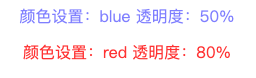
rgba(xxx, xxx, xxx, n)
Compared with rgb, rgba has the fourth digit n in the brackets, and the range of n is 0-1, which is used to specify transparency.
As follows:
<!DOCTYPE html>
<html lang="en">

<head>
    <meta charset="UTF-8">
    <meta http-equiv="X-UA-Compatible" content="IE=edge">
    <meta name="viewport" content="width=device-width, initial-scale=1.0">
    <title>Document</title>
    <link rel="stylesheet" href="./css_reset.css">
    <style>
        div:first-of-type {
            color: rgba(0, 0, 255, .5);
        }

        div:last-of-type {
            color: rgba(255, 0, 0, .8);
        }
    </style>
</head>

<body>
    <div>Color settings: blue Transparency: 50%</div>
    <div>Color settings: red Transparency: 80%</div>
</body>

</html>
Render results:
RGB color comparison table
The following is the RGB color comparison table:
Picture format
Common image formats include jpg, jpeg, png, gif, svg, tif, tiff, etc. they all have different purposes. The following is a brief description of these formats:
-
jpg/jpeg: best for saving photos or lifelike images.
Most computer and network users mainly use JPEG files to upload, download or view images online. Saving in JPEG can compress photos and use a fairly small file size, so you can download and upload them faster. This means that using JPEG can obtain high-quality images without taking up a lot of space. JPEG should be the preferred storage file when uploading or downloading images from the network
-
png: most suitable for screen capture and saving with transparent background
Png files are mainly used by graphic designers, marketers who use brands and logos, and network users who have a lot of space to save content on computers. PNG is usually used to edit an image on an image or edit text on an image. This is because saving as PNG allows images or graphics to be placed on a transparent background, so you can create a logo overlay. Png also provides "clearer" images than JPEG for lines or text, so they are often used for screen shots. Since PNG takes up a lot of space compared with JPEG files, it is best to avoid using them unless you need a transparent background image or the file size is not a problem
-
svg: best for saving graphics that need to be enlarged or reduced digitally
Svg files are mainly used by Web designers. The images and graphics processed by these designers will be displayed and used on many media of different sizes. Saving in SVG can achieve seamless scaling, or allow graphics to be clearly displayed (or enlarged) on screens of different sizes without loss of image quality or "pixelation". Logos are usually created using SVG files because logos are usually displayed on the retinal screen or need to be zoomed in and out without degrading quality
-
gif: best for saving images or short animations with limited colors, or graphics with limited colors
Historically, GIF files were mainly used to store graphics or images with limited colors, and did not occupy a lot of storage space. In today's world, GIF is mainly used as interesting and short loop animation on the Internet, between message platforms and in popular culture. Although animated gifs take up much less storage space than video, they take up more space than SVG or PNG. This storage problem, in addition to some intermittent delivery (and limited chromatography) of animation cycles, may also make GIF animation files less popular than SVG or PNG files
-
tif, tiff: best for saving images to be printed
TIFF files are mainly used by graphic designers dealing with printed materials. When using digital media (images and graphics used by the network, e-mail, etc.), tiff is probably not your preferred media because it obviously lacks digital support. Although saving in TIFF allows you to save layers and represent many colors in graphics or photos, it is not a file supported by all Web browsers or applications, and it cannot be well compressed, so it is only suitable for printing