grid layout
Basic introduction
The grid layout of CSS is also called grid layout, which is a new layout method.
Grid layout is a two-dimensional system, which means that it can process columns and rows at the same time. Similar to elastic layout, grid system is also used by wrapping grid elements in grid containers.
For grid layout, its idea is actually very simple. Draw an area into a grid, and then fill in the elements.
As a learner, you should learn grid layout from the following two perspectives:
- How to draw a grid container
- How to put elements into an area in the grid container
It is worth mentioning that some old browsers do not have good support for grid layout, so the application scenarios of this technology are actually less than traditional floating layout and elastic layout.
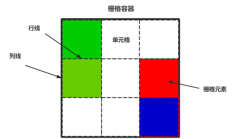
Grid Container
Container declaration
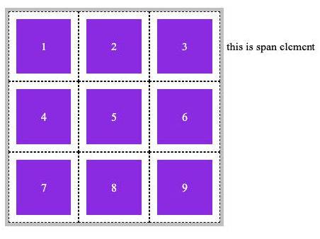
Use display: grid or display: inline GID to declare an element as a grid container.
- Grid: block level grid container, exclusive row
- Inline grid: inline block level grid container without exclusive row
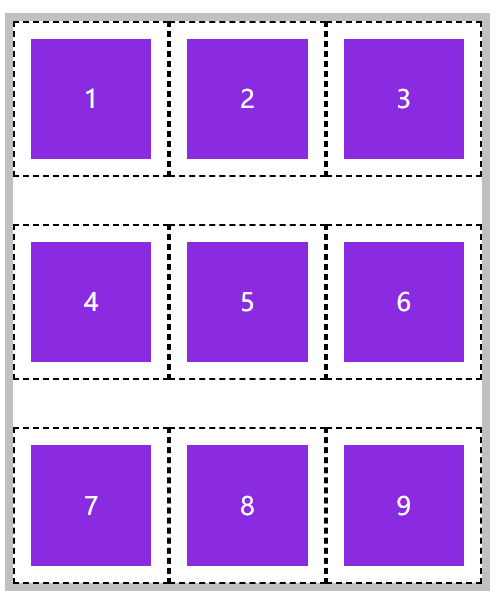
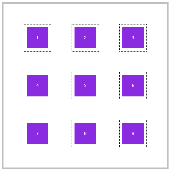
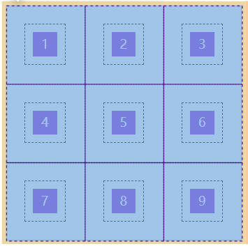
First declare the grid, that is, the block level grid container. You can see that the container itself has an exclusive row:
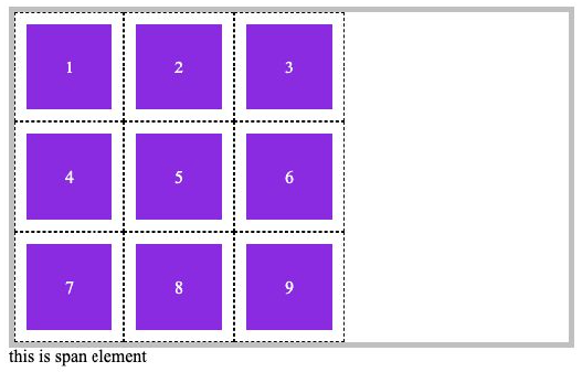
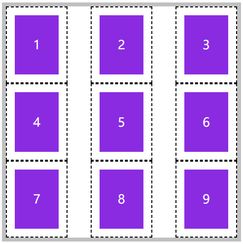
The second is the inline grid, that is, the inline block level grid container. The container itself will not monopolize a row:
Code example:
<!DOCTYPE html>
<html lang="en">

<head>
    <meta charset="UTF-8">
    <meta http-equiv="X-UA-Compatible" content="IE=edge">
    <meta name="viewport" content="width=device-width, initial-scale=1.0">
    <title>Document</title>
    <link rel="stylesheet" href="./css_reset.css">
    <style>
        main {
            border: solid 5px silver;
            /* Declaration container */
            display: inline-grid;
            /*
            display: grid;
            display: inline-grid;
            */


            /* Divide rows and columns */
            grid-template-rows: repeat(3, 100px);
            grid-template-columns: repeat(3, 100px);
        }

        main div {
            background: blueviolet content-box;
            padding: 10px;
            border: 1px #000 dashed;
            text-align: center;
            line-height: 80px;
            color: #fff;
        }
    </style>
</head>

<body>
    <main>
        <div>1</div>
        <div>2</div>
        <div>3</div>
        <div>4</div>
        <div>5</div>
        <div>6</div>
        <div>7</div>
        <div>8</div>
        <div>9</div>
    </main>
    <span>this is span element</span>
</body>

</html>
Row and column division of grid container
Divide rows and columns
It is useless to have a grid container. We also need to divide the grid container into rows and columns and specify the width.
- Grid template rows: number of rows divided
- Grid template columns: number of divided columns
The following describes several ways to divide rows and columns.
Fixed width and height
If we want to draw a grid container with fixed width and height of 2 rows and 3 columns, we can use the following method:
- grid-template-rows: 100px 100px;
- grid-template-columns: 100px 100px 100px;
Rendering result, height 200px, style 300px:
Code example:
<!DOCTYPE html>
<html lang="en">

<head>
    <meta charset="UTF-8">
    <meta http-equiv="X-UA-Compatible" content="IE=edge">
    <meta name="viewport" content="width=device-width, initial-scale=1.0">
    <title>Document</title>
    <link rel="stylesheet" href="./css_reset.css">
    <style>
        main {
            border: solid 5px silver;
            /* Declaration container */
            display: inline-grid;
            /* Divide rows and columns */
            grid-template-rows: 100px 100px;
            grid-template-columns: 100px 100px 100px;
        }

        main div {
            background: blueviolet content-box;
            padding: 10px;
            border: 1px #000 dashed;
            text-align: center;
            line-height: 80px;
            color: #fff;
        }
    </style>
</head>

<body>
    <main>
        <div>1</div>
        <div>2</div>
        <div>3</div>
        <div>4</div>
        <div>5</div>
        <div>6</div>
    </main>
</body>

</html>
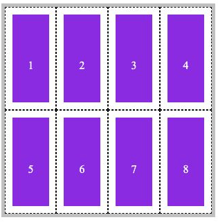
Percentage width and height
Use percentages to draw row and column lines. In this way, you must first specify the width and height of the grid container.
As shown in the following example, draw 2 rows and 4 columns of lines for a 300 * 300 grid container:
- grid-template-rows: 50% 50%;
- grid-template-columns: 25% 25% 25% 25%;
Render results:
Code example:
<!DOCTYPE html>
<html lang="en">

<head>
    <meta charset="UTF-8">
    <meta http-equiv="X-UA-Compatible" content="IE=edge">
    <meta name="viewport" content="width=device-width, initial-scale=1.0">
    <title>Document</title>
    <link rel="stylesheet" href="./css_reset.css">
    <style>
        main {
            border: solid 5px silver;
            width: 300px;
            height: 300px;
            /* Declaration container */
            display: inline-grid;
            /* Divide rows and columns */
            grid-template-rows: 50% 50%;
            grid-template-columns: 25% 25% 25% 25%;
        }

        main div {
            background: blueviolet content-box;
            padding: 10px;
            border: 1px #000 dashed;
            text-align: center;
            line-height: 150px;
            color: #fff;
        }
    </style>
</head>

<body>
    <main>
        <div>1</div>
        <div>2</div>
        <div>3</div>
        <div>4</div>
        <div>5</div>
        <div>6</div>
        <div>7</div>
        <div>8</div>
    </main>
</body>

</html>
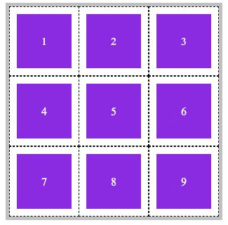
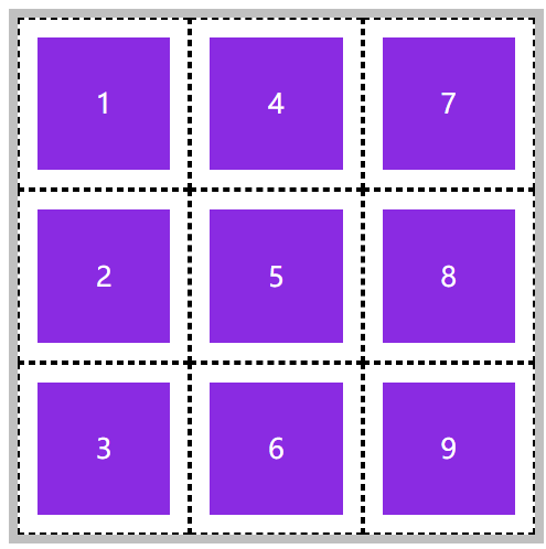
Repeated division
If the spacing of each row or column is the same, you can directly use repeat drawing to divide rows and columns more easily.
- grid-template-rows: repeat(3, 100px);
- grid-template-columns: repeat(3, 100px);
Code example:
<!DOCTYPE html>
<html lang="en">

<head>
    <meta charset="UTF-8">
    <meta http-equiv="X-UA-Compatible" content="IE=edge">
    <meta name="viewport" content="width=device-width, initial-scale=1.0">
    <title>Document</title>
    <link rel="stylesheet" href="./css_reset.css">
    <style>
        main {
            border: solid 5px silver;
            /* Declaration container */
            display: inline-grid;
            /* Divide rows and columns */
            grid-template-rows: repeat(3, 100px);
            grid-template-columns: repeat(3, 100px);
        }

        main div {
            background: blueviolet content-box;
            padding: 10px;
            border: 1px #000 dashed;
            text-align: center;
            line-height: 80px;
            color: #fff;
        }
    </style>
</head>

<body>
    <main>
        <div>1</div>
        <div>2</div>
        <div>3</div>
        <div>4</div>
        <div>5</div>
        <div>6</div>
        <div>7</div>
        <div>8</div>
        <div>9</div>
    </main>
</body>

</html>
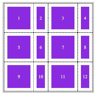
We can also draw cells with different widths repeatedly. For example, the columns of odd items should be wider and the columns of even items should be narrower:
- grid-template-rows: repeat(3, 100px);
- grid-template-columns: repeat(2, 100px 50px);
Code example:
<!DOCTYPE html>
<html lang="en">

<head>
    <meta charset="UTF-8">
    <meta http-equiv="X-UA-Compatible" content="IE=edge">
    <meta name="viewport" content="width=device-width, initial-scale=1.0">
    <title>Document</title>
    <link rel="stylesheet" href="./css_reset.css">
    <style>
        main {
            border: solid 5px silver;
            /* Declaration container */
            display: inline-grid;
            /* Divide rows and columns */
            grid-template-rows: repeat(3, 100px);
            /*
            Repeat twice. The column width of odd items is 100px and that of even items is 50px
            Final total number of columns = number of repetitions * number of subsequent columns
            That is, 2 * 2 = 4 columns
            */
            grid-template-columns: repeat(2, 100px 50px);
        }

        main div {
            background: blueviolet content-box;
            padding: 10px;
            border: 1px #000 dashed;
            text-align: center;
            line-height: 80px;
            color: #fff;
        }
    </style>
</head>

<body>
    <main>
        <div>1</div>
        <div>2</div>
        <div>3</div>
        <div>4</div>
        <div>5</div>
        <div>6</div>
        <div>7</div>
        <div>8</div>
        <div>9</div>
        <div>10</div>
        <div>11</div>
        <div>12</div>
    </main>
</body>

</html>
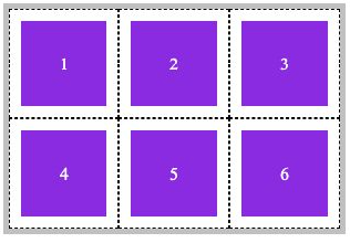
Automatic division
Automatic division means that you do not specify how many rows or columns to divide, but only give him a specific value of the proportion of rows and columns. It will be divided automatically according to the size of the container.
We want to draw in a grid container with a width and height of 300px, and the width and height of each cell are 100px, so set it and give it to him to draw automatically.
- grid-template-rows: repeat(auto-fill, 100px);
- grid-template-columns: repeat(auto-fill, 100px);
Code example:
<!DOCTYPE html>
<html lang="en">

<head>
    <meta charset="UTF-8">
    <meta http-equiv="X-UA-Compatible" content="IE=edge">
    <meta name="viewport" content="width=device-width, initial-scale=1.0">
    <title>Document</title>
    <link rel="stylesheet" href="./css_reset.css">
    <style>
        main {
            width: 300px;
            height: 300px;

            border: solid 5px silver;
            /* Declaration container */
            display: inline-grid;
            /* Divide rows and columns */
            grid-template-rows: repeat(auto-fill, 100px);
            grid-template-columns: repeat(auto-fill, 100px);
        }

        main div {
            background: blueviolet content-box;
            padding: 10px;
            border: 1px #000 dashed;
            text-align: center;
            line-height: 80px;
            color: #fff;
        }
    </style>
</head>

<body>
    <main>
        <div>1</div>
        <div>2</div>
        <div>3</div>
        <div>4</div>
        <div>5</div>
        <div>6</div>
        <div>7</div>
        <div>8</div>
        <div>9</div>
    </main>
</body>

</html>
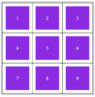
Division proportion
If your grid container has been set with width and height, we can divide the rows and columns according to the spatial scale. The unit is fr.
As shown below, this is a grid container with three rows and three columns. The height of the first and last rows is 3fr, the height of the middle row is 4fr, the width of the first and last columns is 2fr, and the width of the middle column is 6fr:
- grid-template-rows: 3fr 4fr 3fr;
- grid-template-columns: 2fr 6fr 2fr;
Code example:
<!DOCTYPE html>
<html lang="en">

<head>
    <meta charset="UTF-8">
    <meta http-equiv="X-UA-Compatible" content="IE=edge">
    <meta name="viewport" content="width=device-width, initial-scale=1.0">
    <title>Document</title>
    <link rel="stylesheet" href="./css_reset.css">
    <style>
        main {
            width: 300px;
            height: 300px;

            border: solid 5px silver;
            /* Declaration container */
            display: inline-grid;
            /* Divide rows and columns */
            grid-template-rows: 3fr 4fr 3fr;
            grid-template-columns: 2fr 6fr 2fr;
        }

        main div {
            background: blueviolet content-box;
            padding: 10px;
            border: 1px #000 dashed;
            text-align: center;
            line-height: 80px;
            color: #fff;
        }
    </style>
</head>

<body>
    <main>
        <div>1</div>
        <div>2</div>
        <div>3</div>
        <div>4</div>
        <div>5</div>
        <div>6</div>
        <div>7</div>
        <div>8</div>
        <div>9</div>
    </main>
</body>

</html>
Combination definition
Grid template is short for grid template rows, grid template columns and grid template areas.
However, we haven't introduced grid template areas yet, so we only demonstrate using grid template to divide rows and columns.
As follows, a grid container with 3 rows, 3 columns, width and height of 100px will be constructed by combining definitions:
- Note: first, then
- grid-template: repeat(3, 100px) / repeat(3, 100px);
Code example:
<!DOCTYPE html>
<html lang="en">

<head>
    <meta charset="UTF-8">
    <meta http-equiv="X-UA-Compatible" content="IE=edge">
    <meta name="viewport" content="width=device-width, initial-scale=1.0">
    <title>Document</title>
    <link rel="stylesheet" href="./css_reset.css">
    <style>
        main {
            border: solid 5px silver;
            /* Declaration container */
            display: inline-grid;
            /* Divide rows and columns first and then columns */
            grid-template: repeat(3, 100px) / repeat(3, 100px);
        }

        main div {
            background: blueviolet content-box;
            padding: 10px;
            border: 1px #000 dashed;
            text-align: center;
            line-height: 80px;
            color: #fff;
        }
    </style>
</head>

<body>
    <main>
        <div>1</div>
        <div>2</div>
        <div>3</div>
        <div>4</div>
        <div>5</div>
        <div>6</div>
        <div>7</div>
        <div>8</div>
        <div>9</div>
    </main>
</body>

</html>
minmax partition
If your grid container is set with width and height, and the width and height of the cells in the grid container is greater than the width and height of the overall grid container, overflow will occur.
When dividing rows and columns, we can specify minmax and set a dynamic value for row lines or column lines to prevent overflow.
In the above example, the width and height of the grid container are 200px and 300px, but the row and column division is set to 100px for 3 columns and 3 rows, resulting in column overflow.
At this time, we can set minmax during column division to automatically shrink or expand cells:
- Interpretation: there are 3 column lines, with the minimum value range of 50px and the maximum value range of 100px
- grid-template: repeat(3, 100px) / repeat(3, minmax(50px, 100px));
Definition of spacing between grid containers
Row gap
Each element in the grid container is now close together. We can margin or padding the grid elements themselves to leave a gap between them, or we can use the method provided by the grid container.
Use row gap to set row spacing.
<!DOCTYPE html>
<html lang="en">

<head>
        <meta charset="UTF-8">
        <meta name="viewport" content="width=device-width, initial-scale=1.0">
        <title>Document</title>
        <style>
                * {
                        padding: 0;
                        margin: 0;
                }

                body {
                        padding: 100px;
                }

                main {
                        width: 300px;
                        /* height: 300px; */

                        border: solid 5px silver;
                        display: grid;

                        /* Number of rows, number of columns */
                        grid-template: repeat(3,100px)/repeat(3,minmax(50px,100px));
                        /* Row spacing */
                        row-gap:30px ;
                }

                section {
                        background-color: blueviolet;
                        background-clip: content-box;
                        padding: 10px;
                        border: dashed 1px black;

                        text-align: center;
                        line-height: 78px;
                        color: #fff;
                }
        </style>
</head>

<body>

        <main>
                <section>1</section>
                <section>2</section>
                <section>3</section>
                <section>4</section>
                <section>5</section>
                <section>6</section>
                <section>7</section>
                <section>8</section>
                <section>9</section>
        </main>

</body>

</html>
Column gap
Use column gap to define column spacing.
<!DOCTYPE html>
<html lang="en">

<head>
        <meta charset="UTF-8">
        <meta name="viewport" content="width=device-width, initial-scale=1.0">
        <title>Document</title>
        <style>
                * {
                        padding: 0;
                        margin: 0;
                }

                body {
                        padding: 100px;
                }

                main {
                        width: 300px;
                        /* height: 300px; */

                        border: solid 5px silver;
                        display: grid;

                        /* Number of rows, number of columns */
                        grid-template: repeat(3,100px)/repeat(3,minmax(50px,100px));
                        /* Column spacing */
                        column-gap:30px ;
                }

                section {
                        background-color: blueviolet;
                        background-clip: content-box;
                        padding: 10px;
                        border: dashed 1px black;

                        text-align: center;
                        line-height: 78px;
                        color: #fff;
                }
        </style>
</head>

<body>

        <main>
                <section>1</section>
                <section>2</section>
                <section>3</section>
                <section>4</section>
                <section>5</section>
                <section>6</section>
                <section>7</section>
                <section>8</section>
                <section>9</section>
        </main>

</body>

</html>
Combination definition gap
gap rules can be used to define row and column spacing at one time. If the spacing is the same, only one value can be set.
<!DOCTYPE html>
<html lang="en">

<head>
        <meta charset="UTF-8">
        <meta name="viewport" content="width=device-width, initial-scale=1.0">
        <title>Document</title>
        <style>
                * {
                        padding: 0;
                        margin: 0;
                }

                body {
                        padding: 100px;
                }

                main {
                        width: 300px;
                        /* height: 300px; */

                        border: solid 5px silver;
                        display: grid;

                        /* Number of rows, number of columns */
                        grid-template: repeat(3,100px)/repeat(3,minmax(50px,100px));
                        /* Row row spacing */
                        gap:30px ;
                }

                section {
                        background-color: blueviolet;
                        background-clip: content-box;
                        padding: 10px;
                        border: dashed 1px black;

                        text-align: center;
                        line-height: 78px;
                        color: #fff;
                }
        </style>
</head>

<body>

        <main>
                <section>1</section>
                <section>2</section>
                <section>3</section>
                <section>4</section>
                <section>5</section>
                <section>6</section>
                <section>7</section>
                <section>8</section>
                <section>9</section>
        </main>

</body>

</html>
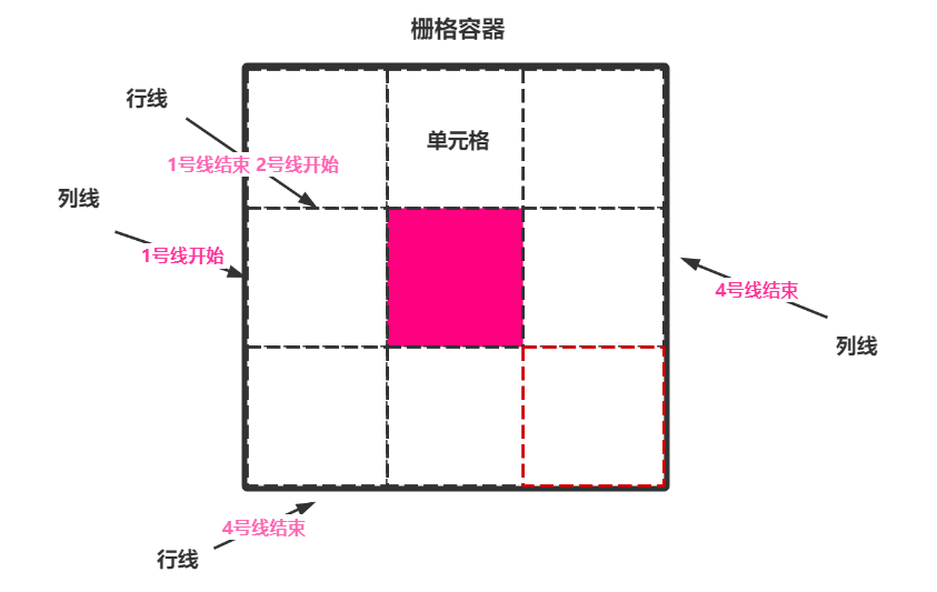
Grid line naming of grid container
Basic knowledge
It can be found that the data with at least 2 lines can locate the location of a grid element.
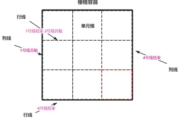
If we want to put the element in the middle, we can set it as follows:
- Line start position: start position of line 2 or end position of line 1
- Column line start position: start position of line 2 or end position of line 1
- Line end position: starting position of line 3 or ending position of line 2
- Column line end position: starting position of line 3 or ending position of line 2
In this way, we can position the element in the middle of the container, and the size occupies only 1 cell.
Independent naming
We can name each grid line independently. Now let's implement the pseudo code above.
- grid-template-rows: [r1-start] 100px [r1-end r2-start] 100px [r2-end r3-start] 100px [r3-end];
- grid-template-columns: [c1-start] 100px [c1-end c2-start] 100px [c2-start c3-start] 100px [c3-end];
Each line can have multiple names, and any name can be used when using it.
When we need to locate, we use the following format to locate an element:
- grid-row-start: r2-start;
- grid-column-start:c1-end;
- grid-row-end: r2-end;
- grid-column-end: c3-start;
be careful! The default grid container will not display grid lines. At this time, you need to open the check function of the browser to see grid lines.
<!DOCTYPE html>
<html lang="en">

<head>
    <meta charset="UTF-8">
    <meta name="viewport" content="width=device-width, initial-scale=1.0">
    <title>Document</title>
    <style>
        * {
            padding: 0;
            margin: 0;
        }

        body {
            padding: 100px;
        }

        main {
            width: 300px;
            /* height: 300px; */

            border: solid 5px silver;
            display: grid;

            /* Number of rows, number of columns */
            grid-template-rows: [r1-start] 100px [r1-end r2-start] 100px [r2-end r3-start] 100px [r3-end];
            grid-template-columns: [c1-start] 100px [c1-end c2-start] 100px [c2-start c3-start] 100px [c3-end];
        }

        section {
            background-color: blueviolet;
            background-clip: content-box;
            padding: 10px;
            border: dashed 1px black;

            text-align: center;
            line-height: 78px;
            color: #fff;

            grid-row-start: r2-start;
            grid-column-start: c1-end;
            grid-row-end: r2-end;
            grid-column-end: c3-start;
        }
    </style>
</head>

<body>

    <main>
        <section>middle</section>
    </main>

</body>

</html>
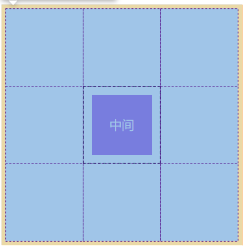
Automatic naming
For the grid container that is set repeatedly, the system will automatically name it, and use r1 and c2 to locate the grid.
- r stands for bank
- c stands for column
Repeat setting, naming prefix:
- grid-template-rows: repeat(3, [r-start] 100px [r-end]);
- grid-template-columns: repeat(3, [c-start] 100px [c-end]);
When positioning with automatically named grid lines, it should follow the following format:
- grid-row-start: r-start 2;
- grid-column-start: c-start 2;
- grid-row-end: r-start 2;
- grid-column-end: c-end 2;
<!DOCTYPE html>
<html lang="en">

<head>
    <meta charset="UTF-8">
    <meta name="viewport" content="width=device-width, initial-scale=1.0">
    <title>Document</title>
    <style>
        * {
            padding: 0;
            margin: 0;
        }

        body {
            padding: 100px;
        }

        main {
            width: 300px;
            /* height: 300px; */

            border: solid 5px silver;
            display: grid;

            /* Number of rows, number of columns */
            grid-template-rows: repeat(3, [r-start] 100px [r-end]);
            grid-template-columns: repeat(3, [c-start] 100px [c-end]);

        }

        section {
            background-color: blueviolet;
            background-clip: content-box;
            padding: 10px;
            border: dashed 1px black;

            text-align: center;
            line-height: 78px;
            color: #fff;

            grid-row-start: r-start 2;
            grid-column-start: c-start 2;
            grid-row-end: r-start 2;
            grid-column-end: c-end 2;

        }
    </style>
</head>

<body>

    <main>
        <section>middle</section>
    </main>

</body>

</html>
Element positioning of grid elements
Positioning method
We can use the following methods to locate grid elements, but there are many ways to locate them.
| option | describe |
|---|---|
| grid-row-start | Row start grid line |
| grid-row-end | Line end grid line |
| grid-column-start | Column start grid line |
| grid-column-end | Column end grid line |
Grid line location
Grid line location is actually counting the horizontal and vertical lines.
It is still the old method to specify the position of row start line and row end line, as well as the position of column start line and column end line.
As you can see, simple counting is very simple and rough.
- grid-row-start: 2;
- grid-column-start: 2;
- grid-row-end: 2;
- grid-column-end: 2;

<!DOCTYPE html>
<html lang="en">

<head>
    <meta charset="UTF-8">
    <meta name="viewport" content="width=device-width, initial-scale=1.0">
    <title>Document</title>
    <style>
        * {
            padding: 0;
            margin: 0;
        }

        body {
            padding: 100px;
        }

        main {
            width: 300px;
            /* height: 300px; */

            border: solid 5px silver;
            display: grid;

            /* Number of rows, number of columns */
            grid-template-rows: repeat(3, 100px);
            grid-template-columns: repeat(3, 100px);

        }

        section {
            background-color: blueviolet;
            background-clip: content-box;
            padding: 10px;
            border: dashed 1px black;

            text-align: center;
            line-height: 78px;
            color: #fff;

            grid-row-start: 2;
            grid-column-start: 2;
            grid-row-end: 2;
            grid-column-end: 2;

        }
    </style>
</head>

<body>

    <main>
        <section>middle</section>
    </main>

</body>

</html>
Grid line name positioning
We said that grid lines have independent naming and automatic naming.
You can also locate according to the grid line name. There is no example here. For details, see the chapter on grid line naming.
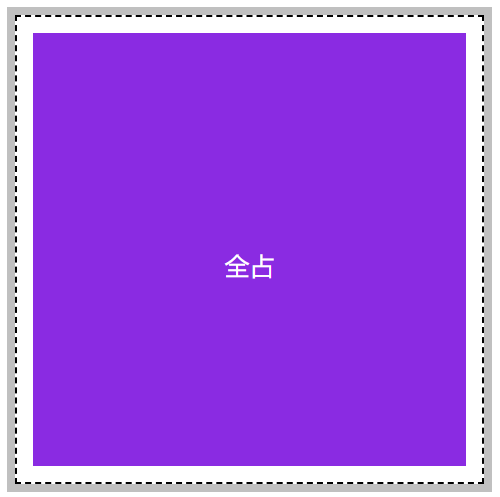
Offset location
In fact, this is also relatively simple. We only need to specify the starting position of the row line and the starting position of the column line. The end is also counting. Use span to count. Go back one line or two lines.
- grid-row-start: 1;
- grid-column-start: 1;
- /*Represents 3 lines backward from the starting position of the line*/
- grid-row-end: span 3;
- /*Represents 3 lines backward from the starting position of the column line*/
- grid-column-end: span 3;
<!DOCTYPE html>
<html lang="en">

<head>
    <meta charset="UTF-8">
    <meta name="viewport" content="width=device-width, initial-scale=1.0">
    <title>Document</title>
    <style>
        * {
            padding: 0;
            margin: 0;
        }

        body {
            padding: 100px;
        }

        main {
            width: 300px;
            /* height: 300px; */

            border: solid 5px silver;
            display: grid;

            /* Number of rows, number of columns */
            grid-template-rows: repeat(3, 100px);
            grid-template-columns: repeat(3, 100px);

        }

        section {
            background-color: blueviolet;
            background-clip: content-box;
            padding: 10px;
            border: dashed 1px black;

            text-align: center;
            line-height: 300px;
            color: #fff;

            grid-row-start: 1;
            grid-column-start: 1;
            /* Represents 3 lines backward from the starting position of the line */
            grid-row-end: span 3;
            /* Represents 3 lines backward from the starting position of the column line */
            grid-column-end: span 3;

        }
    </style>
</head>

<body>

    <main>
        <section>Total occupation</section>
    </main>

</body>

</html>
Abbreviation mode
You can use grid row to set the start grid line and grid column to set the end grid line.
- grid-row: 3/span 3;
- grid-column: 2/span 3;
<!DOCTYPE html>
<html lang="en">
<head>
<meta charset="UTF-8">
<meta name="viewport" content="width=device-width, initial-scale=1.0">
<title>Document</title>
<style>
* {
padding: 0;
margin: 0;
}
body {
padding: 100px;
}
main {
width: 300px;
/* height: 300px; */
border: solid 5px silver;
display: grid;
/* Number of rows, number of columns */
grid-template-rows: repeat(3, 100px);
grid-template-columns: repeat(3, 100px);
}
section {
background-color: blueviolet;
background-clip: content-box;
padding: 10px;
border: dashed 1px black;
text-align: center;
line-height: 78px;
color: #fff;
grid-row: 3/span 3;
grid-column: 2/span 3;
}
</style>
</head>
<body>
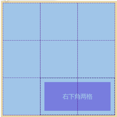
<main>
<section>Two spaces in the lower right corner</section>
</main>
</body>
</html>
Minimalist mode
Grid area is another abbreviation for the above abbreviation pattern grid row and grid column. Its syntax structure is as follows:
- Line start / column start / line end / column end
- grid-area: 2/1/span 1/span 3;
<!DOCTYPE html>
<html lang="en">
<head>
<meta charset="UTF-8">
<meta name="viewport" content="width=device-width, initial-scale=1.0">
<title>Document</title>
<style>
* {
padding: 0;
margin: 0;
}
body {
padding: 100px;
}
main {
width: 300px;
/* height: 300px; */
border: solid 5px silver;
display: grid;
/* Number of rows, number of columns */
grid-template-rows: repeat(3, 100px);
grid-template-columns: repeat(3, 100px);
}
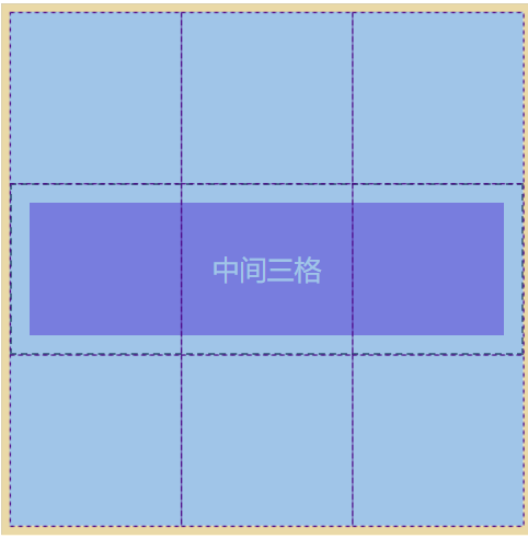
section {
background-color: blueviolet;
background-clip: content-box;
padding: 10px;
border: dashed 1px black;
text-align: center;
line-height: 78px;
color: #fff;
grid-area: 2/1/span 1/span 3;
}
</style>
</head>
<body>
<main>
<section>Middle three grid</section>
</main>
</body>
</html>
bootstrap grid principle
The grid system in bootstrap divides the whole grid container into 12 blocks. In fact, its principle is very simple.
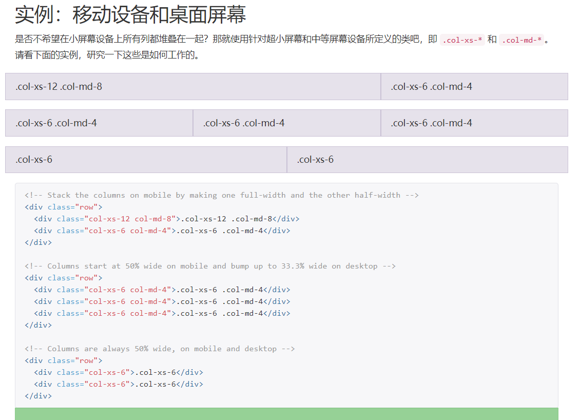
We can also develop similar components with our current knowledge, as shown in the following figure:
<!DOCTYPE html>
<html lang="en">
<head>
<meta charset="UTF-8">
<meta name="viewport" content="width=device-width, initial-scale=1.0">
<title>Document</title>
<style>
* {
padding: 0;
margin: 0;
}
body {
padding: 100px;
}
.row {
padding: 10px;
width: 600px;
border: solid 5px silver;
display: grid;
grid-template-columns: repeat(12, 1fr);
gap: 10px 10px;
}
.col-1 {
grid-column-end: span 1;
}
.col-2 {
grid-column-end: span 2;
}
.col-3 {
grid-column-end: span 3;
}
.col-4 {
grid-column-end: span 4;
}
.col-5 {
grid-column-end: span 5;
}
.col-6 {
grid-column-end: span 6;
}
.col-7 {
grid-column-end: span 7;
}
.col-8 {
grid-column-end: span 8;
}
.col-9 {
grid-column-end: span 9;
}
.col-10 {
grid-column-end: span 10;
}
.col-11 {
grid-column-end: span 11;
}
.col-12 {
grid-column-end: span 12;
}
[class^="col-"] {
background-color: blueviolet;
background-clip: content-box;
height: 30px;
text-align: center;
color: #fff;
}
</style>
</head>
<body>
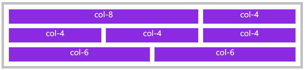
<main>
<div class="row">
<section class="col-8">col-8</section>
<section class="col-4">col-4</section>
<section class="col-4">col-4</section>
<section class="col-4">col-4</section>
<section class="col-4">col-4</section>
<section class="col-6">col-6</section>
<section class="col-6">col-6</section>
</div>
</main>
</body>
</html>
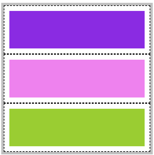
Grid area of grid container
Basic introduction
A grid area is simply an area composed of a pile of grid cells, and a cell is also an area.
We can use grid area to place elements more conveniently instead of slowly counting lines. Grid area placement elements are usually used in large layouts.
When using grid template areas to declare grid areas, it should be noted that the grid area placement elements must be rectangular.
You cannot place an element like this:
Area naming
Let's take a simple example of how to use grid template areas to name grid areas and fill in elements.
<!DOCTYPE html>
<html lang="en">
<head>
<meta charset="UTF-8">
<meta name="viewport" content="width=device-width, initial-scale=1.0">
<title>Document</title>
<style>
* {
padding: 0;
margin: 0;
}
body {
padding: 100px;
}
main {
width: 300px;
/* height: 300px; */
border: solid 5px silver;
display: grid;
/* Number of rows, number of columns */
grid-template-rows: repeat(3, 100px);
grid-template-columns: repeat(3, 100px);
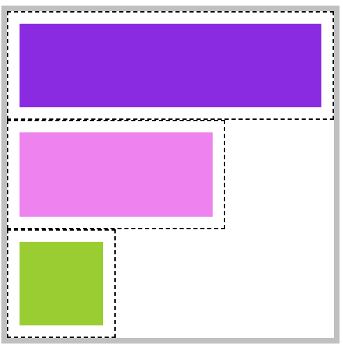
grid-template-areas:
"top top top"
"mid mid mid"
"bottom bottom bottom";
/* Since 9 * 9 cells are drawn, we must name each cell, and it must be in this format*/
}
main * {
background-clip: content-box;
padding: 10px;
border: dashed 1px black;
}
main header {
/* The following abbreviations are recommended for complete writing*/
/* grid-area: top-start/top-start//top-start/top-end/top-end/top-end; */
grid-area: top;
background-color: blueviolet;
}
main article {
grid-area: mid;
background-color: violet;
}
main footer {
grid-area: bottom;
background-color: yellowgreen;
}
</style>
</head>
<body>
<main>
<header></header>
<article></article>
<footer></footer>
</main>
</body>
</html>
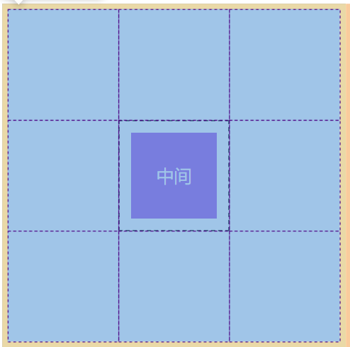
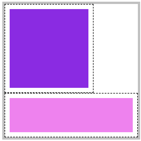
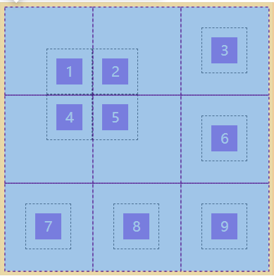
Automatic naming
The column and row lines of each cell in the grid container will be named automatically according to the cell name, as shown in the following figure:
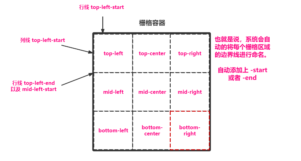
Carry out the experiment according to the name in the figure:
<!DOCTYPE html>
<html lang="en">

<head>
    <meta charset="UTF-8">
    <meta name="viewport" content="width=device-width, initial-scale=1.0">
    <title>Document</title>
    <style>
        * {
            padding: 0;
            margin: 0;
        }

        body {
            padding: 100px;
        }

        main {
            width: 300px;
            /* height: 300px; */

            border: solid 5px silver;
            display: grid;

            /* Number of rows, number of columns */
            grid-template-rows: repeat(3, 100px);
            grid-template-columns: repeat(3, 100px);

            grid-template-areas:
                "top-left top-center top-right"
                "mid-left mid-center mid-right"
                "bottom-left bottom-center bottom-right";

            /* Since 9 * 9 cells are drawn, we must name each cell, and it must be in this format*/

        }

        main * {
            background-clip: content-box;
            padding: 10px;
            border: dashed 1px black;
        }

        main div:first-of-type {
            grid-area: top-left-start/top-left-start/mid-center-end/mid-center-end;
            background-color: blueviolet;
        }

        main div:last-of-type {
            grid-area: bottom-left-start/bottom-left-start/bottom-right-end/bottom-right-end;
            background-color: violet;
        }
    </style>
</head>

<body>

    <main>
        <div></div>
        <div></div>
    </main>

</body>

</html>
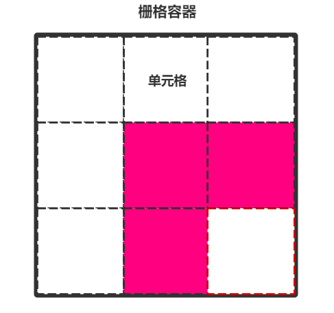
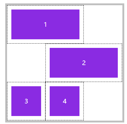
Placeholder naming
Grid area naming occupation means that if some areas don't want to name them, they can be named directly All right.
Why do you do this? We can understand by looking at the figure below and the code. When we divide the area, we have figured out what this area is for, how big it should be, and where there is excess, we can go directly Just occupy the space.
<!DOCTYPE html>
<html lang="en">

<head>
    <meta charset="UTF-8">
    <meta name="viewport" content="width=device-width, initial-scale=1.0">
    <title>Document</title>
    <style>
        * {
            padding: 0;
            margin: 0;
        }

        body {
            padding: 100px;
        }

        main {
            width: 300px;
            /* height: 300px; */

            border: solid 5px silver;
            display: grid;

            /* Number of rows, number of columns */
            grid-template-rows: repeat(3, 100px);
            grid-template-columns: repeat(3, 100px);

            grid-template-areas:
                "top top top"
                "mid mid ."
                "bottom . .";

            /* Because we drew 9 * 9 cells, we named each cell. It must be in this format*/

        }

        main * {
            background-clip: content-box;
            padding: 10px;
            border: dashed 1px black;
        }

        main header {
            /* The following abbreviations are recommended for complete writing*/
            /* grid-area: top-start/top-start//top-start/top-end/top-end/top-end; */
            grid-area: top;
            background-color: blueviolet;
        }

        main article {
            grid-area: mid;
            background-color: violet;
        }

        main footer {
            grid-area: bottom;
            background-color: yellowgreen;
        }
    </style>
</head>

<body>

    <main>
        <header></header>
        <article></article>
        <footer></footer>
    </main>

</body>

</html>
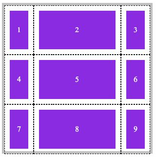
Element sorting of grid elements
sort order
By default, the whole grid elements are sorted in rows (horizontal). We can set the grid auto flow attribute in the container to change the sorting method of elements.
| value | describe |
|---|---|
| column | Sort by column |
| row | Arrange by row |
<!DOCTYPE html>
<html lang="en">

<head>
    <meta charset="UTF-8">
    <meta name="viewport" content="width=device-width, initial-scale=1.0">
    <title>Document</title>
    <style>
        * {
            padding: 0;
            margin: 0;
        }

        body {
            padding: 100px;
        }

        main {
            width: 300px;
            height: 300px;

            border: solid 5px silver;
            display: grid;

            /* Number of rows, number of columns */
            grid-template: repeat(3, 100px)/repeat(3, 100px);
            /* Sort by: vertical */
            grid-auto-flow: column;
        }

        section {
            background-color: blueviolet;
            background-clip: content-box;
            padding: 10px;
            border: dashed 1px black;

            text-align: center;
            line-height: 78px;
            color: #fff;
        }
    </style>
</head>

<body>

    <main>
        <section>1</section>
        <section>2</section>
        <section>3</section>
        <section>4</section>
        <section>5</section>
        <section>6</section>
        <section>7</section>
        <section>8</section>
        <section>9</section>
    </main>

</body>

</html>
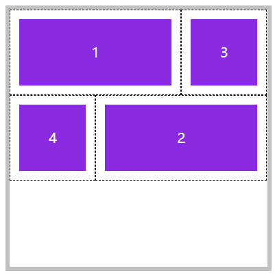
space filling
When the element cannot be placed in the grid, a line break will occur and a blank will be left. Use grid auto flow: row deny; You can fill a blank area.
As shown below, two spaces are generated.
After setting, it can be found that the positions of 1 and 2 have not changed, and 3 and 4 are filled up:
<!DOCTYPE html>
<html lang="en">

<head>
    <meta charset="UTF-8">
    <meta name="viewport" content="width=device-width, initial-scale=1.0">
    <title>Document</title>
    <style>
        * {
            padding: 0;
            margin: 0;
        }

        body {
            padding: 100px;
        }

        main {
            width: 300px;
            height: 300px;

            border: solid 5px silver;
            display: grid;

            /* Number of rows, number of columns */
            grid-template: repeat(3, 100px)/repeat(3, 100px);
            /* Sort by: fill space horizontally */
            grid-auto-flow: row dense;

        }

        section {
            background-color: blueviolet;
            background-clip: content-box;
            padding: 10px;
            border: dashed 1px black;

            text-align: center;
            line-height: 78px;
            color: #fff;
        }

        main section:nth-of-type(1) {
            /* The area from the first column line to the second column line */
            grid-column: 1/span 2;
        }

        main section:nth-of-type(2) {
            /* The area from the second column line to the next two */
            grid-column: 2/span 2;
        }
    </style>
</head>

<body>

    <main>
        <section>1</section>
        <section>2</section>
        <section>3</section>
        <section>4</section>
    </main>

</body>

</html>
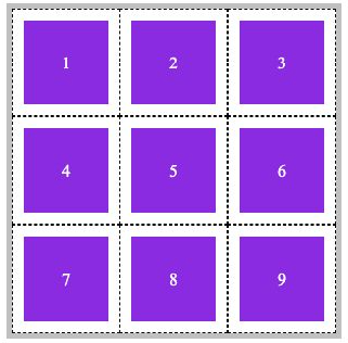
Alignment
alignment option
You can easily define the alignment of grid elements in the grid container through attributes. The available values include start | end | center | stretch | space between | space even | space around.
Here are the properties that provide alignment:
| attribute | describe | object |
|---|---|---|
| align-items | The vertical arrangement of all elements in the grid | Grid Container |
| justify-items | The horizontal arrangement of all elements in the grid | Grid Container |
| justify-content | The horizontal alignment of all grids in the container when the container has additional space | Grid Container |
| align-content | The vertical alignment of all grids in the container when the container has additional space | Grid Container |
| align-self | Vertical alignment of elements in the grid | Grid element |
| justify-self | Horizontal alignment of elements in the grid | Grid element |
The following are the values that can be filled in the attribute:
| value | describe |
|---|---|
| start | Elements are arranged in sort order |
| end | Elements are arranged in reverse order |
| center | Element in container |
| space-between | The first element depends on the starting point, the last element depends on the ending point, and the remaining elements allocate space equally |
| space-around | The spacing on both sides of each element is equal. Therefore, the spacing between items is twice as large as that between items and borders |
| space-evenly | Average distribution of distance between elements |
Overall area alignment
In fact, these are similar to the usage in elastic layout. You can take a look at the elastic layout written in the previous chapter. Here is an example of average distribution.
The average distribution refers to the alignment of the grid area (i.e. cells) in the grid container in the grid container.
Note: the grid container must have extra space.
Specify the alignment of all areas. Use justify content and align content:
<!DOCTYPE html>
<html lang="en">

<head>
    <meta charset="UTF-8">
    <meta name="viewport" content="width=device-width, initial-scale=1.0">
    <title>Document</title>
    <style>
        * {
            padding: 0;
            margin: 0;
        }

        body {
            padding: 100px;
        }

        main {
            width: 600px;
            /* The width and height should be large enough */
            height: 600px;

            border: solid 5px silver;
            display: grid;

            /* Number of rows, number of columns */
            grid-template: repeat(3, 100px)/repeat(3, 100px);
            /* Horizontal average */
            justify-content: space-evenly;
            /* Vertical average */
            justify-content: space-evenly;
            align-content: space-evenly;

        }

        section {

            background-color: blueviolet;
            background-clip: content-box;
            padding: 10px;
            border: dashed 1px black;

            text-align: center;
            line-height: 78px;
            color: #fff;
        }
    </style>
</head>

<body>

    <main>
        <section>1</section>
        <section>2</section>
        <section>3</section>
        <section>4</section>
        <section>5</section>
        <section>6</section>
        <section>7</section>
        <section>8</section>
        <section>9</section>
    </main>

</body>

</html>
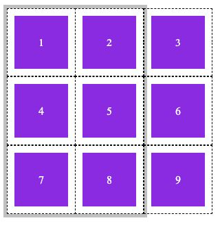
Align all elements
It refers to the alignment of specific grid elements in the grid area. For example, if a cell is too large, what should be done if the content is too small.
Specify the specific elements in all grid areas. Use: justify items and align items
Note: there must be extra space in the grid area.
<!DOCTYPE html>
<html lang="en">

<head>
    <meta charset="UTF-8">
    <meta name="viewport" content="width=device-width, initial-scale=1.0">
    <title>Document</title>
    <style>
        * {
            padding: 0;
            margin: 0;
        }

        body {
            padding: 100px;
        }

        main {
            width: 300px;
            height: 300px;

            border: solid 5px silver;
            display: grid;

            /* Number of rows, number of columns */
            grid-template: repeat(3, 100px)/repeat(3, 100px);

            /* Controls the position of specific elements in cells */
            justify-items: center;
            align-items: center;

        }

        section {
            background-color: blueviolet;
            background-clip: content-box;
            padding: 10px;
            border: dashed 1px black;

            text-align: center;
            color: #fff;

            width: 30px;
            height: 30px;
            line-height: 30px;

        }
    </style>
</head>

<body>

    <main>
        <section>1</section>
        <section>2</section>
        <section>3</section>
        <section>4</section>
        <section>5</section>
        <section>6</section>
        <section>7</section>
        <section>8</section>
        <section>9</section>
    </main>

</body>

</html>
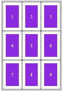
Single element alignment
If you want to control the alignment of individual elements, use justify self and align self.
Note: the grid area containing this element must have extra space.
<!DOCTYPE html>
<html lang="en">

<head>
    <meta charset="UTF-8">
    <meta name="viewport" content="width=device-width, initial-scale=1.0">
    <title>Document</title>
    <style>
        * {
            padding: 0;
            margin: 0;
        }

        body {
            padding: 100px;
        }

        main {
            width: 300px;
            height: 300px;

            border: solid 5px silver;
            display: grid;

            /* Number of rows, number of columns */
            grid-template: repeat(3, 100px)/repeat(3, 100px);

            /* Controls the position of specific elements in cells */
            justify-items: center;
            align-items: center;

        }

        section {
            background-color: blueviolet;
            background-clip: content-box;
            padding: 10px;
            border: dashed 1px black;

            text-align: center;
            color: #fff;

            width: 30px;
            height: 30px;
            line-height: 30px;

        }

        main section:nth-of-type(1) {
            justify-self: end;
            align-self: end;
        }

        main section:nth-of-type(2) {
            justify-self: start;
            align-self: end;
        }

        main section:nth-of-type(4) {
            justify-self: end;
            align-self: start;
        }

        main section:nth-of-type(5) {
            justify-self: start;
            align-self: start;
        }
    </style>
</head>

<body>

    <main>
        <section>1</section>
        <section>2</section>
        <section>3</section>
        <section>4</section>
        <section>5</section>
        <section>6</section>
        <section>7</section>
        <section>8</section>
        <section>9</section>
    </main>

</body>

</html>
Abbreviation mode
1) Place content is used to control the alignment of all areas in the grid. The syntax is as follows:
place-content: <align-content> <justify-content>
2) Place items is used to control the alignment of all elements in all areas. The syntax is as follows:
place-items: <align-items> <justify-items>
3) Place self is used to control the alignment of individual elements in the area. The syntax is as follows:
place-self: <align-self> <justify-self>