@
1. Introduction
Transform: it is one of the features of CSS3. It can realize the effects of element displacement, rotation, scaling and so on. It can be understood as "deformation".
- Moving: translate
- Rotation: rotate
- Scaling: scale
2. 2D conversion
1.) two dimensional plane coordinate system
-
2D conversion is a technology to change the position and shape of labels on a two-dimensional plane.
-
Two dimensional coordinate system

2.) 2D mobile translate
-
explain
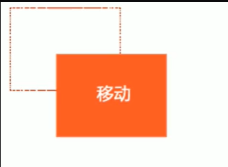
2D move translate is a function of 2D conversion, which can change the position of elements in the page, similar to positioning. (moving the box position in the page can be realized by box model, positioning and 2D movement)
-
grammar
-
x is the horizontal movement on the x axis
-
y is the horizontal movement on the y axis
transform: translate(x, y)
transform: translateX(n)
transfrom: translateY(n)
-
-
be careful ❕
- 2D movement mainly refers to horizontal and vertical movement.
- The biggest advantage of translate is that it does not affect the position of other elements.
- When the parameter in translate is percentage (% unit), the moving distance is calculated relative to its own width and height.
- Inline labels have no effect, while inline block and block level labels have this effect.
-
Code demonstration
div { background-color: lightseagreen; width: 200px; height: 100px; /* translation */ /* Horizontal and vertical movement 100px */ /* transform: translate(100px, 100px); */ /* Horizontal movement 100px */ /* transform: translate(100px, 0) */ /* Vertical movement 100px */ /* transform: translate(0, 100px) */ /* Horizontal movement 100px */ /* transform: translateX(100px); */ /* Vertical movement 100px */ transform: translateY(100px) } -
Center a box horizontally and vertically
 <style>
        div {
            position: relative;
            width: 500px;
            height: 500px;
            background-color: pink;
        }

        p {
            position: absolute;
            top: 50%;
            left: 50%;
            width: 200px;
            height: 200px;
            background-color: purple;
            /* margin-top: -100px;
            margin-left: -100px; */
            /* translate(-50%, -50%)  The advantage of this method is that if the size of the box is changed, the box is still horizontally and vertically centered, because its value is not written dead */
            transform: translate(-50%, -50%);
        }
    </style>
<body>
    <div>
        <p></p>
    </div>
</body>
3.) 2D rotate
-
explain
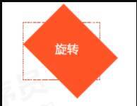
rotate: 2D rotation refers to rotating elements clockwise or counterclockwise in the 2D plane
-
rotate syntax
/* Unit: deg */
transform: rotate(degrees)
-
be careful ❕
- rotate is followed by degrees, and the unit is deg
- When the angle is positive, clockwise; when the angle is negative, counterclockwise
- The default center point of rotation is the center point of the element
-
Code demonstration
img:hover { transform: rotate(360deg) } -
triangle
Implementation code
 <style>
        div {
            position: relative;
            width: 249px;
            height: 35px;
            border: 1px solid #000;
        }

        div::after {
            content: "";
            position: absolute;
            top: 8px;
            right: 15px;
            width: 10px;
            height: 10px;
            border-right: 1px solid #000;
            border-bottom: 1px solid #000;
            transform: rotate(45deg);
            transition: all 0.2s;
        }
        /* The mouse rotates through the triangle inside the div */

        div:hover::after {
            transform: rotate(225deg);
        }
    </style>
<body>
    <div></div>
</body>
-
Set the element rotation center point (transform origin)
-
Transform origin basic syntax
transform-origin: x y;
-
be careful ❕
- Note that the following parameters x and y are separated by spaces
- The default rotation center point of X and Y is the center of the element (50%, 50%), which is equivalent to center center
- You can also set pixels or orientation nouns (top, bottom, left, right, center) for X and y
-
Rotation center case
Implementation code
 <style>
        div {
            overflow: hidden;
            width: 200px;
            height: 200px;
            margin: 100px auto;
            border: 1px solid #000;
        }

        div::before {
            content: 'Special effects';
            display: block;
            width: 100%;
            height: 100%;
            background-color: skyblue;
            transform: rotate(90deg);
            transform-origin: left bottom;
            transition: all 0.5s;
        }

        div:hover::before {
            transform: rotate(0deg);
        }
    </style>
</head>

<body>
    <div>
    </div>
</body>
-
4.) 2D scale
-
explain

The role of scale: it is used to control the enlargement and reduction of elements
-
grammar
transform: scale(x, y)
-
Key points of knowledge
-
Note that the parameters x and y are separated by commas, and the parameter value is a pure value without units, including decimals, indicating a multiple of the current size.
/*Double the width and height, which is equivalent to no magnification*/
transform: scale(1, 1);
/*Both width and height are magnified twice*/
transform: scale(2, 2)
/*If only one parameter is written, the second parameter is consistent with the first parameter*/
transform: scale(2)
/*narrow*/
transform:scale(0.5, 0.5)
-
The biggest advantage of scale: you can convert the center point scaling by setting transform origin. By default, the center point scaling does not affect other boxes
-
-
Code demonstration
   div:hover {
	   /* Note that numbers are multiples, so you don't need to add units */
	   /* transform: scale(2, 2) */

	   /* Achieve proportional scaling and modify the width and height at the same time */
	   /* transform: scale(2) */

	   /* Less than 1 equals scaling*/
	   transform: scale(0.5, 0.5)
   }
-
Picture enlargement case

Code demonstration
<style>
          div {
              overflow: hidden;
              float: left;
              margin: 10px;
          }

          div img {
              transition: all .4s;
          }

          div img:hover {
              transform: scale(1.1);
          }
      </style>

  <body>
      <div>
          <a href="#"><img src="media/scale.jpg" alt=""></a>
      </div>
      <div>
          <a href="#"><img src="media/scale.jpg" alt=""></a>
      </div>
      <div>
          <a href="#"><img src="media/scale.jpg" alt=""></a>
      </div>
  </body>
-
Pagination button case
Code demonstration
    <style>
        li {
            float: left;
            width: 30px;
            height: 30px;
            border: 1px solid pink;
            margin: 10px;
            text-align: center;
            line-height: 30px;
            list-style: none;
            border-radius: 50%;
            cursor: pointer;
            transition: all .4s;
        }

        li:hover {
            transform: scale(1.2);
        }
    </style>
<body>
    <ul>
        <li>1</li>
        <li>2</li>
        <li>3</li>
        <li>4</li>
        <li>5</li>
        <li>6</li>
        <li>7</li>
    </ul>
</body>
5.) 2D conversion comprehensive writing method and sequence problem
-
Key points of knowledge
- Multiple transformations are used at the same time. The format is transform: translate() rotate() scale()
- Although there are no fixed requirements for style order, the order will affect the effect of conversion (first change the coordinate axis direction)
- But when we have position or other attributes at the same time, we should put the displacement in the front
-
Code demonstration
div:hover {
  transform: translate(200px, 0) rotate(360deg) scale(1.2)
}
3. 3D conversion
3D conversion must have an effect on block level elements, and it must have no effect on inline elements. Inline block elements are uncertain
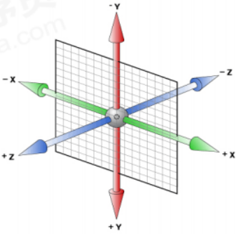
1.) 3D coordinate system
Three dimensional coordinate system actually refers to three-dimensional space, which is composed of three axes.
- x axis: horizontal to the right. Note: the right side of x is positive and the left side is negative
- y axis: vertically downward. Note: the lower part of y is positive and the upper part is negative
- z-axis: vertical screen. Note: positive value to the outside and negative value to the inside
2.) 3D mobile translate3d
3D movement is to add a movable direction on the basis of 2D movement, that is, the z-axis direction
-
transform: translateX(100px): just move on the x axis
-
transform: translateY(100px): just move on the y axis
-
transform: translateZ(100px): just move on the z axis
-
transform: translate3d(x, y, z): where x, y and Z respectively refer to the distance in the direction of the axis to be moved
-
Note: the values corresponding to x, y and Z cannot be omitted, and 0 is not required
Code demonstration
transform: translate3d(100px, 100px, 100px)
/* Note: the values corresponding to x, y and Z cannot be omitted, and 0 is not required */
transform: translate3d(100px, 100px, 0)
3.) perspective
-
If you want a web page to produce a 3D effect, you need Perspective (understood as a 2D plane projected by a 3D object)
-
Perspective is also called sight distance. The so-called sight distance is the distance from people's eyes to the screen. The closer it is to the visual point, the larger the imaging on the computer plane, and the farther it is, the smaller the imaging
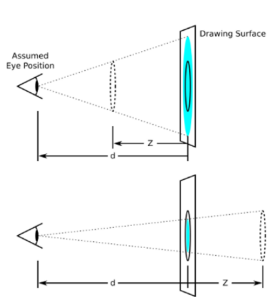
- d: Is the sight distance. The larger the sight distance, the smaller the object imaging.
- z: It's the z-axis. The larger the z-axis (positive value), the larger the object.
-
be careful:
- The unit of perspective is pixels
- The perspective needs to be written on the parent box of the inspected element
Code demonstration
<style> body { perspective: 1000px; } </style> <body> <div> <!-- ... --> </div> </body> -
The difference between translateZ and perspecitve
- perspecitve sets different sizes for the parent and translateZ sets different sizes for the child elements. In this way, it is convenient to realize that multiple sub boxes in the parent box are of different sizes.
4.) 3D rotate3d
-
definition
3D rotation refers to the rotation of elements along the x axis, y axis, z axis or user-defined axis in the 3D plane.
-
grammar
- transform: rotateX(45deg) -- rotate 45 degrees along the positive direction of the x axis
- Transform: rotate y (45DEG) -- rotate 45 degrees along the positive direction of the Y axis
- transform: rotateZ(45deg) -- rotate 45 degrees along the positive direction of the z axis
- transform: rotate3d(x, y, z, 45deg) -- rotate 45 deg along the custom axis as the angle
-
ratateX
-
Code demonstration
<style> div { perspective: 300px; } img { display: block; margin: 100px auto; transition: all 1s; } img:hover { transform: rotateX(-45deg) } </style> <body> <div> <img> </div> </body> -
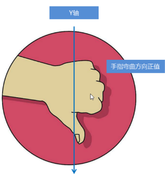
Left handed criterion
- The thumb of the left hand points in the positive direction of the x axis
- The bending direction of other fingers is the rotation direction of the element along the x-axis and the clockwise direction when the degree parameter is positive

-
-
rotateY
-
Code demonstration
div { perspective: 500px; } img { display: block; margin: 100px auto; transition: all 1s; } img:hover { transform: rotateY(180deg) } -
Left handed criterion
- The thumb of the left hand points in the positive direction of the y axis
- The bending direction of the remaining fingers is the direction in which the element rotates along the y axis (positive)
-
-
rotateZ
-
Code demonstration
div {
 /*
   3d The rotation along the Y axis in rotation does not need to write the sight distance style, and its effect is the same as that in 2d rotation.
    */
  perspective: 500px;
}

img {
  display: block;
  margin: 100px auto;
  transition: all 1s;
}

img:hover {
  transform: rotateZ(180deg)
}
-
-
rotate3d
-
transform: rotate3d(x, y, z, deg) -- rotate deg as an angle along a custom axis
- x. Y and Z represent the vector of the rotation axis, which indicates whether you want to rotate along the axis, and the last one indicates the rotation angle
- transform: rotate3d(1, 1, 0, 180deg) -- rotate 45deg diagonally
- transform: rotate3d(1, 0, 0, 180deg) -- rotate 45deg along the x axis
- x. The values of Y and Z are not necessarily 1 or 0, and can also be customized.
- x. Y and Z represent the vector of the rotation axis, which indicates whether you want to rotate along the axis, and the last one indicates the rotation angle
-
Code demonstration
div {
  perspective: 500px;
}

img {
  display: block;
  margin: 100px auto;
  transition: all 1s;
}

img:hover {
  transform: rotate3d(1, 1, 0, 180deg)
}
-
-
3D rendering transform style
- Function: controls whether the child element opens the three-dimensional environment.
- Transform style: flat means that the child element does not open 3D stereo space. It is the default attribute value
- Transform style: preserve-3d child element opens stereo space
- This style is written to the parent, but affects the child box

👇
