Why customize the navigation bar?
Although Andoird studio also has a built-in one-click button to generate an active page in the bottom tab bar for developers to choose from, there is one thing that comes with it, which is inherited from the ButtomNavigationView, has a fixed style, and does not support switching fragmented pages to the left or right. So if you want to have a good bottom to customize the navigation bar, you have to write your own, after all, customized is really fragrant! Instead of following the stream.
What's more, our commonly used page-turning view ViewPager comes with a page-turning tab bar, PagerTabStrip. In fact, you can also achieve the basic page turning requirements, a label corresponds to a fragmented page, but it is very silent, its label is above the page turning view, not below, but only text can not have corresponding icons to display. So the radio button is the most appropriate one. Just leave the radio buttons at the bottom and the fragments above, but the style of the radio buttons must also be customized, otherwise a circle is ugly there.
Layout and style of RadioGroup
Because the style of the radio group is the same, but the difference is the icon and the corresponding text you need to show. You can create a new xml file named styles in the res/values directory. xml.
Here's a basic style:
  <!--Main interface navigation bar style-->
    <style name="TabButton">
        <item name="android:layout_width">0dp</item>
        <item name="android:layout_height">match_parent</item>
        <item name="android:layout_weight">1</item>
        <item name="android:button">@null</item>//Remove default styles
        <item name="android:gravity">center</item>
        <item name="android:textSize">12sp</item>
        <item name="android:padding">5dp</item>
        <item name="android:textColor">@drawable/tab_text_selector</item>//Text Background Selector (Requires Customization)
        <item name="android:background">@drawable/tab_bg_selector</item>//Control Background Selector (Requires Customization)
    </style>
Yes, the main container interface is linearly laid out, vertically arranged, with point weights. The top is a page-flip view, the bottom is a radio group, and the bottom can also be a horizontal linear layout, so that the weights can be well allocated. It is also recommended that the top and bottom margins are good points. A 0.2dp view can also be added between the paged view and the radio group as a small splitter line, which looks better.
You can see the next simple selector declaration, as do other types, whether they are background changes, icon changes, or text color changes. You can do both of the following. State_is set Checked="true" is the selected display
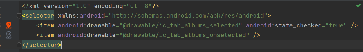
Selector creates a new one in the drawable directory. Remember to name properly!
FragmentPagerAdapter Adapter
The custom method needs to be overridden by inheriting the parent class, where fragment creation is omitted.
public class TabPagerAdapter extends FragmentPagerAdapter {
    //    Fragment adapter construction method, passed into Fragment Manager
    public TabPagerAdapter(FragmentManager fm) {
        super(fm);
    }

    @Override
    public Fragment getItem(int i) {
        Fragment fragment = null;
        switch (i){
            case 0://Group Purchase
                fragment = new ArtistsFragment();
                break;
            case 1://nearby
                fragment = new AlbumsFragment();
                break;
            case 2://My
                fragment = new SongsFragment();
                break;
            case 3://More
                fragment = new PlaylistsFragment();
                break;
            default:
                new AlbumsFragment();
                break;
        }
        return fragment;
    }
    @Override
    public int getCount() {
        return 4;
    }
}
One point is that I'm using a compatible library version, which should belong to an older version, so this constructor is a parameter. In the new version, an int parameter of the behavior is added, which is a declaration of whether the lazy load mode should be carried out or not. If the lazy load is not repeated here, the interested friends can see it.
Main interface loads view, sets adapter and control to listen for events
public class MainActivity extends AppCompatActivity {

    private RadioGroup bottom_bar;
    private ViewPager vp_content;


    @Override
    protected void onCreate(Bundle savedInstanceState) {
        super.onCreate(savedInstanceState);
        setContentView(R.layout.activity_main);//Set up the main container interface
        bottom_bar = findViewById(R.id.bottom_bar);//Get Navigation Bar Radio Button Group
        vp_content = findViewById(R.id.vp_content);//Get Page Flip View
        TabPagerAdapter tabPagerAdapter = new TabPagerAdapter(getSupportFragmentManager());//Build a Paging Adapter
        vp_content.setAdapter(tabPagerAdapter);//Set the adapter for the page view
            /**
            Since the listener OnPageChangeListener mostly uses only the onPageSelected method, the other two are rarely used.
            onPageScrollStateChanged(Triggered when page state changes) and onPageScrolled methods. So it simplifies a listener
            SimpleOnPageChangeListener,You can freely choose which methods to override
            */
        vp_content.addOnPageChangeListener(new ViewPager.SimpleOnPageChangeListener() {
            @Override
            public void onPageSelected(int position) {
                //Select the radio button at the specified location
                bottom_bar.check(bottom_bar.getChildAt(position).getId());
            }
        });

        bottom_bar.setOnCheckedChangeListener(new RadioGroup.OnCheckedChangeListener() {
            @Override
            public void onCheckedChanged(RadioGroup radioGroup, int i) {
                int index = 0;
                switch (i) {
                    case R.id.artists:
                        index = 0;
                        break;
                    case R.id.albums:
                        index = 1;
                        break;
                    case R.id.songs:
                        index = 2;
                        break;
                    case R.id.playlists:
                        index = 3;
                        break;
                }
                vp_content.setCurrentItem(index);//Set the currently displayed paging view
            }
        });
    }
}
Specific bottom several radio to see your needs, but generally in 3 to 5 bar. Too many words, you think, even if the weight is divided, it takes up a small place, which is ugly. Remember to declare a radio button selected in the layout file.
Okay, start your app and see, it should have a good effect.