Staggered floating plate
target
Step 1.
Basic architecture. The item contains picture blocks and text blocks. The size of the picture is 600x350
<body>
    <div class="wrap">
        <!-- item 1 -->
        <div class="item">
            <div class="pic">
                <img src="https://picsum.photos/600/350/?random=1">
            </div>
            <div class="txt">
                <h2></h2>
                <p></p>
            </div>
        </div>
    </div>
</body>
Step 2.
We need a total of four item s
<body>
    <div class="wrap">
        <!-- item 1 -->
        <div class="item">
            <div class="pic">
                <img src="https://picsum.photos/600/350/?random=1">
            </div>
            <div class="txt">
                <h2></h2>
                <p></p>
            </div>
        </div>
        <!-- item 2 -->
        <div class="item">
            <div class="pic">
                <img src="https://picsum.photos/600/350/?random=2">
            </div>
            <div class="txt">
                <h2></h2>
                <p></p>
            </div>
        </div>
        <!-- item 3 -->
        <div class="item">
            <div class="pic">
                <img src="https://picsum.photos/600/350/?random=3">
            </div>
            <div class="txt">
                <h2></h2>
                <p></p>
            </div>
        </div>
        <!-- item 4 -->
        <div class="item">
            <div class="pic">
                <img src="https://picsum.photos/600/350/?random=4">
            </div>
            <div class="txt">
                <h2></h2>
                <p></p>
            </div>
        </div>
    </div>

</body>
Step 3.
Adjust the order of picture and text blocks (item 2 and 4 are text blocks in front and picture blocks in back), and supplement the copy
<body>
	<div class="wrap">
	        <!-- item 1 -->
	        <div class="item">
	            <div class="pic">
	                <img src="https://picsum.photos/600/350/?random=1">
	            </div>
	            <div class="txt">
	                <h2>Cut version that goldfish all know</h2>
	                <p>Goldfish claim to have only seven seconds of memory, but in fact, this is wrong. You will know that goldfish's memory is not only seven seconds, so you have a few seconds of memory? </p>
	            </div>
	        </div>
	        <!-- item 2 -->
	        <div class="item">
	            <div class="txt">
	                <h2>My memory is only three seconds</h2>
	                <p>It is said that only 1 person in the world cuts out the porridge board%Not! Do you believe that? If you don't believe it,
	                    Why not be a goldfish AMOS Learn to cut the version together? After cutting, you become the rare person, then I will...
	                    Help you apply for endangered animal protection(Beaten). </p>
	            </div>
	            <div class="pic">
	                <img src="https://picsum.photos/600/350/?random=2">
	            </div>
	        </div>
	        <!-- item 3 -->
	        <div class="item">
	            <div class="pic">
	                <img src="https://picsum.photos/600/350/?random=3">
	            </div>
	            <div class="txt">
	                <h2>There are very important violent class advertisements here</h2>
	                <p>Violence class, Amos An online video course, from simple to profound, from peace to violence, from principle to practice,
	                From reality to demand change, from demand change to practical understanding, from...Why are you talking so much? You'll know if you sign up.</p>
	            </div>
	        </div>
	        <!-- item 4 -->
	        <div class="item">
	            <div class="txt">
	                <h2>This is the bowl knocking area</h2>
	                <p>The cut version of goldfish has been knocking on the bowl for a year...When the bowl broke, the cut version of the goldfish ran out. What else do you want to see?
	                    Would you like to get a bowl and knock it out? If you break the bowl, you will...Scold your mother.</p>
	            </div>
	            <div class="pic">
	                <img src="https://picsum.photos/600/350/?random=4">
	            </div>
	        </div>
	    </div>
</body>
Step 4.
Page layout initialization
<style>
	* {
		margin: 0;
	   	padding: 0;
	   	list-style: none;
	}
</style>
Step 5.
Set the width of the wrap container and the padding of the body (100px up and down)
<style>
	 body {
	     padding: 100px 0;
	 }
	 .wrap {
	     width: 1200px;
	     margin: auto;
	 }
</style>
Step 6.
Type the item (using flex) and keep the lower part of the item 70px away from other items. For the text, let's center it vertically
<style>
	.item {
	    display: flex;
	    align-items: center;
	    margin-bottom: 70px;
	}
</style>
Step 7.
Width of picture and text blocks
<style>
	.item .pic {
	    width: 55%;
	}
	.item .txt {
	    width: 55%;
	}
</style>
Step 8.
Add a background color to check whether the layout is broken
->It doesn't break, because it uses flex, which will automatically adjust to the appropriate size
<style>
	.item {
		display: flex;
		align-items: center;
		margin-bottom: 70px;
		background-color: #ccc;
	}
	.item .pic {
		width: 55%;
	}
	.item .txt {
		width: 55%;
		background-color: #fa8;
	}
</style>
Step 9.
Set the shrink value to 0 (Flex shrink: 0;), The extra part of the text block will not shrink automatically, so the layout may be broken.
-
Broken one
-
A blank block appears on the right of the picture
(this is because the width of the picture is not set to 100%) -
A blank block appears below the picture
(this is because vertical align defaults to baseline and can be modified to other values.)
-
-
Broken two
Text block out of item range
(this is because flex shrink: 0; does not resize automatically)
<style>
	.item .pic {
		width: 55%;
	 	flex-shrink: 0;
	}
	.item .txt {
		 width: 55%;
		 background-color: #fa8;
		 flex-shrink: 0;
	}
</style>
Introduction to flex shrink attribute
The flex shrink attribute specifies the shrink rule for flex elements. Flex elements shrink only when the sum of the default widths is greater than the container. The size of the shrinkage is based on the value of flex shrink. The initial value is 1, and negative values are not allowed.
Step 10.
Fix a broken one
<style>
	.item .pic img {
         width: 100%;
         vertical-align: middle;
     }
</style>
Step 11.
Fix broken two (make the effect of text block covering the picture block)
<style>
	/* Select the first object in the layer below item */
	.item > :first-child {
        margin-right: -10%;
    }
</style>
Introduction to CSS picker
-
Picker syntax: select object a > select object B
The ">" picker only selects objects at the next level (descendants), but objects at the lower level (grandchildren) cannot be selected.example:
as can be seen from the following example, the background color of son block turns yellow, and the others remain pink, which proves that Me > div only selects the object (son) under me, not the object (grandson) under me.
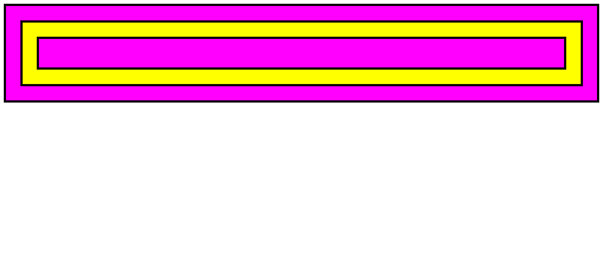
<head> <style> div { padding: 30px; background: #f0f; border: 5px solid #000; } .me > div { background: yellow; } </style> </head> <body> <div class="me"> <div class="son"> <div class="grandson"></div> </div> </div> </body> -
Picker syntax: select object: first child
: first child is to select the first child object.
. item >: first child means to select the first object in the next layer of item.
Add padding in the text block. Oh, it's broken again
<style>
	.item .txt {
	    width: 55%;
	    background-color: #fa8;
	    flex-shrink: 0;
	    padding: 50px 30px;
	}
</style>
Repair. Set box sizing to border box, so that the padding and margin of the object will not increase the width of the object itself.
<style>
	.item .txt {
		width: 55%;
		background-color: #fa8;
		flex-shrink: 0;
		padding: 50px 30px;
		box-sizing: border-box;
	}
</style>
Step 12.
Put the text block above the picture and remove the background color of item
<style>
	.item {
		display: flex;
		align-items: center;
		margin-bottom: 70px;
		/* background-color: #ccc; */
	}
	.item .txt {
		width: 55%;
		background-color: #fa8;
		flex-shrink: 0;
		padding: 50px 30px;
		box-sizing: border-box;
		position: relative;
		z-index: 1;
	}
</style>
The z-index attribute sets the z-order of a positioning element and its descendants or flex items. When the elements overlap, the elements with larger z-index will cover the smaller elements and be displayed on the upper layer.
Step 13
Remove the background color of the text, and then set the background color for each text block
<style>
	.item .txt {
		width: 55%;
		/* background-color: #fa8; */
		flex-shrink: 0;
		padding: 50px 30px;
		box-sizing: border-box;
		position: relative;
		z-index: 1;
	}

	.item:nth-child(1) .txt {
		background-color: #f0aec1;
	}
	.item:nth-child(2) .txt {
		background-color: #2afdd0;
	}
	.item:nth-child(3) .txt {
		background-color: #fec979;
	}
	.item:nth-child(4) .txt {
		background-color: #95dbd6;
	}
</style>
Introduction to: nth child() picker
: nth child(), if we want to select a specific single object, we only need to write the sorting number of the object we want to select into the scratch mark. For example, if you want to select the fifth object, write: nth child (5) {...} Just.
Step 14.
Make the text block background transparent, and convert the original color represented by hexadecimal to RGBA
<style>
	.item:nth-child(1) .txt {
       background-color: rgba(240,174,193,0.8);
    }
    .item:nth-child(2) .txt {
        background-color: rgba(42,253,208,0.8);
    }
    .item:nth-child(3) .txt {
        background-color: rgba(254,201,121,0.8);
    }
    .item:nth-child(4) .txt {
        background-color: rgba(149,219,214,0.8);
    }
</style>
Syntax: RGBA (red, green, blue, transparency)
Step 15.
Set the background color for the body
<style>
	body {
        padding: 100px 0;
        background: linear-gradient(20deg, #3d5493, #1aa2a0)
                    fixed center center / 100% 100%;
    }
</style>
fixed: make the background color (picture) not change with the picture scrolling.
Center: horizontal and vertical positions.
100%: width and height.
Step 16.
Set font and thickness, using Google API

<link href="https://fonts.googleapis.com/css2?family=Noto+Sans+TC:wght@100;300;500;900&display=swap" rel="stylesheet">
<style>
	.item {
		display: flex;
		align-items: center;
		margin-bottom: 70px;
		/* background-color: #ccc; */
		font-family: 'Noto Sans TC', sans-serif;
	}
	.item h2 {
		font-weight: 900;
	}
	.item p {
		font-weight: 300;
	}
</style>
Complete code
<!DOCTYPE html>
<html lang="en">
<head>
    <meta charset="UTF-8">
    <meta http-equiv="X-UA-Compatible" content="IE=edge">
    <meta name="viewport" content="width=device-width, initial-scale=1.0">
    <title>Document</title>
    <link href="https://fonts.googleapis.com/css2?family=Noto+Sans+TC:wght@100;300;500;900&display=swap" rel="stylesheet">
    <style>
        * {
            margin: 0;
            padding: 0;
            list-style: none;
        }
        body {
            padding: 100px 0;
            background: linear-gradient(20deg, #3d5493, #1aa2a0)
                        fixed center center / 100% 100%;
        }
        .wrap {
            width: 1200px;
            margin: auto;
        }
        .item {
            display: flex;
            align-items: center;
            margin-bottom: 70px;
            font-family: 'Noto Sans TC', sans-serif;
        }
        .item h2 {
            font-weight: 900;
        }
        .item p {
            font-weight: 300;
        }
        .item .pic {
            width: 55%;
            flex-shrink: 0;
        }
        .item .pic img {
            width: 100%;
            vertical-align: middle;
        }
        .item .txt {
            width: 55%;
            flex-shrink: 0;
            padding: 50px 30px;
            box-sizing: border-box;
            position: relative;
            z-index: 1;
        }
        .item > :first-child {
            margin-right: -10%;
        }
        .item:nth-child(1) .txt {
            background-color: rgba(240, 174, 193, .8);
        }
        .item:nth-child(2) .txt {
            background-color: rgba(42, 253, 208, .8);
        }
        .item:nth-child(3) .txt {
            background-color: rgba(254, 201, 121, .8);
        }
        .item:nth-child(4) .txt {
            background-color: rgba(149, 219, 214, .8);
        }
    </style>
</head>
<body>

    <div class="wrap">
        <!-- item 1 -->
        <div class="item">
            <div class="pic">
                <img src="https://picsum.photos/600/350/?random=1">
            </div>
            <div class="txt">
                <h2>Goldfish understand the cut version</h2>
                <p>Goldfish claim to have only seven seconds of memory, but in fact, this is wrong. You will know that goldfish's memory is not only seven seconds, so you have a few seconds of memory? </p>
            </div>
        </div>
        <!-- item 2 -->
        <div class="item">
            <div class="txt">
                <h2>My memory is only three seconds</h2>
                <p>It is said that only 1 person in the world cuts out the porridge board%Not! Do you believe that? If you don't believe it,
                    Why not be a goldfish AMOS Learn to cut the version together? After cutting, you become the rare person, then I will...
                    Help you apply for endangered animal protection(Beaten). </p>
            </div>
            <div class="pic">
                <img src="https://picsum.photos/600/350/?random=2">
            </div>
        </div>
        <!-- item 3 -->
        <div class="item">
            <div class="pic">
                <img src="https://picsum.photos/600/350/?random=3">
            </div>
            <div class="txt">
                <h2>There are very important violent class advertisements here</h2>
                <p>Violence class, Amos An online video course, from simple to profound, from peace to violence, from principle to practice,
                From reality to demand change, from demand change to practical understanding, from...Why are you talking so much? You'll know if you sign up.</p>
            </div>
        </div>
        <!-- item 4 -->
        <div class="item">
            <div class="txt">
                <h2>This is the bowl knocking area</h2>
                <p>The cut version of goldfish knocked on the bowl for a year...When the bowl breaks, the cut version of the goldfish runs out. What else do you want to see?
                    Would you like to get a bowl and knock it out? If you break the bowl, you will...Scold your mother.</p>
            </div>
            <div class="pic">
                <img src="https://picsum.photos/600/350/?random=4">
            </div>
        </div>
    </div>

</body>
</html>
References:
Goldfish can understand how to cut the screen of this web page: staggered floating version