Cutting exercise notes (II)
Target
Step 1.
Basic structure and content
<body>
<div class="wrap">
<div class="item">
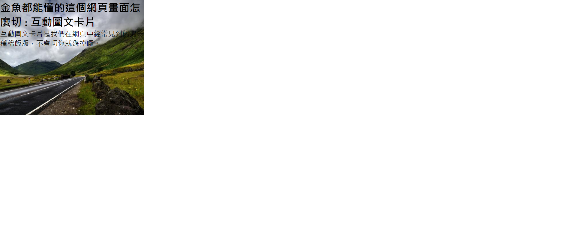
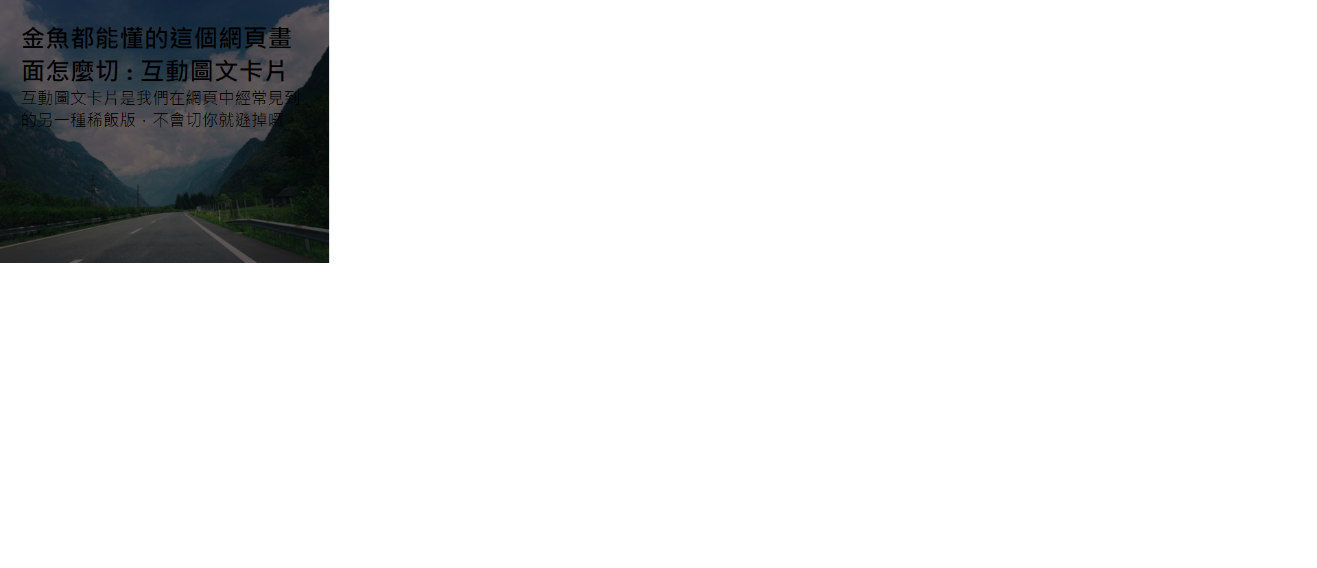
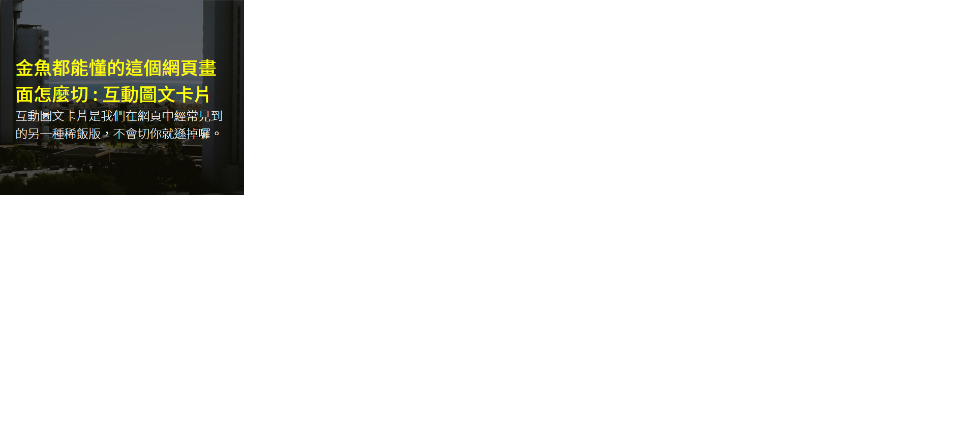
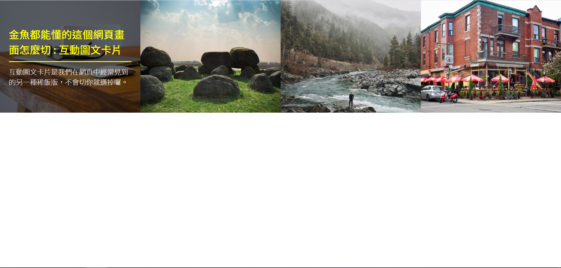
<img src="https://picsum.photos/500/400/?random=1">
<div class="txt">
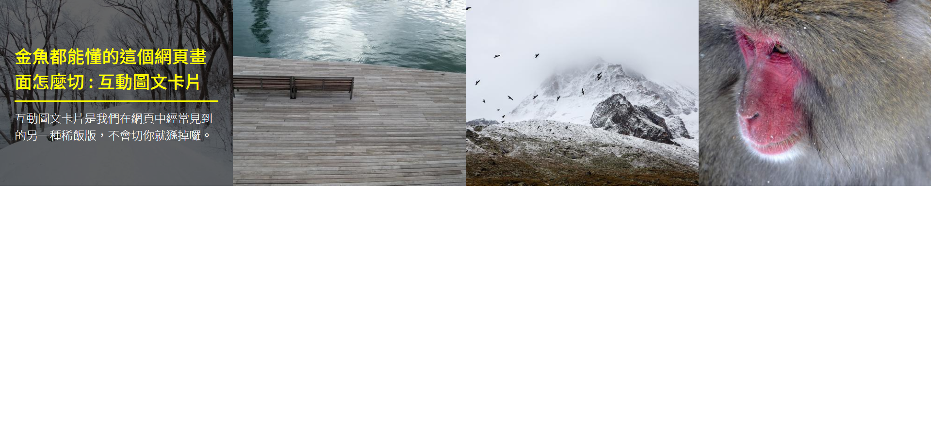
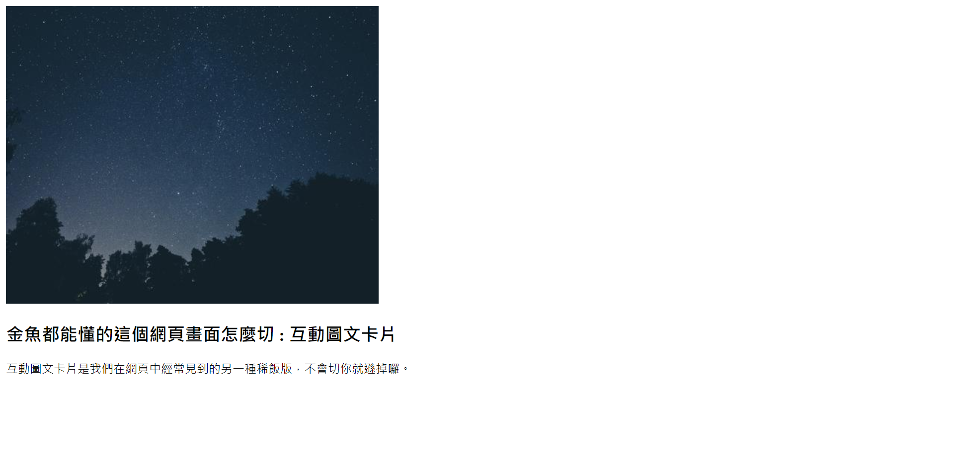
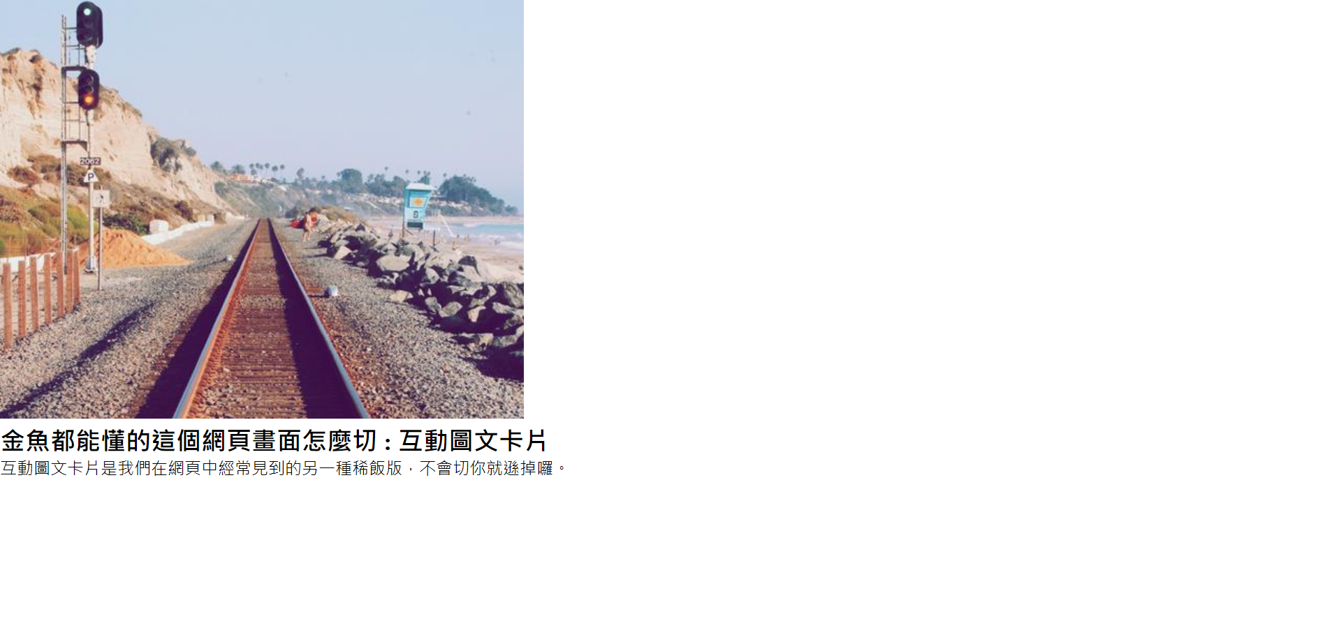
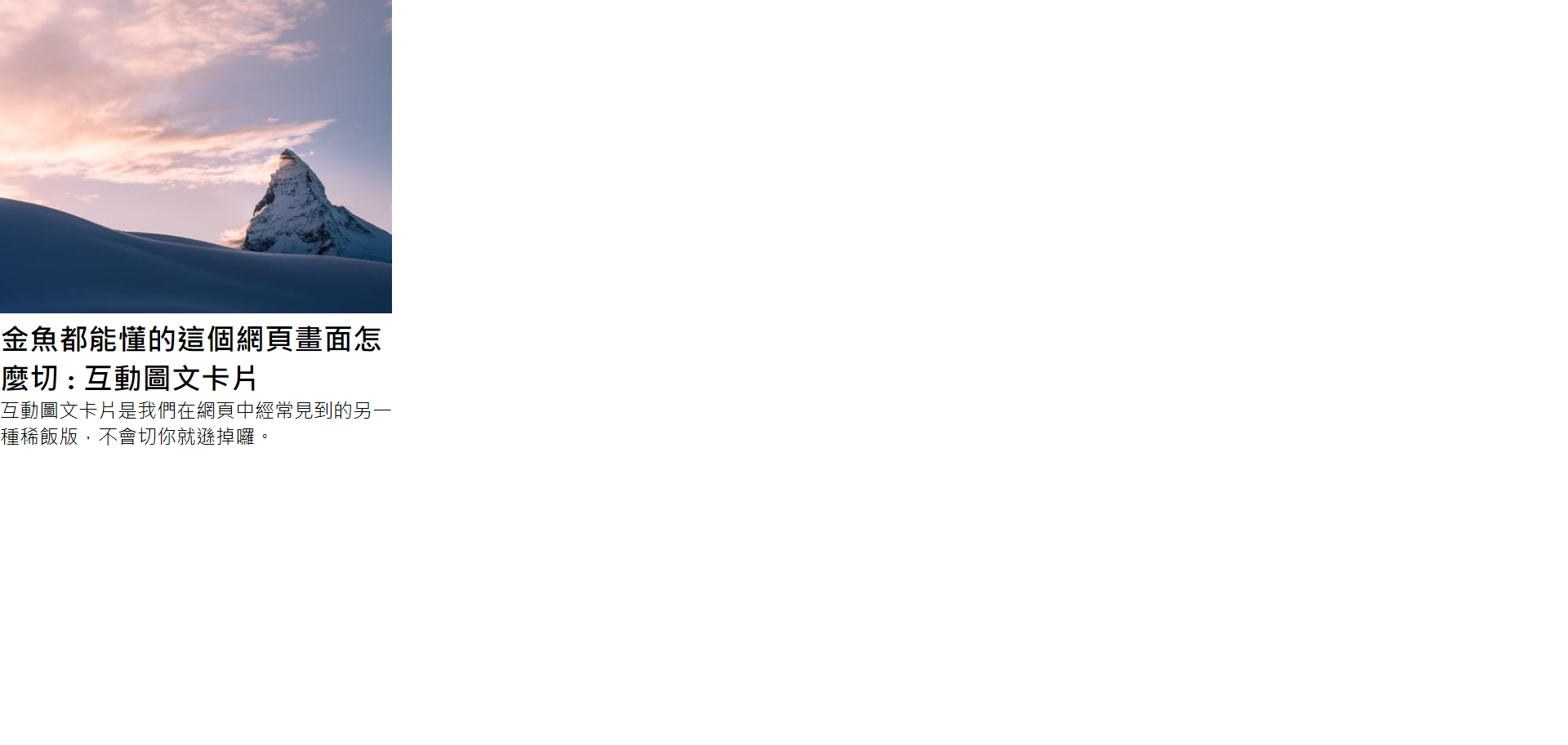
<h2>Goldfish can understand how to cut this web page picture : Interactive graphic card</h2>
<p>Interactive graphic card is another kind of porridge version we often see on the web page. If you don't cut it, you'll lose it.</p>
</div>
</div>
</div>
</body>
Step 2.
Page layout initialization
<style>
	* {
	     margin: 0;
	     padding: 0;
	     list-style: none;
	 }
</style>
Step 3.
Set container and image width
<style>
	.wrap {
	     width: 100%;
	 }
	 .item {
	     width: 25%; /* Because there are four, each accounting for 25% */
	 }
	 .item img {
	     width: 100%;
	 }
</style>
Step 4.
Remove the extra white space at the bottom of the picture
<style>
    .item img {
        width: 100%;
        vertical-align: middle;
    }
</style>
A small blank part (below the picture) will appear in the vertical direction of the picture, which can be removed by vertical align. Vertical align can also be set to an alignment other than baseline to achieve this effect..
Step 5.
Put the text on the picture
<style>
	.item {
	     width: 25%;
	     position: relative;
	 }
	 .item .txt {
	     position: absolute;
	     /* Start at the top left */
	     top: 0;
	     right: 0;
	     left: 0;
	     bottom: 0;
	 }
</style>
Because we want to put the text (txt) on the top of the picture, we will use the absolute positioning to cover it, and we want to locate it on the upper container (the parent item), so the item also needs to set the position.
location
position: absolute;, The element is set to absolute positioning, and it will be positioned relative to its parent element (absolute positioning relative to the parent element).
The absolute element is positioned relative to its upper container (parent element). If the upper container of this element does not have an element that can be located, it will look for the upper container again. If there is no element that can be located, it will finally be located on the "window" (not on the body). If the upper container (parent element) is located (whether fixed, relative or absolute), the element will be fixed on it (if found, it won't look up).
position: static;, staic is the default value. The element set in this way "will not be specially positioned" in a specific position on the page, but will be automatically typeset on the page according to the browser's default configuration.
position: relative ;, Relative behaves like static unless you add some additional attributes. Setting the top, right, bottom and left attributes in an element set as relative will make its element "relatively" adjust its original position. No matter how these "relatively positioned" elements move their position on the page or how much space they add, it will not affect the original position of other elements.
position: fixed;, Fixed positioning elements are positioned relative to the browser window, which means that even if the page scrolls, it will be fixed in the same position.
Step 6.
Set padding and background color for the text, which looks better
<style>
    .item .txt {
        position: absolute;
        top: 0;
        right: 0;
        left: 0;
        bottom: 0;
        padding: 20px;
        background-color: rgba(0, 0, 0, 0.6);
    }
</style>
RGBA (red, green, blue, transparency)
Step 7.
Set the size and color of text (title, text)
<style>
	.item .txt h2 {
		font-size: 24px;
		color: #ff0;
	}
	.item .txt p {
	    font-size: 16px;
	    color: #fff;
	}
</style>
Step 8.
Text typesetting, I hope the text is in the middle
<style>
.item .txt {
     position: absolute;
     top: 0;
     right: 0;
     left: 0;
     bottom: 0;
     padding: 20px;
     background-color: rgba(0, 0, 0, 0.6);
     display: flex;
     justify-content: center;
     flex-direction: column;
 }
</style>
Step 9.
Set page font
<head>
    <meta charset="UTF-8">
    <meta http-equiv="X-UA-Compatible" content="IE=edge">
    <meta name="viewport" content="width=device-width, initial-scale=1.0">
    <title>Document</title>
    <link href="https://fonts.googleapis.com/css2?family=Noto+Sans+TC:wght@100;500&display=swap" rel="stylesheet">
    <style>
        * {
            margin: 0;
            padding: 0;
            list-style: none;
            font-family: 'Noto Sans TC', sans-serif;
        }
        .wrap {
            width: 100%;
        }
        .item {
            width: 25%;
            position: relative;
        }
        .item img {
            width: 100%;
            vertical-align: middle;
        }
        .item .txt {
            position: absolute;
            top: 0;
            right: 0;
            left: 0;
            bottom: 0;
            padding: 20px;
            background-color: rgba(0, 0, 0, 0.6);
            display: flex;
            justify-content: center;
            flex-direction: column;
        }
        .item .txt h2 {
            font-size: 24px;
            color: #ff0;
            font-weight: 500;
        }
        .item .txt p {
            font-size: 16px;
            color: #fff;
            font-weight: 100;
        }
    </style>
</head>
Step 10.
Add three other areas and text content
<body>
<div class="wrap">
<div class="item">
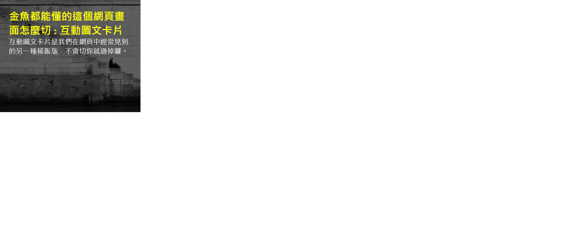
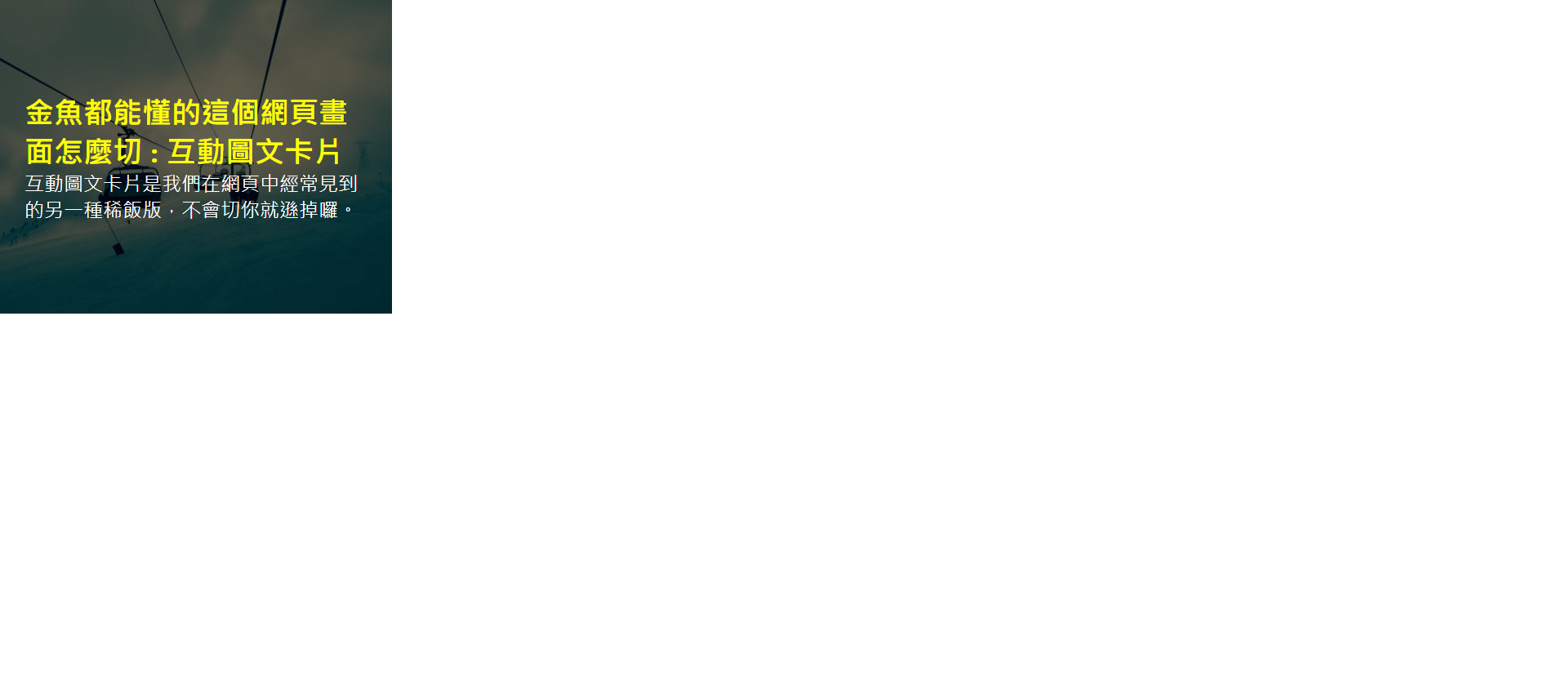
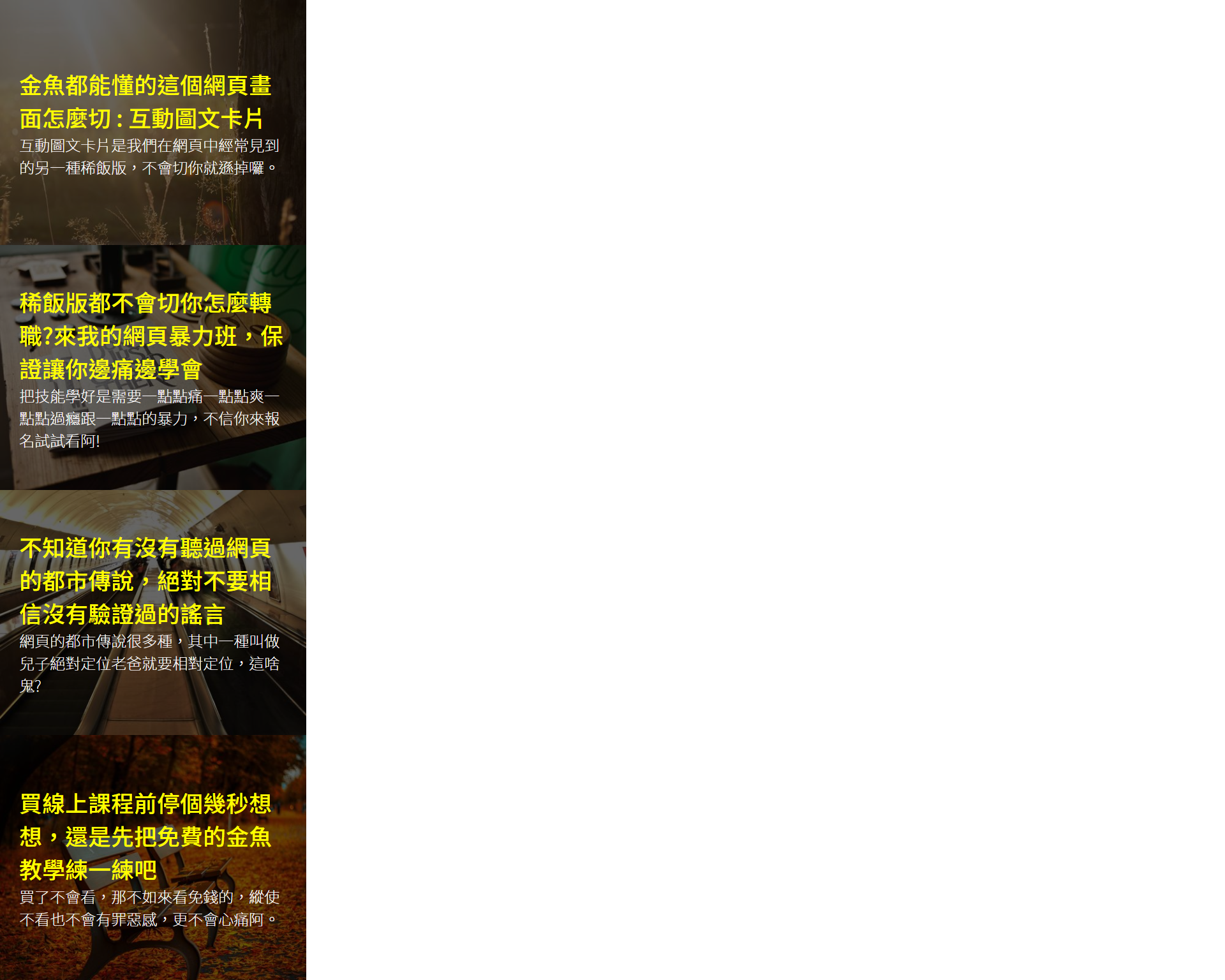
<img src="https://picsum.photos/500/400/?random=1">
<div class="txt">
<h2>Goldfish can understand how to cut this web page picture : Interactive graphic card</h2>
<p>Interactive graphic card is another kind of porridge version we often see on the web page. If you don't cut it, you'll lose it.</p>
</div>
</div>
<div class="item">
<img src="https://picsum.photos/500/400/?random=2">
<div class="txt">
<h2>How can you change your job if the porridge version won't cut it?Come to my web violence class and make sure you learn while you are in pain</h2>
<p>Learning skills well requires a little pain, a little joy, a little fun and a little violence. If you don't believe it, please sign up and have a try!</p>
</div>
</div>
<div class="item">
<img src="https://picsum.photos/500/400/?random=3">
<div class="txt">
<h2>I don't know if you have heard the urban legends on the website. Never believe the rumors that have not been verified</h2>
<p>There are many urban legends on the website, one of which is called the absolute positioning of the son, and the relative positioning of the father. What the hell is this?</p>
</div>
</div>
<div class="item">
<img src="https://picsum.photos/500/400/?random=4">
<div class="txt">
<h2>Stop for a few seconds before buying an online course. Let's practice the free goldfish teaching first</h2>
<p>If you can't see it after buying it, it's better to see the free one. Even if you don't see it, you won't feel guilty, let alone heartache.</p>
</div>
</div>
</div>
</body>
Step 11.
Arrange the four areas horizontally
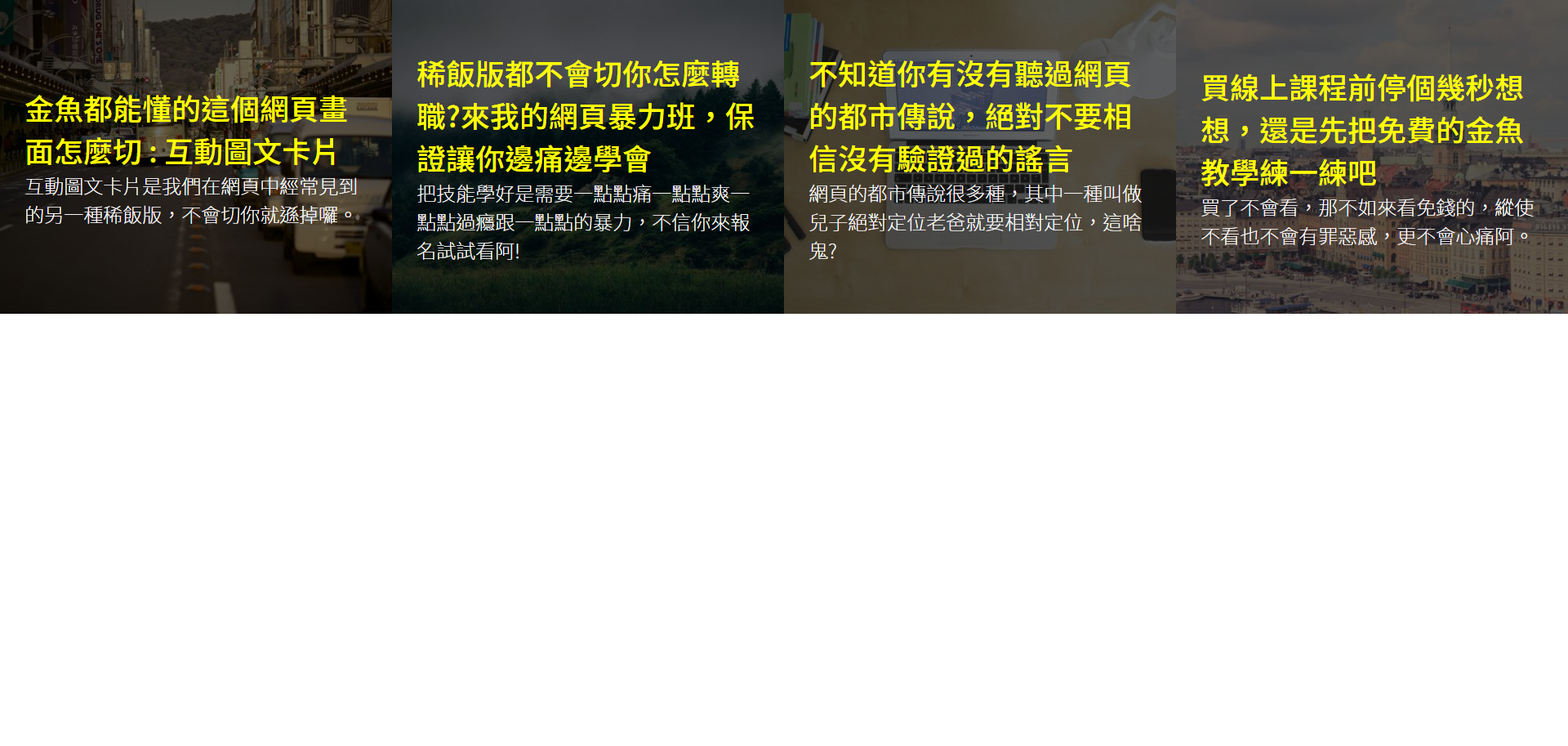
<style>
	.wrap {
	    width: 100%;
	    display: flex;
	}
</style>
Step 12.
Text animation, the text is displayed only when the mouse touches it
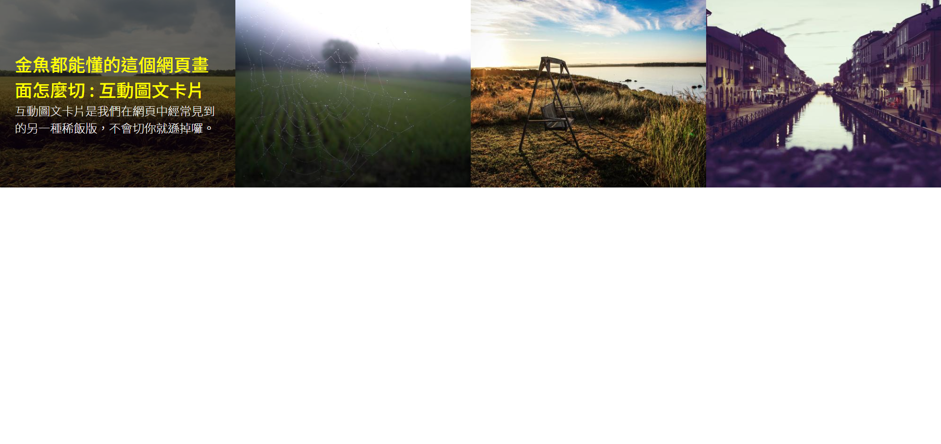
<style>
	.item .txt {
	    position: absolute;
	    top: 0;
	    right: 0;
	    left: 0;
	    bottom: 0;
	    padding: 20px;
	    background-color: rgba(0, 0, 0, 0.6);
	    display: flex;
	    justify-content: center;
	    flex-direction: column;
	    opacity: 0;
	    transition: opacity .5s; /* Animation time */
	}
	/* When an item is touched, its child txt will change the transparency (the parent layer is touched and the child layer does things)*/
	.item:hover .txt {
	    opacity: 1;
	}
</style>
Step 13.
Add a new horizontal line below the title
<style>
	.item .txt h2:after {
		content: '';
		display: block;
		width: 100%;
		height: 2px;
		margin: 10px 0;
		background-color: #ff0;
	}
</style>
CSS pseudo elements (before and after)
before adds content "before" the original element, and after adds content "after" the original element. At the same time, the pseudo element will "inherit" the attributes of the original element. If the original text is black, the text of the pseudo element will also be black.
Step 14.
Animation of horizontal lines, change of width (0% - > 100%)

<style>
	.item .txt h2:after {
		content: '';
		 display: block;
		 width: 0%;
		 height: 2px;
		 margin: 10px 0;
		 background-color: #ff0;
		 transition: width 0.5s 0.5s; /*Special effect conversion time and delayed execution time*/
	}
	.item:hover h2:after {
		 width: 100%;
	}
</style>