Line chart
Add description information
plt.xlabel("describe")#Add description on X axis
plt.ylabel("describe")#Add description on Y axis
plt.title("describe")#Add a description to the title
Note: matplotlib does not support Chinese by default. If you want to use Chinese, you need to adjust the language. For details, please refer to matplotlib Chinese tag , the following same principle will not be explained.
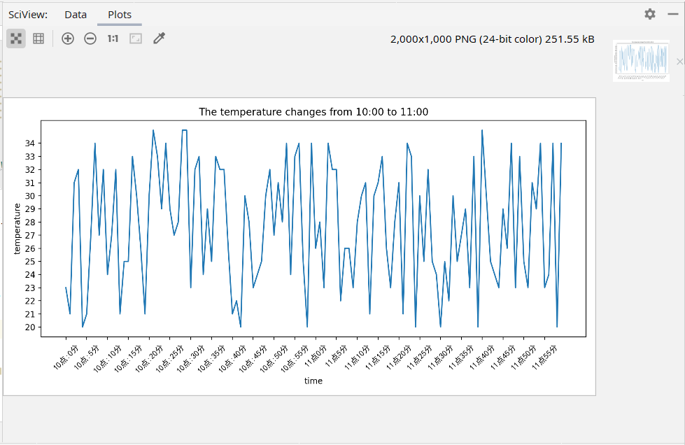
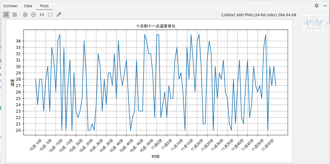
Chinese description
my_font=font_manager.FontProperties(fname="C:\Windows\Fonts\simhei.ttf")
plt.xlabel("describe",fontproperties=my_font)#Add Chinese description on X axis
plt.xlabel("time",fontproperties=my_font)
plt.ylabel("temperature",fontproperties=my_font)
plt.title("The temperature changes from ten to eleven",fontproperties=my_font)
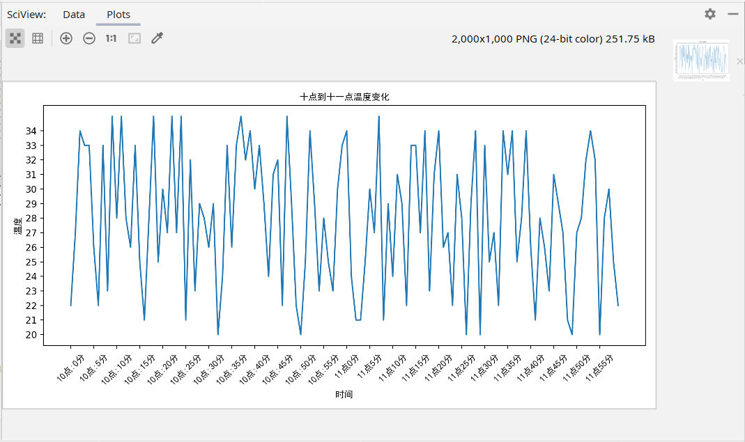
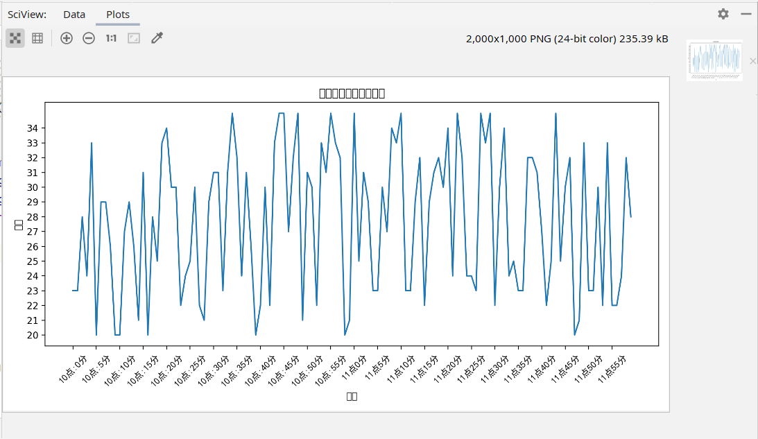
Draw grid guides
from matplotlib import pyplot as plt
plt.grid()
The default grid line will pass through each x and y, so the grid caused by data is too thin or too dense. We can adjust it by adjusting the scale of X and Y axes
In the grid method, we can also add parameters to change the grid properties, such as:
plt.grid(alpha=a)#alpha parameter is to adjust the mesh transparency, and a is the specific value
Multiple polylines and legends
At first we used PLT Plot (x, y) method draws an X, y curve. Similarly, we can repeat plot Plot (a, b) plots multiple curves.
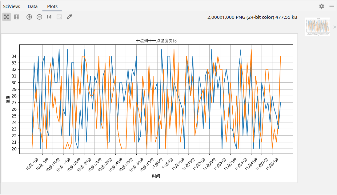
legend
We can also add the character parameter label = after the A and B parameters to add the curve name PLT plot(a,b,label=)
Then through PLT Legend() displays the legend
plt.plot(x,y,label="region A")
plt.plot(a,b,label="region B")
#plt.legend() cannot display Chinese
plt.legend(prop=my_font)
Note that the Chinese parameters set here are not properties, but prop
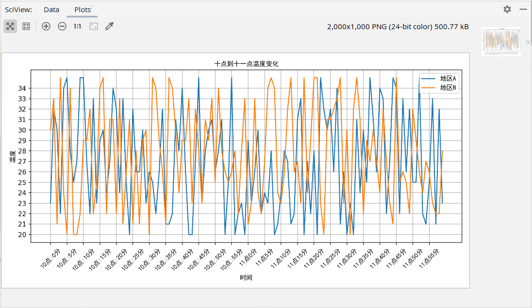
The legend position can be adjusted through the loc parameter, which is not demonstrated here. The specific position corresponding to the loc value or string can be known by viewing the source code
Different curves
We can use PLT Plot() or plot Legend() adds parameters to change the attributes of curves and tables
color=''#colour
linestyle=''#style
linewidth=''#thickness
| Color character | Style character | ||
|---|---|---|---|
| r | gules | - | Solid line |
| g | green | – | Broken line |
| b | blue | -. | Dotted line |
| w | white | : | Dotted line |
| m | Magenta | ||
| y | yellow | ||
| ··· | ··· | ||
| #00ff00 | Hex corresponding color | ||
| 0.8 grayscale string | Corresponding color |
Other graphics
All kinds of graphics are basically the same except for the differences in drawing methods. The following only introduces the drawing methods, and the parameters are not introduced. They are shown with examples
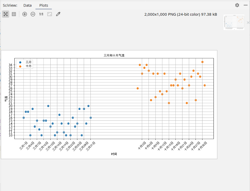
Scatter diagram
Drawing method
plt.scatter()#The parameters are roughly consistent with the polyline
from matplotlib import pyplot as plt
from matplotlib import font_manager
import random
my_font=font_manager.FontProperties(fname="C:\Windows\Fonts\simhei.ttf")
x=range(0,31)
y=[random.randint(10,20) for i in range(31)]
a=range(51,82)
b=[random.randint(20,35) for i in range(31)]
plt.figure(figsize=(10,5),dpi=200)
plt.scatter(x,y,label="March")
plt.scatter(a,b,label="October")
time=["March{}day".format(i) for i in range(1,32)]
time+=["October{}day".format(i) for i in range(1,32)]
tx=list(x)+list(a)
plt.xticks(tx[::3],time[::3],fontproperties=my_font,rotation=45)
plt.yticks(range(10,35))
plt.xlabel("time",fontproperties=my_font)
plt.ylabel("air temperature",fontproperties=my_font)
plt.title("Temperature in March and October",fontproperties=my_font)
plt.legend(prop=my_font)
plt.grid()
plt.show()
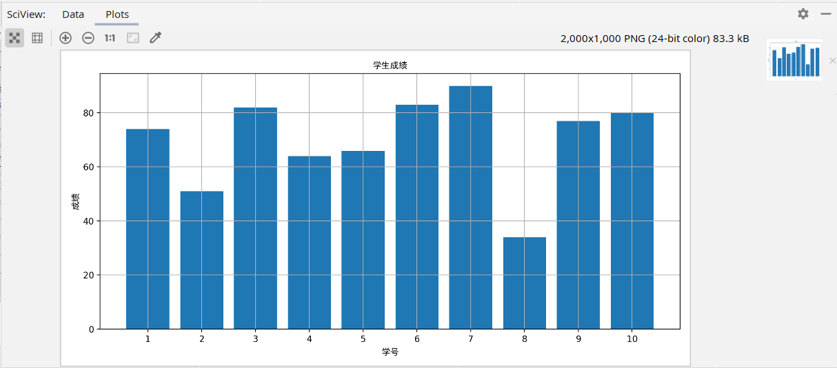
Bar chart
Drawing method
plt.bar(x,y,width=)#Width sets the width of the bar graph
from matplotlib import pyplot as plt
from matplotlib import font_manager
my_font=font_manager.FontProperties(fname="C:\Windows\Fonts\simhei.ttf")
x=range(10)
y=[74,51,82,64,66,83,90,34,77,80]
plt.figure(figsize=(10,5),dpi=200)
plt.bar(x,y)
px=[i+1 for i in x]
plt.xticks(x,px)
plt.xlabel("Student number",fontproperties=my_font)
plt.ylabel("achievement",fontproperties=my_font)
plt.title("Student achievement",fontproperties=my_font)
plt.grid()
plt.show()
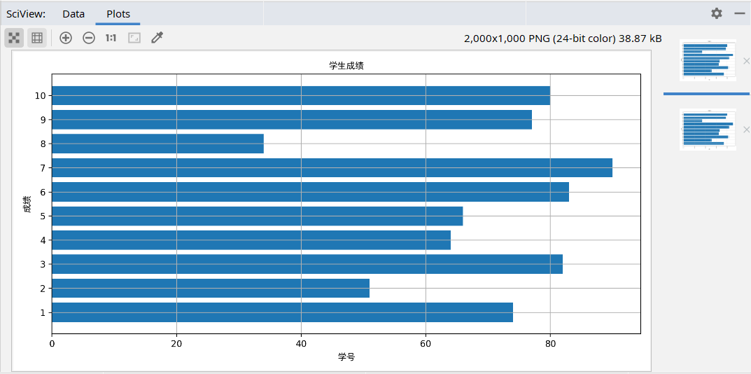
You can also use the drawing method
plt.barh(x,y,height=)
Draw an inverted bar chart
Note: the third parameter of the inverted bar chart is no longer width, but height, because in the inverted barh source code, y passes in width. If the third parameter is still width, the same formal parameter will be assigned twice and an error will be reported, so the inverted third parameter is height. Barh will automatically adjust x and Y under inversion, but other methods need to change according to the diagram.
The above figure is an example
from matplotlib import pyplot as plt
from matplotlib import font_manager
my_font=font_manager.FontProperties(fname="C:\Windows\Fonts\simhei.ttf")
x=range(10)
y=[74,51,82,64,66,83,90,34,77,80]
plt.figure(figsize=(10,5),dpi=200)
plt.barh(x,y)
px=[i+1 for i in x]
plt.yticks(x,px)
plt.xlabel("achievement",fontproperties=my_font)#Positive x-axis scale, inverted y-axis scale
plt.ylabel("Student number",fontproperties=my_font)#Positive y-axis scale, inverted x-axis scale
plt.title("Student achievement",fontproperties=my_font)
plt.grid()
plt.show()
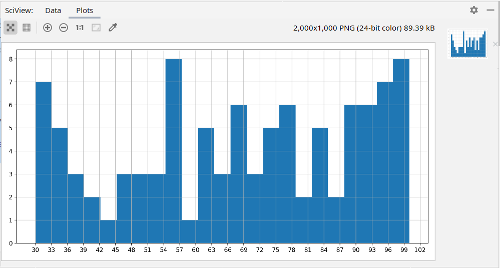
histogram
Drawing method
plt.hist(a,b)
Histogram is different from the previous graphs. The drawing method of square graph has two main parameters. A is a data list and b is the number of groups, that is, the number of parts of data in a.
plt.hist(a,b)
A is the same as above, b can be a list, the length is the number of groups, and the value is the grouping basis. It is used when the group spacing is uneven.
plt.hist(a,b,normed=1)
Normalized is a boolean variable. This parameter determines whether to draw frequency histogram. Usually, it defaults to frequency histogram
from matplotlib import pyplot as plt
from matplotlib import font_manager
my_font=font_manager.FontProperties(fname="C:\Windows\Fonts\simhei.ttf")
import random
a=[random.randint(30,100) for i in range(100)]
d=3#Determine the group distance according to the data
b=(max(a)-min(a))//d# the number of groups is obtained from the group distance
plt.figure(figsize=(10,5),dpi=200)
plt.hist(a,b)
plt.xticks(range(min(a),max(a)+d,d))
plt.grid()
plt.show()