1. Data analysis EDA
1. The value of EDA mainly lies in being familiar with the data set, understanding the data set, and verifying the data set to determine that the obtained data set can be used for subsequent machine learning or in-depth learning.
2. After knowing the data set, our next step is to understand the relationship between variables and the existing relationship between variables and predicted values.
3. Guide data science practitioners to carry out the steps of data processing and Feature Engineering, so as to make the structure and feature set of data set more reliable for the next prediction problem.
4. Complete the exploratory analysis of the data, and make some charts or text summary of the data and punch in.
To be analyzed:
① Data overview, i.e. describe() statistics and info () data types
② Missing value and abnormal value detection
③ Analyze the distribution of the real value to be predicted
④ Correlation analysis between features
2. Data overview
Import of various calculation packages
#coding:utf-8
#Import warnings package and use filter to ignore warning statements.
import warnings
warnings.filterwarnings('ignore')

import pandas as pd
import numpy as np
import matplotlib.pyplot as plt
import seaborn as sns  # seabon is a package for visualization
import missingno as msno  # Used to detect missing values
Data loading
Train_data = pd.read_csv('used_car_train_20200313.csv', sep=' ')  # sep = '' is to separate objects with spaces
Test_data = pd.read_csv('used_car_testA_20200313.csv', sep=' ')
Brief observation data (head()+shape)
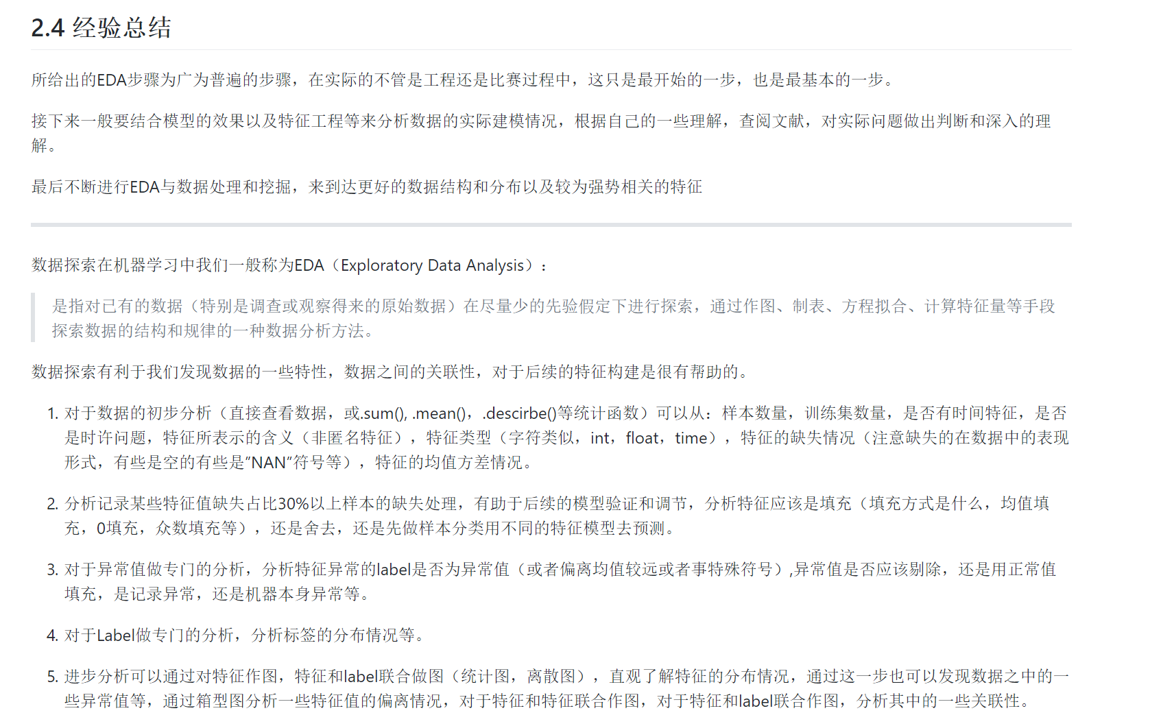
print(Train_data.head().append(Train_data.tail()))  # First 5 lines and last 5 lines

print(Train_data.shape)  # 150000 (31, shape)

print(Test_data.head().append(Test_data.tail()))

print(Test_data.shape)
result:
1. It can be seen that the data is highly dispersed, including integer, floating point, positive, negative and date. Of course, it can be regarded as a string. In addition, if the data are converted into numerical values, the gap between the data is particularly large, some tens of thousands, some tens of thousands, so it is difficult to avoid ignoring the role of some values in prediction, so it is necessary to normalize them.
2. The use of shape is also very important. You should know the size of the data well
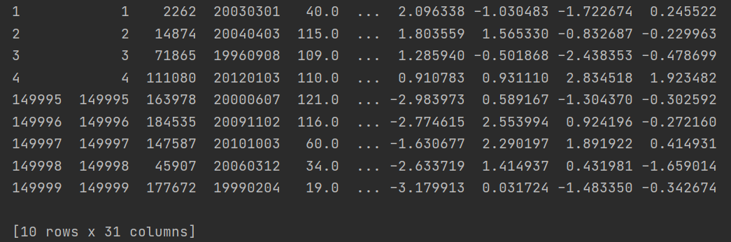
Use describe() to analyze the basic statistics of data. The basic parameters of describe() are as follows (and it only analyzes numerical data by default. If there are string, time series and other data, the statistical items will be reduced):
count: the number of elements in a column;
mean: the average value of a column of data;
std: mean square deviation of a column of data; (the arithmetic square root of variance reflects the dispersion degree of a data set: the greater the difference between data, the higher the dispersion degree of data in the data set; the smaller the difference between data, the lower the dispersion degree of data in the data set)
min: the minimum value in a column of data;
max: the maximum value in a column;
25%: the average value of the first 25% of the data in a column;
50%: the average value of the first 50% of the data in a column;
75%: the average value of the first 75% of the data in a column;
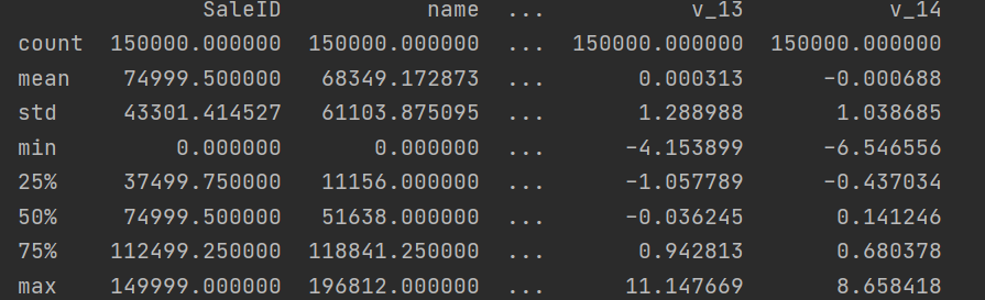
Use info() to check the data type and mainly check whether there is abnormal data
The code is as follows
# 1) Get familiar with the relevant statistics of the data through describe()
print(Train_data.describe())

## 2) Get familiar with data types through info()
print(Train_data.info())
print(Test_data.info())
From the above statistics and information, there is nothing special. As far as the data type is concerned, the type of notrepairddamage is object, which is an alternative and needs special processing in the future.
3. Lack of data
pandas has built-in isnull() to judge whether there is a missing value. It will judge the null value and NA, and then return True or False.
# 1) Check the existence nan condition of each column
print(Train_data.isnull().sum())
print(Test_data.isnull().sum())
It can be seen that the missing data values are mainly concentrated in bodyType, fuelType and gearbox. The model in the training set is missing a value, but it doesn't hurt. As for how to fill in or delete these data, we need to consider it later when selecting the model.
At the same time, we can also view other properties of the default value through the missingno library.
matrix
bar chart
Heat map
dendrogram
# nan visualization
missing = Train_data.isnull().sum()
missing = missing[missing > 0]
missing.sort_values(inplace=True)
missing.plot.bar()
plt.show()
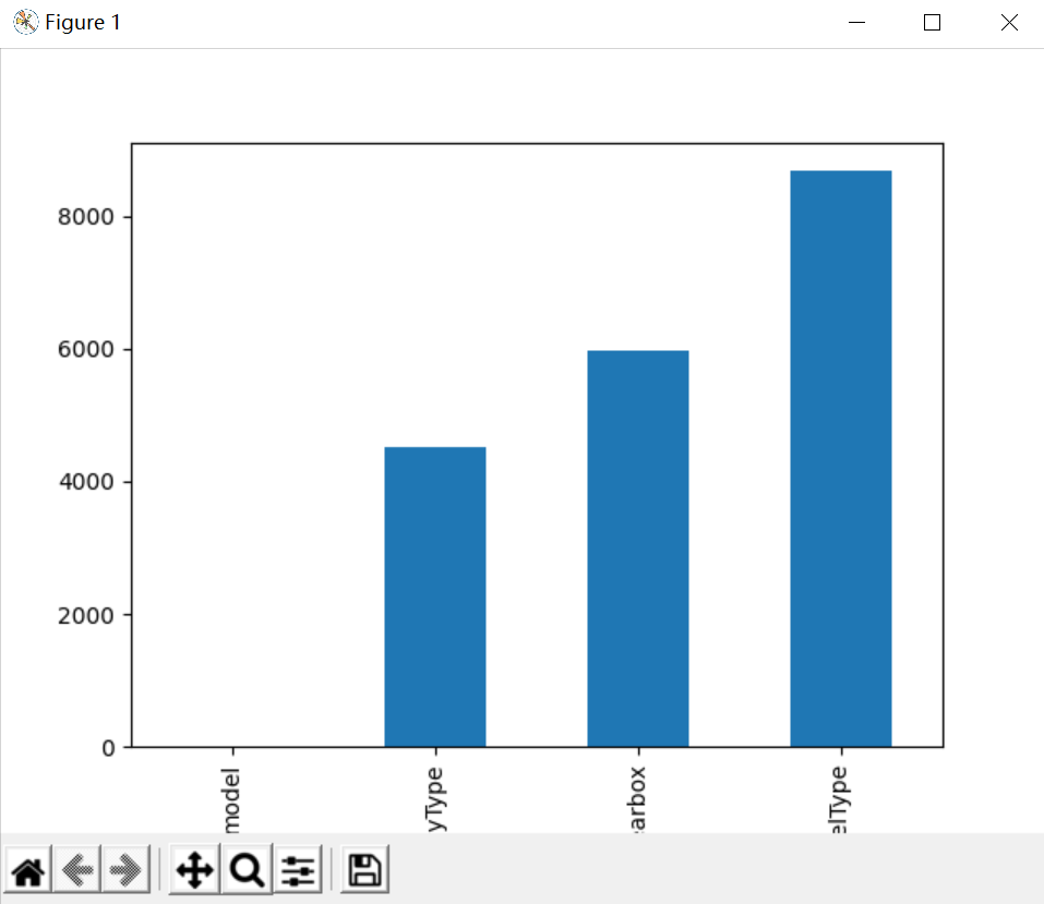
Through the above two sentences, you can intuitively understand which columns have "nan" and print the number of nan. The main purpose is whether the number of nan is really large. If it is small, you generally choose to fill it. If you use lgb and other tree models, you can directly leave it blank and let the tree optimize itself. However, if there are too many nan, you can consider deleting it
# Visualize the default values
'''
The more white lines, the more missing values.
'''
msno.matrix(Train_data.sample(250))  # msno.matrix invalid matrix is a data intensive display. It can quickly and intuitively see that the more blank the data integrity is, the more serious the loss is
plt.show()

msno.bar(Train_data.sample(1000))  # Bar charts provide the same information as matrix charts, but in a simpler format
plt.show()
4. Abnormal data
It was found that the type of notRepairedDamage is object, which is an alternative, so let's take a look at its details.
str in python and string and Unicode (character encoding) in numpy are represented as object s in pandas
print(Train_data['notRepairedDamage'].value_counts())
value_counts() is a quick way to see how many different values are in a column of a table and calculate how many duplicate values each different value has in that column.
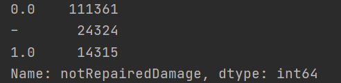
It is found that '-' exists, which can be regarded as a kind of NaN, so it can be replaced with NaN
Train_data['notRepairedDamage'].replace('-', np.nan, inplace=True)
5. Understand the distribution of the real value to be predicted
Look at the distribution of price forecasts
print(Train_data['price'])
print(Train_data['price'].value_counts())
You'll find nothing special
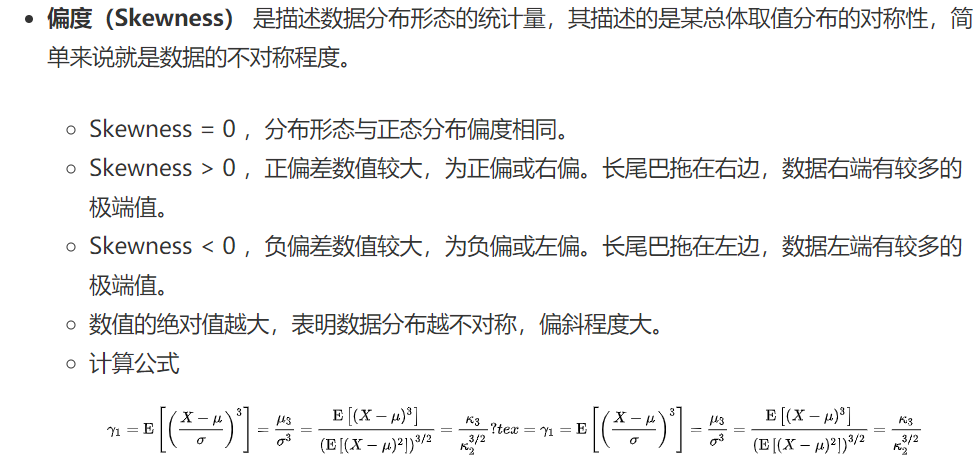
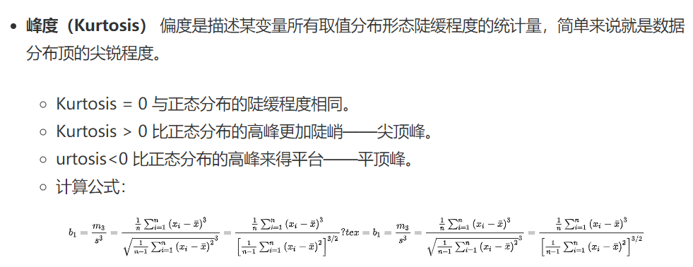
Next, the most important thing is to look at the Skewness and Kurtosis of historical transaction prices. In addition, the most beautiful distributed normal distribution in nature, so we should also look at whether the price distribution to be predicted meets the normal distribution.
We will compare the kurtosis and skewness of the normal distribution with the kurtosis of the normal distribution. If the skewness kurtosis is not 0, it indicates that the variable is left to right, or has a high top and flat top.
# 2) View sketchness and kurtosis
sns.distplot(Train_data['price']);
plt.show()
print("Skewness: %f" % Train_data['price'].skew())
print("Kurtosis: %f" % Train_data['price'].kurt())
result:
Skewness: 3.346487
Kurtosis: 18.995183
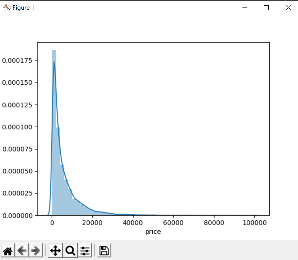
Obviously, the data distribution of the predicted value does not obey the normal distribution, and the values of skewness and kurtosis are very large, which is also in line with their definition. As can be seen from the figure, the long tail dragging on the right confirms that the kurtosis value is very large, and the peak is very sharp, which corresponds to the skewness value is very large. With my vague knowledge of probability and statistics, it's more like being close to Chi square or F distribution. Therefore, the data itself should be transformed.
plt.hist(Train_data['price'], orientation = 'vertical',histtype = 'bar', color ='red')
plt.show()
plt.hist(np.log(Train_data['price']), orientation = 'vertical',histtype = 'bar', color ='red')
plt.show()
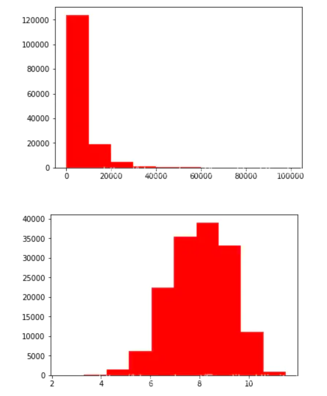
Because the data is relatively concentrated, it brings great difficulties to the prediction of the prediction model. Therefore, a log operation can be carried out to improve the distribution, which is conducive to the subsequent prediction.
6. Analysis of data feature correlation
6.1 correlation analysis of numric features
Before analysis, it is necessary to determine which features are numeric data and which features are object data. The method of automation is as follows:
# Separate label, i.e. predicted value
Y_train = Train_data['price']
This distinction applies to data without direct label coding
This is not applicable. It needs to be distinguished artificially according to the actual meaning
Digital features
numeric_features = Train_data.select_dtypes(include=[np.number])
numeric_features.columns
Type characteristics
categorical_features = Train_data.select_dtypes(include=[np.object])
categorical_features.columns
However, the label of the data set in this question has been marked with a name, and the label is limited. Each category is understandable, so it still needs to be marked manually. For example, although the model bodyType is numerical data, in fact, we know it should be object data. So you can do this:
num_feas = ['power', 'kilometer', 'v_0', 'v_1', 'v_2', 'v_3', 'v_4', 'v_5', 'v_6', 'v_7', 'v_8', 'v_9', 'v_10', 'v_11', 'v_12', 'v_13','v_14' ]

obj_feas = ['name', 'model', 'brand', 'bodyType', 'fuelType', 'gearbox', 'notRepairedDamage', 'regionC
Next, we add price to num_feas, and use pandas to generally analyze the correlation between features and visualize them.
num_feas.append('price')
price_numeric = Train_data[num_feas]
correlation = price_numeric.corr()
print(correlation['price'].sort_values(ascending = False),'\n')
The results don't show up (lazy)
f , ax = plt.subplots(figsize = (8, 8))
plt.title('Correlation of Numeric Features with Price', y = 1, size = 16)
sns.heatmap(correlation, square = True, annot=True, cmap='RdPu', vmax = 0.8) # When the parameter annot is True, data values are written for each cell. If the array has the same shape as the data, it is used to annotate the heat map instead of the original data.
plt.show()
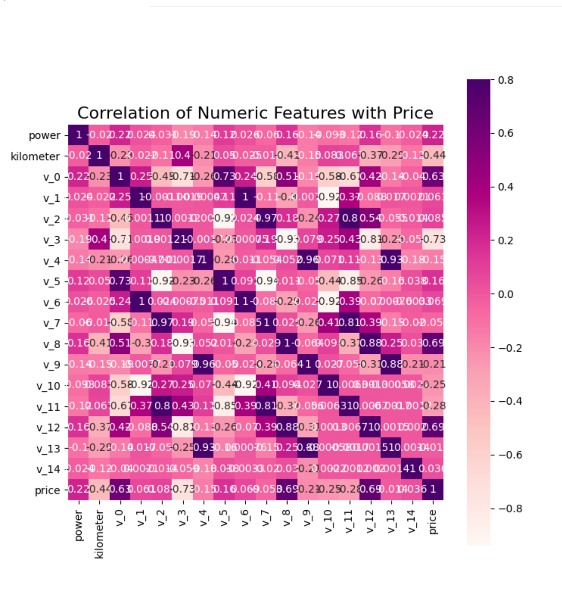
From the heat map, we can see that several characteristics with high correlation with price mainly include: kilometer,v3. It is quite consistent with our practical experience. That V3 may be a parameter related to important automobile parts such as engine.
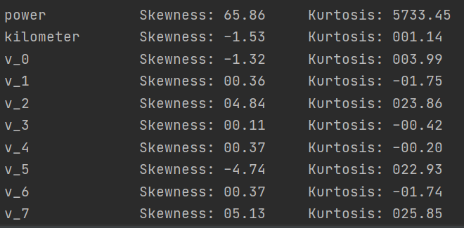
Check the skewness and kurtosis of each feature and the distribution of data
del price_numeric['price']
# The kurtosis and skewness of the output data, where pandas can be called directly
for col in num_feas:
print('{:15}'.format(col),
'Skewness: {:05.2f}'.format(Train_data[col].skew()) ,
' ' ,
'Kurtosis: {:06.2f}'.format(Train_data[col].kurt())
)
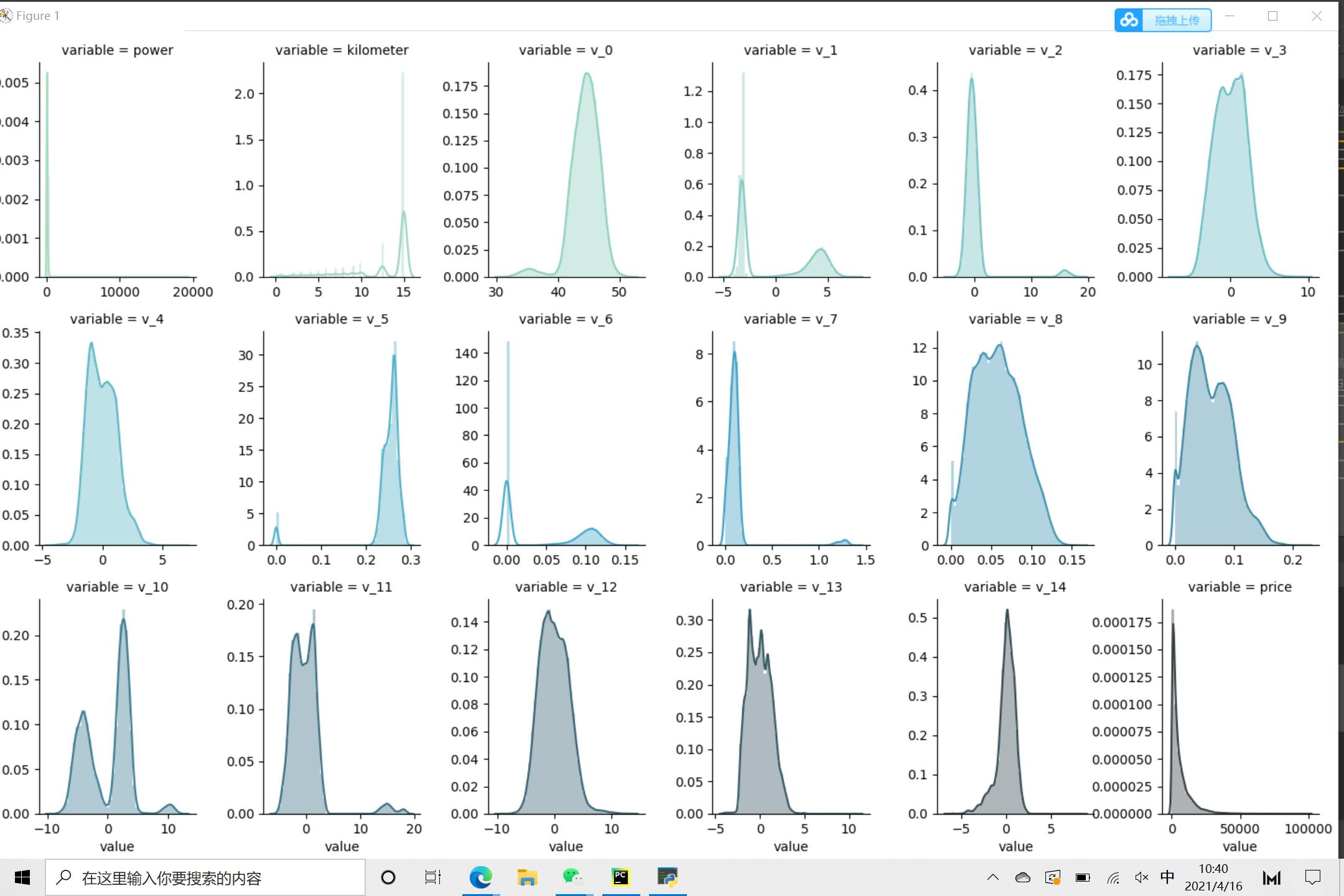
f = pd.melt(Train_data, value_vars = num_feas) # Using the melt function of pandas, the num in the test set_ Get the data corresponding to feas
# FacetGrid is a function used to draw grid graph in sns library, where col_wrap is used to control the number of graphs displayed in a row. Whether sharex or sharey share the X and Y axes means whether each sub graph has its own horizontal and vertical coordinates.
g = sns.FacetGrid(f, col = "variable", col_wrap = 6, sharex = False, sharey = False, hue = 'variable', palette = "GnBu_d") # The optional parameters of palette are similar to cmap above
g = g.map(sns.distplot, "value")
plt.show()
Correlation between numerical characteristics
## 4) Visualization of the relationship between digital features
sns.set()
columns = ['price', 'v_12', 'v_8' , 'v_0', 'power', 'v_5',  'v_2', 'v_6', 'v_1', 'v_14']
sns.pairplot(Train_data[columns],size = 2 ,kind ='scatter',diag_kind='kde')
plt.show()
Many pictures will be displayed
Visualization of the correlation between price and other variables. Here, anonymous variables v0~v13 are used for analysis, and seaborn's regplot function is used for correlation regression analysis.
Y_train = Train_data['price']
fig, ((ax1, ax2), (ax3, ax4), (ax5, ax6), (ax7, ax8), (ax9, ax10),(ax11, ax12),(ax13,ax14)) = plt.subplots(nrows = 7, ncols=2, figsize=(24, 20))
ax = [ax1, ax2, ax3, ax4, ax5, ax6, ax7, ax8, ax9, ax10, ax11, ax12, ax13, ax14]
for num in range(0,14):
    sns.regplot(x = 'v_' + str(num), y = 'price', data = pd.concat([Y_train, Train_data['v_' + str(num)]],axis = 1), scatter = True, fit_reg = True, ax = ax[num])
It can be seen that the distribution of most anonymous variables is relatively concentrated, but the performance of linear regression is relatively weak
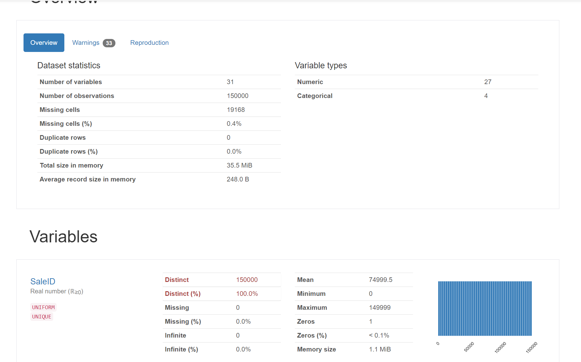
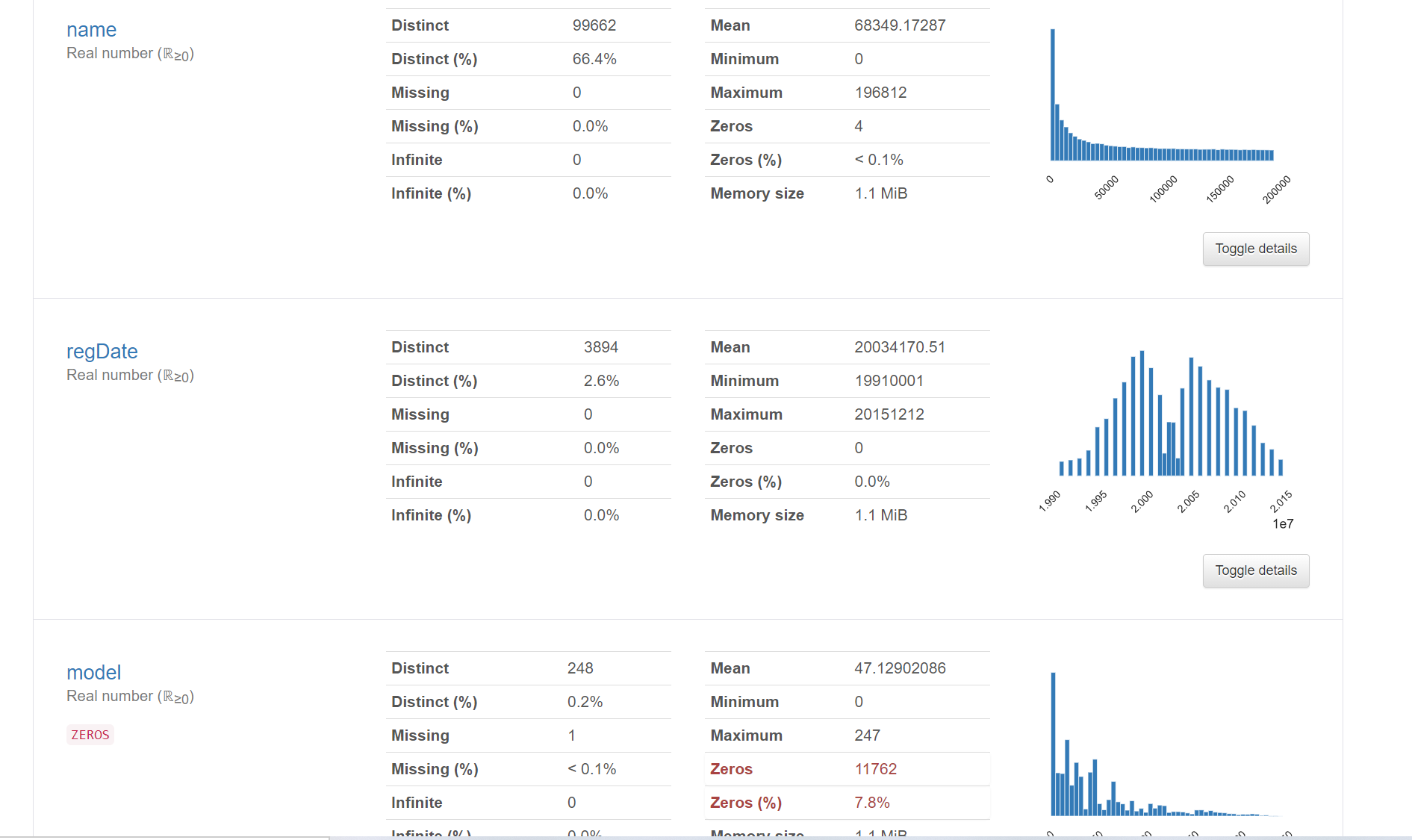
6.2 pandas_ Generating data report
Using pandas_profiling generates a more comprehensive visualization and data report (relatively simple and convenient), and finally opens the html file
#pandas_ Generating data report
import pandas_profiling
pfr = pandas_profiling.ProfileReport(Train_data)
pfr.to_file("pandas_analysis.html")
The generated html file is opened with a browser as follows:
summary
1. Use describe() and info() to describe the basic statistics of data
2. Using missingno library and pandas Isnull() to visually detect and handle outliers and missing values
3. Be familiar with the concepts of Skewness and Kurtosis, and use skeu() and kurt() to calculate their values
4. After determining the range and distribution of predicted values, we can take logarithms or open roots to alleviate the problems in the data set
Correlation analysis
corr() is used to calculate the correlation coefficient of each feature
Use seaborn's heatmap to draw the thermodynamic diagram of correlation coefficient
seaborn's FacetGrid and pairplot can be used to draw the data distribution map within each feature and between the predicted value and other features
seaborn's regplot can also be used to analyze the relationship between the predicted value and each feature