1, rem
px unit: absolute unit
rem unit: relative unit
Calculation result of font size relative to HTML tag in rem unit
1rem=1HTML font size (root font size)
<!DOCTYPE html>
<html lang="en">
<head>
<meta charset="UTF-8">
<meta http-equiv="X-UA-Compatible" content="IE=edge">
<meta name="viewport" content="width=device-width, initial-scale=1.0">
<title>rem Basic use</title>
<style>
* {
margin: 0;
padding: 0;
}
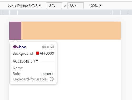
html{
font-size: 20px;
}
.box{
width: 2rem;
height: 3rem;
background-color: red;
}
</style>
</head>
<body>
<div class="box"></div>
</body>
</html>effect:
1. Media inquiry
Detect the width of the viewport, and then write a differentiated css style
Syntax:
@ media (media features){
Selector{
css properties
}
}
<style>
        /* Use media query to set different root font sizes according to different viewport widths */
        @media (width:375px) {
            html{
                font-size: 40px;
            }
        }
</style>
In the current rem layout scheme, the web page is divided into 10 parts, and the font size of HTML tag is 1 / 10 of the width of viewport
<!DOCTYPE html>
<html lang="en">
<head>
    <meta charset="UTF-8">
    <meta http-equiv="X-UA-Compatible" content="IE=edge">
    <meta name="viewport" content="width=device-width, initial-scale=1.0">
    <title>rem Adaptation</title>
    <style>
        * {
            margin: 0;
            padding: 0;
        }

        /* Media query */
        @media (width:320px) {
            html{
                font-size: 32px;
            }
        }
        @media (width:375px) {
            html{
                font-size: 37.5px;
            }
        }
        @media (width:414px) {
            html{
                font-size: 41.4px;
            }
        }
        .box{
            width: 5rem;
            height: 3rem;
            background-color: red;
        }
    </style>
</head>

<body>
    <div class="box"></div>
</body>
</html>
effect:
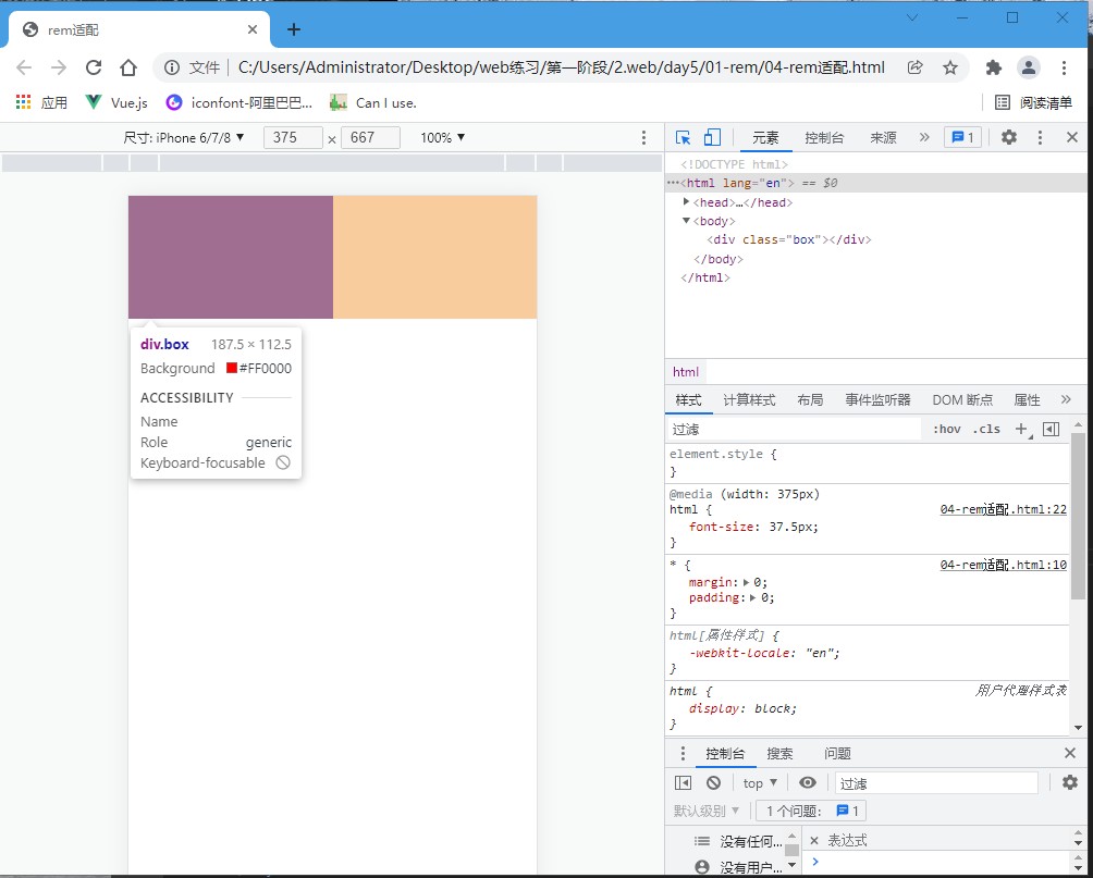
rem unit size
1. Set different font sizes of HTML tags according to the width of the viewport
2. Write the code, and the size is rem unit
2.1 determine the font size of the HTML tag of the equipment corresponding to the design draft
Check the width of the design draft (generally 375px) → determine the width of the reference equipment (viewport width) → determine the reference root font size (1 / 10 viewport width)
2.2 dimensions in rem units
N * 37.5 = 68 → N = 68 / 37.5
Size of rem unit = px unit value / benchmark root font size
2.flexible.js
Using flexible js and rem to achieve the effect of proportionally scaling the size of web page elements in devices with different widths
js framework for mobile terminal
Set different font sizes for html root nodes in web pages according to different viewport widths
Syntax:
<script src="../js/flexible.js"></script>
2, less
CSS does not support computational writing, which can be realized through Less.
Use Less syntax to quickly compile and generate CSS code
Less is a CSS preprocessor, and the suffix of less file is less
The CSS language is expanded to make CSS have certain logic and computing power.
Note: the browser does not recognize the Less code. At this stage, the corresponding CSS file should be introduced into the web page.
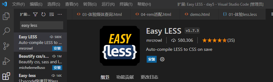
Install the vscode plug-in, save the less file, and automatically generate the css file
1.less syntax
Single-Line Comments
Syntax: / / comment content
Shortcut key: ctrl +/
Block annotation
Syntax: / * comment content*/
Shortcut key: shift + alt + A
Operation:
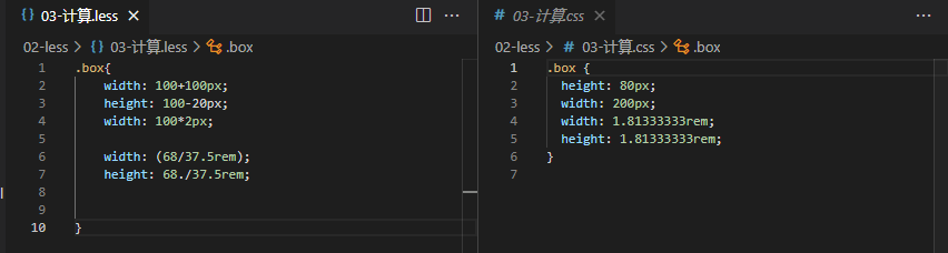
Add, subtract and multiply to write calculation expressions directly
Division requires parentheses or
Note:
There are multiple units in the expression, and the first unit shall prevail
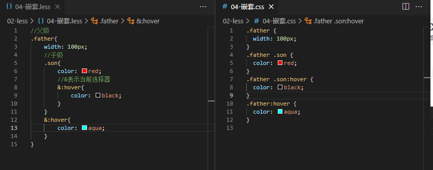
Less nested writing generates descendant selectors to avoid style conflicts
Note: & do not generate a descendant selector, which indicates the current selector. It is usually used with pseudo classes or pseudo elements
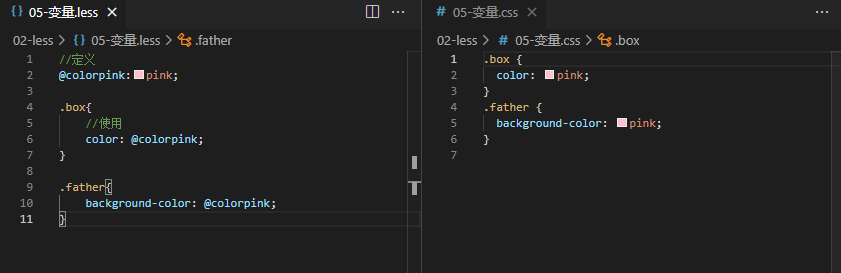
Use the Less variable to set the attribute value
Store the color in a container in advance and set the attribute value to the container name
Variable: store data for easy use and modification.
Syntax:
Define variable: @ variable name: value;
Use variable: CSS attribute: @ variable name;
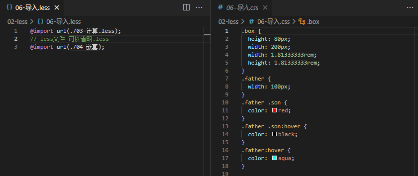
Use the Less import writing method to reference other Less files
Syntax: @ import "file path";
Exporting CSS files using Less syntax
Method 1:
Configure EasyLess plug-in to realize that all Les have the same export path
Configure plug-in: setting → search EasyLess → in setting Edit → add code in JSON (note that it must be double quotation marks)
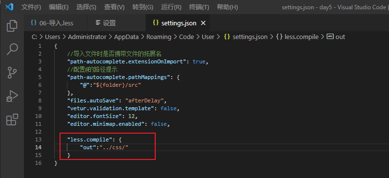
Method 2: control the export path of the current Less file
Add the following code to the first line of the Less file. Note that it is added after the folder name/
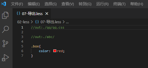
Prohibit export
Add in the first line of the less file: / / out: false
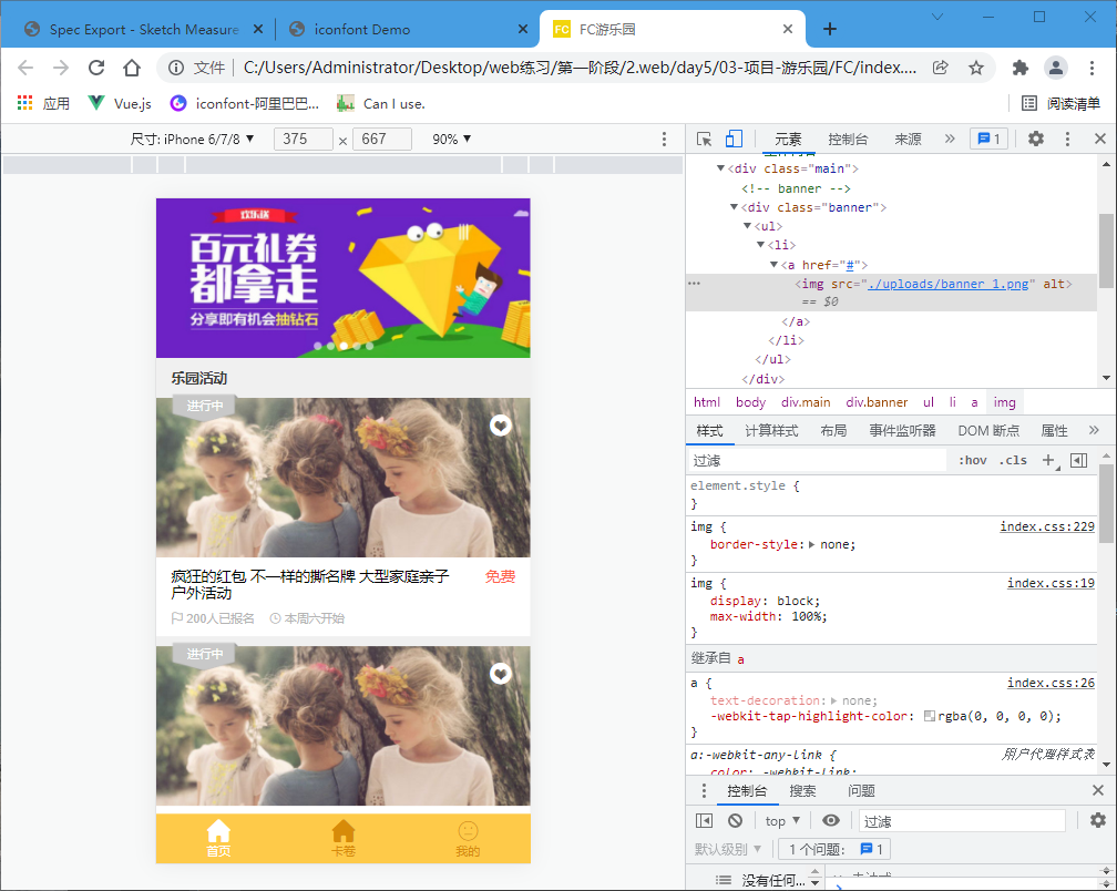
3, Case
html
<!DOCTYPE html>
<html lang="en">
<head>
    <meta charset="UTF-8">
    <meta http-equiv="X-UA-Compatible" content="IE=edge">
    <meta name="viewport" content="width=device-width, initial-scale=1.0">
    <title>FC Amusement Park</title>
    <!-- small icons -->
    <link rel="shortcut icon" href="favicon.ico" type="image/x-icon">
    <!-- Font Icon -->
    <link rel="stylesheet" href="./lib/iconfont/iconfont.css">
    <!-- style sheet -->
    <link rel="stylesheet" href="./css/index.css">

</head>
<body>
    <!-- js -->
    <script src="./js/flexible.js"></script>

    <!-- Main content -->
    <div class="main">
        <!-- banner -->
        <div class="banner">
            <ul>
                <li>
                    <a href="#">
                        <img src="./uploads/banner_1.png" alt="">
                    </a>
                </li>
            </ul>
        </div>

        <!-- Activity title -->
        <div class="title">
            <h4>Paradise activities</h4>
        </div>

        <!--Activity content -->
        <section class="item">
            <div class="pic">
                <a href="#"><img src="./uploads/item_2.png" alt=""></a>
                <!-- Favorite Icon -->
                <i class="iconfont icon-shoucang "></i>
                <!-- state -->
                <div class="active off">have in hand</div>
            </div>
            <div class="txt">
                <div class="top">
                    <h5>Crazy red envelopes are different from tearing famous brands. Large family parent-child outdoor activities</h5>
                    <p>free</p>
                </div>
                <div class="bottom">
                    <p>
                        <i class="iconfont icon-qizhi"></i>
                        <span>200</span>People have signed up
                    </p>
                    <p>
                        <i class="iconfont icon-shizhong"></i>
                        <span>This Saturday</span>start
                    </p>
                </div>

            </div>
        </section>

    </div>
    <!--Main content  -->

    <!-- bottom toolbars  -->
    <footer>
        <a href="#" class="current">
            <i class="iconfont icon-index-copy"></i>
            <p>home page</p>
        </a>
        <a href="#">
            <i class="iconfont icon-youhuiquan "></i>
            <p>Card roll</p>
        </a>
        <a href="#">
            <i class="iconfont icon-iconfront-"></i>
            <p>my</p>
        </a>
    </footer>
    <!-- bottom toolbars  -->

</body>
</html>
less
@import url(./base.less);//initialization
@import url(./normalize.less);//compatible

//Storage variables: 5rem
@rootSize:37.5rem;

body{
    background-color: #f0f0f0;
}


// Main content
.main{
    padding-bottom: (50/@rootSize);

    //Nested writing
    //banner
    .banner{
        height: (160/@rootSize);
    }

    //Activity title
    .title{
        padding-left: (15/@rootSize);
        height: (40/@rootSize);
        line-height: (40/@rootSize);

        h4{
            font-size: (14/@rootSize);
            color: #3C3C3C;
        }
    }

    //Activity content
    .item{
        margin-bottom: (10/@rootSize);

        //picture
        .pic{
            position: relative;
            height: (160/@rootSize);

            //Favorite Icon
            i{
                //location
                position: absolute;
                top: (15/@rootSize);
                right: (18/@rootSize);
                font-size: (24/@rootSize);
                color: #fff;

            }

            //state
            .active{
                //location
                position: absolute;
                left: (15/@rootSize);
                top: (-4/@rootSize);

                width: (68/@rootSize);
                height: (29/@rootSize);
                background-image: url(../images/status_active.png);
                // Resize background picture
                background-size: contain;
                font-size: (12/@rootSize);
                color: #fff;
                //horizontally
                text-align: center;
                //Vertical center
                line-height: (25/@rootSize);

                //Gray picture
                //.active. The off {} intersection selector active also applies the off class
                &.off{
                    background-image: url(../images/status_default.png);

                }
            }

            // .off{
            //     //Gray picture
            // }

        }

        //written words
        .txt{
            padding: (10/@rootSize) (15/@rootSize);
            background-color: #fff;

            .top{
                display: flex;
                // Horizontal alignment
                justify-content: space-between;

                h5{
                    font-size: (15/@rootSize);
                    width: (290/@rootSize);
                    font-weight: normal;
                }
                p{
                    font-size: (15/@rootSize);
                    color: #FE6249;
                }
            }

            .bottom{
                display: flex;
                margin-top: (10/@rootSize);
                p{
                    margin-right: (15/@rootSize);
                    font-size: (11/@rootSize);
                    color: #B4B4B4;

                    //Set font Icon Font Size
                    i{
                        font-size: (11/@rootSize);
                    }
                }
            }
        }
    }
}

//bottom toolbars
footer{
    display: flex;
    //level
    justify-content: space-around;
    // Vertical center
    align-items: center;

    //Positioning and fixing
    position: fixed;
    left: 0;
    bottom: 0;

    height: (50/@rootSize);
    width: 100%;
    background-color: #FECA49;

    text-align: center;

    a{
        color: #D78B09;
        font-size: (11/@rootSize);

        .iconfont{
            font-size: (24/@rootSize);
        }
       //a.current{}
        &.current{
            color: white;
        }
    }

}
effect: