Flutter is a cross platform UI framework launched by Google, which can quickly build high-quality applications on Android and IOS. Its main characteristics are that flutter has the ability of rapid development, expressive and flexible UI and good native performance. This article mainly introduces the Flex layout in flutter, as follows:
- Flex Foundation
- Flex common settings
- Row and Column
- Expanded and Flexible
- Spacer
Flex Foundation
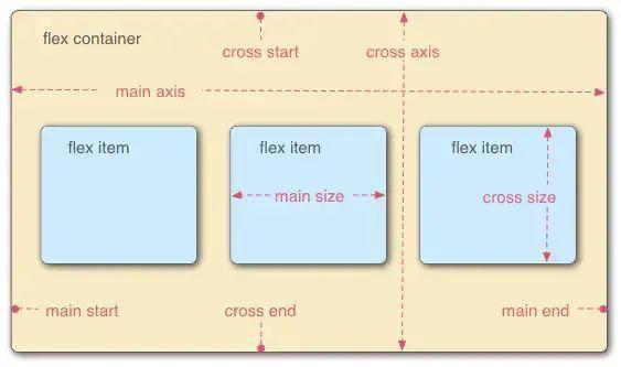
Flex layout has been widely used in front-end and applet development. If you have learned flex layout before, it is similar in fluent. The schematic diagram of Flexible Box is as follows:
For example, if the width of the flex Column and the width of the flex Column are related to each other, you can use the width of the flex Column as the main axis. If the width of the flex Column and the width of the flex Column are related to each other, you can set the direction of the flex Column as the main axis. If the direction of the flex Column and the width of the flex Column are related to each other, you can use the following warning message:
I/flutter (14749): ══╡ EXCEPTION CAUGHT BY RENDERING LIBRARY ╞════════════════════════════════════════════  ═════════════
I/flutter (14749): The following assertion was thrown during layout:
I/flutter (14749): A RenderFlex overflowed by 440 pixels on the right.
The error is displayed as follows:
Flex common settings
Common Flex properties are as follows:
- direction
- mainAxisAlignment
- mainAxisSize
- crossAxisAlignment
- verticalDirection
- textBaseline
1. direction
Set the spindle direction. The settable value is axis Horizontal and axis Vertical, the cross axis is perpendicular to the direction of the main axis.
2. mainAxisAlignment:
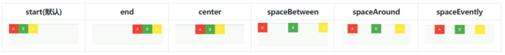
Set the arrangement of child widgets along the spindle direction. The default is mainaxisalignment Start, which can be set as follows:
- MainAxisAlignment.start: left aligned, default value;
- MainAxisAlignment.end: align right;
- MainAxisAlignment.center: center alignment;
- MainAxisAlignment.spaceBetween: align both ends;
- MainAxisAlignment.spaceAround: the spacing on both sides of each Widget is equal, and the spacing with the edge of the screen is half that between other widgets;
- MainAxisAlignment.spaceEvently: evenly distribute all widgets, and the interval between widgets and the edge of the screen is equal to that between other widgets
The comparison effect is as follows:
3. mainAxisSize
Set the size of the spindle. The default is mainaxissize Max, the settable values are as follows:
- MainAxisSize.max: the size of the spindle is the size of the parent container;
- MainAxisSize.min: the size of the spindle is the sum of the sizes of its child widgets.
The comparison effect is as follows:
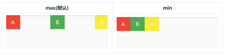
Set mainAxisAlignment to spaceBetween. If mainaxisize is set to max, the Row will be arranged in the way of spaceBetween based on the width of the whole Row. If mainaxisize is set to min, the Row will be arranged in the way of spaceBetween within the sum of the three Container widths.
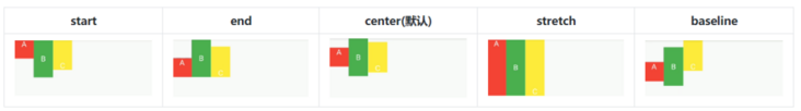
4. crossAxisAlignment
Set the arrangement of child widgets along the cross axis direction. The default is crossaxisalignment Center can be set as follows:
- CrossAxisAlignment.start: align with the starting position of the cross axis;
- CrossAxisAlignment.end: align with the end position of the cross axis;
- CrossAxisAlignment.center: center alignment;
- CrossAxisAlignment.stretch: fill the entire cross axis;
- CrossAxisAlignment.baseline: align according to the baseline of the first line of text.
The comparison effect is as follows:
5. verticalDirection
Set the arrangement order of sub widgets in the vertical direction. The default is verticaldirection Down, the setting method is as follows:
- VerticalDirection.down: start at the top and end at the bottom;
- VerticalDirection.up: start at the bottom and end at the top.
The comparison effect is as follows:
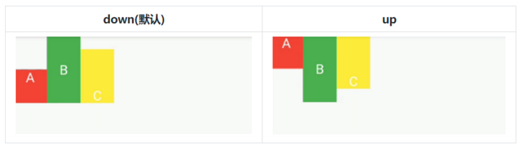
Observe the crossaxisalignment End, on this basis, the change in the vertical direction.
6. textBaseline
Set the baseline type of text alignment. The values you can set are as follows:
- TextBaseline. Alpha: align with the letter baseline;
- TextBaseline.ideographic: align with ideographic baseline;
When using, when crossAxisAlignment is set to baseline, the value of textBaseline property must be set as follows:
// textBaseline
class FlexSamplePage extends StatelessWidget {
  @override
  Widget build(BuildContext context) {
    return Scaffold(
      appBar: AppBar(
        title: Text("Flex Sample"),
        centerTitle: true,
      ),
      body: Row(
        children: <Widget>\[
          Expanded(
              child: Row(
                children: <Widget>\[
                  Text("Bow",style: TextStyle(fontSize: 40,),),
                  Text("x",style: TextStyle(fontSize: 60,),),
                  Text("ing",style: TextStyle(fontSize: 16,),),
                  Text("of",style: TextStyle(fontSize: 16,),),
                \],
          )),
          Expanded(
              child: Row(
                crossAxisAlignment: CrossAxisAlignment.baseline,
                textBaseline: TextBaseline.alphabetic,
                children: <Widget>\[
                  Text("Bow",style: TextStyle(fontSize: 40,),),
                  Text("x",style: TextStyle(fontSize: 60,),),
                  Text("ing",style: TextStyle(fontSize: 16,),),
                  Text("of",style: TextStyle(fontSize: 16, ),),
                \],
          )),
          Expanded(
              child: Row(
                crossAxisAlignment: CrossAxisAlignment.baseline,
                textBaseline: TextBaseline.ideographic,
                children: <Widget>\[
                  Text("Bow",style: TextStyle(fontSize: 40, ),),
                  Text("x",style: TextStyle(fontSize: 60,),),
                  Text("ing",style: TextStyle(fontSize: 16,),),
                  Text("of",style: TextStyle(fontSize: 16,),),
                \],
              ))
        \],
      ),
    );
  }
}
Do not set textBaseline property and set textBaseline Alpha and textBaseline Ideographic, the comparison effect is as follows:

Although the two are different in the meaning of the corresponding baseline, the test did not find any difference. Continue to pay attention to the observation in the later stage, and friends who know can comment and point out.
Row and Column
Both Row and Column inherit Flex. The direction of Row spindle is horizontal and the direction of Column spindle is vertical. That is, the direction of spindle is set on the basis of Flex, as follows:
// Row
direction: Axis.horizontal,
/// Column
direction: Axis.vertical,
If the spindle direction is determined, you can directly use Row or Column in the same way as Flex.
Expanded and Flexible
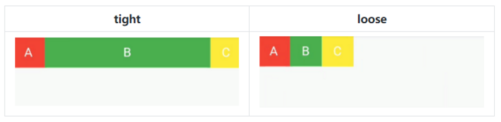
The fix property of Flexible defaults to Flexfit Loose, while Expanded inherits Flexible, and its fix attribute is specified as Flexfit Tight. They are different because their fix attribute is not used. If the fit attribute of Flexible is set to Flexfit Tight, then Flexible is equivalent to Expanded, and the settable fit attributes are as follows:
- tight: forced filling of available space;
- loose: the available space is not forced to be filled, and the size of the Widget itself.
The comparison effect is as follows:
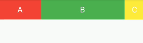
Expanded enables the components in Row, Column and flex to fill the available space along the main axis. If multiple widgets use expanded components, the expanded flex attribute can be used to allocate the main axis space in proportion. The flex attribute is equivalent to the weight attribute of Android LinearLayout, as follows:
// Expanded
class ExpandedSamplePage extends StatelessWidget {
  @override
  Widget build(BuildContext context) {
    return Scaffold(
        appBar: AppBar(
          title: Text("Row Sample"),
          centerTitle: true,
        ),
        body: Row(
          mainAxisAlignment: MainAxisAlignment.start,
          mainAxisSize: MainAxisSize.max,
          children: <Widget>\[
            Expanded(
              flex: 1,
              child: Container(
                  width: 50,
                  height: 50,
                  color: Colors.red,
                  child: Center(
                    child: Text(
                      "A",
                      style: TextStyle(fontSize: 20, color: Colors.white),
                    ),
                  )),
            ),
            Expanded(
              flex: 2,
              child: Container(
                  width: 50, //Invalid width under Row # Expanded
                  height: 50, //Invalid height under Column Expanded
                  color: Colors.green,
                  child: Center(
                    child: Text(
                      "B",
                      style: TextStyle(fontSize: 20, color: Colors.white),
                    ),
                  )),
            ),
            Container(
                width: 50,
                height: 50,
                color: Colors.yellow,
                child: Center(
                  child: Text(
                    "C",
                    style: TextStyle(fontSize: 20, color: Colors.white),
                  ),
                )),
          \],
        ));
  }
}
The display effect is as follows:
Spacer
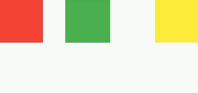
Spacer is used to adjust the spacing between widgets and will occupy all the remaining space. Therefore, the setting of MainAxisAlignment will be invalid. The property flex of spacer is used to set the allocation weight of the remaining space. The default value is 1, which means to occupy all the remaining space. If there are more than two spacers, the remaining space will be allocated according to flex. The code reference is as follows:
class RowSamplePage1 extends StatelessWidget {
  @override
  Widget build(BuildContext context) {
    return Scaffold(
        appBar: AppBar(
          title: Text("Row Sample"),
          centerTitle: true,
        ),
        body: ConstrainedBox(
          constraints: BoxConstraints(maxHeight: 150),
          child: Row(
            children: <Widget>\[
              Container(
                width: 80,
                height: 80,
                color: Colors.red,
              ),
              Spacer(flex: 1,),
              Container(
                width: 80,
                height: 80,
                color: Colors.green,
              ),
              Spacer(flex: 2,),
              Container(
                width: 80,
                height: 80,
                color: Colors.yellow,
              ),
            \],
          ),
        ));
  }
}
The display effect is as follows: