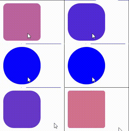
Some simple animation transition effects can be realized through the transition attribute in css3~
1. Grammar
transition: property duration timing-function delay;
The transition attribute sets the transition effect of the element. It is a composite attribute, including four short attributes:
- Transition property: Specifies the name of the CSS property and the transition effect (default: all)
- Transition duration (required): the duration of the transition effect (not specified, the default is 0, and there will be no effect)
- Transition timing function: Specifies the speed curve of the transition effect (default: ease)
- Transition delay: Specifies the transition delay start time (0 by default)
Note: IE9 and below do not support this attribute, safari3 1-6,IOS3.2-6.1,android2.1-4.3 - webkit prefix needs to be added; Other browsers support standard writing
<!DOCTYPE html>
<html>
    <head>
        <meta charset="utf-8">
        <title></title>
        <style type="text/css">
        .tra{
            width: 50px;
            height: 50px;
            background-color: lightcoral;
            /* Composite attribute */
            transition: all 2s ease 0s;
            /* The following sub attributes can also be used */
            transition-duration: 2s;
            transition-property: all;
            transition-timing-function: ease;
            transition-delay: 0s;
        }
        .tra:hover{
            width: 200px;
        }
        </style>
    </head>
    <body>
        <div class="tra"></div>
    </body>
</html>
Operation effect:

Note: when using the {transition} composite attribute, each attribute is separated by a space and cannot be used,
2. Sub attribute
(1)transition-property
The transition property attribute can specify the css attribute that needs to be transitioned. The default value is all, which means that all attributes are transitioned (if you don't write the attribute value, it also means all). If it is none, there is no transition effect on any attribute
.tra{
    width: 50px;
    height: 50px;
    background-color: lightcoral;
    /* Specifies the width property transition */
    transition: width 2s ease 0s;
}
.tra:hover{
    width: 200px;
    height: 100px;
}
<div class="tra"></div>

Only the {width} attribute is specified, and the height} attribute is not specified
Note: not all css attributes can be transitioned. Only attributes with intermediate values can be transitioned. For example, display:block cannot be transitioned to display:none
(2)transition-duration
The transition duration property can be used to set the time required for the transition of an attribute, that is, the time required for the transition of the attribute from the old value to the new value (duration). The default value is 0s. If it is not specified, there will be no transition effect
.tra{
    width: 50px;
    height: 50px;
    display: block;
    background-color: lightcoral;
    /* Transition property is omitted here, and the default value is all */
    /* The specified transition time is 2s */
    transition: 2s ease 0s;
}
.tra:hover{
    width: 100px;
    height: 100px;
}

be careful:
- Cannot be negative
- The unit must be brought. A single number is invalid
- When the value is a single value, that is, all transition attributes correspond to the same time; When the value is multi valued, the transition attribute corresponds to the duration in order
.tra{
    width: 50px;
    height: 50px;
    display: block;
    background-color: lightcoral;

    transition-property: width,background;
    transition-timing-function: ease;
    transition-duration: 5s, 2s;
    /* The above sub attributes are equivalent to the following compound attribute writing method */
    transition: width 5s ease 0, background 2s ease 0;
}
.tra:hover{
    width: 100px;
    background-color: blue;
}

When the value is multi valued, the transition attribute corresponds to the duration in order
(3)transition-timing-function
The transition timing function attribute refers to the "slow function" of the transition. It is used to specify the animation motion form during attribute transition. The values can be keywords and bezier curves. The default value is ease
Keywords: linear | ease | ease in | ease out | ease in out|
Bessel: cubic Bezier (n, N, N, n);

.tra{
    width: 50px;
    height: 50px;
    display: block;
    background-color: lightcoral;
    /* transition-timing-function The default value is ease */
    transition: 1s linear| ease| ease-in| ease-out| ease-in-out|;
}
.tra:hover{
    border-radius: 50%;
    background-color: blue;
}
ease: slow start and end, fast in the middle

linear: uniform velocity

Ease in: slow at first, faster and faster

Ease out: the end is slow, getting slower and slower

Ease in out: accelerate first and then decelerate. It is similar to ease, but larger than ease

If the four values in cubic Bezier (n, N, N, n) Bezier curve are adjusted arbitrarily, different effects will be obtained
.tra{
    width: 50px;
    height: 50px;
    display: block;
    background-color: lightcoral;
    transition: 1s cubic-bezier(.75,2.03,0,.14);
}
.tra:hover{
    border-radius: 50%;
    background-color: blue;
}

(4)transition-delay
The transition delay property specifies the delay time before the transition begins
.tra{
    width: 50px;
    height: 50px;
    display: block;
    background-color: lightcoral;
    /* 2s Implementation will not begin until after the transition */
    transition: 1s cubic-bezier(.75,2.03,0,.14) 2s;
}
.tra:hover{
    border-radius: 50%;
    background-color: blue;
}

3. Conclusion
Finally, two additional points will be explained:
1. Trigger method: the transition attribute cannot be triggered only by hover. Other operations such as click event, get / lose focus, and long press can trigger the transition attribute transition
2. Event callback: the transition attribute has only one event, that is, the transitionend event, which is triggered after the transition event is completed
<!DOCTYPE html>
<html>
    <head>
        <meta charset="utf-8">
        <title></title>
<style>
    #test{
        height: 60px;
        width: 60px;
        background-color: lightpink;
        transition: width 1.5s;
        font-size: 12px;
    }
    #test:hover{
        width: 250px;
    }
</style>
    </head>
    <body>
        <div id="test"></div>
    </body>
    <script>
        //monitor transitionend event
        test.addEventListener("transitionend", myFunction);
        // Callback function
        function myFunction(e){
            e = e || event;
            test.innerHTML = "After the transition, execute the event callback content"
        }
    </script>
</html>
