Now more and more websites support theme switching, so do ours!
Here, we want to implement two examples, theme switching and night mode!
Topic switching:
Night mode:
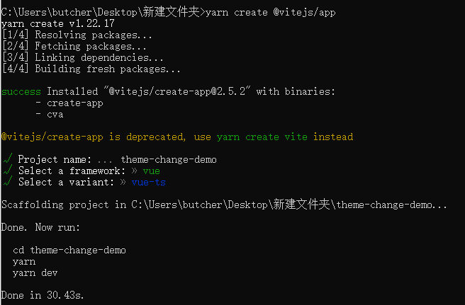
1. Get ready to initialize a simple vite project
Install Ant Design Vue and less
yarn add ant-design-vue@next

yarn add less --save
Because Ant Design Vue is developed using less, since we use it, we'd better use less which is consistent with it.
In main Import style and antd in global components
import { createApp } from 'vue'
import App from './App.vue'

import Antd from 'ant-design-vue';

import 'ant-design-vue/dist/antd.less'

createApp(App).use(Antd).mount('#app')
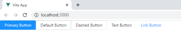
On app In Vue, we remove the useless code and add some antd buttons for testing.
<template>
  <a-button type="primary">Primary Button</a-button>
  <a-button>Default Button</a-button>
  <a-button type="dashed">Dashed Button</a-button>
  <a-button type="text">Text Button</a-button>
  <a-button type="link">Link Button</a-button>
</template>
Start with yarn dev
The reason for the error is that the style we introduced is a less file. We need to use vite config. Enable support in the TS file.
import { defineConfig } from 'vite'
import vue from '@vitejs/plugin-vue'

export default defineConfig({
  plugins: [vue()],
  // Enable less support
  css: {
    preprocessorOptions: {
      less: {
        javascriptEnabled: true
      }
    }
  }
})
Restart
2. Switch theme
Don't be too verbose. Understand the steps to create it, so as not to jump the pit. Otherwise, I don't know what's going on when I fall into a pit in the future. For example, the above enables less support
The topic switching is explained on the official website: https://next.antdv.com/docs/vue/customize-theme-cn
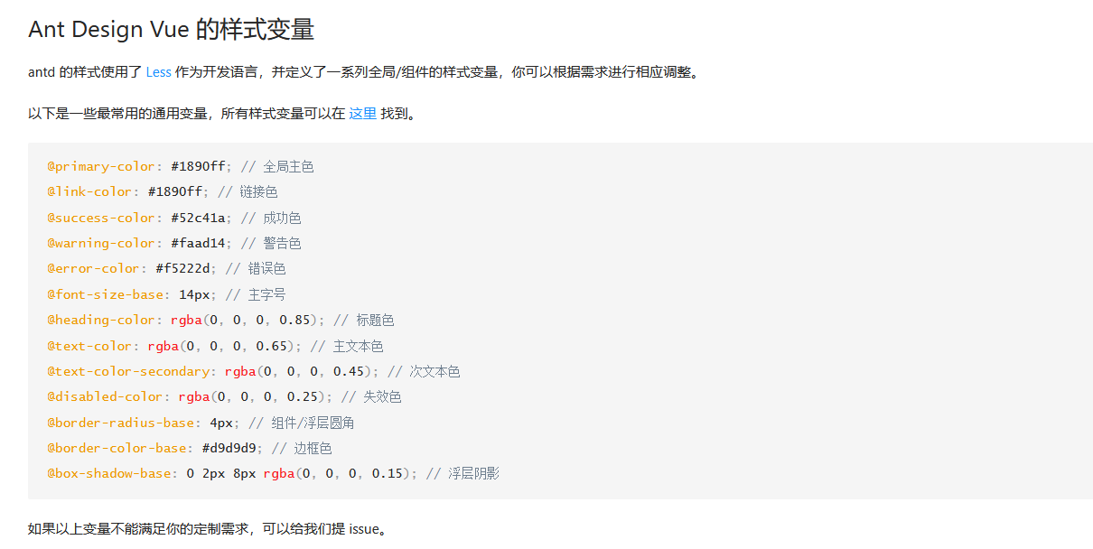 In other words, we can achieve our goal of customizing the theme by modifying these less variables.
Although the official website does not provide instructions on how to modify the theme in vite, it gives examples of vue cli and webpack. In fact, we can also know that it is similar in vite, which is modified through modifyVars in less. try
css: {
  preprocessorOptions: {
    less: {
      modifyVars: {
        'primary-color': '#1DA57A',
        'link-color': '#1DA57A',
        'border-radius-base': '2px',
      },
      javascriptEnabled: true
    }
  }
}
Note that here are key value pairs in string form.
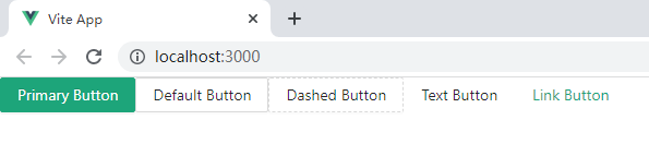
Look at the theme. It has indeed changed.
But this is only static. What we want to achieve is to dynamically switch our themes. How to achieve it?
3. Dynamically switch topics
Here I use a vite plug-in: vite-plugin-theme-preprocessor
A vite v2 0 + plug-in, which is used to realize multiple less and sass variable files and compile multi topic css, making the online dynamic switching of theme styles based on less, sass and css modules very simple.
Original post address: Portal
According to the instructions in the warehouse, we need to install the plug-in first:
yarn add @zougt/vite-plugin-theme-preprocessor -D

yarn add path --save
Note that path is used to resolve paths, which will be used in many places in our project. The same is true. Here too.
Then we need to be in vite config. Use this plug-in in TS.
import { defineConfig } from 'vite'
import vue from '@vitejs/plugin-vue'

import path from 'path'

import themePreprocessorPlugin from "@zougt/vite-plugin-theme-preprocessor";

export default defineConfig({
  plugins: [
    vue(),
    themePreprocessorPlugin({
      less: {
        // Location of each topic file
        multipleScopeVars: [
          {
            scopeName: "theme-default",
            path: path.resolve("src/theme/default.less"),
          },
          {
            scopeName: "theme-green",
            path: path.resolve("src/theme/green.less"),
          },
        ],
      },
    }),
  ],
  // Enable less support
  css: {
    preprocessorOptions: {
      less: {
        modifyVars: {
          'primary-color': '#1DA57A',
          'link-color': '#1DA57A',
          'border-radius-base': '2px',
        },
        javascriptEnabled: true
      }
    }
  }
})
Above, we have defined two themes: theme default and theme green, and the location of the corresponding theme file.
We switch themes by theme files.
Next, we need to create these two theme files and introduce the style files of ant respectively. Note that the format is less.
@import "ant-design-vue/lib/style/themes/default.less";
// defalut.less
// The core style file is introduced above. We can modify it and overwrite the original to achieve our purpose.
// Here you can modify not only variables but also styles

// For example, I modify the following

// Global dominant color yellow
@primary-color: #ffa618;

// Link color cyan
@link-color: #18ffb2;


@import "ant-design-vue/lib/style/themes/default.less";

// green.less

// Global dominant color green
@primary-color: #1cce42;

// Link color pink
@link-color: #c76f98;
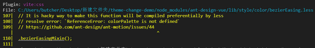
Note: Ant Design Vue / lib / style / themes / default There is no problem with the path of easy less. If an error is reported, please check whether you have installed the easy less plug-in. If so, disable it!
Then, we can carry out the logic of topic switching!
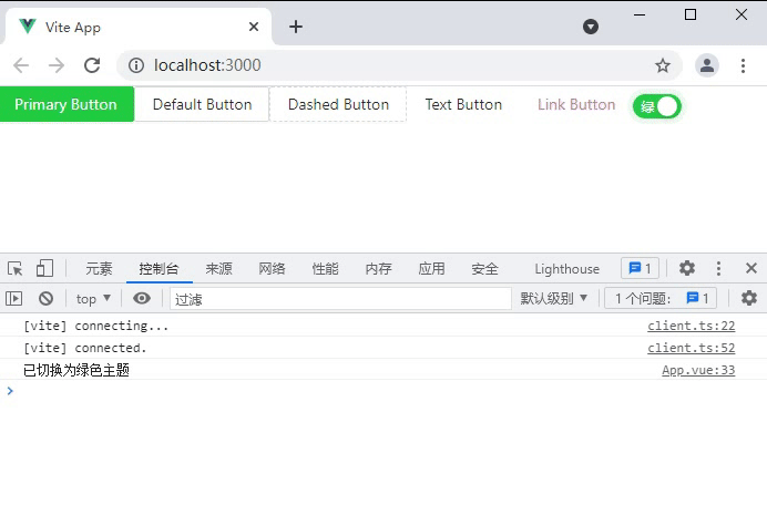
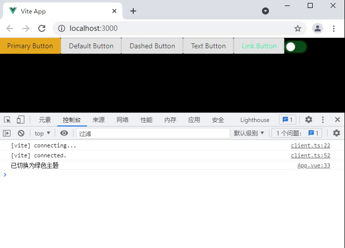
Our logic is relatively simple. I use a switch. It turns on green and turns off yellow.
On app In Vue
<template>
  <a-button type="primary">Primary Button</a-button>
  <a-button>Default Button</a-button>
  <a-button type="dashed">Dashed Button</a-button>
  <a-button type="text">Text Button</a-button>
  <a-button type="link">Link Button</a-button>

  <!-- Switch theme -->
  <a-switch
    v-model:checked="checked"
    checked-children="green"
    un-checked-children="yellow"
    @change="change"
  />
</template>

<script lang="ts">
import { defineComponent, ref } from "vue";

import { toggleTheme } from "@zougt/vite-plugin-theme-preprocessor/dist/browser-utils.js";

export default defineComponent({
  setup() {
    const checked = ref<boolean>(false);

    // Switch topic callback
    const change = (value: boolean) => {
      // If the switch is on, it will be switched to green theme, otherwise the default is yellow theme
      if (value) {
        toggleTheme({
          scopeName: "theme-green",
        });
        console.log("Switched to green theme");
      } else {
        toggleTheme({
          scopeName: "theme-default",
        });
        console.log("Switched to default theme");
      }
    };
    return {
      checked,
      change,
    };
  },
});
</script>
Note: if you report an error when introducing the plug-in, but it is not an error, you need to turn off the strict inspection mode of ts. That is, in tsconfig "Strict" in JSON: false,
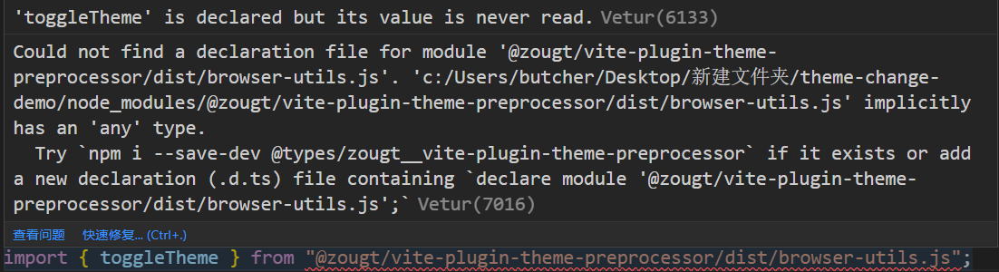 Then note that the switching topic discovery is invalid at this time.
Remember when you were at vite config. Delete or comment out the customized theme in TS because it has high priority.
 css: {
  preprocessorOptions: {
    less: {
      // modifyVars: {
      //   'primary-color': '#1DA57A',
      //   'link-color': '#1DA57A',
      //   'border-radius-base': '2px',
      // },
      javascriptEnabled: true
    }
  }
}
At this time, the effect of our title came out.
4. Night mode
This is very simple with the foreshadowing in front. The official has realized a set of dark themes. We will green Less modify it.
// @import "ant-design-vue/lib/style/themes/default.less";
// Change to dark theme
@import "ant-design-vue/lib/style/themes/dark.less";

// Global dominant color green
@primary-color: #1cce42;

// Link color pink
@link-color: #c76f98;
The others don't have to change
For this kind of component library, if it does not provide a similar dark mode, it may need to be changed a little, which will take a lot of time.
5. Summary
The above topic switching is not only applicable to ant design Vue, but also applicable to all less and sass based applications. The usage is the same.
Before that, we'll look at many schemes for topic switching, CSS variables antd-theme-generator There are also a lot of webbacks, but these are not what I need. Fortunately, I finally found the vite plugin theme preprocessor written by the ZGT boss, which really meets my expectations.