Flow layout of mobile WEB development
01 mobile terminal Foundation
1.1 browser status
1.2 current situation of mobile phone screen
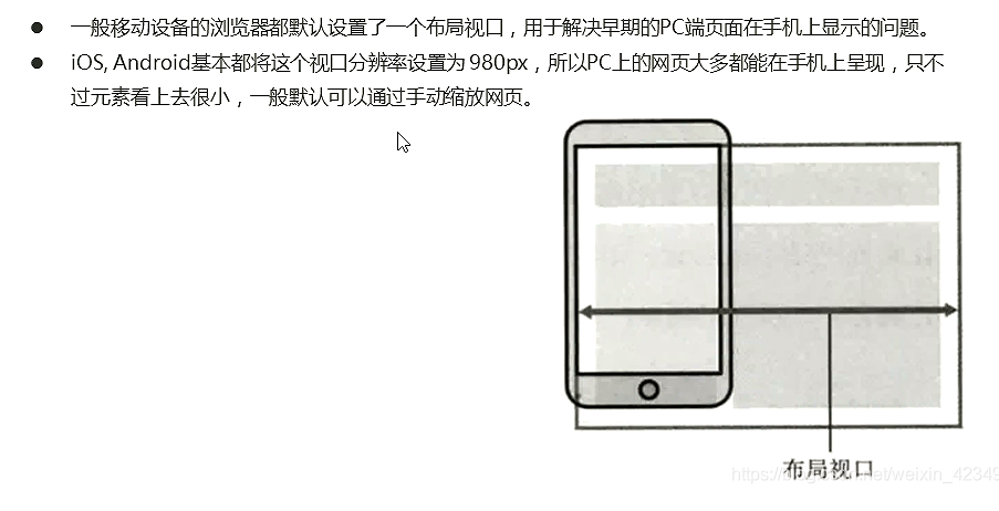
02 viewport
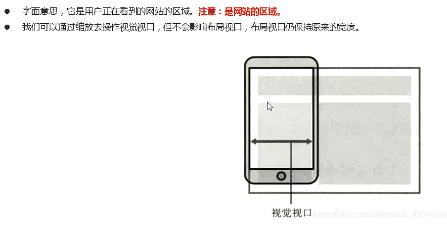
A viewport is the area of the screen.
2.1 layout viewport
2.2 visual viewport
2.3 ideal viewport
2.5 meta viewport labels
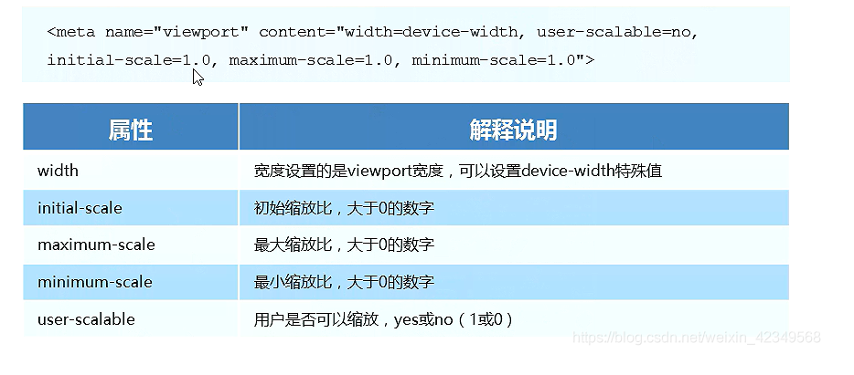
2.6 standard viewport settings
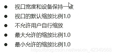
    <meta name="viewport" content="width=device-width,
     initial-scale=1.0,maximum-scale=1.0, minimum-scale=1.0, user-scalable=no">
03 double graph
3.1 physical pixel to physical pixel ratio
Physical pixels are screen resolution
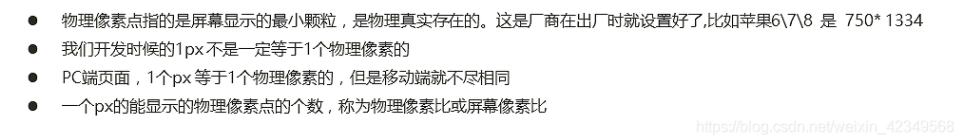
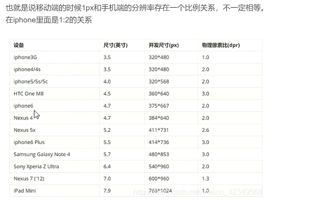
The reasons are as follows
3.2 multiple plot
<!DOCTYPE html>
<html lang="en">
<head>
<meta charset="UTF-8">
<meta name="viewport" content="width=device-width, initial-scale=1.0">
<meta http-equiv="X-UA-Compatible" content="ie=edge">
<title>Document</title>
<style>
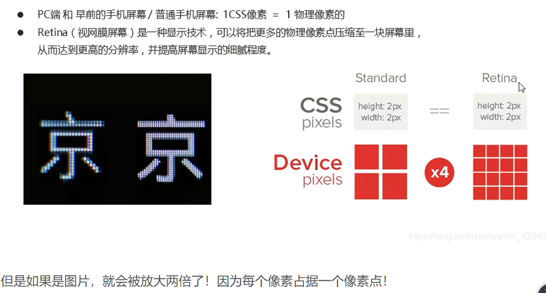
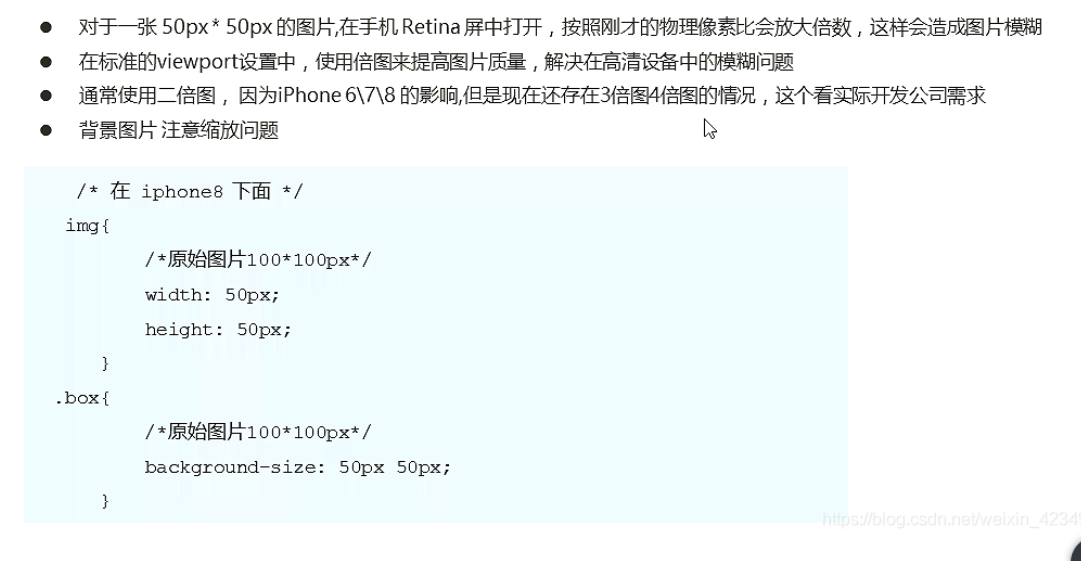
/* We need a 50 * 50 pixel (css pixel) image directly into our iPhone 8, which will be magnified twice and blurred by 100 * 100 */
/* What we do is put a 100 * 100 picture, and then manually reduce the picture to 50 * 50 (css pixels) */
/* The size of the picture we prepared is twice as large as what we actually need. This is the way of 2x picture */
img:nth-child(2) {
width: 50px;
height: 50px;
}
</style>
</head>
<body>
<!-- Vague -->
<img src="images/apple50(1).jpg" alt="">
<!-- We take a 2-fold graph -->
<img src="images/apple100.jpg" alt="">
</body>
</html>
3.3 background size
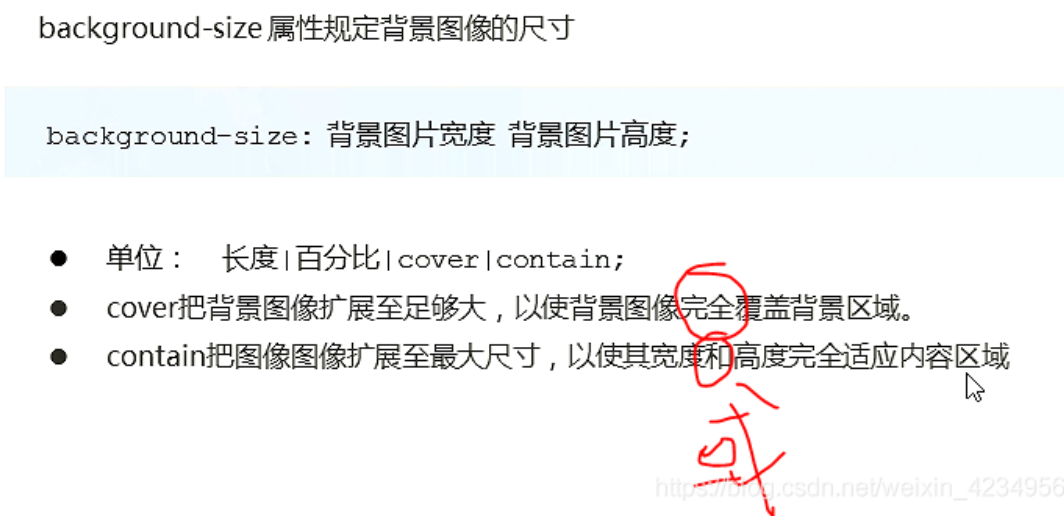
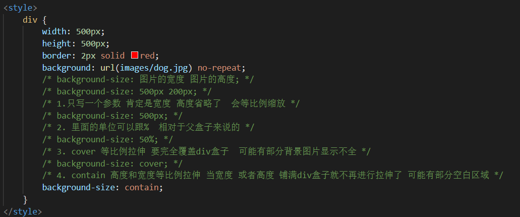
Double background picture
    <style>
        /* 1. We have a 50 * 50 box and need a background picture, but according to the analysis, this picture still needs to be prepared twice, 100 * 100 */
        /* 2. We need to scale the picture in half, that is, 50 * 50 background size*/

        div {
            width: 50px;
            height: 50px;
            border: 1px solid red;
            background: url(images/apple100.jpg) no-repeat;
            background-size: 50px 50px;
        }
    </style>
3.4 cuterman
You can use ps's image cutting tool to cut out double and triple images at the same time.
@3x 3x graph
@2X 2 x graph
@1X 1 x original
04 mobile terminal commissioning
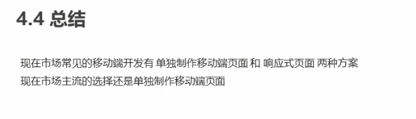
4.2 separate mobile terminal page (mainstream)

4.3 responsive compatible PC terminal
4.4 summary
05 mobile terminal technology solutions
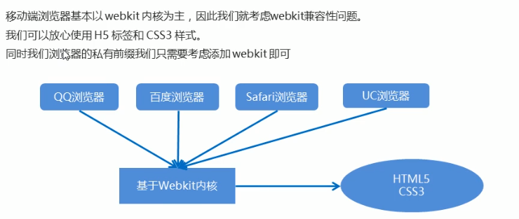
5.1 mobile browser
Rest assured and use h5c3 boldly.
5.2 CSS initialization normalize css
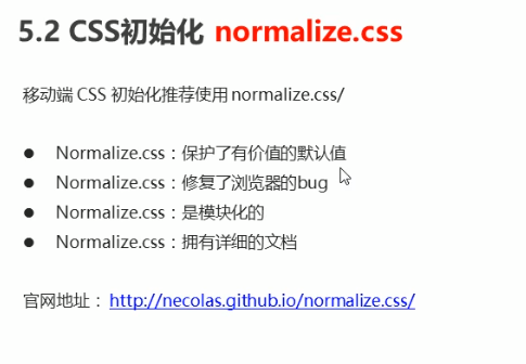
Download address: http://necolas.github.io/normalize.css/
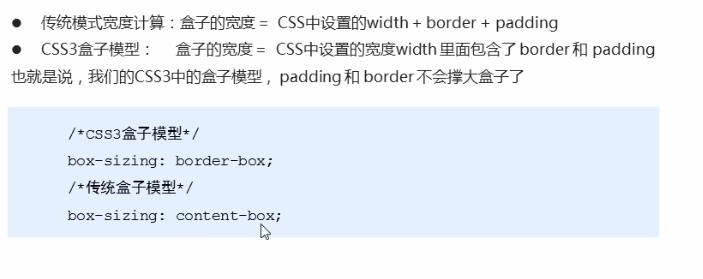
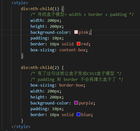
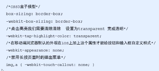
5.3 CSS3 box sizing
5.4 special styles
   <style>
        a {
            /* Unconnect highlight/*  */
            -webkit-tap-highlight-color: transparent;
        }

        input {
            /* Cancel default appearance */
            -webkit-appearance: none;
        }
    </style>
06 common layout of mobile terminal
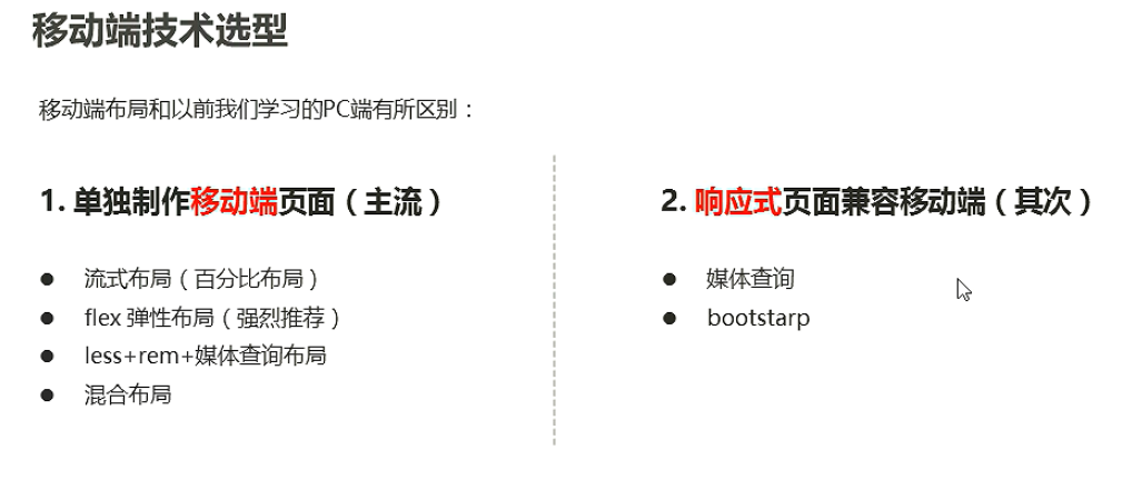
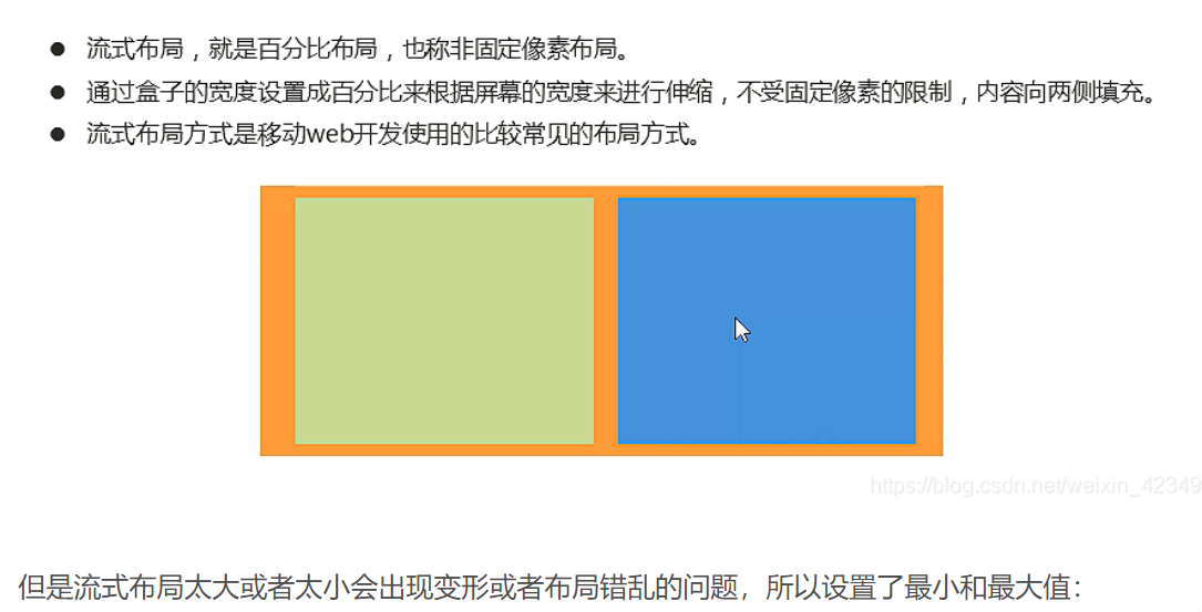
6.1 flow layout (percentage layout)
<style>
* {
margin: 0;
padding: 0;
}
section {
width: 100%;
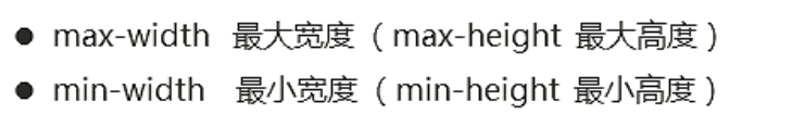
max-width: 980px;
min-width: 320px;
margin: 0 auto;
}
section div {
float: left;
width: 50%;
height: 400px;
}
section div:nth-child(1) {
background-color: pink;
}
section div:nth-child(2) {
background-color: purple;
}
</style>
</head>
<body>
<section>
<div></div>
<div></div>
</section>
</body>
07 flow layout of mobile terminal development
08 home page production of JD mobile terminal
(D: \ dark horse HTML\CSS exercise new \ home page layout of JD mobile terminal)
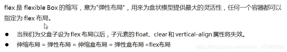
flex layout of mobile WEB development
01 flex layout experience
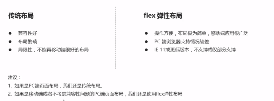
1.1 traditional layout and flex layout
1.2 initial experience
<!DOCTYPE html>
<html lang="en">

<head>
    <meta charset="UTF-8">
    <meta name="viewport" content="width=device-width, initial-scale=1.0">
    <meta http-equiv="X-UA-Compatible" content="ie=edge">
    <title>Document</title>
    <style>
        div {
            display: flex;
            width: 80%;
            height: 300px;
            background-color: pink;
            justify-content: space-around;
        }

        div span {
            /* width: 150px; */
            height: 100px;
            background-color: purple;
            margin-right: 5px;
            flex: 1;
        }
    </style>
</head>

<body>
    <div>
        <span>1</span>
        <span>2</span>
        <span>3</span>
    </div>
</body>

</html>
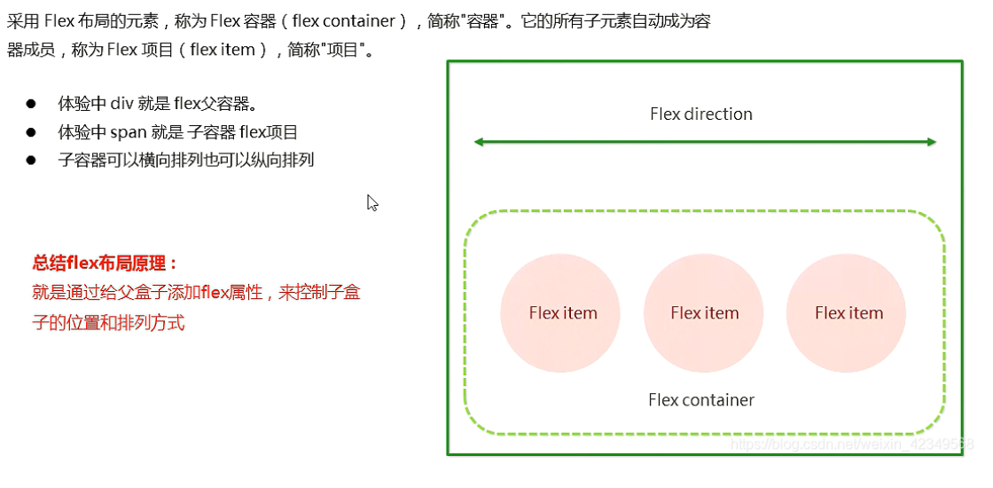
02 flex layout principle
Conclusion: by setting the display attribute of flex to the parent box, the layout of the child box can be controlled
Once flex is set for the parent box, the child box will become a block, and the width and height can be set, which is a bit similar to setting float
2.1 layout principle
03 common attributes of flex layout parent
3.1 common parent attributes
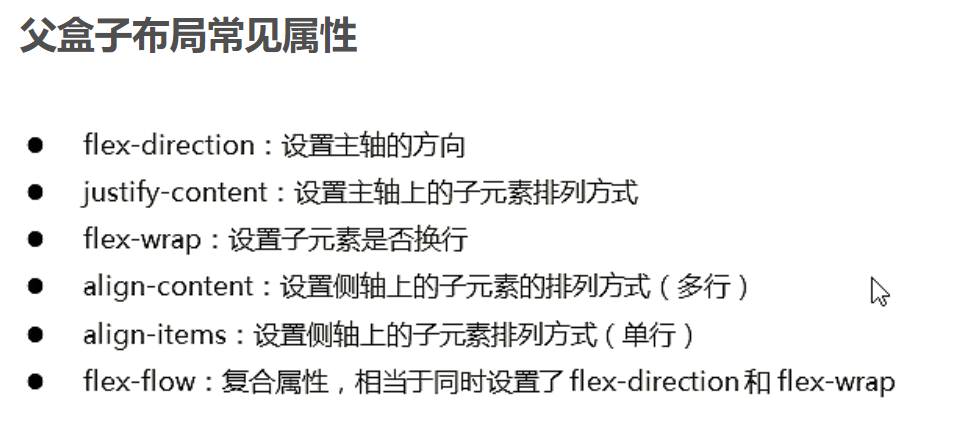
3.2 flex direction sets the direction of the spindle***
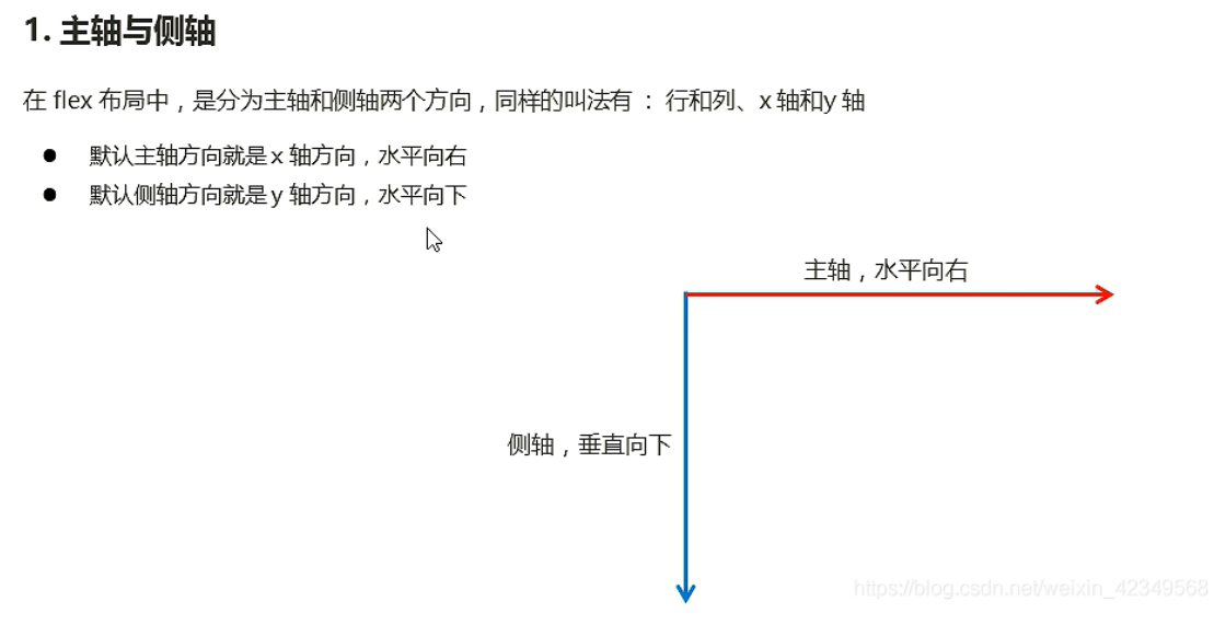
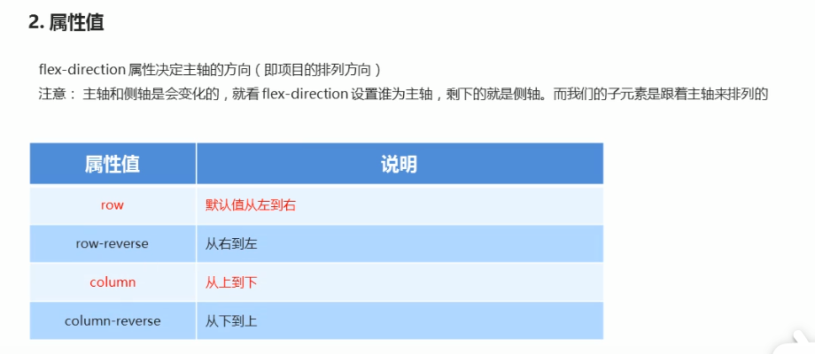
The default principal axis is the x-axis row, so the y-axis is the side axis
Our elements are arranged along the main axis
3.3 justify content sets the arrangement of sub elements on the spindle***
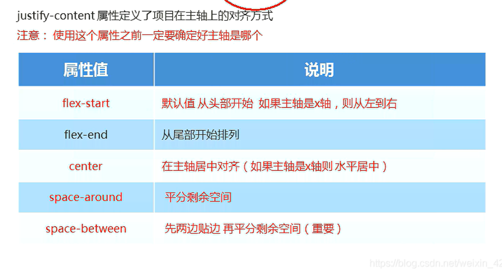
/* First edge both sides and allocate the remaining space */
            justify-content: space-between;
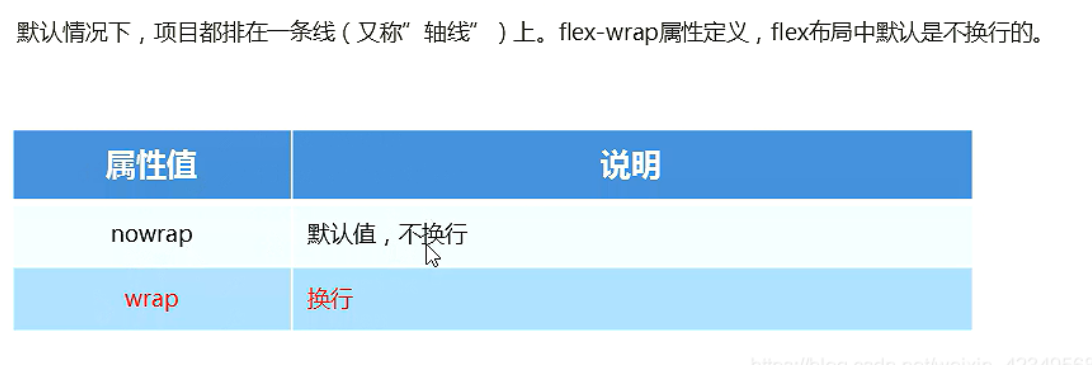
3.4 flex wrap sets whether child elements wrap***
In the flex layout, the default child element does not wrap. If it cannot be installed, the width of the child element will be reduced and placed in the parent element
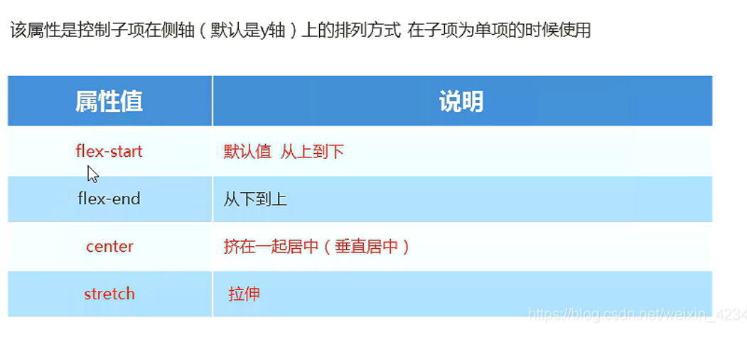
3.5 align items sets the arrangement of sub elements on the side axis (single line)***
/* Stretch, but don't give height to the sub box */
            /* align-items: stretch; */
            /* The default principal axis is the x-axis row */
            flex-direction: column;
            justify-content: center;
            align-items: center;
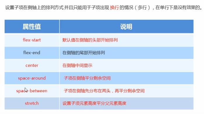
3.6 align content sets the arrangement of sub elements on the side axis (multiple lines)
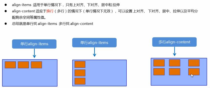
3.6 difference between alight content and alight items
3.7 flex-flow
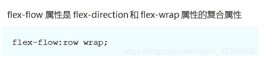
/* flex-direction: column;
            flex-wrap: wrap; */
            /* Abbreviate the setting of spindle direction and whether to break lines (columns) */
            flex-flow: column wrap;
04 common attributes of flex layout sub items
4.1 flex properties***
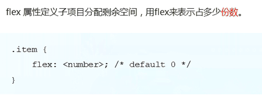
It is worth noting that the parent box first sets: display:flex, and then the child box sets the number of copies occupied by flex.
In addition, whoever sets flex will begin to allocate the remaining space. If multiple sub elements participate in the allocation, set the number of allocated shares, and they will coordinate who is wide.
<!DOCTYPE html>
<html lang="en">

<head>
    <meta charset="UTF-8">
    <meta name="viewport" content="width=device-width, initial-scale=1.0">
    <meta http-equiv="X-UA-Compatible" content="ie=edge">
    <title>Document</title>
    <style>
        section {
            display: flex;
            width: 60%;
            height: 150px;
            background-color: pink;
            margin: 0 auto;
        }

        section div:nth-child(1) {
            width: 100px;
            height: 150px;
            background-color: red;
        }

        section div:nth-child(2) {
            flex: 1;
            background-color: green;
        }

        section div:nth-child(3) {
            width: 100px;
            height: 150px;
            background-color: blue;
        }

        p {
            display: flex;
            width: 60%;
            height: 150px;
            background-color: pink;
            margin: 100px auto;
        }

        p span {
            flex: 1;
        }

        p span:nth-child(2) {
            flex: 2;
            background-color: purple;
        }
    </style>
</head>

<body>
    <section>
        <div></div>
        <div></div>
        <div></div>
    </section>
    <p>
        <span>1</span>
        <span>2</span>
        <span>3</span>
    </p>
</body>

</html>
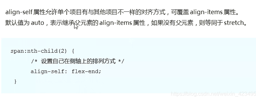
4.2 align self controls the arrangement of sub items on the side axis
<!DOCTYPE html>
<html lang="en">
<head>
<meta charset="UTF-8">
<meta name="viewport" content="width=device-width, initial-scale=1.0">
<meta http-equiv="X-UA-Compatible" content="ie=edge">
<title>Document</title>
<style>
div {
display: flex;
width: 80%;
height: 300px;
background-color: pink;
/* Align the three sub boxes along the bottom side of the side axis */
/* align-items: flex-end; */
/* We just want box 3 down to the bottom */
}
div span {
width: 150px;
height: 100px;
background-color: purple;
margin-right: 5px;
}
div span:nth-child(2) {
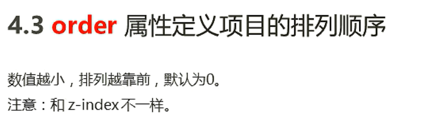
/* The default is 0 - 1, which is smaller than 0, so it is in the front */
order: -1;
}
div span:nth-child(3) {
align-self: flex-end;
}
</style>
</head>
<body>
<div>
<span>1</span>
<span>2</span>
<span>3</span>
</div>
</body>
</html>
4.3 order
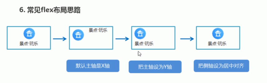
05 case production of Ctrip home page
5.1 common flex layout ideas
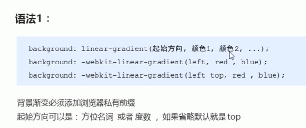
5.2 background linear gradient
    <style>
        div {
            width: 600px;
            height: 200px;
            /* The background gradient must be prefixed with a browser private prefix */
            /* background: -webkit-linear-gradient(left, red, blue); */
            /* background: -webkit-linear-gradient(red, blue); */
            background: -webkit-linear-gradient(top left, red, blue);
        }
    </style>
rem layout of mobile WEB development
01 rem Foundation
1.em: length unit. Benchmark is the font size value of parent element.
2.rem: length unit. The benchmark is the font size value of html.
3. The advantage of REM is that you can modify the text size in html
To change the size of elements in the page, which can be controlled as a whole
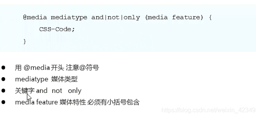
02 Media Query
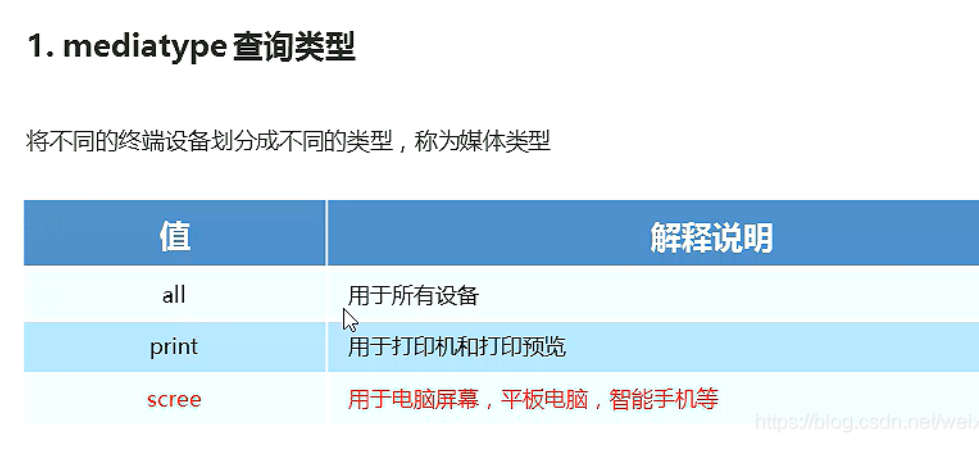
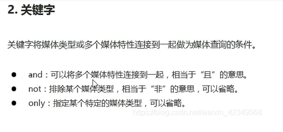
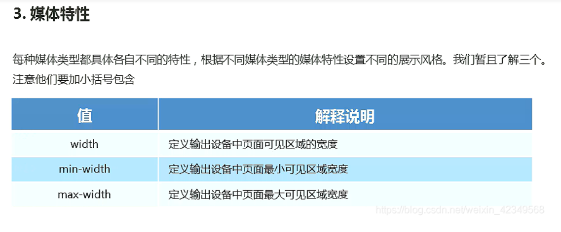
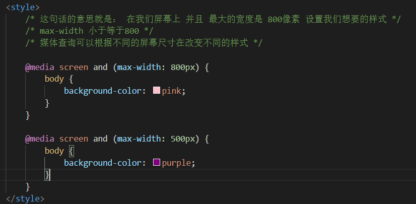
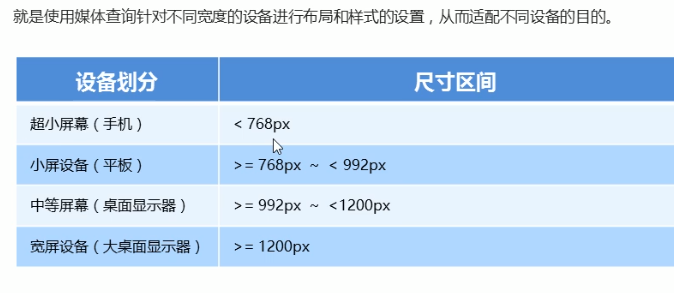
2.1 what is media query
@media can set different styles for different screen sizes
2.2 syntax specification
2.3 media query + rem can realize the dynamic change of elements
<!DOCTYPE html>
<html lang="en">

<head>
    <meta charset="UTF-8">
    <meta name="viewport" content="width=device-width, initial-scale=1.0">
    <meta http-equiv="X-UA-Compatible" content="ie=edge">
    <title>Document</title>
    <style>
        * {
            margin: 0;
            padding: 0;
        }
        /* html {
            font-size: 100px;
        } */
        /* From small to large */

        @media screen and (min-width: 320px) {
            html {
                font-size: 50px;
            }
        }

        @media screen and (min-width: 640px) {
            html {
                font-size: 100px;
            }
        }

        .top {
            height: 1rem;
            font-size: .5rem;
            background-color: green;
            color: #fff;
            text-align: center;
            line-height: 1rem;
        }
    </style>
</head>

<body>
    <div class="top">Shopping Cart</div>
</body>

</html>
2.4 introduction of resources (understanding)
    /* When our screen is greater than or equal to 640px, we let div display 2 in one line */
    /* When our screen is smaller than 640, we let div display one on each line */
    /* One suggestion: the best way for us to query the media is from small to large */
    /* Introducing resources is to call different css files for different screen sizes */
<!DOCTYPE html>
<html lang="en">

<head>
    <meta charset="UTF-8">
    <meta name="viewport" content="width=device-width, initial-scale=1.0">
    <meta http-equiv="X-UA-Compatible" content="ie=edge">
    <title>Document</title>
    <style>
        /* When our screen is greater than or equal to 640px, we let div display 2 in one line */
        /* When our screen is smaller than 640, we let div display one on each line */
        /* One suggestion: the best way for us to query the media is from small to large */
        /* Introducing resources is to call different css files for different screen sizes */
    </style>
    <link rel="stylesheet" href="style320.css" media="screen and (min-width: 320px)">
    <link rel="stylesheet" href="style640.css" media="screen and (min-width: 640px)">
</head>

<body>
    <div>1</div>
    <div>2</div>
</body>

</html>
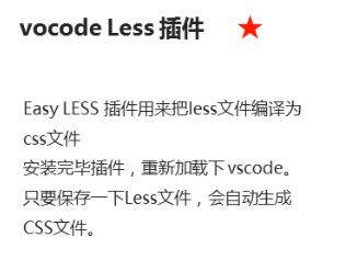
03 Less Foundation
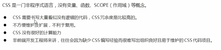
3.1 disadvantages of maintaining css
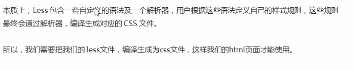
3.2 introduction to less
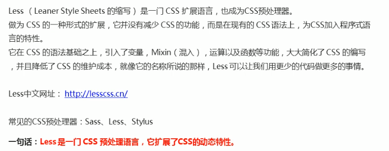
3.3 use of less
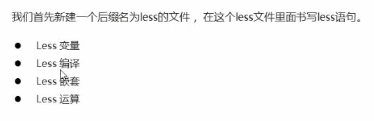
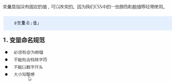
3.4 Less variable
my.less
// Define a pink variable
@color: pink;
// Bad variable name @ 1color @ color~@#
// Variable names are case sensitive. @ Color and @ Color are two different variables
// Defines a variable with a font of 14 pixels
@font14: 14px;
body {
    background-color: @color;
}
div {
    color: @color;
    font-size: @font14;
}
a {
    font-size: @font14;
}
3.5 Less compilation
3.6 Less nesting
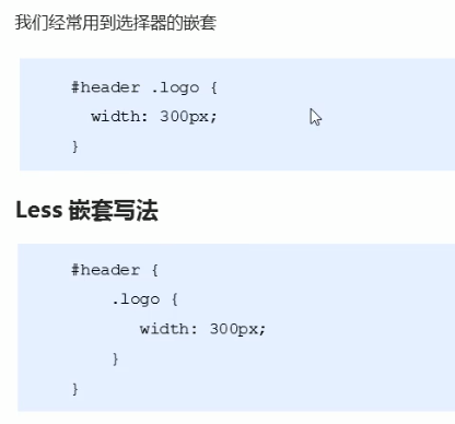
.header {
width: 200px;
height: 200px;
background-color: pink;
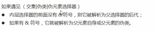
// 1. The style of the less nested child element should be written directly to the parent element
a {
color: red;
// 2. If there are pseudo classes, intersection selectors and pseudo element selectors, we need to add them in front of the inner selector&
&:hover {
color: blue;
}
}
}
.nav {
.logo {
color: green;
}
&::before {
content: "";
}
}
3.7 Less operation***
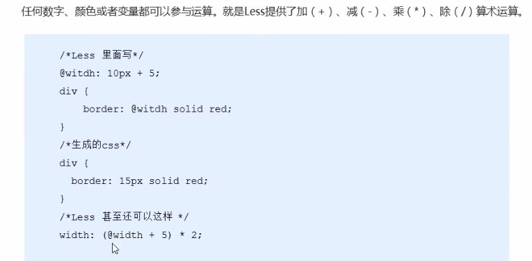
@baseFont: 50px;
html {
font-size: @baseFont;
}
@border: 5px + 5;
div {
width: 200px - 50;
height: (200px + 50px ) * 2;
border: @border solid red;
background-color: #666 - #222;
}
img {
width: 82rem / @baseFont;
height: 82rem / @baseFont;
}
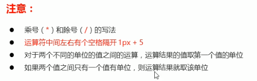
// 1. The left and right sides of our operator must be separated by a space
// 2. Two numbers participate in the operation. If only one number has a unit, the final result will be subject to this unit
// 3. Two numbers participate in the operation. If both numbers have units and different units, the final result shall be subject to the first unit
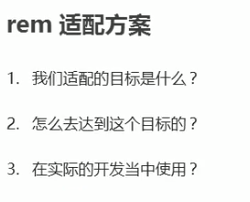
04 rem adaptation scheme
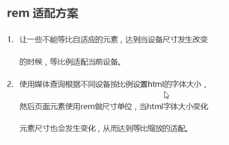
4.1 rem actual development adaptation scheme
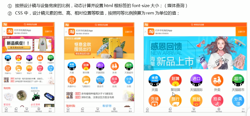
4.2 application of REM adaptation scheme Technology (mainstream in the market)
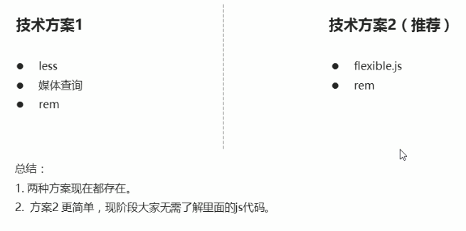
4.3 rem actual development adaptation scheme 1
<!DOCTYPE html>
<html lang="en">
<head>
<meta charset="UTF-8">
<meta name="viewport" content="width=device-width, initial-scale=1.0">
<meta http-equiv="X-UA-Compatible" content="ie=edge">
<title>Document</title>
<style>
@media screen and (min-width: 320px) {
html {
font-size: 21.33px;
}
}
@media screen and (min-width: 750px) {
html {
font-size: 50px;
}
}
div {
width: 2rem;
height: 2rem;
background-color: pink;
}
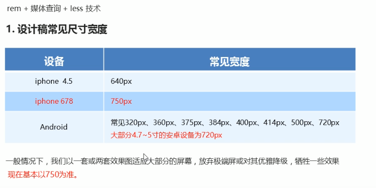
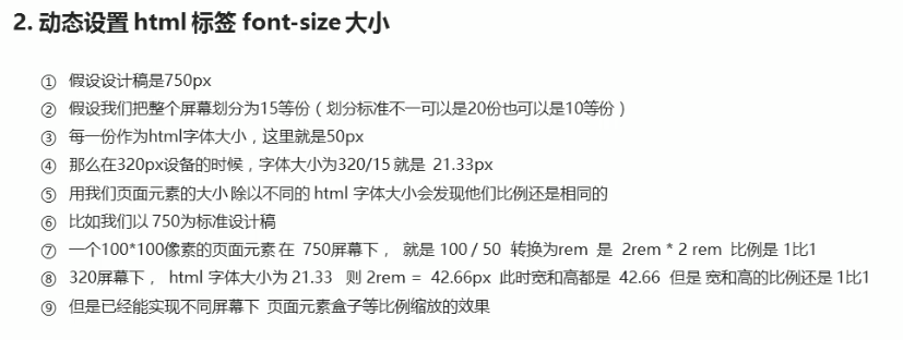
/* 1. First, we choose a standard size of 750
2. We divide the screen size by the number of copies we divide to get the text size in html, but we know that the text size is different under different screens */
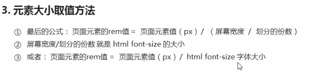
/* 3. rem value of page element = px value of page element at 750 pixels / text size in html */
</style>
</head>
<body>
<div></div>
</body>
</html>
05 Suning home page case production
(D: \ dark horse HTML\html_css_material\rem case \ H5)
06 rem adaptation scheme 2
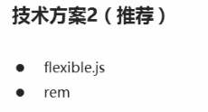
6.1 simple and efficient rem adaptation scheme flexible js
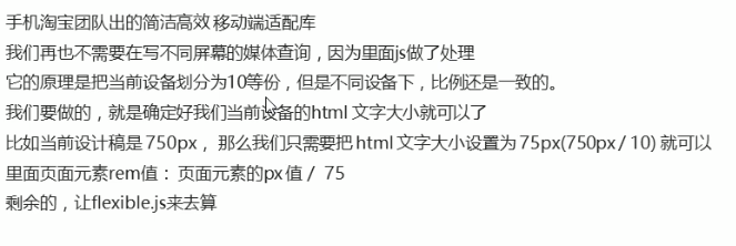
6.2 use adaptation scheme 2 to make the home page of Suning mobile terminal
(D: \ dark horse HTML\html_css_material\rem case \ html5)
6.3 vscode px conversion rem plug-in cssrem
Responsive layout of mobile WEB development
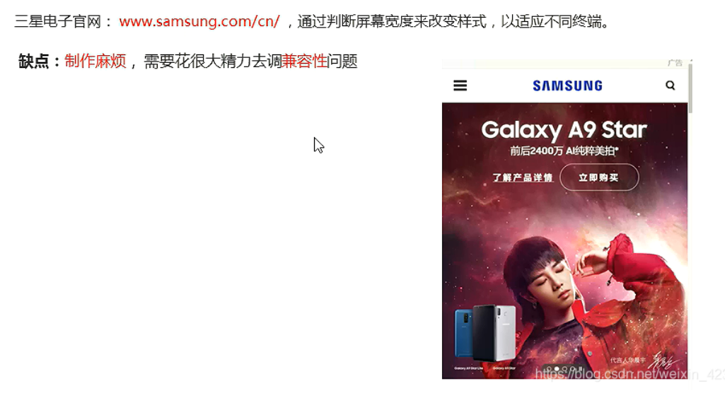
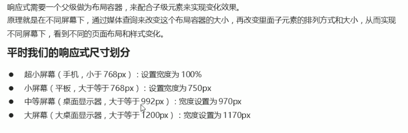
01 responsive development
1.1 principles of responsive development
1.2 responsive layout container
02 Bootstrap front end development framework
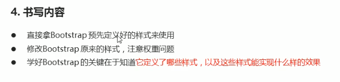
2.1 Bootstrap introduction
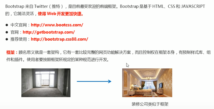
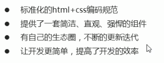
1. Advantages
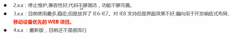
2. Version
2.2 Bootstrap usage
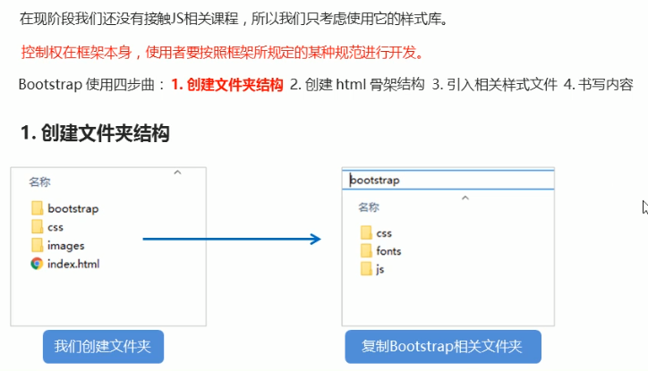
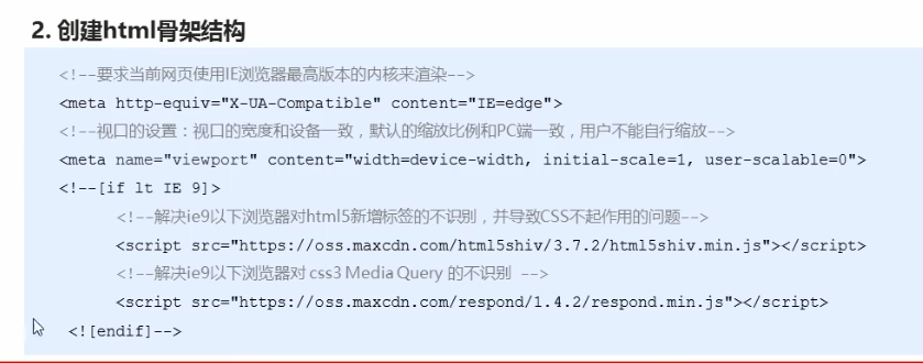
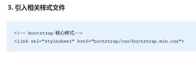
2.3 container layout
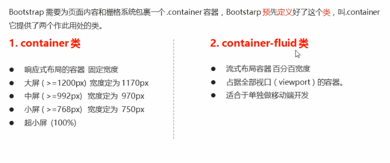
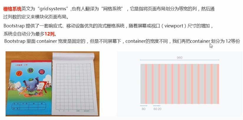
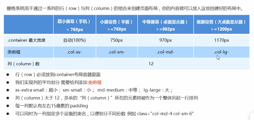
03 Bootstrap grid system
3.1 introduction to grid system
3.2 grid option parameters
        <!-- If the child's shares add up to 12, the child can occupy the whole container Width of -->
        <div class="row">
            <div class="col-lg-6">1</div>
            <div class="col-lg-2">2</div>
            <div class="col-lg-2">3</div>
            <div class="col-lg-2">4</div>
        </div>
        <!-- What happens if the child's shares add up to less than 12? It accounts for the whole container The width of the will be blank -->
        <div class="row">
            <div class="col-lg-6">1</div>
            <div class="col-lg-2">2</div>
            <div class="col-lg-2">3</div>
            <div class="col-lg-1">4</div>
        </div>
        <!-- What happens if the child's shares add up to more than 12? More than one column will be displayed in another row  -->

        <div class="row">
            <div class="col-lg-6">1</div>
            <div class="col-lg-2">2</div>
            <div class="col-lg-2">3</div>
            <div class="col-lg-3">4</div>
        </div>
3.3 column nesting
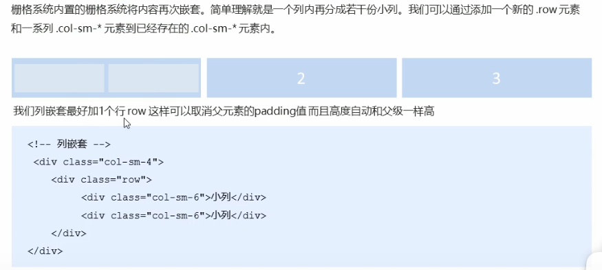
We'd better add a row to the column nesting, so that the padding value of the parent element can be cancelled
And the height is automatically as high as the parent
<body>
    <div class="container">
        <div class="row">
            <div class="col-md-4">
                <!-- We'd better add a row to the nested columns row This cancels the of the parent element padding And the height is automatically as high as the parent -->
                <div class="row">
                    <div class="col-md-4">a</div>
                    <div class="col-md-8">b</div>
                </div>
            </div>
            <div class="col-md-4">2</div>
            <div class="col-md-4">3</div>
        </div>
    </div>
</body>
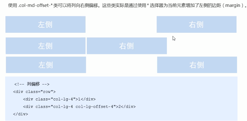
3.4 column offset
<body>
    <div class="container">
        <div class="row">
            <div class="col-md-3">left</div>
            <!-- The number of copies offset is 12 - Number of copies in two boxes = 6 -->
            <div class="col-md-3 col-md-offset-6">right</div>
        </div>
        <div class="row">
            <!-- If there is only one box, then offset = (12 - 8) /2 -->
            <div class="col-md-8 col-md-offset-2">Middle box</div>
        </div>

    </div>
</body>
3.5 column sorting
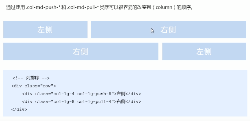
    <style>
        .row div {
            height: 50px;
            background-color: pink;
        }
    </style>
</head>

<body>
    <div class="container">
        <div class="row">
            <div class="col-md-4 col-md-push-8">left</div>
            <div class="col-md-8 col-md-pull-4">right</div>
        </div>
    </div>
</body>
Responsive tools
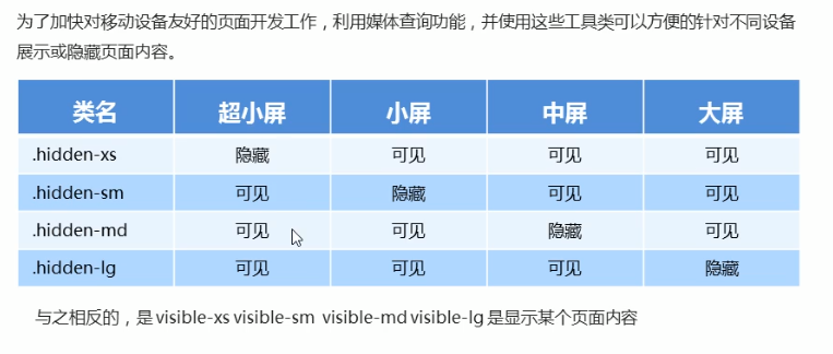
<body>
    <div class="container">
        <div class="row">
            <div class="col-xs-3">
                <span class="visible-lg">I'll show you</span>
            </div>
            <div class="col-xs-3">2</div>
            <div class="col-xs-3 hidden-md hidden-xs">I can do magic</div>
            <div class="col-xs-3">4</div>
        </div>

    </div>
</body>
04 Alibaba Baixiu homepage case
(D: \ dark horse HTML\CSS exercise new \ responsive layout \ alibaixiu)