In the previous chapter, there are children's shoes that mention why not jump by routing?Actually, what I want to say is that this sharing is just beginning. Don't worry!In this section, we'll walk you through creating the header component and tabbar routing jumps.
https://segmentfault.com/a/1190000008491055
vue catalog:
1-vuejs2.0 Actual: Fake Douban app Project, Create Custom Component tabbar
Create header component
Let's start by analyzing the bean petal app:
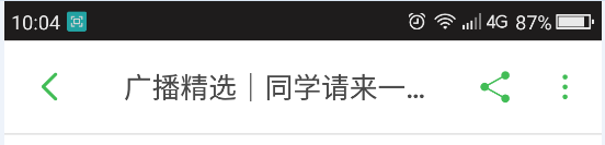


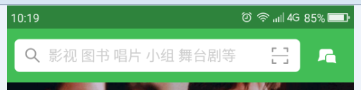
The header background of the first page is green and has a search box. The other pages have a gray background. On the left side of the header, there is a return button, on the right, there are icons such as share or comment, and in the middle is the header's title.Let's not start with a header without a search box.
First, we create a header.vue file in the components file and create a new color variable var.less in the less file (unified management of app colors, unified). First, we write out the general framework of the components of the other elements, as well as the styles.It is then introduced in index.vue.
//var.less

//APP default color
@defaultColor:#42bd56;
//header
@headerBg:@defaultColor;
@headerDefaultColor:rgb(73,73,73);

//tabbar
@tabbarActiveColor: @defaultColor;
//header.vue
<template>
<header class="m-header is-bg is-fixed" >
<div class="m-header-button is-left">
<a href="javascript:;">
< img class="m-icon-img" src="../../assets/images/ic_bar_back_white.png"/>Return</a>
</div>
<h1 class="m-header-title">Douban app</h1>
<div class="m-header-button is-right">
<a href="javascript:;">share</a>
</div>
</header>
</template>
<script>
</script>
<style lang="less">
/*Import color variables*/
@import "../assets/less/var.less";
.m-header{
display: flex;
align-items: center;
height: 44px;
padding: 0 10px;
background: #fff;
color: @headerDefaultColor;
border-bottom:1px solid #eee;
a{
color: @headerDefaultColor;
}
.m-header-button{
width: 70px;
align-items:stretch;
&.is-left{
text-align: left;
}
&.is-right{
text-align: right;
}
.m-icon-img{
width: 20px;
height: 20px;
}
.margin-right-10{
margin-right: 10px;
}
}
.m-header-title{
flex: 1;
text-align: center;
font-size: 16px;
text-overflow: ellipsis;
white-space: nowrap;
overflow: hidden;
}
&.is-bg{
background:@headerBg;
color: #fff;
a{color: #fff;}
.m-header-title{
color: #fff;
}
}
&.is-fixed{
position: fixed;
left: 0;
right: 0;
top: 0;
z-index: 9;
}
}
</style>Here's a screenshot of what we've done:

is-bg: Whether to show background color, default is-fixed green: whether to show on top
Remove is-bg, header component with white background

Since var.less was not used in the tarbar component in the previous chapter, change it here as well
//tabbar.vue

<style lang="less">
@import "../assets/less/var.less";
.m-tabbar-item{
    flex: 1;
    text-align: center;
    .m-tabbar-item-icon{
        display: block;
        padding-top: 2px;
        img{
            width: 28px;
            height: 28px;
        }

    }
    .m-tabbar-item-text{
        display: block;
        font-size: 10px;
        color:#949494;
    }
    &.is-active{
        .m-tabbar-item-text{
            color: @tabbarActiveColor;
        }
    }
}
</style>
If we need to change the color of the entire app, just change the variable at var.less.For example:
Change to Yellow
//var.less

//APP default color
@defaultColor:#f6c210;
//header
@headerBg:@defaultColor;
@headerDefaultColor:rgb(73,73,73);

//tabbar
@tabbarActiveColor: @defaultColor;

Change to Red
//var.less

//APP default color
@defaultColor:#ff0000;
//header
@headerBg:@defaultColor;
@headerDefaultColor:rgb(73,73,73);

//tabbar
@tabbarActiveColor: @defaultColor;

Is it very convenient!!!
Next we'll transform the header into a component that can configure properties, passing props(title,fixed,bg),
<template>
    <header class="m-header" :class="{'is-bg':bg,'is-fixed':fixed}">
          <div class="m-header-button is-left">
              <slot name="left"></slot>
          </div>

          <h1 class="m-header-title" v-text="title"></h1>

          <div class="m-header-button is-right">
              <slot name="right"></slot>
          </div>


      </header>
</template>
<script>
   export default{
       props:{
           title:{
               type:String,
               default:''
           },
           bg:{
               type:Boolean,
               default:false
           },
           fixed:{
               type:Boolean,
               default:false
           }
       }
   }
</script>
<style lang="less">
/*Import color variables*/
@import "../assets/less/var.less";
.m-header{
    display: flex;
    align-items: center;
    height: 44px;
    padding: 0 10px;
    background: #fff;
    color: @headerDefaultColor;
    border-bottom:1px solid #eee;
    a{
        color: @headerDefaultColor;
    }
    .m-header-button{
        width: 70px;
        align-items:stretch;
        &.is-left{
            text-align: left;
        }
        &.is-right{
            text-align: right;
        }
        .m-icon-img{
            width: 20px;
            height: 20px;
        }
        .margin-right-10{
            margin-right: 10px;
        }
    }
    .m-header-title{
        flex: 1;
        text-align: center;
        font-size: 16px;
        text-overflow: ellipsis;
        white-space: nowrap;
        overflow: hidden;
    }
    &.is-bg{
        background:@headerBg;
        color: #fff;
        a{color: #fff;}
        .m-header-title{
            color: #fff;
        }
    }
    &.is-fixed{
        position: fixed;
        left: 0;
        right: 0;
        top: 0;
        z-index: 9;
    }
}
</style>
Be accomplished!Let's call it!
<m-header title="Douban app" :bg="true">
              <a href="javascript:;" slot="left">< img class="m-icon-img" src="../../assets/images/ic_bar_back_white.png"/>Return</a>
              <a href="javascript:;" slot="right">share</a>
      </m-header>
      <m-header title="Douban app" :bg="true">
          <a href="javascript:;" slot="left">< img class="m-icon-img" src="../../assets/images/ic_bar_back_white.png"/>Return</a>
              <a href="javascript:;" slot="right">share</a>
      </m-header>
      <m-header title="Douban app" fixed>
              <a href="javascript:;" slot="left">< img class="m-icon-img" src="../../assets/images/ic_bar_back_green.png"/>Return</a>
              <a href="javascript:;" slot="right">< img class="m-icon-img margin-right-10" src="../../assets/images/ic_actionbar_search_icon.png"/></a>
              <a href="javascript:;" slot="right">< img class="m-icon-img" src="../../assets/images/ic_chat_green.png"/></a>
      </m-header>
Modify tabbar to complete route jump
In the previous chapter, we just finished changing the color of tabbar clicks, so how do we jump pages by routing?
Let's start by creating a new routing page for the tabbar at the bottom. Douban app is a big or small project. To plan the structure, we will create a new folder for each route, and then create a new page inside the folder.Add a different header component to each page, as shown in the diagram:

Then in each routing page, we add the header component.Example with header component:
Mine.vue
<template>
  <div>
          <m-header title="My" fixed>
              <a href="javascript:;" slot="right">< img class="m-icon-img margin-right-10" src="../../assets/images/ic_actionbar_search_icon.png"/></a>
              <a href="javascript:;" slot="right">< img class="m-icon-img" src="../../assets/images/ic_chat_green.png"/></a>
      </m-header>
  </div>
</template>

<script>
  import mHeader from '../../components/header'

  export default {
    name: 'mine',
    components: {
      mHeader
    }
  }
</script>
Once the routing page is complete, we need to configure page routing in index.js under the router folder.The following:
import Vue from 'vue'
import Router from 'vue-router'
import Index from '../pages/Index/Index'
import Broadcast from '../pages/Broadcast/Broadcast'
import AudioBook from '../pages/AudioBook/AudioBook'
import Group from '../pages/Group/Group'
import Mine from '../pages/Mine/Mine'
Vue.use(Router)

export default new Router({
  routes: [
    {
      path: '/',
      name: 'Index',
      component: Index
    },
    {
      path: '/broadcast',
      name: 'Broadcast',
      component: Broadcast
    },
    {
      path: '/audioBook',
      name: 'AudioBook',
      component: AudioBook
    },
    {
      path: '/group',
      name: 'Group',
      component: Group
    },
    {
      path: '/mine',
      name: 'Mine',
      component: Mine
    },
    {
      path: '/Index',
      redirect: '/'
    },
    {
      path: '*',
      redirect: '/'
    },
  ]
})
We can enter the configured routing address in the browser to access whether this page exists or not.If there is no detailed check to see if the path is correct.
Next, we'll transform the tabbar to implement route jumps.We first move the tabbar component in index.vue into app.vue, change each id to a corresponding route, and add an isRouter attribute to determine if the current item is a route jump.Then in tabbar-item.vue we add isRouter to props, click click on the jump method to put into methods, and judge whether it is currently jumping by route based on the isRouter passed in
App.vue
<template>
  <div id="app">
    <router-view></router-view>
    <m-tabbar v-model="select">
     <m-tabbar-item id='Index' isRouter>
        < img src="./assets/images/ic_tab_home_normal.png" alt="" slot="icon-normal">
        < img src="./assets/images/ic_tab_home_active.png" alt="" slot="icon-active">
        //home page
      </m-tabbar-item>
      <m-tabbar-item id='AudioBook' isRouter>
        < img src="./assets/images/ic_tab_subject_normal.png" alt="" slot="icon-normal">
        < img src="./assets/images/ic_tab_subject_active.png" alt="" slot="icon-active">
        //douban
      </m-tabbar-item>
      <m-tabbar-item id='Broadcast' isRouter>
        < img src="./assets/images/ic_tab_status_normal.png" alt="" slot="icon-normal">
        < img src="./assets/images/ic_tab_status_active.png" alt="" slot="icon-active">
        //Radio broadcast
      </m-tabbar-item>
      <m-tabbar-item id='Group' isRouter>
        < img src="./assets/images/ic_tab_group_normal.png" alt="" slot="icon-normal">
        < img src="./assets/images/ic_tab_group_active.png" alt="" slot="icon-active">
        //group
      </m-tabbar-item>
       <m-tabbar-item id='Mine' isRouter>
        < img src="./assets/images/ic_tab_profile_normal.png" alt="" slot="icon-normal">
        < img src="./assets/images/ic_tab_profile_active.png" alt="" slot="icon-active">
        //My
      </m-tabbar-item>
    </m-tabbar>
  </div>
</template>

<script>
import mTabbar from './components/tabbar'
import mTabbarItem from './components/tabbar-item'
export default {
  name: 'app',
  components:{
      mTabbar,
    mTabbarItem
  },
  data() {
      return {
        select:"Index"
      }
    }
}
</script>

<style>

</style>
tabbar-item.vue
<template>
    <a class="m-tabbar-item" :class="{'is-active':isActive}" @click="goToRouter">
        <span class="m-tabbar-item-icon" v-show="!isActive"><slot name="icon-normal"></slot></span>
        <span class="m-tabbar-item-icon" v-show="isActive"><slot name="icon-active"></slot></span>
        <span class="m-tabbar-item-text"><slot></slot></span>
    </a>
</template>
<script>
    export default{
        props: {
            id:{
                type:String
            },
            isRouter:{
                type:Boolean,
                default:false
            }
        },
        computed: {
           isActive(){
               if(this.$parent.value===this.id){
                   return true;
               }
           }
        },
        methods:{
            goToRouter(){
                this.$parent.$emit('input',this.id)
                        //Determine whether it is a route jump
                if(this.isRouter){
                                //Jump to the corresponding routing page based on id
                    this.$router.push(this.id)
                }
            }
        }
    }
</script>
<style lang="less">
@import "../assets/less/var.less";
.m-tabbar-item{
    flex: 1;
    text-align: center;
    .m-tabbar-item-icon{
        display: block;
        padding-top: 2px;
        img{
            width: 28px;
            height: 28px;
        }

    }
    .m-tabbar-item-text{
        display: block;
        font-size: 10px;
        color:#949494;
    }
    &.is-active{
        .m-tabbar-item-text{
            color: @tabbarActiveColor;
        }
    }
}
</style>
The route jump is complete, as shown in the following figure:

Git Address:
https://github.com/MrMoveon/d...
Chapter II Source Codes
Link: http://pan.baidu.com/s/1kUElWX5 Password: sp4i
vue catalog:
1-vuejs2.0 Actual: Fake Douban app Project, Create Custom Component tabbar