As the saying goes, a picture is worth a thousand words. Drawing is one of the most basic and important data analysis skills, so that people give the whole behavior process of drawing a more professional name - Data Visualization. As a powerful and flexible data analysis tool, Stata can realize a variety of drawings. This topic [Stata drawing] aims to promote a broad and in-depth understanding of Stata's drawing function. To this end, a series of articles will be launched one after another, striving to show the structure and details of the drawing.
introduction
This article is the first lecture in the # drawing a picture with Stata # series. It is a general introduction to the drawing function and drawing type of Stata.
Functional aspects. The drawing function of Stata is mainly realized through the drawing syntax (Syntax) and its Graph Editor. Among them, the drawing syntax of Stata starts with the graph command, including the drawing commands for drawing various graphs and the drawing management commands for deleting, reading or merging multiple graphs after the graphs are drawn. The following table briefly lists two types of commands.
graph commands | graph management commands | ||
|---|---|---|---|
graph twoway | scatterplots, line plots, etc | graph save | save graph to disk |
graph matrix | scatterplot matrices | graph use | redisplay graph stored on disk |
graph bar | bar charts | graph display | redisplay graph stored in memory |
graph dot | dot charts | graph combine | combine multiple graphs |
graph box | box-and-whisker plots | graph replay | redisplay graphs stored in memory and on disk |
graph pie | pie charts | graph export | export .gph file to PostScript, etc. |
Other graphics commands | More commands to draw statistical graphs: Distributional diagnostic plots; Smoothing and densities; Regression diagnostics; Time series; Vector autoregressive (VAR, SVAR, VECM) models; Longitudinal data/panel data | ...... | The commands for printing a graph, that deal with the graphs currently stored in memory, that describe available schemes and allow you to identify and set the default scheme, that lists available styles, for setting options for printing and exporting graphs, that allows you to draw graphs without displaying them. |
Note: the above commands are the official commands of Stata, and many practical drawing commands are written by users. These commands will be introduced in detail in the subsequent articles of this series.
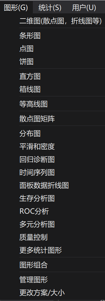
Drawing type. It can be seen from the drawing commands in the above table that Stata drawing is nothing more than to realize several common types of drawing. For drawing commands, we can further divide them into descriptive graph and inferential graph according to the differences of drawing objects. The former focuses on intuitively reflecting the distribution and correlation mode of the data itself, while the latter displays the results of statistical analysis through graphics. The key difference between the two types is whether the source of data used for mapping is based on statistical models. This paper introduces the former, that is, descriptive statistical drawing, which focuses on the visualization of the cleaned data or analysis results. It is one of the important links in the process of empirical analysis, reflecting the author's skills, taste and thinking. The drawing based on inference statistics will be introduced in detail in combination with specific research methods. The following figure shows the contents contained in the "graphics" of the toolbar in the Stata interface (Figure 1).
Drawing type based on descriptive statistics
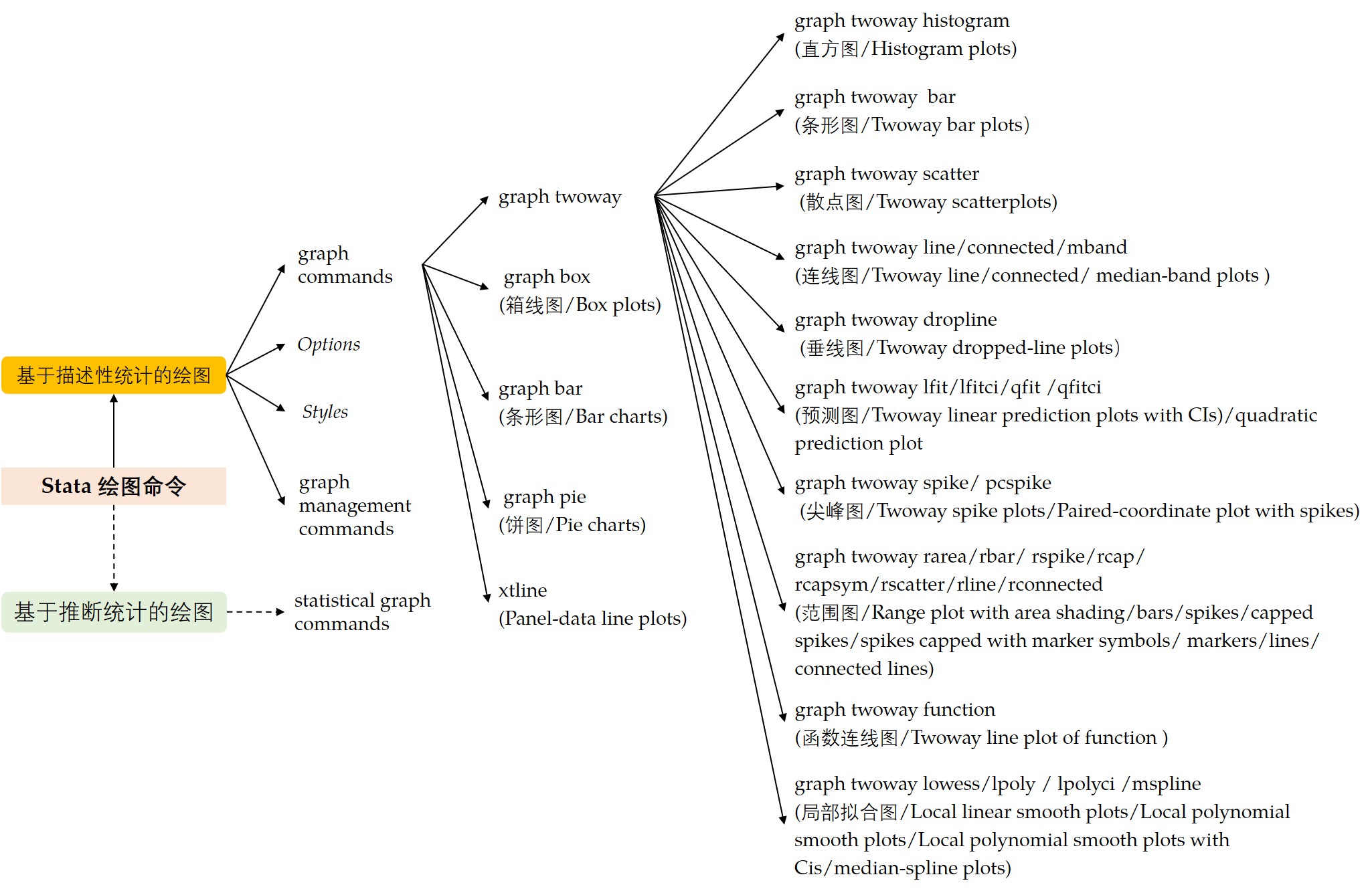
The following figure shows Stata's drawing command structure and drawing type (Figure 2).
Draw with commands. To draw a graph in Stata, you can click the "graph" button in the above figure, which is very convenient. However, with the increasing demand for skilled techniques and customized drawing, drawing with commands is not only more efficient, but also can continuously strengthen the practical operation ability. It should be noted that since the drawing command is very "huge", it is necessary to continuously accumulate the graphic code in the data of all parties in the study and application; At the same time, make good use of Graph Editor in drawing
Optimize the local details of the drawing. After all, we can't remember the options of all drawing commands.
The drawing code of Stata mainly includes four parts: (1) Graph Commands; (2) Options; (3) Styles; (4) Graph Management Commands. The first three types of commands are the basic elements of drawing using existing data. Take the common graph twoway as an example. Twoway is a family of plots, all of which fit on numerical y and x scales. The syntax structure is as follows:
[graph] twoway plot [if] [in] [, twoway_options]
Where, "plot" represents a specific type of graphics. The following figure shows all members of the twoway family (Figure 3), and Figure 2 shows only some common graphics types. "[]" indicates parts of the code that can be omitted. Although it can be omitted, this part is the core of mastering drawing commands. Choosing the appropriate plot type can only ensure the "right" drawing, but can not guarantee the "good" drawing. Therefore, the focus of our study of Stata drawing falls on the rendering effect of graphics.
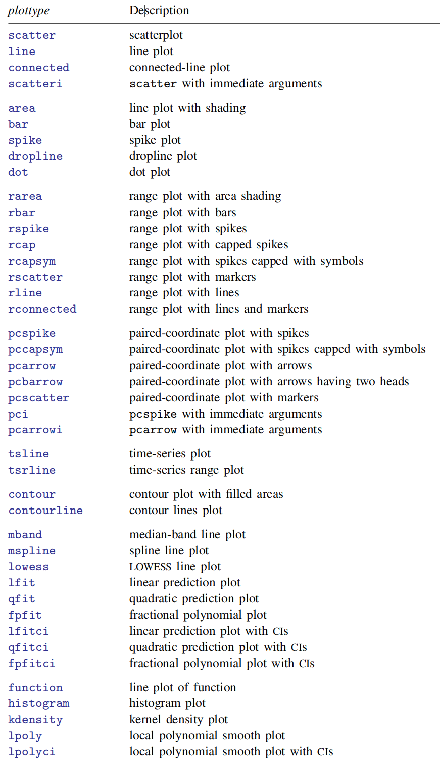
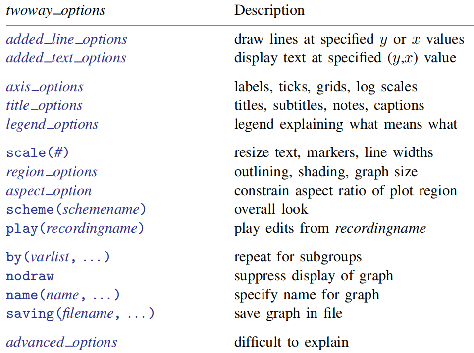
Figure 4 shows the specific contents of twoway options. With these options, we can improve and optimize the rendering effect of graphics drawn based on twoway, for example, adding specific values for the x or y axis (added_line_options). The use of these options is also very regular. They appear after the drawing command, and can be used together with various options we need. There is no difference between them.
The above takes the graph twoway command as an example to illustrate the drawing logic of Stata. However, as shown in Figure 2, there are many kinds of graphics that can be drawn, but their syntax structure is the same. Master the structure of drawing syntax. Once we have data, we can carry out data visualization quickly and gracefully. Next, we show Stata drawing with a set of confusing examples to help us understand Stata's functions and drawing types.
Drawing example
1. Bar charts
The graph bar allows you to draw vertical or horizontal bar / column charts.
In the vertical bar chart, the y-axis is a numerical variable, the x-axis is a classified variable, and the horizontal bar chart is vice versa.
*** Bar graph syntax example ***
    graph bar (mean) numeric_var, over(cat_var) //(mean) is numeric_var statistics, if removed, then percent is the default statistics
    graph hbar (mean) numeric_var, over(cat_var) //hbar stands for horizontal bar charts

*** "," After that, there are various options to optimize the drawing effect ***
    **group_options
      over(varname [, over subopts]): specifies a categorical variable over which the yvars are to be repeated;
      nofill: specifies that missing subcategories be omitted;
      allcategories: specifies that all categories in the entire dataset be retained for the over() variables;

    **yvar_options
      graph bar y1 y2 y3, ascategory whatever_other_options //ascategory is a useful option
      graph bar y, over(group) asyvars whatever_other_options
      graph bar (mean) inc_male inc_female, over(region) percentage stack
      graph bar (mean) wage, over(sex) over(region) asyvars percentage stack
      ...

    **lookofbar_options
      bargap(#):specifies the gap to be left between yvar bars as a percentage-of-bar-width units, and the
                default is bargap(0)
      intensity(#):  specify the intensity of the color used to fill the inside of the bar
      ...

    **legending_options
      If more than one yvar is specified, a legend is produced.

    **axis_options
      axis_scale_options: specify how the numerical y axis is scaled and how it looks;
      axis_label_options: specify how the numerical y axis is to be labeled;
      ytitle(): overrides the default title for the numerical y axis;

    **title_and_other_options
      text(): adds text to a specified location on the graph;
      yline(): adds horizontal (bar) or vertical (hbar) lines at specified y values;
      aspect_option: allows you to control the relationship between the height and width of a graph's plot region
      std_options: Options for use with graph construction commands, which allow you to add titles, control the graph size, save the graph on disk, and much more;
      by(varlist, . . . ) : draws separate plots within one graph;

    **Suboptions for use with over( ) and yvaroptions( )
      relabel(# "text" . . . ) : specifies text to override the default category labeling;
      gap(#) and gap(*#): specify the gap between the bars in this over() group;gap(#) is specified in
                          percentage-of-bar-width units, so gap(67) means two-thirds the width of a bar. gap(*#) allows
                          modifying the default gap. gap(*1.2) would increase the gap by 20%, and gap(*.8) would
                          decrease the gap by 20%.
      sort(varname), sort(#), and sort((stat) varname): control how bars are ordered;
This paper attempts to give a drawing example of bar chart under the combination of bar direction and "over()" option. Next, we use a US City temperature data with 956 observation points to show the drawing idea of the bar chart and the usage of various options.
(1) Vertical bar chart + 1 over()
use https://www.stata-press.com/data/r17/citytemp,clear
describe
		/*
		 Observations:           956                  City temperature data
		    Variables:             6                  3 Mar 2020 19:17
		----------------------------------------------------------------------------
		Variable      Storage   Display    Value
		    name         type    format    label      Variable label
		----------------------------------------------------------------------------
		division        int     %16.0g     division   Census division
		region          int     %13.0g     region     Census region
		heatdd          int     %8.0g                 Heating degree days
		cooldd          int     %8.0g                 Cooling degree days
		tempjan         float   %9.0g                 Average January temperature
		tempjuly        float   %9.0g                 Average July temperature
		----------------------------------------------------------------------------
		Sorted by: region  */

graph bar (mean) tempjuly tempjan, over(region) ///
			  bargap(-30) ///*bargap(#) specifies the gap to be left between yvar bars as a percentage-of-bar-width units. The default is bargap(0), meaning that bars touch.
			  legend( label(1 "July") label(2 "January") ) ///
			  ytitle("Temperature( Fahrenheit)") ///
			  title("Average July and January temperatures") ///
			  subtitle("by regions of the United States") ///
			  note("Source: U.S. Census Bureau, U.S. Dept. of Commerce") ///
			  graphregion(fcolor(white))  plotregion(fcolor(white))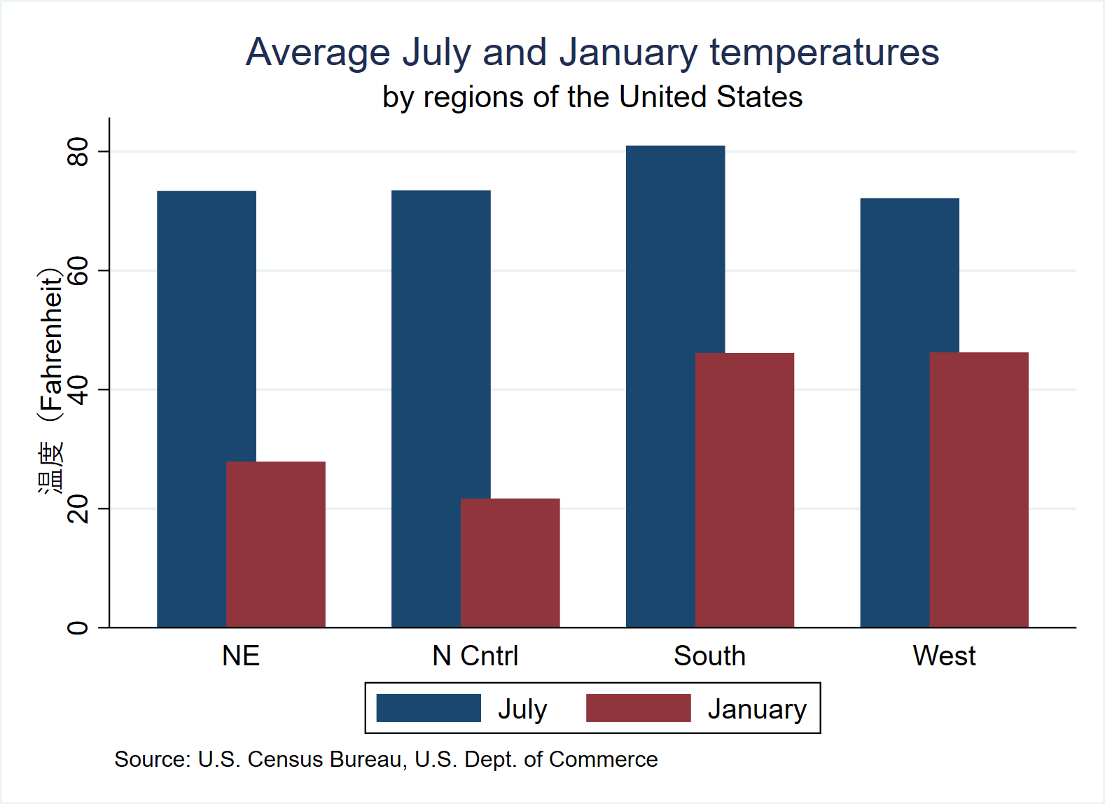
(2) Horizontal bar chart + 2 over()
use https://www.stata-press.com/data/r17/citytemp, clear
graph hbar (mean) tempjan, over(division) over(region) nofill ///*nofill specifies that missing subcategories be omitted
		      ytitle("Degrees Fahrenheit") ///
			  title("Average January temperature") ///
			  subtitle("by region and division of the United States") ///
		      note("Source: U.S. Census Bureau, U.S. Dept. of Commerce") ///
		      graphregion(fcolor(white))  plotregion(fcolor(white))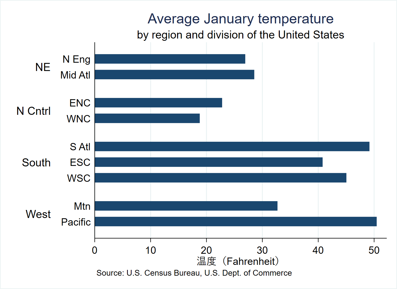
(3) Vertical bar chart + 3 over()
use https://www.stata-press.com/data/r17/nlsw88, clear / / load a new data
describe
		/*
		Observations:         2,246                  NLSW, 1988 extract
	       Variables:            17                  1 May 2020 22:52
		                                             (_dta has notes)
		------------------------------------------------------------------------------------------------------------------------------------------
		Variable      Storage   Display    Value
		    name         type    format    label      Variable label
		------------------------------------------------------------------------------------------------------------------------------------------
		idcode          int     %8.0g                 NLS ID
		age             byte    %8.0g                 Age in current year
		race            byte    %8.0g      racelbl    Race
		married         byte    %8.0g      marlbl     Married
		never_married   byte    %16.0g     nev_mar    Never married
		grade           byte    %8.0g                 Current grade completed
		collgrad        byte    %16.0g     gradlbl    College graduate
		south           byte    %9.0g      southlbl   Lives in the south
		smsa            byte    %9.0g      smsalbl    Lives in SMSA
		c_city          byte    %16.0g     ccitylbl   Lives in a central city
		industry        byte    %23.0g     indlbl     Industry
		occupation      byte    %22.0g     occlbl     Occupation
		union           byte    %8.0g      unionlbl   Union worker
		wage            float   %9.0g                 Hourly wage
		hours           byte    %8.0g                 Usual hours worked
		ttl_exp         float   %9.0g                 Total work experience (years)
		tenure          float   %9.0g                 Job tenure (years)
		------------------------------------------------------------------------------------------------------------------------------------------
		Sorted by: idcode  */
notes
		  /*_dta:
		  1.  1988 data, extracted from National Longitudinal of Young Woman who were ages 14-24 in 1968 (NLSW).
		  2.  This dataset is the result of extraction and processing by various people at various times.
		  3.  For more information on the NLS, see http://www.bls.gov/nls/.  */

graph bar (mean) wage, over(smsa) over(married) over(collgrad) ///* Note the order of the three "over()"
			  title("Average Hourly Wage, 1988, Women Aged 34-46") ///
			  subtitle("by College Graduation, Marital Status, and SMSA residence") ///
			  note("Source: 1988 data from NLS, U.S. Dept. of Labor, Bureau of Labor Statistics") ///
			  graphregion(fcolor(white))  plotregion(fcolor(white))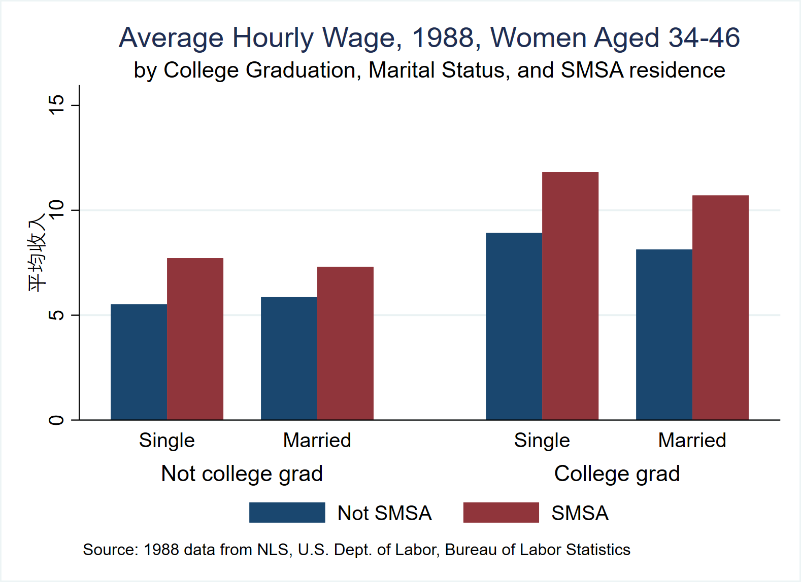
(4) Horizontal bar chart + (quantity) stack
use https://www.stata-press.com/data/r17/educ99gdp, clear
generate total = private + public
graph hbar (asis) public private, ///
			  over(country, sort(total) descending) stack  ///
			  title( "Spending on tertiary education as % of GDP, 1999", span pos(11) ) ///
			  subtitle(" ") ///
			  legend(region(lcolor(white))) ///
			  note("Source: OECD", span) ///
			  graphregion(fcolor(white))  plotregion(fcolor(white))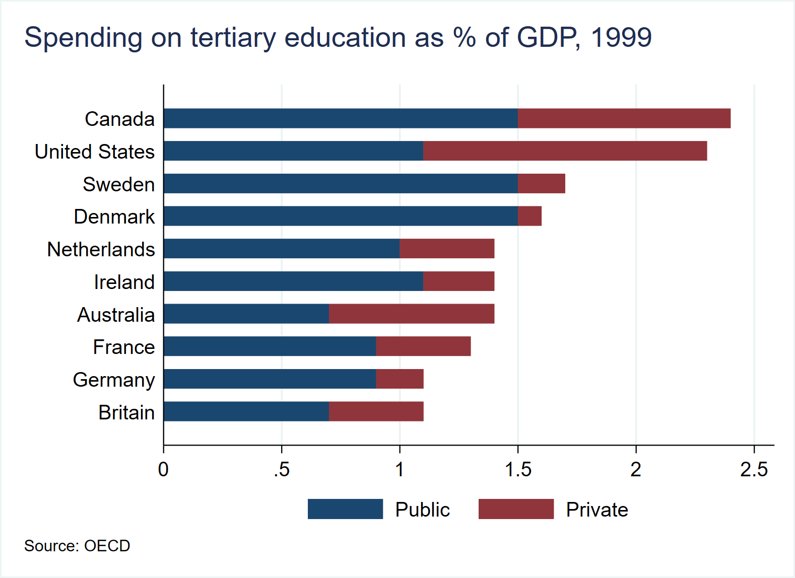
(4) Horizontal bar chart + (scale) stack
use https://www.stata-press.com/data/r17/educ99gdp, clear
generate frac = private/(private + public)
			  graph hbar (asis) public private, ///
			  over(country, sort(frac) descending) stack percent ///
			  title("Public and private spending on tertiary education, 1999", span pos(11) ) ///
			  subtitle(" ") ///
			  legend(region(lcolor(white))) ///
			  note("Source: OECD", span) ///
			  graphregion(fcolor(white))  plotregion(fcolor(white))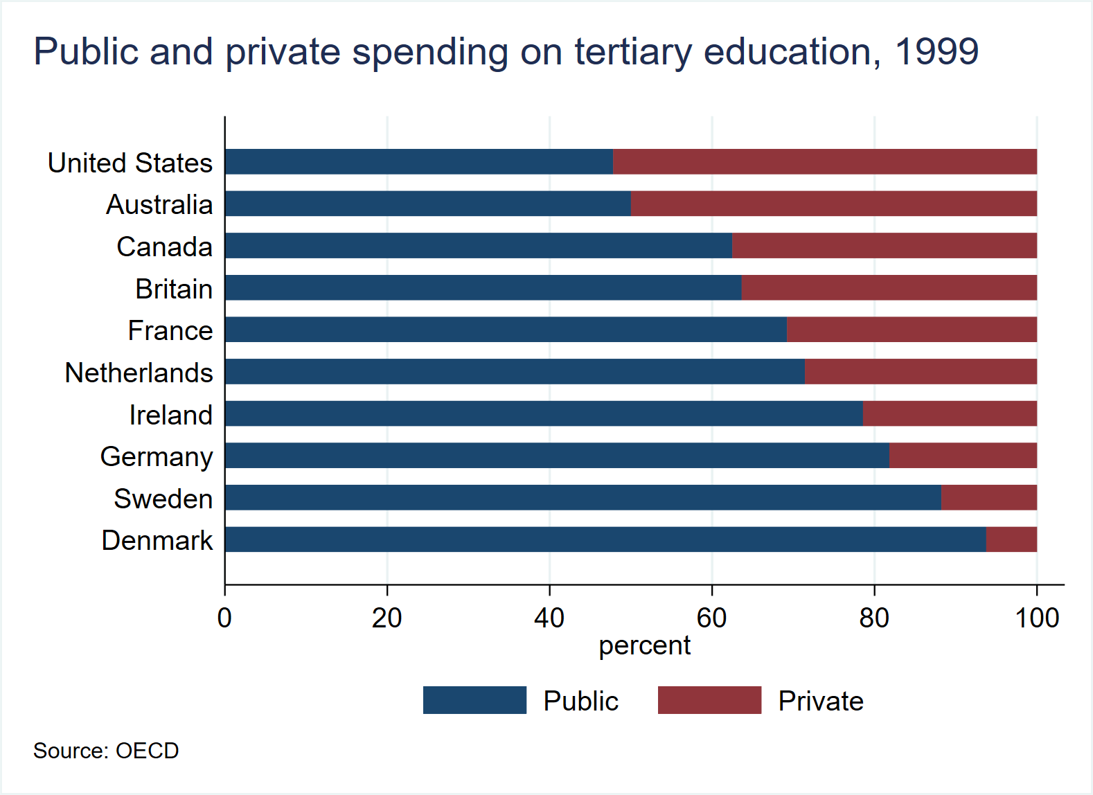
2. Two way bar plots
The (x, y) of twoway bar in the graph is numeric.
use https://www.stata-press.com/data/r17/sp500, clear
describe
	    /* Observations:           248                  S&P 500
		      Variables:             7                  22 Apr 2020 10:52
		                                              (_dta has notes)
		-----------------------------------------------------------------------------------------------------------------------
		Variable      Storage   Display    Value
		    name         type    format    label      Variable label
		-----------------------------------------------------------------------------------------------------------------------
		date            int     %td                   Date
		open            float   %9.0g                 Opening price
		high            float   %9.0g                 High price
		low             float   %9.0g                 Low price
		close           float   %9.0g                 Closing price
		volume          double  %12.0gc               Volume (thousands)
		change          float   %9.0g                 Closing price change
		-----------------------------------------------------------------------------------------------------------------------
		Sorted by: date */
list date close change in 1/5
		/*   +---------------------------------+
		     |      date     close      change |
		     |---------------------------------|
		  1. | 02jan2001   1283.27           . |
		  2. | 03jan2001   1347.56    64.29004 |
		  3. | 04jan2001   1333.34   -14.22009 |
		  4. | 05jan2001   1298.35   -34.98999 |
		  5. | 08jan2001   1295.86    -2.48999 |
		     +---------------------------------+ */
graph twoway bar change date in 1/50, ///
	    	  graphregion(fcolor(white))  plotregion(fcolor(white))
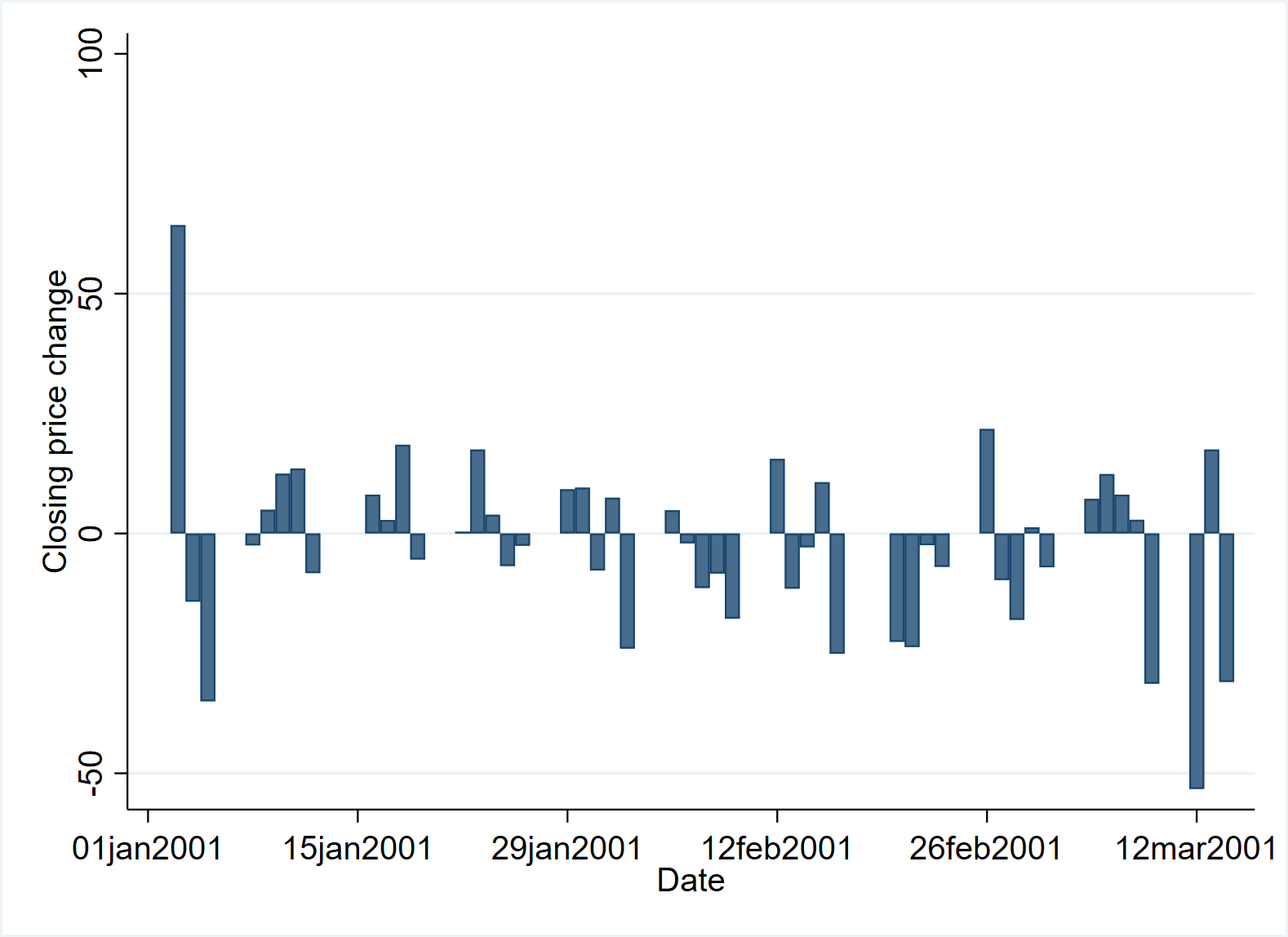
Its advantage is that it can be used in combination with other drawing types of twoway family.
use https://www.stata-press.com/data/r17/sp500, clear
graph twoway line close date, yaxis(1) || bar change date, yaxis(2) || in 1/50, ///
			  yscale(axis(1) r(1000 1400)) ylab(1200(100)1400, axis(1)) ///
			  ytick(1200(100)1400, axis(1) grid) ///
			  yscale(axis(2) r(-50 300)) ylab(-50(50)50, axis(2)) ///
			  ytick(-50(50)50, axis(2) grid) ///
			  legend(off) ///
			  xtitle("Date") ///
			  title("S&P 500") ///
			  subtitle("January - March 2001") ///
			  note("Source: Yahoo!Finance and Commodity Systems, Inc.", span) ///
			  yline(1150, axis(1) lstyle(foreground))  ///
			  graphregion(fcolor(white))  plotregion(fcolor(white))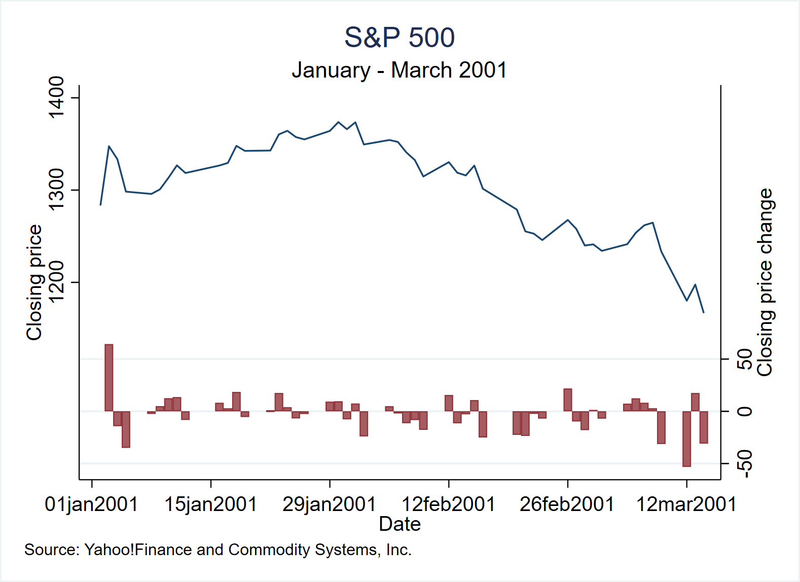
3. Histograms
Draw the histogram of variable (varname). Unless the discrete option is specified, it is generally assumed that varname is a continuous variable. According to Beniger and Robyn (1978), although A. M. Guerry used histograms in his publication in 1833, the term "histogram" was first used by Karl Pearson in 1895.
(1) Histogram of continuous variables
use https://www.stata-press.com/data/r17/sp500, clear
histogram volume
graph save "$figures\histo_01", replace
histogram volume, fraction
graph save "$figures\histo_02", replace
graph combine "$figures\histo_01" "$figures\histo_02", row(1)
save "$figures\histo_0102", replace
graph export "$figures\histo_0102.png", replace
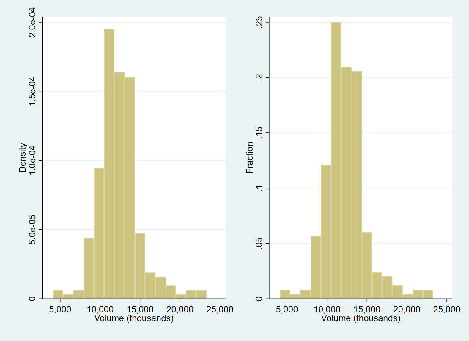
The histogram is called bin, and its number (k) is determined according to a mathematical rule:
k=min(\sqrt{N}, 10 \times \frac{ln(N)}{ln(10)})Where N is the number of variables that can be observed. How to make better use of the statistical characteristics of continuous variables? Based on the above benchmark graph, we can use the following command to include the standard deviation information into the graph at the same time. It is also a more recommended histogram drawing method, which can be used in papers and research reports.
use "https://www.stata-press.com/data/r17/sp500", clear
sum volume //The sum command can help us get the statistics of variables
		/*
	    Variable |        Obs        Mean    Std. dev.       Min        Max
		-------------+-----------------------------------------------------
	      volume |        248    12320.68    2585.929       4103    23308.3     */

return list //View the calculated statistics, which are saved in "scalars"
	    /*scalars:
                  r(N) =  248
              r(sum_w) =  248
               r(mean) =  12320.67661290323
                r(Var) =  6687027.906981193
                 r(sd) =  2585.928828676689
                r(min) =  4103
                r(max) =  23308.3
                r(sum) =  3055527.8 */

*Find the mean r(mean)Sum standard deviation r(sd),Calculate the values corresponding to several units of deviation from the standard deviation
display r(mean)+r(sd) //14906.605
display r(mean)+2*r(sd) //17492.534
display r(mean)+3*r(sd) //20078.463
display r(mean)+4*r(sd) //22664.392
display r(mean)-r(sd) // 9734.7478
display r(mean)-2*r(sd) //7148.819

*Draw graphics
histogram volume, freq normal kdensity ///
				  xaxis(1 2) ///
				  ylabel(0(10)80, grid) ///
				  xlabel(12320.68 "mean" ///* Mean=12320.68
				  9734.7478 "-1 s.d." ///
				  14906.605 "+1 s.d." ///
				  7148.819 "-2 s.d." ///
				  17492.534 "+2 s.d." ///
				  20078.463 "+3 s.d." ///
				  22664.392 "+4 s.d.", axis(2) grid gmax) ///
				  xtitle("", axis(2)) ///
				  subtitle("S&P 500, January 2001 - December 2001") ///
				  note("Source: Yahoo! Finance and Commodity Systems, Inc.") ///
				  graphregion(fcolor(white))  plotregion(fcolor(white))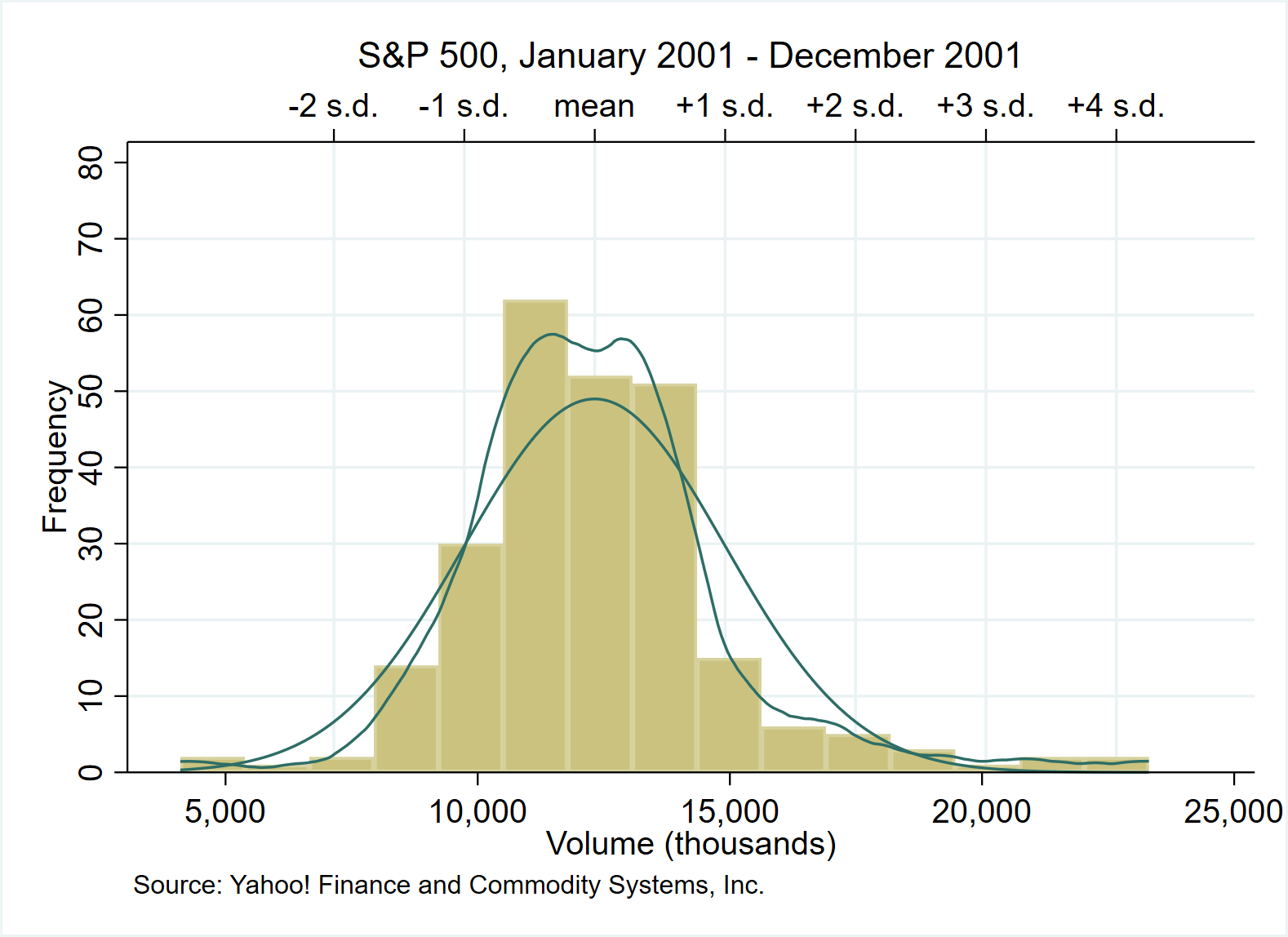
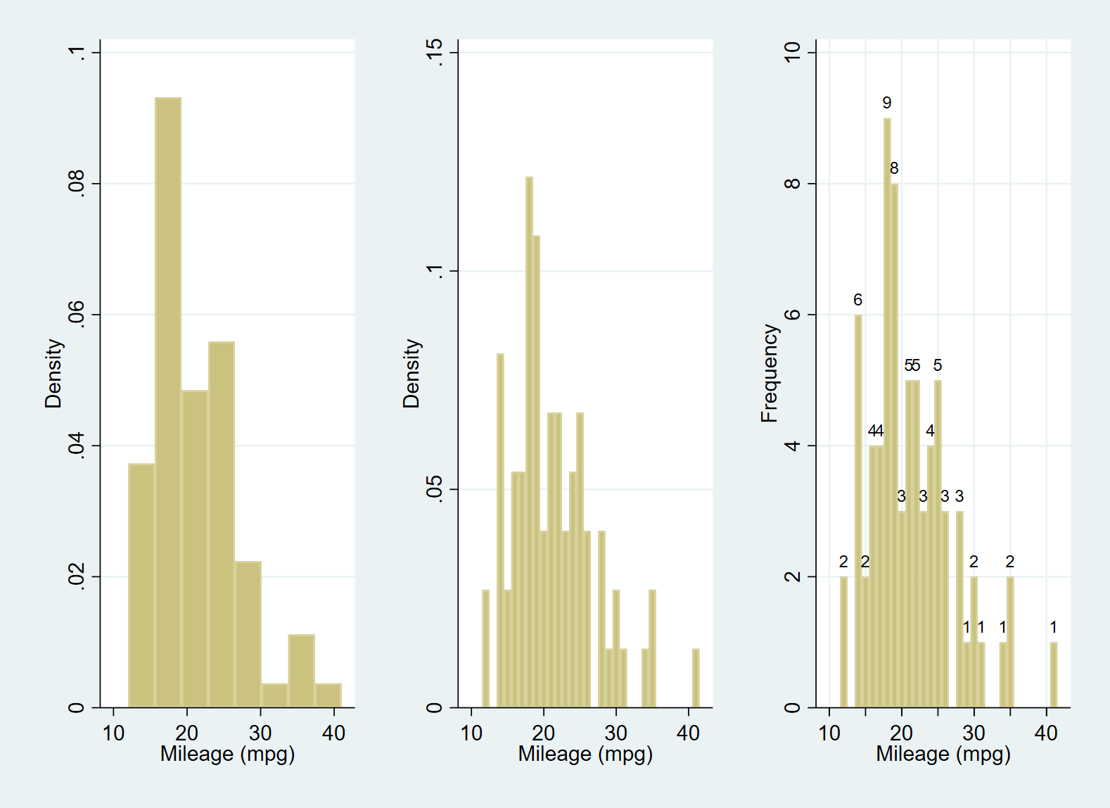
(2) Histogram of discrete variables
Use the discrete option to treat variables as discrete rather than continuous, even though the variables themselves may be continuous. At this time, each unique value of the variable will have a bin, so the number of columns is also large. The height of each column represents the density, frequency, percentage or proportion corresponding to the value.
use https://www.stata-press.com/data/r17/auto, clear
histogram mpg //mpg would be treated as continuous and categorized into eight bins by the default number-of-bins calculation (here N=74)
graph save "$figures\histo_discrete01", replace
histogram mpg, discrete //Adding the discrete option makes a histogram with a bin for each of the 21 unique values
graph save "$figures\histo_discrete02", replace
histogram mpg, discrete freq addlabels ylabel(,grid) xlabel(10(10)40) xtick(10(5)40,grid)
graph save "$figures\histo_discrete03", replace
graph combine "$figures\histo_discrete01" "$figures\histo_discrete02" "figures\histo_discrete03", row(1)
graph export "figures\histo_discrete010203.png", replace
(3) Histogram using weight information
use https://www.stata-press.com/data/r17/voter, clear

describe
		/*Observations:            15                  1992 U.S. presidential voters
		     Variables:             5                  3 Mar 2020 14:27
		                                               (_dta has notes)
		-----------------------------------------------------------------------------
		Variable      Storage   Display    Value
		    name         type    format    label      Variable label
		-----------------------------------------------------------------------------
		candidat        int     %8.0g      candidat   Candidate voted for, 1992
		inc             int     %8.0g      inc2       Family income
		frac            float   %9.0g
		pfrac           double  %10.0g
		pop             double  %10.0g
		-----------------------------------------------------------------------------
		Sorted by: inc  */
label list candidat
		/*candidat:
           2 Clinton
           3 Bush
           4 Perot */
histogram candi [fweight=pop], discrete fraction by(inc, total) /// *frequency weights
 				   barwidth(1) gap(40) xlabel(2 3 4, valuelabel) /// *place a gap between the bars by reducing bar width by #%
 				   graphregion(fcolor(white)) plotregion(fcolor(white))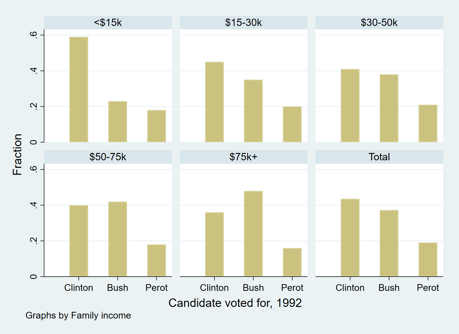
It is worth noting that we can also implement the above example with bar chart, but the object of drawing has changed.
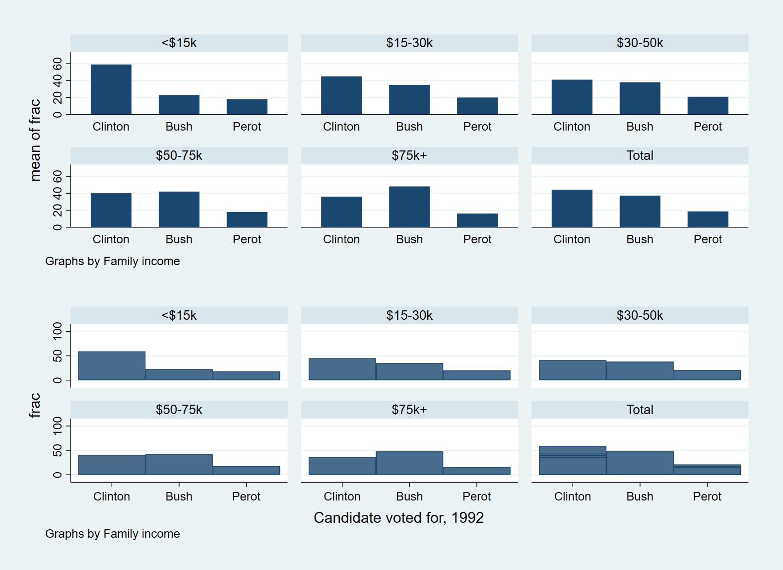
Through this set of examples, we can better understand the three commands.
use https://www.stata-press.com/data/r17/voter, clear
graph bar frac, over(candidat) by(inc, total)
graph save "$figures/histogram_bar",replace
graph twoway bar frac candidat, by(inc, total) xlabel(2 3 4, valuelabel) yscale(r(0 100))
graph save "$figures/histogram_2waybar",replace
graph combine "$figures/histogram_bar" "$figures/histogram_2waybar", row(2)
graph save "$figures/histogram_bar & 2waybar",replace
graph export "$figures/histogram_bar & 2waybar.png",replace
4. Histogram plots
There is almost no difference between twoway histogram and the histogram presented above, and the latter can superimpose the normal density function or kernel density estimation on the histogram, which also makes the advantage of the latter. Therefore, in practical application, histogram is recommended.
The above is the content of this paper. The essence of drawing lies in: (1) making clear what kind of graphics to draw with the available data (you can inspire yourself through visual images or referring to other people's works); (2) Select the appropriate drawing command (such as using graph bar or twoway graph bar); (3) Through various drawing options, the drawn graphics are more beautiful and self explanatory. Subsequent articles will break down the main graphic types one by one, and let the data speak with pictures!
reference material
- StataCorp. (2021). [G] Stata Graphics Reference Manual, Stata: Release 17. Statistical Software. College Station, TX: StataCorp LLC.
- Michael Mitchell. (2012) .Visual Guide to Stata Graphics(Third Edition), Published by Stata Press.