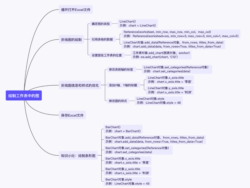
3. Optimization of line chart information and style
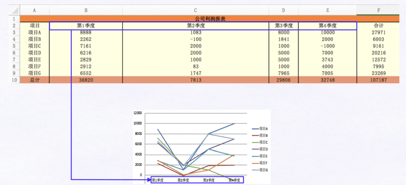
After the above line chart is drawn, the line chart of the current worksheet should be as follows:
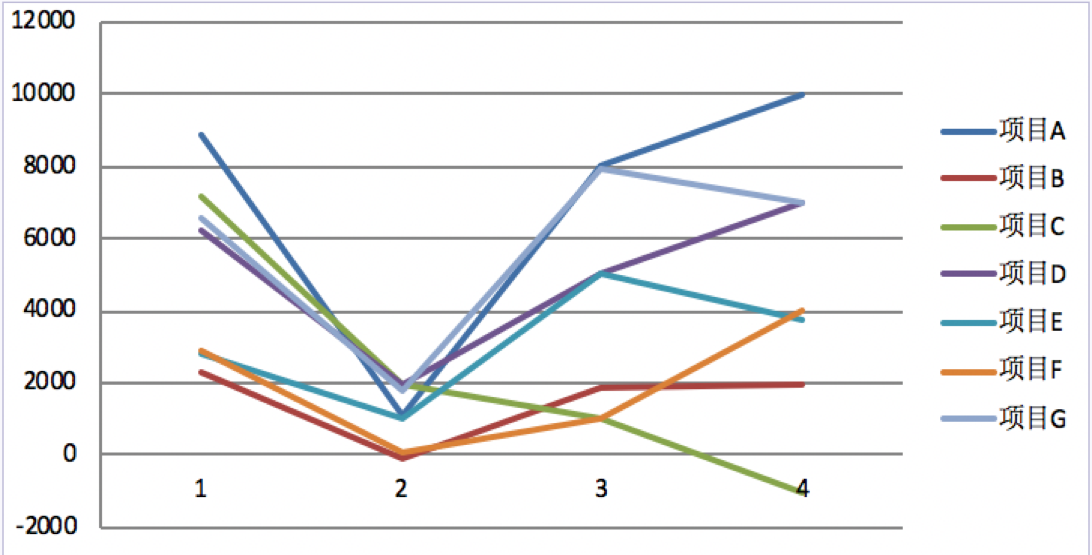
There are some problems in this line chart: the information is fuzzy; It is unclear what data the X-axis and Y-axis describe; The style of line chart is not very beautiful.
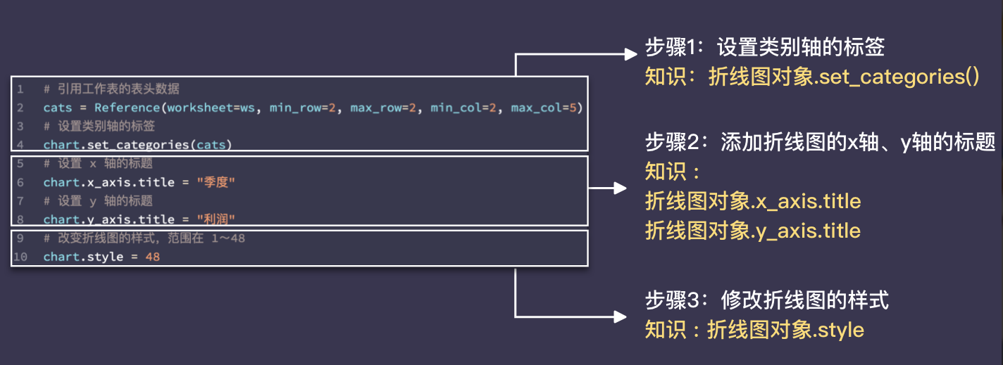
Therefore, it is also necessary to optimize the line chart information and style, which can be divided into three steps: modify the label of the category axis; Add the titles of X-axis and Y-axis; Change the style of the line chart.
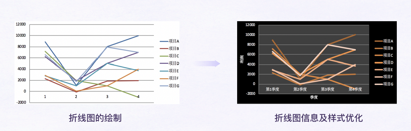
Comparing the differences before and after the line chart optimization, we can see several changes: the line chart adds the titles of X and Y axes and modifies the labels of category axes to make the information of the chart clearer. In addition, the style of line chart has also been adjusted.
Then, how to realize the optimization function block of line chart information and style? As mentioned earlier, there are the following steps.
Label category axes
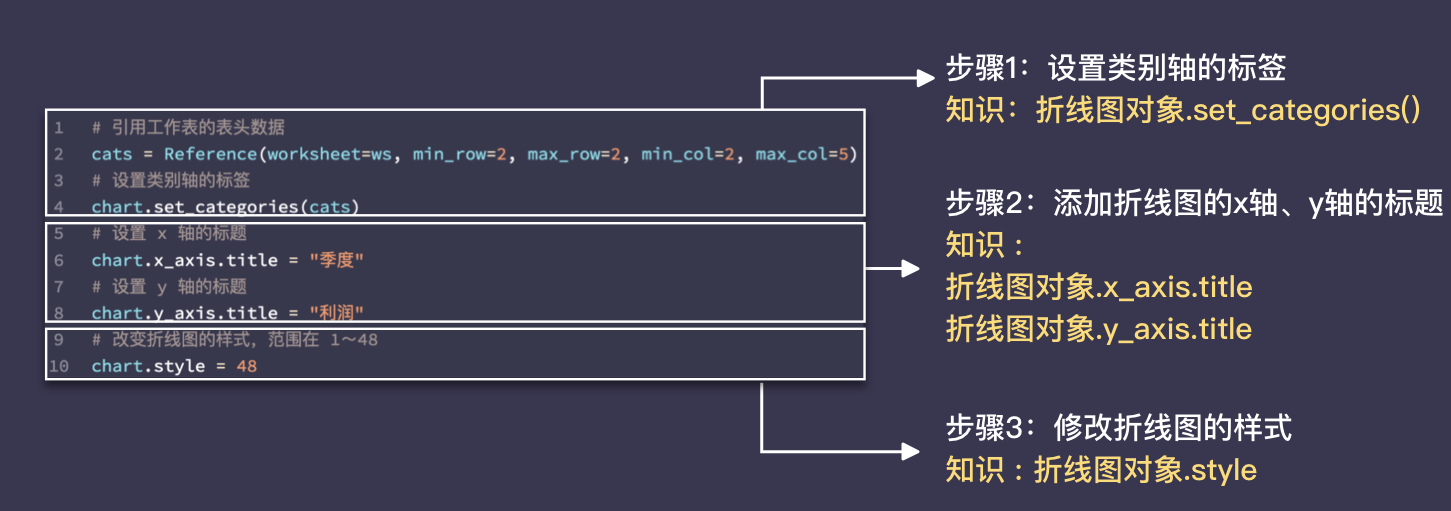
LineChart object set_categories()
Call the method LineChart object set_categories(), you can reference the data in the table to set the label of category axis. (set Chinese Translation: settings; categories Chinese Translation: categories)
The use of this method is simple: the LineChart object set_categories(Reference object), which indicates the data to be referenced.
Let's look at the LineChart object in detail set_ Use of categories().
# Reference "header part" cell range
cats = Reference(worksheet=ws, min_row=2, max_row=2, min_col=2, max_col=5)
# Label category axes
chart.set_categories(cats)
In the above code block, the label of the category axis is named using some data in the second row of the table.
from openpyxl import load_workbook
from openpyxl.chart import LineChart, Reference

# Read Workbook
wb = load_workbook('./Division 01_3.xlsx')
# Read active sheet in Workbook
ws = wb.active
# Instantiate the LineChart() class to get the LineChart object
chart = LineChart()
# Reference some data of the worksheet
data = Reference(worksheet=ws, min_row=3, max_row=9, min_col=1, max_col=4)
# Add referenced data to the LineChart object
chart.add_data(data, from_rows=True, titles_from_data=True)
# Add a LineChart object to the worksheet and specify the location of the line chart
ws.add_chart(chart, "C12")

# Reference "header part" cell range
cats = Reference(worksheet=ws, min_row=2, max_row=2, min_col=2, max_col=4)
# Label category axes
chart.set_categories(cats)
# Label category axes

# Save file
wb.save('./Division 01_3.xlsx')
When setting the label of category axis, remember to instantiate the Reference class to Reference data.
Add titles for X and Y axes
LineChart object x_axis.title, LineChart object y_axis.title
Set the property LineChart object x_axis.title, LineChart object y_ axis. You can add x-axis and y-axis titles to the line chart. (Chinese translation of x_axis and y_axis: X axis and Y axis; Chinese translation of Title: title)
For example, the following code can add titles to the X-axis and Y-axis: "quarter" and "profit".
# Sets the title of the x-axis
chart.x_axis.title = "quarter"
# Sets the title of the y-axis
chart.y_axis.title = "profit"
from openpyxl import load_workbook
from openpyxl.chart import LineChart, Reference

# Read Workbook
wb = load_workbook('./Division 01_3.xlsx')
# Read active sheet in Workbook
ws = wb.active

# Instantiate the LineChart() class to get the LineChart object
chart = LineChart()
# Reference some data of the worksheet
data = Reference(worksheet=ws, min_row=3, max_row=9, min_col=1, max_col=4)
# Add referenced data to the LineChart object
chart.add_data(data, from_rows=True, titles_from_data=True)
# Add a LineChart object to the worksheet and specify the location of the line chart
ws.add_chart(chart, "C12")

# Reference "header part" cell range
cats = Reference(worksheet=ws, min_row=2, max_row=2, min_col=2, max_col=5)
# Label category axes
chart.set_categories(cats)
# Set the title of the x-axis to "month"
chart.x_axis.title='month'
# Set the title of the y-axis to "profit"
chart.y_axis.title='profit'
# Save file
wb.save('./Division 01_3.xlsx')
Isn't it very simple? Just give me a "chart" x_ axis. title,chart.y_axis.title assignment.
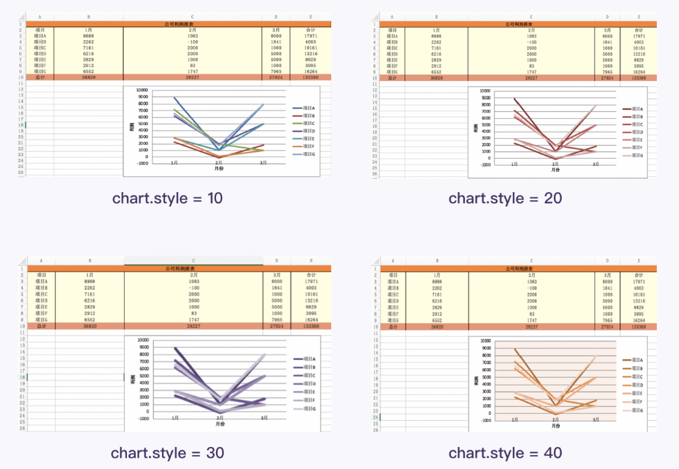
Change the style of the drawing
LineChart object style
Sets the LineChart object Style, you can adjust the style of the line chart (line chart background color, line chart line color).
LineChart object The value of style can be set to an integer from 1 to 48 (including 1 and 48).
Below I will give some examples of styles and their corresponding values.
So far, we know how to realize the line chart information and style optimization function block. Next, use the knowledge learned to reproduce the optimization function block of line chart information and style.
Function block exercise
Before practice, let's recall the steps and knowledge of the optimization function block of line chart information and style.
from openpyxl import load_workbook
from openpyxl.chart import LineChart, Reference

# Read Workbook
wb = load_workbook('./Division 01.xlsx')
# Read active sheet in Workbook
ws = wb.active
# Instantiate the LineChart() class to get the LineChart object
chart = LineChart()
# Reference some data of the worksheet
data = Reference(worksheet=ws, min_row=3, max_row=9, min_col=1, max_col=5)
# Add referenced data to the LineChart object
chart.add_data(data, from_rows=True, titles_from_data=True)
# Add a LineChart object to the worksheet and specify the location where the line chart is generated
ws.add_chart(chart, "C12")

# Reference "header part" cell range: column 2 to column 5 of row 2
cats=Reference(worksheet=ws,min_row=2,max_row=2,min_col=2,max_col=5)
# Label category axes
chart.set_categories(cats)
# Set the title of the x-axis to "quarter"
chart.x_axis.title="quarter"
# Set the title of the y-axis to "profit"
chart.y_axis.title='profit'
# To chart Style setting value (integer from 1 to 48). 48 is recommended
chart.style=42
# Save file
wb.save('./Division 01.xlsx')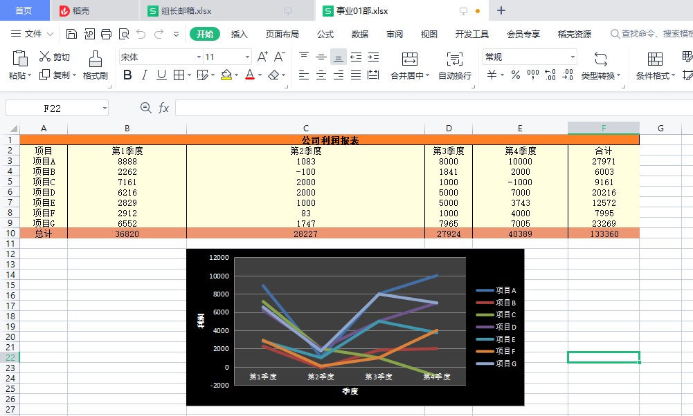
4. Program realization and summary
Function block merging
The codes of "function block 1: cycle open Excel file" and "function block 4: save Excel file" have been learned
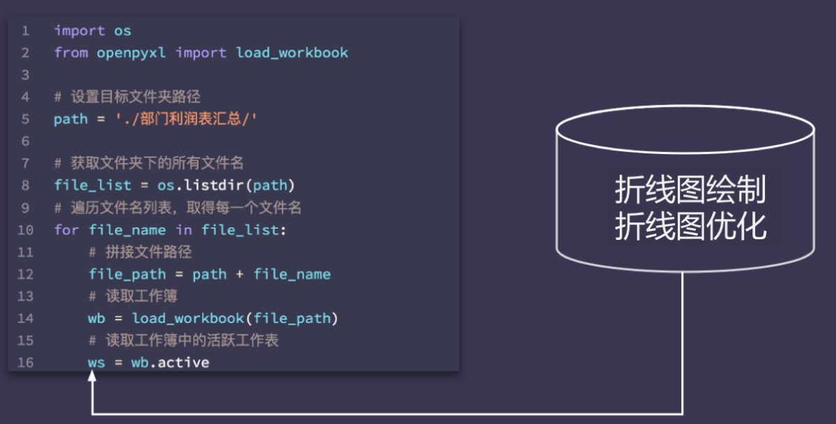
Function block 1: cycle open Excel file
import os
from openpyxl import load_workbook
# Set destination folder path
path = './Summary of profit statement of each department/'
# Get all file names under the folder
file_list = os.listdir(path)
# Traverse the file name list to get each file name
for file_name in file_list:
# Splice file path
file_path = path + file_name
print('Processing:' + file_name)
# Read Workbook
wb = load_workbook(file_path)
# Navigate to the active worksheet in the workbook
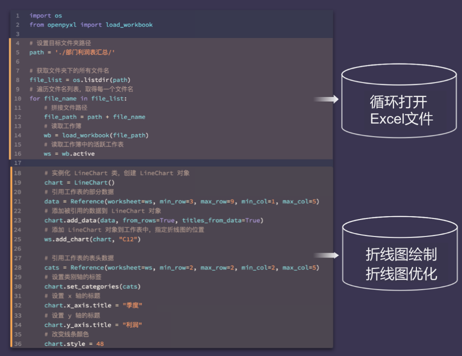
ws = wb.activeThe code for drawing and optimizing line chart is as follows:
The code for drawing and optimizing line chart is as follows:


# Instantiate the LineChart() class to get the LineChart object
chart = LineChart()
# Reference some data of the worksheet
data = Reference(worksheet=ws, min_row=3, max_row=9, min_col=1, max_col=5)
# Add referenced data to the LineChart object
chart.add_data(data, from_rows=True, titles_from_data=True)
# Add a LineChart object to the worksheet and specify the location where the line chart is generated
ws.add_chart(chart, "C12")

# Reference the header data of the worksheet
cats = Reference(worksheet=ws, min_row=2, max_row=2, min_col=2, max_col=5)
# Label category axes
chart.set_categories(cats)
# Sets the title of the x-axis
chart.x_axis.title = "quarter"
# Sets the title of the y-axis
chart.y_axis.title = "profit"
# Sets the color of the line chart
chart.style = 48
Next, merge the above two codes and draw a line chart for the workbooks in the folder ". / summary of profit statement of each department /".
You can take the line chart drawing and optimized code as a whole and put it into the for loop. In this way, each cycle opens a worksheet and draws and optimizes a line chart.
After the code is merged, it becomes like this:
Next, we begin to optimize and modify the code.
1) Check whether the code imports the required libraries, modules, classes and functions.
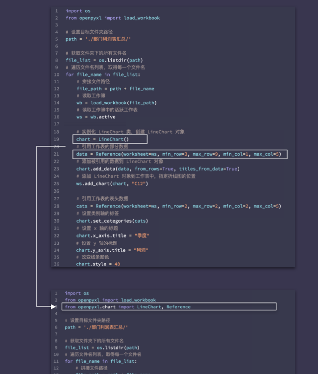
2) Check whether the names of variables are consistent.
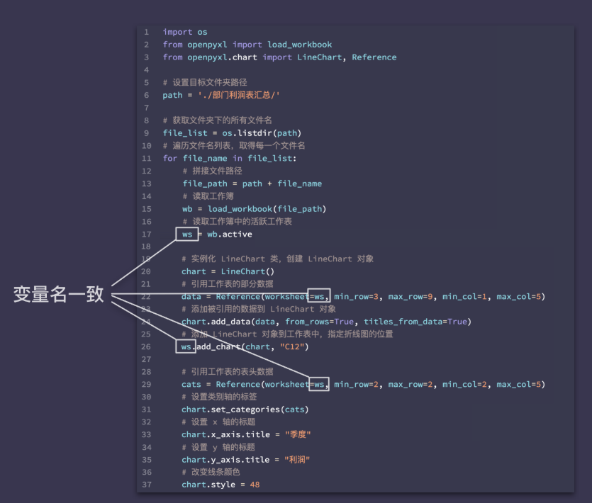
Finally, don't forget function block 4: save an Excel file.
Finally, the code is:
import os
from openpyxl import load_workbook
from openpyxl.chart import LineChart, Reference

# Set destination folder path
path = './Summary of profit statement of each department/'
# Get all file names under the folder
file_list = os.listdir(path)
# Traverse the file name list to get each file name
for file_name in file_list:
    # Splice file path
    file_path = path + file_name
    print('Processing:' + file_name)
    # Read Workbook
    wb = load_workbook(file_path)
    # Navigate to the active worksheet in the workbook
    ws = wb.active

    # Instantiate the LineChart() class to get the LineChart object
    chart = LineChart()
    # Reference some data of the worksheet
    data = Reference(worksheet=ws, min_row=3, max_row=9, min_col=1, max_col=5)
    # Add referenced data to the LineChart object
    chart.add_data(data, from_rows=True, titles_from_data=True)
    # Add a LineChart object to the worksheet and specify the location where the line chart is generated
    ws.add_chart(chart, "C12")

    # Reference the header data of the worksheet
    cats = Reference(worksheet=ws, min_row=2, max_row=2, min_col=2, max_col=5)
    # Label category axes
    chart.set_categories(cats)
    # Sets the title of the x-axis
    chart.x_axis.title = "quarter"
    # Sets the title of the y-axis
    chart.y_axis.title = "profit"
    # Sets the color of the line chart
    chart.style = 48

    # Save Workbook
wb.save(file_path) 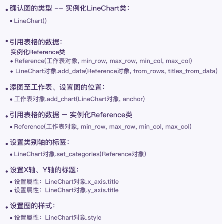
Knowledge induction and summary
Finally, sort out the process of completing the project!
The drawing of chart involves three function blocks: opening Excel file circularly, drawing line chart, optimizing line chart information and style, and saving Excel file.
In order to realize the function block of line chart drawing, line chart information and style optimization, we mainly learned:
1) Creation of LineChart object: LineChart()
2) Method of LineChart object: LineChart add_ Data (reference object, from_rows, titles_from_data), LineChart set_ Categories (reference object)
3) Properties of the LineChart object: LineChart x_ axis. title,chart.y_axis.title,chart.style
4) Creation of reference object: Reference(worksheet, min_row, max_row, min_col, max_col)
5) Method of worksheet object: WS add_ Chart (chart object, anchor)