background
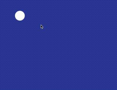
Today, I visited CodePen and saw such an interesting effect:
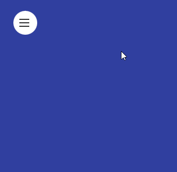
CodePen Demo -- Material Design Menu By Bennett Feely
There are still some points worth exploring and learning about this effect. Let's take a look at it together.
How to achieve such a similar effect?
First of all, think about what you would do if you were allowed to achieve the above effect?
Here I briefly list some possible ways:
- Shadow box shadow
- Gradient radial gradient
- Scale transform: scale()
One by one quickly.
Using box shadow
If box shadow is used, the code is roughly as follows:
<div class="g-container">
    <div class="g-item"></div>
</div>
.g-container {
position: relative;
width: 400px;
height: 300px;
overflow: hidden;
}
.g-item {
position: absolute;
width: 48px;
height: 48px;
border-radius: 50%;
background: #fff;
top: 20px;
left: 20px;
box-shadow: 0 0 0 0 #fff;
transition: box-shadow .3s linear;
&:hover {
box-shadow: 0 0 0 420px #fff;
}
}The core lies in:
- The outer layer is a mask with overflow: hideen set
- When the inner element hover is used, it implements a change from box shadow: 0 #fff to box shadow: 0 0 420px #fff
The effects are as follows:
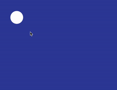
The overall animation is simulated, but its most fatal problems are two:
- When our mouse leaves the circle, the whole animation begins to reverse, and the white area begins to disappear. If we want to operate the button, we can't complete it
- The elements hidden in the expanded rectangle of the animation are not easy to place
Therefore, although box shadow looks good, it can only give up. The above Demo code-- CodePen Demo -- box-shadow zoom in animation
Implementation using gradient radial gradient
Next, we can restore the above effect by using radial gradient and CSS @property:
<div class="g-container"></div>
@property --size {
  syntax: '<length>';
  inherits: false;
  initial-value: 24px;
}

.g-container {
    position: relative;
    width: 400px;
    height: 300px;
    overflow: hidden;
    background: radial-gradient(circle at 44px 44px, #fff 0, #fff var(--size), transparent var(--size), transparent 0);
    transition: --size .3s linear;

    &:hover {
        --size: 450px;
    }
}
By controlling the animation effect of radial gradient, when hover ing, we change the original small circle background into a large circle background. The effects are as follows:
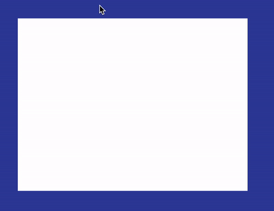
emmm, the effect is indeed restored, and the problem is also fatal:
- Due to the change of background, the mouse does not need to hover over the small circle. It only needs to enter the scope of div and the animation will start. This is obviously wrong
- Similar to the first box shadow method, the DOM of navigation elements hidden under white is not easy to place
The above Demo code-- CodePen Demo -- radial-gradient zoom in animation
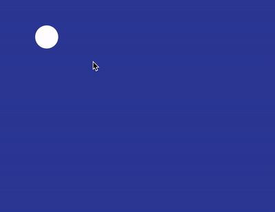
emmm, there is another method. There will be some problems by scaling transform: scale(), so we won't continue to expand here.
So here, to achieve the above effect, the core lies in:
- The mouse must hover over the circle to start the animation, and the mouse can move freely within the expanded range without retracting the animation effect
- After the animation is unfolded, the placement of DOM inside can't be too troublesome. It's best to control the display and hiding of the content without the help of Javascript
Dynamic region clipping using clip path
So, here, we actually need a dynamic region clipping.
In my article-- How to implement overflow: hidden without using overflow: hidden? , this paper introduces several ways to cut elements in CSS, and the most suitable one to use this effect is clip path.
Using clip path, the function of dynamic clipping can be well realized, and the code is also very simple:
<div class="g-container"></div>
.g-container {
    position: relative;
    width: 400px;
    height: 300px;
    overflow: hidden;
    transition: clip-path .3s linear;
    clip-path: circle(20px at 44px 44px);
    background: #fff;

    &:hover {
        clip-path: circle(460px at 44px 44px);
    }
}
We only need to use clip path to cut a rectangular div into a circle by using clip path: circle (20px at 44px 44px). When hover ing, we can expand the radius of the cutting circle to the whole rectangular range.
The effects are as follows:
In this way, we can perfectly achieve the effect of the title map, and the built-in DOM elements can be written directly into the div.
<div class="g-container">
    <ul>
        <li>11111</li>
        <li>22222</li>
        <li>33333</li>
        <li>44444</li>
    </ul>
</div>
The effects are as follows:
CodePen Demo -- clip-path zoom in animation
A very interesting skill, using clip path to realize dynamic region clipping, I hope you can master it.