Day01
1. What is data visualization
1.1 what is data visualization
More intuitive display of data, data visualization can clearly and effectively transfer information;
1.2 implementation of visualization
Report type: Excel, Crystal Report
Business Intelligence BI: Microsoft BI, power Bi
Coding class: echarts js,D3.js
ECharts is an open source visualization library developed by Baidu;
D3.js is foreign;
2. Basic use of ECharts
2.1 introduction to echarts
ECharts is an open-source visualization library implemented by Javascript, with strong compatibility. The bottom layer relies on the vector graphics library ZReader to provide intuitive, interactive and highly personalized data visualization charts;
characteristic:
1. Open source free
2. Rich functions
3. Active community
https://echarts.apache.org/zh/index.html
Rich visualization types
Line chart, bar chart, pie chart, K-line chart
https://echarts.apache.org/zh/index.html
Multiple data format support
Key value data format;
Two dimensional table;
TypeArray format;
Stream data support
Dynamic rendering of stream data;
Incremental rendering technology;
Also: mobile terminal optimization, cross platform use, gorgeous special effects, 3D Visualization
https://echarts.apache.org/zh/feature.html
2.2 quick start to echarts
Step 1: introduce echarts JS file
Step 2: prepare a box to present the chart;
Step 3: initialize the ecarts instance object;
Step 4: prepare configuration items;
Step 5: set the configuration item to the ecarts instance object;
<!DOCTYPE html>
<html lang="en">

<head>
    <meta charset="UTF-8">
    <meta http-equiv="X-UA-Compatible" content="IE=edge">
    <meta name="viewport" content="width=device-width, initial-scale=1.0">
    <title>Document</title>
    <!-- Step 1: Import echarts.js file -->
    <script src="echarts.min.js"></script>
</head>

<body>
    <!--
     Import step: 1 echarts.js file
     Step 2: prepare a box to present the chart;
     Step 3: initialize echarts Instance object;
     Step 4: prepare configuration items;
    Step 5: set the configuration item to echarts Instance object; -->

    <!-- Step 2: prepare a box to present the chart; -->
    <div style="width: 600px;height: 400px;"></div>

    <script>
        window.onload = function () {
            // Step 3: initialize the ecarts instance object; Initialize the ecarts instance based on the prepared dom
            var myEchart = echarts.init(document.querySelector("div"));

            // Step 4: prepare configuration items;
            var option = {
                title:{
                    text:"ECharts Getting started example"
                },
                tooltip:{},
                legend:{
                    data:['sales volume']
                },
                xAxis:{
                    data:["shirt","cardigan","Chiffon shirt","trousers","high-heeled shoes","Socks"]
                },
                yAxis:{},
                series:[{
                    name:'sales volume',
                    type:'bar',
                    data:[5, 20, 36, 10, 10, 20]
                }]
            };

            myEchart.setOption(option);

        }
    </script>
</body>

</html>
Use of configuration items:
Except that the configuration items will change, other codes are fixed;
The learning and use of configuration items should refer to official documents and examples;
https://echarts.apache.org/zh/option.html#title
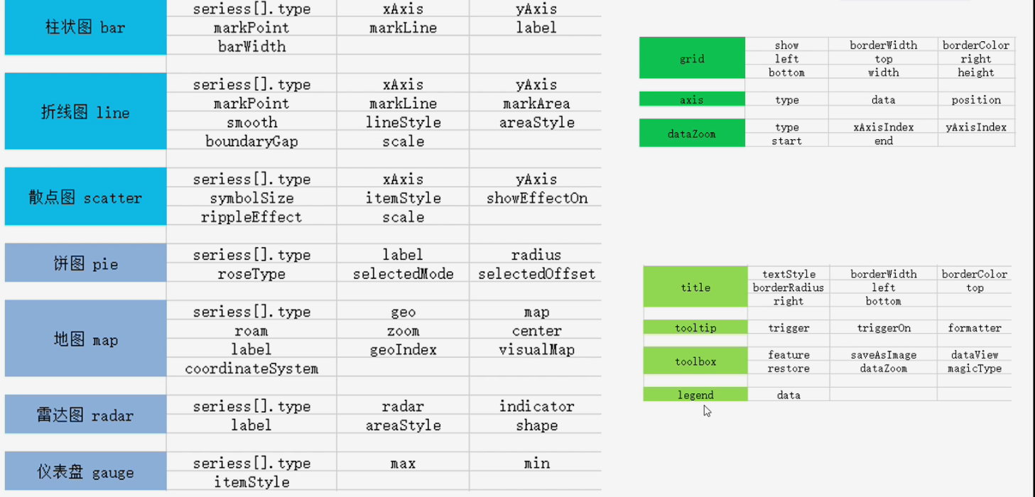
2.3 common charts of echarts
General configuration
General configuration refers to the configuration that can be used by any chart;
Title: title
Text style: textStyle
Title border: borderWidth, borderColor, borderRadius
Title Position: left, top, right, bottom
title: {
        text: "Basic realization and common effects of histogram",
        // Text style
        textStyle:{
              color:"red"
        },
        borderWidth:5,
        borderColor:"red",
        borderRadius:5
 }
Tip: tooltip
tooltip: prompt box component, which is used to configure the display box when the mouse slides over or clicks the chart;
trigger type: item, axis
Trigger on: mouseover, click
Format formatter: String template, callback function
tooltip:{
         // trigger:'item'
         trigger:'axis',
         triggerOn:'click',
         // formatter:'{b}:{c}'
         formatter:function(args){
         // console.log(args);
         return args[0].name +"of" +args[0].seriesName+"The result is"+args[0].data;
         }
       }
Tool button: toolbox
Toolbox: toolbar provided by echarts;
Built in five tools: export picture, data view, data area scaling, recovery (reset) and dynamic type switching;
Show toolbar button feature:
saveAsImage,dataView,dataZoom,restore,magicType
toolbox:{
         feature:{
                saveAsImage:{}, // Export picture
                dataView:{},  // Data view
                restore:{}, //Reset
                dataZoom:{}, //Area scaling
                magicType:{    // Dynamic chart type switching
                        type:['bar','line']
                        }
                    }
                }
legend: legend
legend: legend, used to filter series, which needs to be used with series;
The data in legend is an array;
The value of data in legend must be consistent with the name value of a group of data in the series array;
legend:{
       data:['language','mathematics']
 },
summary
<!DOCTYPE html>
<html lang="en">

<head>
    <meta charset="UTF-8">
    <meta http-equiv="X-UA-Compatible" content="IE=edge">
    <meta name="viewport" content="width=device-width, initial-scale=1.0">
    <title>Document</title>
    <!-- Step 1: Import echarts.mim.js file -->
    <script src="echarts.min.js"></script>
</head>

<body>
    <!-- Step 2:Prepare a box to present the chart -->
    <div style="width: 600px;height: 400px;"></div>
    <script>
        window.onload = function () {
            // Step 3: initialize the ecarts instance object; Initialize the ecarts instance based on the prepared dom
            var myBar = echarts.init(document.querySelector("div"));

            // Step 4: prepare configuration items;
            var option = {
                // title
                title: {
                    text: "Basic realization and common effects of histogram",
                    // Text style
                    textStyle:{
                        color:"red"
                    },
                    borderWidth:5,
                    borderColor:"red",
                    borderRadius:5
                },
                // prompt box
                tooltip:{
                    // trigger:'item'
                    trigger:'axis',
                    triggerOn:'click',
                    // formatter:'{b}:{c}'
                    formatter:function(args){
                        // console.log(args);
                        return args[0].name +"of" +args[0].seriesName+"The result is"+args[0].data;
                    }
                },
                // toolbar
                toolbox:{
                    feature:{
                        saveAsImage:{}, // Export picture
                        dataView:{},  // Data view
                        restore:{}, //Reset
                        dataZoom:{}, //Area scaling
                        magicType:{    // Dynamic chart type switching
                            type:['bar','line']
                        }
                    }
                },
                // Legend: for filtering series
                legend:{
                    data:['language','mathematics']
                },

                xAxis: {
                    type: "value"
                },
                yAxis: {

                    type: "category",
                    data: ["Zhang San", "Wang Wu", "Li Si"]
                },
                // series
                series: [
                    {
                    name: "language",
                    type: "bar",
                    data: [90, 88, 100],
                    // Configure maximum and minimum values for markPoint
                    markPoint: {
                        data: [
                            { type: "max", name: "Maximum" },
                            { type: "min", name: "minimum value" }
                        ]
                    },
                    // markLine: average value
                    markLine: {
                        data: [
                            { type: "average", name: "average value" }
                        ]
                    },
                    // Numerical display
                    label: {
                        show: true,
                        rotate: 60,
                        position: 'inside'
                    },
                    // Column width
                    barWidth: '30%'
                },

                {
                    name: "mathematics",
                    type: "bar",
                    data: [8, 7, 5],
                    // Configure maximum and minimum values for markPoint
                    markPoint: {
                        data: [
                            { type: "max", name: "Maximum" },
                            { type: "min", name: "minimum value" }
                        ]
                    },
                    // markLine: average value
                    markLine: {
                        data: [
                            { type: "average", name: "average value" }
                        ]
                    },
                    // Numerical display
                    label: {
                        show: true,
                        rotate: 60,
                        position: 'inside'
                    },
                    // Column width
                    barWidth: '30%'
                }
            ]
        };

            // Step 5: set the configuration item to the ecarts instance object
            myBar.setOption(option);
        }
    </script>
</body>

</html>
Chart 1: histogram
Basic histogram:
Basic code structure;
Data of x-axis and y-axis;
Set the type in the series to bar;
Common effects of histogram:
Max / min: markPoint;
Average value: markLine;
Display of values: label;
Column width: barWidth;
Features of histogram:
The histogram describes the classification data and presents the number of each classification. Through the histogram, you can clearly see the ranking of each classification data;
<!-- Step 1: Import echarts.mim.js file -->
 <script src="echarts.min.js"></script>
<!-- Step 2:Prepare a box to present the chart -->
    <div style="width: 600px;height: 400px;"></div>
// Step 3: initialize the ecarts instance object; Initialize the ecarts instance based on the prepared dom
var myBar = echarts.init(document.querySelector("div"));
// Step 4: prepare configuration items;
            var option = {
                title: {
                    text: "Basic realization and common effects of histogram"
                },
                xAxis: {
                    type: "value"
                },
                yAxis: {

                    type: "category",
                    data: ["Zhang San", "Wang Wu", "Li Si"]
                },
                series: {
                    name: "language",
                    type: "bar",
                    data: [90, 88, 100],
                    // Configure maximum and minimum values for markPoint
                    markPoint: {
                        data: [
                            { type: "max", name: "Maximum" },
                            { type: "min", name: "minimum value" }
                        ]
                    },
                    // markLine: average value
                    markLine: {
                        data: [
                            { type: "average", name: "average value" }
                        ]
                    },
                    // Numerical display
                    label: {
                        show: true,
                        rotate: 60,
                        position: 'inside'
                    },
                    // Column width
                    barWidth: '30%'
                }
            };
// Step 5: set the configuration item to the ecarts instance object
myBar.setOption(option);
Chart 2: line chart
Common effects of line chart:
Marking: maximum value, minimum value, average value, marking interval
markPoint,markLine,markArea
Line control: smooth style
smooth,lineStyle
Fill style
areaStyle
Next to the edge
boundaryGap
Scaling: scale off 0 values
scale
Stacking diagram
<!-- Step 1: Import echarts.mim.js file -->
    <script src="echarts.min.js"></script>
 <!-- Step 2:Prepare a box to present the chart -->
    <div style="width: 600px;height: 400px;"></div>
// Step 3: initialize the ecarts instance object; Initialize the ecarts instance based on the prepared dom
            var myChart = echarts.init(document.querySelector("div"));
//  Step 4: prepare configuration items
            var option = {
                xAxis: {
                    type: "category",
                    data: ['1 month', '2 month', '3 month', '4 month', '5 month', '6 month', '7 month', '8 month', '9 month', '10 month', '11 month', '12 month'],
                    // Next to the edge
                    boundaryGap:false,
                },
                yAxis: {
                    type: "value",
                    // Support scaling
                    scale:true
                },
                series: [
                    {
                        name: "a brand of instant noodles",
                        type: "line",
                        data: [1000, 1000, 8000, 3900, 1000, 1000, 8000, 3909, 1900, 1080, 8000, 3099],
                        stack:"all",
                        // Maximum and minimum
                        markPoint: {
                            data: [
                                { type: 'max' },
                                { type: 'min' }
                            ]
                        },
                        // average value
                        markLine: {
                            data: [
                                { type: "average" }
                            ]
                        },
                        // Label interval
                        markArea: {
                            data: [
                                [
                                    { xAxis: "1 month" },
                                    { xAxis: "2 month" }
                                ],
                                [
                                    { xAxis: "7 month" },
                                    { xAxis: "8 month" }
                                ]

                            ]
                        },
                        // Line controls: smoothing
                        smooth:true,
                        // Line style
                        lineStyle:{
                            color:"green",
                            type:"dashed",
                        },
                        // Fill style
                        areaStyle:{}
                    },
                    {
                        name: "Master Niu",
                        type: "line",
                        data: [10000, 10000, 8000, 3900, 100, 1000, 8000, 3990, 190, 100, 800, 399],
                        stack:"all",
                        // Maximum and minimum
                        markPoint: {
                            data: [
                                { type: 'max' },
                                { type: 'min' }
                            ]
                        },
                        // average value
                        markLine: {
                            data: [
                                { type: "average" }
                            ]
                        },
                        // Label interval
                        markArea: {
                            data: [
                                [
                                    { xAxis: "1 month" },
                                    { xAxis: "2 month" }
                                ],
                                [
                                    { xAxis: "7 month" },
                                    { xAxis: "8 month" }
                                ]

                            ]
                        },
                        // Line controls: smoothing
                        smooth:true,
                        // Line style
                        lineStyle:{
                            color:"green",
                            type:"dashed",
                        },
                        // Fill style
                        areaStyle:{}
                    }
                ]
            };
// Step 5: set the configuration item to the ecarts instance object
            myChart.setOption(option);
Chart 3: scatter chart
Characteristics of scatter diagram:
Scatter plot can help us infer the correlation between variables;
Scatter charts are also often used in map labeling;
Basic scatter diagram:
Basic code structure
The data of x-axis and y-axis is a two-dimensional array;
Set the type in the series to scatter;
Set the type in xAxis and yAxis to value;
Common effects:
Bubble chart effect:
The size of scatter points is different symbolSize
The colors of scatter points are different itemstyle color
Ripple animation effect:
type:effectScatter
showEffectOn:"emphasis",
rippleEffect:{}
<!DOCTYPE html>
<html lang="en">

<head>
    <meta charset="UTF-8">
    <meta http-equiv="X-UA-Compatible" content="IE=edge">
    <meta name="viewport" content="width=device-width, initial-scale=1.0">
    <title>Document</title>
    <script src="echarts.min.js"></script>
</head>

<body>
    <div style="width: 600px;height: 400px;"></div>

    <script>
        window.onload = function () {
            var myChart = echarts.init(document.querySelector("div"));

            var option = {
                xAxis: {
                    type: "value",
                },
                yAxis: {
                    type: "value"
                },
                series: {
                    // type:"scatter",
                    type:"effectScatter",
                    showEffectOn:"emphsis",
                    symbolSize:10,
                    itemStyle:{
                        color:"red"
                    },
                    rippleEffect:{
                        scale:5
                    },
                    data: [
                        [10.0, 8.04],
                        [8.07, 6.95],
                        [13.0, 7.58],
                        [9.05, 8.81],
                        [11.0, 8.33],
                        [14.0, 7.66],
                        [13.4, 6.81],
                        [10.0, 6.33],
                        [14.0, 8.96],
                        [12.5, 6.82],
                        [9.15, 7.20],
                        [11.5, 7.20],
                        [3.03, 4.23],
                        [12.2, 7.83],
                        [2.02, 4.47],
                        [1.05, 3.33],
                        [4.05, 4.96],
                        [6.03, 7.24],
                        [12.0, 6.26],
                        [12.0, 8.84],
                        [7.08, 5.82],
                        [5.02, 5.68]
                    ],
                }
            };

            myChart.setOption(option);
        }
    </script>
</body>

</html>
Common configurations in rectangular coordinate system
Chart of rectangular coordinate system: bar chart, broken line chart and scatter chart
Configuration 1: Grid
grid is used to control the layout and size of rectangular coordinate system;
The x-axis and y-axis are drawn on the basis of Grid;
Show grid:show
Border of grid: borderWidth, borderColor
Position and size of grid: left, top, right, bottom, width, height
Configuration 2: axis
The coordinate axis is divided into x axis and y axis
x-axis and y-axis with two positions at most in a grid;
(1) Axis type
Value: value axis, which will automatically read data from the target data;
Category: category axis. This type must set category data through data;
(2) Display position
xAxis: the value can be top or bottom
yAxis: can be left or right
(3) dataZoom area zoom configuration
dataZoom is used for area scaling and data range filtering. Both x-axis and y-axis can be owned;
dataZoom is an array, which means that multiple area scalers can be configured:
(a) type:
Slider: slider
inside: built in, zooming by mouse wheel or two fingers;
(b) Indicate which axis works:
xAxisIndex: set which x-axis is controlled by the scaling component, generally write 0;
yAxisIndex: set which y-axis is controlled by the scaling component, generally write 0;
(c) Indicates the scaling of the initial state
start: the starting percentage of the data window range;
End: end percentage of data window range;
Configuration 3: Area zoom dataZoom
Chart 4: pie chart
Basic structure:
Basic code structure;
Data is an array of objects composed of name and value;
Set the type in the series to pie;
No need to configure xAxis and yAxis;
Common effects of pie chart:
Formatting of displayed text:
label.formatter;
Ring:
Set two radii: ['50%', '70%'];
 radius:80,  // Radius of pie chart
 // radius:'20%' / / the percentage refers to the smaller half of the width and height to set the percentage
 // radius:['50%','70%'] / / the 0-th element represents the radius of the inner circle, and the 1-th element represents the radius of the outer circle
Nightingale map:
roseType:‘radius’; The radius of each area of the pie chart of the nandinger chart is different
roseType:'radius', //The radius of each area of the pie chart of the nandinger chart is different
Select effect
Selected mode: single / multiple;
Selected offset: selectedOffset:30
Characteristics of pie chart:
Pie chart can help users quickly understand the proportion of data of different classifications;
Chart 5: Map

Figure 6: radar chart
Implementation steps of radar chart:
Define the maximum value of each dimension
Define the type of chart;
Characteristics of radar chart:
Radar chart can be used to analyze the comparison between multi-dimensional data and standard data;
<!-- Step 1: Import echarts.min.js file -->
<script src="echarts.min.js"></script>
<!--Step 2: place the container of the chart-->
<div style="width: 600px;height: 400px;"></div>
<!-- Step 3: initialize the instance object echarts -->
var radar = echarts.init(document.querySelector("div"));
<!-- Define the maximum value of each dimension -->

var dataMax = [
     { name: "Ease of use", max: 100 },
     { name: "function", max: 100 },
     { name: "photograph", max: 100 },
     { name: "Run points", max: 100 },
     { name: "Endurance", max: 100 },
     ];


 // radar maximum value of multiple dimensions
    radar: {
             indicator: dataMax,  //indicator
             shape:"circle", // Configure the outermost graph of radar chart
                },
<!-- Set the chart type to radar chart -->
series: [
                    {
                        type: "radar",  // This chart is a radar chart
                        // Numerical display
                        label:{
                            show:true
                        },
                        // Shadow the radar map of each product
                        areaStyle:{},
                        data: [
                            {
                                name: "Huawei Mobile",
                                value: [100, 90, 80, 90, 100]
                            },
                            {
                                name: "Mi phones",
                                value: [70, 90, 80, 90, 100]
                            },
                            {
                                name: "iPhone",
                                value: [100, 60, 80, 90, 100]
                            }
                        ]
                    }
                ]
<!-- Set configuration item to echarts Instance object -->
radar.setOption(option);
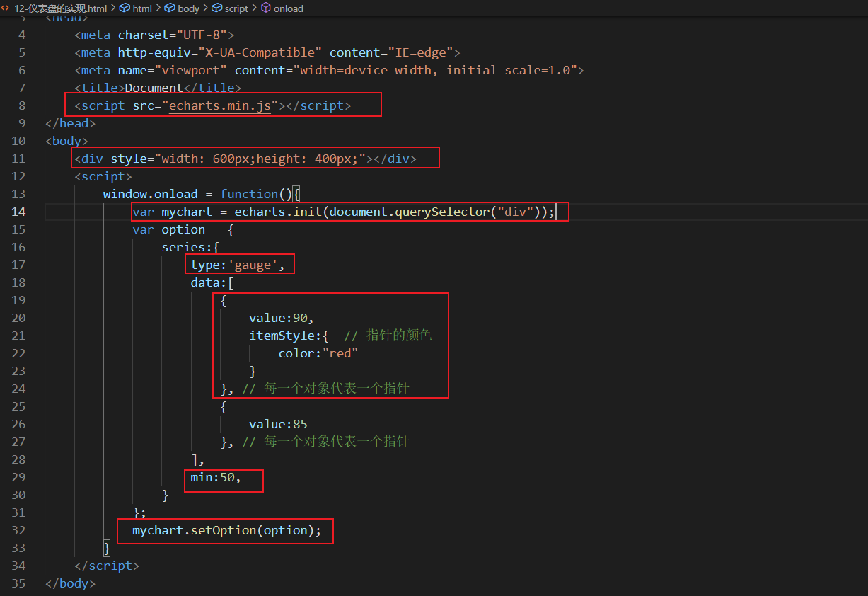
Figure 7: instrument panel diagram
Common effects:
Value range: max, min;
Multiple pointers: add array elements in data;
Multiple pointer color differences: itemStyle
Features of instrument diagram:
The instrument panel is mainly used for progress control and data range monitoring;

Day02
1. Display correlation
1.1 theme
1.1.1 built in theme
By default, two sets of themes are built in ECharts: light and dark;
In the initialization object method init, you can specify:
var chart = echarts.init(dom, 'light');
var chart = echarts.init(dom, 'dark');
The init method has two parameters. The first parameter represents a dom node and the second parameter represents which set of topics to use
1.1.2 custom theme
1. To edit a theme in the theme editor: https://echarts.apache.org/zh/theme-builder.html;
2. Download the theme, which is a js file;
3. Introduce theme js file;
4. Use topics in the init method;
1.2 color palette
A palette is a set of colors, graphics, and series from which colors are automatically selected;
Theme palette: a color node when registering a theme;
Global palette: var option = {color: []}, the global palette will overwrite the theme palette;
Partial palette: series:[{type:"bar",color:[''red ",]}]
The function of the palette follows the principle of proximity;
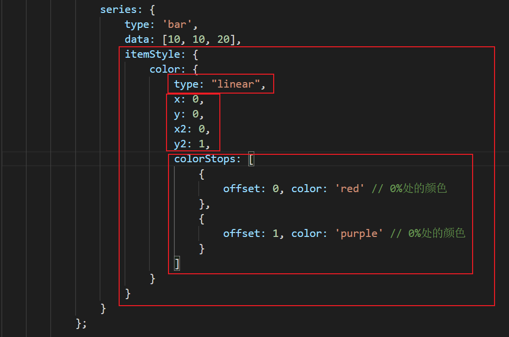
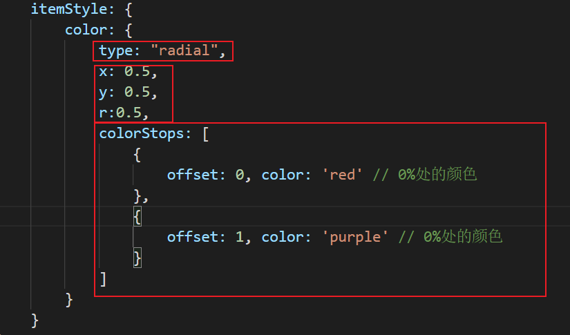
Color gradient
Linear gradient:
Radial gradient:
1.3 style
Direct style
textStyle: controls the text style of the title
itemStyle: controls the style of an area
lineStyle,areaStyle,label
Highlight style
Package itemStyle, textStyle, lineStyle, areaStyle and label in emphsis
1.4 adaptation
When the size of the browser changes, if you want the chart to adapt to the change;
1. Listen for window size change events
2, call resize of ECharts instance object in event handling function.
window.onresize = function(){
   myChart.resize();
}
2. Use of animation
2.1 loading animation
Ecarts has built-in animation for loading data. We just need to show or hide it at the right time;
Show load animation
myChart.showLoading()
Hide loading animation
myChart.hideLoading()
The following error was encountered here:
Access to XMLHttpRequest at 'file:///F:/2021%E6%98%A5/%E5%89%8D%E7%AB%AF%E5%AD%A6%E4%B9%A0/Echarts-study/day02/textData.json' from origin 'null' has been blocked by CORS policy: Cross origin requests are only supported for protocol schemes: http, data, chrome, chrome-extension, chrome-untrusted, https.
Reason: limitation of homology strategy;
Solution: download the live server plug-in in VScode. Live server is a small server with real-time loading function. You can use it to crack html/css/javascript, but it cannot be used to deploy the final site. In other words, we can use live server as a real-time server to view the developed web pages or project effects in real time.
2.2 incremental animation
myCharts.setOption(option)
All data updates are realized through setOption;
Regardless of what changes have taken place in the data;
ECharts will find the difference between the two groups of data, and then use appropriate animation to show the changes of data;
 modify.addEventListener('click', function () {
                // setOption can be set multiple times
                // The relationship between old and new option s is not a relationship of mutual coverage, but a relationship of mutual integration
                // When setting new option s, we only need to consider the changed parts
                var option = {
                    series:{
                        data: [30, 10, 20]
                    }
                };
                mychart.setOption(option);
            });
            add.addEventListener('click', function () {
                var option = {
                    xAxis: {
                    data: ['millet', "Xiao Ming", "principal","san"]
                },
                    series:{
                        data: [30, 10, 20, 50]
                    }
                };
                mychart.setOption(option);
            });
2.3 animation configuration
Turn on animation
animation: true
Animation duration
animationDuration:5000
Jog animation
animationEasing:"bounceOut"
Animation threshold
animationThreshold:10;
When the number of elements in a single form is greater than this threshold, the animation will be turned off;

3. Interactive API
Common methods of global ecarts object
The global ecarts object is the introduction of ecarts JS file can be used directly;
(1)init
Initialize the ecarts instance object;
Use theme;
(2)registerTheme
Registered subject;
Only registered topics can be used in init method;
(3)registerMap
(4)connect
Associate multiple charts;
There can be multiple independent charts in one page;
Each chart corresponds to an ECharts instance object;
connect can realize multi graph Association and incoming linkage. The target is ECharts instance object, and supports array:
Save automatic splicing of pictures
Refresh button
Reset button
Prompt box linkage, legend selection, data range modification, etc;
echartsInstance object
The eckartsinstance object is created through eckartsinstance Obtained after init method call;
(1) setOption method
Set or modify the configuration items and data of the chart;
Call setOption method many times: merge new configuration items with old configuration items and incremental animation;
(2) resize method
Recalculate and chart
It is generally used in combination with the resize event of window object:
window.onresize = function(){
     mychart.resize();
}
(3) on/off method
Bind or unbind event handling functions;
Mouse events:
Common events: 'click', 'dbclick', 'mousedown', 'mousemove', 'mouseup', etc;
Event parameter: event related data information;
Echarts event:
Common events: legendselectedchanged, 'datazoom', 'pieselectchanged', etc;
Event parameter: event related data information;
(4) dispatchAction method
Trigger certain behaviors;
Use code to simulate user behavior;
myCharts.dispatchAction({
   type:"highlight", // Event type
   seriesIndex:0, // Icon index
   dataIndex:1, // Which item in the chart is highlighted

})
(5) clear method
Clearing the current instance will remove all components and charts in the instance;
After clearing, you can set option again;
(6) dispose method
Examples of destruction;
The instance cannot be used again after destruction;
Day03 e-commerce platform data visualization project (unfinished)
1. Use of Koa2
1.1 introduction to koa2
Based on node web development framework of JS platform;
Built by the original team of Express;
| Frame name | effect | Asynchronous processing |
|---|---|---|
| Express | web Framework | Callback function |
| Koa | web Framework | Generator+yield |
| Koa2 | web Framework | async/await |
Environment dependent node v7 6.0 and above;
Koa2 features:
1. Support async/await
2. Middleware of onion model
1.2 Koa2 quick start
1. Check the environment of node: node -v;
2. Install koa: npm init -y; npm install koa;
3. Create and write app JS file;
(1) Create koa objects;
(2) Write response function (Middleware);
(3) Listening port;
4. Start service: node app js
1.3 features of koa2 Middleware
The Koa object is added to a middleware through the use method;
A middleware is a function;
The execution sequence of middleware conforms to the onion model;
Whether the inner middleware can execute depends on whether the next function of the outer middleware is called;
The Promise object is obtained by calling the next function;
app.use(async(ctx, next)=>{
  // What you want to do when you just enter the middleware
  await next()
  //What you want to do after the end of all Middleware in the inner layer;

})