Eccharts data visualization tutorial (super detailed)
Introduction to ECharts
Official website link: Apache ECharts
ECharts is an open source visualization library implemented by JavaScript, which can run smoothly on PC and mobile devices. It is compatible with most current browsers (IE8/9/10/11, Chrome, Firefox, Safari, etc.), and the underlying layer depends on vector graphics library ZRender , provide intuitive, interactive and highly personalized data visualization charts.
Popular understanding:
- Is a JS plug-in
- Good performance and smooth operation of PC and mobile devices
- Compatible with mainstream browsers
- Many commonly used charts [line chart, bar chart, scatter chart, pie chart, K-line chart] are provided and can be customized (customization is supported)
Introduction to ECharts
Official tutorial: 5 minutes to start ECharts
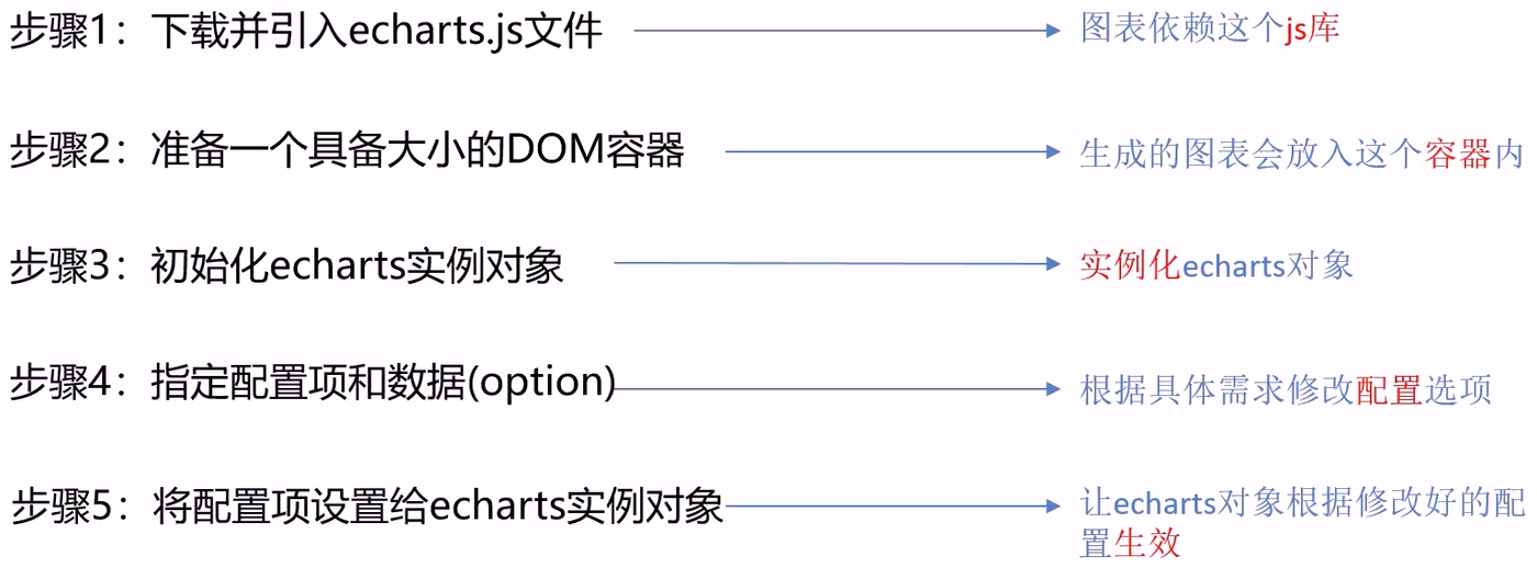
Step 1: Download and introduce schools JS file
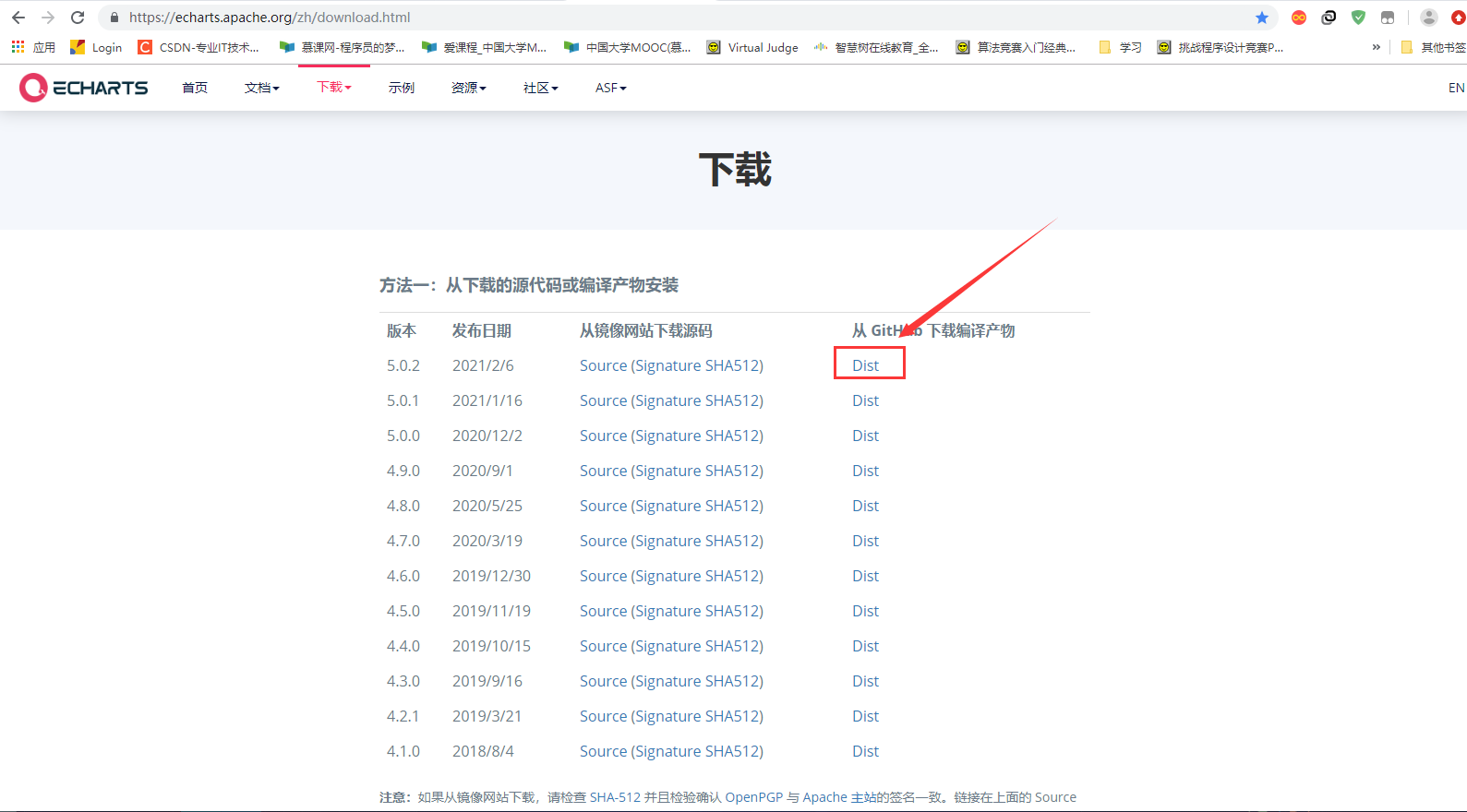
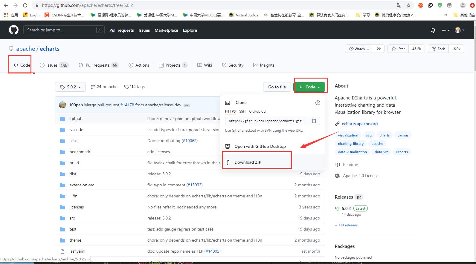
Get ECharts: Download address
1. Click Dist to jump to Github.
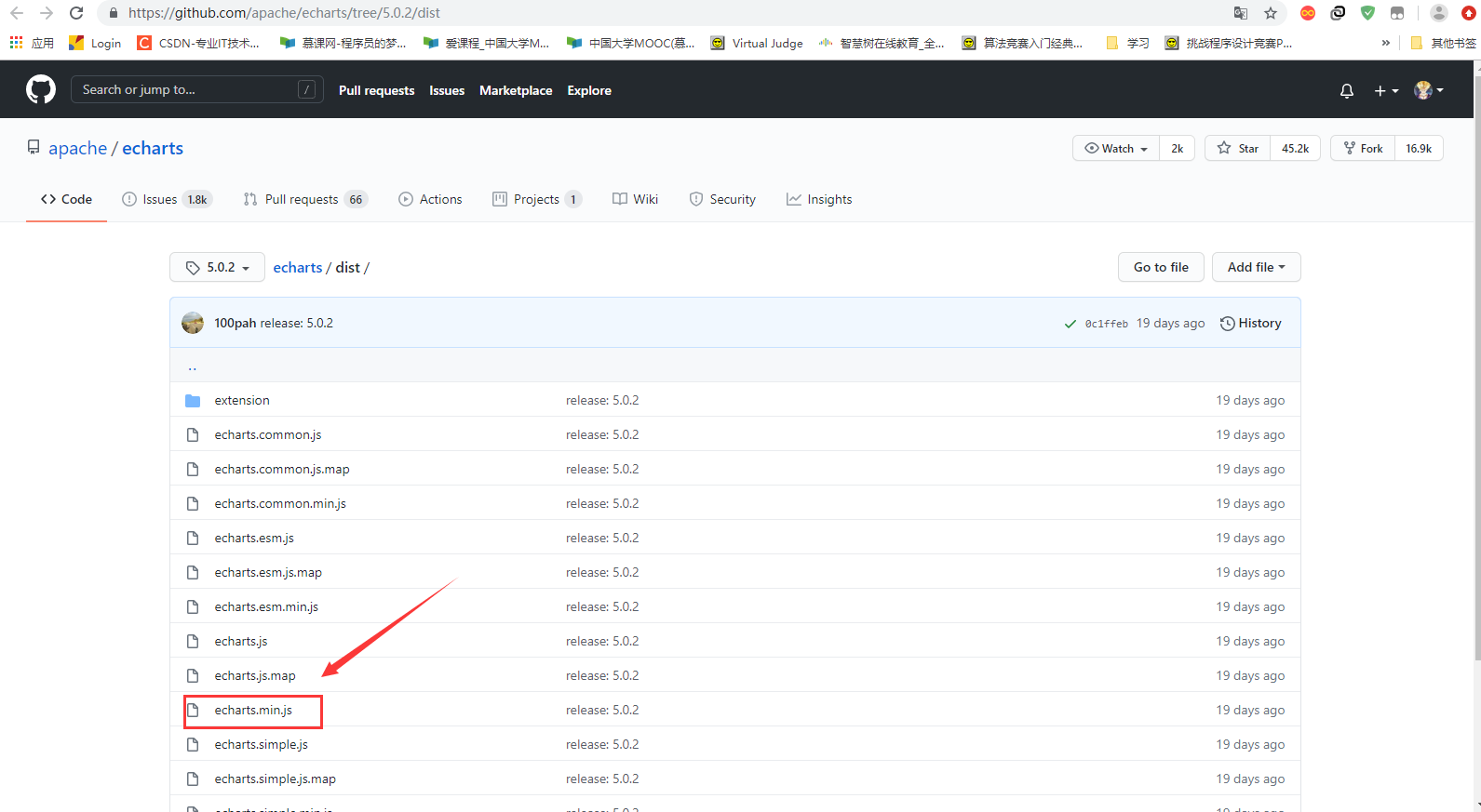
2. Click in
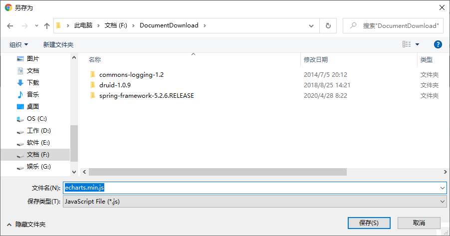
3. Right click Raw and select link save as
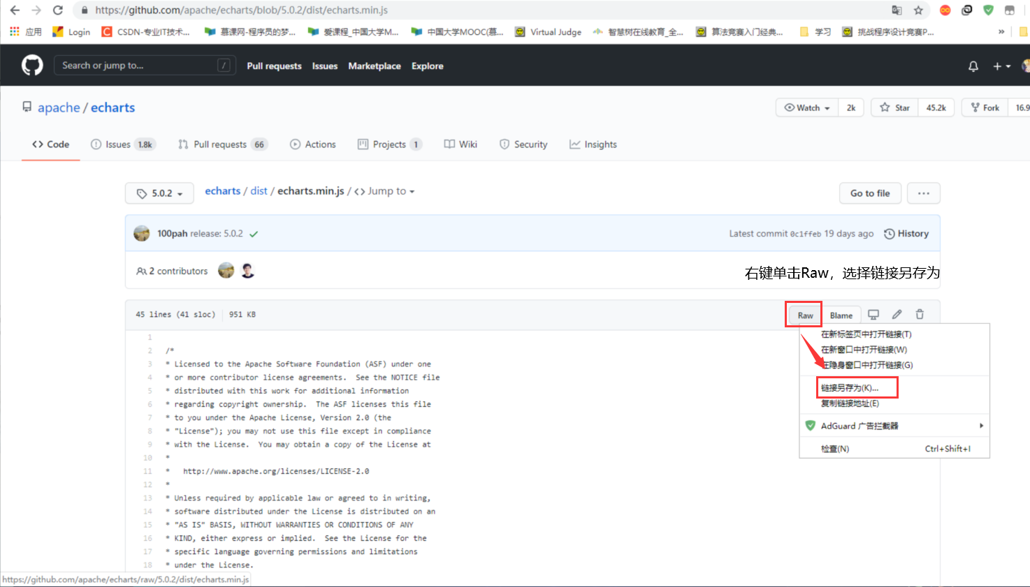
4. So we have the documents we need
Simple and rough way:
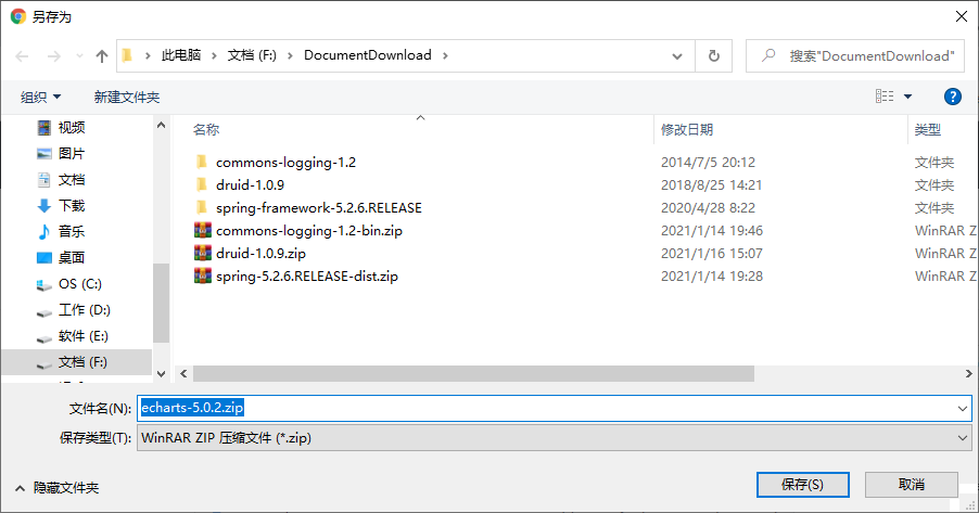
After the first step above, the second step is to directly click code, then download the compressed package, which is simple and direct, and then find the files we need in it.
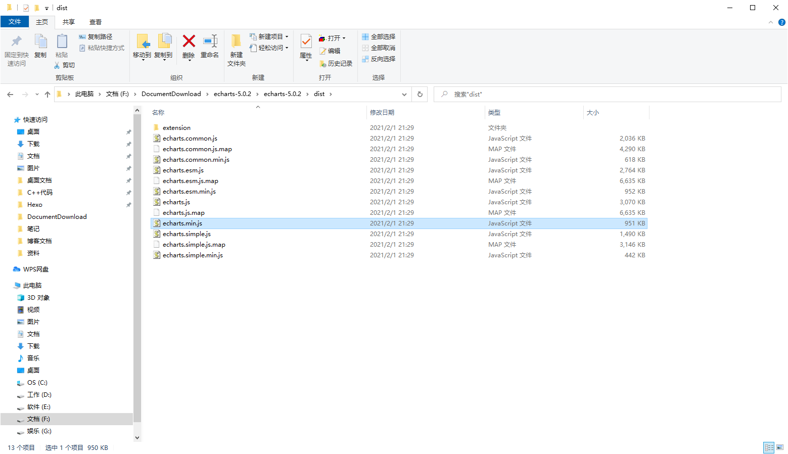
Open the compressed package, find the required files and import them into the js folder of our project
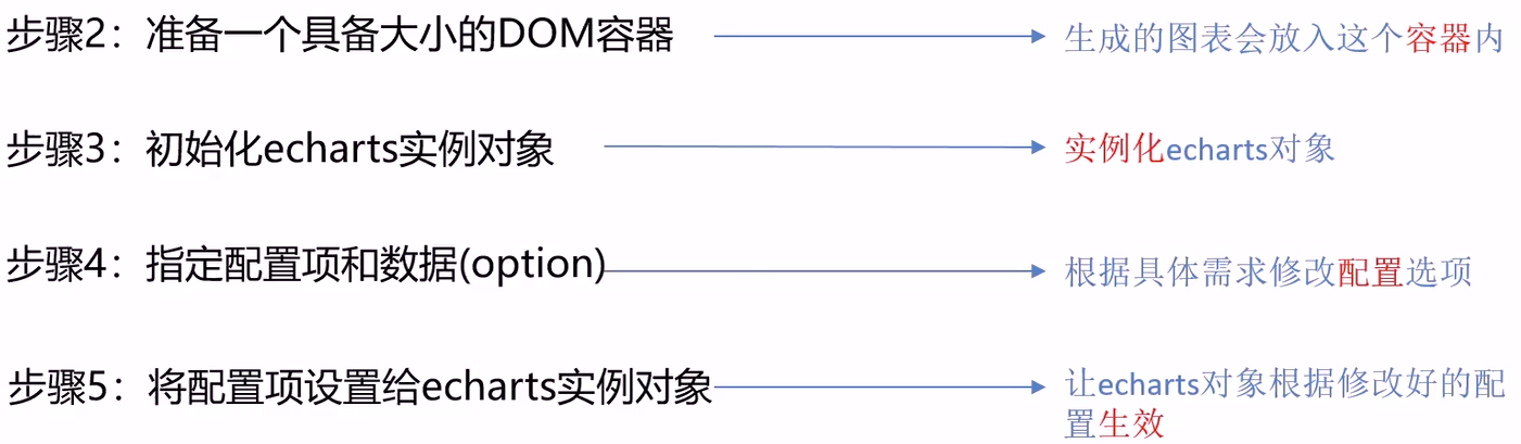
Step 2: write code
directory structure
Write index HTML code
Write the code according to steps 2 to 5 above.
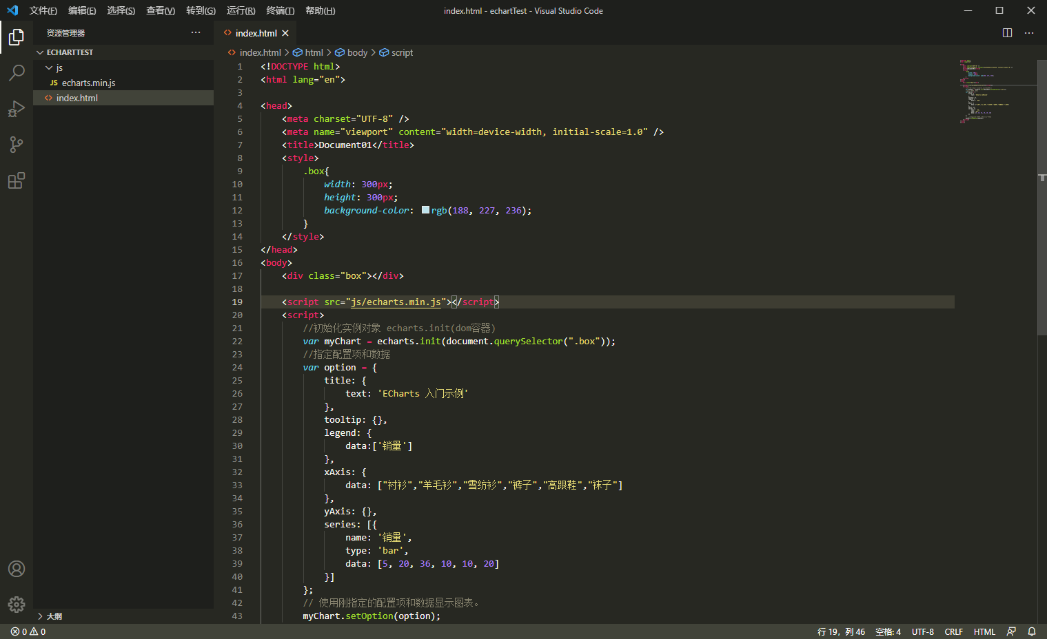
index.html:
<!DOCTYPE html>
<html lang="en">

<head>
    <meta charset="UTF-8" />
    <meta name="viewport" content="width=device-width, initial-scale=1.0" />
    <title>Document01</title>
    <style>
        .box{
            width: 300px;
            height: 300px;
            background-color: rgb(188, 227, 236);
        }
    </style>
</head>
<body>
	<!-- 2.Prepare with size DOM container -->
    <div class="box"></div>

    <script src="js/echarts.min.js"></script>
    <script>
        //Echarts. Instance initialization Init (DOM container)
        var myChart = echarts.init(document.querySelector(".box"));
        //4. Specify configuration items and data
        var option = {
            title: {
                text: 'ECharts Getting started example'
            },
            tooltip: {},
            legend: {
                data:['sales volume']
            },
            xAxis: {
                data: ["shirt","cardigan","Chiffon shirt","trousers","high-heeled shoes","Socks"]
            },
            yAxis: {},
            series: [{
                name: 'sales volume',
                type: 'bar',
                data: [5, 20, 36, 10, 10, 20]
            }]
        };
        //5. Set the configuration item to the ecarts instance object, and use the configuration item and data just specified to display the chart.
        myChart.setOption(option);
    </script>
</body>
</html>
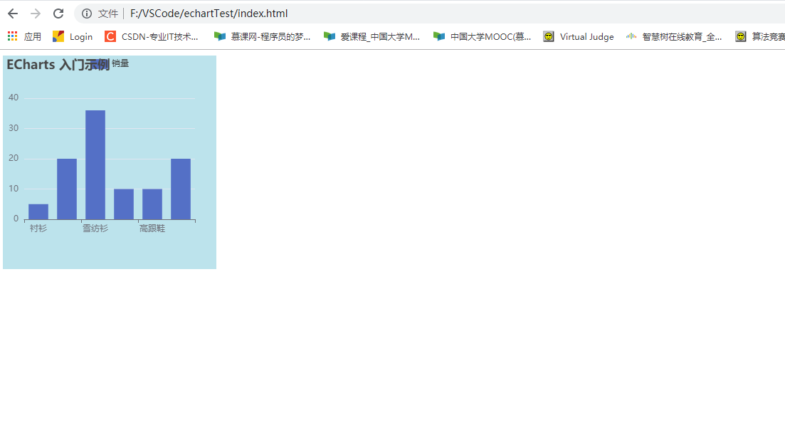
Effect display
Basic configuration of ECharts
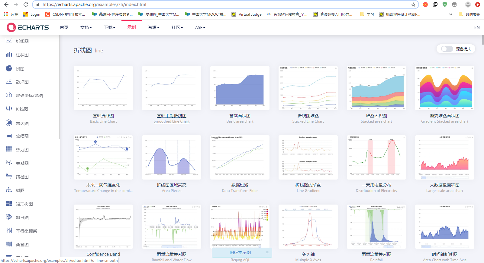
Many examples are given on the official website: link
We can all use it directly, but we can modify some configurations according to our own needs, so we need to understand the basic configuration of ECharts.
Main configuration (common)
Official website configuration item reference document: address
Main configurations to understand: series xAxis yAxis grid tooltip title legend color
-
series
– list of series. Each series determines its own chart type by type
– popular understanding: icon data, specify what type of icon, and multiple charts can be overlapped. -
xAxis: the x-axis in the rectangular coordinate system grid
– boundaryGap: the white space strategy on both sides of the coordinate axis is true. At this time, the scale is only used as a separation line, and the label and data point will be in the middle of the band between the two scales.
-
yAxis: y axis in rectangular coordinate system grid
-
Grid: drawing grid in rectangular coordinate system.
-
title: title Component
-
tooltip: prompt box component
-
legend: legend component
-
Color: palette color list
-
Stack: Data stacking. After the series on the same category axis are configured with the same stack value, the values of the next series will be added to the values of the previous series.
For more configuration items, refer to the official documents, which are very specific.
Case explanation
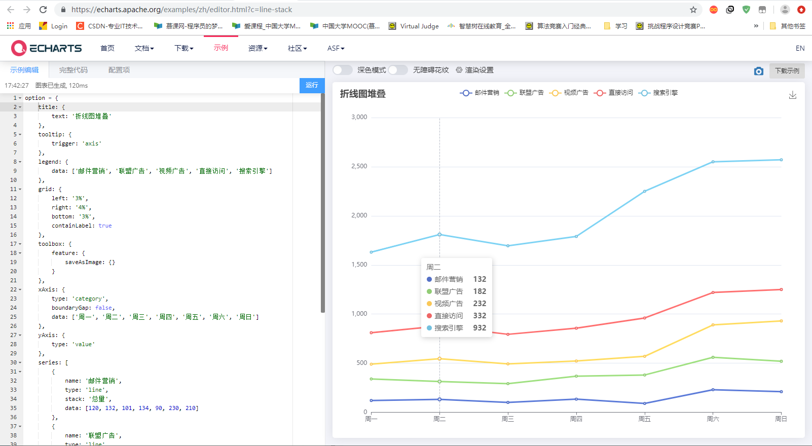
Next, by modifying the example in the official example Line chart stacking , to get familiar with configuration items.
Style before modification:
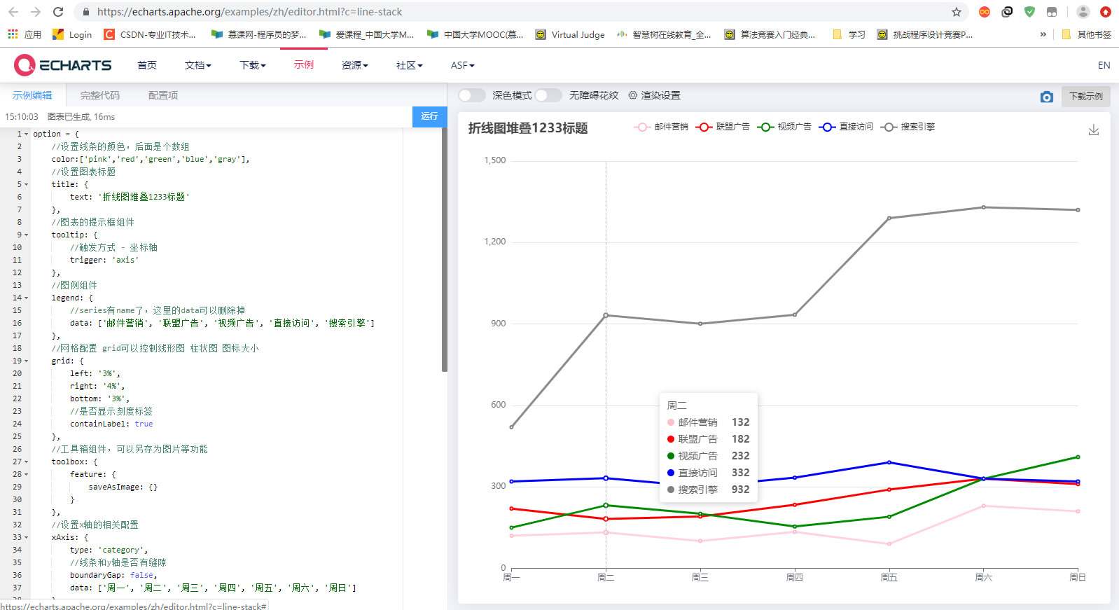
Modified code:
option = {
    //Set the color of the line, followed by an array
    color:['pink','red','green','blue','gray'],
    //Set chart title
    title: {
        text: 'Line chart stack 1233 title'
    },
    //Prompt box component of chart
    tooltip: {
        //Trigger mode - coordinate axis
        trigger: 'axis'
    },
    //Legend components
    legend: {
        //The series has a name, and the data here can be deleted
        data: ['Mail marketing', 'Alliance advertising', 'Video advertising', 'Direct access', 'Search Engines']
    },
    //Grid configuration grid can control the size of line chart and bar chart icons
    grid: {
        left: '3%',
        right: '4%',
        bottom: '3%',
        //Show scale labels
        containLabel: true
    },
    //Toolbox components can be saved as pictures and other functions
    toolbox: {
        feature: {
            saveAsImage: {}
        }
    },
    //Set the relevant configuration of the x-axis
    xAxis: {
        type: 'category',
        //Is there a gap between the line and the y-axis
        boundaryGap: false,
        data: ['Monday', 'Tuesday', 'Wednesday', 'Thursday', 'Friday', 'Saturday', 'Sunday']
    },
    //Set the relevant configuration of y-axis
    yAxis: {
        type: 'value'
    },
    //Series chart configuration determines which type of chart to display
    series: [
        {
            name: 'Mail marketing',
            type: 'line',
            //The total amount will be stacked in the back and accumulated in the front. If it is deleted, it will be folded. Generally, it is not necessary
            //stack: 'total quantity',
            data: [120, 132, 101, 134, 90, 230, 210]
        },
        {
            name: 'Alliance advertising',
            type: 'line',
            //stack: 'total quantity',
            data: [220, 182, 191, 234, 290, 330, 310]
        },
        {
            name: 'Video advertising',
            type: 'line',
            //stack: 'total quantity',
            data: [150, 232, 201, 154, 190, 330, 410]
        },
        {
            name: 'Direct access',
            type: 'line',
            //stack: 'total quantity',
            data: [320, 332, 301, 334, 390, 330, 320]
        },
        {
            name: 'Search Engines',
            type: 'line',
            //stack: 'total quantity',
            data: [520, 932, 901, 934, 1290, 1330, 1320]
        }
    ]
};
Modified style:
supplement
Sample link
In addition to the official website mentioned above, there are links to many examples: Click here
There is another supplement: Gallery
Execute function now
In order to prevent variable pollution and reduce naming conflicts, we can use the writing method of immediate execution function, because the variables in immediate execution function are local variables.
We need many var option s. We use the immediate execution function package to avoid name conflicts.
The format is as follows:
Example code: index js
// Basic line chart
(function() {

  // Instantiate object
  var myChart = echarts.init(document.querySelector(".bar .chart"));
  // Specify configuration and data
  var option = {
    xAxis: {
        type: 'category',
        data: ['Mon', 'Tue', 'Wed', 'Thu', 'Fri', 'Sat', 'Sun']
    },
    yAxis: {
        type: 'value'
    },
    series: [{
        data: [150, 230, 224, 218, 135, 147, 260],
        type: 'line'
    }]
  };

  // Configuration items and data are given to our instantiated objects
  myChart.setOption(option);

  // When our browser zooms, the chart also scales equally
  window.addEventListener("resize", function() {
    // Let our chart call the resize method
    myChart.resize();
  });

})();

// Pie chart
(function() {

  // Initialize the ecarts instance based on the prepared dom
  var myChart = echarts.init(document.querySelector(".line .chart"));

  // Specify configuration and data
  var option = {
    title: {
        text: 'User access source of a site',
        subtext: 'It's pure fiction',
        left: 'center'
    },
    tooltip: {
        trigger: 'item'
    },
    legend: {
        orient: 'vertical',
        left: 'left',
    },
    series: [
        {
            name: 'Access source',
            type: 'pie',
            radius: '50%',
            data: [
                {value: 1048, name: 'Search Engines'},
                {value: 735, name: 'Direct access'},
                {value: 580, name: 'Mail marketing'},
                {value: 484, name: 'Alliance advertising'},
                {value: 300, name: 'Video advertising'}
            ],
            emphasis: {
                itemStyle: {
                    shadowBlur: 10,
                    shadowOffsetX: 0,
                    shadowColor: 'rgba(0, 0, 0, 0.5)'
                }
            }
        }
    ]
  };

  // Configuration items and data are given to our instantiated objects
  myChart.setOption(option);

  // When our browser zooms, the chart also scales equally
  window.addEventListener("resize", function() {
    // Let our chart call the resize method
    myChart.resize();
  });

})();
Let the chart follow the screen adaptively
  // When our browser zooms, the chart also scales equally
  window.addEventListener("resize", function() {
    // Let our chart call the resize method
    myChart.resize();
  });
The above is the whole content of the introduction tutorial (super detailed) of eccharts to realize data visualization.
After reading, if it helps you, thank you for your praise and support!
If you are a computer, do you see the "one key three links" in the lower right corner? Yes, click it [HA HA]

come on.
make joint efforts!
Keafmd