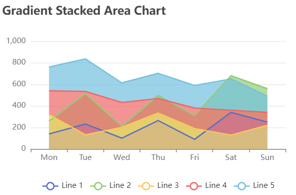
The version of Echarts used in this article is: 5.3.0
this series is mainly to learn from ecarts by reproducing the examples on apach ecarts official website. Target image page address: https://echarts.apache.org/examples/zh/editor.html?c=area-stack-gradient
1. Ecarts drawing
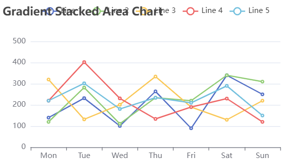
- Here, first draw the basic graphics, draw 5 broken lines, and then improve them step by step. The basic graphic code is as follows:
<!DOCTYPE html>
<html>
<head>
    <meta charset="utf-8">
    <title>Echarts Official website example learning</title>
    <!-- introduce echarts.js -->
    <script src="https://cdn.staticfile.org/echarts/5.3.0/echarts.min.js"></script>
</head>
<body>
    <!-- by ECharts Prepare one with size (width and height) Dom -->
    <div id="main" style="width:500px;height:300px"></canvas>
    <script type="text/javascript">
        // Initialize the ecarts instance based on the prepared dom
        var myChart = echarts.init(document.getElementById("main"),"white",
									{renderer:"canvas"});
        // Specify configuration items and data for the chart
        var option = {
			title:{text:'Gradient Stacked Area Chart'},
			xAxis:{
				type:'category',
				data:['Mon','Tue','Wed','Thu','Fri','Sat','Sun']},
			yAxis:{type:'value'},
			legend:{},
			series:[{
					type:'line',
					name:'Line 1',
					data:[140, 232, 101, 264, 90, 340, 250]},
					{
					type:'line',
					name:'Line 2',
					data:[120, 282, 111, 234, 220, 340, 310]},
					{
					type:'line',
					name:'Line 3',
					data:[320, 132, 201, 334, 190, 130, 220]},
					{
					type:'line',
					name:'Line 4',
					data:[220, 402, 231, 134, 190, 230, 120]},
					{
					type:'line',
					name:'Line 5',
					data:[220, 302, 181, 234, 210, 290, 150]}]
        };
         myChart.setOption(option);
    </script>
</body>
</html>
The basic drawing is:
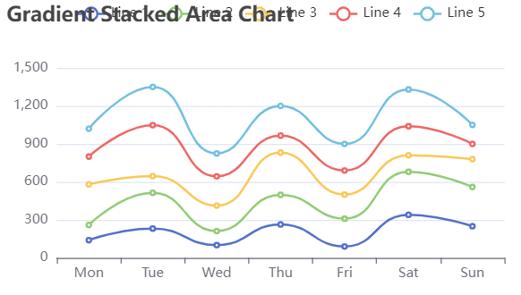
- Next, change the polyline on the basic graph to "smooth curve" and set the data stack. You can achieve this by setting the smooth and stack properties of each polyline. The specific code is as follows (only the settings of relevant attributes are described here, the same below. The complete drawing code can be seen at the end of this part):
{smooth:true,
stack:'Total'}
After operation, the figure is as follows:
- Change the drawing to an area chart and set a gradient. This requires a broken line areaStyle Properties. The details are as follows:
<!--Let's show it here first Line 1 For the gradient area map, add the following code Line1 corresponding{}Medium-->
areaStyle:{
			opacity:0.8,
			color:{
				type:'linear',
				x:0,
				y:0,
				x2:0,
				y2:1,
				colorStops:[{offset:0,color:'rgb(255, 191, 0)'},
							{offset:1,color:'rgb(224, 62, 76)'}]}}
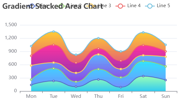
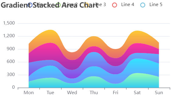
- Remove the original broken line and its mark. The "removal" here is just to make it invisible visually. Use the width property in lineStyle to make the polyline invisible, and use symboSize to make the data item mark (7 small circles on each polyline) invisible. The specific codes are as follows:
lineStyle:{width:0},
symbolSize:0,
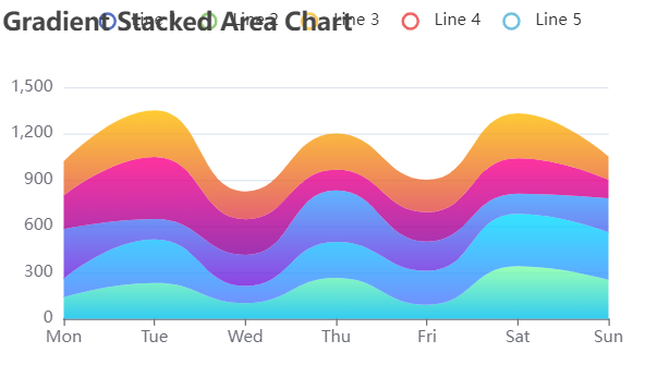
- Delete the blank parts on both sides of the figure. In this example, the x coordinate axis is the category axis. You need to add the boundaryGap attribute in xAxis. Set the boundaryGap to false to delete it. The specific codes are as follows:
xAxis:{boundaryGap:false,}
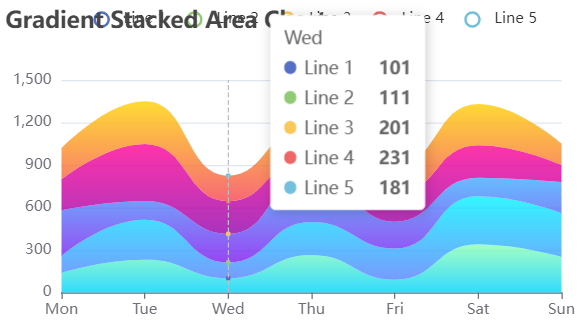
- Add a prompt box. When the mouse slides over the target graph, you can see the values of the five lines of each day displayed in the prompt box. Here, you need to change the trigger type of the prompt box to "axis" trigger. The specific codes are as follows:
tooltip:{trigger:'axis'}
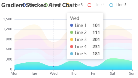
- When you slide the mouse over the graph, you will find that when you slide the mouse to an area zone, the broken line graph will be highlighted. This can be set through the emphasis attribute of the polyline. The specific codes are as follows:
emphasis:{focus:true,},
- When you use to slide data on a graph, the current scale of the coordinate axis where the mouse is located will be displayed at any time. This requires the axisPoint attribute of tooltip. The details are as follows:
axisPointer:{type:'cross'},
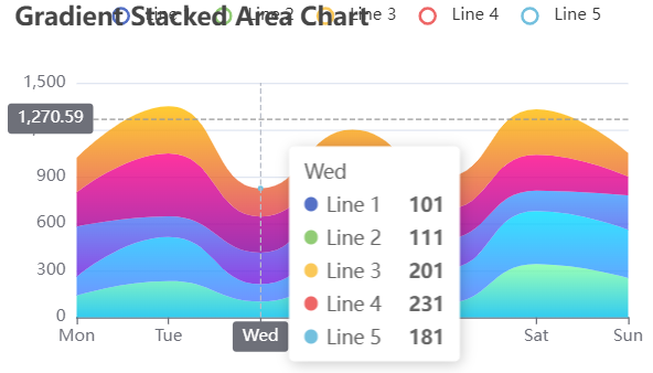
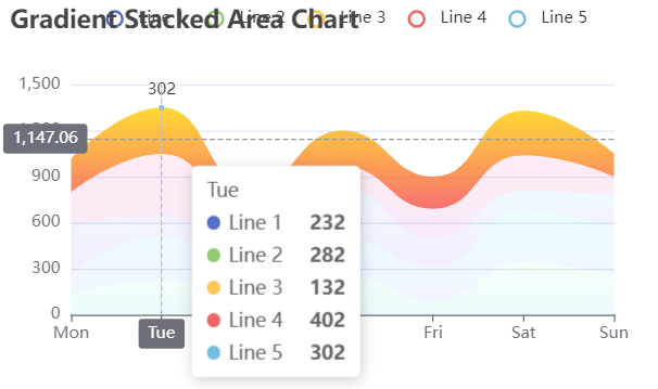
- When the mouse hovers over the 5th polyline, the data label of the corresponding data item will be displayed. This can be set through showSymbol. The specific codes are as follows:
{showSymbol:false;
label:{show:true,},}
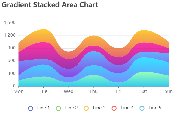
- So far, the target graph has been basically completed. However, because the size of the graph is too small when drawing, the legend and chart title overlap. Here you can move the legend below the icon. The specific codes are as follows:
legend:{bottom:'0%'},
Complete code
<!DOCTYPE html>
<html>
<head>
    <meta charset="utf-8">
    <title>Echarts Official website example learning</title>
    <!-- introduce echarts.js -->
    <script src="https://cdn.staticfile.org/echarts/5.3.0/echarts.min.js"></script>
</head>
<body>
    <!-- by ECharts Prepare one with size (width and height) Dom -->
    <div id="main" style="width:500px;height:300px"></canvas>
    <script type="text/javascript">
        // Initialize the ecarts instance based on the prepared dom
        var myChart = echarts.init(document.getElementById("main"),"white",
									{renderer:"canvas"});
        // Specify configuration items and data for the chart
        var option = {
			title:{text:'Gradient Stacked Area Chart'},
			xAxis:{
				type:'category',
				boundaryGap:false,
				data:['Mon','Tue','Wed','Thu','Fri','Sat','Sun']},
			yAxis:{type:'value'},
			legend:{bottom:'0%'},
			tooltip:{
						trigger:'axis',
						axisPointer:{type:'cross'},
					},
			series:[{
					type:'line',
					name:'Line 1',
					data:[140, 232, 101, 264, 90, 340, 250],
					smooth:true,
					stack:'Total',
					lineStyle:{width:0},
					symbolSize:0,
					areaStyle:{
						opacity:0.8,
						color:{
								type:'linear',
								x:0,
								y:0,
								x2:0,
								y2:1,
								colorStops:[{offset:0,color:'rgb(128, 255, 165)'},
											{offset:1,color:'rgb(1, 191, 236)'}]}},
					emphasis:{focus:'series'},},
					{
					type:'line',
					name:'Line 2',
					data:[120, 282, 111, 234, 220, 340, 310],
					smooth:true,
					stack:'Total',
					lineStyle:{width:0},
					symbolSize:0,
					areaStyle:{
						opacity:0.8,
						color:{
								type:'linear',
								x:0,
								y:0,
								x2:0,
								y2:1,
								colorStops:[{offset:0,color:'rgb(0, 221, 255)'},
											{offset:1,color:'rgb(77, 119, 255)'}]}},
					emphasis:{focus:'series'},},
					{
					type:'line',
					name:'Line 3',
					data:[320, 132, 201, 334, 190, 130, 220],
					smooth:true,
					stack:'Total',
					lineStyle:{width:0},
					symbolSize:0,
					areaStyle:{
						opacity:0.8,
						color:{
								type:'linear',
								x:0,
								y:0,
								x2:0,
								y2:1,
								colorStops:[{offset:0,color:'rgb(55, 162, 255)'},
											{offset:1,color:'rgb(116, 21, 219)'}]}},
					emphasis:{focus:'series'},
					},
					{
					type:'line',
					name:'Line 4',
					data:[220, 402, 231, 134, 190, 230, 120],
					smooth:true,
					stack:'Total',
					lineStyle:{width:0},
					symbolSize:0,
					areaStyle:{
						opacity:0.8,
						color:{
								type:'linear',
								x:0,
								y:0,
								x2:0,
								y2:1,
								colorStops:[{offset:0,color:'rgb(255, 0, 135)'},
											{offset:1,color:'rgb(135, 0, 157)'}]}},
					emphasis:{focus:'series'},
					},
					{
					type:'line',
					name:'Line 5',
					data:[220, 302, 181, 234, 210, 290, 150],
					smooth:true,
					stack:'Total',
					showSymbol:false,
					label:{show:true,},
					lineStyle:{width:0},
					symbolSize:0,
					areaStyle:{
						opacity:0.8,
						color:{
								type:'linear',
								x:0,
								y:0,
								x2:0,
								y2:1,
								colorStops:[{offset:0,color:'rgb(255, 191, 0)'},
											{offset:1,color:'rgb(224, 62, 76)'}]}},
					emphasis:{focus:'series'},
					}]
        };
         myChart.setOption(option);
    </script>
</body>
</html>
2. Supplementary contents
this part mainly introduces the attributes and their usage involved in part 1 (the graphics in part 1 will not be used as an example here).
- How to use the stack attribute of Line?
After the series on the same category axis are configured with the same stack value, the values of the latter series will be added to the values of the previous series. Take the following code as an example:
<!DOCTYPE html>
<html>
<head>
    <meta charset="utf-8">
    <title>Echarts Official website example learning</title>
    <!-- introduce echarts.js -->
    <script src="https://cdn.staticfile.org/echarts/5.3.0/echarts.min.js"></script>
</head>
<body>
    <!-- by ECharts Prepare one with size (width and height) Dom -->
    <div id="main" style="width:500px;height:300px"></canvas>
    <script type="text/javascript">
        // Initialize the ecarts instance based on the prepared dom
        var myChart = echarts.init(document.getElementById("main"),"white",
									{renderer:"canvas"});
        // Specify configuration items and data for the chart
        var option = {
			title:{text:'Gradient Stacked Area Chart'},
			xAxis:{
				type:'category',
				data:['Mon','Tue','Wed','Thu','Fri','Sat','Sun']},
			yAxis:{type:'value'},
			legend:{bottom:'0%'},
			series:[{
					type:'line',
					name:'Line 1',
					data:[140, 232, 101, 264, 90, 340, 250],
					stack:'Sum',
					symbolSize:0,
					areaStyle:{},
					emphasis:{focus:'series'}},
					{
					type:'line',
					name:'Line 2',
					data:[120, 282, 111, 234, 220, 340, 310],
					stack:'Sum',
					symbolSize:0,
					areaStyle:{},
					emphasis:{focus:'series'}},
					{
					type:'line',
					name:'Line 3',
					data:[320, 132, 201, 334, 190, 130, 220],
					stack:'Total',
					symbolSize:0,
					areaStyle:{},
					emphasis:{focus:'series'}},
					{
					type:'line',
					name:'Line 4',
					data:[220, 402, 231, 134, 190, 230, 120],
					stack:'Total',
					symbolSize:0,
					areaStyle:{},
					emphasis:{focus:'series'}
					},
					{
					type:'line',
					name:'Line 5',
					data:[220, 302, 181, 234, 210, 290, 150],
					stack:'Total',
					symbolSize:0,
					areaStyle:{},
					emphasis:{focus:'series'},
					}]
        };
         myChart.setOption(option);
    </script>
</body>
</html>
In this example, two sets of number stacks are constructed, line1 and line2 are stacked together (stack: 'Sum') and line3, line4 and line5 are stacked together (stack: 'Total')
