Write in front
This paper presents the crawled National University information visually using Echarts. Including classic line chart, bar chart, pie chart, and more interesting rose chart, rectangular tree chart, polar chart, distribution map, etc.
In addition, the original data (json) and complete code (html) have been uploaded and can be seen at the end of the text.
Stacked Area Chart
Description: the total score of a university is the sum of scores from multiple dimensions, such as school running level, discipline level, school running resources, teacher scale, major achievements, international competition, etc. The stacked area chart intuitively shows the total score and score composition of an institution, and can also make a horizontal comparison of the total score or the score of a dimension.
Example: the following figure shows the score and score composition of C9 colleges and universities (2028) in China. We can draw the following conclusions: the score of Qingbei college is significantly higher than that of Harbin University of technology; In all colleges and universities, the scores of talent training are relatively high; The international competitiveness scores of colleges and universities are similar, but the major projects and achievements show a decreasing trend with the ranking.
Code:
// C9 colleges and universities in China (lazy here, write the ranking to death ~)
const C9 = ["Tsinghua University", "Peking University", "Zhejiang University", "Shanghai Jiaotong University", "Nanjing University", "Fudan University", "University of science and technology of China", "Xi'an Jiaotong University", "Harbin Institute of Technology"];
// Each comparison dimension (I'm lazy to write here ~)
const ST = ["School running level", "Discipline level", "School resources", "Scale and structure of Teachers", "personnel training", "scientific research", "Serving society", "Academic talents", "Major projects and achievements", "International Competitiveness"];

// Select C9 institutions
var data = [];
for (var i = 0; i < raw.length; i++) {
    if (C9.includes(raw[i]["School name"])) {
        data.push(raw[i]);
    }
}

// Construct data in the desired format
var scores = [];
for (var i = 0; i < ST.length; i++) {
    var score = [];
    for (var j = 0; j < data.length; j++) {
        score.push(data[j][ST[i]]);
    }
    scores.push(score);
}

// Construct a series of charts
var series = [];
for (var i = 0; i < 10; i++) {
    series.push({
        name: ST[i],
        type: 'line',
        stack: 'Total',
        areaStyle: {},
        emphasis: {
            focus: 'series'
        },
        data: scores[i]
    });
}

// Configuration chart
option = {
    tooltip: {
        trigger: 'axis',
        axisPointer: {
            type: 'cross',
            label: {
                backgroundColor: '#6a7985'
            }
        }
    },
    legend: {
        top: '5%',
        data: ST
    },
    grid: {
        left: '3%',
        right: '4%',
        bottom: '3%',
        containLabel: true
    },
    xAxis: [
        {
            type: 'category',
            boundaryGap: false,
            data: C9
        }
    ],
    yAxis: [
        {
            type: 'value'
        }
    ],
    series: series
};

// Put ECharts in the box
var myChart = echarts.init(document.getElementById('main'));

// Specify configuration and data
myChart.setOption(option);
Stacked Horizontal Chart
Description: similar to the stacking area diagram above, it not only shows the comparison of total scores, but also allows horizontal comparison of each component of total scores.
Example: the following figure also shows the score and score composition of C9 colleges and universities (2028) in China. The conclusion is the same as the stacking area diagram above.
Code:
// C9 colleges and universities in China (lazy here, write the ranking to death ~)
const C9 = ["Tsinghua University", "Peking University", "Zhejiang University", "Shanghai Jiaotong University", "Nanjing University", "Fudan University", "University of science and technology of China", "Xi'an Jiaotong University", "Harbin Institute of Technology"];
// Each comparison dimension (I'm lazy to write here ~)
const ST = ["School running level", "Discipline level", "School resources", "Scale and structure of Teachers", "personnel training", "scientific research", "Serving society", "Academic talents", "Major projects and achievements", "International Competitiveness"];

// Select C9 institutions
var data = [];
for (var i = 0; i < raw.length; i++) {
    if (C9.includes(raw[i]["School name"])) {
        data.push(raw[i]);
    }
}

// Construct data in the desired format
var scores = [];
for (var i = 0; i < ST.length; i++) {
    var score = [];
    for (var j = 0; j < data.length; j++) {
        score.push(data[j][ST[i]]);
    }
    scores.push(score.reverse());
}

// Construct a series of charts
var series = [];
for (var i = 0; i < 10; i++) {
    series.push({
        name: ST[i],
        type: 'bar',
        stack: 'total',
        label: {
            show: true
        },
        emphasis: {
            focus: 'series'
        },
        data: scores[i]
    });
}

// Configuration chart
option = {
    tooltip: {
        trigger: 'axis',
        axisPointer: {
            type: 'shadow'
        }
    },
    legend: {
        top: '3%'
    },
    grid: {
        left: '3%',
        right: '4%',
        bottom: '3%',
        containLabel: true
    },
    xAxis: {
        type: 'value'
    },
    yAxis: {
        type: 'category',
        data: C9.reverse()
    },
    series: series
};

// Put ECharts in the box
var myChart = echarts.init(document.getElementById('main'));

// Specify configuration and data
myChart.setOption(option);
Chinese Distribution Map
Description: Taking provinces as units, the distribution of universities in China is counted. When the cursor hovers, the number of universities in the province can be displayed. In addition, in order to more intuitively show the regional distribution law of universities in China, the map is colored with red (#8debff) and blue (#ff8dab). The redder the color, the more universities in the province; The bluer the color, the fewer universities in the province; Gray indicates that there is no data information.
Example: locally, Jiangsu has the highest number of universities (37), and Qinghai, Tibet and Ningxia have the lowest number of universities (only 1); On the whole, the distribution of universities in China is characterized by "less in the west, more in the East and imbalance", which is actually closely related to the objective geographical location, investment in educational resources, economic development level and other factors.

Code:
// Distribution of statistical Universities
var locate = {};
for (var i = 0; i < raw.length; i++) {
    if (raw[i]["Provinces and cities"] in locate) {
        locate[raw[i]["Provinces and cities"]] += 1;
    } else {
        locate[raw[i]["Provinces and cities"]] = 0;
    }
}

// Convert to desired format
var data = [];
for (var province in locate) {
    data.push({
        name: province,
        value: locate[province]
    });
}

// Configuration chart
option = {
    tooltip: {
        formatter: function (params, ticket, callback) {
            return params.seriesName + '<br />' + params.name + ': ' + params.value
        }
    },
    visualMap: {
        min: 1,
        max: 40,
        left: 'left',
        top: 'bottom',
        text: ['many', 'less'],
        inRange: {
            color: ['#8debff', '#ff8dab']
        },
        show: true
    },
    geo: {
        map: 'china',
        roam: false,
        zoom: 1.23,
        label: {
            normal: {
                show: true,
                fontSize: '10',
                color: 'rgba(0,0,0,0.7)'
            }
        },
        itemStyle: {
            normal: {
                borderColor: 'rgba(0, 0, 0, 0.2)'
            },
            emphasis: {
                areaColor: '#F3B329',
                shadowOffsetX: 0,
                shadowOffsetY: 0,
                shadowBlur: 20,
                borderWidth: 0,
                shadowColor: 'rgba(0, 0, 0, 0.5)'
            }
        }
    },
    series: [
        {
            name: 'Number of universities in the province',
            type: 'map',
            geoIndex: 0,
            data: data
        }
    ]
};

// Put ECharts in the box
var myChart = echarts.init(document.getElementById('main'));

// Specify configuration and data
myChart.setOption(option);
Basic Bar Chart
Description: the number of universities in each province is counted and intuitively displayed through the height of the histogram. When the cursor hovers, the specific number of universities in the selected province can be displayed.
Example: from the following histogram, we can intuitively see that the number of colleges and universities in Jiangsu, Shandong and Henan is the largest, and the number of colleges and universities in Ningxia, Qinghai and Tibet is the least.
Code:
// Statistics on the number of universities in each province
var map = {};
for (var i = 0; i < raw.length; i++) {
    if (raw[i]["Provinces and cities"] in map) {
        map[raw[i]["Provinces and cities"]] += 1;
    } else {
        map[raw[i]["Provinces and cities"]] = 0;
    }
}

// Convert map to list
var list = [];
for (var province in map) {
    list.push({
        province: province,
        count: map[province]
    });
}

// Sort by number of Universities
list.sort(function (obj1, obj2) {
    if (obj1.count < obj2.count) {
        return 1;
    } else if (obj1.count > obj2.count) {
        return -1;
    } else {
        return 0;
    }
});

// Convert to desired format
var provinces = [];
var statistic = [];
for (var i = 0; i < list.length; i++) {
    if (i > 14 && i < 19) {
        continue;
    }
    provinces.push(list[i].province);
    statistic.push(list[i].count);
}

// Configuration chart
option = {
    tooltip: {
        trigger: 'axis',
        axisPointer: {
            type: 'shadow'
        }
    },
    grid: {
        left: '3%',
        right: '4%',
        bottom: '3%',
        containLabel: true
    },
    xAxis: [
        {
            type: 'category',
            data: provinces,
            axisTick: {
                alignWithLabel: true
            }
        }
    ],
    yAxis: [
        {
            type: 'value'
        }
    ],
    series: [
        {
            name: 'Direct',
            type: 'bar',
            barWidth: '60%',
            data: statistic
        }
    ]
};

// Put ECharts in the box
var myChart = echarts.init(document.getElementById('main'));

// Specify configuration and data
myChart.setOption(option);
Positive and Negative Column Chart
Description: Statistics on the ranking fluctuation of each university. When the cursor hovers, the specific ranking fluctuation number of the selected university can be displayed.
Example: as can be seen from the figure below, the top ranked universities do not fluctuate much, the middle ranked universities fluctuate greatly, and the lower ranked universities show a downward trend as a whole.
Code:
// University name
var univ = [];
// Ranking rise and fall
var data = [];

// The subscripts of university name and ranking rise and fall correspond one by one
for (var i = 0; i < raw.length; i++) {
    univ.push(raw[i]['School name']);
    data.push(raw[i]['rise/drop']);
}

// Configuration chart
option = {
    tooltip: {
        trigger: 'axis',
        axisPointer: {
            type: 'shadow'
        },
        formatter: function (params) {
            var wave = params[0].data;
            var index = params[0].dataIndex;
            return "School name: " + univ[index] + "</br>Ranking fluctuation: " + wave;
        }
    },
    grid: {
        left: '3%',
        right: '4%',
        bottom: '3%',
        containLabel: true
    },
    xAxis: [
        {
            show: false,
            type: 'category',
            // data: ['Mon', 'Tue', 'Wed', 'Thu', 'Fri', 'Sat', 'Sun'],
            axisTick: {
                alignWithLabel: true
            }
        }
    ],
    yAxis: [
        {
            type: 'value'
        }
    ],
    series: [
        {
            type: 'bar',
            showBackground: true,
            itemStyle: {
                color: new echarts.graphic.LinearGradient(0, 0, 0, 1, [
                    { offset: 0, color: '#83bff6' },
                    { offset: 0.5, color: '#188df0' },
                    { offset: 1, color: '#188df0' }
                ])
            },
            emphasis: {
                itemStyle: {
                    color: new echarts.graphic.LinearGradient(0, 0, 0, 1, [
                        { offset: 0, color: '#2378f7' },
                        { offset: 0.7, color: '#2378f7' },
                        { offset: 1, color: '#83bff6' }
                    ])
                }
            },
            data: data
        }
    ]
};

// Put ECharts in the box
var myChart = echarts.init(document.getElementById('main'));

// Specify configuration and data
myChart.setOption(option);
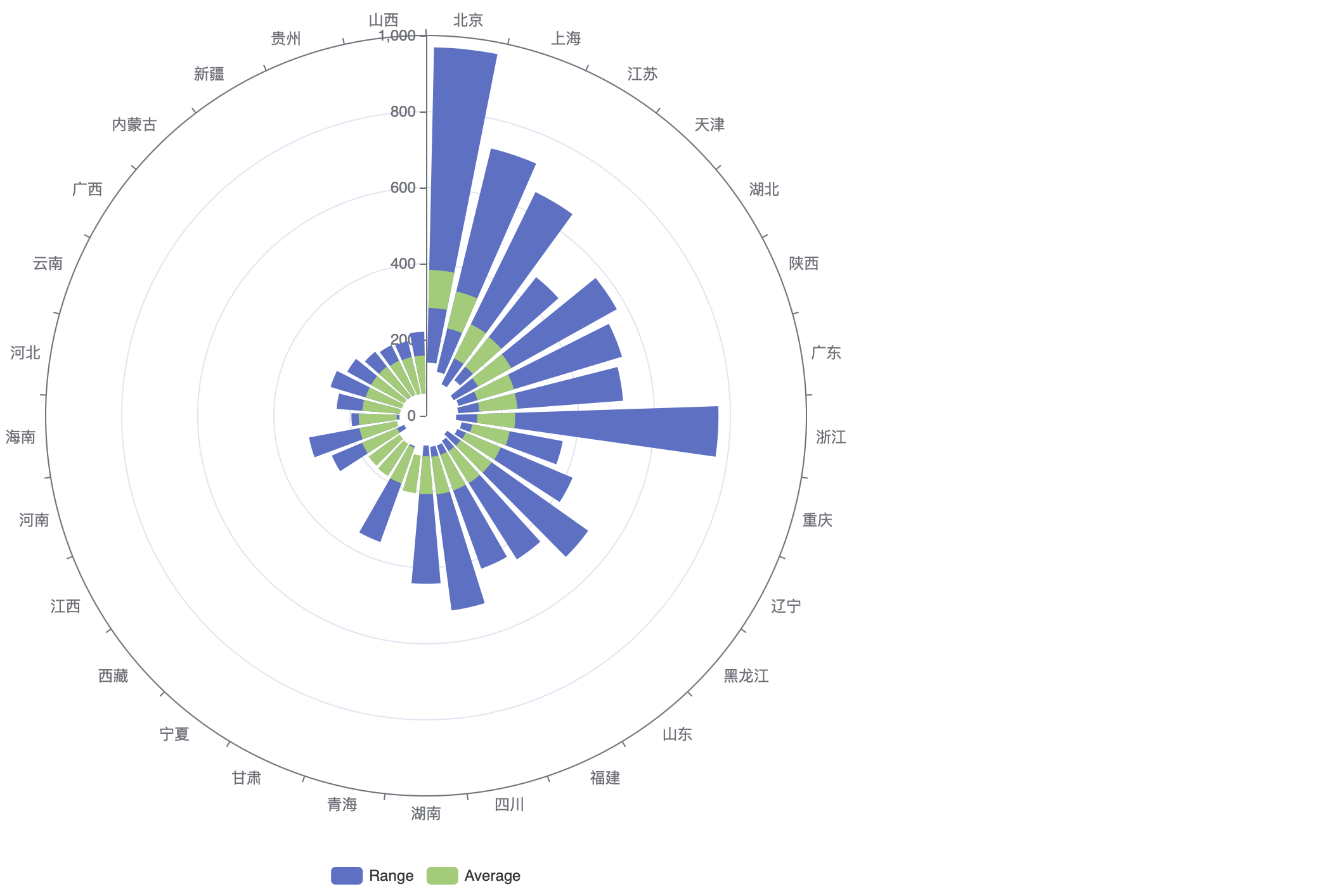
Bar Chart on Polar
Description: the polar histogram counts the highest score, lowest score and average score of each province in the unit of provinces, and displays them in the polar coordinate domain (not the polar coordinate in the mathematical definition). The blue sections on both sides show the lowest and highest scores, and the green section in the middle shows the average score. In addition, the chart is sorted according to the average score.
Example: as can be seen from the figure below, Beijing has the highest average score, followed by Shanghai and Jiangsu; Guizhou, Shanxi and other places have the lowest average scores; Although the average score of Zhejiang is not in the forefront, it has a high highest score; On the whole, the highest score is basically positively correlated with the average score.
Code:
// Statistics of scores of colleges and universities in all provinces
var locate = {};
for (var i = 0; i < raw.length; i++) {
    if (!(raw[i]["Provinces and cities"] in locate)) {
        var info = {};
        info["scores"] = [];
        info["max"] = 0;
        info["min"] = 0;
        info["ave"] = 0;
        locate[raw[i]["Provinces and cities"]] = info;
    }
    locate[raw[i]["Provinces and cities"]]["scores"].push(parseFloat(raw[i]["Total score"]));
}

// Calculate the maximum and minimum average
for (var province in locate) {
    var scores = locate[province].scores;
    var cnt = 0;
    var sum = 0;
    var max = Number.MIN_VALUE;
    var min = Number.MAX_VALUE;
    for (var i = 0; i < scores.length; i++) {
        if (scores[i]) {
            sum += scores[i];
            cnt += 1;
            max = Math.max(max, scores[i]);
            min = Math.min(min, scores[i]);
        }
    }
    locate[province].max = max;
    locate[province].min = min;
    locate[province].ave = sum / cnt;
}

// Convert objects to lists
var list = []
for (var province in locate) {
    var obj = {};
    obj["province"] = province;
    obj["max"] = locate[province].max;
    obj["min"] = locate[province].min;
    obj["ave"] = locate[province].ave;
    list.push(obj);
}

// Decorate all data to one decimal place
for (var i = 0; i < list.length; i++) {
    list[i].ave = list[i].ave.toFixed(1);
}

// Sort according to average score
list.sort(function (obj1, obj2) {
    if (obj1.ave < obj2.ave) {
        return 1;
    } else if (obj1.ave > obj2.ave) {
        return -1;
    } else {
        return 0;
    }
});

// Convert to desired format
var provinces = [];
var statistic = [];
for (var i = 0; i < list.length; i++) {
    if (i > 15 && i < 18) {
        continue;
    }
    provinces.push(list[i].province);
    statistic.push([list[i].min, list[i].max, list[i].ave]);
}

// Configuration chart
const data = statistic;
const cities = provinces;
const barHeight = 50;
option = {
    legend: {
        show: true,
        top: 'bottom',
        data: ['Range', 'Average']
    },
    grid: {
        top: 100
    },
    angleAxis: {
        type: 'category',
        data: cities
    },
    tooltip: {
        show: true,
        formatter: function (params) {
            const id = params.dataIndex;
            return (
                cities[id] +
                '<br>Lowest: ' +
                data[id][0] +
                '<br>Highest: ' +
                data[id][1] +
                '<br>Average: ' +
                data[id][2]
            );
        }
    },
    radiusAxis: {},
    polar: {},
    series: [
        {
            type: 'bar',
            itemStyle: {
                color: 'transparent'
            },
            data: data.map(function (d) {
                return d[0];
            }),
            coordinateSystem: 'polar',
            stack: 'Min Max',
            silent: true
        },
        {
            type: 'bar',
            data: data.map(function (d) {
                return d[1] - d[0];
            }),
            coordinateSystem: 'polar',
            name: 'Range',
            stack: 'Min Max'
        },
        {
            type: 'bar',
            itemStyle: {
                color: 'transparent'
            },
            data: data.map(function (d) {
                return d[2] - barHeight;
            }),
            coordinateSystem: 'polar',
            stack: 'Average',
            silent: true,
            z: 10
        },
        {
            type: 'bar',
            data: data.map(function (d) {
                return barHeight * 2;
            }),
            coordinateSystem: 'polar',
            name: 'Average',
            stack: 'Average',
            barGap: '-100%',
            z: 10
        }
    ]
};

// Put ECharts in the box
var myChart = echarts.init(document.getElementById('main'));

// Specify configuration and data
myChart.setOption(option);
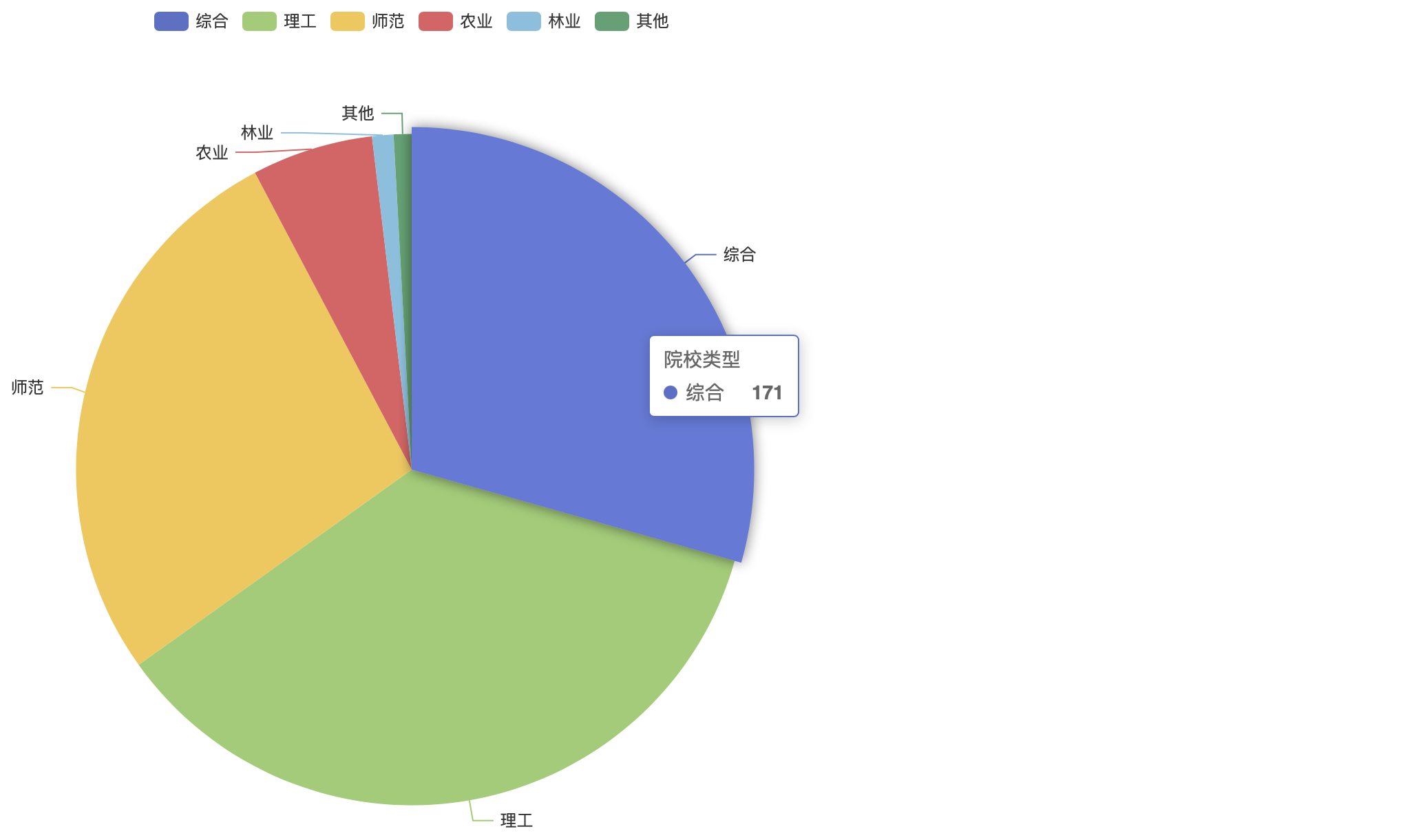
Basic Pie Chart
Description: pie chart can visually show the proportion of each component. It is a very simple chart.
Example: as can be seen from the following chart, China's colleges and universities are mainly comprehensive, science and engineering and normal universities, while agriculture, forestry and other types of colleges and universities account for a relatively small proportion.
Code:
// Because the original data is incorrect, statistics and correction shall be made in advance
const types = ['comprehensive', 'Science and Engineering', 'normal school', 'Agriculture', 'Forestry'];
const other = 'other';

// initialization
var map = {};
for (var i = 0; i < types.length; i++) {
    map[types[i]] = 0;
}
map[other] = 0;

// Statistics
for (var i = 0; i < raw.length; i++) {
    if (types.includes(raw[i]["type"])) {
        map[raw[i]["type"]] += 1;
    } else {
        map[other] += 1;
    }
}

// Convert to desired format
var data = [];
for (var key in map) {
    data.push({
        name: key,
        value: map[key]
    });
}

// Configuration chart
option = {
    tooltip: {
        trigger: 'item'
    },
    legend: {
        top: '5%',
        left: 'center'
    },
    series: [
        {
            name: 'Types of institutions',
            type: 'pie',
            radius: '65%',
            data: data,
            emphasis: {
                itemStyle: {
                    shadowBlur: 10,
                    shadowOffsetX: 0,
                    shadowColor: 'rgba(0, 0, 0, 0.5)'
                }
            }
        }
    ]
};

// Put ECharts in the box
var myChart = echarts.init(document.getElementById('main'));

// Specify configuration and data
myChart.setOption(option);
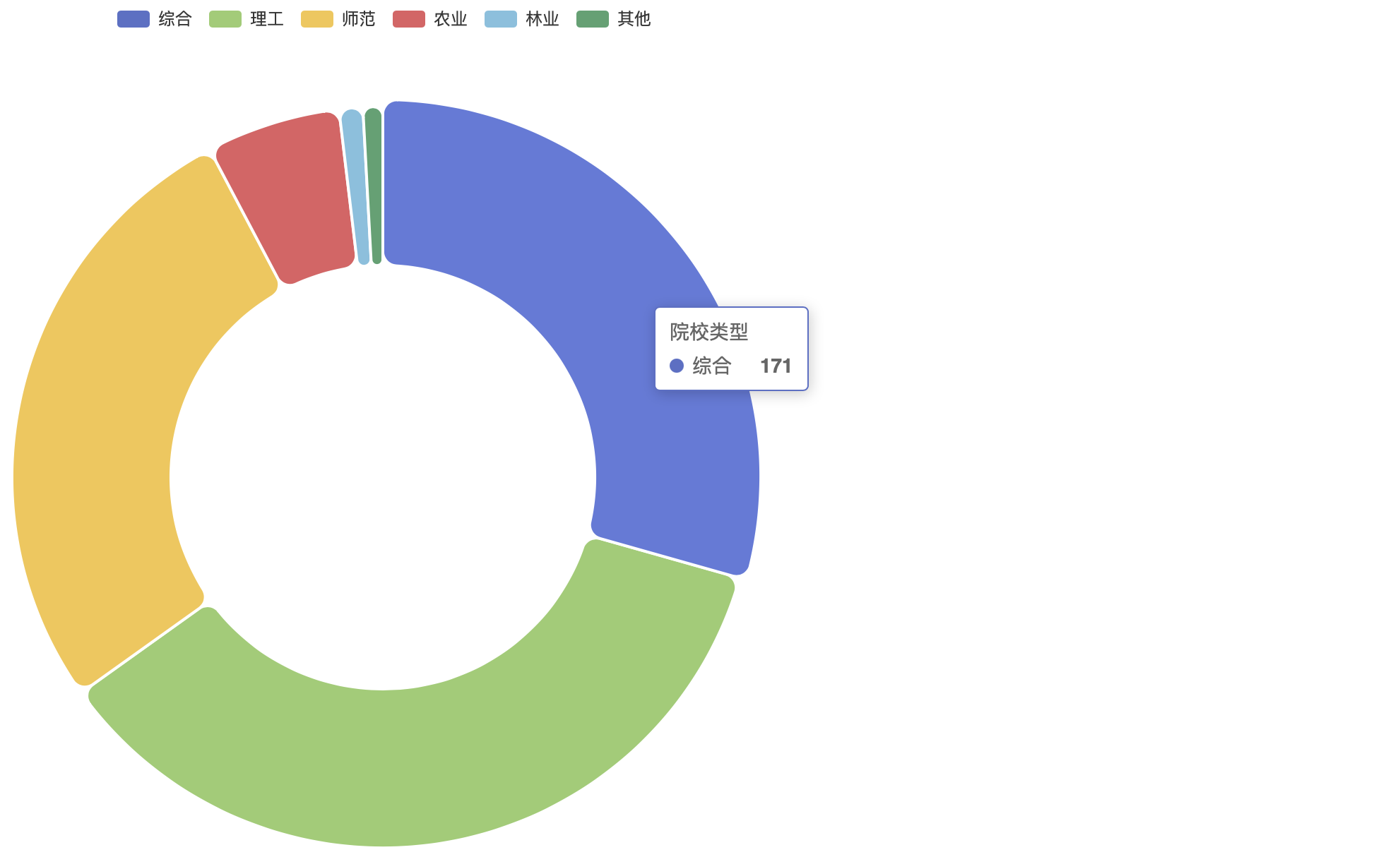
Doughnut Chart
Description: the ring chart can visually show the proportion of each component. It is a very simple chart.
Example: as can be seen from the following chart, China's colleges and universities are mainly comprehensive, science and engineering and normal universities, while agriculture, forestry and other types of colleges and universities account for a relatively small proportion.
Code:
// Because the original data is incorrect, statistics and correction shall be made in advance
const types = ['comprehensive', 'Science and Engineering', 'normal school', 'Agriculture', 'Forestry'];
const other = 'other';

// initialization
var map = {};
for (var i = 0; i < types.length; i++) {
    map[types[i]] = 0;
}
map[other] = 0;

// Statistics
for (var i = 0; i < raw.length; i++) {
    if (types.includes(raw[i]["type"])) {
        map[raw[i]["type"]] += 1;
    } else {
        map[other] += 1;
    }
}

// Convert to desired format
var data = [];
for (var key in map) {
    data.push({
        name: key,
        value: map[key]
    });
}

// Configuration chart
option = {
    tooltip: {
        trigger: 'item'
    },
    legend: {
        top: '5%',
        left: 'center'
    },
    series: [
        {
            name: 'Types of institutions',
            type: 'pie',
            radius: ['40%', '70%'],
            avoidLabelOverlap: false,
            itemStyle: {
                borderRadius: 10,
                borderColor: '#fff',
                borderWidth: 2
            },
            label: {
                show: false,
                position: 'center'
            },
            emphasis: {
                label: {
                    show: true,
                    fontSize: '40',
                    fontWeight: 'bold'
                }
            },
            labelLine: {
                show: false
            },
            data: data
        }
    ]
};

// Put ECharts in the box
var myChart = echarts.init(document.getElementById('main'));

// Specify configuration and data
myChart.setOption(option);
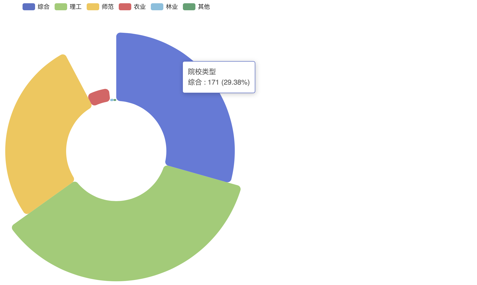
Nightingale Chart
Florence Nightingale may be a well-known nurse, but most people don't know that she is also a statistician. This round histogram is called "Nightingale's Rose". This pattern was once used by the great nurse to express the seasonal mortality in military hospitals, which made the medical improvement proposal supported by the queen. When Nightingale rose was used to express the number of deaths in COVID-19 countries, the effect was very impressive.
Example: as can be seen from the following chart, China's colleges and universities are mainly comprehensive, science and engineering and normal universities, while agriculture, forestry and other types of colleges and universities account for a relatively small proportion.
Code:
// Because the original data is incorrect, statistics and correction shall be made in advance
const types = ['comprehensive', 'Science and Engineering', 'normal school', 'Agriculture', 'Forestry'];
const other = 'other';

// initialization
var map = {};
for (var i = 0; i < types.length; i++) {
    map[types[i]] = 0;
}
map[other] = 0;

// Statistics
for (var i = 0; i < raw.length; i++) {
    if (types.includes(raw[i]["type"])) {
        map[raw[i]["type"]] += 1;
    } else {
        map[other] += 1;
    }
}

// Convert to desired format
var data = [];
for (var key in map) {
    data.push({
        name: key,
        value: map[key]
    });
}

// Configuration chart
option = {
    legend: {
        top: '5%',
        left: 'center'
    },
    tooltip: {
        trigger: 'item',
        formatter: '{a} <br/>{b} : {c} ({d}%)'
    },
    series: [
        {
            name: 'Types of institutions',
            type: 'pie',
            radius: [100, 260],
            center: ['50%', '45%'],
            roseType: 'radius',
            itemStyle: {
                borderRadius: 8
            },
            label: {
                show: false
            },
            emphasis: {
                label: {
                    show: true
                }
            },
            data: data
        }
    ]
};

// Put ECharts in the box
var myChart = echarts.init(document.getElementById('main'));

// Specify configuration and data
myChart.setOption(option);
Tree Map (rectangular tree)
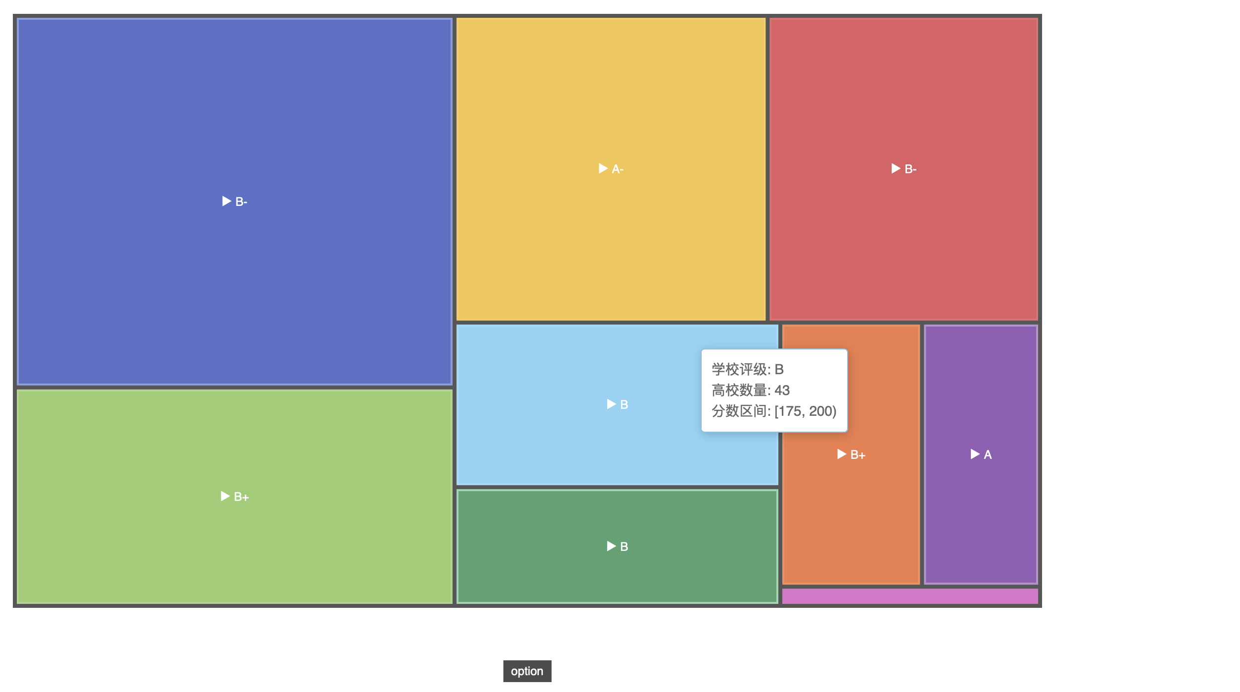
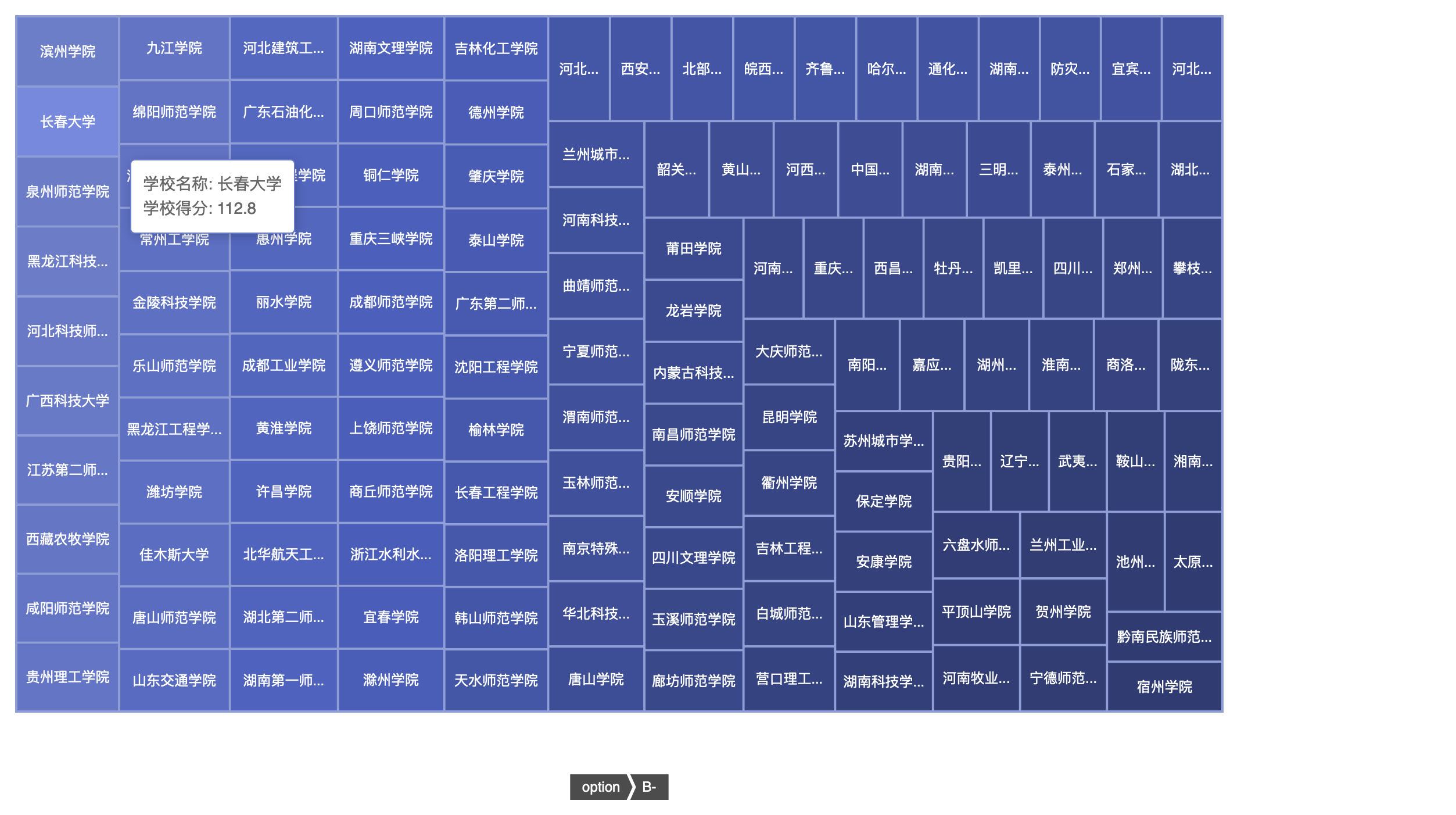
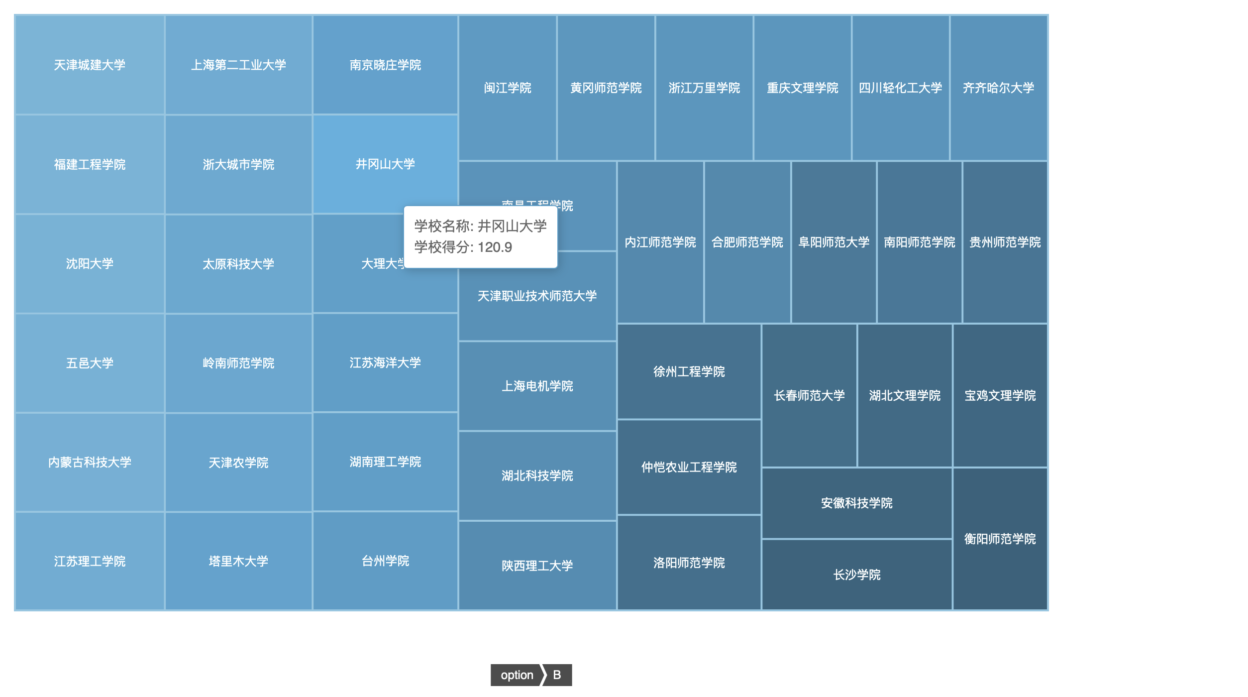
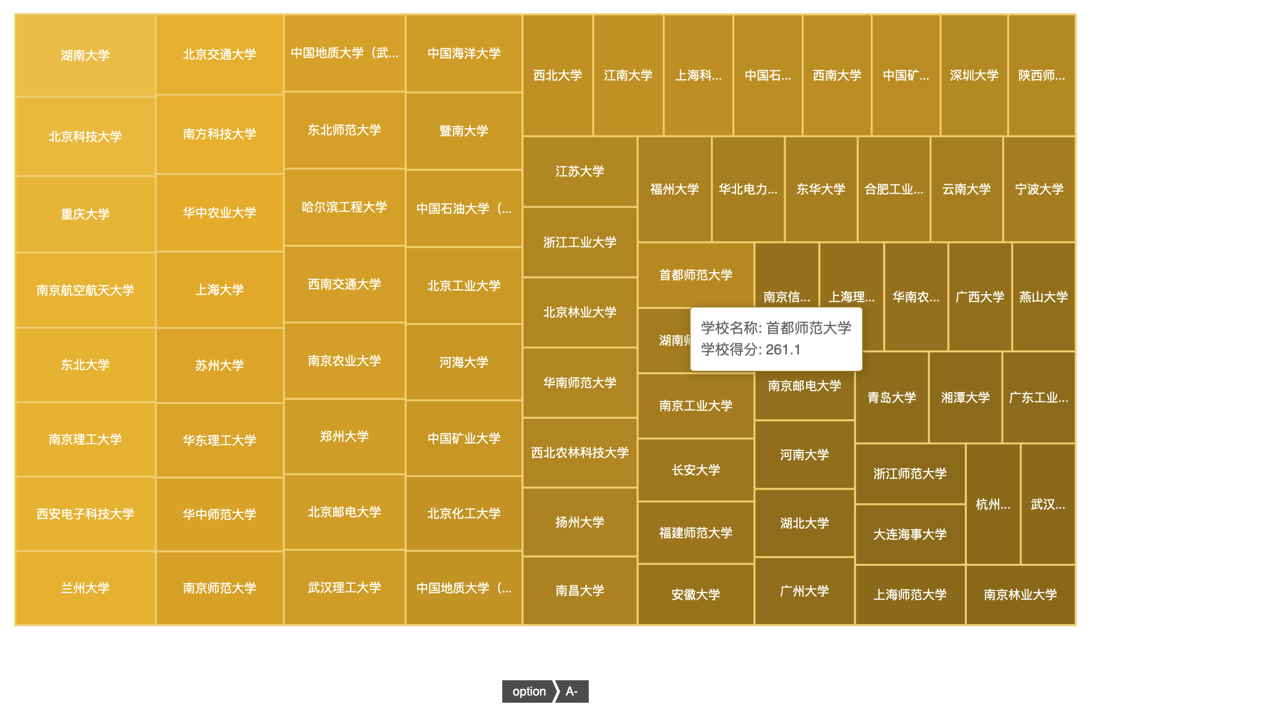
Description: the rectangular tree graph visualizes the data with hierarchical relationship into a group of nested rectangles. It intuitively represents values in area and categories in color. The sum of the areas of all rectangles represents the size of the whole. The area of each small rectangle represents the proportion of each sub item. The larger the rectangular area, the larger the proportion of sub data in the whole. Rectangular tree graph is good at visualizing weighted data relationships.
Example: according to the score, the university is divided into nine grades (A +, A, A -, B +, B, B -, C +, C, C -). Each color block represents A grade, and the size of the color block is directly proportional to the number of colleges and universities in the grade. Each color block is clickable. The next layer is all colleges and universities belonging to this level. In this layer, the size of the color block is directly proportional to the score of the college.
Code:
// Rating name & rating standard
const len = 9;
const standard_nam = ['A+', 'A', 'A-', 'B+', 'B', 'B-', 'B+', 'B', 'B-'];
const standard_num = [700, 400, 225, 200, 175, 150, 125, 100, 0];

// Tier 1 (rating)
var data = [];
for (var i = 0; i < len; i++) {
    data.push({
        type: "root",
        name: standard_nam[i],
        value: 0,
        children: []
    });
}

// cursor
var index = 0;

// Second floor (school)
for (var i = 0; i < raw.length; i++) {
    if (raw[i]['Total score'] >= standard_num[index]) {
        data[index].value += 1;
        data[index].children.push({
            type: "leaf",
            name: raw[i]['School name'],
            value: raw[i]['Total score']
        });
    } else {
        index++;
    }
}

// Configuration chart
option = {
    tooltip: {
        formatter: function (params) {
            if (params.data.type == "root") {
                var level = params.data.name;
                var amount = params.data.value;
                var minBorder, maxBorder;
                if (level == 'A+') {
                    minBorder = 700;
                    maxBorder = 1000;
                } else {
                    minBorder = standard_num[standard_nam.indexOf(level)];
                    maxBorder = standard_num[standard_nam.indexOf(level) - 1]
                }
                return "School rating: " + level + "</br>Number of colleges and Universities: " + amount + "</br>Fractional interval: [" + minBorder + ", " + maxBorder + ")";
            } else {
                var university = params.data.name;
                var score = params.data.value;
                return "School name: " + university + "</br>School score: " + score;
            }
        }
    },
    series: [
        {
            name: 'option',
            type: 'treemap',
            visibleMin: 300,
            data: data,
            leafDepth: 1,
            roam: false,
            levels: [
                {
                    itemStyle: {
                        borderColor: '#555',
                        borderWidth: 4,
                        gapWidth: 4
                    }
                },
                {
                    colorSaturation: [0.3, 0.6],
                    itemStyle: {
                        borderColorSaturation: 0.7,
                        gapWidth: 2,
                        borderWidth: 2
                    }
                },
                {
                    colorSaturation: [0.3, 0.5],
                    itemStyle: {
                        borderColorSaturation: 0.6,
                        gapWidth: 1
                    }
                },
                {
                    colorSaturation: [0.3, 0.5]
                }
            ]
        }
    ]
}

// Put ECharts in the box
var myChart = echarts.init(document.getElementById('main'));

// Specify configuration and data
myChart.setOption(option);
Write it at the back
Some useful resources:
- Raw data (. csv)
- Raw data (. json)
- Full project (. html)
Some useful web sites:
- Echarts (poke here)
- CSDN (stamp here)
- Github (poke here)