Flutter imitates wechat excel function
preface
In project development, report is a very common function, which is helpful for users to see the trend and law of data at a glance. It is very suitable for viewing and comparing a large number and a wide variety of data. Although Flutter provides Table, DataTable and other related components, in the actual project development, the function, scalability, practicability and flexibility are very limited. It can be said that it is almost impossible to be directly used in production projects without adjustment and modification. The author will explain in detail how to use Flutter technology to develop reports this time.
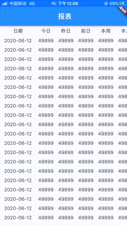
Effect preview
Demand realization
| Implementation requirements | Whether to realize |
|---|---|
| Android, iOS cross platform | ✅ |
| First column fixed | ✅ |
| Title line fixed | ✅ |
| The first column slides up and down with the content column | ✅ |
| The title line slides left and right with the content line | ✅ |
development environment
| Required environment | Function description |
|---|---|
| Flutter 1.22.6.stable | Cross platform UI framework |
| flutter_screenutil: 4.0.4+1 | Shutter screen adapter |
In pubspec Add dependency to yaml file
flutter_screenutil: 4.0.4+1
technical analysis
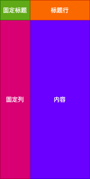
The whole report is divided into four parts: fixed column header on the top left, fixed column on the bottom left, header row on the top right and content on the bottom right. It can be seen that Table and Datatable are not suitable for the development of this function, so the author decided to use ListView to realize this requirement. The fixed column, title row and content adopt ListView. The fixed column on the left is a vertically sliding ListView, the title row on the upper right is a horizontally sliding ListVie, and the lower right is a ListView that can slide both vertically and horizontally, while the fixed column title on the upper left uses ordinary components. In this way, the report imitating Excel can be realized. The function decomposition can be referred to as shown in the figure below
Technical realization
Preliminary definition of components
All the components need is the data source and title line. In addition, some style parameters are added. The code is as follows
class DataGrid extends StatefulWidget {
  final List<Map> datas; // data source

  final List<String> titleRow; // Title Line

  final Alignment cellAlignment; // Cell alignment

  final EdgeInsets cellPadding; // Inner margin of cell

  final Color borderColor; // Border color

  final String fixedKey;	// Fixed column key

  final String fixedTitle;	 // Fixed column header

  const DataGrid({
    Key key,
    this.datas,
    this.titleRow,
    this.fixedTitle,
    this.fixedKey,
    this.cellAlignment,
    this.cellPadding,
    this.borderColor,
    }) : super(key: key);

  @override
  _DataGridState createState() => _DataGridState();
}
......
Cell
There are two kinds of cell rendering: merged cells and ordinary cells. Ordinary cells need to have four borders, while merged cells need to remove the corresponding borders.
Define the method of rendering the border and control the border rendering of cells. The code is as follows
Border _buildBorderSide({bool hideLeft = false, bool hideRight = false, bool hideTop = false, bool hideBottom = false}) {
  final double borderWidth = 0.33;
  return Border(
      bottom: hideBottom ?
      BorderSide.none
          :
      BorderSide(width: borderWidth, color: widget.borderColor ?? widget.LIGHT_GREY),
      top: hideTop ?
      BorderSide.none
          :
      BorderSide(width: borderWidth, color: widget.borderColor ?? widget.LIGHT_GREY),
      right: hideRight ?
      BorderSide.none
          :
      BorderSide(width: borderWidth, color: widget.borderColor ?? widget.LIGHT_GREY),
      left: hideLeft ?
      BorderSide.none
          :
      BorderSide(width: borderWidth, color: widget.borderColor ?? widget.LIGHT_GREY)
  );
}
The method of component cell is as follows:
Widget _buildCell(String title, {
  bool hideLeft = false, bool hideRight = false, bool hideTop = false,
  bool hideBottom = false, bool hideTitle = false, Color bgColor}) {
  return IntrinsicHeight(
      child: Container(
          alignment: widget.cellAlignment ?? Alignment.center,
          padding: widget.cellPadding ?? EdgeInsets.fromLTRB(0, 15.0.h, 0, 15.h),
          decoration: BoxDecoration(
              border: _buildBorderSide(
                  hideLeft: hideLeft,
                  hideRight: hideRight,
                  hideTop: hideTop,
                  hideBottom: hideBottom
              ),
              color: bgColor
          ),
          child: Opacity(
              opacity: hideTitle ? 0 : 1,
              child: Text(
                title,
                maxLines: 1,
                overflow: TextOverflow.ellipsis,
                style: TextStyle(fontSize: 14, color: widget.borderColor ?? ColorHelper.TEXT_BLACK),
              ))
      )
  );
}
Warm tip: the IntrinsicHeight component in the above code may be rarely used. It is a component that can be automatically adjusted according to the height of sub components, similar to Android wrap_content
Component empty cell
  Widget _buildEmptyCell() {
    return IntrinsicHeight(
        child: Container(
            alignment: widget.cellAlignment ?? Alignment.center,
            padding: widget.cellPadding ?? EdgeInsets.fromLTRB(0, 20.0.h, 0, 20.h),
            decoration: BoxDecoration(
                border: Border(
                  bottom: BorderSide(width: 0.33, color: widget.borderColor ?? ColorHelper.LIGHT_GREY),
                  top: BorderSide(width: 0.33, color: widget.borderColor ?? ColorHelper.LIGHT_GREY),
                  right: BorderSide(width: 0.33, color: widget.borderColor ?? ColorHelper.LIGHT_GREY),
                  left: BorderSide(width: 0.33, color: widget.borderColor ?? ColorHelper.LIGHT_GREY),
                )
            ),
            child: Text(
              '',
              maxLines: 1,
              overflow: TextOverflow.ellipsis,
              style: TextStyle(fontSize: 14, color: widget.borderColor ?? ColorHelper.TEXT_BLACK),
            )
        )
    );
  }
Technical difficulties
- How to make the title column move when sliding the content vertically
- How to move the title line when sliding the content horizontally
- How to make content slide horizontally and vertically
Solution
For questions 1 and 2, each scrollable component can use a ScrollController to control, monitor and record the scrolling position, so we can use the ScrollController to realize linkage. Define four ScrollController objects, one for fixed columns, one for Title rows, one for horizontal scrolling of content, and one for vertical scrolling of content. The code is as follows
//Define controllable scrolling components
ScrollController firstColumnController = ScrollController();
ScrollController secondColumnController = ScrollController();

ScrollController firstRowController = ScrollController();
ScrollController secondedRowController = ScrollController();

 // Fixed column width
 final double columnWidth = 780.0.w;
In the initState method, bind the linkage relationship of each ScrollController object
  @override
  void initState() {
    super.initState();
    //Monitor fixed column scrolling
    firstColumnController.addListener(() {
      if (firstColumnController.offset != secondColumnController.offset) {
        secondColumnController.jumpTo(firstColumnController.offset);
      }
    });

    //Listen for vertical scrolling of the content line
    secondColumnController.addListener(() {
      if (firstColumnController.offset != secondColumnController.offset) {
        firstColumnController.jumpTo(secondColumnController.offset);
      }
    });

    //Listen for scrolling of header lines
    firstRowController.addListener(() {
      if (firstRowController.offset != secondedRowController.offset) {
        secondedRowController.jumpTo(firstRowController.offset);
      }
    });

    //Listen for horizontal scrolling of the content line
    secondedRowController.addListener(() {
      if (firstRowController.offset != secondedRowController.offset) {
        firstRowController.jumpTo(secondedRowController.offset);
      }
    });
  }
Fixed column and fixed cell codes are as follows
                Container(
                  width: 300.w,
                  height: 1900.h,
                  child: Column(
                    children: [
                      Table(
                        children: [
                          TableRow(
                            children: [
                              _buildCell(
                                '${widget.fixedTitle ?? ''}',
                                hideBottom: true,
                                hideTop: true,
                                hideLeft: true,
                                bgColor: ColorHelper.LIGHT_GREY
                              ),
                            ]
                          ),
                        ],
                      ),
                      Expanded(
                        child: ListView(
                          controller: firstColumnController,
                          children: [
                            Table(children: _buildTableColumnOne()),
                          ],
                        ),
                      ),
                    ],
                  ),
                ),
Realize the content that can scroll vertically and horizontally
To solve problem 3, you can use the SingleChildScrollView component nested inside the ListView to realize both horizontal and vertical scrolling of content. SingleChildScrollView is responsible for horizontal scrolling, ListView is responsible for vertical scrolling, and SingleChildScrollView must have a certain width. Refer to the following for specific codes
ListView(
	controller: thirdColumnController,
	children: [
	  SingleChildScrollView(
	    controller: secondedRowController,
	    scrollDirection: Axis.horizontal,
	    child: IntrinsicWidth(
	        child: Container(
	          padding: EdgeInsets.only(bottom: 10.h),
	          // Avoid that the bottom border disappears when the number of rows is not filled
	          child: ...
	          width: 1000.w
	        )
	      )
	    )
	],
)
The complete code is as follows
import 'package:flutter/cupertino.dart';
import 'package:flutter/material.dart';
import 'package:flutter_study/common/util/color_helper.dart';
import 'package:flutter_screenutil/flutter_screenutil.dart';

///Data table
class DataGrid extends StatefulWidget {

  final List<Map> datas; // data source

  final List<String> titleRow; // Title Line

  final Alignment cellAlignment; // Cell alignment

  final EdgeInsets cellPadding; // Inner margin of cell

  final Color borderColor; // Border color

  final String fixedKey;	// Fixed column key

  final String fixedTitle;	 // Fixed column header

  const DataGrid({
    Key key,
    this.datas,
    this.titleRow,
    this.fixedTitle,
    this.fixedKey,
    this.cellAlignment,
    this.cellPadding,
    this.borderColor,
    }) : super(key: key);

  @override
  _DataGridState createState() => _DataGridState();
}

class _DataGridState extends State<DataGrid> {

  final List<String> fixedColumn = [];

  final List<Map> datas = [];

  //Define controllable scrolling components
  final ScrollController firstColumnController = ScrollController();

  final ScrollController thirdColumnController = ScrollController();

  final ScrollController firstRowController = ScrollController();

  final ScrollController secondedRowController = ScrollController();

  // Non floating column width
  final double columnWidth = 390;

  final Color LIGHT_GREY = Color.fromRGBO(244, 247, 252, 1);

  @override
  void initState() {
    super.initState();
    //Monitor changes in the first column
    firstColumnController.addListener(() {
      if (firstColumnController.offset != thirdColumnController.offset) {
        thirdColumnController.jumpTo(firstColumnController.offset);
      }
    });

    //Monitor changes in the third column
    thirdColumnController.addListener(() {
      if (firstColumnController.offset != thirdColumnController.offset) {
        firstColumnController.jumpTo(thirdColumnController.offset);
      }
    });

    //Listen for changes in the first line
    firstRowController.addListener(() {
      if (firstRowController.offset != secondedRowController.offset) {
        secondedRowController.jumpTo(firstRowController.offset);
      }
    });

    //Listen for changes in the second line
    secondedRowController.addListener(() {
      if (firstRowController.offset != secondedRowController.offset) {
        firstRowController.jumpTo(secondedRowController.offset);
      }
    });
    widget.datas.forEach((e) {
      fixedColumn.add(e[widget.fixedKey].toString());
      e.remove(widget.fixedKey);
      datas.add(e);
    });
  }

  @override
  Widget build(BuildContext context) {
    return Container(
      color: Colors.white,
      child: NotificationListener(
        child: Scaffold(
          body: Container(
            height: 1900.h,
            width: 1080.w,
            color: ColorHelper.DAY_TEXT,
            child: Row(
              children: [
                Container(
                  width: 300.w,
                  height: 1900.h,
                  child: Column(
                    children: [
                      Table(
                        children: [
                          TableRow(
                            children: [
                              _buildCell(
                                '${widget.fixedTitle ?? ''}',
                                hideBottom: true,
                                hideTop: true,
                                hideLeft: true,
                                bgColor: ColorHelper.LIGHT_GREY
                              ),
                            ]
                          ),
                        ],
                      ),
                      Expanded(
                        child: ListView(
                          controller: firstColumnController,
                          children: [
                            Table(children: _buildTableColumnOne()),
                          ],
                        ),
                      ),
                    ],
                  ),
                ),
                //Remaining columns
              Expanded(
                child: Container(
                  child: Column(
                    children: [
                      SingleChildScrollView(
                        scrollDirection: Axis.horizontal, //horizontal
                        controller: firstRowController,
                        child: IntrinsicWidth(
                          child: Container(
                            child: Table(children: _buildTableFirstRow()),
                            width: 1000.w,
                          )
                        )
                      ),
                      Expanded(
                        child: ListView(
                          controller: thirdColumnController,
                          children: [
                            SingleChildScrollView(
                              controller: secondedRowController,
                              scrollDirection: Axis.horizontal,
                              child: IntrinsicWidth(
                                  child: Container(
                                    padding: EdgeInsets.only(bottom: 10.h),
                                    // Avoid that the bottom border disappears when the number of rows is not filled
                                    child: Table(children: _buildTableRow()),
                                    width: 1000.w
                                  )
                                )
                              )
                            ],
                          ),
                        ),
                      ]
                    ),
                  ),
                ),
              ],
            ),
          )
        ),
      ),
    );
  }

  /*
   * Create fixed column
   * For example, if the time column is fixed, it will only respond to vertical sliding
   * When it is a non daily report, the cell line with one more line will occupy the space
   */
  List<TableRow> _buildTableColumnOne() {
    List<TableRow> returnList = [];
    int i = 0;
    fixedColumn?.forEach((e) {
      returnList.add(_buildSingleColumnOne(
          e, bgColor: i % 2 == 0 ? LIGHT_GREY : ColorHelper.LIGHT_GREY));
      i++;
    });
    return returnList;
  }

  /*
   * Create data row
   * Render data rows
   */
  List<TableRow> _buildTableRow() {
    List<TableRow> returnList = [];
    int i = 0;
    this.datas.forEach((e) {
      Color bgColor = i % 2 == 0 ? LIGHT_GREY : ColorHelper.LIGHT_GREY;
      List<String> vals = [];
      e.values.forEach((v) {
        vals.add(v.toString());
      });
      returnList.add(
          _buildRow(vals, isTitle: false, bgColor: bgColor));
      i++;
    });
    return returnList;
  }

  /*
   * Create first row header
   * The data row will only slide left and right, and float on the top when sliding up and down
   * When it is a non daily report, one more title line will be generated
   */
  List<TableRow> _buildTableFirstRow() {
    List<TableRow> returnList = [];
    returnList.add(_buildRow(widget.titleRow, isTitle: true));
    return returnList;
  }

  /*
   * Create a column
   * The first row of the left fixed column, this cell will not have any sliding
   */
  TableRow _buildSingleColumnOne(String text,
      {bool isTitle = false, Color bgColor}) {
    return TableRow(
        children: [
          _buildCell(
            isTitle ? '${widget.fixedTitle ?? ''}' : '${text ?? ''}',
            bgColor: bgColor,
            hideLeft: true,
            hideTop: true,
            hideBottom: true,
          ),
        ]
    );
  }

  /*
   * Building cells for each row of data
   * When it is a monthly report and an annual report, a channel has three cells
   */
  TableRow _buildRow(List<String> textList,
      {bool isTitle = false, Color bgColor = ColorHelper.LIGHT_GREY}) {
    List<Widget> wd = [];
    textList.forEach((e) {
      wd.add(_buildCell(e, hideRight: true,
          hideTop: true,
          hideBottom: true,
          hideLeft: true,
          bgColor: bgColor));
    });
    return TableRow(
        children: wd
    );
  }

  /*
   * The second line title when constructing monthly report and annual report
   */
  TableRow _buildSecondTitleRow() {
    List<Widget> wd = [];
    widget.titleRow.forEach((e) {
      wd.add(_buildCell('average value', bgColor: ColorHelper.LIGHT_GREY,
          hideRight: true,
          hideTop: true,
          hideBottom: true));
      wd.add(_buildCell('Maximum', bgColor: ColorHelper.LIGHT_GREY,
          hideRight: true,
          hideTop: true,
          hideBottom: true,
          hideLeft: true));
      wd.add(_buildCell('minimum value', bgColor: ColorHelper.LIGHT_GREY,
          hideLeft: true,
          hideTop: true,
          hideBottom: true));
    });
    return TableRow(
        children: wd
    );
  }

  /*
   * Building empty cells
   */
  Widget _buildEmptyCell() {
    return IntrinsicHeight(
      child: Container(
          alignment: widget.cellAlignment ?? Alignment.center,
          padding: widget.cellPadding ??
              EdgeInsets.fromLTRB(0, 20.0.h, 0, 20.h),
          decoration: BoxDecoration(
              border: Border(
                bottom: BorderSide(width: 0.33,
                    color: widget.borderColor ?? ColorHelper.LIGHT_GREY),
                top: BorderSide(width: 0.33,
                    color: widget.borderColor ?? ColorHelper.LIGHT_GREY),
                right: BorderSide(width: 0.33,
                    color: widget.borderColor ?? ColorHelper.LIGHT_GREY),
                left: BorderSide(width: 0.33,
                    color: widget.borderColor ?? ColorHelper.LIGHT_GREY),
              )
          ),
          child: Text(
            '',
            maxLines: 1,
            overflow: TextOverflow.ellipsis,
            style: TextStyle(fontSize: 14,
                color: widget.borderColor ?? ColorHelper.TEXT_BLACK),
          )
      )
    );
  }

  // Building merged cells
  Widget _buildCell(String title, {
    bool hideLeft = false, bool hideRight = false, bool hideTop = false,
    bool hideBottom = false, bool hideTitle = false, Color bgColor}) {
    return IntrinsicHeight(
        child: Container(
            alignment: widget.cellAlignment ?? Alignment.center,
            padding: widget.cellPadding ??
                EdgeInsets.fromLTRB(0, 15.0.h, 0, 15.h),
            decoration: BoxDecoration(
                border: _buildBorderSide(
                    hideLeft: hideLeft,
                    hideRight: hideRight,
                    hideTop: hideTop,
                    hideBottom: hideBottom
                ),
                color: bgColor
            ),
            child: Opacity(
                opacity: hideTitle ? 0 : 1,
                child: Text(
                  title,
                  maxLines: 1,
                  overflow: TextOverflow.ellipsis,
                  style: TextStyle(fontSize: 14,
                      color: widget.borderColor ?? ColorHelper.TEXT_BLACK),
                ))
        )
    );
  }

  Border _buildBorderSide(
      {bool hideLeft = false, bool hideRight = false, bool hideTop = false, bool hideBottom = false}) {
    final double borderWidth = 0.33;
    return Border(
        bottom: hideBottom ?
        BorderSide.none
            :
        BorderSide(
            width: borderWidth, color: widget.borderColor ?? LIGHT_GREY),
        top: hideTop ?
        BorderSide.none
            :
        BorderSide(
            width: borderWidth, color: widget.borderColor ?? LIGHT_GREY),
        right: hideRight ?
        BorderSide.none
            :
        BorderSide(
            width: borderWidth, color: widget.borderColor ?? LIGHT_GREY),
        left: hideLeft ?
        BorderSide.none
            :
        BorderSide(
            width: borderWidth, color: widget.borderColor ?? LIGHT_GREY)
    );
  }
}
Use this component
The code is as follows
import 'package:flutter/material.dart';
import 'package:flutter_study/common/ui/datagrid.dart';

class TestScrollView extends StatefulWidget {
  const TestScrollView({Key key}) : super(key: key);

  @override
  _TestScrollViewState createState() => _TestScrollViewState();
}

class _TestScrollViewState extends State<TestScrollView> {

  List<Map> datas = [];

  @override
  void initState() {
    super.initState();
  }

  @override
  Widget build(BuildContext context) {
    datas = _getData();
    return Scaffold(
      appBar: AppBar(
        title: Text('report form'),
      ),
      body: _buildBody(),
    );
  }

  Widget _buildBody() {
    return Container(
      child: DataGrid(
        datas: datas,
        fixedKey: 'day',
        fixedTitle: 'date',
        titleRow: ['today', 'yesterday', 'The day before yesterday', 'This week', 'This month', 'This year'],
      ),
    );
  }

// Generate data source
  List<Map> _getData() {
    List<Map> datas = [];
    for (int i = 0; i < 100; i++) {
      Map data = {};
      data['day'] = '2020-06-12';
      data['today'] = 49899;
      data['yesterday'] = 49899;
      data['beforeday'] = 49899;
      data['week'] = 49899;
      data['month'] = 49899;
      data['year'] = 49899;
      datas.add(data);
    }
    return datas;
  }
}
In this way, the effect in preview can be realized, and readers can adjust the code according to the actual business scenario.
matters needing attention
For components that can slide both horizontally and longitudinally, a width or height must be determined. Fluent allows you to directly set the height or width of components, or determine the width or height of components by setting the width or height of sub components