Note: this blog is based on Python 3, matplotlib 3.5.1, numpy 1.22.0
preface
Visual operation is widely used in data analysis and machine learning. It can help people observe outliers or required data conversion effects more intuitively; As a desktop drawing package of python, matplotlib can generate publishing quality charts; The work package was first produced and released by John Hunter in 2002, which makes it possible to draw in matlab style in Python environment. This paper mainly introduces the code implementation of creating chart object, setting scale, scale label, axis boundary range, axis label, legend, chart name and text, and saving icon object.
1, Create (initialize) chart objects
To draw a chart, you must first create a chart and sub chart
Next, we introduce two common methods of creating charts and sub charts
1.1 create new sub charts one by one in the new chart table
Formula:
New chart = Matplotlib pyplot. figture(figsize = ); Where figsize is to set the size of the new chart in inches, usually 8 and 6
New sub chart = new chart add_ Subplot (number of subgraph rows, number of subgraph columns, number of subgraphs); The number of subgraph rows refers to the number of subgraphs in the row of the new chart, the number of subgraph columns refers to the number of subgraphs in the column of the new chart, and the number of subgraphs refers to the number of subgraphs created in the order of first and last columns
For example, we want to create a new chart of 12 * 8. The new chart has four subgraphs in total;
The code is as follows
import matplotlib.pyplot as plt
import numpy as np
# ###Create pictures and subgraphs
# ###create picture
fig = plt.figure(figsize = (12,8))

###Method 1 of creating a subgraph in a picture
axe1 = fig.add_subplot(2,2,1)
axe2 = fig.add_subplot(2,2,2)
axe3 = fig.add_subplot(2,2,3)
axe4 = fig.add_subplot(2,2,4)
The results are as follows,
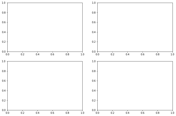
On the left of the first line is axe1, and on the right of the first line is axe2
On the left of the second line is axe3, and on the right of the second line is axe4
1.2 create a sub chart with rows and columns sharing coordinates in the chart
Formula: fig, axes = Matplotlib pyplot. subplots(3,3,sharex = True, sharey = True); The returned fig is the new chart, and axes is the sub chart of the new icon; If you subsequently reference / draw a sub chart instance, you can use axes [row position of sub chart, column position of sub chart]
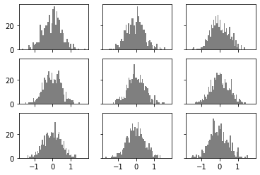
For example, I now want to create a new chart. The icon has 9 sub charts (3 rows and 3 columns), and the 9 icons share rows and ordinates. Each sub graph draws a histogram of 500 sample points subject to normal distribution with mean value of 0 and standard deviation of 0.5, and each sub graph has 50 bin.
The code is as follows
import matplotlib.pyplot as plt
import numpy as np
fig, axes = plt.subplots(3,3,sharex = True, sharey = True)
for i in range(3):
    for j in range(3):
        axes[i, j].hist(np.random.normal(0,0.5, size = 500),bins = 50,color = "k", alpha = 0.5)
The results are as follows,
Advanced: if we want to adjust the distance between subgraphs, we can use Matplotlib pyplot. subplot_ Adjust (wspace =, hspace =).
For example, if I want the 9 subgraphs sharing the x and y axes created by the second method to be closer together, I can execute the following code
plt.subplots_adjust(wspace = 0, hspace = 0)
The results are as follows,
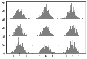
Isn't it perfect?
Creating charts and sub charts is the top priority in the matplotlib application. Please master them~
2, Plot each subgraph (line chart)
After creating a chart or sub chart, we can draw each chart; There are many drawing methods, such as histogram, line chart, scatter chart and so on; Each drawing method corresponds to different adjustable parameters. In this section, we mainly introduce the most common line chart.
For the discount chart, it mainly consists of 6 + 2 parameters
linestyle: "dashed" / "solid" / "dashdot" / "dotted"
linewidth: curve width
Marker: marker point style, which is the coordinates of points in the dataset; “o”/“x”
Marker size: marker point size
Color: curve color; There are two assignment methods, one is color abbreviation, the other is hexadecimal color code; The hexadecimal color code is given in the reference at the end of the text. Please refer to it if necessary.
label: Legend; [Note: the legend corresponds to the. legend() and plt.show() methods of axe type objects]
The other two parameters are the x-axis data and y-axis data we need to draw,
Note that x and y must be one-dimensional data!!!
For example, I want to draw a conic with a blue dotted line, draw sample points with a circle, and the legend is one;
The code is as follows
x = np.array([i for i in range(0,100,5)])
y = x ** 2
axe1.plot(x, y, linestyle = "dashed",marker = "o",color = "b", label = "one")
axe1.legend()
plt.show()
The results are as follows,

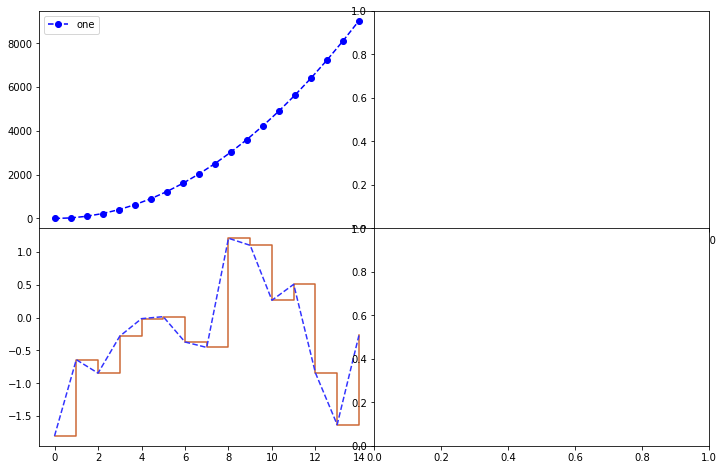
Advanced: sometimes we need to use different methods to draw a line graph on the same discrete data. At this time, we need to repeatedly call the plot method of the axe type object instance
For example, I want to draw a broken line graph in dotted line form and a gradient step broken line graph for 15 samples subject to Gaussian distribution with mean value of 0 and variance of 1; The broken line diagram of dotted line is represented by blue, and the broken line diagram of gradient step is represented by orange
The code is as follows,
import matplotlib.pyplot as plt
import numpy as np

fig = plt.figure(figsize = (12,8))
###Method 1 of creating a subgraph in a picture
axe1 = fig.add_subplot(2,2,1)
axe2 = fig.add_subplot(2,2,2)
axe3 = fig.add_subplot(2,2,3)
axe4 = fig.add_subplot(2,2,4)

###Adjust subgraph spacing
plt.subplots_adjust(wspace = 0, hspace = 0)
###Draw axe1
x = np.array([i for i in range(0,100,5)])
y = x ** 2
axe1.plot(x, y, linestyle = "dashed",marker = "o",color = "b", label = "one")
axe1.legend()
###Draw axe3
data = np.random.randn(15)
axe3.plot(data, drawstyle = "steps-post", color = "#CC6633")
axe3.plot(data, linestyle = "--", color = "#3333FF")
plt.show()
The results are as follows,
3, Further processing of subgraphs
The second part introduces the method of drawing line graph, but no matter what kind of graph (such as histogram), we can further process the subgraph;
The processing of subgraphs includes (6 items in total): setting the scale (setting the scale value according to the actual value of a coordinate), scale label (based on the original scale value), axis boundary, axis label (row / vertical axis), picture label (i.e. picture name), and adding picture text
Set scale formula: axe type object set_xticks (displayed scale list) / axe type object set_yticks (displayed scale list)
Set scale label formula: axe type object set_xticklabels (list of scale labels that need to replace the scale) / axe type object set_yticklabels (list of scale labels that need to replace the scale); Replace the original scale representation from the "origin" in turn;
[error prone point: this method starts to replace from the origin.]
Set axis boundary formula: axe type object set_xlim (maximum range list represented by x axis) / axe type object set_ylim (list of maximum ranges that can be represented by y-axis);
[Note: this method will cause the overall scaling of the image]
Set axis label formula: axe type object set_xlabel (x-axis name) / axe type object set_ylabel (y-axis name);
Set picture label formula: axe type object set_title (picture name)
Add formula to picture text: axe type object Text (text is located in the row coordinate of the picture, in the vertical coordinate of the picture, color =, text content)
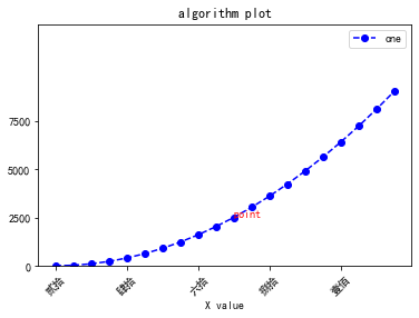
We create a new picture to implement the above six methods
The code is as follows,
import matplotlib.pyplot as plt
import numpy as np

plt.rcParams['font.sans-serif'] = ['SimHei']
####Recreate a separate subgraph
axe1 = plt.figure().add_subplot(1,1,1)
x = np.array([i for i in range(0,100,5)])
y = x ** 2
axe1.plot(x, y, linestyle = "dashed",marker = "o",color = "b", label = "one")
axe1.legend()
# ###Set scale, scale label, axis label, boundary, legend and drawing name
axe1.set_yticks([0,2500,5000,7500])
# ###Set the scale label and rotate 45 °
axe1.set_xticklabels(["Fatal Frame","Fatal Frame","twenty","forty","sixty","eighty"], rotation = 45, fontsize = "medium")
# ###Set axis label
axe1.set_xlabel("X value")
###Set the legend, which corresponds to the label parameter in the drawing method
axe1.legend(loc = "best")
###Set icon boundary, list form
axe1.set_ylim([0,12500])
axe1.set_title("algorithm plot")

###Add text. The coordinates are the coordinates on the drawing
axe1.text(50,2500, "point", color = "red")
The results are as follows,
4, Picture saving
Formulas: axe type objects savefig(fname, dpi=, facecolor=);fname is the save path, DPI is the pixel, that is, the definition of the picture, and facecolor is the color of the blank part of the picture
If I want to save the image drawn in the third part to the current path and name it pic, I can execute the following code
plt.savefig("pic.png", dpi = 1000)
Next, you can see a pic in the current path PGN named new picture
summary
The drawing of matplotlib is so simple that it is finally attached with a hexadecimal color code