1. Topic analysis
The Metropolis sampling method of random walk is used to generate the random number of standard Laplace distribution, in which the normal distribution is used to generate the increment, compare the differences of chains generated by different variances of the proposed distribution, and compare the receiving probability of each chain.
2. Code display
We first import the required libraries:
import numpy as np
import scipy.stats as st
import seaborn as sns
import matplotlib.pyplot as plt
According to the given target distribution f and proposed distribution g, we write the code according to the Metropolis algorithm of random walk:
def RandomWalkMetropolis(m, f, g, x0):
    k = 0
    np.random.rand(0)
    x = np.zeros(m)
    u = np.random.random(m)
    x[0] = x0

    for i in range(1, m):
        xt = x[i-1]
        y = g.rvs()
        num = f.pdf(y)
        den = f.pdf(xt)
        if u[i] <= num / den:
            x[i] = y
            k += 1
        else:
            x[i] = xt
    print('acceptance rate: ' + str(k / m))

    return  x
We set the length of Markov chain as 100000; The pre burning period is 10000; The target distribution is standard Laplace distribution; The proposed distribution is 0 for the mean and 0 for the standard deviation σ \sigma σ Normal distribution of, where σ ∈ [ 0.05 , 0.5 , 1 , 4 , 16 , 32 ] \sigma \in [0.05, 0.5, 1, 4, 16, 32] σ ∈ [0.05,0.5,1,4,16,32], initialization point x 0 = 0 x_0=0 x0=0:
name = '6_6_sigm0.05'
m = 100000
burn = 10000
sigm = [0.05, 0.5, 1, 4, 16, 32]
f = st.laplace
g = st.norm(scale=sigm[0])
x = RandomWalkMetropolis(m, f, g, 0)
3. Model evaluation
In this part, we systematically compare the different standard deviations of the proposed distribution σ \sigma σ We evaluate our algorithm model by accepting probability, Trace Plot, QQ graph and sampling target distribution density graph.
3.1 acceptance probability
We use different standard deviations to repeatedly run the Metropolis algorithm in 2 and get the following results:
sigma=0.05, acceptance rate: 0.98319
sigma=0.5, acceptance rate: 0.84878
sigma=1, acceptance rate: 0.72404
sigma=4, acceptance rate: 0.34838
sigma=16, acceptance rate: 0.09858
sigma=32, acceptance rate: 0.04895
We can see that with the increase of standard deviation, the acceptance probability decreases gradually and the sampling efficiency decreases significantly.
3.2 track diagram
Taking the number of iterations as the horizontal axis and the value of Markov chain as the vertical axis, we write the function of drawing TracePlot
def DrawTracePlot(x, name):
    dataX = np.arange(1, x.shape[0]+1)
    dataY = x

    plt.figure(figsize=(12, 5))
    plt.plot(dataX, dataY, linewidth=0.4, color="red")
    plt.title("Trace Plot", fontsize=20)
    plt.xlabel("Iterations", fontsize=12)
    plt.ylabel("Sample Values", fontsize=12)

    plt.savefig(name + "TracePlot.png", dpi=200)
    plt.show()
We call the above code to get the TracePlot diagram.
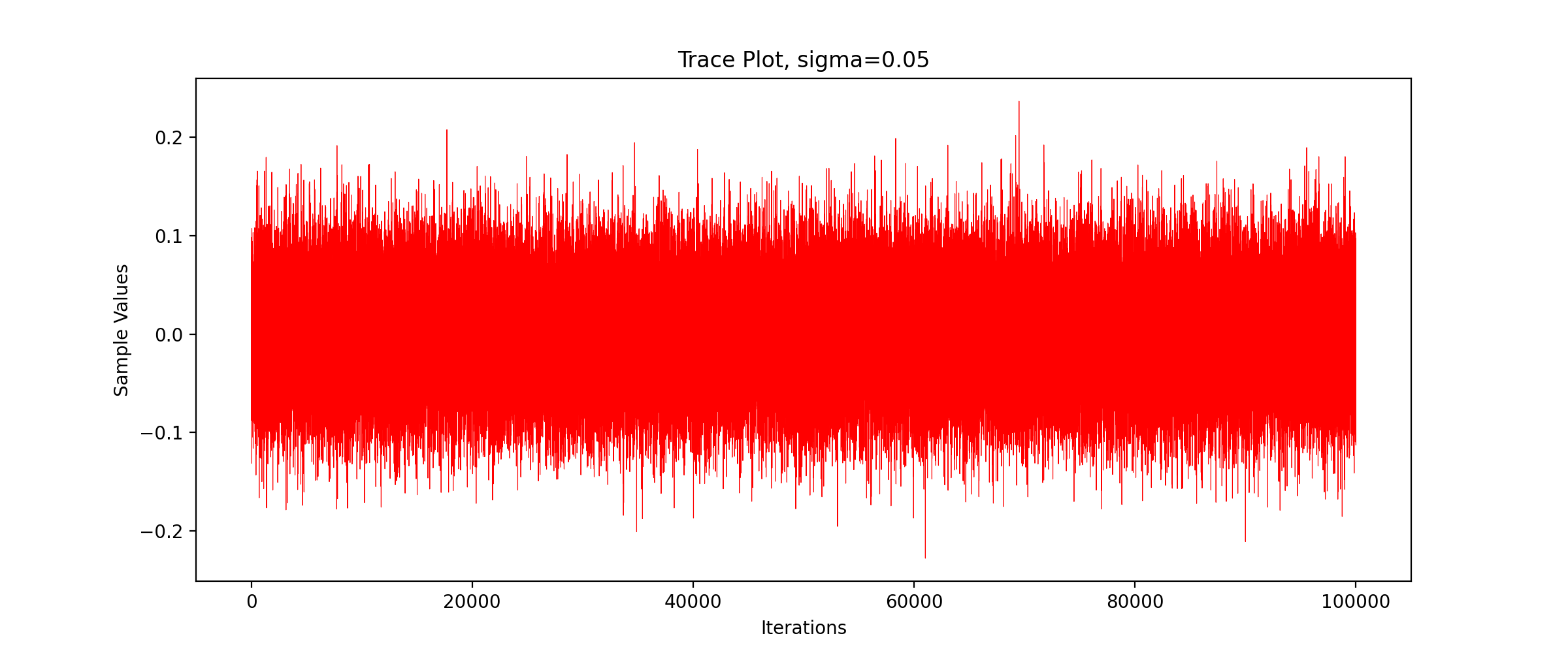
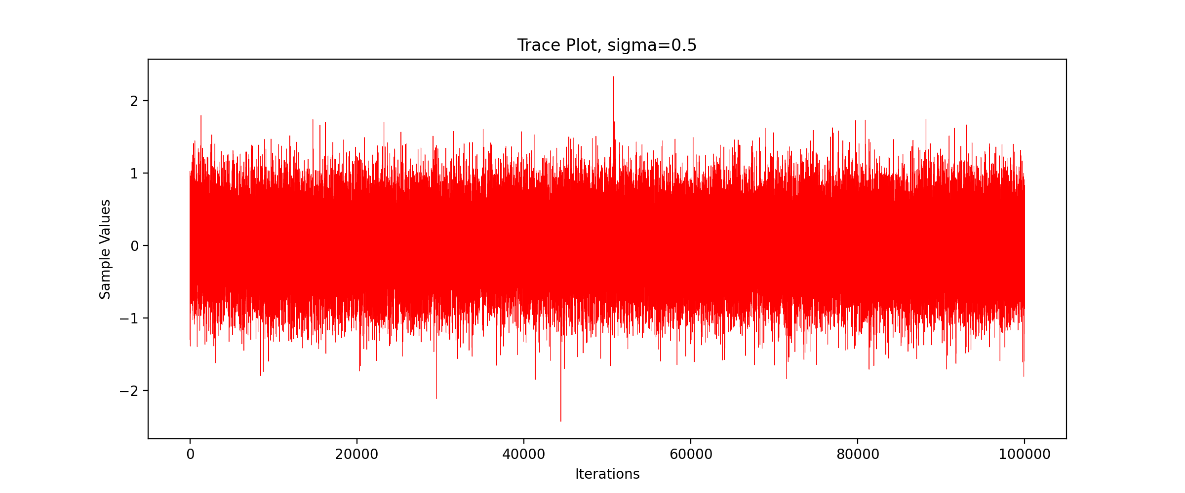
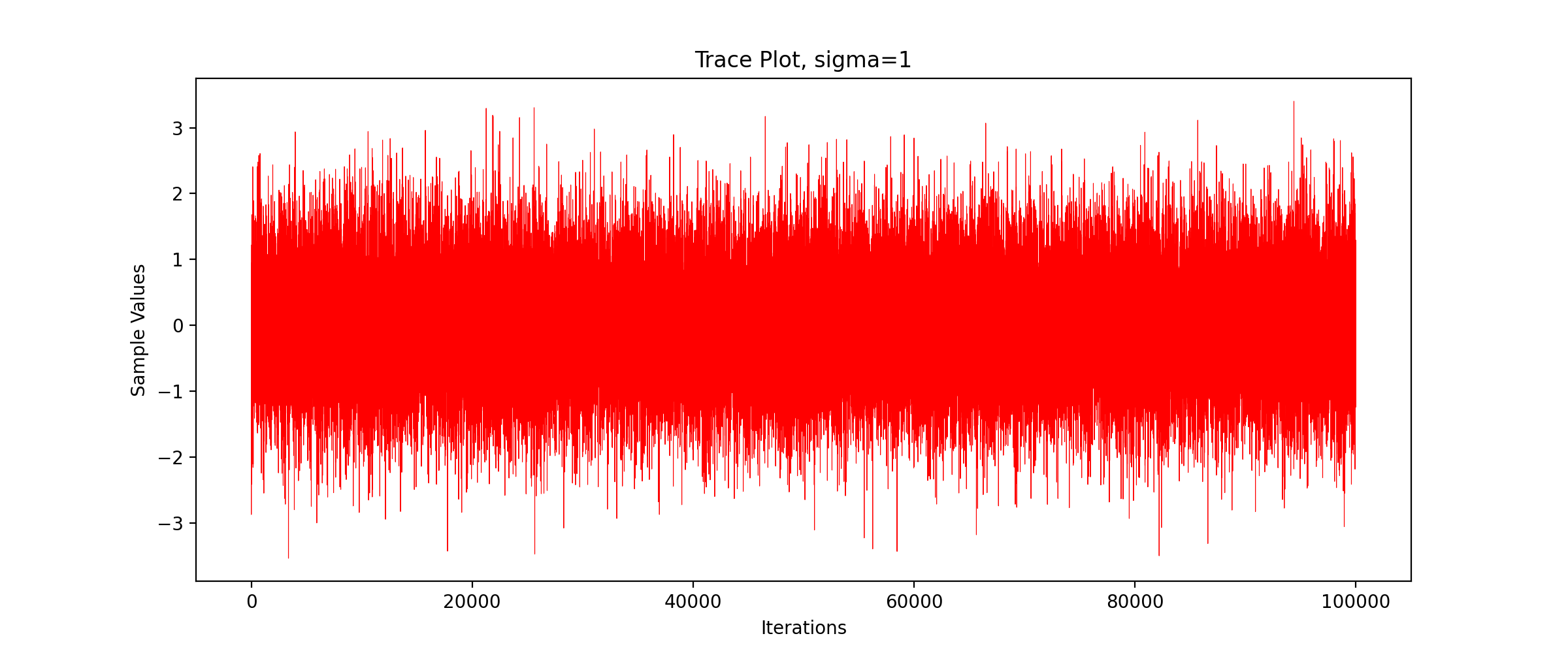
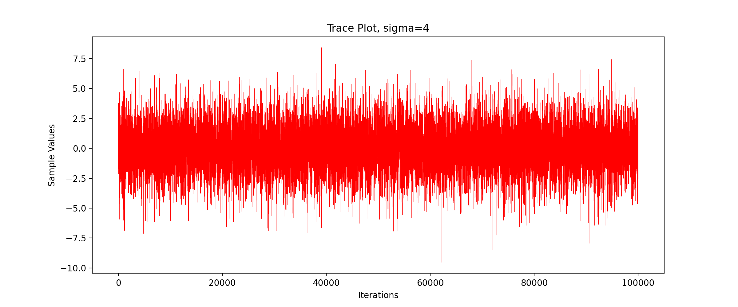
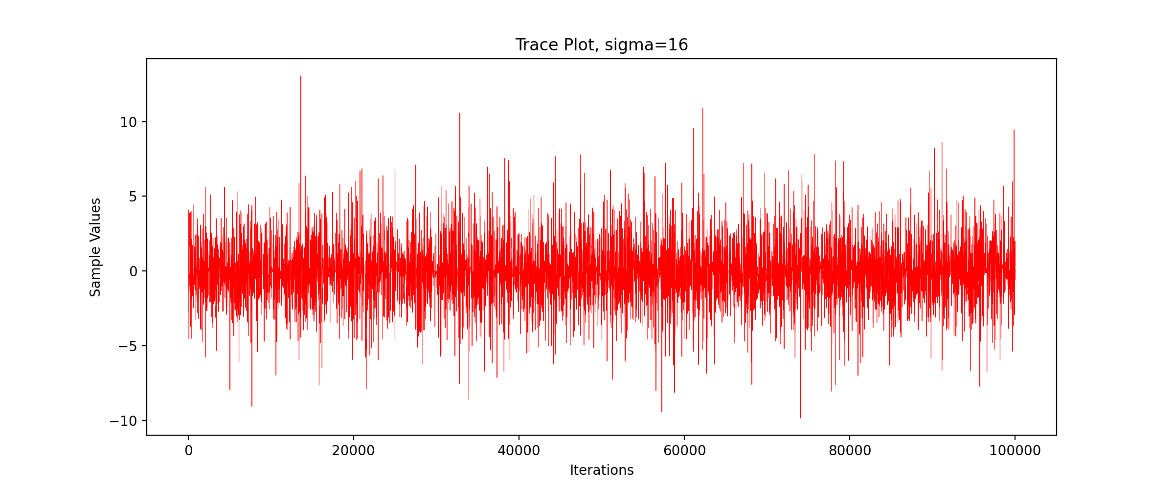
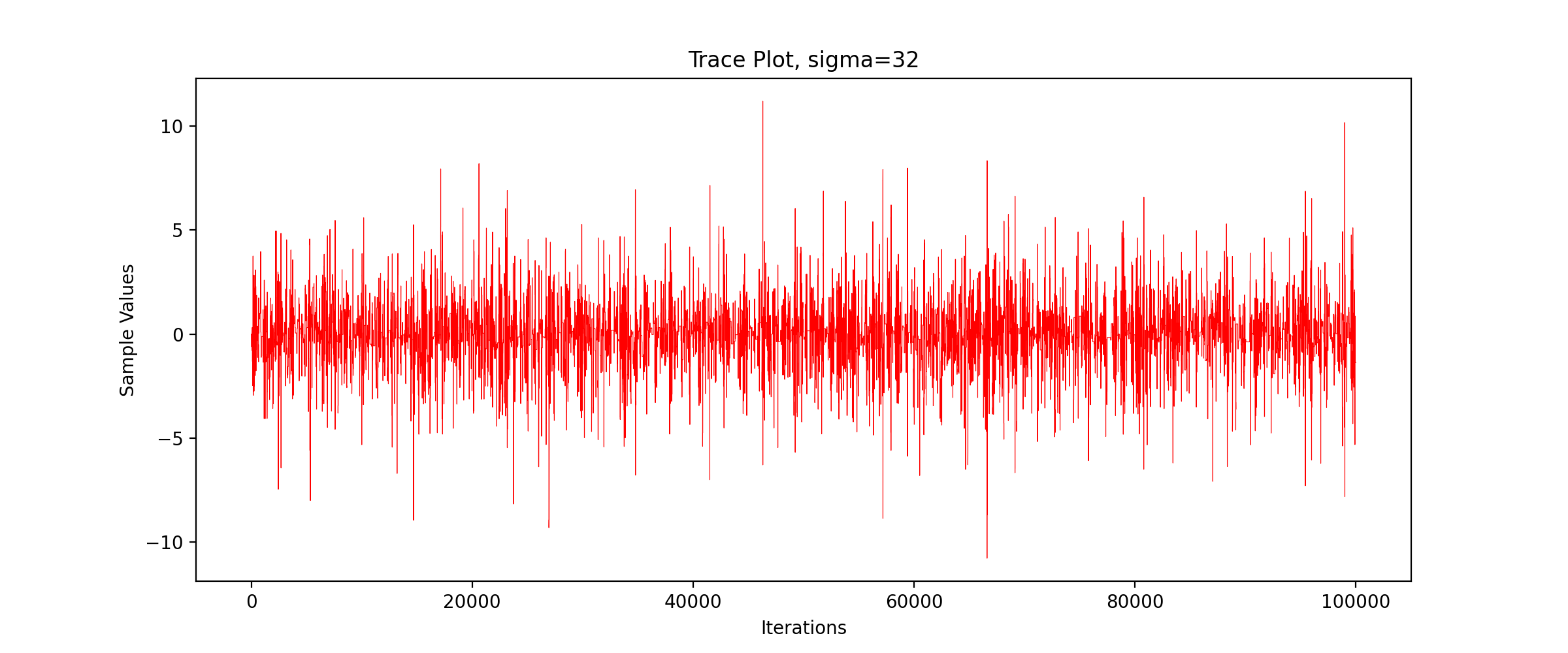
We can see that the sampling efficiency decreases greatly with the increase of the standard deviation of the proposed distribution.
3.3 distribution histogram
Next, we draw the sampling frequency histogram and observe the distribution. We write the following code:
def DrawHistogram(x, burn, f, name):
    x = x[burn:]
    plt.figure(figsize=(10,5))
    plt.title("Histogram")
    plt.xlabel('Observed Values')
    plt.ylabel('Distribution Density')
    plt.hist(x, bins=100, color="blue", density=True, edgecolor="black", alpha=0.5)
    y = f.rvs(size=x.shape[0])

    plt.savefig(name + " Histogram.png", dpi=200)
    plt.show()
We pass in parameters and run the above code to get the following results:
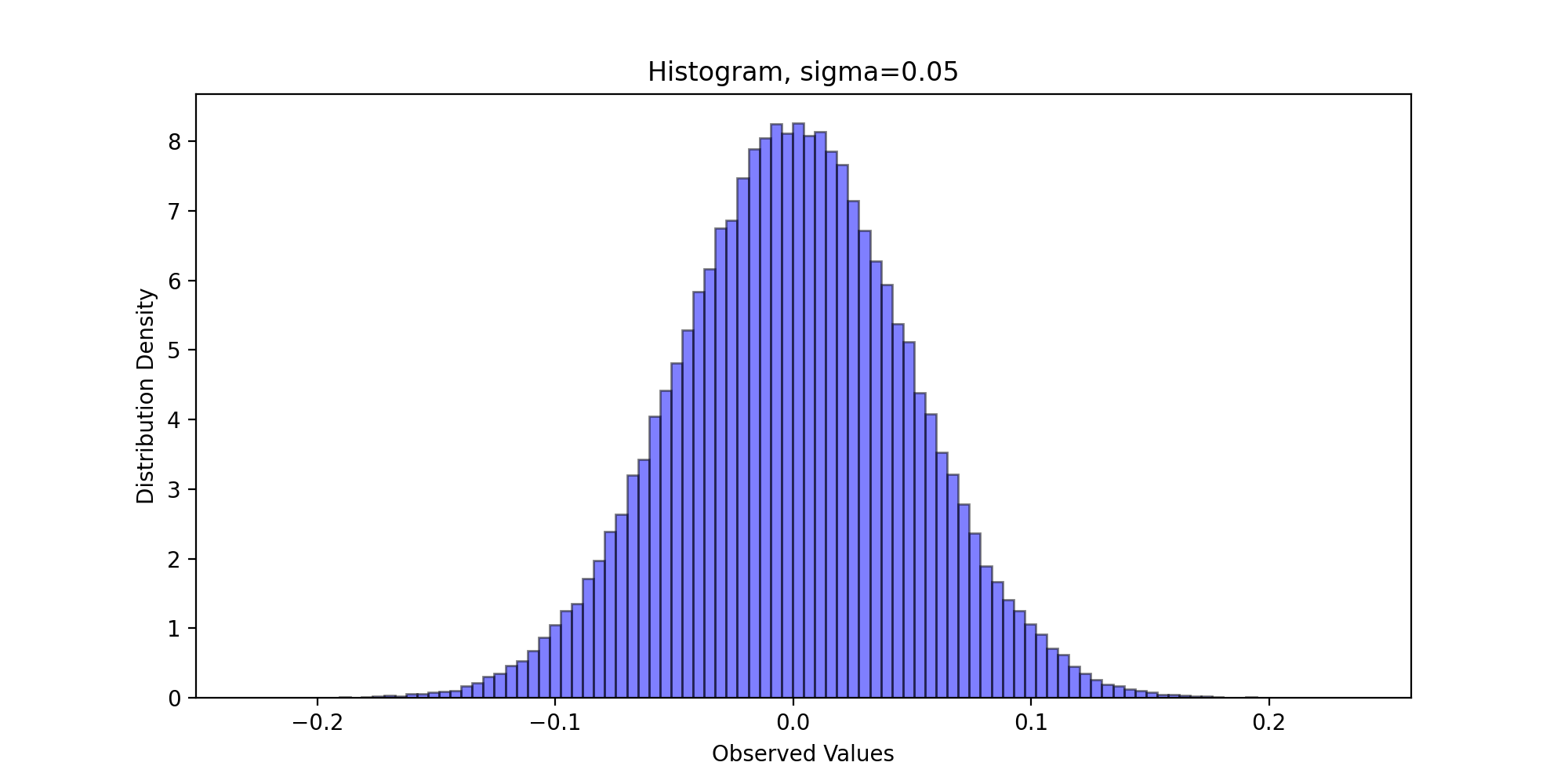
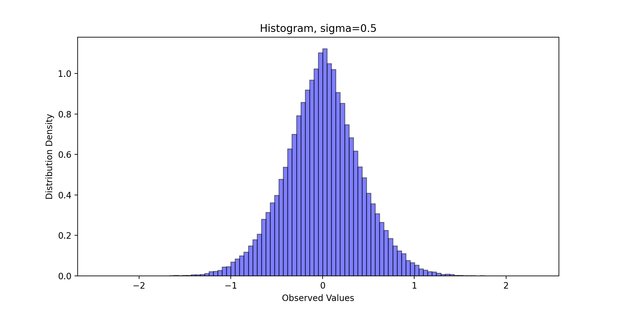
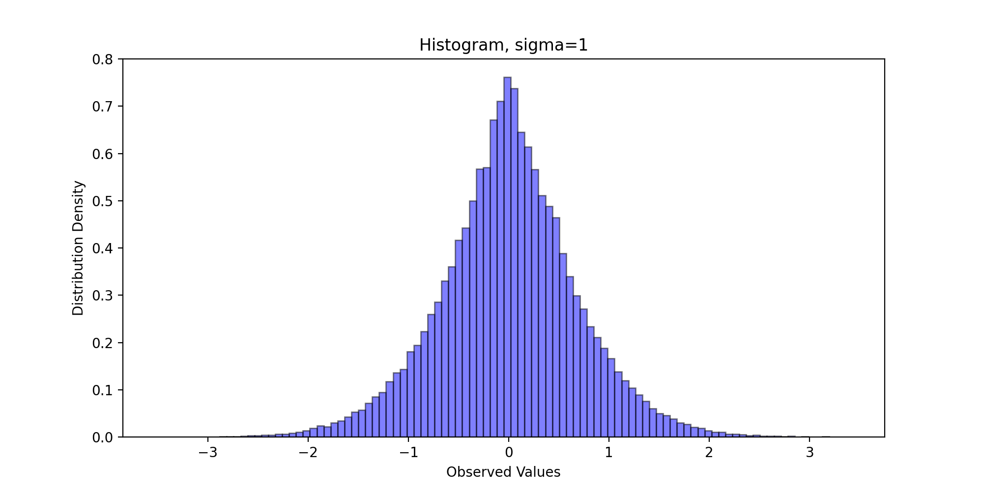
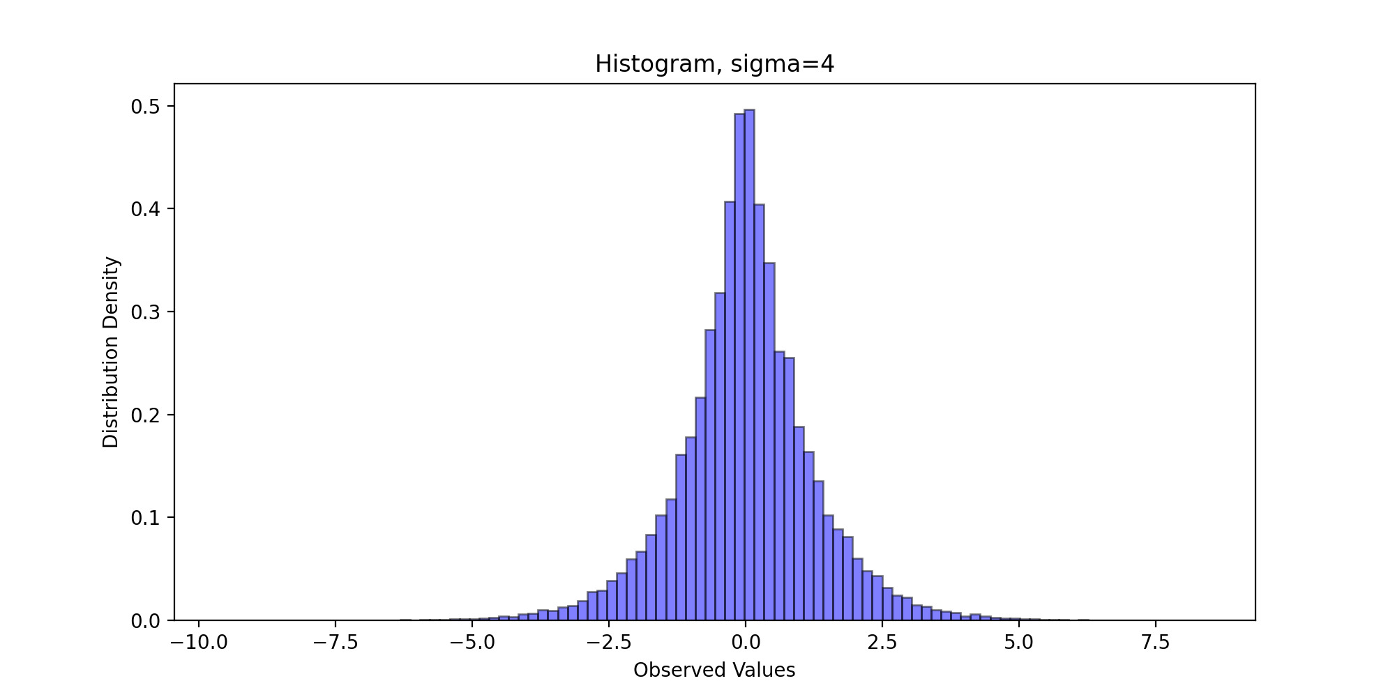
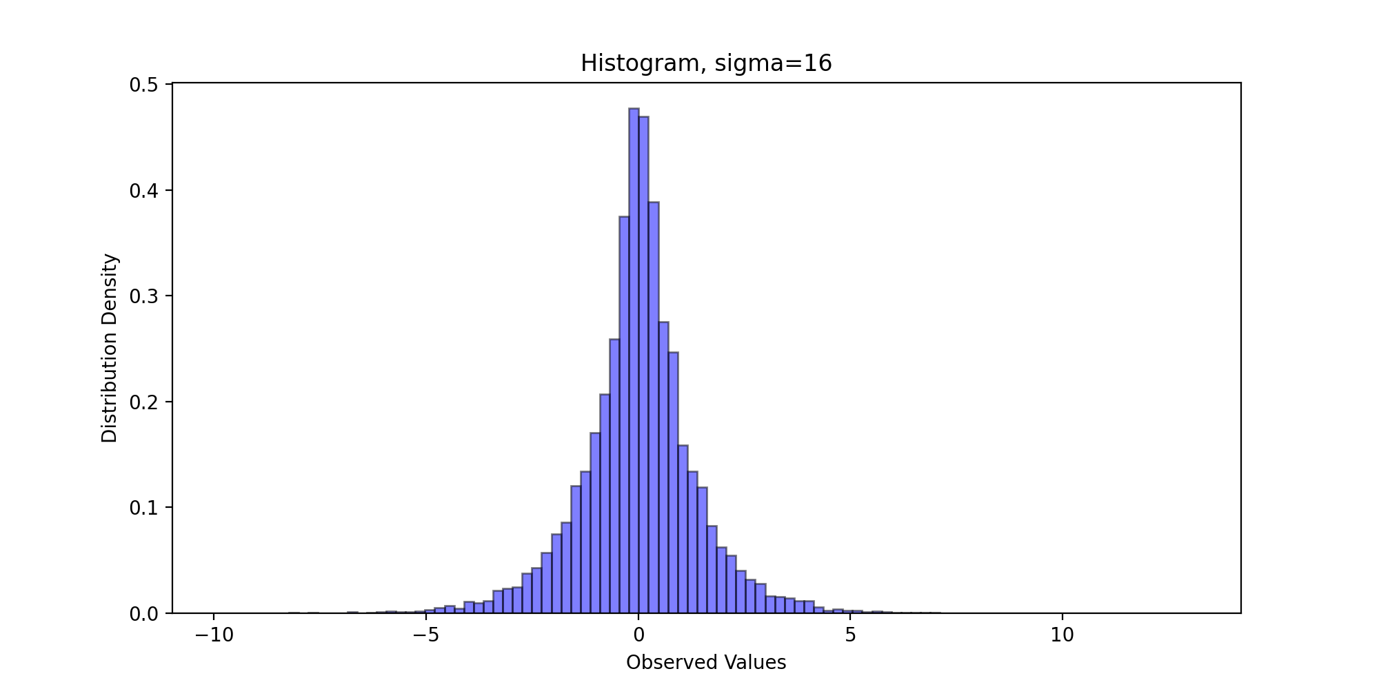
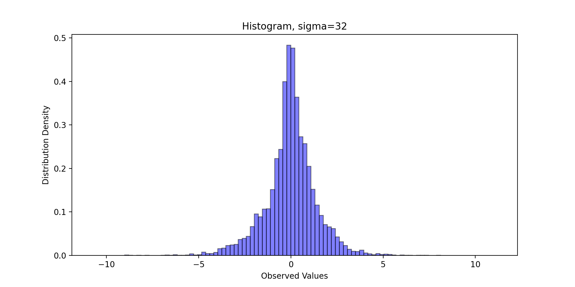
Through visual observation, we believe that the sampling distribution basically conforms to the standard Laplace distribution.
3.4 distribution density diagram
Further, we draw the distribution density diagram of theoretical distribution and sampling distribution for comparison. We write the following code:
def DrawDistribution(x, burn, f):
    x = x[burn:]
    tick = np.arange(x.min(), x.max(), 0.001)
    plt.figure(figsize=(10,5))
    plt.plot(tick, f.pdf(tick), color="red")
    p, y = np.histogram(x, bins=100, normed=True)
    y = (y[:-1] + y[1:])/2
    plt.plot(y, p, '--b')
    plt.title('Distribution')
    plt.legend(['target distribution', 'fitted distribution'])
    plt.xlabel('Observed Values')
    plt.ylabel('Distribution Density')
    plt.savefig(name + "Distribution.png", dpi=200)
    plt.show()
We pass in parameters and run the above code to get the following results:

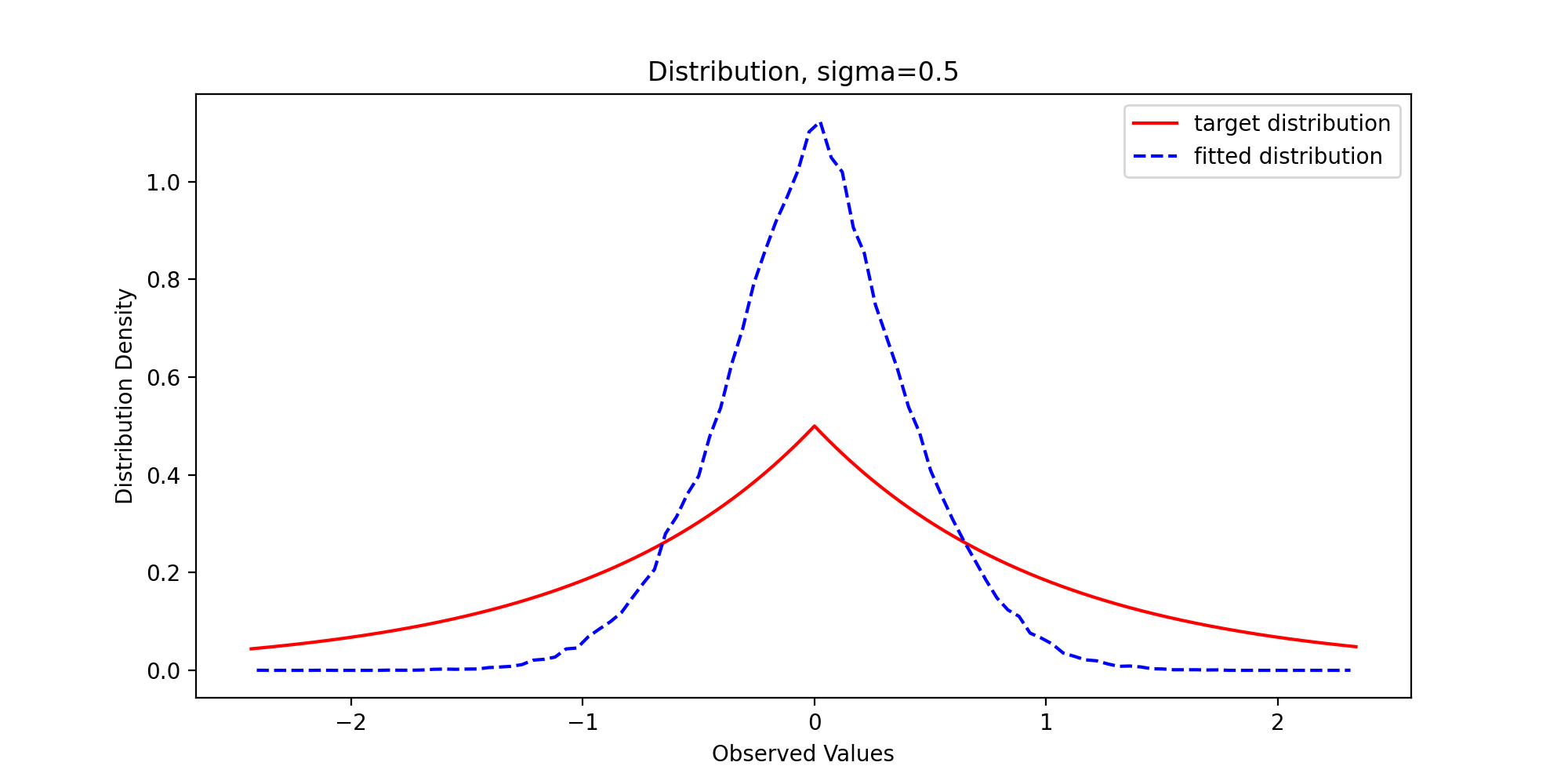
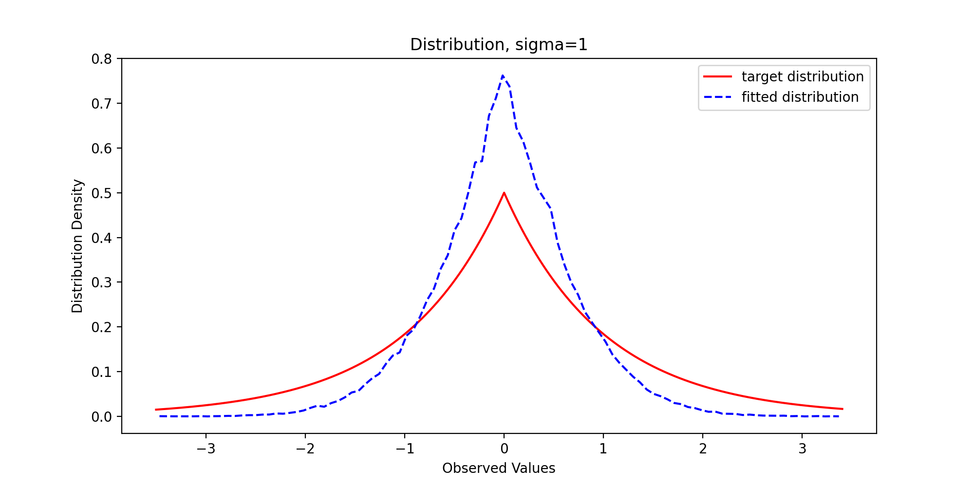
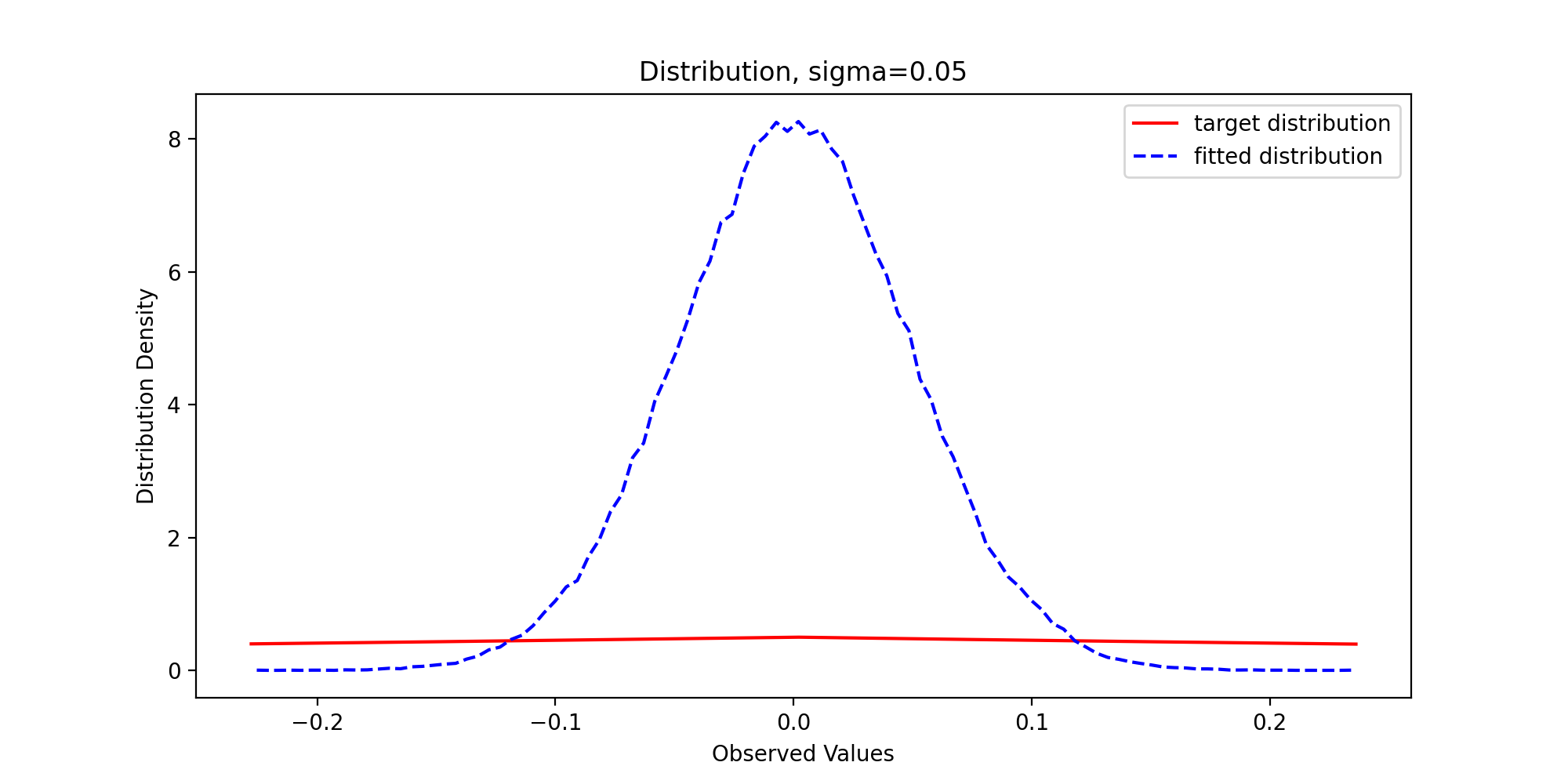
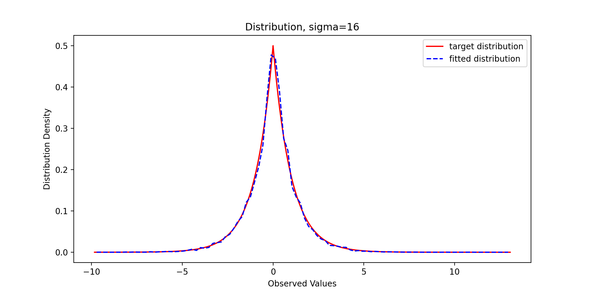
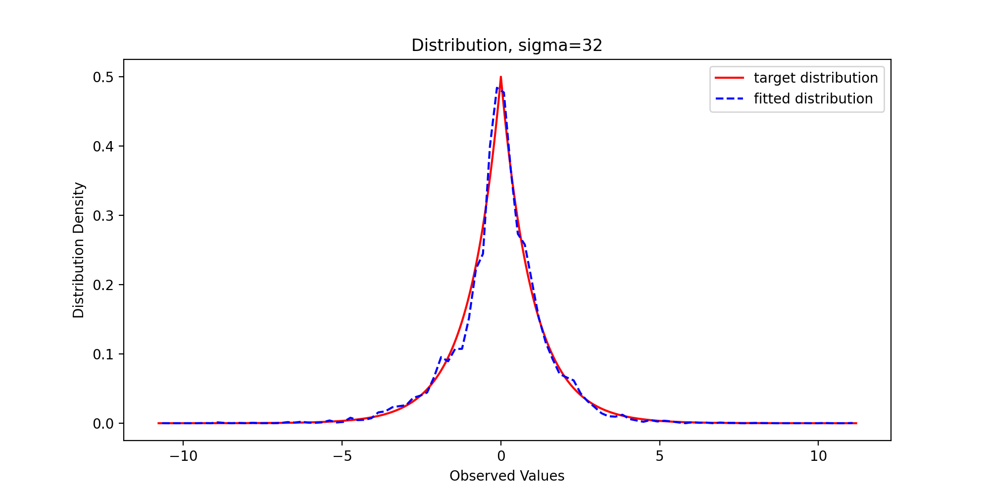
Through observation, we can find that with the gradual increase of variance, the sample distribution density is gradually close to the theoretical distribution density, which reflects the premise that the support set of the proposed distribution must include the support set of the target distribution.
3.5 QQ chart
Finally, in order to systematically quantify the difference between the sample distribution and the theoretical distribution, we draw the QQ diagram, and we write the following code:
def DrawQQPlot(x, burn, scale):
    x = x[burn:]
    x.sort()
    y = st.cauchy.rvs(size=x.shape[0])
    y.sort()
    quantileX = [np.percentile(x, i) for i in range(101)]
    quantileY = [np.percentile(y, i) for i in range(101)]

    print('10 quantitile of sample:{}'.format(quantileX[10]))
    print('10 quantitile of theoretical distribution:{}'.format(quantileY[10]))

    plt.scatter(quantileY, quantileX, c='blue')
    plt.xlim(scale)
    plt.ylim(scale)
    plt.xlabel('Theoretical Quantitiles')
    plt.ylabel('Sample Quantitiles')
    plt.plot(scale, scale, linewidth=2, color='red')
    plt.savefig(name + "QQPlot.png", dpi=200)
    plt.show()
We pass in parameters and run the above code to get the following results:
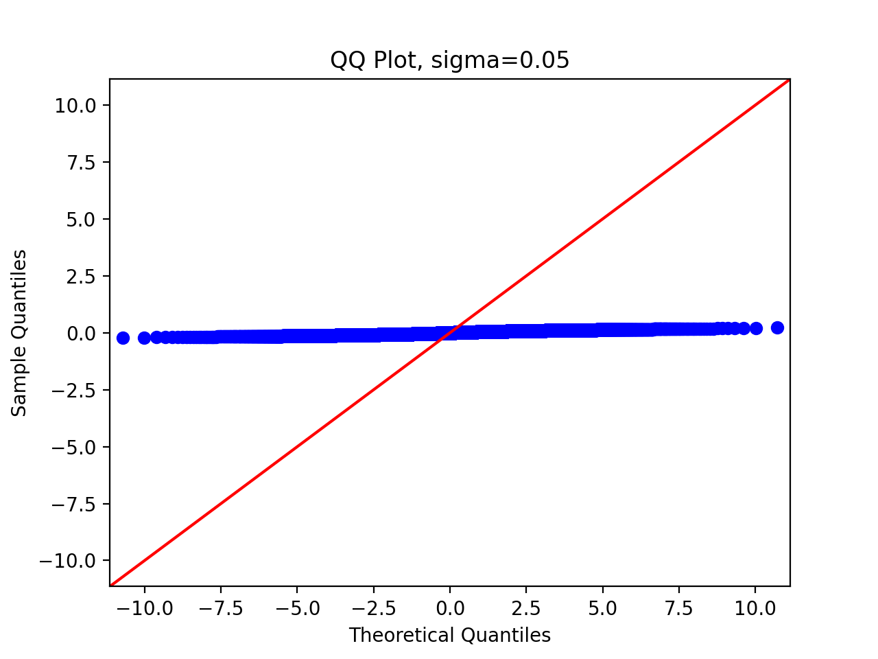

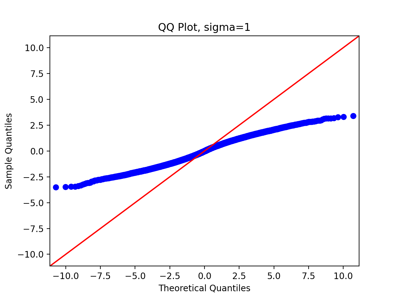
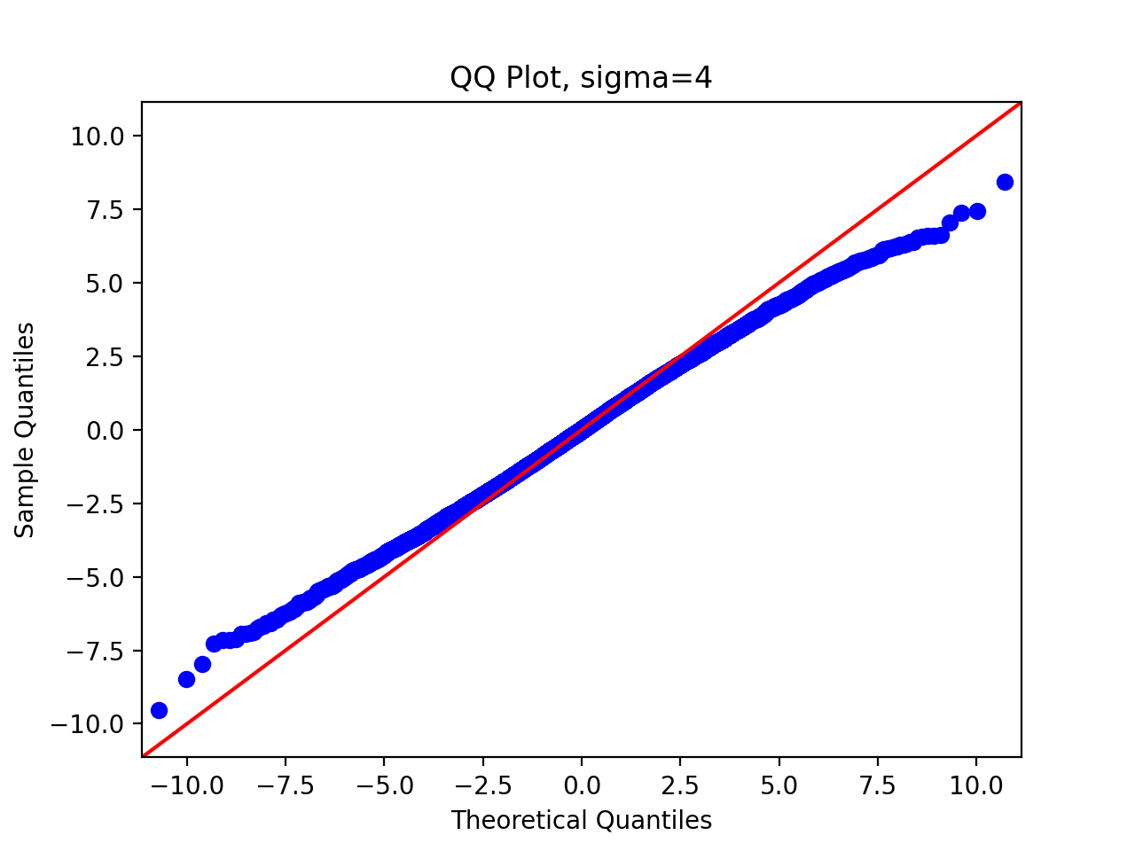
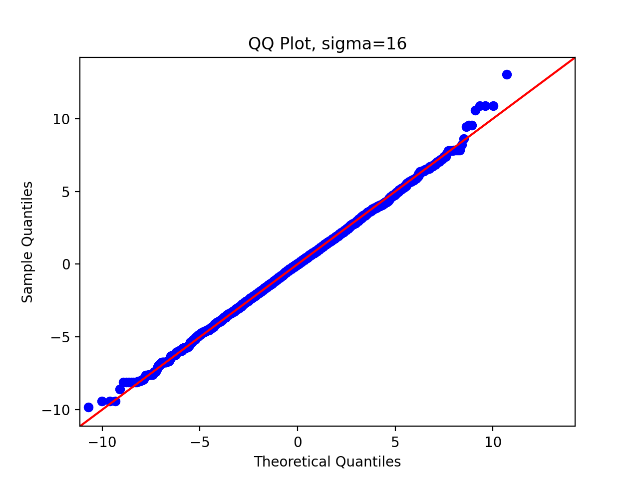
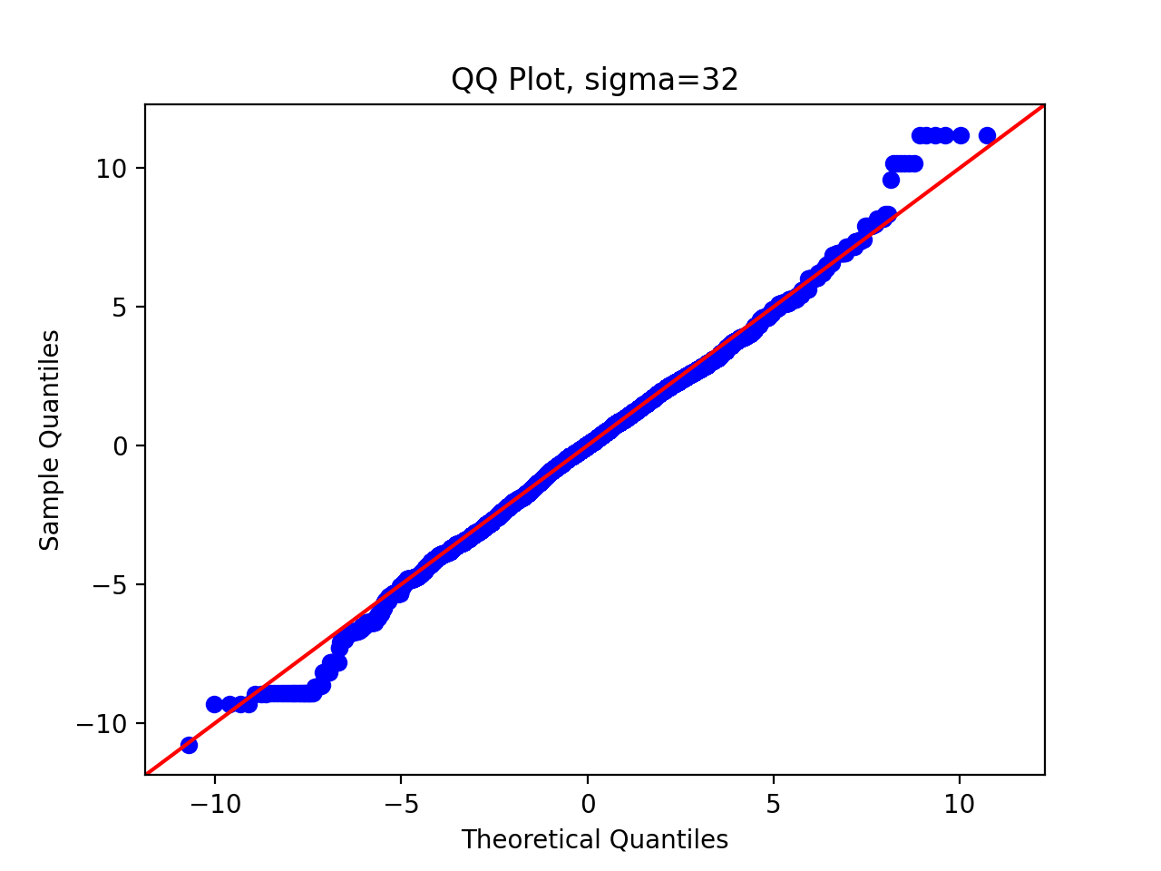
We can observe that as the standard deviation of the proposed distribution increases, the sampling distribution is closer and closer to the original distribution.
So far, our task has been completed.