Five common layouts of CSS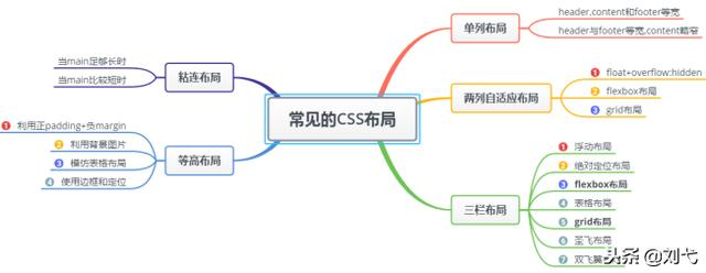
1, Single column layout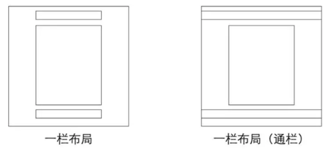
There are two common single column layouts:
Single column layout with the same width of header,content and footer
A single column layout with the same width of header and footer and slightly narrow content
1. How to achieve
For the first type, first set width: 1000px or max width: 1000px for header, content and footer (the difference between the two is that when the screen is less than 1000px, a scroll bar will appear for the former, but not for the latter, showing the actual width); then set margin:auto to realize the middle.
<div class="header"></div>
<div class="content"></div>
<div class="footer"></div>
.header{
 margin:0 auto;
 max-width: 960px;
 height:100px;

}
.content{
 margin: 0 auto;
 max-width: 960px;
 height: 400px;

}
.footer{
 margin: 0 auto;
 max-width: 960px;
 height: 100px;

}
For the second type, the content width of header and footer is not set, and block level elements fill the whole screen, but the content areas of header, content and footer are set with the same width, and are centered through margin:auto.
<div class="header">
 <div class="nav"></div>
</div>
<div class="content"></div>
<div class="footer"></div>
.header{
 margin:0 auto;
 max-width: 960px;
 height:100px;

}
.nav{
 margin: 0 auto;
 max-width: 800px;
 height: 50px;
}
.content{
 margin: 0 auto;
 max-width: 800px;
 height: 400px;

}
.footer{
 margin: 0 auto;
 max-width: 960px;
 height: 100px;

}
2, Two column adaptive layout
Two column adaptive layout refers to a layout in which one column is split by content and the other column is full of the remaining width
1.float+overflow:hidden
If it is a common two column layout, the margin of floating + common elements can be realized, but if it is an adaptive two column layout, it can be realized by using float+overflow:hidden. This method mainly triggers BFC through overflow, while BFC does not overlap floating elements. Since setting overflow:hidden does not trigger the haslayout property of IE6 browser, you need to set zoom:1 to be compatible with IE6 browser. The specific code is as follows:
<div class="parent" style="background-color: lightgrey;">
    <div class="left" style="background-color: lightblue;">
        <p>left</p>
    </div>
    <div class="right"  style="background-color: lightgreen;">
        <p>right</p>
        <p>right</p>
    </div>
</div>
.parent {
  overflow: hidden;
  zoom: 1;
}
.left {
  float: left;
  margin-right: 20px;
}
.right {
  overflow: hidden;
  zoom: 1;
}
Note: if the sidebar is on the right, pay attention to the rendering order. In HTML, write the sidebar first and then the main content
2.Flex layout
Flex layout, also known as flexible box layout, can realize the layout of various pages in a few lines of code.
//The html part is the same as above
.parent {
  display:flex;
}
.right {
  margin-left:20px;
  flex:1;
}
3.grid layout
Grid layout is a two-dimensional layout system based on grid, which aims to optimize user interface design.
//The html part is the same as above
.parent {
  display:grid;
  grid-template-columns:auto 1fr;
  grid-gap:20px
}
3, Three column layout
Features: adaptive width of middle column, fixed width on both sides, there are many ways to realize three column layout (several ways to realize three column layout can be jabbed). This paper focuses on the Holy Grail layout and double wings layout.
1. Layout of Holy Grail
Characteristics
The only difference is that the dom structure must write the middle column first, so that the middle column can be loaded first.
  .container {
    padding-left: 220px;//Make room for the left and right bars
    padding-right: 220px;
  }
  .left {
    float: left;
    width: 200px;
    height: 400px;
    background: red;
    margin-left: -100%;
    position: relative;
    left: -220px;
  }
  .center {
    float: left;
    width: 100%;
    height: 500px;
    background: yellow;
  }
  .right {
    float: left;
    width: 200px;
    height: 400px;
    background: blue;
    margin-left: -200px;
    position: relative;
    right: -220px;
  }


 <article class="container">
    <div class="center">
      <h2>Holy Grail layout</h2>
    </div>
    <div class="left"></div>
    <div class="right"></div>
  </article>
② Implementation steps
All three parts are set to float on the left. Otherwise, the left and right sides cannot be in the same row with the middle column without going up. Then set the width of the center to 100% (realize the content adaptation of the middle column), and the left and right parts will skip to the next row

Let the left and right parts return to the same line as the center part by setting the margin left to a negative value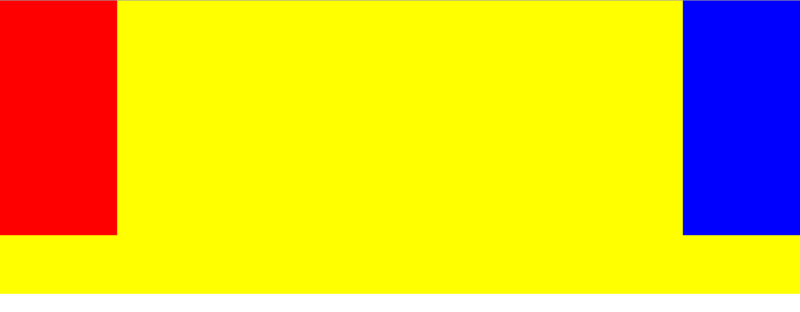
By setting the padding left and padding right of the parent container, leave a gap between the left and right sides.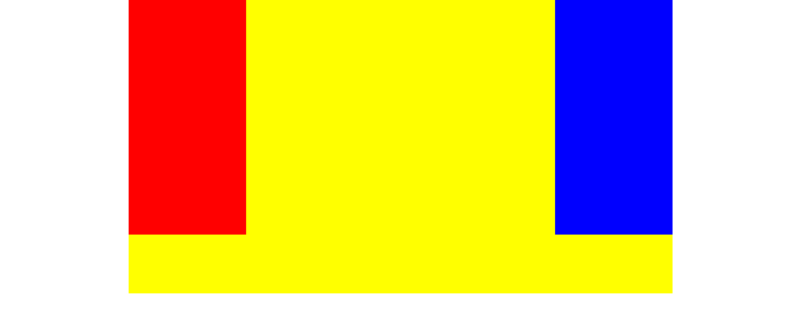
By setting the relative positioning, let the left and right parts move to both sides.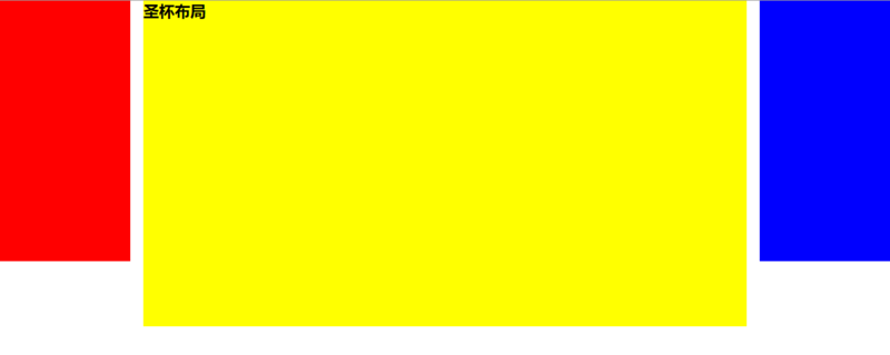
Disadvantages
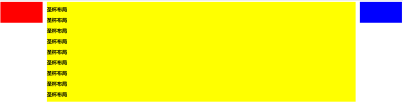
The minimum width of the center part cannot be less than the width of the left part, otherwise the left part will fall to the next line
If the contents of one column are lengthened (as shown below), the background of the other two columns will not be filled automatically. (it can be solved by means of pseudo equal high layout)
④ Pseudo contour layout
Equal height layout refers to the layout mode in which the child elements are equal in height in the parent element. The realization of contour layout includes pseudo contour and true contour. Pseudo contour is only apparent contour, while true contour is real contour.
Here we can solve the second disadvantage of the Holy Grail layout by pseudo equal layout, because the background is displayed in the padding area. Set a padding bottom with a large value, then set a negative margin bottom with the same value, add a container outside all columns, and set overflow:hidden to cut off the overflow background. This kind of layout can realize multi column equal height layout, and also can realize the effect of separating lines between columns. It has simple structure and is compatible with all browsers. The new code is as follows:
  .center,
  .left,
  .right {
    padding-bottom: 10000px;
    margin-bottom: -10000px;
  }
  .container {
    padding-left: 220px;
    padding-right: 220px;
    overflow: hidden;//Cut off the overflow background
  }
2. Dual wing layout
Characteristics
It is also a three column layout, which is further optimized on the basis of the layout of the Holy Grail to solve the problem of disordered layout of the Holy Grail and realize the separation of content and layout. And any column can be the highest column without any problem.
.container {
    min-width: 600px;//Make sure the middle content can be displayed, twice the width of left + right
}
.left {
    float: left;
    width: 200px;
    height: 400px;
    background: red;
    margin-left: -100%;
}
.center {
    float: left;
    width: 100%;
    height: 500px;
    background: yellow;
}
.center .inner {
    margin: 0 200px; //New part
}
.right {
    float: left;
    width: 200px;
    height: 400px;
    background: blue;
    margin-left: -200px;
}
  <article class="container">
        <div class="center">
            <div class="inner">Double wing layout</div>
        </div>
        <div class="left"></div>
        <div class="right"></div>
    </article>
② Implementation steps (the first two steps are the same as the layout of the Holy Grail)
All three parts are set to float to the left, and then the width of the center is set to 100%. At this time, the left and right parts will jump to the next line;
Set the margin left to a negative value to return the left and right parts to the same line as the center part;
In the center part, add an inner div and set margin: 0 200px;
Disadvantages
Add one more layer of dom tree node to increase the computation of rendering tree generation.
3. Comparison of two layout implementation methods:
Both layouts place the main column at the front of the document flow, giving priority to the loading of the main column.
There are also similarities in the implementation of the two layout methods, which are to let the three columns float, and then form the three column layout through the negative margin.
The difference between the two layouts is how to handle the position of the middle main column:
The layout of the Holy Grail is based on the left and right inner margins of the parent container + two subordinate columns;
The layout of double wings is to nest the main column in a new parent block and adjust the layout by using the left and right margins of the main column
4, Adhesion layout
1. characteristics
There is a piece of content, when Gao Kang is long enough, the elements that follow closely
Will follow the element.When the elements are relatively short (such as less than the height of the screen), we expect this
Elements can "stick" at the bottom of the screenWhen main is long enough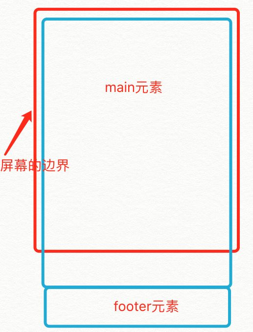
When main is short
The specific code is as follows:
<div id="wrap">
  <div class="main">
    main <br />
    main <br />
    main <br />
  </div>
</div>
<div id="footer">footer</div>
  * {
        margin: 0;
        padding: 0;
      }
      html,
      body {
        height: 100%;//The height is inherited
      }
      #wrap {
        min-height: 100%;
        background: pink;
        text-align: center;
        overflow: hidden;
      }
      #wrap .main {
        padding-bottom: 50px;
      }
      #footer {
        height: 50px;
        line-height: 50px;
        background: deeppink;
        text-align: center;
        margin-top: -50px;
      }
2. Implementation steps
(1) The footer must be an independent structure without any nesting relationship with wrap
(2) The height of the wrap area changes to the viewport height by setting min height
(3)footer uses negative margin to determine its position
(4) You need to set padding bottom in the main area. This is also to prevent negative margin from causing the footer to overwrite any actual content.

