Elastic box model
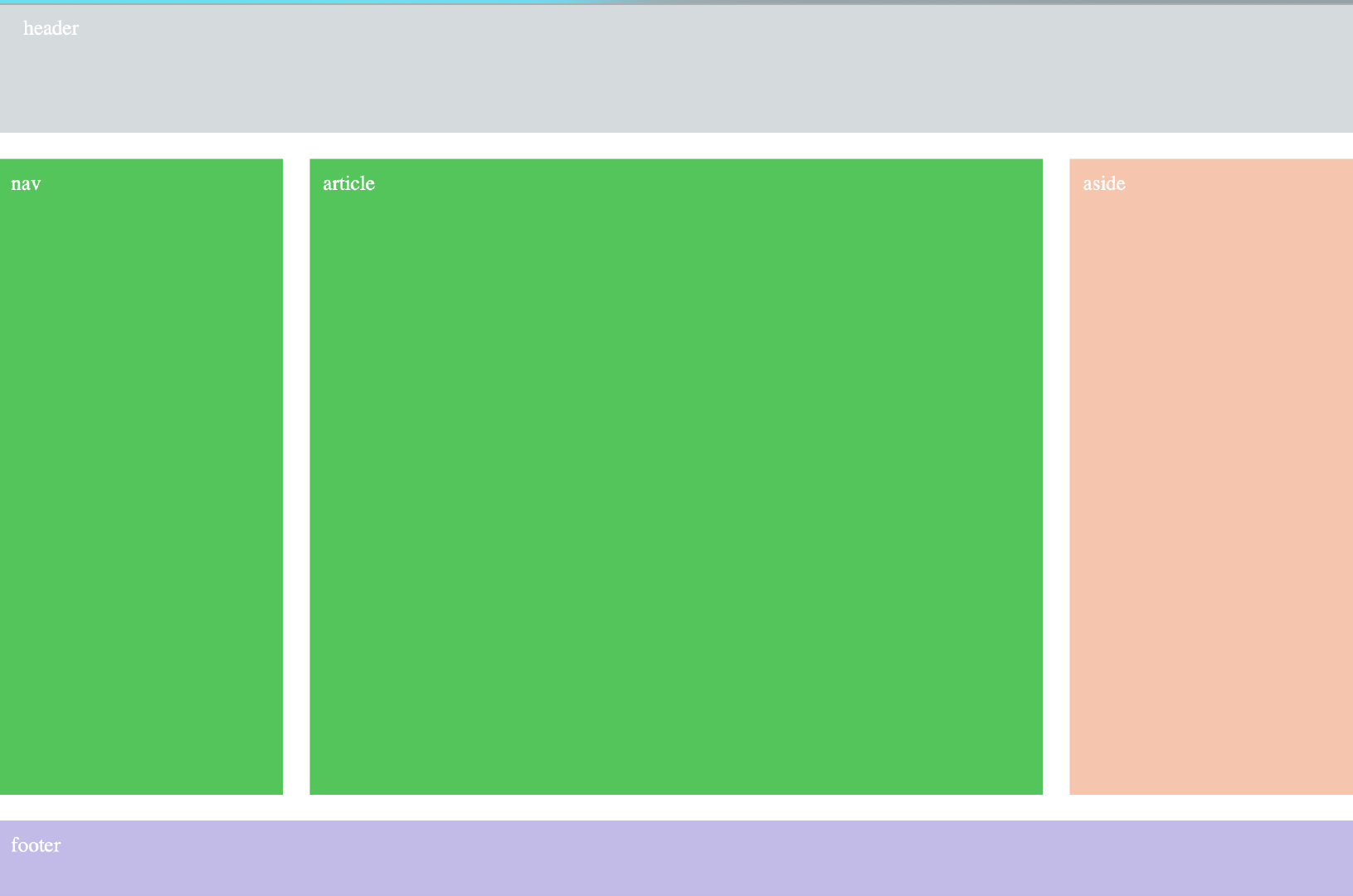
1. Telescopic container display
Flex is the abbreviation of Flexible Box, meaning "flexible layout", which is used to provide maximum flexibility for box model. Any container can be specified as a flex layout.
Elements with Flex layout are called Flex containers, or "containers" for short. All its child elements automatically become container members, called Flex items, or "items" for short.
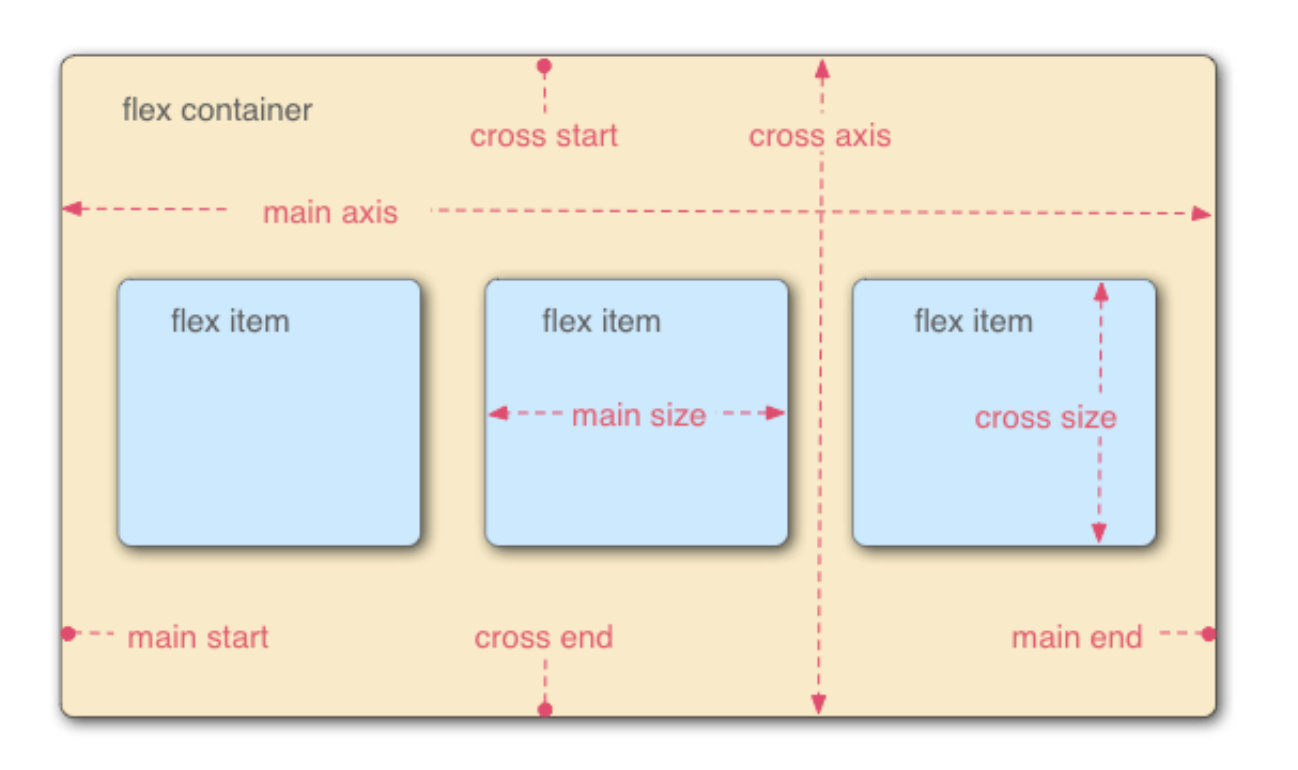
By default, the container has two axes: the horizontal main axis and the vertical cross axis.
The start position of the spindle (the intersection with the border) is called main start, and the end position is called main end; The start position of the cross axis is called cross start and the end position is called cross end.
Items are arranged along the main axis by default. The spindle space occupied by a single item is called main size, and the cross axis space occupied is called cross size.
The following six properties are set on the container.
-
flex-direction
-
flex-wrap
-
flex-flow
-
justify-content
-
align-items
-
align-content
The following six properties are set on the project.
- order
- flex-grow
- flex-shrink
- flex-basis
- flex
- align-self
2. Flex direction
The flex direction property determines the direction of the spindle (that is, the arrangement direction of the items).
.box { flex-direction: row | row-reverse | column | column-reverse; }
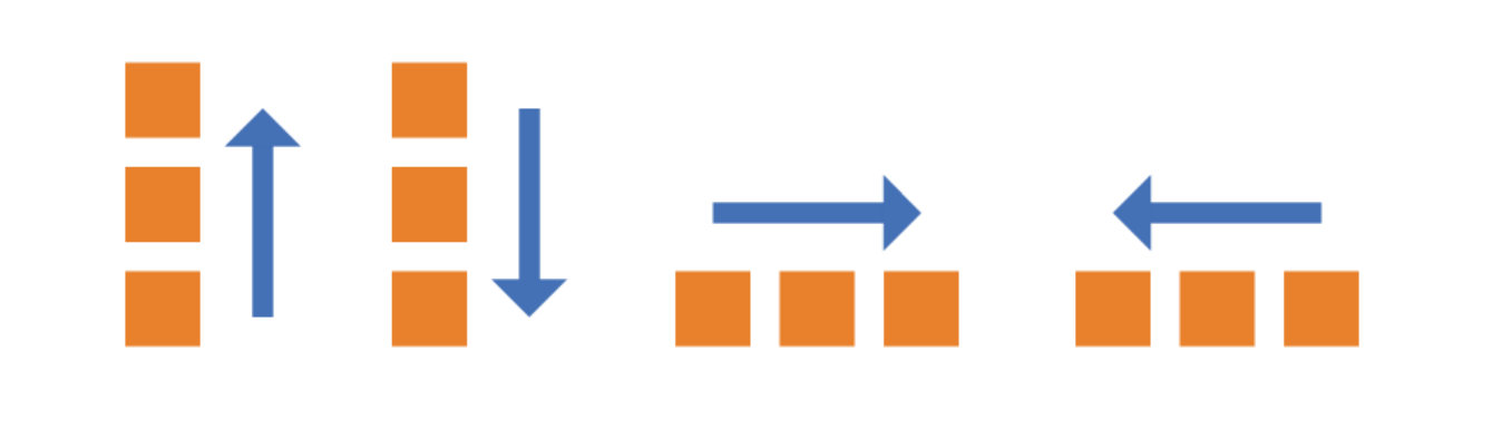
It may have four values.
- row (default): the main axis is horizontal and the starting point is at the left end.
- Row reverse: the spindle is horizontal and the starting point is at the right end.
- column: the main axis is vertical and the starting point is at the top edge.
- Column reverse: the main axis is vertical and the starting point is at the bottom edge.
3. Flex wrap
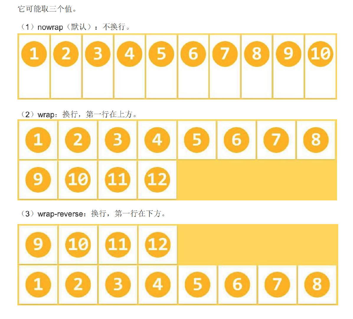
By default, projects are arranged on a single line (also known as a grid line). The flex wrap attribute defines how to wrap lines if one axis cannot be arranged.
.box{ flex-wrap: nowrap | wrap | wrap-reverse; }
It may take three values.
- nowrap (default): no line breaks.
- Wrap: wrap, first line above.
- Wrap reverse: wrap line, first line below.
4. Expansion flow direction and line feed flex flow
The flex flow attribute is a short form of the flex direction attribute and the flex wrap attribute. The default value is row nowrap.
box { flex-flow: <flex-direction> <flex-wrap>; }
5. Spindle alignment justify content
The justify content attribute defines the alignment of items on the spindle.
.box { justify-content: flex-start | flex-end | center | space-between | space-around; }
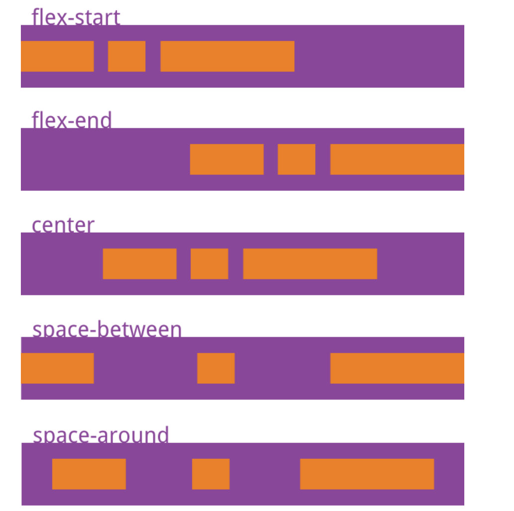
It may take 5 values, and the specific alignment is related to the direction of the axis. Let's assume that the spindle is left to right.
- Flex start (default): align left
- Flex end: right justified
- center: center
- Space between: both ends are aligned, and the spacing between items is equal.
- Space around: the space on both sides of each item is equal. Therefore, the interval between items is twice as large as that between items and borders.
6. Align items and align self
The align items property defines how items are aligned on the cross axis.
.box { align-items: flex-start | flex-end | center | baseline | stretch; }
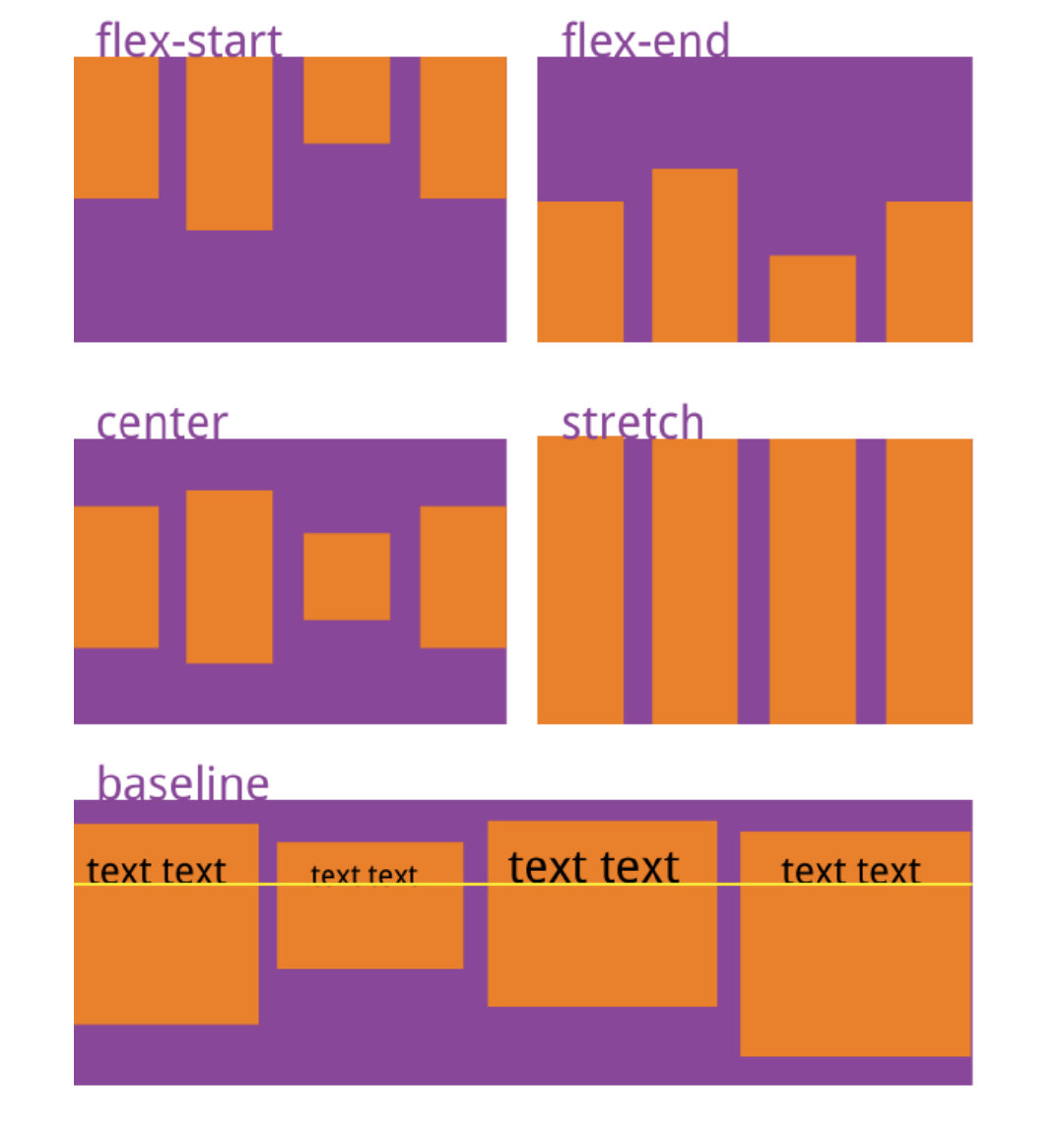
It may take five values. The specific alignment is related to the direction of the cross axis. It is assumed that the cross axis is from top to bottom.
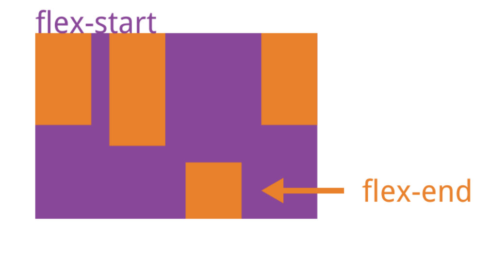
- Flex start: align the start point of the cross axis.
- Flex end: align the ends of the cross axes.
- center: align the midpoint of the cross axis.
- Baseline: the baseline alignment of the first line of text of the project.
- stretch (default): if the project is not set to height or set to auto, it will occupy the height of the entire container.
The align self attribute allows a single item to have a different alignment from other items, and can override the align items attribute.
The default value is auto, which means that it inherits the align items attribute of the parent element. If there is no parent element, it is equivalent to stretc h.
.item { align-self: auto | flex-start | flex-end | center | baseline | stretch; }
7. Stack scaling line align content
The align content attribute defines the alignment of multiple axes. This property has no effect if the project has only one axis.
Function: sets the vertical arrangement of items inside the free box.
Condition: the free box attribute display:flex; must be set on the parent element;, And set the arrangement mode as horizontal arrangement flex direction: row; And set line feed, flex Wrap: wrap; In this way, the setting of this property will work.
Setting object: this attribute is used to set the parent element for the items inside her container.
.box{
  align-content: flex-start | flex-end | center | space-between | space-around | stre tch;
}
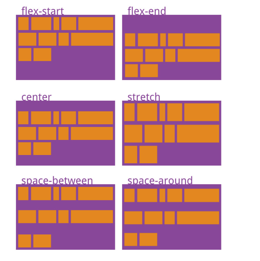
This attribute may take 6 values.
- Flex start: align with the start point of the cross axis.
- Flex end: align with the end of the cross axis.
- center: align with the midpoint of the cross axis.
- Space between: align with both ends of the cross axis, and the spacing between the axes is evenly distributed.
- Space around: the spacing on both sides of each axis is equal. Therefore, the spacing between the axes is twice as large as that between the axis and the frame.
- stretch (default): the axis occupies the entire cross axis.
8. Flexible flex
Flex attribute is short for flex grow, flex shrink and flex basis. The default value is 0 1 auto. The last two properties are optional.
.item { flex: none | [ <'flex-grow'> <'flex-shrink'>? || <'flex-basis'> ] }
This attribute has two quick values: auto (1 1 auto) and none (0 0 auto).
It is recommended to use this attribute first rather than write three separate attributes separately, because the browser will calculate the relevant values.
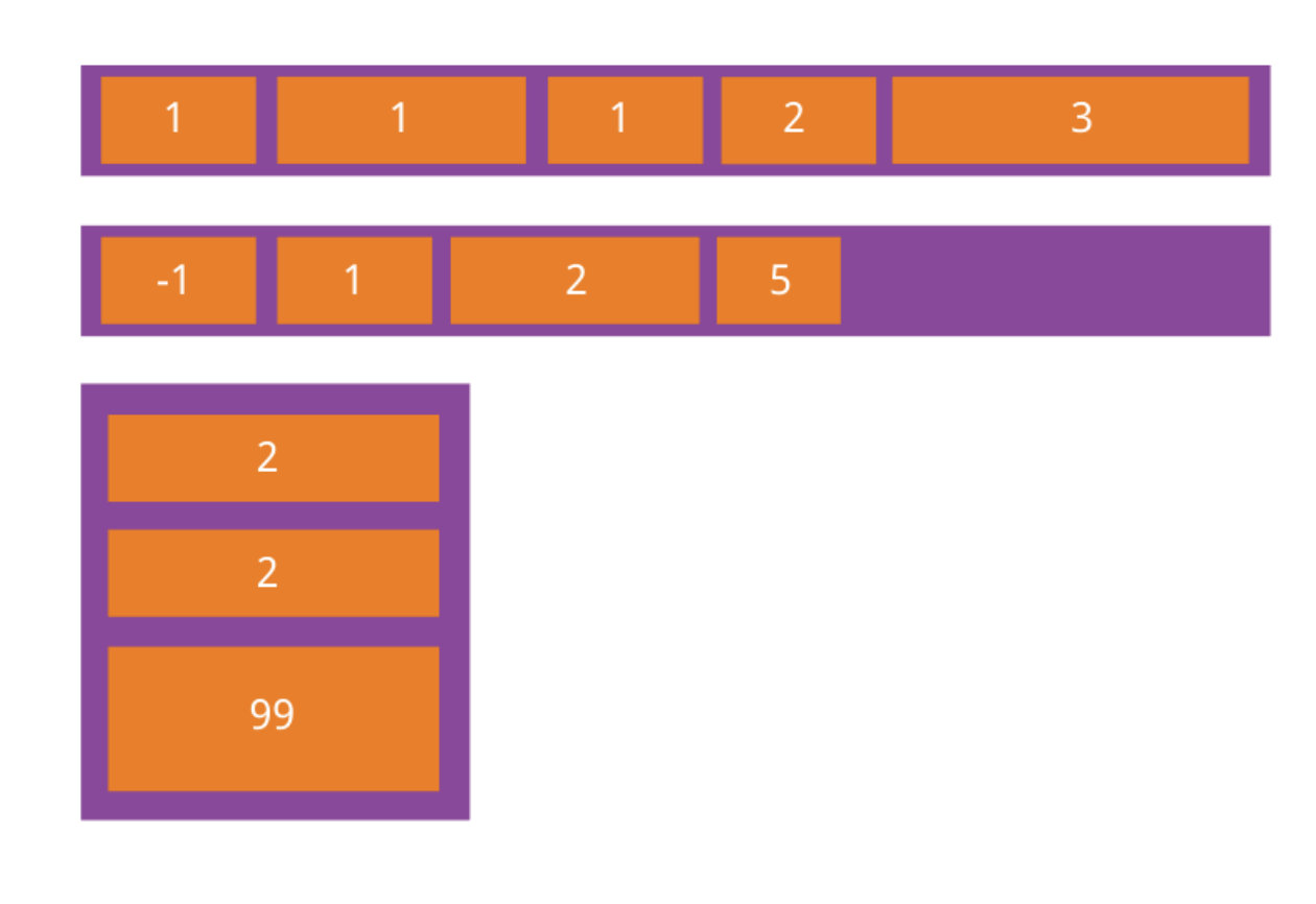
1. The flex growth property defines the magnification of the item. The default value is 0, that is, if there is any remaining space, it will not be enlarged.
.item { flex-grow: ; /* default 0 */ }
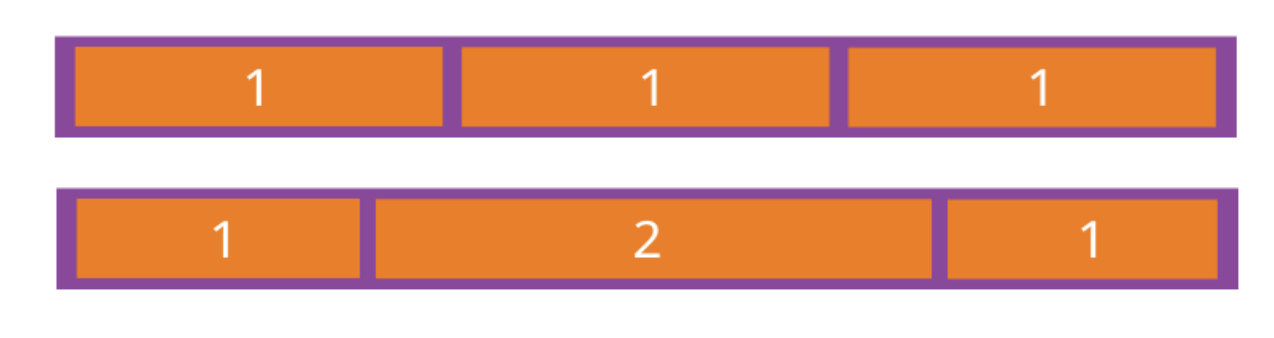
If all items have a flex growth attribute of 1, they will equally divide the remaining space, if any. If the flex growth attribute of one item is 2 and all other items are 1, the remaining space occupied by the former will be twice as much as that of other items.
2. The flex shrink attribute defines the reduction scale of the item, which is 1 by default, that is, if there is insufficient space, the item will be reduced.
.item { flex-shrink: <number>; /* default 1 */ }
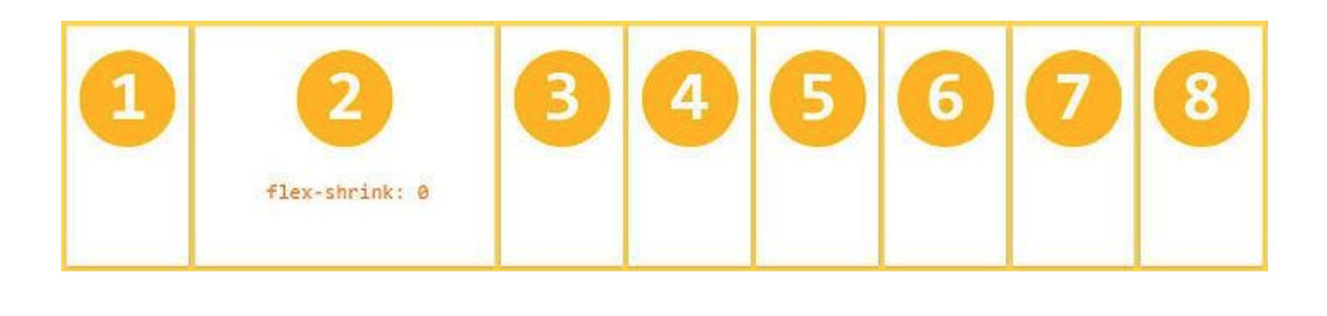
If the flex shrink attribute of all items is 1, they will be scaled down equally when there is insufficient space. If the flex shrink attribute of one item is 0 and all other items are 1, the former will not shrink when the space is insufficient. Negative values are not valid for this property.
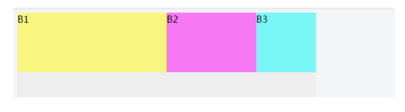
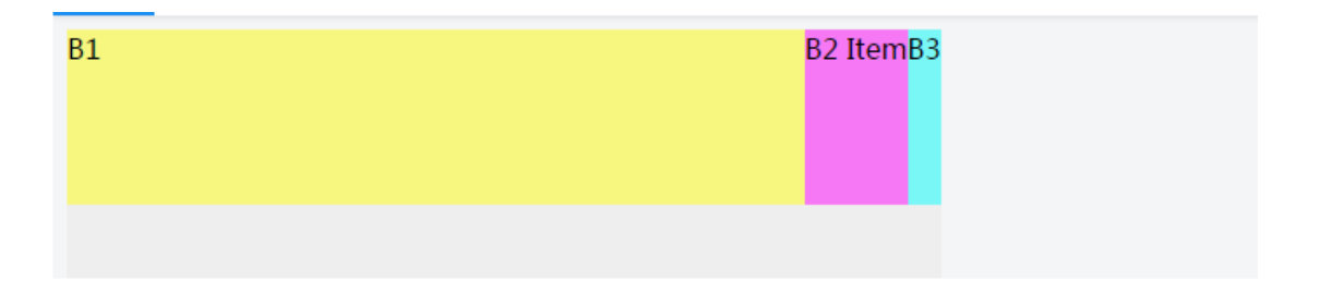
3. The flex basis attribute defines the main size occupied by the project before allocating excess space. browser
According to this attribute, calculate whether the spindle has excess space. Its default value is auto, which is the original size of the project.
.item { flex-basis: <length> | auto; /* default auto */ }
It can be set to the same value as the width or height attribute (such as 350px), and the project will occupy fixed space.
Flex base (default: Auto) was confused when I first saw the attribute flex base. I didn't know what it was used for. Later, research found that the function of this attribute value is a substitute for width. If the child container has flex base or width set, they will reserve so much space with the parent container before allocating space, and then the rest will be included in the remaining space, and then the parent container will allocate the remaining space to the container with flex growth set. If flex base and width are set at the same time, the width attribute will be overwritten, that is, flexbase has higher priority than width. It should be noted that if one of flex base and width is auto, the other non auto attribute will have higher priority.
Tips: Flex basis and width are auto values, and the final space is determined according to the amount of content. More content occupies more horizontal space.
9. Display order
The order property defines the order in which items are arranged. The smaller the value, the higher the arrangement. The default value is 0.
.item { order: ; }
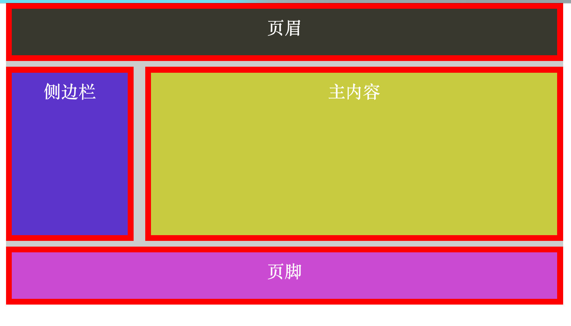
Layout code
<!DOCTYPE html>
<html lang="en">
<head>
    <meta charset="UTF-8">
    <meta http-equiv="X-UA-Compatible" content="IE=edge">
    <meta name="viewport" content="width=device-width, initial-scale=1.0">
    <title>box-sizing Saved the layout</title>
    <style>
        *{
            padding: 0;
            margin: 0;
        }
        .wrapper{
            width: 960px;
            margin-left: auto;
            margin-right: auto;
            color: #fff;
            font-size: 30px;
            text-align: center;
            background-color: #ccc;
        }
        #header{
            height: 100px;
            background-color: #38382e;
            margin-bottom: 10px;
            border: 10px solid red;
            padding: 10px;
            width: 100%;
            -moz-box-sizing: border-box;
            -webkit-box-sizing: border-box;
            -o-box-sizing: border-box;
            -ms-box-sizing: border-box;
            box-sizing: border-box;
        }
        .sidebar{
            float: left;
            width: 220px;
            margin-right: 20px;
            margin-bottom: 10px;
            height: 300px;
            background: #5d33cf;
            border: 10px solid red;
            padding: 10px;
            -moz-box-sizing: border-box;
            -webkit-box-sizing: border-box;
            -o-box-sizing: border-box;
            -ms-box-sizing: border-box;
            box-sizing: border-box;
        }
        .content{
            float: left;
            width: 720px;
            height: 300px;
            background: #c8ca30;
            margin-bottom: 10px;
            border: 10px solid red;
            padding: 10px;
            -moz-box-sizing: border-box;
            -webkit-box-sizing: border-box;
            -o-box-sizing: border-box;
            -ms-box-sizing: border-box;
            box-sizing: border-box;
        }
        #footer{
            background-color: #cc4ad5;
            height: 100px;
            text-align: center;
            clear: both;
            border: 10px solid red;
            padding: 10px;
            width: 100%;
            -moz-box-sizing: border-box;
            -webkit-box-sizing: border-box;
            -o-box-sizing: border-box;
            -ms-box-sizing: border-box;
            box-sizing: border-box;
        }
    </style>
</head>
<body>
    <div class="wrapper">
        <div id="header">header</div>
        <div class="sidebar">sidebar </div>
        <div class="content">Main content</div>
        <div id="footer">footer</div>
    </div>
</body>
</html>
<!DOCTYPE html>
<html lang="en">
<head>
    <meta charset="UTF-8">
    <meta http-equiv="X-UA-Compatible" content="IE=edge">
    <meta name="viewport" content="width=device-width, initial-scale=1.0">
    <title>Property to modify the layout order grail layout</title>
    <style>
        *{
            margin: 0;
            padding: 0;
            box-sizing: border-box;
        }
        html,body{
            height: 100%;
            color: #fff;
        }
        body{
            min-width: 100%;
            display: -webkit-flex;
            display: flex;
            -webkit-flex-flow:column wrap;
            flex-flow: column wrap;
            -webkit-justify-content: start;
            justify-content: start;
        }
        header,
        section,
        nav,
        aside,
        footer{
            display: block;
        }
        header{
            background-color: hsla(200,10%,70%,.5);
            min-height: 100px;
            padding: 10px 20px;
            width: 100%;
            -webkit-order:1;
            order:1;
        }
        section{
            min-width: 100%;
            margin: 20px 0;
            display: -webkit-flex;
            display: flex;
            -webkit-order:2;
            order:2;
            -webkit-flex:1;
            flex:1;
        }
        nav{
            background-color: hsla(120,50%,50%,.9);
            padding: 1%;
            width: 220px;
            -webkit-order:1;
            order:1;
        }
        article{
            background-color: hsla(120,50%,50%,.9);
            padding: 1%;
            margin-left: 2%;
            margin-right: 2%;
            -webkit-flex:1;
            flex:1;
            -webkit-order:2;
            order:2;
        }
        aside{
            background-color: hsla(20,80%,80%,.9);
            padding: 1%;
            width: 220px;
            -webkit-order:3;
            order:3;
        }
        footer{
            background-color: hsla(250,50%,80%,.9);
            min-height: 60px;
            padding: 1%;
            min-width: 100%;
            -webkit-order:3;
            order:3;
        }
    </style>
</head>
<body>
    <header>header</header>
    <section>
        <article>article</article>
        <nav>nav</nav>
        <aside>aside</aside>
    </section>
    <footer>footer</footer>
</body>
</html>