List is the most common form in App. ListView is provided in fluent to implement the list. This article will implement a list with pictures and texts through ListView.
Interface layout analysis
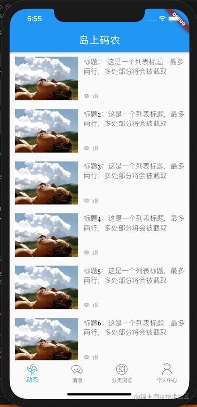
The list to be implemented in this chapter is shown in the figure above. After we get the interface design draft, the first thing we do in UI development is to consider the elements and layout of the interface. Taking the above interface as an example, the actual interface elements include list and list elements, and list elements are the key. List elements include a picture on the left, a title on the right and viewing times (with front icon). The layout of the elements of the list is shown in the following figure.
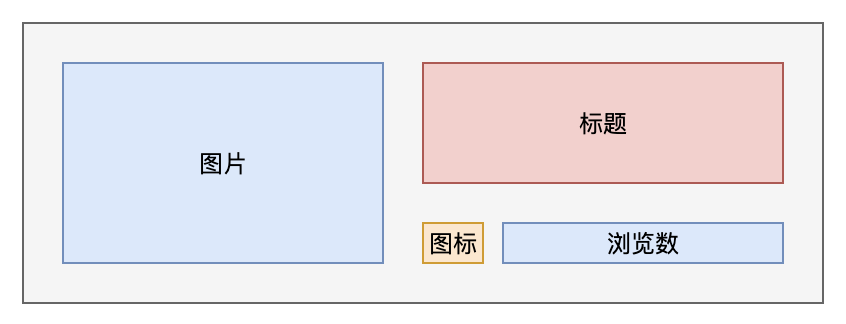
Vertically, the layout height of list elements is determined by the picture. The height of icons and views is fixed, and the remaining space is occupied by the title. Considering the beauty of the interface, the maximum number of lines of the title is 2, and the excess part is replaced by.
Horizontally, in order to maintain the fixed aspect ratio of the picture, the picture width is fixed. After the width is fixed, the remaining space (except the space left blank) is the space of the title.
Based on the above description, the general layout can be obtained:
- The whole list element is wrapped with a Container to set the outer margin around;
- Horizontally, the Row component is used to complete the horizontal layout.
- The right area uses the Column component to complete the vertical layout.
- The number of views icon and text on the right also need to use Row to complete the horizontal layout.
- In order to keep the space between the picture on the left and the area on the right, the right side is wrapped with a Container to control the space.
Introduction to ListView
ListView is used to generate lists. Usually, the builder static method is used to build a list. The key parameters are:
- itemCount: the number of list elements.
- itemBuilder: list element construction function, which returns the corresponding list element component by specifying the subscript of the element.
If you want to use the list of separated components, you can also use the ListView.seperate method to build the list. This method adds a seperateBuilder parameter to return the corresponding separated components between list elements.
Therefore, the key of the list is the implementation of the list element component.
Coding implementation
We still implement the list in dynamic.dart based on the previous project. Add two files in the source code directory, dynamic_item.dart is used to build list elements, dynamic_mock_data. Dart is used to simulate background interface data. Where dynamic_ mock_ The data of data is relatively simple. A list static method is used to return paging data, as shown below:
class DynamicMockData {
  static List<Map<String, Object>> list(int page, int size) {
    return List<Map<String, Object>>.generate(size, (index) {
      return {
        'title': 'title ${index + (page - 1) * size + 1}: This is a list title, up to two lines, and multiple parts will be intercepted',
        'imageUrl':
            'https://ss3.bdstatic.com/70cFv8Sh_Q1YnxGkpoWK1HF6hhy/it/u=3331308357,177638268&fm=26&gp=0.jpg',
        'viewCount': 180,
      };
    });
  }
}
page and size are used to simulate paging to facilitate subsequent pull-up and pull-down refresh. Note that the generate method of List is used to build an array. This method is used to build an array of a specified size. You can build an array element with index subscript through the callback function with index input.
dynamic_ The implementation code of item.dart is as follows:
import 'package:flutter/material.dart';

class DynamicItem extends StatelessWidget {
  final String title;
  final String imageUrl;
  final int viewCount;
  static const double ITEM_HEIGHT = 100;
  static const double TITLE_HEIGHT = 80;
  static const double MARGIN_SIZE = 10;
  const DynamicItem(this.title, this.imageUrl, this.viewCount, {Key key})
      : super(key: key);

  @override
  Widget build(BuildContext context) {
    return Container(
      margin: EdgeInsets.all(MARGIN_SIZE),
      child: Row(
        crossAxisAlignment: CrossAxisAlignment.start,
        children: [
          _imageWrapper(this.imageUrl),
          Expanded(
            child: Column(
              crossAxisAlignment: CrossAxisAlignment.start,
              children: [
                _titleWrapper(context, this.title),
                _viewCountWrapper(this.viewCount.toString()),
              ],
            ),
          )
        ],
      ),
    );
  }

  Widget _titleWrapper(BuildContext context, String text) {
    return Container(
      height: TITLE_HEIGHT,
      margin: EdgeInsets.fromLTRB(MARGIN_SIZE, 0, 0, 0),
      child: Text(
        this.title,
        maxLines: 2,
        overflow: TextOverflow.ellipsis,
        style: Theme.of(context).textTheme.headline6,
      ),
    );
  }

  Widget _viewCountWrapper(String text) {
    return Container(
      margin: EdgeInsets.fromLTRB(MARGIN_SIZE, 0, 0, 0),
      height: ITEM_HEIGHT - TITLE_HEIGHT,
      child: Row(children: [
        Icon(
          Icons.remove_red_eye_outlined,
          size: 14.0,
          color: Colors.grey,
        ),
        SizedBox(width: 5),
        Text(
          this.viewCount.toString(),
          style: TextStyle(color: Colors.grey, fontSize: 14.0),
        ),
      ]),
    );
  }

  Widget _imageWrapper(String imageUrl) {
    return SizedBox(
      width: 150,
      height: ITEM_HEIGHT,
      child: Image.network(imageUrl),
    );
  }
}
First, the member properties of title, imageUrl and viewCount are defined. Using the final constraint is convenient for other external classes to access directly, but cannot be modified. If these properties themselves are not externally accessible, they can also be defined as private members.
The second is to use the constructor to initialize the member attributes directly. This is a short method of Dart language. As long as the order of parameters is consistent, there is no need for the function body to initialize the members automatically. It is usually used in the member attributes modified by final.
The whole interface is built in the build method. Note that the right area of the Expanded package is used here. The Expanded component indicates that in the horizontal layout, the component will automatically occupy the remaining space. If there is no such package, it will cause an alarm when the content on the right side is too wide.
Images, titles and views are obtained through separate component building methods. On the one hand, this is to reduce the UI nesting level. On the other hand, if there are the same components in the future, you can separate the separate component building methods to improve reusability. Several key settings are explained below:
- crossAxisAlignment: CrossAxisAlignment.start: the element used to mark the Row layout component of Row is aligned from the starting position in the column direction (i.e. vertically on the right and along the top of the picture).
- margin of Container: used to set the distance up, down, left and right. If the distance in four directions is consistent, you can use EdgeInsets.all method to set it. If it is inconsistent, it is necessary to set the spacing in four directions separately for EdgeInsets.fromLTRB.
- A SizedBox component is used in the browsing array. This component has nothing in itself, just to open a certain distance between icons and browsing numbers and improve aesthetics.
Components used
In addition to ListView, the components involved in this article are as follows:
- Text: text component, equivalent to label. In addition to the text content, you can use style to set the text style. Here, the maxLines constraint is used for the title, the maximum title is 2 lines, overflow is used, and the post-processing method of text overflow is set.
- Image: image component. Here, Image.network is used to load images from the network. This Image.network is a very primary usage, and cached will be used later_ image_ Network plug-in replacement.
- Icon: icon component. Many font icons are built in the fluent, which can be satisfied for most scenes. Icons can use the icon name defined by the icons class to find the desired icon.
- Row: row layout component. Its child components are arranged in the same row from left to right in order.
- Column: column layout component. Its child components are arranged in the same column from top to bottom.
The above components are basic applications in this example. For more settings, you can view the source code in the IDE or read the official documents. The source code has been uploaded to: Column source code.
Conclusion: This article describes how to use ListView to complete the construction of list, focusing on how to layout list elements, specific layout components and implementation methods. The key work of interface implementation is actually the splitting of layout sub elements. There are many ways to implement the rest, depending on your preferences. However, attention should be paid to avoid excessive nesting, resulting in reduced code readability and improved reusability of UI components.