5. AnimatedList
AnimatedList has the same function as ListView. As its name implies, it will perform some animation when inserting or deleting nodes in the list
It is a StatefulWidget, and the corresponding State is AnimatedListState. The methods of adding and deleting elements are as follows:
void insetItem(int index, { Duration duration = mDuration });
void removeItem(int index, AnimatedListRemovedItemBuilder builder, { Duration duration = mDuration });
5.1 example code
class _AnimatedListRouteState extends State<AnimatedListRoute> {
  var data = <String>[];
  int counter = 5;

  final globalKey = GlobalKey<AnimatedListState>();

  @override
  void initState() {
    for (var i = 0; i < counter; i++) {
      data.add("${i + 1}");
    }
    super.initState();
  }

  @override
  Widget build(BuildContext context) {
    return Scaffold(
      body: Stack(
        children: [
          AnimatedList(
              key: globalKey,
              initialItemCount: data.length,
              itemBuilder: (BuildContext context, int index,
                  Animation<double> animation) {
                // The fade animation is performed when you add a list item
                return FadeTransition(
                    opacity: animation, child: buildItem(context, index));
              }),
          // Create an add button
          buildAddBtn(),
        ],
      ),
    );
  }

  Widget buildAddBtn() {
    return Positioned(
      child: FloatingActionButton(
        child: const Icon(Icons.add),
        onPressed: () {
          // Add a list item
          data.add("${++counter}");
          // Tell the list item that there are added list items
          globalKey.currentState!.insertItem(data.length - 1);
        },
      ),
      bottom: 30,
      left: 0,
      right: 0,
    );
  }

  // Build list item
  Widget buildItem(context, index) {
    String char = data[index];
    return ListTile(
      key: ValueKey(char),
      title: Text(char),
      trailing: IconButton(
          icon: const Icon(Icons.delete),
          // Delete when clicked
          onPressed: () => onDelete(context, index)),
    );
  }

  void onDelete(context, index) {
    setState(() {
      globalKey.currentState!.removeItem(index, (context, animation) {
        // The deletion process performs a reverse animation, animation Value will change from 1 to 0
        var item = buildItem(context, index);
        data.removeAt(index);
        return FadeTransition(
          opacity: CurvedAnimation(
            parent: animation,
            curve: const Interval(0.5, 1.0),
          ),
          // Keep reducing the height of list items
          child: SizeTransition(
            sizeFactor: animation,
            axisAlignment: 0.0,
            child: item,
          ),
        );
      }, duration: const Duration(milliseconds: 200));
    });
  }
}
6. GridView
GridView is used to build the grid list. The constructor is as follows:
class GridView extends BoxScrollView {
  GridView({
    Key? key,
    Axis scrollDirection = Axis.vertical,
    bool reverse = false,
    ScrollController? controller,
    bool? primary,
    ScrollPhysics? physics,
    bool shrinkWrap = false,
    EdgeInsetsGeometry? padding,
    required this.gridDelegate,
    bool addAutomaticKeepAlives = true,
    bool addRepaintBoundaries = true,
    bool addSemanticIndexes = true,
    double? cacheExtent,
    List<Widget> children = const <Widget>[],
    ...
  }
GridView also contains the common parameters of most listviews. The more important is the gridDelegate attribute, which accepts a slicergriddelegate to control how the GridView subcomponents are arranged
- SliverGridDelegate
Is an abstract class that defines GridView Layout related interfaces, and subclasses implement it to implement layout algorithms. Flutter has provided two implementation classes: SliverGridDelegateWithFixedCrossAxisCount and slivergriddelegatewithmaxcrossaxisextend
These two should be used more. Let's use and introduce them:
6.1 SliverGridDelegateWithFixedCrossAxisCount
The horizontal axis is a layout algorithm with a fixed number of child elements, and the constructor is:
SliverGridDelegateWithFixedCrossAxisCount({
    required this.crossAxisCount,
    this.mainAxisSpacing = 0.0,
    this.crossAxisSpacing = 0.0,
    this.childAspectRatio = 1.0,
    this.mainAxisExtent,
  }
- crossAxisCount
The number of child elements of the horizontal axis. After this attribute is determined, the length of the child elements on the horizontal axis is determined, that is, the length of the horizontal axis of the ViewPort / crossAxisCount - mainAxisSpacing
Spacing in spindle direction - crossAxisSpacing
Spacing of child elements in the horizontal axis direction - childAspecRatio
The ratio between the horizontal axis length and the spindle length of the child element. After the crossAxisCount is specified, the horizontal axis length of the child element is determined, and then the length of the child element in the spindle can be determined through this parameter value - mainAxisExtent
The specific length of each child element on the spindle
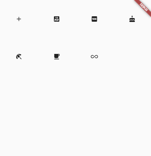
Here is an example:
 GridView(
      gridDelegate: const SliverGridDelegateWithFixedCrossAxisCount(
          // Horizontal axis three child widgets
          crossAxisCount: 4,
          // The aspect ratio is 1:1
          childAspectRatio: 1.0),
      children: const [
        Icon(Icons.add),
        Icon(Icons.eleven_mp),
        Icon(Icons.ten_k),
        Icon(Icons.cake),
        Icon(Icons.beach_access),
        Icon(Icons.free_breakfast),
        Icon(Icons.all_inclusive),
      ],
    ))
6.2 GridView.count
GridView. The count constructor uses the slicergriddelegatewithfixedcrossaxiscount internally. Through it, we can quickly create a GridView with a fixed number of sub elements on the horizontal axis. The above example code is actually equivalent to:
GridView.count(
      crossAxisCount: 4,
      childAspectRatio: 1.0,
      children: const [
        Icon(Icons.add),
        Icon(Icons.eleven_mp),
        Icon(Icons.ten_k),
        Icon(Icons.cake),
        Icon(Icons.beach_access),
        Icon(Icons.free_breakfast),
        Icon(Icons.all_inclusive),
      ],
    )
6.3 SliverGridDelegateWithMaxCrossAxisExtent
The layout algorithm with fixed maximum length of horizontal axis sub elements is realized, and the constructor is:
  const SliverGridDelegateWithMaxCrossAxisExtent({
    required this.maxCrossAxisExtent,
    this.mainAxisSpacing = 0.0,
    this.crossAxisSpacing = 0.0,
    this.childAspectRatio = 1.0,
    this.mainAxisExtent,
  }
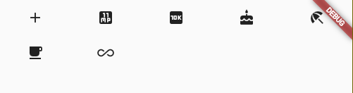
Properties are as like as two peas before, and maxCrossAxisExtent is the maximum length of child elements on the horizontal axis. If the ViewPort's horizontal axis length is 450, then when the value of maxCrossAxisExtent is in interval [450/4, 450/3], the final actual length of the subelement is 112.5, while childAspectRatio is the ratio of the transverse axis of the daughter element to the spindle length.
Here is an example:
 GridView(
        padding: EdgeInsets.zero,
        gridDelegate: const SliverGridDelegateWithMaxCrossAxisExtent(
            maxCrossAxisExtent: 120.0, childAspectRatio: 2.0 // The aspect ratio is 2
            ),
        children: const [
          Icon(Icons.add),
          Icon(Icons.eleven_mp),
          Icon(Icons.ten_k),
          Icon(Icons.cake),
          Icon(Icons.beach_access),
          Icon(Icons.free_breakfast),
          Icon(Icons.all_inclusive),
        ],
      ),
6.4 GridView.extent
The above code is equivalent to:
GridView.extent(
        padding: EdgeInsets.zero,
        maxCrossAxisExtent: 120.0, childAspectRatio: 2.0,
        // The aspect ratio is 2
        children: const [
          Icon(Icons.add),
          Icon(Icons.eleven_mp),
          Icon(Icons.ten_k),
          Icon(Icons.cake),
          Icon(Icons.beach_access),
          Icon(Icons.free_breakfast),
          Icon(Icons.all_inclusive),
        ],
      ),
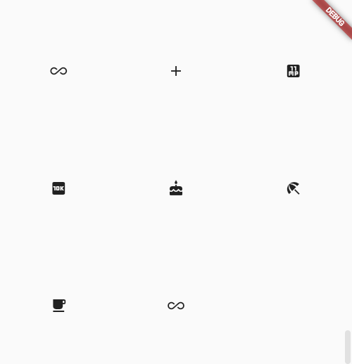
6.5 GridView.builder
As described above, GridView requires a Widget array as its child elements. These methods will build all child widgets in advance, so it is only applicable to the case where the number of child widgets is relatively small. When more widgets are used, GridView is used as ListView Builder to build a child Widget, GridView The builder must specify two parameters:
GridView.builder(
 ...
 required SliverGridDelegate gridDelegate,
 required IndexedWidgetBuilder itemBuilder,
)
6.5. 1 example
class _GridViewRouteRouteState extends State<GridViewRoute> {
  // icon data source
  List<IconData> _icons = [];

  @override
  void initState() {
    super.initState();
    // Initialization data
    _retrieveIcons();
  }

   // Simulate asynchronous loading of data
  void _retrieveIcons() {
    Future.delayed(const Duration(milliseconds: 200)).then((value) {
      setState(() {
        _icons.addAll([
          Icons.add,
          Icons.eleven_mp,
          Icons.ten_k,
          Icons.cake,
          Icons.beach_access,
          Icons.free_breakfast,
          Icons.all_inclusive
        ]);
      });
    });
  }

  @override
  Widget build(BuildContext context) {
    return Scaffold(
      body: GridView.builder(
          gridDelegate: const SliverGridDelegateWithFixedCrossAxisCount(
              // 4 columns per row
              crossAxisCount: 3,
              childAspectRatio: 1.0),
          itemCount: _icons.length,
          itemBuilder: (context, index) {
            if (index == _icons.length -1 && _icons.length < 200) {
              _retrieveIcons();
            }
            return Icon(_icons[index]);
          }),
    );
  }
}
7. PageView and page cache
7.1 PageView
In Android, if you need to switch pages, you can use PageView. Fluent also has a Widget with the same name and function. Here is its constructor:
  PageView({
    Key? key,
    this.scrollDirection = Axis.horizontal,
    this.reverse = false,
    PageController? controller,
    this.physics,
    this.pageSnapping = true,
    this.onPageChanged,
    List<Widget> children = const <Widget>[],
    this.dragStartBehavior = DragStartBehavior.start,
    this.allowImplicitScrolling = false,
    this.restorationId,
    this.clipBehavior = Clip.hardEdge,
    this.scrollBehavior,
    this.padEnds = true,
  }
- pageSnapping
Whether to forcibly switch the whole screen every time you slide. If false, the page will be displayed according to the actual sliding distance - this.allowImplicitScrolling
It is mainly used with auxiliary functions - padEnds
It will be explained below
Let's look at an example of Tab switching. Each Tab displays only one number, and then there are 6 tabs in total:
class _PageViewRouteState extends State<PageViewRoute> {
  @override
  Widget build(BuildContext context) {
    var children = <Widget>[];
    // Set six tabs
    for (int i = 0; i < 6; i++) {
      children.add(Page(
        text: "$i",
      ));
    }
    return Scaffold(body: PageView(children: children));
  }
}

class Page extends StatefulWidget {
  const Page({Key? key, required this.text}) : super(key: key);

  final String text;

  @override
  State<StatefulWidget> createState() => _PageState();
}

class _PageState extends State<Page> {
  @override
  Widget build(BuildContext context) {
    print("build ${widget.text}");
    return Center(
        child: Text(
      widget.text,
      textScaleFactor: 5,
    ));
  }
}
Next, you can slide the Tab normally, and the implementation is relatively simple
7.2 page caching
In the above example, each Page switch can trigger the build of a new Page, which shows that PageView has no caching function by default. Once a Page is drawn, the Page will be destroyed.
This is because PageView does not transmit cacheExtent to the Viewport, so the default cacheExtent of the Viewport is 1, but the pre rendering area is set when allowuplicitscrolling is true. At this time, the cache type will be set to cacheextensstyle For Viewport, cacheExtent means that the length of the cache is the width of several viewports, and cacheExtent is 1.0, which means that one page is cached before and after.
That is, when allowimplicitscolling of PageView is set to true, the pages of the first and second pages will be cached
The root of the problem seems to be that setting cacheextend in PageView will conflict with the auxiliary functions of iOS. There is no better solution. Flutter takes this problem with him. However, there is basically no need to consider using auxiliary functions in China, so the solution is to copy a copy of the source code of PageView, and then pass through cacheextend.
Of course, fluent also provides a more general solution, that is, the solution of caching sub items
8. Scrollable component subitem cache KeepAlive
There is an addAutomaticKeepAlives property in the ListView constructor, which is not introduced. If it is true, the ListView will add an AutomaticKeepAlive parent component for each child. Although the default constructor of PageView and PageView The build constructor does not have this parameter, but they will eventually generate a SliverChildDelegate. This component will add a parent component of AutomaticKeepAlive for each list sub item when it is built. The following describes this parent component.
8.1 AutomaticKeepAlive
The main function of the AutomaticKeepAlive component is to automatically mark the keepAlive of the root RenderObject of the list item as true or false on demand.
It is the root Widget of the list item. Here, Viewport+cacheExtent is called the loading area.
- When keepAlive is false, if the list item slides out of the loading area, the list component will be destroyed
- When keepAlive is true, when the list item slides out of the loading area, the Viewport will cache the list item components. When the list item enters the loading area, the Viewport will first find out whether it has been cached from the cache. If there is direct reuse, if there is no re creation of the list item
The setting of the automatic keepalive flag is actually controlled by our developers.
Therefore, in order to enable PageView to realize multi page caching, our idea is to make PageView say that AutomaticKeepAlive is set to true. The method of FLUENT is to mix a list item component with an AutomaticKeepAliveClientMixin, and then implement wantKeepAlive(). The code is as follows:
class _PageState extends State<Page> with AutomaticKeepAliveClientMixin {
  @override
  Widget build(BuildContext context) {
    super.build(context);
    ...
  }

  @override
  bool get wantKeepAlive => true; // Cache required
}
After implementing wantKeepAlive, we must also call super. in the build method. Build (context), which will notify the information of keepAlive.
Note that if we use pageview If the list item is not wrapped with the AutomaticKeepAlive parent component when the page is built by cutom, the above scheme cannot work normally.
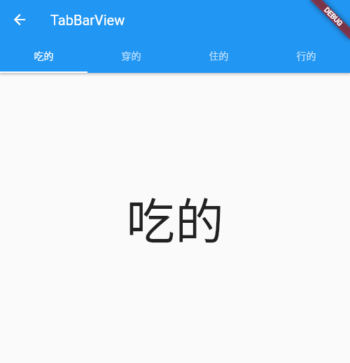
9. TabBarView
TabBarView is a Tab component provided by martial, which is usually used with TabBar
9.1 TabBarView
TabBarView encapsulates PageView. The constructor is as follows:
  const TabBarView({
    Key? key,
    required this.children, // Tab page
    this.controller, // TabController
    this.physics,
    this.dragStartBehavior = DragStartBehavior.start,
  })
The TabController here is used to monitor and control the page switching of TabBarView. It is usually linked with TabBar. If it is not specified, it will find the latest DefaultTabController in the component tree by default
9.2 TabBar
Many properties of TabBar are used to configure indicators and label s. Let's take a look at its constructor:
  const TabBar({
    Key? key,
    // We need to create a specific Tab array
    required this.tabs,
    // TabController, used for linkage with TabBarView
    this.controller,
    // Can I slide
    this.isScrollable = false,
    this.padding,
    // Indicator color
    this.indicatorColor,
    this.automaticIndicatorColorAdjustment = true,
    // Indicator height, default to 2
    this.indicatorWeight = 2.0,
    this.indicatorPadding = EdgeInsets.zero,
    // Indicator Decoration
    this.indicator,
    // Indicator length: two optional values: Tab length and label length
    this.indicatorSize,
    this.labelColor,
    this.labelStyle,
    this.labelPadding,
    ...
  })
TabBar and TabBarView are linked by TabController. It should be noted that the number of children of TabBar and TabBarView should be the same.
Tab is the child of TabBar and can be any Widget, but Material has implemented the default tab component for us to use:
const Tab({
  Key? key,
  this.text, //text
  this.icon, // Icon
  this.iconMargin = const EdgeInsets.only(bottom: 10.0),
  this.height,
  this.child, // Custom widget
})
Where text and child are mutually exclusive
9.3 example
The code is as follows:
class _TabBarViewRouteState extends State<TabBarViewRoute>
    with SingleTickerProviderStateMixin {
  final ScrollController _controller = ScrollController();

  late TabController _tabController;
  List tabs = ["Eat", "Wear", "Resident", "OK"];

  @override
  void initState() {
    super.initState();
    _tabController = TabController(length: tabs.length, vsync: this);
  }

  @override
  Widget build(BuildContext context) {
    return Scaffold(
        appBar: AppBar(
            title: const Text("TabBarView"),
            bottom: TabBar(
              controller: _tabController,
              tabs: tabs.map((e) => Tab(text: e)).toList(),
            )),
        body: TabBarView(
          controller: _tabController,
          children: tabs.map((e) {
            return Container(
              alignment: Alignment.center,
              child: Text(e, textScaleFactor: 5),
            );
          }).toList(),
        ));
  }

  @override
  void dispose() {
    // Release resources
    _tabController.dispose();
    super.dispose();
  }
}
Because the TabController needs a TickerProvider (vsync parameter), we mixed SingleTickerProviderStateMixin. Because the TabController will execute animation and hold some resources, we need to release resources (dispose) when the page is destroyed
To sum up, we find that the process of creating TabController is still complex. In practice, if TabBar and TabBarView need to be linked, a DefaultTabController is usually created as their common parent component, so that they will look up from the component during execution and use the Controller we specify. The code is as follows:
    return DefaultTabController(
        length: tabs.length,
        child: Scaffold(
            appBar: AppBar(
                title: const Text("TabBarView"),
                bottom: TabBar(
                  controller: _tabController,
                  tabs: tabs.map((e) => Tab(text: e)).toList(),
                )),
            body: TabBarView(
              controller: _tabController,
              children: tabs.map((e) {
                return Container(
                  alignment: Alignment.center,
                  child: Text(e, textScaleFactor: 5),
                );
              }).toList(),
            )));
  }
In this way, we don't need to manually manage the life cycle of the Controller (without manual release), and we don't need to mix SingleTickerProviderStateMixin.
10. CustomScrollView and Slivers
10.1 CustomScrollView
The ListView, PageView and GridView learned earlier are complete Scrollable components because they all contain three elements: Scrollable, Viewport and slicer.
If we want to include multiple scrollable components in a page at the same time and make their effects unified, for example, we want to combine two listviews scrolling along the vertical direction into a ListView. When the first ListView slides to the bottom, we can connect the second ListView. First try the following code:
class _CustomViewRouteState extends State<CustomViewRoute> {
  @override
  Widget build(BuildContext context) {
    return Scaffold(body: buildTwoListView());
  }

  Widget buildTwoListView() {
    var listView = ListView.builder(
        itemBuilder: (_, index) => ListTile(title: Text("$index")),
        itemCount: 20);

    return Column(
      children: [
        Expanded(child: listView,),
        const Divider(color: Colors.grey),
        Expanded(child: listView)
      ],
    );
  }
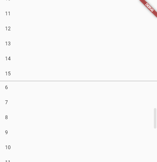
There are two listviews in the page, each accounting for half. Although they can be displayed and slid, each ListView will only respond to the sliding in its own visual area, which can not achieve the desired effect. The reason for this is that both listviews have their own independent Scrollable, Viewport and slicer.
Therefore, we need to create common Scrollable and Viewport objects for them, and then add the Sliver corresponding to the two listviews to the common Viewport object to achieve the desired effect. However, the implementation is undoubtedly very complex, so fluent provides a CustomScrollView to help create public Scrollable and Viewport, and then accepts a Sliver array. The code is as follows:
  Widget buildTwoListView() {
    var listView = SliverFixedExtentList(
        itemExtent: 50,
        delegate: SliverChildBuilderDelegate(
            (_, index) => ListTile(title: Text("$index")),
            childCount: 15));

    return CustomScrollView(
      slivers: [listView, listView],
    );
  }
Sliverfixedextentlist is a Sliver, which can generate list items with the same height. If the list items have the same height, sliverfixedextentlist or sliverprototypeextenslist should be used first. If they are different, SliverList should be used again
That's what we want.
10.2 Sliver commonly used in flutter
As described earlier, SLiverFixedExtentList is a highly fixed list. In addition, there are other slivers, as shown in the following figure:
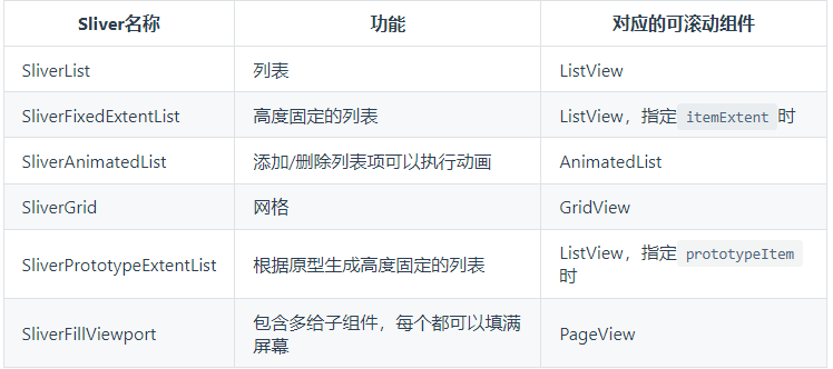
The above are slivers corresponding to the list, and some are components for layout and decoration of slivers, such as:
There will be many components in the Sliver series. Here, you only need to remember its characteristics.
10.2. 1 example
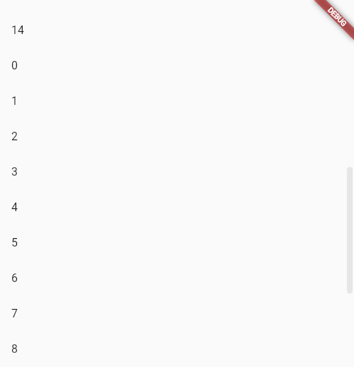
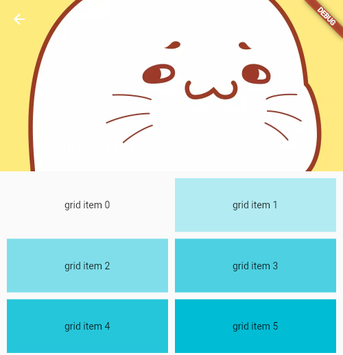
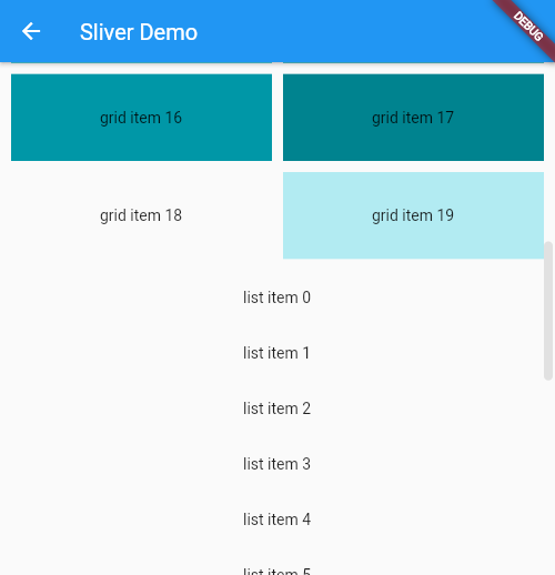
Here is the official Demo:
  @override
  Widget build(BuildContext context) {
    return Material(
        child: CustomScrollView(
      slivers: [
        // App Bar is a navigation bar
        SliverAppBar(
          // It will be fixed when sliding to the top
          pinned: true,
          expandedHeight: 250.0,
          flexibleSpace: FlexibleSpaceBar(
            title: const Text("Sliver Demo"),
            background: Image.asset("images/bobo.jpg", fit: BoxFit.cover),
          ),
        ),
        SliverPadding(
          padding: const EdgeInsets.all(10.0),
          sliver: SliverGrid(
            gridDelegate: const SliverGridDelegateWithFixedCrossAxisCount(
                // Two column display
                crossAxisCount: 2,
                mainAxisSpacing: 10.0,
                crossAxisSpacing: 10.0,
                childAspectRatio: 3.0),
            delegate: SliverChildBuilderDelegate((context, index) {
              return Container(
                alignment: Alignment.center,
                // Gradual change
                color: Colors.cyan[100 * (index % 9)],
                child: Text("grid item $index"),
              );
            }, childCount: 20),
          ),
        ),
        SliverFixedExtentList(
            delegate: SliverChildBuilderDelegate((context, index) {
              return Container(
                alignment: Alignment.center,
                color: Colors.lightBlue[100 * index % 9],
                child: Text("list item $index"),
              );
            }, childCount: 20),
            itemExtent: 50.0),
      ],
    ));
  }
The effect is:
10.2.2 SliverToBoxAdapter
A: list item must have adapter!
In the actual layout, we usually add custom components to the CustomScrollView, but often these components do not have the Sliver version. For this reason, Flutter provides an adapter component: SliverToBoxAdapter, which can adapt the RenderBox to the Sliver. For example, we want to add a PageView that can slide horizontally at the top of the list, You can use the slicertoboxadapter:
CustomScrollView(
        slivers: [
          SliverToBoxAdapter(
            child: SizedBox(
              height: 300.0,
              child: PageView(
                children: const [Text("1"), Text("2")],
              ),
            ),
          ),
          buildSliverFixedList(),
        ],
      ),
PageView has no Sliver version, so it uses the adapter added in the above code.
Note, however, that if you replace the PageView with a ListView of the sliding direction and the parent component CustomScrollView, it will not work properly. The reason is: CustomScrollView provides a shared Scrollable for all child slivers, and then uniformly processes the sliding events in the specified sliding direction. If other Scrollable are introduced into the Sliver, the sliding event conflict will occur. The final effect is that sliding in the ListView will only work on the ListView. The gestures in the fluent conflict. By default, the child elements take effect.
If the CustomScrollView introduces a sub component with the same sliding direction, it will not work normally. To solve this problem, you can replace it with NestedScrollView
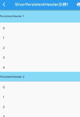
10.2.3 SliverPersistentHeader
The function of SliverPersistentHeader is to fix the component on the top when sliding to the top of CustomScrollView
However, I have learned about slivereappbar before. In fact, Flutter designed this component to implement slivereappbar, so their properties and callbacks will be used in slivereappbar.
Let's look at its definition:
  const SliverPersistentHeader({
    Key? key,
    required this.delegate,
    this.pinned = false,
    this.floating = false,
  })
- delegate
Delegate used to construct header component - floating
When pinned is false, the header can slide out of the Viewport. When the user slides down again, no matter how far the header has been slid out, it will immediately appear on the top of the visual area and be fixed. The header will not return to its original position until it continues to slide to the original position of the header in the list
You can see the official website to get the delegate Construction: Encapsulation and implementation of the official website SliverPersistentHeaderDelegate Achieve the following effects: