
1. Preface
As one of the most popular technologies at present, with its excellent performance and the advantage of smoothing multi-terminal differences, fluent has already attracted the attention of a large number of technology lovers, and even some large companies such as Xianyu, meituan and Tencent have been put into production. Although its ecology is not yet fully mature, its development speed is amazing enough with the blessing of Google. It can be predicted that the demand for Flutter developers will increase in the future.
It's been 9102 years, whether for the current technology or the future trend. As a front-end developer, there seems to be no reason not to try it. It is with this mentality that the author also began to learn Flutter and built a platform for practice Warehouse , all subsequent codes will be hosted on it. Welcome to star and learn together. This is my Flutter series:
- Building a beautiful UI interface with fluent - basic components
- Fluent rolling container components - ListView
- Fluent grid layout - GridView
- Using custom Icon in fluent
In the last article article In, we learned some of the most frequently used basic components in fluent. However, in some scenarios, when the width or height of the component exceeds the edge of the screen, the fluent will often give an overflow warning to remind that a component overflows the screen. In order to solve this problem, today we will learn one of the most commonly used rolling container components - ListView component.
2. ListView usage
From the perspective of function comparison, the ListView component in fluent is very similar to the ScrollView/FlatList in RN, but there are still some differences in the use methods. Next, follow me to see what common usage methods ListView components have.
2.1 ListView()
The first method is to directly call its default constructor to create a list, which is equivalent to the ScrollView component in RN. However, there is a problem with lists created in this way: for those long lists or subcomponents that require expensive rendering overhead, even if they do not appear on the screen, they will still be created by ListView, which will be a large overhead. Improper use may cause performance problems or even jamming.
However, although this method may have performance problems, it still depends on its different application scenarios. Let's take a look at its constructor (the uncommon attributes have been omitted):
ListView({
  Axis scrollDirection = Axis.vertical,
  ScrollController controller,
  ScrollPhysics physics,
  bool shrinkWrap = false,
  EdgeInsetsGeometry padding,
  this.itemExtent,
  double cacheExtent,
  List<Widget> children = const <Widget>[],
})- scrollDirection: the scrolling direction of the list. The optional values are horizontal and vertical of Axis. You can see that the default is to scroll in the vertical direction;
- Controller: controller, which is related to list scrolling, such as listening to list scrolling events;
- Physics: the physical effect of scrolling the list to the edge and continuing to drag. The effect of Android is different from that of iOS. Android will show a ripple (corresponding to clapingscrollphysics), while iOS has a rebound elastic effect (corresponding to bouncing crollphysics). If you want to present their own effects on different platforms, you can use alwayscrolllablescroll physics, which will automatically select their own physical effects according to different platforms. If you want to disable the drag effect on the edge, you can use NeverScrollableScrollPhysics;
- shrinkWrap: this attribute determines whether the length of the list wraps only the length of its contents. When the ListView is embedded in an infinite container component, the shrinkWrap must be true, otherwise the fluent will give a warning;
- padding: margin in the list;
- Itemextend: length of child element. This value can be specified when the length of each item in the list is fixed, which helps to improve the performance of the list (because it can help ListView calculate the position of each element before actually rendering the child elements);
- cacheExtent: the length of the pre rendered area. ListView will leave an area with the length of cacheExtent on both sides of its visual area as the pre rendered area (for the list created by ListView.build or ListView.separated constructor, the child elements not in the visual area and pre rendered area will not be created or destroyed);
- children: an array of components containing child elements.
There are a lot of properties described above, which are not as realistic as a practical example. We can use a ListView component to wrap the implementation in the previous article bank card,Pet card,Wechat Moments These three examples:
Code( File address)
class NormalList extends StatelessWidget {

  const NormalList({Key key}) : super(key: key);

  @override
  Widget build(BuildContext context) {
    return ListView(
      children: <Widget>[
        CreditCard(data: creditCardData),
        PetCard(data: petCardData),
        FriendCircle(data: friendCircleData),
      ],
    );
  }
}
preview

You can see that the usage of the default constructor is very simple. Just put the child element components in the children array. However, the potential problems have been explained earlier. For the application scenario of long list, you should still use listview The build constructor will perform better.
2.2 ListView.build()
The ListView default constructor is simple to use, but it is not suitable for long lists. To do this, let's take a look at ListView Build constructor:
ListView.builder({
  ...
  int itemCount,
  @required IndexedWidgetBuilder itemBuilder,
})
Some parameters that are not commonly used and repeated with the ListView default constructor are omitted here. In contrast, we can find that ListView The builder has two new parameters:
- itemCount: number of elements in the list;
- itemBuilder: the rendering method of the child element, which allows self defining the child element component (equivalent to the renderItem attribute of the FlatList component in rn).
Unlike the listview default constructor, which specifies child elements through the children parameter, listview Build returns the control of rendering sub elements to the caller by exposing the unified itemBuilder method. Here we use an example of WeChat official account to illustrate ListView.. The way to use build (the layout of official account cards can be seen). here , which can also be regarded as a consolidation and review of basic components):
Code( File address)
class SubscribeAccountList extends StatelessWidget {
  const SubscribeAccountList({Key key}) : super(key: key);

  @override
  Widget build(BuildContext context) {
    return Container(
      color: Color(0xFFEFEFEF),
      child: ListView.builder(
        itemCount: subscribeAccountList.length,
        itemBuilder: (context, index) {
          return SubscribeAccountCard(data: subscribeAccountList[index]);
        },
      ),
    );
  }
}
preview
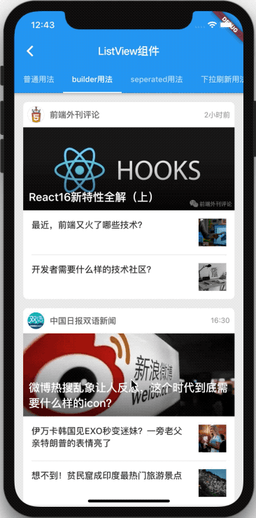
According to the above code, you can see that listview The two most important parameters for building a list are itemCount and itemBuilder. For example, the official account list is because the layout of every official account card is regular and the list may be very large. So, use ListView.build is perfect for creating.
2.3 ListView.separated()
For most list class requirements, we can use listview Build constructor to solve the problem, but some list sub items need split lines. At this time, we can use another constructor listview. Provided by fluent Separated to create a list. Let's see how the constructor is different:
ListView.separated({
  ...
  @required IndexedWidgetBuilder separatorBuilder
})
Compared to listview Build constructor, you can see listview Separated is only one more required parameter of separatorBuilder. As the name suggests, this is the callback method exposed to the caller's custom split line component. Take Alipay's friends list as an example. here ), let's take a look at listview Usage of separated:
Code( File address)
class FriendList extends StatelessWidget {
  const FriendList({Key key}) : super(key: key);

  @override
  Widget build(BuildContext context) {
    return ListView.separated(
      itemCount: friendListData.length,
      itemBuilder: (context, index) {
        return FriendCard(data: friendListData[index]);
      },
      separatorBuilder: (context, index) {
        return Divider(
          height: .5,
          indent: 75,
          color: Color(0xFFDDDDDD),
        );
      },
    );
  }
}
preview
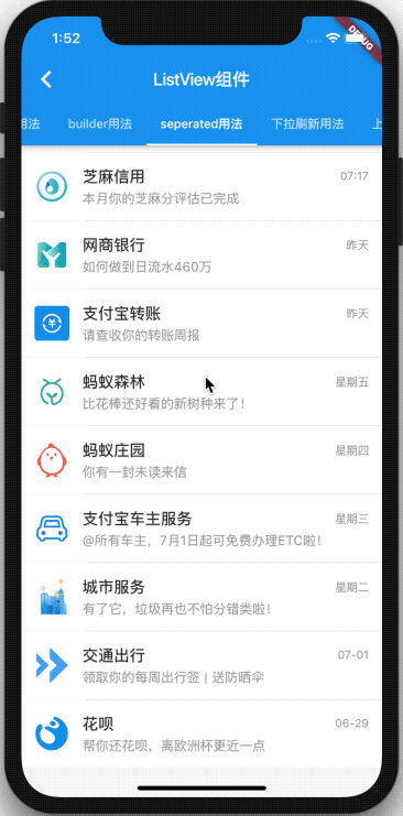
You can see from the code that the difference lies in the implementation of the separatorBuilder function, through which we can customize the division line between each child element.
2.4 summary
So far, we have learned ListView, ListView Build and ListView Separated three ways to create lists, each of which has its own applicable scenarios, so you still have to analyze specific problems when meeting requirements.
However, ListView also has a constructor: ListView custom. And ListView Build and ListView Separated is finally through ListView Custom implementation. However, this paper does not intend to introduce this method, because in general, the three construction methods mentioned above are enough to solve the problem (we will study this later when we encounter practical problems).
3. ListView advanced method
We introduced the basic usage of ListView above, but in the actual product, we will encounter the requirements of list pull-down refresh and pull-up loading. Next, let's learn how to implement this kind of interaction in fluent.
3.1 pull down refresh
In fact, it is very simple to realize the drop-down refresh effect of the list in fluent, because fluent encapsulates a RefreshIndicator component for us, which is also very convenient to use. Look at the following example code:
class PullDownRefreshList extends StatefulWidget {
  const PullDownRefreshList({Key key}) : super(key: key);

  @override
  _PullDownRefreshListState createState() => _PullDownRefreshListState();
}

class _PullDownRefreshListState extends State<PullDownRefreshList> {

  Future onRefresh() {
    return Future.delayed(Duration(seconds: 1), () {
      Toast.show('Current is the latest data', context);
    });
  }

  @override
  Widget build(BuildContext context) {
    return RefreshIndicator(
      onRefresh: this.onRefresh,
      child: ListView.separated(
        itemCount: friendListData.length,
        itemBuilder: (context, index) {
          return FriendCard(data: friendListData[index]);
        },
        separatorBuilder: (context, index) {
          return Divider(
            height: .5,
            indent: 75,
            color: Color(0xFFDDDDDD),
          );
        },
      ),
    );
  }
}
Because the data source of the list is variable, we choose to inherit from StatefulWidget this time.
You can see that the usage of RefreshIndicator is very simple. Just take our original ListView as its child and implement its onRefresh method. The onRefresh method is actually a callback function that notifies the RefreshIndicator after refresh. In the above code, we simulate a 1s wait as a network request, and then pop up a Toast prompt "it is the latest data" (Toast here is the package of toast: ^0.1.3, which is not provided by Flutter native).
Here, the list UI of today's headlines is imitated as an example (you can see the style layout of the news card) here ), let's look at the following effects:
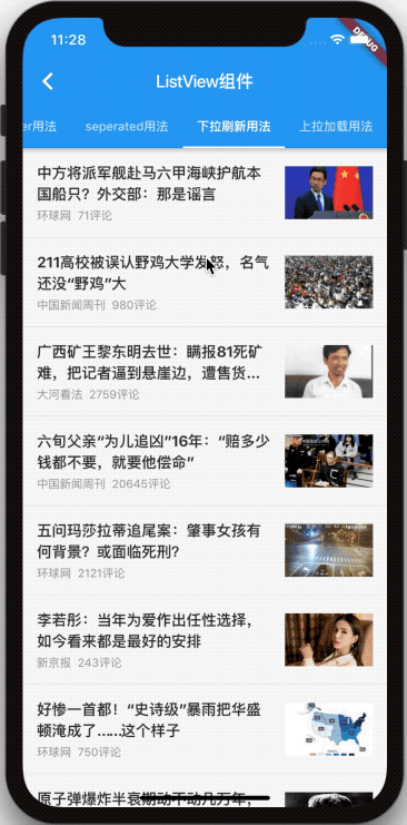
You can see that everything has been successfully implemented as expected, the effect is still good, and the RefreshIndicator is very easy to use. However, because the customizability of the RefreshIndicator component encapsulated by FLUENT is a little weak, it can not meet the requirements of custom styles in most app s. However, fortunately, there are not many source codes of RefreshIndicator. After learning animation in the future, we will go back and study how to customize a custom drop-down refresh component.
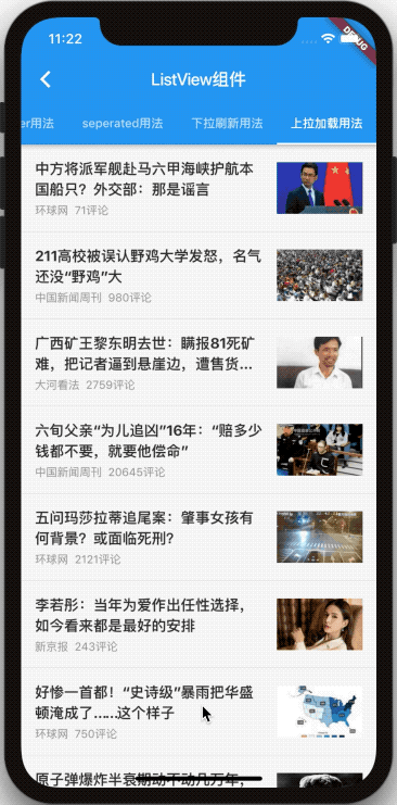
3.2 pull up loading
In addition to pull-down refresh, pull-up loading is another list operation that is often encountered. However, Flutter does not provide ready-made components like pull-down refresh, which can be called directly. The interaction of pull-up loading needs to be completed by ourselves. To this end, let's briefly analyze:
- A list variable is required inside the component to store the data source of the current list;
- A bool type isLoading flag bit is required inside the component to indicate whether it is currently in the Loading state;
- You need to be able to judge whether the current list has been scrolled to the bottom, and this depends on the controller attribute mentioned earlier (ScrollController can obtain the scrolling position of the current list and the maximum scrolling area of the list, and the results can be obtained by comparison);
- When loading data, you need to set isLoading to true; When the data is loaded, you need to merge the new data into the list variable and set isLoading to false again.
According to the above idea, we can get the following code:
class PullUpLoadMoreList extends StatefulWidget {
  const PullUpLoadMoreList({Key key}) : super(key: key);

  @override
  _PullUpLoadMoreListState createState() => _PullUpLoadMoreListState();
}

class _PullUpLoadMoreListState extends State<PullUpLoadMoreList> {
  bool isLoading = false;
  ScrollController scrollController = ScrollController();
  List<NewsViewModel> list = List.from(newsList);

  @override
  void initState() {
    super.initState();
    // Add listener to scroll list
    this.scrollController.addListener(() {
      // Key judgment of sliding to the bottom
      if (
        !this.isLoading &&
        this.scrollController.position.pixels >= this.scrollController.position.maxScrollExtent
      ) {
        // Start loading data
        setState(() {
          this.isLoading = true;
          this.loadMoreData();
        });
      }
    });
  }

  @override
  void dispose() {
    // When the component is destroyed, release resources (you must not forget, otherwise it may cause memory leakage)
    super.dispose();
    this.scrollController.dispose();
  }

  Future loadMoreData() {
    return Future.delayed(Duration(seconds: 1), () {
      setState(() {
        this.isLoading = false;
        this.list.addAll(newsList);
      });
    });
  }

  Widget renderBottom() {
    // TODO
  }

  @override
  Widget build(BuildContext context) {
    return ListView.separated(
      controller: this.scrollController,
      itemCount: this.list.length + 1,
      separatorBuilder: (context, index) {
        return Divider(height: .5, color: Color(0xFFDDDDDD));
      },
      itemBuilder: (context, index) {
        if (index < this.list.length) {
          return NewsCard(data: this.list[index]);
        } else {
          return this.renderBottom();
        }
      },
    );
  }
}
One thing to note is that the itemCount value of the list becomes list Length + 1, because we rendered one more bottom component. When not loading, we can show a pull-up to load more suggestive components; When loading data, we can show another hard loading Placeholder assembly. The implementation of renderBottom is as follows:
Widget renderBottom() {
  if(this.isLoading) {
    return Container(
      padding: EdgeInsets.symmetric(vertical: 15),
      child: Row(
        mainAxisAlignment: MainAxisAlignment.center,
        children: <Widget>[
          Text(
            'Trying to load...',
            style: TextStyle(
              fontSize: 15,
              color: Color(0xFF333333),
            ),
          ),
          Padding(padding: EdgeInsets.only(left: 10)),
          SizedBox(
            width: 20,
            height: 20,
            child: CircularProgressIndicator(strokeWidth: 3),
          ),
        ],
      ),
    );
  } else {
    return Container(
      padding: EdgeInsets.symmetric(vertical: 15),
      alignment: Alignment.center,
      child: Text(
        'Pull up to load more',
        style: TextStyle(
          fontSize: 15,
          color: Color(0xFF333333),
        ),
      ),
    );
  }
}
Finally, let's look at the final implementation effect:
4. Summary
Firstly, this paper introduces the commonly used ListView, ListView Build and ListView Separated three construction methods to create lists, and illustrate their different use scenarios with practical examples. Then, it introduces how to implement the two commonly used interactive operations of list component pull-down refresh and pull-up load in fluent.
Through the five practical examples in this article, I believe you must have a preliminary understanding of how to use ListView in fluent. The rest is to practice it more~
All the code in this article is hosted in here , you can also pay attention to mine Blog.