Hello, everyone. I am nuts. The official account is "nuts front end".

AppBar
The application bar is one of the most commonly used components in various applications. It can be used to hold search fields, buttons to navigate between pages, or just page titles. Because it is such a common component, fluent provides a function called AppBar Special widget for.
In this tutorial, we will show you how to customize the AppBar in the fluent application through some practical examples.
The following is what we will introduce:
- What is the AppBar in fluent?
- Apply bar layout
- Customize AppBar
What is the AppBar in fluent?
The shuttle AppBar is based on Material Design Application components built by the guide. It is usually located at the top of the screen and can include other widgets in its layout. Appbars typically display brand information, such as logos and titles, and usually contain buttons or other user interaction points.
The following is what the default AppBar looks like in fluent:
// Mostly, AppBar is used inside a Scaffold widget.
Scaffold(
  appBar: AppBar(),
),
Apply bar layout
In fluent, the layout of the AppBar mainly includes three components: leading, title, and actions. The leading is placed in the leftmost position of the AppBar; Title and actions appear on its right.
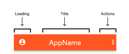
leading
leading accepts a widget and can assign anything -- text, icons, or even multiple widgets in a row.
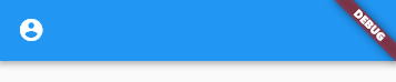
AppBar(
  leading: Icon(Icons.account_circle_rounded),
),
You can control how much width the leading can occupy:
AppBar(
  leading: Icon(Icons.account_circle_rounded),
  leadingWidth: 100, // default is 56
),

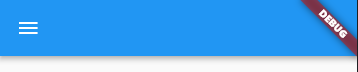
If the leading is not provided, AppBar will automatically hint to us. Examples include a navigation arrow to return to the previous page or a menu icon to open a drawer.
When the previous route is available, the navigation arrow appears automatically.
class HomePage extends StatelessWidget {
  @override
  Widget build(BuildContext context) {
    return Scaffold(
      body: Center(
        child: TextButton(
          child: Text('Push'),
          onPressed: () => Navigator.push(context, MaterialPageRoute(
            builder: (context) {
              return SecondPage();
            },
          )),
        ),
      ),
    );
  }
}

class SecondPage extends StatelessWidget {
  @override
  Widget build(BuildContext context) {
    return Scaffold(
      appBar: AppBar(),
    );
  }
}

When we add a Drawer to Scaffold, we will assign a menu icon leading to open the Drawer.
class HomePage extends StatelessWidget {
  @override
  Widget build(BuildContext context) {
    return Scaffold(
      appBar: AppBar(),
      drawer: Drawer(),
    );
  }
}
If necessary, you can prevent this behavior by setting automatically imply leading false.
AppBar(
  automaticallyImplyLeading: false, // simple as that!
),
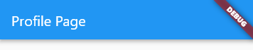
title
As the name suggests, it is mainly used to display titles, such as application titles or page headers.
AppBar(
  title: Text('Profile Page'),
),
But you are not limited to this, because the title also needs a widget. You can use it to display icons, images, shapes, or any combination of column s using layout widgets such as row and.
Here is an example:
AppBar(
  title: Container(
    width: 40,
    child: Image.network(url),
  ),
),

By default, title is aligned with the left side of the AppBar according to the Material guide. You can change this setting to center it:
AppBar( title: Container( width: 40, child: Image.network(url), ), centerTitle: true, // like this!),
actions
actions is a list of widgets aligned to the right of the AppBar. We usually see them in applications that are used as buttons to trigger drop-down menus, profile avatars, etc.
AppBar( actions: [ Icon(Icons.more_vert), ],),

Let's add another widget to the list:
AppBar( actions: [ Container( width: 30, child: Image.asset( 'assets/images/profile_pic.png', ), ), Icon(Icons.more_vert), ],),
Customizing AppBar in fluent
Now that we are familiar with the layout of the AppBar, let's take customization to a new level by using the theme option. AppBar contains various properties, including color, size, icon theme, text theme, and so on.
background color
The following code changes the background color of the AppBar to dark orange. 500 adds a specific shadow to access the color, 900, that is, the darkest and brightest 50.
AppBar( backgroundColor: Colors.deepOrange[500],),
Icon theme
The following code changes the color of the icon to green and the size to 36:
AppBar( actionsIconTheme: IconThemeData(color: Colors.green, size: 36),),
Text theme
Suppose you want to change the text color to amber with lighter shadows, 200, and set the font size to 24:
AppBar( textTheme: TextTheme( headline6: TextStyle( // headline6 is used for setting title's theme color: Colors.amber[200], fontSize: 24, ), ),),
Elevation
If you want to give the AppBar a height, you can use elevation. The following code increases the height of the AppBar to 15
AppBar( elevation: 15,),
Notice that the AppBar is raised and the shadow spans a larger area.
Shadow color
You can even confuse the color of the shadow. The following code changes the shadow color of the AppBar to orangeAccent.
AppBar( shadowColor: Colors.orangeAccent,),
Cool, right?
Toolbar height and opacity
Finally, we have toolbar properties. The toolbar contains text, icons, buttons, and the foreground of any other company, except for widgets such as Container and Image.
To change the height and opacity of the AppBar toolbar item:
AppBar( toolbarHeight: 100, // default is 56 toolbarOpacity: 0.5,),
conclusion
If you have done this, you should now understand:
- What is AppBar and how is it used in fluent
- Layout of AppBar (leading, title, and actions)
- How to customize the layout of the AppBar and add widgets
- How to theme the icon, text, background, height, shadow color, and toolbar of the AppBar
So we have! A complete walkthrough of all the contents that must be provided by the AppBar of fluent. I hope this article can help you create beautiful AppBars in all future Flutter applications.
Finally, some properties of AppBar are attached
AppBar({ Key? key, this.leading,//The icon displayed on the left usually shows the application logo on the first page, and the return button this.automaticallyImplyLeading = true on other pages. / / use this.title with leading, / / Title Text this.actions, / / item this.flexiblespace on the right, / / the control displayed below the AppBar is the same height as the AppBar, / / you can achieve some special effects, This attribute is usually used in the slivereappbar, / / an AppBarBottomWidget object, usually TabBar. It is used to display a Tab navigation bar this.elevation under the Toolbar title. / / the z-coordinate order of the control. The default value is 4. For a scrollable sliderappbar, when the sliderappbar is the same level as the content, the value is 0. / / when the content scrolling sliderappbar becomes the Toolbar, modify the value of elevation. This.shape, this.backgroundcolor, / / AppBar background color this.brightness,//AppBar brightness has black and white themes this.icontheme, / / the style of the icon on the AppBar this.actionsicontheme, / / the style of the action icon on the AppBar this.texttheme, / / the text style on the AppBar this.primary = true, this.centertitle, //Is the title centered? This.titlespating = navigationtoolbar.kmiddlespacing, / / the gap between the title and other controls this.toolbarOpacity = 1.0,//AppBar tool area transparency this.bottom opacity = 1.0, / / bottom area transparency this.toolbarheight, this.backwardscompatibility, this.toolbartextstyle, this.titletextstyle, this.systemOverlayStyle, })
I hope you like this article, thank you