From https://blog.csdn.net/analyzesystem/article/details/51426473
Open Source Project Effectiveness

Call instance
Must Practice Basic Skills
Android studio project import depends on compile path
dependencies{
    compile 'com.android.support:support-v4:23.1.1'
    compile 'com.flyco.tablayout:FlycoTabLayout_Lib:2.0.2@aar'
}- 1
- 2
- 3
- 4
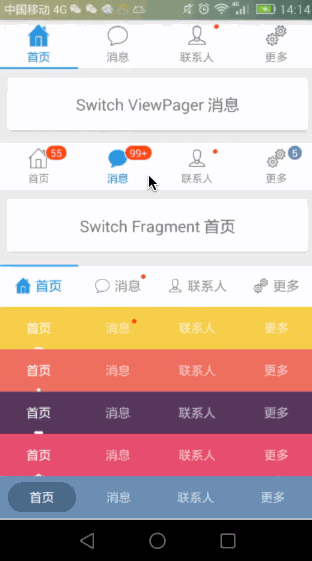
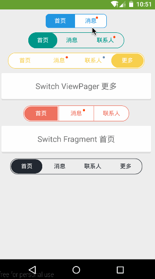
FlycoTabLayout is an Android TabLayout library and currently has three TabLayouts
-
Sliding Tab Layout: A lot of modifications are made with reference to Pager Sliding Tab Strip. Source code analysis of Pager Sliding Tab Strip can be referred to in a previous blog post. http://blog.csdn.net/analyzesystem/article/details/50316745
- Adding some new attributes
- New Indicator Display Support
- Added support for unread message display
- New method setViewPager
 /** Associate ViewPager for situations where you do not want to set titles data in the ViewPager adapter */
    public void setViewPager(ViewPager vp, String[] titles)

    /** Associated ViewPager for situations where even adapters don't want to instantiate themselves */
public void setViewPager(ViewPager vp, String[] titles, FragmentActivity fa, ArrayList<Fragment> fragments) - 1
- 2
- 3
- 4
- 5
-
Common TabLayout: Unlike Sliding TabLayout, which relies on ViewPager, it is a TabLayout that does not depend on ViewPager and can be freely used with other controls.
- Support multiple Indicator displays, and Indicator animation
- Support unread message display
- Supporting Icon and Icon Location
- New method
/** Connected data supports simultaneous switching of fragments */
public void setTabData(ArrayList<CustomTabEntity> tabEntitys, FragmentManager fm, int containerViewId, ArrayList<Fragment> fragments)- 1
- 2
- SegmentTabLayout: Control that mimics tab switching in the header of QQ message list
Custom Property Table
Tl_indicator_color setting display color
 Tl_indicator_height dimension sets display height
 Tl_indicator_width dimension sets the fixed width of the display
 Tl_indicator_margin_left dimension sets the display margin, which is invalid when indicator_width is greater than 0
 Tl_indicator_margin_top dimension sets the display margin, which is invalid when indicator_width is greater than 0
 Tl_indicator_margin_right dimension sets the display margin, when indicator_width is greater than 0, it is invalid
 Tl_indicator_margin_bottom dimension sets the display margin, which is invalid when indicator_width is greater than 0
 Tl_indicator_corner_radius dimension setting display roundness
 Tl_indicator_gravity enum sets the top (TOP) or bottom (BOTTOM) of the display, which is useful only for conventional displays.
Tl_indicator_style enum sets the display to Normal (NORMAL) or Triangular (TRIANGLE) or Background Block (BLOCK)
Tl_underline_color setting underline color
 Tl_underline_height dimension sets the underscore height
 Tl_underline_gravity enum sets whether the underline is above (TOP) or below (BOTTOM)
Tl_divider_color sets the splitter color
 Tl_divider_width dimension sets the width of the partition line
 Tl_divider_padding dimension sets padding Top and padding Bottom of the partition line
 Tl_tab_padding dimension sets padding Left and padding Right of tab
 Tl_tab_space_equal Boolean sets tab size equal
 Tl_tab_width dimension sets the fixed size of tab
 Tl_textsize dimension sets font size
 Tl_textSelectColor Sets Font Selection Color
 Tl_text Unselect Color Sets Font Unselected Color
 Tl_textBold Boolean set font bold
 Tl_iconWidth dimension sets icon width (CommonTabLayout only)
Tl_iconHeight dimension sets icon height (CommonTabLayout only)
Tl_iconVisible Boolean sets whether icon is visible (CommonTabLayout only supported)
Tl_iconGravity enum sets the icon display position corresponding to the constant value of Gravity, upper left and lower right (CommonTab Layout only supported)
Tl_iconMargin dimension sets icon and text spacing (CommonTabLayout only)
Tl_indicator_anim_enable Boolean Settings Display Support Animation (only for CommonTab Layout)
Tl_indicator_anim_duration integer sets the display animation time (only for CommonTabLayout)
Tl_indicator_bounce_enable Boolean setting monitor supports animation rebound effect (only for Common Tab Layout)
Tl_indicator_width_equal_title Boolean settings display as long as the title (only for Sliding Tab Layout)
- 1
- 2
- 3
- 4
- 5
- 6
- 7
- 8
- 9
- 10
- 11
- 12
- 13
- 14
- 15
- 16
- 17
- 18
- 19
- 20
- 21
- 22
- 23
- 24
- 25
- 26
- 27
- 28
- 29
- 30
- 31
- 32
The library relies on the animation compatibility Library NineOldAndroids and FlycoRoundView Later, I'll take a brief look at FlycoRoundView in source analysis.
Sliding TabLayout call
Sliding TabLayout custom attributes support underscore settings, control the direction of underscore display width and height, can make line width = text width, can also be fixed proportional width, can set the small red dots of unread messages, can also set the number of unread messages, all of these premises are based on ViewPager to achieve, all need to bind ViewPager, through a variety of binding methods
 /**Associate ViewPager,Adapter rewrites the getPageTitle method*/
 tabLayout.setViewPager(vp);

 /**Associate ViewPager for situations where you do not want to set titles data in the ViewPager adapter*/
 tabLayout.setViewPager(vp, mTitles);

 /**Associated ViewPager for situations where even adapters don't want to instantiate themselves, internal help instantiates an InnerPager Adapter*/
tabLayout.setViewPager(vp, mTitles, this, mFragments);- 1
- 2
- 3
- 4
- 5
- 6
- 7
- 8
Now let's take a look at tabLayout's offering a few more useful ways for us
/**Displays unread red dots at specified locations*/
tabLayout.showDot(4);
/**Hide unread red dots or messages at specified locations*/
tabLayout.hideMsg(5);
/**showMsg(int position, int num):position Location, num is less than or equal to 0 to display red dots, num is greater than 0 to display numbers, function: display unread messages, if the number of messages > 99, display effect 99+*/
tabLayout.showMsg(3, 5);
/**  setMsgMargin(int position, float leftPadding, float bottomPadding)Set the unread message offset and the origin is the upper right corner of the text. When the height of the control is fixed, the position of the message prompt is easy to control and the display effect is good. */
tabLayout.setMsgMargin(3, 0, 10);

/**Setting the background of unread message messages*/
 MsgView msgView = tabLayout.getMsgView(3);
 if (msgView != null) {
     msgView.setBackgroundColor(Color.parseColor("#6D8FB0"));
  }
//...- 1
- 2
- 3
- 4
- 5
- 6
- 7
- 8
- 9
- 10
- 11
- 12
- 13
- 14
- 15
With so many custom attributes, there are naturally quite a few set methods, but just refer to the above custom attributes xml reference, which methods are not commonly used.
CommonTabLayout call
Sliding TabLayout corresponds to the method is applicable here no longer repeat, the most important thing of Common TabLayout is the setTabData (ArrayList tab Entities) method, so that Common TabLayout no longer depends on ViewPager to complete initialization, achieve bottom navigation or head navigation effect, let's say goodbye to RadioButton+ViewPager era, Custom TabEntity naming is a bit of a problem, naming is one. TabEntity implements the interface, modifies the construction method and initializes the internal parameters. Here is a navigation example with Common TabLayout + ViewPager.
        mFragmentList = addFragmentList(R.id.home_frameLayout, fragmentClasses);

        for (int i = 0; i < titles.length; i++) {
            mTabEntities.add(new TabEntity(titles[i], checkeds[i], normals[i]));
        }

        commonTabLayout.setTabData(mTabEntities);
        commonTabLayout.setOnTabSelectListener(new OnTabSelectListener() {
            @Override
            public void onTabSelect(int position) {

                if (position == 1) {
                    topBarBuilder.configSearchStyle(titles[position], R.drawable.ic_action_search);
                } else {
                    topBarBuilder.configTitle(titles[position]);
                }

                showFragment(R.id.home_frameLayout, position, mFragmentList);
                onLoggerD("initial callback ,show fragment with position " + position + ";FragmentName:" + mFragmentList.get(position).toString());
            }

            @Override
            public void onTabReselect(int position) {
                //TODO reselection
            }
});- 1
- 2
- 3
- 4
- 5
- 6
- 7
- 8
- 9
- 10
- 11
- 12
- 13
- 14
- 15
- 16
- 17
- 18
- 19
- 20
- 21
- 22
- 23
- 24
- 25
- 26
- 27
SegmentTabLayout call
The implementation of SegmentTabLayout is similar to the switching effect at the top of the qq message list. Unified support for setTabData(mTitles) is provided here, but an array of headings is passed in. TabLayout calls the method setCurrentTab provided by tabLayout with ViewPager switching. The setTabData provided by SegmentTabLayout (String[] titles, Fragmenty Activitfa, int containerViewId, ArrayList fragments) method is in our eL. Ayout + Fragment layout switching Fragment is more practical
Source code analysis
FlycoRoundView Source Code Analysis
After a brief look at the library's custom properties file, I realized one thing: the automatic prompt for the custom properties is as follows (previously, all my custom properties were defined directly in declare-style leable)
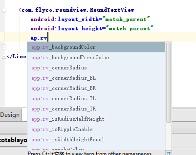
Here are the specific meanings of these custom attributes (as specified in attrs)
<! - Here's the correct posture for reusing attr, all for automatic prompting in the layout - >
    <! - Rounded rectangular background color - >
    <attr name="rv_backgroundColor" format="color"/>
    <! - Rounded rectangular background color press - >
    <attr name="rv_backgroundPressColor" format="color"/>
    <! - rounded arc, unit DP - >
    <attr name="rv_cornerRadius" format="dimension"/>
    <! - rounded arc, unit DP - >
    <attr name="rv_strokeWidth" format="dimension"/>
    <! - Round corner border color - >
    <attr name="rv_strokeColor" format="color"/>
    <! - Rounded border color press - >
    <attr name="rv_strokePressColor" format="color"/>
    <! - Text color press - >
    <attr name="rv_textPressColor" format="color"/>
    <! - The arc of the rounded corner is half of the height - >
    <attr name="rv_isRadiusHalfHeight" format="boolean"/>
    <! - The width and height of the rounded rectangle are equal, and the value of the wider rectangle is higher than that of the higher rectangle.
    <attr name="rv_isWidthHeightEqual" format="boolean"/>
    <! - rounded arc, unit dp, TopLeft-->
    <attr name="rv_cornerRadius_TL" format="dimension"/>
    <! - rounded arc, unit dp, TopRight-->
    <attr name="rv_cornerRadius_TR" format="dimension"/>
    <! - rounded arc, unit dp, Bottom Left - >
    <attr name="rv_cornerRadius_BL" format="dimension"/>
    <! - Arc, unit dp, Bottom Right - >.
    <attr name="rv_cornerRadius_BR" format="dimension"/>
    Whether Ripple is effective or not, api21 + is effective -->
    <attr name="rv_isRippleEnable" format="boolean"/>

    <declare-styleable name="RoundTextView">
        <attr name="rv_backgroundColor"/>
        <attr name="rv_backgroundPressColor"/>
        <attr name="rv_cornerRadius"/>
        <attr name="rv_strokeWidth"/>
        <attr name="rv_strokeColor"/>
        <attr name="rv_strokePressColor"/>
        <attr name="rv_textPressColor"/>
        <attr name="rv_isRadiusHalfHeight"/>
        <attr name="rv_isWidthHeightEqual"/>
        <attr name="rv_cornerRadius_TL"/>
        <attr name="rv_cornerRadius_TR"/>
        <attr name="rv_cornerRadius_BL"/>
        <attr name="rv_cornerRadius_BR"/>
        <attr name="rv_isRippleEnable"/>
</declare-styleable>- 1
- 2
- 3
- 4
- 5
- 6
- 7
- 8
- 9
- 10
- 11
- 12
- 13
- 14
- 15
- 16
- 17
- 18
- 19
- 20
- 21
- 22
- 23
- 24
- 25
- 26
- 27
- 28
- 29
- 30
- 31
- 32
- 33
- 34
- 35
- 36
- 37
- 38
- 39
- 40
- 41
- 42
- 43
- 44
- 45
- 46
- 47
The View controls of Round series customize RoundTextView, RoundFrameLayout, RoundLinearLayout RoundRelative Layout. The internal source code implementation of these controls is not complicated. It can be said that it is extremely simple. The constructor parses the custom attributes through RoundView Delegate proxy, followed by the measurement-related of onMeasure and onLayout. ToggleButton As mentioned in the Source Code Analysis article, EXACTLY is used here.
 @Override
    protected void onMeasure(int widthMeasureSpec, int heightMeasureSpec) {
        super.onMeasure(widthMeasureSpec, heightMeasureSpec);
        if (delegate.isWidthHeightEqual() && getWidth() > 0 && getHeight() > 0) {
            int max = Math.max(getWidth(), getHeight());
            int measureSpec = MeasureSpec.makeMeasureSpec(max, MeasureSpec.EXACTLY);
            super.onMeasure(measureSpec, measureSpec);
            return;
        }

        super.onMeasure(widthMeasureSpec, heightMeasureSpec);
    }

    @Override
    protected void onLayout(boolean changed, int left, int top, int right, int bottom) {
        super.onLayout(changed, left, top, right, bottom);
        if (delegate.isRadiusHalfHeight()) { //If the radian is half the height, set radio to half the height directly, otherwise call
            delegate.setCornerRadius(getHeight() / 2);
        }else {
            delegate.setBgSelector();// Ripple effect is compatible with 21+. How many Ripple effects can be realized? Ripple Drawable is used here. Please refer to api for specific usage. This is not the focus of this article.
        }
}- 1
- 2
- 3
- 4
- 5
- 6
- 7
- 8
- 9
- 10
- 11
- 12
- 13
- 14
- 15
- 16
- 17
- 18
- 19
- 20
- 21
- 22
The setBgSelector method uses GradientDrawable, StateListDrawable, which you haven't seen before. Drawable Series This blog has a brief introduction. RoundViewDelegate provides a set get method for these custom attributes. Our code calls the instance initialized by the constructor obtained by the custom control getDelegate to set and get the corresponding attributes.
Source Code Analysis of FlycoTabLayout Lib Library
MsgView imitates a custom control written by FlycoRoundView library, which is mainly used for display of unread messages. Similar codes are omitted.
Sliding TabLayout custom control's uniform custom attributes drift past and come to setViewPager, the only way to find the new world notify DataSetChanged () call, get the title through dapter's getPageTitle method, and add a layout to HorizontalScrollView's sub-View LinearLayout, and bind Tab's desired listening callback.
 /** Update data */
 public void notifyDataSetChanged() {
        mTabsContainer.removeAllViews();
        this.mTabCount = mTitles == null ? mViewPager.getAdapter().getCount() : mTitles.length;
        View tabView;
        for (int i = 0; i < mTabCount; i++) {
            if (mViewPager.getAdapter() instanceof CustomTabProvider) {
                tabView = ((CustomTabProvider) mViewPager.getAdapter()).getCustomTabView(this, i);
            } else {
                tabView = View.inflate(mContext, R.layout.layout_tab, null);
            }

            CharSequence pageTitle = mTitles == null ? mViewPager.getAdapter().getPageTitle(i) : mTitles[i];
            addTab(i, pageTitle.toString(), tabView);
        }

        updateTabStyles();
    }

/** Create and add tab s */
private void addTab(final int position, String title, View tabView) {
        TextView tv_tab_title = (TextView) tabView.findViewById(R.id.tv_tab_title);
        if (tv_tab_title != null) {
            if (title != null) tv_tab_title.setText(title);
        }

        tabView.setOnClickListener(new OnClickListener() {
            @Override
            public void onClick(View v) {
                if (mViewPager.getCurrentItem() != position) {
                    mViewPager.setCurrentItem(position);
                    if (mListener != null) {
                        mListener.onTabSelect(position);
                    }
                } else {
                    if (mListener != null) {
                        mListener.onTabReselect(position);
                    }
                }
            }
        });

        /** Layout parameters for each Tab */
        LinearLayout.LayoutParams lp_tab = mTabSpaceEqual ?
                new LinearLayout.LayoutParams(0, LayoutParams.MATCH_PARENT, 1.0f) :
                new LinearLayout.LayoutParams(LayoutParams.WRAP_CONTENT, LayoutParams.MATCH_PARENT);
        if (mTabWidth > 0) {
            lp_tab = new LinearLayout.LayoutParams((int) mTabWidth, LayoutParams.MATCH_PARENT);
        }

        mTabsContainer.addView(tabView, position, lp_tab);
}- 1
- 2
- 3
- 4
- 5
- 6
- 7
- 8
- 9
- 10
- 11
- 12
- 13
- 14
- 15
- 16
- 17
- 18
- 19
- 20
- 21
- 22
- 23
- 24
- 25
- 26
- 27
- 28
- 29
- 30
- 31
- 32
- 33
- 34
- 35
- 36
- 37
- 38
- 39
- 40
- 41
- 42
- 43
- 44
- 45
- 46
- 47
- 48
- 49
- 50
- 51
- 52
The calcIndicatorRect method calculates the Rect range according to different attributes for drawing. The specific drawing method refers to the Canvas API. It is necessary to mention the following method. If you use the system-dependent code in the constructor of a custom control or other drawing-related places, the visual editor will not be able to report errors and prompt: Use View. isInEditMode () in you. R custom views to skip code when showing in Eclipseis, with the addition of isIn EditMode, the judgement will no longer be wrong.
 if (isInEditMode() || mTabCount <= 0) {
            return;
}- 1
- 2
- 3
For code setting custom attribute values, the following two methods invalidate() and updateTabStyles() are invoked; for drawing, invalidate is invoked; for direct modification, updateTabStyles is invoked. (Personal feeling is not very friendly, for example, if the code sets an attribute value, it needs to traverse all view s, while calling attribute assignment again, the key is to modify only one of the subordinates. Sex!! )
  private void updateTabStyles() {
        for (int i = 0; i < mTabCount; i++) {
            View v = mTabsContainer.getChildAt(i);
//            v.setPadding((int) mTabPadding, v.getPaddingTop(), (int) mTabPadding, v.getPaddingBottom());
            TextView tv_tab_title = (TextView) v.findViewById(R.id.tv_tab_title);
            if (tv_tab_title != null) {
                tv_tab_title.setTextColor(i == mCurrentTab ? mTextSelectColor : mTextUnselectColor);
                tv_tab_title.setTextSize(TypedValue.COMPLEX_UNIT_PX, mTextsize);
                tv_tab_title.setPadding((int) mTabPadding, 0, (int) mTabPadding, 0);
                if (mTextAllCaps) {
                    tv_tab_title.setText(tv_tab_title.getText().toString().toUpperCase());
                }

                if (mTextBold) {
                    tv_tab_title.getPaint().setFakeBoldText(mTextBold);
                }
            }
        }
}- 1
- 2
- 3
- 4
- 5
- 6
- 7
- 8
- 9
- 10
- 11
- 12
- 13
- 14
- 15
- 16
- 17
- 18
- 19
The setMsg and setDot methods are mentioned in the invocation examples. How can the show hide state be saved here? Here's the same way to keep the internal state of AbsListView: SparseArray to keep the state of the corresponding location
    /**
     * Display unread messages
     *
     * @param position Display tab position
     * @param num      num Less than or equal to 0 to display red dots, num greater than 0 to display numbers
     */
    public void showMsg(int position, int num) {
        if (position >= mTabCount) {
            position = mTabCount - 1;
        }

        View tabView = mTabsContainer.getChildAt(position);
        MsgView tipView = (MsgView) tabView.findViewById(R.id.rtv_msg_tip);
        if (tipView != null) {
            UnreadMsgUtils.show(tipView, num);

            if (mInitSetMap.get(position) != null && mInitSetMap.get(position)) {
                return;
            }

            setMsgMargin(position, 4, 2);
            mInitSetMap.put(position, true);
        }
    }

    /**
     * Display unread red dots
     *
     * @param position Display tab position
     */
    public void showDot(int position) {
        if (position >= mTabCount) {
            position = mTabCount - 1;
        }
        showMsg(position, 0);
    }

    /** Hide unread messages */
    public void hideMsg(int position) {
        if (position >= mTabCount) {
            position = mTabCount - 1;
        }

        View tabView = mTabsContainer.getChildAt(position);
        MsgView tipView = (MsgView) tabView.findViewById(R.id.rtv_msg_tip);
        if (tipView != null) {
            tipView.setVisibility(View.GONE);
        }
    }
- 1
- 2
- 3
- 4
- 5
- 6
- 7
- 8
- 9
- 10
- 11
- 12
- 13
- 14
- 15
- 16
- 17
- 18
- 19
- 20
- 21
- 22
- 23
- 24
- 25
- 26
- 27
- 28
- 29
- 30
- 31
- 32
- 33
- 34
- 35
- 36
- 37
- 38
- 39
- 40
- 41
- 42
- 43
- 44
- 45
- 46
- 47
- 48
- 49
- 50
Carefully, you will find that show does not directly control the visual display and hiding of View, but uses UnreadMsgUtils. This class provides two methods, setSize and show methods. Show method makes a judgment on countSize of show, converting 0 to point, 1-99 circle + number, and > 99 to 99 +, the arc of background is half of the width.
Back to the setViewPager(ViewPager vp, String[] titles, FragmentActivity fa, ArrayList fragments) method, we built an internally defined InnerPager Adapter adapter when we invoked this method. If you want to be lazy and don't want to write the adapter, you can invoke this method. InnerPager Adapter rewrites getPageTitle to facilitate dynamic addition of tab items to notifyDataSetChanged method calls.
 class InnerPagerAdapter extends FragmentPagerAdapter {
        private ArrayList<Fragment> fragments = new ArrayList<>();
        private String[] titles;

        public InnerPagerAdapter(FragmentManager fm, ArrayList<Fragment> fragments, String[] titles) {
            super(fm);
            this.fragments = fragments;
            this.titles = titles;
        }

        @Override
        public int getCount() {
            return fragments.size();
        }

        @Override
        public CharSequence getPageTitle(int position) {
            return titles[position];
        }

        @Override
        public Fragment getItem(int position) {
            return fragments.get(position);
        }

        @Override
        public void destroyItem(ViewGroup container, int position, Object object) {
            // Override destroy Item and implement it empty so that views in each Fragment will not be destroyed
            // super.destroyItem(container, position, object);
        }

        @Override
        public int getItemPosition(Object object) {
            return PagerAdapter.POSITION_NONE;
        }
}- 1
- 2
- 3
- 4
- 5
- 6
- 7
- 8
- 9
- 10
- 11
- 12
- 13
- 14
- 15
- 16
- 17
- 18
- 19
- 20
- 21
- 22
- 23
- 24
- 25
- 26
- 27
- 28
- 29
- 30
- 31
- 32
- 33
- 34
- 35
- 36
Common TabLayout has 99% similarity with Sliding TabLayout above. The repetition is not in the narrative. The difference lies in the setTabData and notify DataSetChanged methods. Notfy DataSetChanged enters different layout views to make Tab according to Icon's Gravity attribute. Although Text View has drawable Left RightTop Bottom related attributes, it does not allow us to control Ui so freely.
    /** Update data */
    public void notifyDataSetChanged() {
        mTabsContainer.removeAllViews();
        this.mTabCount = mTabEntitys.size();
        View tabView;
        for (int i = 0; i < mTabCount; i++) {
            if (mIconGravity == Gravity.LEFT) {
                tabView = View.inflate(mContext, R.layout.layout_tab_left, null);
            } else if (mIconGravity == Gravity.RIGHT) {
                tabView = View.inflate(mContext, R.layout.layout_tab_right, null);
            } else if (mIconGravity == Gravity.BOTTOM) {
                tabView = View.inflate(mContext, R.layout.layout_tab_bottom, null);
            } else {
                tabView = View.inflate(mContext, R.layout.layout_tab_top, null);
            }

            tabView.setTag(i);
            addTab(i, tabView);
        }

        updateTabStyles();
}- 1
- 2
- 3
- 4
- 5
- 6
- 7
- 8
- 9
- 10
- 11
- 12
- 13
- 14
- 15
- 16
- 17
- 18
- 19
- 20
- 21
- 22
Inside the setTabData (ArrayList tab Entitys, FragmentActivity fa, int containerViewId, ArrayList fragments) method, a FragmentChange Manager, a management assistant class for Fragments, is initialized. This class dynamically adds hidden fragments to the constructor, and provides fragments (int index) to display the specified location, which is in the layout of the Fragments+Fragments+commonTabLayout. Face saves us from managing Fagments
Compared with Common Tab Layout, SegmentTab Layout has more animation processing. It clicks on a Tab, calls setCurrentTab, and indirectly calls calcOffset to open the animation. During the execution of the animation, onAnimation Update redraws and adjusts its position.
  tabView.setOnClickListener(new OnClickListener() {
            @Override
            public void onClick(View v) {
                int position = (Integer) v.getTag();
                if (mCurrentTab != position) {
                    setCurrentTab(position);
                    if (mListener != null) {
                        mListener.onTabSelect(position);
                    }
                } else {
                    if (mListener != null) {
                        mListener.onTabReselect(position);
                    }
                }
            }
        });

    //setter and getter
    public void setCurrentTab(int currentTab) {
        mLastTab = this.mCurrentTab;
        this.mCurrentTab = currentTab;
        updateTabSelection(currentTab);
        if (mFragmentChangeManager != null) {
            mFragmentChangeManager.setFragments(currentTab);
        }
        if (mIndicatorAnimEnable) {
            calcOffset();
        } else {
            invalidate();
        }
    }

    @Override
    public void onAnimationUpdate(ValueAnimator animation) {
        IndicatorPoint p = (IndicatorPoint) animation.getAnimatedValue();
        mIndicatorRect.left = (int) p.left;
        mIndicatorRect.right = (int) p.right;
        invalidate();
    }
- 1
- 2
- 3
- 4
- 5
- 6
- 7
- 8
- 9
- 10
- 11
- 12
- 13
- 14
- 15
- 16
- 17
- 18
- 19
- 20
- 21
- 22
- 23
- 24
- 25
- 26
- 27
- 28
- 29
- 30
- 31
- 32
- 33
- 34
- 35
- 36
- 37
- 38
- 39
- 40
Summary
First of all, demo is not available here. It needs to be official. https://github.com/H07000223/FlycoTabLayout Next, after looking at the library, there are still great gains, such as the use of custom attributes, the internal instance of setViewPager(ViewPager vp, String[] titles, FragmentActivity fa, ArrayList fragments), an adapter adapter adapter adapter adapter adapter, the most important thing is that custom attribute parsing and attribute value code settings are done through a class proxy.