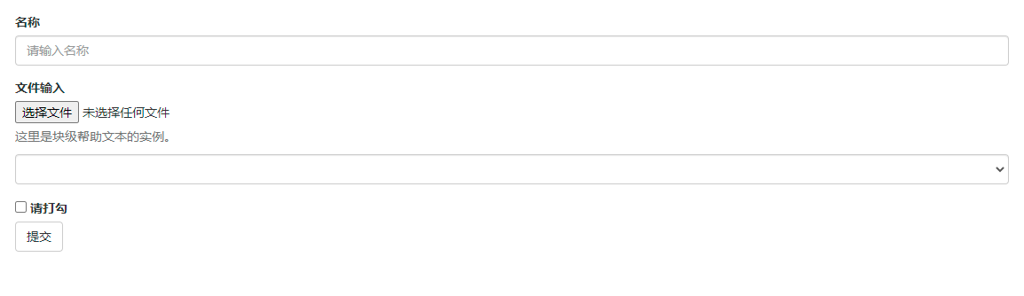
Vertical (basic) form
- The basic form structure comes with Bootstrap. Individual form controls automatically receive some global styles
1) Add role="form" to the parent < form > element
2) Put the label and control in a < div > with form group class, which is necessary to obtain the best spacing.
3) Add form control classes to all text elements < input >, < textarea >, and < Select > - Help block class prompts help information
<!DOCTYPE html>
<html>
<head>
	<meta charset="utf-8">
	<title>Bootstrap example - Basic form</title>
	<link rel="stylesheet" href="https://cdn.staticfile.org/twitter-bootstrap/3.3.7/css/bootstrap.min.css">
	<script src="https://cdn.staticfile.org/jquery/2.1.1/jquery.min.js"></script>
	<script src="https://cdn.staticfile.org/twitter-bootstrap/3.3.7/js/bootstrap.min.js"></script>
</head>
<body>

<form role="form">
	<div class="form-group">
		<label for="name">name</label>
		<input type="text" class="form-control" id="name"
			   placeholder="Please enter a name">
	</div>
	<div class="form-group">
		<label for="inputfile">File input</label>
		<input type="file" id="inputfile">
		<p class="help-block">Here is an example of block level help text.</p>
		<select class="form-control">aaa</select>
	</div>
	<div>
		<label>
			<input type="checkbox"> Please tick
		</label>
	</div>
	<button type="submit" class="btn btn-default">Submit</button>
</form>

</body>
</html>
Inline form
- If you need to create a form, all its elements are inline, aligned to the left, and the labels are side by side, please add a form inline class to the label
- SR only class: the text description of these elements is marked, but it does not need to be displayed to ordinary users. Therefore, the significance of adding SR only is to ensure that the screen reader can read correctly and will not affect the use of normal people
<!DOCTYPE html>
<html>

<head>
    <meta charset="utf-8" />
    <title>Bootstrap example - Basic form</title>
    <link rel="stylesheet" href="https://cdn.staticfile.org/twitter-bootstrap/3.3.7/css/bootstrap.min.css" />
    <script src="https://cdn.staticfile.org/jquery/2.1.1/jquery.min.js"></script>
    <script src="https://cdn.staticfile.org/twitter-bootstrap/3.3.7/js/bootstrap.min.js"></script>
</head>

<body>
    <form role="form">
        <div class="form-group">
            <label for="name">name</label>
            <input type="text" class="form-control" id="name" placeholder="Please enter a name" />
        </div>
        <div class="form-group">
            <label for="inputfile">File input</label>
            <input type="file" id="inputfile" />
            <p class="help-block">Here is an example of block level help text.</p>
            <select class="form-control">
          aaa
        </select>
        </div>
        <div>
            <label> <input type="checkbox" /> Please tick </label>
        </div>
        <button type="submit" class="btn btn-default">Submit</button>
    </form>
</body>

</html>

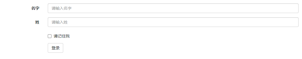
Horizontal form
- Both column - * - offset and column - * - push can offset a column to the right; col-*-offset uses the margin left attribute to shift right, and col-*-push uses the float + left attribute to shift right
1) Add a form horizontal class to the parent < form > element
2) Put the label and control in a < div > with a form group class
3) Add the control label class to the label
<!DOCTYPE html>
<html>
<head>
	<meta charset="utf-8">
	<title>Bootstrap example - Horizontal form</title>
	<link rel="stylesheet" href="https://cdn.staticfile.org/twitter-bootstrap/3.3.7/css/bootstrap.min.css">
	<script src="https://cdn.staticfile.org/jquery/2.1.1/jquery.min.js"></script>
	<script src="https://cdn.staticfile.org/twitter-bootstrap/3.3.7/js/bootstrap.min.js"></script>
</head>
<body>

<form class="form-horizontal" role="form">
	<div class="form-group">
		<label for="firstname" class="col-sm-2 control-label">name</label>
		<div class="col-sm-10">
			<input type="text" class="form-control" id="firstname"
				   placeholder="Please enter your name">
		</div>
	</div>
	<div class="form-group">
		<label for="lastname" class="col-sm-2 control-label">surname</label>
		<div class="col-sm-10">
			<input type="text" class="form-control" id="lastname"
				   placeholder="Please enter last name">
		</div>
	</div>
	<div class="form-group">
		<div class="col-sm-offset-2 col-sm-10">
			<div class="checkbox">
				<label>
					<input type="checkbox"> Please remember me
				</label>
			</div>
		</div>
	</div>
	<div class="form-group">
		<div class="col-sm-offset-2 col-sm-10">
			<button type="submit" class="btn btn-default">Sign in</button>
		</div>
	</div>
</form>

</body>
</html>
Supported form controls
- Input box
Bootstrap provides support for all native HTML5 input types, including text, password, datetime, datetime local, date, month, time, week, number, email, url, search, tel and color. - Textarea
When multiple lines of input are required, the text box textarea can be used. If necessary, you can change the rows attribute (fewer rows = smaller boxes, more rows = larger boxes). - Check box and Radio
When creating a form, use checkbox if you want to select several options from the list. If you are limited to selecting only one option, use radio.
Use the checkbox inline class or radio inline class for a series of check boxes and radio boxes to control them to appear on the same line. - Select box
Use the selection box when you want to select from multiple options, but only one option can be selected by default.
Use the < Select > display list option, which is usually a selection list familiar to users, such as states or numbers.
Using multiple="multiple" allows the user to select multiple options. - Static control
When you need to place plain text behind the form label in a horizontal form, use the form control static class on < p >.
Form control status
- Input box focus
When the input box receives: focus, the outline of the input box will be removed and box shadow will be applied. - Disabled input field
If you want to disable an input box, simply add the disabled attribute, which will not only disable the input box, but also change the style of the input box and the style of the mouse pointer when the mouse pointer hovers over the element. - Disabled fieldset
Add the disabled attribute to < fieldset > to disable all controls in the. - Verification status
Bootstrap contains validation styles for error, warning, and success messages. Simply add the appropriate class (. Has warning,. Has error, or. Has success) to the parent element to use the validation status.
Form control size
You can use the input LG class and col LG - * class to set the height and width of the form respectively