Preface
Jingdong is a typical e-commerce website. It is valuable to learn how to make this website. We are going to develop with WebStorm.
The screenshot of the front page of Jingdong is as follows: http://img.smyhvae.com/20180119_1653.jpg
Page Planning: New Empty Project
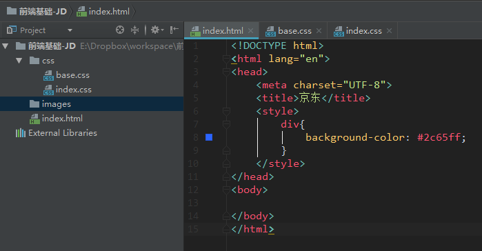
First of all, we will build an empty project:
CSS initialization (basic style)
Jingdong website has some basic styles, which are used in every page: (copy these basic styles to css.base)
Common parts of base.css:
@charset "UTF-8";
/*css Initialization */
html, body, ul, li, ol, dl, dd, dt, p, h1, h2, h3, h4, h5, h6, form, fieldset, legend, img { margin:0; padding:0; }
fieldset, img,input,button { border:none; padding:0;margin:0;outline-style:none; }  /*Remove borders, outlines (such as the blue border outside the input box)*/

/*Remove the dots in front of the list*/
ul, ol {
    list-style: none;
}
input { padding-top:0; padding-bottom:0; font-family: "SimSun","Song style";}  /*The font typically specifies these two*/
select, input { vertical-align:middle;}
select, input, textarea { font-size:12px; margin:0; }
textarea { resize:none; } /*Prohibit dragging text input boxes in the lower right corner (because dragging adjusts the size of input boxes)*/
img {border:0;	vertical-align:middle; }  /* Remove the default 3-pixel gap at the bottom of the image*/
table { border-collapse:collapse; }
body {
    font:12px/150% Arial,Verdana,"\5b8b\4f53";  /*\5b8b\4f53 It refers to Song Style*/
    color:#666;
    background:#fff
}

/*start:Clear float [This method is recommended to clear float]. The left float and the right float are cleared, and the box is just closed.*/
.clearfix:before, .clearfix:after {
    content: "";
    display: table;
}

.clearfix:after {
    clear: both;
}

.clearfix {
    *zoom: 1; /*IE/7/6*/
}
/*end: Clear floating*/

a {color:#666; text-decoration:none; }  /*Remove the underline of the hyperlink*/
a:hover{color:#C81623;} /*The color of hovering mouse*/
h1,h2,h3,h4,h5,h6 {text-decoration:none;font-weight:normal;font-size:100%;} /*font-size:100% Meaning: Make them as big as your father and avoid displaying inconsistent sizes in different browsers*/
s,i,em{font-style:normal;text-decoration:none;}  /*Remove the italics of the i tag and em, and remove the deletion line of the s tag*/
.col-red{color: #C81623!important;}

/*Public class*/
.w { /*Edition center (visual area). It needs to be specially extracted. */
    width: 1210px;
    margin: 0 auto;
}

.fl {
    float: left
}

.fr {
    float: right
}

.al {
    text-align: left
}

.ac {
    text-align: center
}

.ar {
    text-align: right
}

.hide {
    display: none
}
The above code explains:
(1) Ways of clearing floats:
.clearfix:before, .clearfix:after {
    content: "";
    display: table;
}

.clearfix:after {
    clear: both;
}

.clearfix {
    *zoom: 1; /*IE/7/6*/
}
This is the more popular way to clear the float nowadays. For example, millet official website is using this.
(2) Other attributes:
We have outline-style:none for tags such as field set, img, input, button, which means to remove the outline (for example, remove the blue border outside the input box, after that, the blue is gone, but the black still exists). The reason for the removal is: first, the outline is not good; secondly, in google and Firefox browsers, the rendering effect is different.
In img tag, we use vertical-align:middle attribute to remove the default 3-pixel blank gap at the bottom of the picture. Another way to achieve the effect is display: block.
Setting ** font-size:100%** for h1,h2,h3,h4,h5,h6 is because: the size of the H tag is different in each browser, and setting this property means that they are as big as their father.
(3) Some small markers
s is a delete line, i and em are italics. We often use them for small decorations and icons.
Introduce css file
After base.css is initialized, we need to introduce it into the html file. The way to introduce external style sheets is as follows: (stylesheet refers to style sheets)
<link rel="stylesheet" href="css/base.css">
The results are as follows:
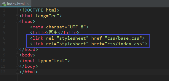
Note that the writing order of base.css and index.css cannot be reversed because they are loaded from top to bottom in the writing order.
Favicon Icon
The Favicon icon refers to the small icon at the arrow:

Official website link https://www.jx.com/favicon.ico You can download this little icon.
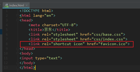
We put the favicon.ico image in the root directory of the project file and load it in the following way:
<link rel="shortcut icon" href="favicon.ico">
Note that short cut icon is a proper noun for Favicon and cannot be changed into another word.
Code location:
Making Top Navigation
Let's start with the following section, which is located at the top of the website:

The html structure of the top navigation bar is as follows: (directly under the body tag)
<!--Top navigation start--> <div class="shortcut"> <!--Layout--> <div class="w"> <!--Left floating region--> <div class="fl"> <div class="dt"> To: Beijing <i><s>◇</s></i> </div> </div> <!--Right floating area--> <div class="fr"> <ul> <li> <a href="#">Hello, please login.</a> <a href="#" class="col-red">Free registration</a> </li> <li class="line"></li> <li>My order</li> <li class="line"></li> <li class="fore">My Jingdong <i><s>◇</s></i> </li> <li class="line"></li> <li>Jingdong member</li> <li class="line"></li> <li>Enterprise procurement</li> <li class="line"></li> <li class="fore tel-jd"> <em class="tel"></em> <!--Small Phone Icon--> Mobile Jingdong <i><s>◇</s></i> </li> <li class="line"></li> <li class="fore"> Focus on Jingdong <i><s>◇</s></i> </li> <li class="line"></li> <li class="fore"> customer service <i><s>◇</s></i> </li> <li class="line"></li> <li class="fore"> Website navigation <i><s>◇</s></i> </li> </ul> </div> </div> </div> <!--Top navigation end-->
The top navigation bar needs to add the following CSS style: (in base.css)
/*Top Navigation start*/
.shortcut {
    height: 30px;
    line-height: 30px;
    background-color: #f1f1f1;
}

.dt,
.shortcut .fore {
    padding: 0 20px 0 10px;
    position: relative;
}

.dt i,
.fore i {
    font: 400 15px/15px "Song style";
    position: absolute;
    top: 13px;
    right: 3px;
    height: 7px;
    overflow: hidden;
    width: 15px;
}

.dt s,
.fore s {
    position: absolute;
    top: -8px;
    left: 0;
}

.fr li {
    float: left;
    padding: 0 10px;
}

.fr .line {
    width: 1px;
    height: 12px;
    background-color: #ddd;
    margin-top: 9px;
    padding: 0;
}

.shortcut .tel-jd {
    padding: 0 20px 0 25px;
}

.tel {
    position: absolute;
    width: 15px;
    height: 20px;
    background: url(../images/sprite.png) no-repeat;
    left: 5px;
    top: 5px;
}
/*Top Navigation end*/
css code interpretation:
(1) The entire top navigation bar is a short cut:
.shortcut {
    height: 30px;
    line-height: 30px;
    background-color: #f1f1f1;
}
Then set the text on the left to float on the left and the text on the right to float on the right.
(2) Complete the left part of the text.
(3) The structure of the right part of the text: nine li are placed in ul to store the text. The code shortcut key is UL > li * 9 (symbol > is the relationship of inclusion).
It should be noted that "login" and "registration" are the same.
(4) Interval line between words:

As shown in the figure above, we find that there is a 1-pixel wide and 12-pixel high spacer between each li, which is also made of li.
(5) Increase the small triangle on the right side of the text.
(6) Add the mobile phone icon in the li of Jingdong, where the css wizard map is used.
The engineering documents of the navigation bar at the top of Jingdong are as follows:
http://download.csdn.net/download/smyhvae/10214943
Top banner graph
Next, we just do the top banner diagram. The effect is as follows:

That's the location of "1 yuan rob treasure" in the picture above.
The html code involved is as follows:
<!--Jingdong topbanner Part-->
<div class="topbanner">
    <div class="w tb">
        <img src="images/topbanner.jpg" alt=""/>
        <a href="javascript:;" class="close-banner"></a>
    </div>
</div>
<!--Jingdong topbanner Part end-->
The CSS code involved in base.css is as follows:
/*topbanner start*/
.topbanner {
    background-color: #8A25C6;
}
.close-banner {
    position: absolute;
    right:0;
    top:5px;
    width: 19px;
    height: 19px;
    background: url(../images/close.png) no-repeat;
}
.close-banner:hover {
    background-position:bottom;
}
.tp{
    position: relative;
}
/*topbanner end*/
Code Interpretation:
The point is close-banner, which is the X in the upper right corner. Here we use the absolute father phase. Note that the relative location of the father is the tb class, because we need to consider the situation of web page zooming.
In the property of close-banner:hover, we set the location of background map as bottom, which means to ensure that the bottom of the wizard map and the bottom of the father are aligned, so that the wizard rabbit map is not located in the way of pixels.
Search box
The UI of the search box is as follows:

In the figure above, there are four parts:
-
logo on the left
-
Search box in the middle
-
The shopping cart on the right
-
Hot search text (below the middle search box)
We enter. search-logo+.search-input+.search-car+.search-moreA in the WebStorm and press the tab key to complete the code:
        <div class="search-logo"></div>
        <div class="search-input"></div>
        <div class="search-car"></div>
        <div class="search-moreA"></div>
The relevant html code is as follows:
<!--search Part start--> <div class="serach"> <div class="w clearfix"> <div class="search-logo"> <a href="http://www.jx.com" title="Beijing West" target="_blank">Jingdong official website</a> </div> <div class="search-input"> <!--placeholder="Motion camera"--> <input type="text" value="Motion camera"/> <button>search</button> </div> <div class="search-car"> <a href="#">My shopping cart</a> <i class="icon1"></i> <i class="icon2">></i> <i class="icon3">8</i> </div> <div class="search-moreAlink"> <a href="#" class="col-red">Exit 999</a> <a href="#">Boiling kitchen</a> <a href="#">249 Minus 100</a> <a href="#">Mobile phone Festival</a> <a href="#">50 per 150</a> <a href="#">Boots</a> <a href="#">Chocolates</a> <a href="#">cool1 Mobile phone</a> <a href="#">Men's sweater</a> </div> </div> </div> <!--search Part end-->
The relevant css code is as follows:
/*search Part start*/
.search-logo {
    float: left;
    width: 362px;
    height: 60px;
    padding: 20px 0;
}
.search-logo a {
    width: 270px;
    height: 60px;
    display: block;
    text-indent: -9999px;
    background: url(../images/logo.png) no-repeat;
}
.search-input {
    float: left;
    height: 36px;
    padding-top: 25px;
}
.search-input input {
    float: left;
    width: 450px;
    height: 32px;
    padding-left: 4px;
    font: 400 14px/32px "microsoft yahei";
    color: rgb(153, 153, 153);
    border: 2px solid #B61D1D;
    border-right: 0;
}
.search-input button {
    width: 82px;
    height: 36px;
    color: #fff;
    float: left;
    font: 400 16px/36px "Microsoft YaHei";
    background-color: #B61D1D;
    cursor: pointer;
    /*cursor: pointer;          Become a little hand*/
    /*cursor: text;             Cursor*/
    /*cursor: move;             Turn into a four-pointed arrow*/
    /*cursor: default;          Turn white*/
}
.search-car {
    float: right;
    width: 96px;
    height: 34px;
    line-height: 34px;
    padding-left: 43px;
    position: relative;
    margin: 25px 65px 0 0;
    border: 1px solid #DFDFDF;
    background-color: #F9F9F9;
}
.icon1 {
    position: absolute;
    top: 9px;
    left: 18px;
    width: 18px;
    height: 16px;
    background: url(../images/tel.png) no-repeat 0 -58px;
}
.icon2 {
    position: absolute;
    right: 10px;
    color: #999;
    /*font-family: "SimSun";*/
    font: 13px/34px "SimSun";
}
.icon3 {
    position: absolute;
    top: -5px;
    /*left: 0;*/
    width: 16px;
    height: 14px;
    background-color: #C81623;
    line-height: 14px;
    text-align: center;
    color: #fff;
    border-radius: 7px 7px 7px 0;  /*round rectangle*/
}
.search-moreAlink {
    float: left;
    width: 530px;
    height: 28px;
    line-height: 28px;
}
.search-moreAlink a {
    margin-right: 8px;
}
/*search Part end*/
For these four parts, we will explain them in turn.
1. logo on the left
In order to facilitate SEO, you need to add text to the hyperlink of the picture, and then set the indent of the text to text-indent: -9999px;.
2. Search Bar
"Search" button: When we put the mouse on "Search", we found that the mouse turned into a small hand. Here we use the cursor attribute.
cursor has the following attribute values:
        cursor: pointer;          /*Become a little hand*/
        cursor: text;             /*Cursor*/
        cursor: move;             /*Turn into a four-pointed arrow*/
        cursor: default;          /*Become the default arrow*/
3. Shopping cart
The shopping cart contains four elements: a text and three icons.
In order to get the text "My shopping cart" in the middle of the upper and lower directions, we give the line-height of the < a > label as the height of the father.
In addition, the four words "my shopping cart" are not in the middle of the level, so we can give it a padding on the left instead of padding on the right.
The other three icons can be done with absolute positioning.
Small icon in the upper right corner (rounded rectangle): Its red background is not a picture, but a rounded rectangle drawn with border-radius attributes.
Rounded rectangular border-radius has the following drawings:
    border-radius: wide/High half;
    border-radius: 50%;
    border-radius: 0.3em;
    border-radius: The upper left corner, the upper right corner, the lower right corner and the lower left corner;
Hot search text under the search box
Hot search text is not very functional, just use a few hyperlinks < a > tags (each A is separated by margin). There is no need to put Li in ul and a in li, as in other navigation bars.
Note that each a is separated by margin, not padding; otherwise, there will be a jump in the middle of the mouse click.
The engineering files of the top navigation bar + top banner + search box are as follows:
http://download.csdn.net/download/smyhvae/10218022
slogen: slogan
The results required are as follows:

As you can see from the figure above, the effect here is to ensure that the left side of the second slogen is in the middle of the browser no matter how the browser moves. This is knowledge that can be used for absolute positioning.
The code for html is as follows:
    <!--Slogan at the bottom start-->
    <div class="slogen">
        <span class="item slogen1">
            <img src="images/slogen1.png" alt=""/>
        </span>
        <span class="item slogen2">
            <img src="images/slogen2.png" alt=""/>
        </span>
        <span class="item slogen3">
            <img src="images/slogen3.png" alt=""/>
        </span>
        <span class="item slogen4">
            <img src="images/slogen4.png" alt=""/>
        </span>
    </div>
    <!--Slogan at the bottom end-->
class=slogen refers to the entire slogen region. item represents the same part of the four slogans.
The code of css is as follows.
/*The slogan at the bottom is start*/
.slogen {
    height: 54px;
    padding: 20px 0;
    background-color: #f5f5f5;
    position: relative;
    margin-bottom: 15px;
}

.item {
    width: 302px;
    position: absolute;
    top: 20px;
    left: 50%;
}

.slogen1 {
    margin-left: -608px;
}

.slogen2 {
    margin-left: -304px;
}

.slogen3 {
    margin-left: 2px;
}

.slogen4 {
    margin-left: 304px;
}

/*The slogan at the bottom is end*/
Let's set left: 50% for item; make sure that each item moves right in the middle of the father. Then each item can move the corresponding distance.
The Lowest Shopping Guide: Area Coverage
The results to be achieved are as follows:

In the figure above, there are two parts to be implemented: the shopping guide on the left and the area coverage on the right (I separated the two parts with red lines).
Shopping Directory
The layout to be used is as follows:

The emphasis here is to measure the line heights of dt and dd.
The html code is as follows:
    <!--Shopping guide, etc. start-->
    <div class="w footer-shopping clearfix">
        <dl>
            <dt>Shopping Directory</dt>
            <dd><a href="#">Shopping process</a></dd>
            <dd><a href="#">Member introduction</a></dd>
            <dd><a href="#">Life Travel/Group buying</a></dd>
            <dd><a href="#">Common problem</a></dd>
            <dd><a href="#">Large household appliances</a></dd>
            <dd><a href="#">Contact Customer Service</a></dd>
        </dl>
        <dl>
            <dt>Distribution mode</dt>
            <dd><a href="#">From door to door</a></dd>
            <dd><a href="#">211 Limited time</a></dd>
            <dd><a href="#">Distribution Service Query</a></dd>
            <dd><a href="#">Distribution Fee Collection Standard</a></dd>
            <dd><a href="#">Overseas distribution</a></dd>
        </dl>
        <dl>
            <dt>Shopping Directory</dt>
            <dd><a href="#">Shopping process</a></dd>
            <dd><a href="#">Member introduction</a></dd>
            <dd><a href="#">Life Travel/Group buying</a></dd>
            <dd><a href="#">Common problem</a></dd>
            <dd><a href="#">Large household appliances</a></dd>
            <dd><a href="#">Contact Customer Service</a></dd>
        </dl>
        <dl>
            <dt>Shopping Directory</dt>
            <dd><a href="#">Shopping process</a></dd>
            <dd><a href="#">Member introduction</a></dd>
            <dd><a href="#">Life Travel/Group buying</a></dd>
            <dd><a href="#">Common problem</a></dd>
            <dd><a href="#">Large household appliances</a></dd>
            <dd><a href="#">Contact Customer Service</a></dd>
        </dl>
        <dl class="last-dl">
            <dt>Shopping Directory</dt>
            <dd><a href="#">Shopping process</a></dd>
            <dd><a href="#">Member introduction</a></dd>
            <dd><a href="#">Life Travel/Group buying</a></dd>
            <dd><a href="#">Common problem</a></dd>
            <dd><a href="#">Large household appliances</a></dd>
            <dd><a href="#">Contact Customer Service</a></dd>
        </dl>
    </div>
    <!--Shopping guide, etc. end-->
Because this area is floating, we need to clear the floating by clearfix class to prevent it from being covered.
The css code is as follows:
/*Shopping guides, etc.*/
.footer-shopping {
    margin-top: 16px;  /*Keep a distance from the top*/
}
.footer-shopping dl{
    float: left;
    width: 200px;
}
dl.last-dl {
    width: 100px;
}
.footer-shopping dt{
    height: 34px;
    font: 400 16px/34px "microsoft yahei";
}
.footer-shopping dd{
    line-height: 20px;
}
/*Shopping guide, etc.*/
Regional coverage
The html code is as follows:
                <div class="coverage">
                    <h3> Beijing East Self-operated Coverage Area and County</h3>
                    <p> Jingdong has provided its own distribution services to 2654 districts and counties nationwide, supporting cash on delivery, POS card swiping and after-sales door-to-door service. </p>
                    <a href=""> View Details></a>
                </div>
The css code is as follows:
/*Coverage area start*/
.coverage {
    float: left;
    width: 186px;
    height: 169px;
    margin-right: 60px;
    padding-left: 17px;
    background: url(../images/china.png) no-repeat left bottom;
}

.coverage h3 {
    height: 34px;
    font: 400 16px/34px "microsoft yahei";
}

.coverage p {
    padding-top: 8px;
}
.coverage a {
    float: right;
}
/*Coverage area end*/
Note that when setting the wizard map to the background, the location attribute used here is left bottom, which means to ensure that the left side of the wizard map is aligned with the left side of the father, and the lower side with the father. In this way, there is no need to locate by pixels.
lowest level
The bottom effect is as follows:

As shown in the figure above, it contains three parts.
The html code involved is as follows:
    <!--lowest level start-->
    <div class="w footer-bottom">

        <div class="footer-about">
            <a href="#">About us</a>|
            <a href="#">Contact us</a>|
            <a href="#">Contact Customer Service</a>|
            <a href="#">Merchant entry</a>|
            <a href="#">Marketing Center</a>|
            <a href="#">Mobile Jingdong</a>|
            <a href="#">Friendship link</a>|
            <a href="#">Sales alliance</a>|
            <a href="#">Jingdong community</a>|
            <a href="#">Jingdong public interest</a>|
            <a href="#">English Site</a>|
            <a href="#">Contact Us</a>
        </div>

        <div class="footer-copyright">
            <img src="images/guohui.png"/>Beijing Public Network AnBei 11000002000088  |  Beijing ICP No. 070359  |  Qualification Certificate Number of Internet Drug Information Service(Beijing)-Management nature-2014-0008  |  New Start Beijing Zero Character No. 120007<br>
            Internet Publishing License Number New Online License(Beijing)Word 150  |  Publications License  |  Beijing Internet Culture License[2014]2148-348 Number  |  Illegal and Bad Information Reporting Telephone: 4006561155<br>
            Copyright © 2004 - 2016   JX.com Copyright  |  Consumer rights hotline: 4006067733<br>
            Jingdong's website: Jingdong Wallet
        </div>

        <div class="footer-bottom-img">
            <a href="#"><img src="images/img1.jpg"/></a>
            <a href="#"><img src="images/img1.jpg"/></a>
            <a href="#"><img src="images/img1.jpg"/></a>
            <a href="#"><img src="images/img1.jpg"/></a>
            <a href="#"><img src="images/img1.jpg"/></a>
            <a href="#"><img src="images/img1.jpg"/></a>
        </div>
    </div>
    <!--lowest level end-->
The css code involved is as follows:
/*Bottom start*/
.footer-bottom {
    margin-top: 20px;
    text-align: center;  /*Let the text center horizontally in the container*/
    padding: 20px 0 30px;
    border-top: 1px solid #E5E5E5;
}

.footer-bottom .footer-about a{
    margin: 0 10px;
}

.footer-copyright {
    padding: 10px 0;
}

.footer-bottom-img a {
    margin: 0 5px;
}
/*Bottom end*/
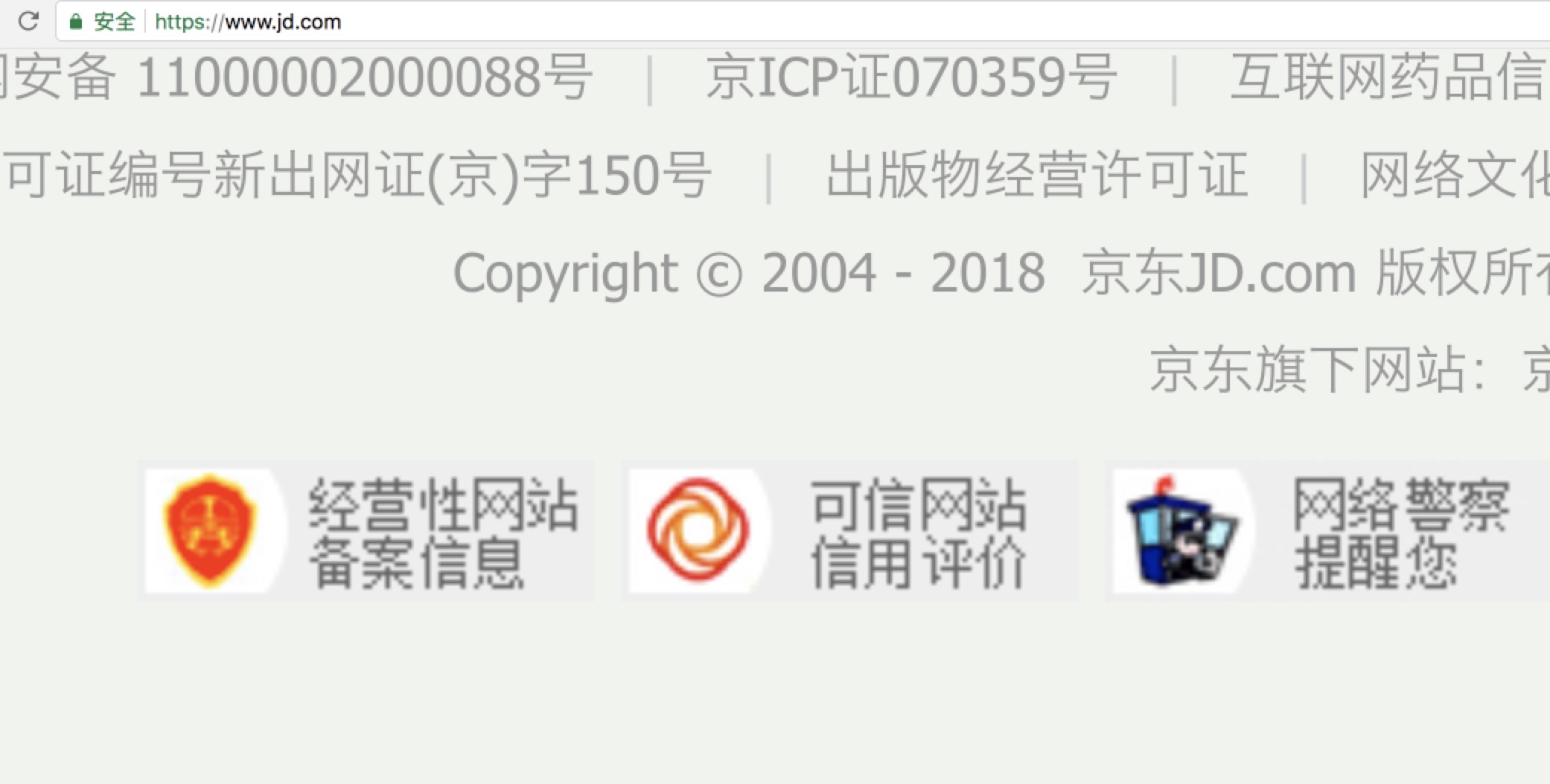
You go to the official website of Jingdong and find that the bottom text is actually a picture.
summary
The final results are as follows:
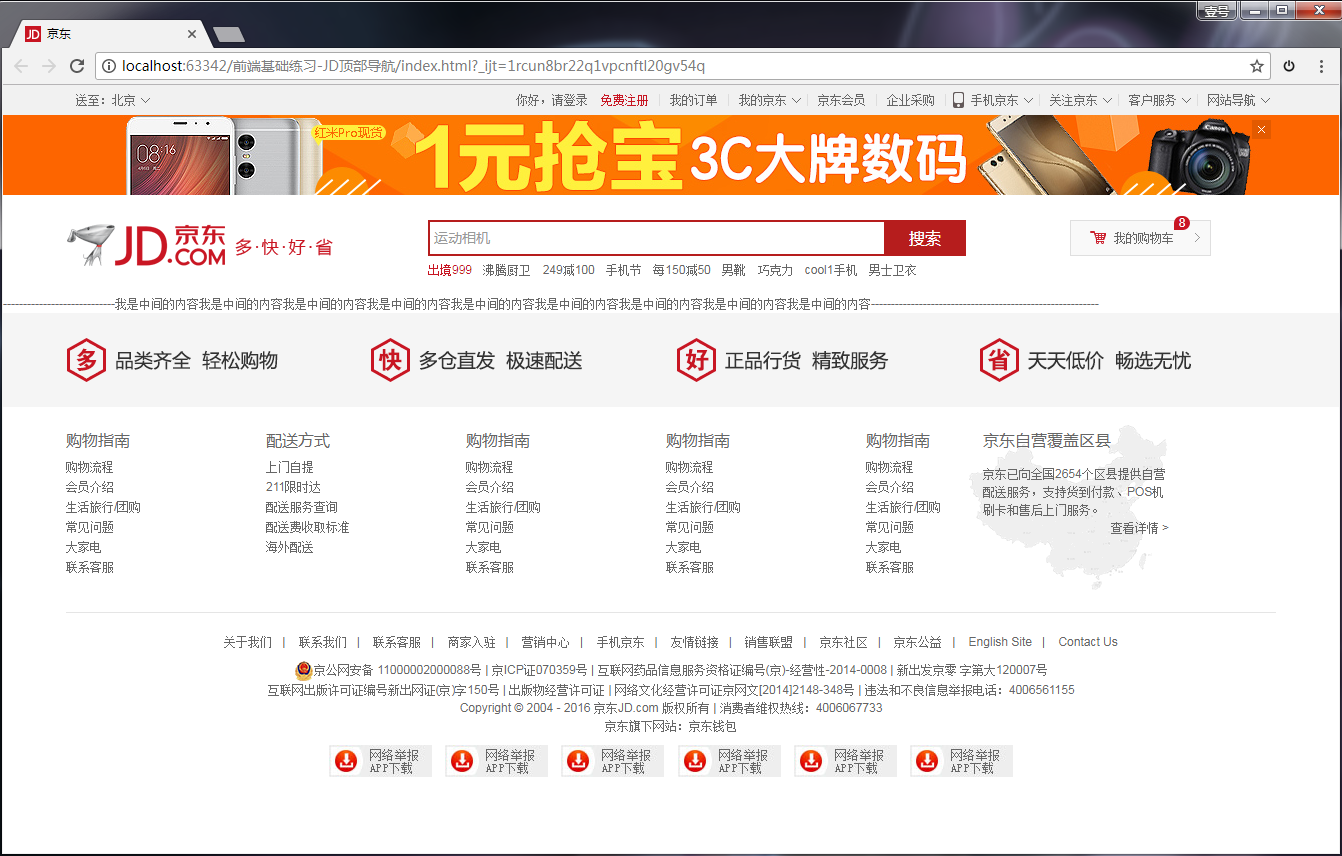
The corresponding engineering documents are as follows: