| preface | ❤️ In order to illuminate the night sky, the stars stand high in the sky ❤️ |
|---|
1, CSS Chapter 8
(1) 2D conversion
one ️⃣ Transformation is one of the subversive features in CSS3, which can realize the effects of element displacement, rotation, scaling and so on;
two ️⃣ transform can be simply understood as deformation: Move: translate, rotate: rotate, scale: scale;
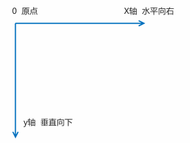
1.1 two dimensional coordinate system
2D conversion is a technology to change the position and shape of labels on the two-dimensional plane. Let's learn the two-dimensional coordinate system first;
1.2 2D translation
2D movement is a function of 2D conversion, which can change the position of elements in the page, similar to positioning;
The syntax is as follows:
transform: translate(x,y);
Or write it separately
transform: translateX(n);
transform: translateY(n);
😆 Warm reminder 😆:
- Define the movement in 2D conversion and move elements along the X and Y axes;
- The biggest advantage of translate: it will not affect the position of other elements;
- The percentage unit in translate is the translate relative to its own element: (50%, 50%);
- No effect on in-line labels;
1.3 rotation of 2D conversion
2D rotation refers to making the element rotate clockwise or counterclockwise in the 2-dimensional plane;
The syntax is as follows:
transform:rotate(degrees);
😆 Warm reminder 😆:
- Rotate is followed by degrees, and the unit is deg, such as rotate(45deg);
- When the angle is positive, it is clockwise, and when it is negative, it is counterclockwise;
- The default rotation center point is the center point of the element;
1.4 transform origin of 2D conversion center point
We can set the center point of element transformation;
The syntax is as follows:
transform-origin: x y;
😆 Warm reminder 😆:
- Note that the following parameters x and y are separated by spaces;
- The center point of Y element is 50% by default;
- You can also set pixels or position nouns (top bottom left right center) for X and Y;
1.5 scaling of 2D conversion
Zoom, as the name suggests, can zoom in and out. As long as you add this attribute to an element, you can control whether it zooms in or out;
The syntax is as follows:
transform:scale(x,y);
😆 Warm reminder 😆:
- Note that x and y are separated by commas;
- transform:scale(1,1): double the width and height, compared with no magnification;
- transform:scale(2,2): the width and height are magnified twice;
- transform:scale(2): write only one parameter, and the second parameter is the same as the first parameter, which is equivalent to scale(2,2);
- transform:scale(0.5,0.5): reduce;
- sacle: the center of the box is set to be the largest point, and the default point of the box can not be scaled;
1.5.1 case: pagination button
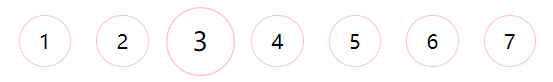
The complete code is demonstrated as follows:
<!DOCTYPE html>
<html lang="en">

<head>
    <meta charset="UTF-8">
    <meta name="viewport" content="width=device-width, initial-scale=1.0">
    <meta http-equiv="X-UA-Compatible" content="ie=edge">
    <title>Document</title>
    <style>
        li {
            float: left;
            width: 40px;
            height: 40px;
            border: 1px solid pink;
            margin: 10px;
            text-align: center;
            line-height: 40px;
            list-style: none;
            border-radius: 50%;
            cursor: pointer;
            transition: all .4s;
        }

        li:hover {
            transform: scale(1.3);
        }
    </style>
</head>

<body>
    <ul>
        <li>1</li>
        <li>2</li>
        <li>3</li>
        <li>4</li>
        <li>5</li>
        <li>6</li>
        <li>7</li>
    </ul>
</body>

</html>
1.6 2D conversion comprehensive writing method
😆 be careful 😆:
- Multiple transformations are used at the same time. The format is: transform: translate() rotate() scale()... And so on;
- The order affects the effect of the conversion. (change the direction of the coordinate axis first);
- When we write comprehensively and have displacement and other attributes at the same time, remember to put the displacement first;
(2) Animation
Animation is one of the subversive features in CSS3. You can set multiple nodes to accurately control one or a group of animation, which is often used to achieve complex animation effects. Compared with transition, animation can achieve more changes, more control, continuous automatic playback and other effects.
2.1 basic use of animation
Making animation is divided into two steps: 1 Define the animation first; 2. Reuse (call) animation;
one ️⃣ Define animation with keyframes (similar to defining class selector);
The code is shown as follows:
/* 1. Define animation */
@keyframes Animation name {
	/* Start state */
	0%{
		width:100px;
	}
	/* End state */
	100%{
		width:200px;
	}
}
😆 Animation sequence 😆:
- 0% is the beginning of the animation and 100% is the completion of the animation. Such rules are animation sequences;
- Specify a CSS style in @ keyframes to create an animation effect that gradually changes from the current style to a new style;
- Animation is the effect of gradually changing elements from one style to another. You can change as many styles as you want and as many times as you want;
- Please specify the time of change with percentage, or use the keywords "from" and "to", which are equivalent to 0% and 100%;
two ️⃣ Element use animation;
The code is shown as follows:
div {
	width: 200px;
	height: 200px;
	background-color: pink;
	margin: 100px auto;
	/* Call animation */
	animation-name: Animation name;
	/* Duration */
	animation-duration: Duration;
}
2.2 common attributes of animation
| attribute | describe |
|---|---|
| @keyframes | Specify animation. |
| animation | Short for all animation attributes, except the animation play state attribute. |
| animation-name | Specifies the name of the @ keyframes animation. (required) |
| animation-duration | Specifies the seconds or milliseconds that the animation takes to complete a cycle. The default is 0. (required) |
| animation-timing-function | Specifies the speed curve of the animation. The default is "ease". |
| animation-delay | Specifies when the animation starts. The default is 0. |
| animation-iteration-count | Specify the number of times the animation is played. The default is 1 and infinite. |
| animation-direction | Specifies whether the animation is played backwards in the next cycle. The default is "normal" and "alternate". |
| animation-play-state | Specifies whether the animation is running or paused. The default is "running" and "paused". |
| animation-fill-mode | Specify the state after the end of the animation, keep forwards and return to the starting backwards. |
2.3 animation abbreviation attribute
Animation: animation name, duration, when the motion curve starts playing, and whether the animation starts or ends in the opposite direction;
The code is shown as follows:
animation: myfirst 5s linear 2s infinite alternate;
😆 Warm reminder 😆:
- The short attribute does not contain animation play state;
- Pause Animation: animation play state: pushed; It is often used in conjunction with the mouse and other;
- Want the animation to come back instead of jumping back directly: animation direction: alternate;
- After the box animation, stop at the end position: animation fill mode: forwards;
2.4 speed curve details
Animation timing function: Specifies the speed curve of animation. The default is "ease";
| value | describe |
|---|---|
| linear | The speed of the animation is the same from beginning to end. Uniform speed |
| ease | Default. The animation starts at a low speed, then speeds up and slows down before it ends. |
| ease-in | The animation starts at a low speed. |
| ease-out | The animation ends at low speed. |
| ease-in-out | The animation starts and ends at low speed. |
| steps() | Specifies the number of intervals (in steps) in the time function |
(3) 3D conversion
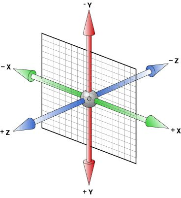
3.1 3D coordinate system
Three dimensional coordinate system actually refers to three-dimensional space, which is composed of three axes.
one ️⃣ x axis: horizontal to the right. Note: the right side of x is positive and the left side is negative;
two ️⃣ y axis: vertically downward. Note: the lower part of y is positive and the upper part is negative;
three ️⃣ z-axis: vertical screen. Note: positive value to the outside and negative value to the inside;
3.2 3D mobile translate3d
3D movement adds a movable direction on the basis of 2D movement, that is, the z-axis direction.
- translform:translateX(100px): just move on the x-axis;
- translform:translateY(100px): just move on the Y axis;
- translform:translateZ(100px): it only moves on the Z axis (Note: translateZ is generally in PX units);
- transform:translate3d(x,y,z): where x, y and Z respectively refer to the distance in the direction of the axis to be moved;
Because the z-axis is perpendicular to the screen and points from the inside to the outside, the default is that you can't see the elements moving in the direction of the z-axis.
3.3 perspective
Produce near large and far small visual stereo in 2D plane, but the effect is only two-dimensional;
- If you want to produce a 3D effect on a web page, you need Perspective (understood as a 3D object projected in a 2D plane);
- Perspective is also called sight distance: sight distance is the distance from human eyes to the screen;
- The closer to the visual point, the larger the imaging in the computer plane, and the farther the imaging is, the smaller the imaging is;
- The unit of perspective is pixels;
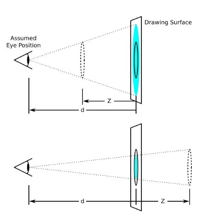
d: Is the sight distance, which is the distance from people's eyes to the screen;
z: The z-axis is the distance between the object and the screen. The larger the z-axis (positive value), the larger the object we see;
😆 Warm reminder 😆: The perspective is written on the parent box of the observed element;
3.4 3D rotate3d
Rotate the 3D element along the x axis or the z axis.
The syntax is as follows:
transform:rotateX(45deg): along x Rotate the shaft 45 degrees in the positive direction
transform:rotateY(45deg) : along y The shaft rotates 45 in the positive direction deg
transform:rotateZ(45deg) : along Z The shaft rotates 45 in the positive direction deg

transform:rotate3d(x,y,z,deg):  Rotate along custom axis deg Angle (just understand)
Example 1 transform:rotate3d(1,0,0,45deg) Is along x Shaft rotation 45 deg
 Example 2 transform:rotate3d(1,1,0,45deg) Is to rotate 45 diagonally deg
To judge the direction of element rotation, we need to learn a left-handed criterion first.
one ️⃣ The thumb of the left hand points in the positive direction of the y axis;
two ️⃣ The bending direction of other fingers is the rotation direction of the element along the y-axis (positive value);
3.5 3D rendering transfrom style
one ️⃣ Control whether the sub element turns on the three-dimensional environment;
two ️⃣ Transform style: the sub element of flat does not enable the default of 3d stereo space;
three ️⃣ transform-style: preserve-3d; Sub elements open three-dimensional space;
four ️⃣ The code is written to the parent, but it affects the sub box;
The display effect is as follows:

The complete code is demonstrated as follows:
<!DOCTYPE html>
<html lang="en">

<head>
    <meta charset="UTF-8">
    <meta name="viewport" content="width=device-width, initial-scale=1.0">
    <meta http-equiv="X-UA-Compatible" content="ie=edge">
    <title>Document</title>
    <style>
        body {
            perspective: 500px;
        }

        .box {
            position: relative;
            width: 200px;
            height: 200px;
            margin: 100px auto;
            transition: all 2s;
            /* Let the sub elements maintain the 3d space environment */
            transform-style: preserve-3d;
        }

        .box:hover {
            transform: rotateY(60deg);
        }

        .box div {
            position: absolute;
            top: 0;
            left: 0;
            width: 100%;
            height: 100%;
            background-color: pink;
        }

        .box div:last-child {
            background-color: purple;
            transform: rotateX(60deg);
        }
    </style>
</head>

<body>
    <div class="box">
        <div></div>
        <div></div>
    </div>
</body>

</html>
3.6 case study
3.6.1 case: 3D navigation bar
The display effect is as follows:

The complete code is demonstrated as follows:
<!DOCTYPE html>
<html lang="en">

<head>
    <meta charset="UTF-8">
    <meta name="viewport" content="width=device-width, initial-scale=1.0">
    <meta http-equiv="X-UA-Compatible" content="ie=edge">
    <title>Document</title>
    <style>
        * {
            margin: 0;
            padding: 0;
        }

        ul {
            margin: 100px;
        }

        ul li {
            float: left;
            margin: 0 5px;
            width: 200px;
            height: 35px;
            line-height: 35px;
            text-align: center;
            list-style: none;
            /* Later, we need to rotate the box and also need perspective. Simply add the sub box inside li to have perspective effect */
            perspective: 500px;
        }

        .box {
            position: relative;
            width: 100%;
            height: 100%;
            transform-style: preserve-3d;
            transition: all 1s;
        }

        .box:hover {
            transform: rotateX(90deg);
        }

        .front,
        .bottom {
            position: absolute;
            left: 0;
            top: 0;
            width: 100%;
            height: 100%;
        }

        .front {
            background-color: pink;
            z-index: 1;
            transform: translateZ(17.5px);
        }

        .bottom {
            background-color: purple;
            /* This x-axis must be negative */
            /* If we have mobile or other styles, we must write our mobile first */
            transform: translateY(17.5px) rotateX(-90deg);
        }
    </style>
</head>

<body>
    <ul>
        <li>
            <div class="box">
                <div class="front">Warriors Championship!</div>
                <div class="bottom">Warriors Championship!</div>
            </div>
        </li>
        <li>
            <div class="box">
                <div class="front">Warriors Championship!</div>
                <div class="bottom">Warriors Championship!</div>
            </div>
        </li>
        <li>
            <div class="box">
                <div class="front">Warriors Championship!</div>
                <div class="bottom">Warriors Championship!</div>
            </div>
        </li>
        <li>
            <div class="box">
                <div class="front">Warriors Championship!</div>
                <div class="bottom">Warriors Championship!</div>
            </div>
        </li>
    </ul>
</body>

</html>
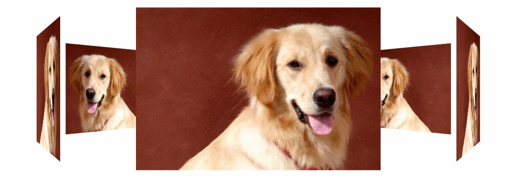
3.6.2 case: rotating pictures
The display effect is as follows:
The complete code is demonstrated as follows:
<!DOCTYPE html>
<html lang="en">

<head>
    <meta charset="UTF-8">
    <meta name="viewport" content="width=device-width, initial-scale=1.0">
    <meta http-equiv="X-UA-Compatible" content="ie=edge">
    <title>Case: rotating pictures</title>
    <style>
        body {
            perspective: 2000px;
        }

        section {
            position: relative;
            width: 300px;
            height: 200px;
            margin: 150px auto;
            transform-style: preserve-3d;
            /* Add animation effect */
            animation: rotate 10s linear infinite;
            /* background: url(media/dog.jpg) no-repeat; */
        }

        section:hover {
            /* Put the mouse into the section to stop the animation */
            animation-play-state: paused;
        }

        @keyframes rotate {
            0% {
                transform: rotateY(0);
            }

            100% {
                transform: rotateY(360deg);
            }
        }

        section div {
            position: absolute;
            top: 0;
            left: 0;
            width: 100%;
            height: 100%;
            background: url(media/dog.jpg) no-repeat;
        }

        section div:nth-child(1) {
            transform: rotateY(0) translateZ(300px);
        }

        section div:nth-child(2) {
            /* Rotate first and then move the distance */
            transform: rotateY(60deg) translateZ(300px);
        }

        section div:nth-child(3) {
            /* Rotate first and then move the distance */
            transform: rotateY(120deg) translateZ(300px);
        }

        section div:nth-child(4) {
            /* Rotate first and then move the distance */
            transform: rotateY(180deg) translateZ(300px);
        }

        section div:nth-child(5) {
            /* Rotate first and then move the distance */
            transform: rotateY(240deg) translateZ(300px);
        }

        section div:nth-child(6) {
            /* Rotate first and then move the distance */
            transform: rotateY(300deg) translateZ(300px);
        }
    </style>
</head>

<body>
    <section>
        <div></div>
        <div></div>
        <div></div>
        <div></div>
        <div></div>
        <div></div>
    </section>
</body>

</html>
😆 Warm reminder 😆:
one ️⃣ Add perspective effect to the body perspective: 2000px;
two ️⃣ When adding a size to the section, be sure not to forget to add 6 div s in the 3d rendering effect control. Don't forget that the son has no father, and the section should be relatively positioned;
three ️⃣ All six div s inside are absolutely positioned and stacked together, and then move at different angles and distances.
four ️⃣ Add animation to the section so that it can rotate automatically;
(4) Browser private prefix
The browser private prefix is to be compatible with the writing of the old version, and the newer version of the browser does not need to be added.
one ️⃣ - moz -: represents the private property of firefox browser;
two ️⃣ - ms -: represents the private attribute of ie browser;
three ️⃣ - webkit -: represents safari and chrome private attributes;
four ️⃣ - o -: represents the private attribute of Opera;
The code is shown as follows:
-moz-border-radius: 10px;
-webkit-border-radius: 10px;
-o-border-radius: 10px;
border-radius: 10px;
2, Summary
😝 Because there are many contents, I decided to write separately. I will keep updating! Like friends, remember to praise! 😝