CSS Basics
1: What is CSS
Cascading style sheets (English full name: Cascading Style Sheets) is a computer language used to represent file styles such as HTML (an application of Standard General Markup Language) or XML (a subset of Standard General Markup Language). CSS can not only modify web pages statically, but also format each element of web pages dynamically with various scripting languages.
CSS can accurately control the layout of elements in the web page at the pixel level, support almost all font and size styles, and have the ability to edit web page objects and model styles.
Note: find CSS style websites:
CSS style rookie tutorial
2: Selector
1: idea new CSS catalog style
2: Two methods of CSS code application in HTML
a: Create a new CSS file, write CSS code in it, and then insert a link to the CSS file in HTML
<link rel="stylesheet" href="css/style.css">
b: Insert the style tag in the head tag and write css code in the style tag
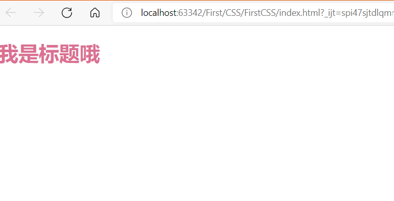
a: Label selector
Format: selector {}
Use CSS to change the font color under h1 label:
<!DOCTYPE html>
<html lang="en">
<head>
    <meta charset="UTF-8">
    <title>Title</title>
    <style>
/*This is called CSS annotation*/
        h1{
           color: #c1e6ad;
        }
    </style>

</head>
<body>
<h1>I'm the title</h1>
</body>
</html>
style should be written in the head tag.

Note: for ordinary selector, all h1 will change color
The selector set above is called internal style, and the one with a higher priority is called inline style.
Is to set style directly in the line of h1.
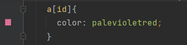
<h1 style="color: palevioletred">I'm the title</h1>

When there are internal styles and inline styles at the same time, the effect of the final label still depends on the inline style.
<!DOCTYPE html>
<html lang="en">
<head>
    <meta charset="UTF-8">
    <title>Title</title>
    <style>
/*This is called CSS annotation*/
        h1{
           color: #c1e6ad;
        }
    </style>

</head>
<body>
<h1 style="color: palevioletred">I'm the title</h1>
</body>
</html>
3: Three selectors
a: Label selector, as above
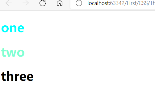
b: Class selector
Format: Name of class
It can be implemented across tags
Class: controls each tag with the same class.
<head>
    <meta charset="UTF-8">
    <title>Title</title>
    <style>
        .Zhang San{
          color: aqua;
        }
        .Li Si{
          color: aquamarine;
        }
    </style>
</head>
<body>
<!--Class selector -->
<h1 class="Zhang San">one</h1>
<h1 class="Li Si">two</h1>
<h1>three</h1>
</body>
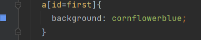
c: Format of ID selector: #id name {}
id is globally unique and cannot be reused
Do not follow the principle of proximity: fixed
id selector > class selector > label selector
When h1 is set to Zhang San, other tags cannot be set to Zhang San.
Therefore, it is a separate control for each label.
<head>
    <meta charset="UTF-8">
    <title>Title</title>

    <style>
     #Zhang San{
       color: cornflowerblue;
     }
    </style>
</head>
<body>
<h1 id="Zhang San">Zhang San</h1>
<h1>Li Si</h1>
<h1>Wang Wu</h1>
<h1>Zhao Liu</h1>
<h1>ha-ha</h1>
</body>
4: Hierarchy selector
a: Descendant selector
All descendants of the element following an element (in this case, body),
<style>
body p{
        background: aquamarine;
      }
<style>
This is all p elements after the body is selected
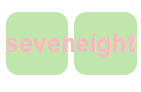
The first generation of body: P, ul and h1. The generation of ul is also p, and all children P will be selected, so the P after ul will also be selected.
<body>
<p>zero</p>
<p class="active">one</p>
<p>two</p>
<p>three</p>
<ul>
  <li>
    <p>four</p>
  </li>
  <li>
    <p>five</p>
  </li>
  <li>
    <p>six</p>
  </li>
</ul>
<p class="active">seven</p>
<h1>eight</h1>

</body>
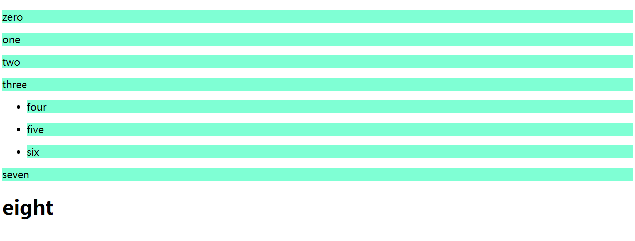
Note: only body has descendants p and h1, but h1 is not a descendant of p. they are parallel.
So if you want to select h1, you should write:
<style>
 body h1{
        background: aquamarine;
      }
 </style>
b: Sub selector
Only the next generation is selected, so the offspring p in ul will not be selected
Format:
<style>
body>p{
       background: antiquewhite;
      }
</style>

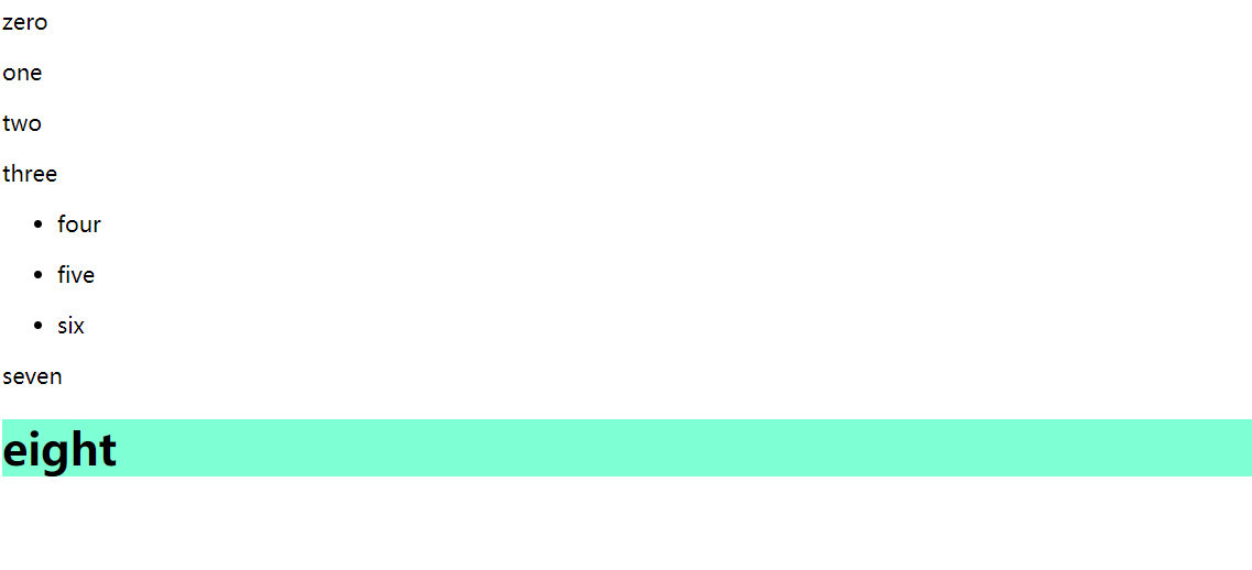
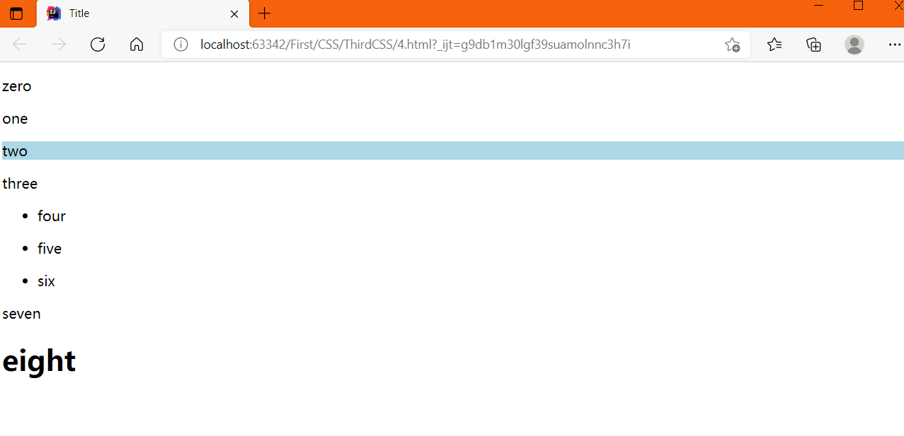
c: Adjacent sibling selector
The next label of the selected label (occurring between generations)
<style>
.active + p{
       background: lightblue;

     }
     </style>
Select the next label whose class is active
<body>
<p>zero</p>
<p class="active">one</p>
<p>two</p>
<p>three</p>
<ul>
  <li>
    <p>four</p>
  </li>
  <li>
    <p>five</p>
  </li>
  <li>
    <p>six</p>
  </li>
</ul>
<p class="active">seven</p>
<h1>eight</h1>

</body>
So the two below one is selected
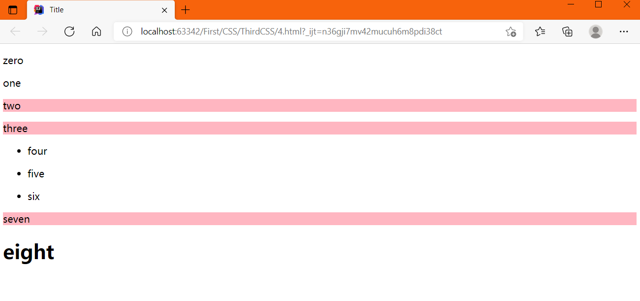
d: Universal selector
All adjacent sibling elements (only below)
<style>
.active~p{
       background: lightpink;
      }
    </style>
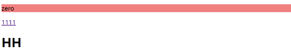
4: Structure pseudo class selector
a: Select the first child element of a label
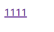
<body>
<p>zero</p>
<a href="">1111</a>

<h1>HH</h1>

<p>one</p>
<p>two</p>
<p>three</p>
<ul>
  <li>li1</li>
  <li>li2</li>
  <li>li3</li>
</ul>
</body>

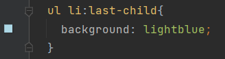
b: Select the last child element of a label
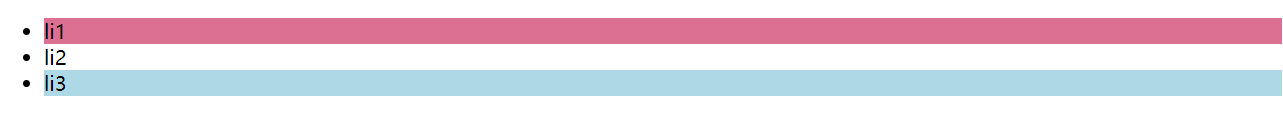
c: Select the first child element of a parent element. Note: if the first element of the child label of body is p, it is written as p; if it is h1, it is written as h1 Because the first one in our body is p, it is written as:

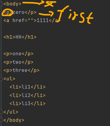

If p is not the first element in the body, it will not take effect
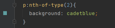
d: Select the second element in the child type of the parent element


In addition, a label changes color when the mouse moves here
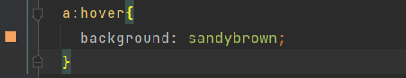

Color change after clicking:
<style>
 a:active{
      color: lightblue;
    }
</style>
5: Attribute selector
Tags contain many attributes. We can select elements through attributes
**a: select the element with id attribute**
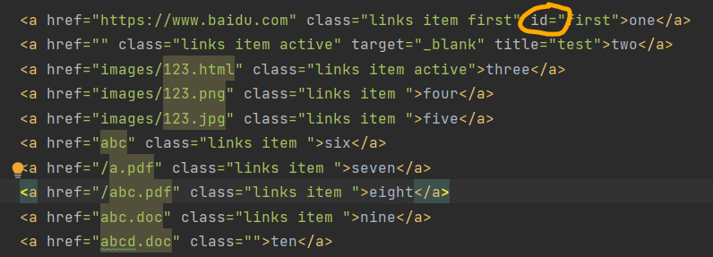

b: Select the element with ID as the first attribute a[id =] {}
Or one

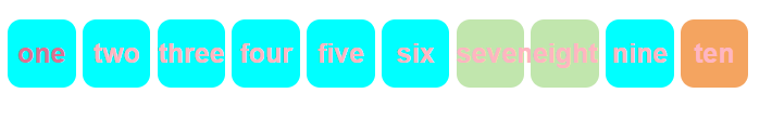
c: Select the element with links item in the class

=The equal sign is absolute equal to
*=Is relative equal to, a bit like fuzzy query

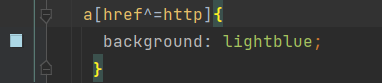
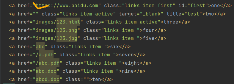
d: Select the elements in the href that begin with http

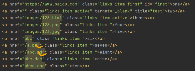
e: Select the pdf terminated element in the href

3: Font and color settings
1: Typeface
 <style>
    p{
      font: 12px "Song typeface";
    }
    </style>
Font family: Arial;
font-size: 25px;
color: aqua;

Coarsening:
font-weight: bold;
2: Colour
Color: RGB 0~F
Transparency RGBA
Vector representation, the first three variables are color variables, and the last variable is transparency
<style>
h1{
      color: rgba(159, 224, 160,0.25);
      text-align: center;
    }
    </style>
Note: text align: Center

3: Miscellaneous
a: First line indent
  <style>
 .p1{
      text-indent: 2em;
    }
      </style>
b: Underline
<style>
.l1{
      text-decoration: underline;
    }
</style>
c: Middle dash
<style>
.l2{
      text-decoration: line-through;
    }
</style>
d: Upper scribe
<style>
 .l3{
      text-decoration: overline;
    }
</style>
effect:
e: Align the picture with the horizontal line of the word
 <style>
      /*Horizontal alignment, reference required*/
    img,span{
      vertical-align: middle;
    }
  </style>
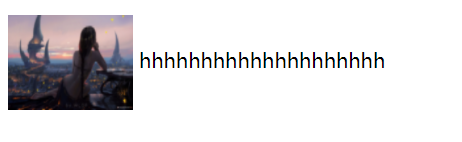
<body>
<p>
  <img src="images/b.jpg" alt="" width="100" height="76">
  hhhhhhhhhhhhhhhhhhhh
</p>

</body>
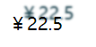
4: Set shadows
From left to right:
<style>
 /*Shadow color, horizontal offset, vertical offset, shadow radius*/
    #price{
      text-shadow: #19404c 10px -10px 2px;
    }
    </style>
4: List style

become:
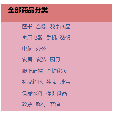
1: Set different colors for the two areas (background)
2: Adjust the row height to the appropriate size (text line)
3: Remove the points in the ordered list (list style: none)
4: Remove the underline of pseudo links (text decoration: none)
5: Change font color
6: Add underline and change font color when encountering font (a hover text decoration)
7: Set the front spacing to make its alignment more obvious: (text indent)
The code is as follows:
<!DOCTYPE html>
<html lang="en">
<head>
<meta charset="UTF-8">
<title>Title</title>
<style>
#nav{
width:300px;
background: #e6adbf
}
/*Set title
text-indent:Front spacing
line-height:Row height
Here refers to the height of the red square above
*/
.title{
font-size: 18px;
font-weight:bold;
text-indent:1em;
line-height: 35px;
/* Color, picture, picture position, tiling method*/
background: #d97979 url("images/g.jpg") 200px 10px no-repeat;
}
/*
Row height
Remove ul's point: list style: None
Become a hollow circle: list style: circle
list-style:decimal An ordered list is replaced with numbers
list-style:square:square
*/
ul li{
height:30px;
list-style:none;
text-indent: 1em;
background-image:url("images/g.jpg");
background-repeat: no-repeat;
background-position:200px 2px;
}
a{
text-decoration: none;
font-size: 14px;
color: #32538b;
}
/*Underline when touching*/
a:hover{
color: cornflowerblue;
text-decoration: underline;
}
</style>
</head>
<body>
<div id="nav">
<h2 class="title">All commodity categories</h2>
<ul>
<li><a href="#">books</a> <a href="#">Audio visual</a> <a href="#"> digital goods</a></li>
<li><a href="#">Household Electric Appliances</a> <a href="#">mobile phone</a> <a href="#"> Digital</a></li>
<li><a href="#">computer</a> <a href="#"> Office</a></li>
<li><a href="#">Home Furnishing</a> <a href="#">home decoration</a> <a href="#"> kitchenware</a></li>
<li><a href="#">Clothing, shoes and hats</a> <a href="#"> make up</a></li>
<li><a href="#">Gift bags</a> <a href="#">clocks and watches</a> <a href="#"> Jewelry</a></li>
<li><a href="#">Food and beverage</a> <a href="#"> health food</a></li>
<li><a href="#">lottery</a> <a href="#">travel</a> <a href="#"> recharge</a></li>
</ul>
</div>
</body>
</html>
5: Box model

The box includes four attributes: margin, border, padding and actual content
1: Application of background image and color gradient
Set background image: background image: URL ()
When the picture is small, the background picture will cover the whole screen

We can spread it the way we like:
For example, horizontal paving:
For example, vertical paving:

Or we hope it's not full, only one:

The code implementation is as follows:
<!DOCTYPE html>
<html lang="en">
<head>
    <meta charset="UTF-8">
    <title>Title</title>
  <style>
    div{
      width:1000px;
      height:700px;
      border:1px solid palevioletred;
      /*Tile all by default*/background-image: url("images/d.jpg");
    }
    .div1{
      /*tile horizontally*/
      background-repeat: repeat-x;
    }
    .div2{
    /*Tile vertically*/
      background-repeat: repeat-y;
    }
    .div3{
      background-repeat: no-repeat;
    }
  </style>
</head>
<body>
<!--Background color and background picture-->
<div class="div1"></div>
<div class="div2"></div>
<div class="div3"></div>
</body>
</html>
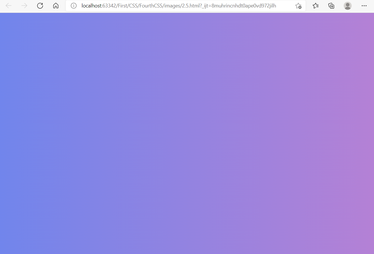
Web site for gradient template:
Link here!
The explanation of two gradients is linked here: Two gradients
 <style>
    body{
     background-image:linear-gradient(19deg,#7085ec 0%, #b581d5 100%);
    /*  Or just background:*/
    }
  </style>
effect: