Transform
1. Introduction
In the previous study, we learned two special effects: transition and animation. Let's learn a new effect transformation. The transformation effect is mainly a series of operations on two-dimensional (2D) and three-dimensional (3D) coordinates. Let's learn it together.
2. Transform
(1) transformation overview: CSS transformations allow you to move, rotate, scale and tilt elements.
(2) classification: transformation can be divided into four categories: translate, rotate, scale and skew. Let's study it respectively.
(3) transform from related attributes and syntax
transfrom Related attributes and syntax

transfrom: Change type(Mainly refers to four:translate,scale,rotate,skew)

transform-origin:Sets the starting point for the conversion

           The starting point here can be used x Shaft y Axis as the starting point of coordinates, such as(0%,0%)

           You can also use distance as the starting point, which is based on the origin of the page(top left corner)Distance, e.g:(10px,10px)

           You can also use keywords that represent directions, such as:left,right,center,top,bottom
3. Translate
(1). Translation overview: translation is what we call translation in mathematics. It moves on the coordinate axis and is based on the change of the geometric center of the element center.
(2). Syntax and parameter description related to Translation:
translation

grammar:

transform:translate(x,y); //Specifies the translation element in both horizontal and vertical directions.

transform:translateX(Length or percentage); //Specifies the translation element in the horizontal direction

transform:translateY(Length or percentage); //Specifies the translation element in the vertical direction
(3). Translation code implementation and effect
<style type="text/css">
			.box{
				width: 150px;
			    height: 100px;
				border: 1px solid red;
				color: #008000;
				margin-top: 20px;
			}

			.left{
				background-color: #6da300;
				transform: translate(50px,50px);
			}

			.center{
				background-color: #00aa00;
				transform: translateY(50px);
			}

			.right{
				background-color: #d00000;
				transform: translateX(50px);
			}
</style>
<body>
		<div class="containner">
			<div class="box origin">
				Original box
			</div>
			<div class="box left">
				Translate 50 vertically and horizontally px
			</div>
			<div class="box center">
				Vertical translation 50 px
			</div>
			<div class="box right">
				Horizontal translation 50 px
			</div>
		</div>
</body>
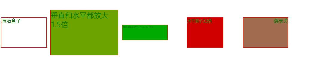
4. Scale
(1). Overview of scaling: the starting point of scaling is to change the width and height of the element. The original size of the original image is 1.0, change the element to X times and the height to Y times. If the given value is between 0 and 1, it means reduction; If the given value is greater than 1, it indicates amplification. It should be noted here that if the given value is negative, it will first rotate 180 ° around the X-axis or Y-axis, move it to the opposite quadrant, and then scale it.
(2). Syntax and parameter description related to scaling:
zoom

grammar:

transform:scale(x,y); //Specifies the scaling element in both horizontal and vertical directions.

transform:scaleX(Length or percentage); //Specifies the scale element in the horizontal direction

transform:scaleY(Length or percentage); //Specifies the scaling element in the vertical direction
(3). Scaling code implementation and effect
<style type="text/css">
			.box{
				width: 150px;
			    height: 100px;
				border: 1px solid red;
				color: #008000;
				margin-top: 50px;
				float: left;
			}

			.left{
				background-color: #6da300;
				transform:scale(1.5,1.5);
				margin-left: 50px;
			}

			.center{
				background-color: #00aa00;
				transform: scaleY(.5);
				margin-left: 50px;
			}

			.right{
				background-color: #d00000;
				transform: scaleX(.8);
				margin-left: 50px;
			}
			.test{
				background-color: #a16b50;
				transform: scaleX(-1.0);
				margin-left: 50px;
			}
</style>
<body>
		<div class="containner">
			<div class="box origin">
				Original box
			</div>
			<div class="box left">
				Zoom in both vertically and horizontally 1.5 times
			</div>
			<div class="box center">
				Vertical zoom out 0.5 times
			</div>
			<div class="box right">
				Horizontal zoom out 0.8 times
			</div>
			<div class="box test">
				Negative parameter
			</div>
		</div>
</body>
5. Rotate
(1). Rotation overview: the so-called rotation changes the previous elements according to a certain angle.
(2). Description of syntax and parameters related to rotation:
rotate

trasiform:rotete(Rotation angle);

Unit of rotation angle:

deg: Angle is the angle of our mathematical cognition

grad:Gradient is actually the rate of change

rad:radian

trun:turn(Or circle)
(3). Rotation code implementation and effect
<style type="text/css">
			.box{
				width: 150px;
			    height: 100px;
				border: 1px solid red;
				color: #008000;
				margin-top: 50px;
				float: left;
			}

			.left{
				background-color: #6da300;
				transform:rotate(45deg);
				margin-left: 50px;
			}

			.right{
				background-color: #d00000;
				transform:rotate(-30deg);
				margin-left: 50px;
			}

</style>

<body>
		<div class="containner">
			<div class="box origin">
				Original box
			</div>
			<div class="box left">
				Positive value, clockwise rotation 45°
			</div>
			<div class="box right">
				Negative value, select 30 counterclockwise°
			</div>
		</div>
	</body>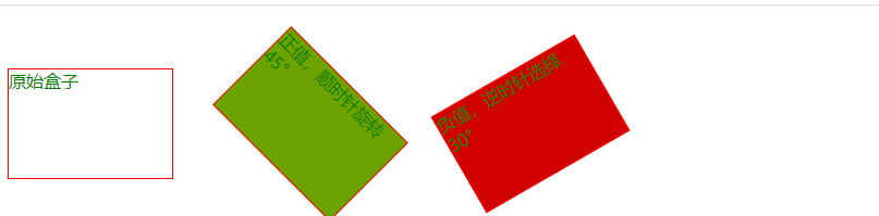
6. Skew
(1). Tilt overview: the so-called tilt stretches the previous elements at a certain angle to tilt the elements at a given angle along the X and Y axes.
(2). Syntax and parameter description related to tilt:
tilt

grammar:

transform:skew(x-angle,y-angle); //Specifies the tilt angle in both horizontal and vertical directions.

transform:skewX(x-angle); //Specifies that the extrusion is tilted by an angle in the horizontal direction

transform:skewY(y-angle); //Specifies that the extrusion is tilted by an angle in the vertical direction
(3). Tilt code implementation and effect
<style type="text/css">
			.box {
				width: 150px;
				height: 100px;
				border: 1px solid red;
				color: #ffff7f;
				margin-top: 50px;
				float: left;
			}

			.left {
				background-color: #6da300;
				transform: skew(30deg,30deg);
				margin-left: 10px;
			}

			.center {
				background-color: #5500ff;
				transform: skewX(45deg);
				margin-left: 50px;
			}

			.right {
				background-color: #d00000;
				transform: skewY(45deg);
				margin-left: 50px;
			}
		</style>
	</head>
	<body>
		<div class="containner">
			<div class="box origin">
				Original box
			</div>
			<div class="box left">
				Tilt 30 in both horizontal and vertical directions°
			</div>
			<div class="box center">
				Tilt 45 horizontally°
			</div>
			<div class="box right">
				Tilt 45 in vertical direction°
			</div>
		</div>
	</body>