1. Form
① Function of form
Collect the information of the client. When the visitor enters the information in the form and clicks the submit button, the information will be sent to the server, and the server script or application will process the corresponding information. When the server responds, it will return the requested data to the client, or perform some operations based on the form content.
② form label
Ⅰ. definition:
The form tag is an area for storing form elements;
Form is just a large area, which provides data input and collection, which is completed by many form control elements.
Ⅱ. Writing method:
<form action="address" method="get" target="_blank" name="Form name">
  <!-- Various form control elements -->
</form>
action tag attribute --- the address of the server that submits the form information
method tag attribute - there are generally two ways for the form to submit data. The difference between get and post is as follows:
get : https://www.baidu.com/?name=ysc&age=22
post : data{
name:"ysc",
age : 22
}
Target tag attribute - where will the new page returned from the back end open after submitting data? The value is the same as the target in a
Name tag attribute --- form name
③ Form control
The function of form controls is to collect user data and submit it to the back end, so all controls must have name and value attributes, and the names of all controls except radio buttons cannot be the same (the names of check boxes can be the same or different, and the friendliness to back-end operations should be the same).
1️⃣ input
Clear the outline during input focusing: outline: none;
The input element is a single label. Its label attribute type can make its meaning different (inline block label):
input # required attributes:
type: determines the function of this form element
Name: the name of the transmitted data
value: the content submitted by the input element. When this attribute is not written, the browser will automatically add it
Other properties:
max: the maximum value allowed
min: minimum value allowed to enter
Step: step size (how much to increase each time)
placeholder prompts are supported by most input s
Checked is checked by default
selected by default
disabled disable element all elements are common
maxlength the longest input character
required must be filled in
<!-- case 1 : Single line text input box  value Property is the input content, so it can not be written -->
<input type="text" name="name" placeholder="You can write prompt text here" /> <br>

<!-- case 2 : Single line password input box  value Property is the input content, so it can not be written -->
<input type="password" name="name" /> <br>

<!-- case 3 : Radio button, a set of options name Must be the same, name Those with the same value will become an option group, value Must be different( value Value (defined casually). Generally, you need to write text after it for auxiliary selection -->
<input type="radio" name="sex" value="male" />male
<input type="radio" name="sex" value="female" />female
<input type="radio" name="Country" value="0" />China
<input type="radio" name="Country" value="1" />U.S.A
<input type="radio" name="Country" value="2" />Japan
<input type="radio" name="Country" value="3" />other <br>

<!-- case 4 : Multiple choice, name It can be the same or different. Considering the convenience of back-end operation, name When the values are the same, the back end gets an array,Therefore, in order to facilitate operation, name The value should be set to the same, value The values can be the same or different -->
<input type="checkbox" name="hobby" value="Basketball" />Basketball
<input type="checkbox" name="hobby" value="Football" />Football
<input type="checkbox" name="hobby" value="badminton" />badminton
<input type="checkbox" name="hobby" value="Table Tennis" />Table Tennis
<input type="checkbox" name="hobby" value="Tennis" />Tennis <br>

<!-- case 5 : Reset button, click to reset all controls in all forms, and the button text defaults"Reset",Can define value Change text display -->
<input type="reset" /> <br>

<!-- case 6 : Empty button, an empty button without any function, needs to be set value Value for display, generally used for js Add feature event -->
<input type="button" value="Button" />  <!--perhaps-->  <button>Button</button> <br>

<!-- case 7 : Upload file -->
<input type="file" name="f" /> <br>

<!-- case 8 : Hide the form control that is not displayed, which is used to pass the attached information that does not need to be displayed to the user -->
<input type="button" name="hide" value="0" /> <br>

<!-- case 9 : Submit, click to submit the form form Data, default value yes"Submit" -->
<input type="submit" /> <br>
As shown in the figure: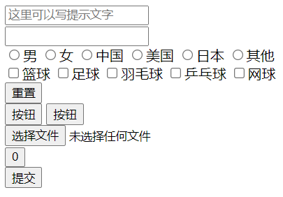
Other unusual type types:
Digital input box: < input type="number" max="999" min="18" step="10" name = "" id = "" > < br >
Slider input box: < input type="range" step="20" value="100" name = "" > < br >
Date input box: < input type="month" name="dat" id = "" > < br >
Color input box: < input type="color" name = "" id = "" > < br >
Mailbox input box: < input type = "email" name = "email" id = "" > < br >
Telephone input box: < input disabled type = "Tel" name = "Tel" id = "" > < br >
2️⃣ label
The function is to assist in input selection.
When we make single or multiple choices, we must click input itself to select, because the following text is only a visual auxiliary function. We can label the text and associate the text with input.
The for attribute of label corresponds to the id attribute of input, for example:
<input type="radio" name="sex" value="1" id="sex1" /><label for="sex1">male</label>
<input type="radio" name="sex" value="2" id="sex2" /><label for="sex2">female</label>
three ️⃣ It is selected by default and cannot be used
Default checked: the default checked or multiple items can be selected
Prohibited: the disabled tag attribute specifies that input is prohibited
four ️⃣ Drop down box
select and option cooperate to realize the drop-down selection box
Grouping of optgroup # options
Option ¢ option (value must be present, and if it is not passed in the past, it is a null value)
<!-- name Prescribed to select  value Prescribed to option,And cannot be the same -->
<select name="days">
  <option value="none">---Please select a week---</option>
  <option value="1">Monday</option>
  <option value="2">Tuesday</option>
  <option value="3">Wednesday</option>
  <option value="4">Thursday</option>
  <option value="5">Friday</option>
  <option value="6">Saturday</option>
  <option value="0">Sunday</option>
</select>
As shown in the figure: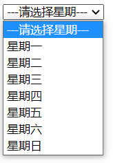
The size tag attribute, set to select, specifies the maximum number that can be displayed in the select drop-down list;
The selected tag attribute, set to option, specifies which option is displayed by default.
five ️⃣ Text field textarea
Multi line text input box, the rows tag attribute defines the height, and the cols tag attribute defines the width;
If it needs to be used to transfer values, it is also necessary to formulate the name attribute.
six ️⃣ Form control grouping
fieldset and legend cooperate to group multiple form controls as needed;
fieldset grouping, and legend defines the group title.
<form action="" medthod="" name="">
  <fieldset>
    <legend>Registration information</legend>
    user name:<input type="text" name="user" />
    password:<input type="text" name="pwd" />
  </fieldset>
  <fieldset>
    <legend>personal information</legend>
    full name:<input type="text" name="name" />
    Age:<input type="text" name="age" />
    Gender:<input type="radio" name="sex" value="0" />male<input type="radio" name="sex" value="1" />female
  </fieldset>
</form>
As shown in the figure: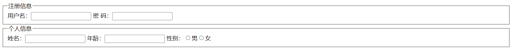
2. Form
The table tag defines a table, which is internally matched with some table tags to define the contents of the table.
A long time ago, many front-end pages used table to layout, but with the development of front-end technology and the enrichment of content, the disadvantages of table are becoming more and more obvious. For example, it is too regular, does not meet the diversification of today's web page layout, is extremely unfriendly to SEO, and the maintenance cost is too high. So at present, the use of table is relatively rare.
① Simple form
The contents in the table area cannot be written directly. The area must be divided first
Properties: text is centered vertically in tr
Generally, when using tables, we don't need many labels: table, tr, th, td;
tr defines the row of the table, and the contents are written in the row;
th is defined in the row, and the font will be bold to represent the title of a column;
td is defined in the line and represents each item;
<table>
  <tr>
    <th>full name</th>
    <th>Gender</th>
    <th>Age</th>
  </tr>
  <tr>
    <td>lh</td>
    <td>male</td>
    <td>20</td>
  </tr>
  <tr>
    <td>zzt</td>
    <td>male</td>
    <td>21</td>
  </tr>
  <tr>
    <td>zwm</td>
    <td>male</td>
    <td>20</td>
  </tr>
</table>
As shown in the figure: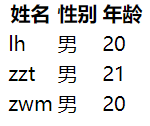
② Borders and margins
Label the table with the attribute border to make each cell border. This attribute receives a numeric value. This value can only change the border width of the tab, not the border width of the items inside;
Add CSS style border collapse: collapse to table; To merge the borders of adjacent cells and beautify the style;
Add the tag attribute cell padding to the table so that each cell is padded. This attribute will be affected by the CSS style;
Add the label attribute cellspacing to the table to add a gap between each cell. This effect can be replaced by the CSS attribute border spacing;
Adding the tag attribute * align * to td/th can set the text alignment, which is similar to the effect of text align.
Set the gap between td: only one of border spacing, border spacing and border collapse can exist
③ Other styles
When using table, we also need to use CSS style to help control the display of the whole table, such as width and height, text size, center and bold, etc. Even though tabel provides some tag attribute control, it is not easy to control. Except for border, it is recommended to use CSS control for other styles.
④ Cell merge
The rowspan property specifies the number of rows the cell spans vertically (vertical merge)
<td rowspan="2"></td>
The colspan property specifies the number of columns the cell spans (horizontal merge)
<td colspan="2"></td>
⑤ Default properties for tables
Without style intervention, the table has some default features, such as:
Another table can be nested inside the table cell
The height of cells in a row shall be subject to the largest, and the width of cells in a column shall be subject to the largest;
The width of cells in a row is allocated according to the content. If one cell has a width set, the remaining width will be divided equally among others that have not been set;
The height of cells in a column is the same as above.
If we want elements that are not tables to have these characteristics of tables, we can use display:table; Some related attributes:
<style>
  #box{ display:table; }  /*  Equivalent to becoming a table*/
  #box div{ display:table-row; } /* Equivalent to becoming tr*/
  #box p{ display:table-cell; } /* Equivalent to td*/
</style>
<div id="box">
  <div>
    <p>full name</p>
    <p>Age</p>
  </div>
  <div>
    <p>Zhang San</p>
    <p>21</p>
  </div>
  <div>
    <p>Li Si</p>
    <p>22</p>
  </div>
</div>
We can use the characteristics of table to solve some problems, such as fixed width on the left and adaptive width on the right:
<style type='text/css'>
    *{ margin:0; padding:0;font-family:'Microsoft yahei';}
    body{
        width:100%;
        display:table;
    }
    #a{
        display:table-cell;
        width:500px;
        height:100px;
        background:pink;
    }
    #b{
        display:table-cell;
        height:100px;
        background:red;
    }
</style>
<div id="a"></div>
<div id="b"></div>
As shown in the figure: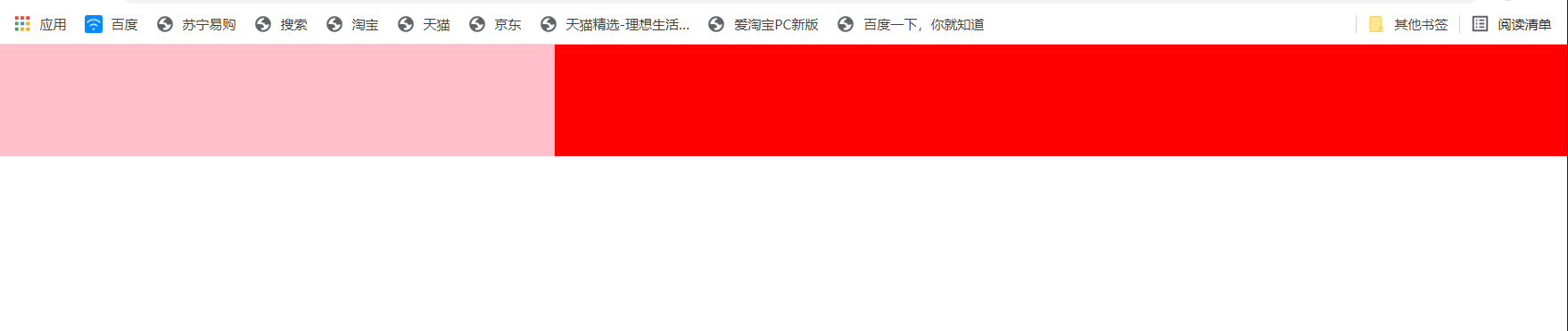
⑥ Other table labels
tbody will add this tag to wrap all contents by default even if it is not written;
thead and tfoot denote the header and footer of the table respectively;
caption table title.
<style>
    table{ border-collapse:collapse; }
</style>
<table border="1">
    <caption>2017 Zhang San's performance statistics in</caption>
    <thead>
        <tr>
            <td></td>
            <td>language</td>
            <td>mathematics</td>
            <td>English</td>
        </tr>
    </thead>
    <tbody>
        <tr>
            <td>1st time</td>
            <td>90</td>
            <td>80</td>
            <td>70</td>
        </tr>
        <tr>
            <td>2nd time</td>
            <td>86</td>
            <td>85</td>
            <td>68</td>
        </tr>
        <tr>
            <td>The 03rd time</td>
            <td>96</td>
            <td>99</td>
            <td>98</td>
        </tr>
        <tr>
            <td>04th meeting</td>
            <td>60</td>
            <td>50</td>
            <td>70</td>
        </tr>
    </tbody>
    <tfoot>
        <tr>
            <td>average</td>
            <td>xx</td>
            <td>xx</td>
            <td>xx</td>
        </tr>
    </tfoot>
</table>
The effect is shown in the figure: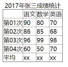
3. Supplement
: focus is selected when the form gets focus.