Complete Handbook of C Language Self-study (33 articles)
Android Multiresolution Adaptation Framework
HTML5 Front-end Development Practical Course Series
MySQL Database Practical Tutorial (35 Graphics Edition)
Overthrow Yourself and Past - Custom View Series (10)
A series of front-end tutorials for Android programmers (40 free video tutorials + source code)
Copyright Statement
- The original author of this article: Gu Ge's younger brother
- Author's blog address: http://blog.csdn.net/lfdfhl
From the previous study, we know that block-level elements (such as < div> </div>) display exclusively on one line in top-down order, while in-line elements (such as < span> </span>) are displayed on the same line in left-to-right order. These display modes are called normal flow or document flow. In the standard flow, the elements at block level are arranged vertically and horizontally.
What we're going to learn and discuss today is float, which is different from standard flow. Hmm, let's get started.
A Brief Introduction to Floating
The Function of Floating
Setting floating elements will detach from the original standard stream.
A floating element can move left or right until its outer edge touches the border of the parent container or another floating box. Floating elements are detached from the original document stream, affecting not only themselves but also the surrounding elements to surround them.
Grammar of float
float:left | right | none;
- left: left float
Right: right float
none: Not floating. This value is the default value.
An introductory example of float
There are three div tags in the page, which by default are arranged in top-down order.
The code is as follows:
<!DOCTYPE html>
<html lang="en">

	<head>
		<meta charset="utf-8">
		<title>Float</title>
		<style type="text/css">
			.firstBox {
				width: 100px;
				height: 100px;
				background: pink;
			}

			.secondBox {
				width: 150px;
				height: 150px;
				background: red;
			}

			.thirdBox {
				width: 200px;
				height: 200px;
				background: blue;
			}
		</style>
	</head>
	<body>
		<div class="firstBox"></div>
		<div class="secondBox"></div>
		<div class="thirdBox"></div>
	</body>
</html>
The results are as follows:
Add floating for. firstBox here, and the rest of the code is unchanged.
The code is as follows:
.firstBox {
	width: 100px;
	height: 100px;
	background: pink;
	float: left;
}
The results are as follows: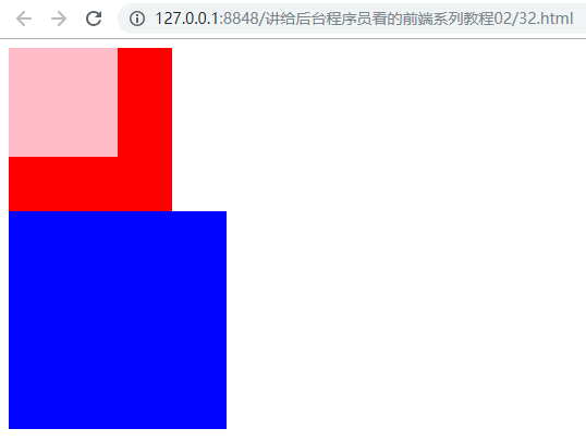
In this example, we can see that firstBox is displayed on secondBox and thirdBox, separated from the original standard stream. Similarly, we set the. secondBox to float and observe the effect.
The code is as follows:
.secondBox {
	width: 150px;
    height: 150px;
	background: red;
	float: left;
}
The results are as follows:
In this example, we can see that firstBox and secondBox are separated from the original standard stream and displayed on thirdBox. Similarly, we continue to float the. thirdBox and observe the effect.
The code is as follows:
.thirdBox {
	width: 200px;
	height: 200px;
	background: blue;
	float: left;
}
The results are as follows: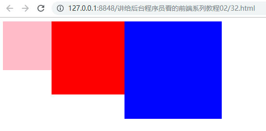
In this example, we can see that firstBox and secondBox and thirdBox are separated from the original standard stream.
Summary of introductory examples
- Standard flow of desulfurization after floating element
- The float attribute converts block-level elements, such as divs, into in-line block elements
The Characteristics of Floating
Let's start with a small example to see the use and effect of float.
The code is as follows:
<!DOCTYPE html>
<html lang="en">

	<head>
		<meta charset="utf-8">
		<title>Float</title>
		<style type="text/css">
			.firstBox {
				width: 250px;
				height: 100px;
				background-color: red;
			}

			.secondBox {
				width: 300px;
				height: 110px;
				background-color: yellowgreen;
			}
		</style>
	</head>

	<body>
		<div class="firstBox">
			<p>Looking for, cold and lonely, sad and miserable. When it's warm and cold, it's hard to rest. Three glasses and two light wines, how can you beat him and make the evening rush? Yan Guoye, is sad, but it is old acquaintance.</p>
		</div>
		<div class="secondBox">
			<p>Rehmannia glutinosa piled up, haggard and damaged, who can pick it now? Keeping the window, how can you get dark alone? The Chinese parasol trees are also drizzling, and at dusk, drops by drops. This time, how a sad word!</p>
		</div>
	</body>

</html>
The results are as follows:
In this example, there are two < div> </div>; in order to facilitate discussion, we call red div the first div, which uses the class selector firstBox; green div is called the second div, which uses the class selector secondBox.
Now make a slight change to the code, add the float attribute to the class selector firstBox, and leave the rest as it is:
.firstBox {
	width: 250px;
	height: 100px;
	background-color: red;
	float: left;
}
Run it, please observe the effect:
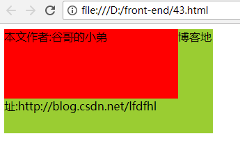
We find that the second div is displayed at the lower level of the first Div. Why is that? Simply put, intuitively speaking: adding float attribute to firstBox causes the first div to break away from the standard stream, so the first div "floats" and the second div appears below it.
After looking at the simplest example of float, let's summarize the characteristics of float:
- 1. Elements that use float will break away from the standard stream and no longer occupy the original position.
- 2. When several block-level elements (such as div) use float s at the same time, they will be displayed on the same line
- 3. float converts in-line elements into in-line block elements
As for the first point, we have already talked about it in the example just now. What does the second point mean? Let's take another example:
<!DOCTYPE html>
<html lang="en">

<head>
    <meta charset="utf-8">
    <title>Float</title>
    <style type="text/css">
    div {
        width: 300px;
        height: 170px;
        line-height: 170px;
        margin: auto;
    }

    .firstBox {
        background-color: red;
        float: left;
    }

    .secondBox {
        background-color: yellowgreen;
        float: left;
    }

    .thirdBox {
        background-color: blue;
        float: left;
    }
    </style>
</head>

<body>
    <div class="firstBox">
        //Author: Gu Ge's younger brother
    </div>
    <div class="secondBox">
        //Blog address: http://blog.csdn.net/lfdfhl
    </div>
    <div class="thirdBox">
        //Intentional Classroom: http://www.stay4it.com/
    </div>
</body>

</html>
In this example, there are three <div> </div>. For discussion purposes, we call the red div; the first div, which uses the class selector firstBox; the green div; the second div, which uses the class selector secondBox; the blue div; and the third div, which uses the class selector thirdBox. In these three types of selectors, we have float:left, so all three divs will "float up", the effect is as follows: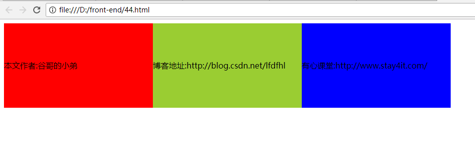
The first and second points about float characteristics, which we have already mentioned in the example just now, what does the third point mean? Let's take another example:
<!DOCTYPE html>
<html lang="en">

<head>
    <meta charset="utf-8">
    <title>Float</title>
    <style type="text/css">
    strong {
        width: 170px;
        height: 70px;
        margin-left: 15px;
        background-color: yellowgreen;
        font-weight: bold;
        color: red;
        float: left;
    }
    </style>
</head>

<body>
    <strong>Welcome to Heart Class</strong>
    <strong>Make a little progress every day</strong>
</body>

</html>
In this example, there are two < strong > </strong > tags, in which the tag selector strong sets the attribute float:left; the code runs as follows:
[External Link Picture Transfer Failure (img-Lv56K5pr-1568000081586)(https://img-blog.csdn.net/20171104172310912)]
In this example, the float:left attribute is used to convert the in-line element strong into the in-line block element, so the height can be set for it. Speaking of this, you may recall that we used to use display attributes to convert patterns as well. Yes! Will we use float or display for mode conversion later? The answer is the latter, because float, after all, leads to element delisting.
Floating application scenarios
Now that we have some basic knowledge and understanding of float, let's look at the common application scenarios of float.
- 1. Using float to surround pictures and texts
- 2. Making Navigation Bar by Floating
- 3. Realizing Web Page Layout by Floating
Three common application scenarios of float are illustrated.
Floating Example 1
The code is as follows:
<!DOCTYPE html>
<html lang="en">

	<head>
		<meta charset="utf-8">
		<title>Float</title>
		<style type="text/css">
			div {
				width: 385px;
				height: 250px;
				background-color: yellowgreen;
			}

			div img {
				margin: 0px 20px 0px 0px;
				float: left;
				width: 40%;
			}
		</style>
	</head>

	<body>
		<div>
			<img src="img/girlfriend.jpg" title="My goddess">
			<p>Zhang Hanyun was born on April 9, 1989, in Peiyang District, Deyang City, Sichuan Province. She is a female pop singer and film and television actor in mainland China. In 2004, he participated in the Hunan Satellite TV show "Super Girl" competition, won the runner-up in Chengdu singing area and the national finals, thus formally entered the Performing Arts circle. In 2005, the first personal music album "I'm Charming with Rhyme" was released. In March 2006, he won the Best Newcomer Silver Award in the "Oriental Wind and Cloud List". In the same year, he starred in his first TV drama "Wave on the End of the World". In February 2007, the second personal music album Youth Invincible was released.</p>
		</div>
	</body>

</html>
The results are as follows:
In this example, a picture and its corresponding text introduction are shown. In this paper, the descendant selector div img is used to set the attribute float:left for img, which causes the picture to "float" and surround it with words. This is a very common use of float attribute, and is also the original intention of researchers to design float!
Floating Example 2
The code is as follows:
<!DOCTYPE html>
<html lang="en">

<head>
    <meta charset="utf-8">
    <title>Float</title>
    <style type="text/css">
    ul {
        margin: 0;
        padding: 0;
        list-style-type: none;
        overflow: hidden;
        background-color: #272822;
    }


    li {
        list-style: none;
        float: left;
		width: 20%;
    }

    li a {
        display: block;
        color: white;
        text-align: center;
        padding: 14px 16px;
        text-decoration: none;
    }

    li a:hover {
        background-color: yellowgreen;
        color: red;
    }
    </style>
</head>

<body>
    <ul>
        <li>
            <a href="http://blog.csdn.net/lfdfhl">Home</a>
        </li>
        <li>
            <a href="http://blog.csdn.net/lfdfhl">Hot clothes</a>
        </li>
        <li>
            <a href="http://blog.csdn.net/lfdfhl">New Arrivals</a>
        </li>
        <li>
            <a href="http://blog.csdn.net/lfdfhl">High quality after-sale</a>
        </li>
        <li>
            <a href="http://blog.csdn.net/lfdfhl">Contact us</a>
        </li>
    </ul>
</body>

</html>
The results are as follows: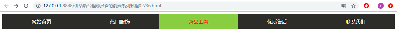
In this example, we skillfully implemented the navigation bar of the website in ul by using float.
Floating Example 3
The code is as follows:
<!DOCTYPE html>
<html lang="en">

	<head>
		<meta charset="utf-8">
		<title>Float</title>
		<style type="text/css">
			* {
				margin: 0;
				padding: 0;
			}

			.all {
				width: 490px;
				height: 350px;
				background-color: #458B00;
				margin: 0 auto;
			}

			.header {
				height: 25px;
				background-color: pink;
			}

			.content {
				height: 300px;
				background-color: #46F3B6;
			}

			.left-content {
				width: 50px;
				height: 300px;
				background-color: #20B2AA;
				float: left;
			}

			.middle-content {
				width: 390px;
				height: 300px;
				background-color: #CBE923;
				float: left;
			}

			.right-content {
				width: 50px;
				height: 300px;
				background-color: blue;
				float: left;
			}

			.top-content {
				height: 150px;
				background-color: #55cd0e;
			}

			.bottom-content {
				height: 150px;
				background-color: #a4cd0e;
			}
		</style>
	</head>

	<body>
		<br>
		<div class="all">
			<div class="header"></div>
			<div class="content">
				<div class="left-content"></div>
				<div class="middle-content">
					<div class="top-content"></div>
					<div class="bottom-content"></div>
				</div>
				<div class="right-content"></div>
			</div>
		</div>
	</body>

</html>
The results are as follows: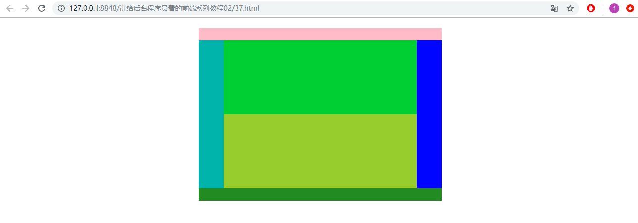
In this example, we show the common web page layout, which includes: header, left-content, middle-content, top-content, bottom-content, right-content and so on. In the process of web page layout, we need to display some < div> </div> in the same row; at this time, float property can be used to implement the design.
Clear float
In HTML, when an element is set to float, it departs from the original standard stream; at this time, other elements adjacent to it will be affected by float to change their position. In order to avoid the effect of floating on other elements, it is necessary to clear floating. The grammar is as follows:
Selector {clear: attribute value}
The common attributes of clear are as follows:
- Left: Clear the effect of left float
- Right: Clear the effect of the right float
- both: Clear the effects of left and right side floats
- none: The float is not clear, which is the default value of the clear attribute
Let's first look at a normal situation:
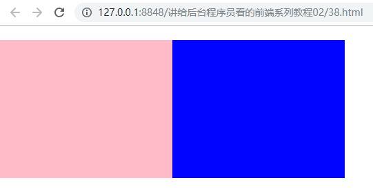
<!DOCTYPE html>
<html lang="en">

	<head>
		<meta charset="utf-8">
		<title>float Float</title>
		<style type="text/css">
			* {
				margin: 0;
				padding: 0;
			}

			.all {
				width: 500px;
				height: auto;
				background-color: yellow;
			}

			.left-content {
				width: 250px;
				height: 200px;
				background-color: pink;
			}


			.right-content {
				width: 250px;
				height: 200px;
				background-color: blue;
			}

			.bottom-content {
				height: 150px;
				width: 500px;
				background-color: #00FF00;
			}
		</style>
	</head>

	<body>
		<br>
		<div class="all">
			<div class="left-content"></div>
			<div class="right-content"></div>
		</div>
		<div class="bottom-content"></div>
	</body>

</html>
In this example, we use the < div> </div> of the class selector all to set its height to auto; under the parent element, there are three < div> </div> which use the class selector left-content, right-content and bottom-content, respectively. The results are as follows:

Now set the property float:left for left-content and right-content, and observe the effect after running:
The float attribute is set in the child element (even using the div of the class selector left-content and right-content). At this point, the green div using bottom-content at the bottom of the class selector is not visible in the interface due to overflow. Now, we need to clear up the effects of floats.
The first way to clear floats
<!DOCTYPE html>
<html lang="en">

<head>
    <meta charset="utf-8">
    <title>Clear float(float)The first way</title>
    <style type="text/css">
    * {
        margin: 0;
        padding: 0;
    }

    .all {
        width: 500px;
        height: auto;
        background-color: yellow;
    }

    .left-content {
        width: 250px;
        height: 200px;
        background-color: pink;
        float: left;
    }


    .right-content {
        width: 250px;
        height: 200px;
        background-color: blue;
        float: left;
    }


    .bottom-content {
        width: 500px;
        height: 150px;
        background-color: #00FF00;
    }

    .clearfix {
        clear: both;
    }
    </style>
</head>

<body>
    <br>
    <div class="all">
        <div class="left-content"></div>
        <div class="right-content"></div>
        <div class="clearfix"></div>
    </div>
    <div class="bottom-content"></div>
</body>

</html>
In this example:
- Define the class selector clearfix, set the property clear: both, see lines 41-43 of the code
- Add a div below the two divs that set the float property and set its class selector clearfix, as shown in line 53 of the code
- Except for this, no other changes are made to the code
After operation, the effect is as follows:
Hmm, here we use the class selector clearfix to eliminate the overflow effect caused by float.
The second way to clear floats
<!DOCTYPE html>
<html lang="en">

<head>
    <meta charset="utf-8">
    <title>Clear float(float)The second way</title>
    <style type="text/css">
    * {
        margin: 0;
        padding: 0;
    }

    .all {
        width: 500px;
        height: auto;
        background-color: yellow;
        overflow: hidden;
    }

    .left-content {
        width: 250px;
        height: 200px;
        background-color: pink;
        float: left;
    }


    .right-content {
        width: 250px;
        height: 200px;
        background-color: blue;
        float: left;
    }


    .bottom-content {
        width: 500px;
        height: 150px;
        background-color: #00FF00;
    }
    </style>
</head>

<body>
    <br>
    <div class="all">
        <div class="left-content"></div>
        <div class="right-content"></div>
    </div>
    <div class="bottom-content"></div>
</body>

</html>
In this example:
- Subelements use the class selector left-content, see line 47 of the code
- Subelements use the class selector right-content, see line 48 of the code
- The parent element of the child element uses the class selector all, see line 46 of the code
- Set the property overflow: hidden in the class selector all, see line 17 of the code
The operation effect is the same as the above figure, and it will not be repeated. Note, however, that if the parent element has a positioned element, it is generally not recommended to use this method to remove the effects of floats.
The third way to clear floats
<!DOCTYPE html>
<html lang="en">

<head>
    <meta charset="utf-8">
    <title>Clear float(float)The third way</title>
    <style type="text/css">
    * {
        margin: 0;
        padding: 0;
    }

    .all {
        width: 500px;
        height: auto;
        background-color: yellow;
    }

    .left-content {
        width: 250px;
        height: 200px;
        background-color: pink;
        float: left;
    }


    .right-content {
        width: 250px;
        height: 200px;
        background-color: blue;
        float: left;
    }


    .bottom-content {
        width: 500px;
        height: 150px;
        background-color: #00FF00;
    }

    .clearfix:after {
        content: "";
        display: block;
        clear: both;
        height: 0;
        line-height: 0;
        visibility: hidden;
    }

    .clearfix {
        zoom: 1;
    }
    </style>
</head>

<body>
    <br>
    <div class="all clearfix">
        <div class="left-content"></div>
        <div class="right-content"></div>
    </div>
    <div class="bottom-content"></div>
</body>

</html>
In this example, the pseudo elements in CSS3 are used to remove the effects of floats.
- Define clearfix:after, see lines 41-48 of the code
- To define clearfix for compatibility with IE browsers, see lines 50-52
- Use all and clearfix in the parent element, see line 58 of the code
The operation effect is the same as the above figure, and it will not be repeated. This method is a more standard and practical way of writing, so it is widely used in development.